
Search results for "Never before seen" in Home Design Ideas
 Jeanne Schultz Design Studio
Words by Wilson Hack
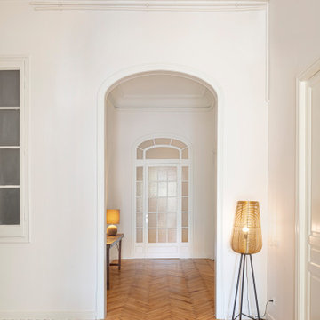
The best architecture allows what has come before it to be seen and cared for while at the same time injecting something new, if not idealistic. Spartan at first glance, the interior of this stately apartment building, located on the iconic Passeig de Gràcia in Barcelona, quickly begins to unfold as a calculated series of textures, visual artifacts and perfected aesthetic continuities.
The client, a globe-trotting entrepreneur, selected Jeanne Schultz Design Studio for the remodel and requested that the space be reconditioned into a purposeful and peaceful landing pad. It was to be furnished simply using natural and sustainable materials. Schultz began by gently peeling back before adding only the essentials, resulting in a harmoniously restorative living space where darkness and light coexist and comfort reigns.
The design was initially guided by the fireplace—from there a subtle injection of matching color extends up into the thick tiered molding and ceiling trim. “The most reckless patterns live here,” remarks Schultz, referring to the checkered green and white tiles, pink-Pollack-y stone and cast iron detailing. The millwork and warm wood wall panels devour the remainder of the living room, eliminating the need for unnecessary artwork.
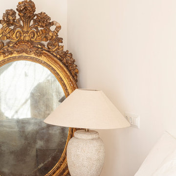
A curved living room chair by Kave Home punctuates playfully; its shape reveals its pleasant conformity to the human body and sits back, inviting rest and respite. “It’s good for all body types and sizes,” explains Schultz. The single sofa by Dareels is purposefully oversized, casual and inviting. A beige cover was added to soften the otherwise rectilinear edges. Additionally sourced from Dareels, a small yet centrally located side table anchors the space with its dark black wood texture, its visual weight on par with the larger pieces. The black bulbous free standing lamp converses directly with the antique chandelier above. Composed of individual black leather strips, it is seemingly harsh—yet its soft form is reminiscent of a spring tulip.
The continuation of the color palette slips softly into the dining room where velvety green chairs sit delicately on a cascade array of pointed legs. The doors that lead out to the patio were sanded down and treated so that the original shape and form could be retained. Although the same green paint was used throughout, this set of doors speaks in darker tones alongside the acute and penetrating daylight. A few different shades of white paint were used throughout the space to add additional depth and embellish this shadowy texture.
Specialty lights were added into the space to complement the existing overhead lighting. A wall sconce was added in the living room and extra lighting was placed in the kitchen. However, because of the existing barrel vaulted tile ceiling, sconces were placed on the walls rather than above to avoid penetrating the existing architecture.
 RAJ Kitchen and Bath, LLC
 “Full apartment design”.
IF you have not yet seen this apartment conversion before, we strongly urge you to go to the bottom left of this page and click on the short 2-minutes video. It would put a lot of things into perspective when you come back and continue reading this.
It is true we were literally handed the keys and told a list of things that they wanted to have happen and we were to go into the apartment, look at the space and come up with a design that would satisfy all of that need. UNTIL we showed up! The unit had really seen some better days but we knew we had to look past that and come up with a concept that would work for them.
The immediate challenges were centered around 3 big ideas:
1. Adding a second bedroom to the already small footprint
2. Figuring out a way to make the kitchen bigger, better and brighter
3. Creating a master room walk in closet
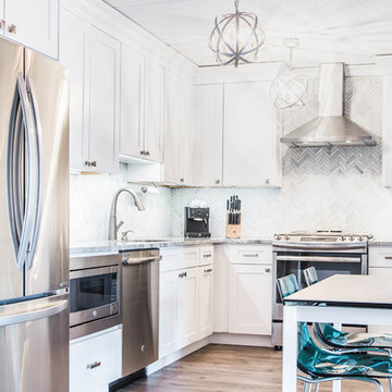
It’s always difficult to add new rooms into existing footprint without expanding out or up and not incurring any opportunity cost. In this case, that was exactly what we had to do. Item one and two above had to be tackled as one. We went ahead and switched out the location of the dining room and eliminating an area where there was a “nook” type eat-in area. By doing so, we were able to cut right into that footprint and change the layout of the kitchen.
That one move allowed us to dig into the kitchen design because it was now the main focal point in the apartment. It was no longer an option to keep it in that tiny hole where it was, so we had to ensure that this design was functional and aesthetically pleasing at the same time. By adding the table into the space where an Island typically would go, we were able to both cut cost and still provide a dining experience. The Table serves as an Island as well when cooking.
We then proceeded to block in the existing doorway to the dining room. By doing this, we were able to create a full room which allowed us to put a door on the other side and called that room Bedroom #2. This was easier to do because all of the mechanicals were already in that space (light, heater and windows). By shifting things around, we also achieved a huge wall to wall closet from inside. PERFECT!
Then we moved into the Single bedroom. We thought it was a big room with a small closet, so by creatively adding an L shaped wall and steal some footprint into the bedroom side, we were able to put a door on that new room and design it for the walk-in closet. Even after this, the bedroom still holds a queen size bed with 2 night stands, a TV on the wall, a sitting chair and plenty of room to walk around. This was done by rethinking the location for the bed and night stands.
The bathroom was gutted to make sure there was no leaks and rebuild from the ground up. We kept all of the plumbing where it was, added a new vanity, medicine cabinet, tiles and lighting and it was done.
From there, the rest of the unit had new flooring all throughout, paint, and lighting. After completion and walk through, this project was handed over back to the clients.
Execution and collaboration between all the trades were: Reggie and his team from Premier Interiors and Rohan from RD Mechanical Services.
p.s. Please see our website to see the video.
 Jeanne Schultz Design Studio
Words by Wilson Hack
The best architecture allows what has come before it to be seen and cared for while at the same time injecting something new, if not idealistic. Spartan at first glance, the interior of this stately apartment building, located on the iconic Passeig de Gràcia in Barcelona, quickly begins to unfold as a calculated series of textures, visual artifacts and perfected aesthetic continuities.
The client, a globe-trotting entrepreneur, selected Jeanne Schultz Design Studio for the remodel and requested that the space be reconditioned into a purposeful and peaceful landing pad. It was to be furnished simply using natural and sustainable materials. Schultz began by gently peeling back before adding only the essentials, resulting in a harmoniously restorative living space where darkness and light coexist and comfort reigns.
The design was initially guided by the fireplace—from there a subtle injection of matching color extends up into the thick tiered molding and ceiling trim. “The most reckless patterns live here,” remarks Schultz, referring to the checkered green and white tiles, pink-Pollack-y stone and cast iron detailing. The millwork and warm wood wall panels devour the remainder of the living room, eliminating the need for unnecessary artwork.
A curved living room chair by Kave Home punctuates playfully; its shape reveals its pleasant conformity to the human body and sits back, inviting rest and respite. “It’s good for all body types and sizes,” explains Schultz. The single sofa by Dareels is purposefully oversized, casual and inviting. A beige cover was added to soften the otherwise rectilinear edges. Additionally sourced from Dareels, a small yet centrally located side table anchors the space with its dark black wood texture, its visual weight on par with the larger pieces. The black bulbous free standing lamp converses directly with the antique chandelier above. Composed of individual black leather strips, it is seemingly harsh—yet its soft form is reminiscent of a spring tulip.
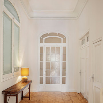
The continuation of the color palette slips softly into the dining room where velvety green chairs sit delicately on a cascade array of pointed legs. The doors that lead out to the patio were sanded down and treated so that the original shape and form could be retained. Although the same green paint was used throughout, this set of doors speaks in darker tones alongside the acute and penetrating daylight. A few different shades of white paint were used throughout the space to add additional depth and embellish this shadowy texture.
Specialty lights were added into the space to complement the existing overhead lighting. A wall sconce was added in the living room and extra lighting was placed in the kitchen. However, because of the existing barrel vaulted tile ceiling, sconces were placed on the walls rather than above to avoid penetrating the existing architecture.
Find the right local pro for your project
 Bushra's LIfestyle | A Lifestyle & Home Decor Blog
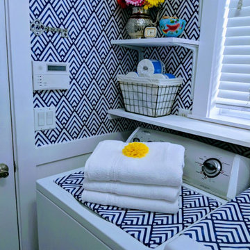
We also removed the ugly and lonely shelf in the corner what you have seen in the before picture. You can add more storage by adding fake floating shelves easily.
 Michael Jacobson Gomez
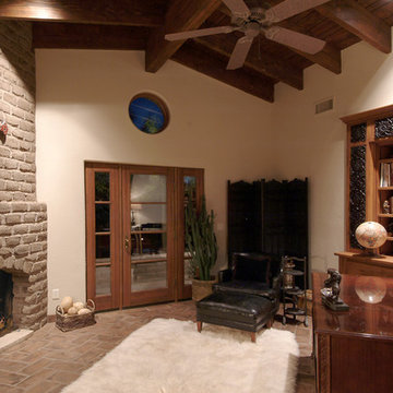
THE LIBRARY: Years before this home was built, the Owners had collected several pallets of 70 year-old adobe utilized by the famed Tucson Architect 'Josias Joseler' to build 'St. Phillips in the Hills' Church. A Road expansion required partial demolition of the original courtyard wall of this desert masterpiece, which the astute church members salvaged for some special us. This Libray fireplace was veneered with the 70 year old adobe. A metal plate on the wall (upper left) holds the original Catalina Foothills lot sign and number (153). The Architectural Designer/Builder visited the site at night-fall to verify and document the protected view corridor of city lights seen at night time. A window located opposite the desk location (not seen in this photo) allows the homeowners the city light view.
 RAJ Kitchen and Bath, LLC
 “Full apartment design”.
IF you have not yet seen this apartment conversion before, we strongly urge you to go to the bottom left of this page and click on the short 2-minutes video. It would put a lot of things into perspective when you come back and continue reading this.
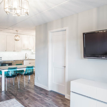
It is true we were literally handed the keys and told a list of things that they wanted to have happen and we were to go into the apartment, look at the space and come up with a design that would satisfy all of that need. UNTIL we showed up! The unit had really seen some better days but we knew we had to look past that and come up with a concept that would work for them.
The immediate challenges were centered around 3 big ideas:
1. Adding a second bedroom to the already small footprint
2. Figuring out a way to make the kitchen bigger, better and brighter
3. Creating a master room walk in closet
It’s always difficult to add new rooms into existing footprint without expanding out or up and not incurring any opportunity cost. In this case, that was exactly what we had to do. Item one and two above had to be tackled as one. We went ahead and switched out the location of the dining room and eliminating an area where there was a “nook” type eat-in area. By doing so, we were able to cut right into that footprint and change the layout of the kitchen.
That one move allowed us to dig into the kitchen design because it was now the main focal point in the apartment. It was no longer an option to keep it in that tiny hole where it was, so we had to ensure that this design was functional and aesthetically pleasing at the same time. By adding the table into the space where an Island typically would go, we were able to both cut cost and still provide a dining experience. The Table serves as an Island as well when cooking.
We then proceeded to block in the existing doorway to the dining room. By doing this, we were able to create a full room which allowed us to put a door on the other side and called that room Bedroom #2. This was easier to do because all of the mechanicals were already in that space (light, heater and windows). By shifting things around, we also achieved a huge wall to wall closet from inside. PERFECT!
Then we moved into the Single bedroom. We thought it was a big room with a small closet, so by creatively adding an L shaped wall and steal some footprint into the bedroom side, we were able to put a door on that new room and design it for the walk-in closet. Even after this, the bedroom still holds a queen size bed with 2 night stands, a TV on the wall, a sitting chair and plenty of room to walk around. This was done by rethinking the location for the bed and night stands.
The bathroom was gutted to make sure there was no leaks and rebuild from the ground up. We kept all of the plumbing where it was, added a new vanity, medicine cabinet, tiles and lighting and it was done.
From there, the rest of the unit had new flooring all throughout, paint, and lighting. After completion and walk through, this project was handed over back to the clients.
Execution and collaboration between all the trades were: Reggie and his team from Premier Interiors and Rohan from RD Mechanical Services.
p.s. Please see our website to see the video.
 Inspired Closets Baton Rouge
You open your kitchen cabinet. It's a mess. An endless abyss.
You're looking for olive oil to sauté delicious garlic and onions for dinner.
You know you have it. Where could it be?
Cooking your favorite family meal can take longer than the Macy's Thanksgiving Day Parade without organization to find what you need.
That's what happened each & every time one of our recent Baton Rouge clients, Jan, tried to cook a meal in her home.
Searching For A Pantry Solution
Jan and her family moved into their new home in 2017 despite not having a pantry. Knowing they needed one desperately, Jan wondered if a pantry could fit in their vast laundry room.
Instead of trying the DIY route, Jan wanted professional help to get it done right.
Jan saw an Inspired Closets sign on the lawn of a home in her neighborhood. She decided to visit their showroom to meet with our expert designer, Felicity.
After Jan shared her vision of what they wanted in a pantry, Felicity got to work! She created a custom design accomplishing everything Jan wanted. So there was never a need to shop around for other companies.
Let The Fun Begin: The Design & Construction Process
Jan thought the process was terrific. Much easier than they thought it would be. The 3D rendering of the project allowed them to see their dream space before installation began.
And, during the process, Jan realized she wanted to expand the project by redoing the laundry room as well!
Jan said, "I was able to make a few tweaks until it was perfect."
Felicity had a contractor she worked with closely. Together they handled it all, making it super easy for them with no mess or stress left behind.
A True Eye-Opening Experience: Make Getting The Ingredients The Easiest Part
"The functionality was the best part," says Jan. Finally, her family could see everything.
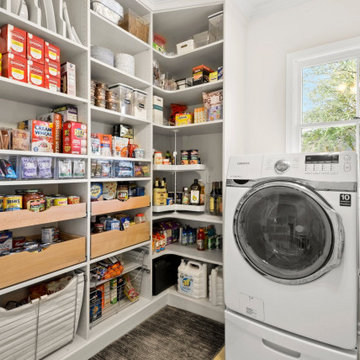
Inspired Closets put everything in plain sight by creating:
- clear acrylic snap drawers to see everything
- sliding pull-out drawers for canned goods
- a produce pull-out drawer
- a basket for chips and snacks that the kids loved
- a lazy Susan that holds vinegar, oils, and bottled items
Felicity maximized every inch of space in the design. Jan and her family were amazed the room had a wide-open feel, even with all the items in the room. The area was functional and beautiful.
Saving Time, Money, And Stress
But it wasn’t just pretty to look at. Now that everything is more accessible in her pantry, making a grocery list is a cinch. Jan found herself saving money by not buying things she already owned but simply couldn’t see.
"I love how the kids can find things so quickly. We never have to guess where stuff is, making daily life easier," Jan says.
Another Happy Ending
Jan’s family could not be more satisfied with their reimagined space, telling everyone they know not to be overwhelmed when considering a new project.
Let us help get rid of the mess and stress in your pantry or laundry space like we did for Jan!
Whether you’re embarking on your new construction, forever home, or a renovation to make life better, just imagine how we can help you create your dream come true.

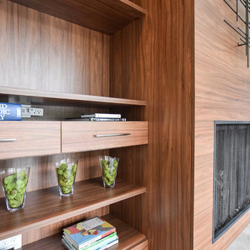
 California Closets of Michigan
Per Erin: "In so many cases we have seen our product installed before, but this was a completely new style of design for us to take on. The client was thrilled with the final outcome, stating that they have built homes before and done expensive renovations and they had not been able to find a source to create this detailed of a plan for the wall unit they desired."
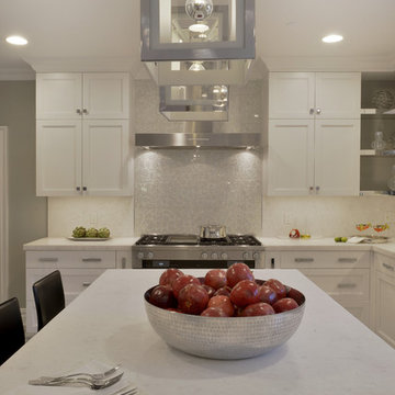
 Bilotta Kitchen & Home
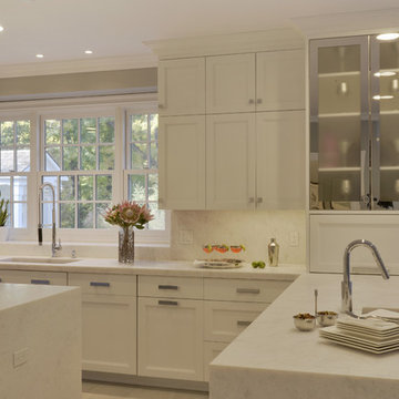
From the outside of this very traditional home in Harrison, New York, you would never expect the contemporary styling and pops of color throughout the interior, including the white feather chandelier and oversized painting of Marilyn Monroe with pink bubblegum, both of which accent the dinner table. When the client first came into meet with Bilotta designer, Danielle Florie, they had an idea of what they wanted, and what they didn’t want. They have modern/transitional taste and wanted both an aesthetically “wow” kitchen that was also very functional. Danielle made it come to life. They had been collecting photos for ten years before they decided to pull the trigger. They opted for Bilotta’s private cabinetry line, the Bilotta Collection, and selected a frameless, stepped door with double tiered wall cabinets, all accented by polished chrome rectangular pulls and square knobs. Instead of a deep corner cabinet they went with thick alumasteel shelves in the corner of the kitchen. At the peninsula they added some “bling” with the polished chrome and glass doors above the appliance garage. Also at the peninsula they decided to face their secondary, “prep” sink out towards the dinner table primarily so the kids could wash their hands before eating. There is also an undercounter beverage center to the right of that sink for easy access to drinks. Instead of going with a smooth painted finish they opted for a hand-brushed finish for a little texture. All appliances are Miele including their brand new 48” duel fuel range, smart enough on its own to tell you how to cook! The backsplash behind the range is the Stone Fox Collection from Ellen Blakeley of Ellen Blakely Studio in Santa Rosa, CA. It is a custom made tempered glass mosaic. The countertops and rest of the backsplash are White Diamond marble from Rye Marble, and the flooring is a porcelain Tile from Terra Tile. Designer: Danielle Florie. Photo Credit: Peter Krupenye
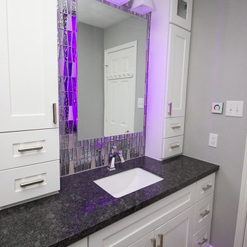
 Griffin Design
Designed By: Robby & Lisa Griffin
Photos By: Desired Photo
The true beauty of the Emser Tile Alchemy series (seen here in "Silver") is the metallic nature of the silver melded together with the matte of the copper and wrought iron tones throughout the rest of the tile.The understated shimmer of the Alchemy is the perfect companion to the polished glimmer of the Imagine used as the feature tile in our "Alchemist's Dream" Guest Bathroom design. The geometric, but never round, theme carries throughout the space, seen here in our multi-function shower head by Delta Faucet. Designed by: Robert Griffin and Lisa Forrest Photos by: Desired Photo
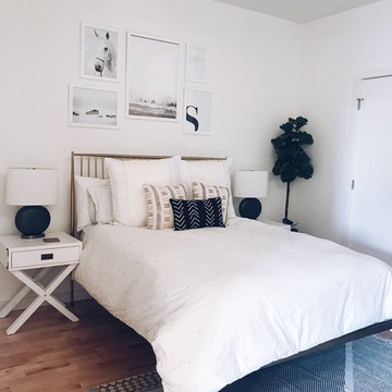
 Paintzen, Inc.
When it comes to finding inspiration for your house or apartment design, there are a variety of routes you can take. For some, it is important to dive into the latest trends in fashion and art, using only the most popular decor pieces and embracing the color palettes seen on runways or in home and garden magazines. But for others, it’s simply about discovering what feels most like “home.”
Ashley Steele, the creator of A Styled Affair, was part of the latter group. “Since my husband and I were moving into a space that was previously owned, I needed a way to make it feel like it was truly ours, and unique to us,” she told our team.
A Styled Affair sprang from Ashley’s passion for fashion, and need for a creative outlet. But it soon became more than that. She developed a following, and it quickly became a place where she could share her personal style, travel adventures, and lifestyle tips. “While the blogging industry has become overwhelmed with people sharing their favorite home decor or make-up tips, I think what sets A Styled Affair apart is my commitment to stay true to my unique taste. I have always marched to the beat of my own drum – and that carries through in the clothes I wear, the decor I select for our home, and the travels I plan.”
Paintzen connected with Ashley as she was settling into her new home in Boston’s Seaport District. Although she and her husband have lived in Boston for almost 8 years, they were used to smaller, more traditional spaces. Their new home is much bigger, and more modern, than any place they lived before. “I wanted to select colors of comfort, simplicity, and sophistication so we could elevate the space and make it feel more like a home.” Ashley also accurately pointed out that new construction can sometimes feel a little cold and sterile, almost industrial. “I wanted our home to feel like a peaceful oasis after coming in from the bustling city.”
Ashley chose soft white paint for her walls to bring a sense of comfort and zen. With lots of wall decor, art work and carefully selected furniture, the walls serve as a clean and comfortable palette, and allowed her more freedom when making her other design decisions throughout the space. Ashley kept the overall palette fairly neutral, and incorporated “modern bohemian” inspired decor throughout the home; the final product was clean and simple, and catered to her style.
We asked Ashley what she was most excited for now. “I’m most excited to continue to find new decor pieces to compliment the paint colors and decor we’ve already found for the space. We have been really patient with decorating and selected each piece really careful to make sure it is cohesive and flows from room to room. I’m looking forward to enjoying the space with my husband and dog, and entertaining friends and family in the spring and summer!”
A few final questions for Ashley on her experience with Paintzen:
“I would highly recommend Paintzen to anyone, especially those that live in the city. There are so many different paint companies and contractors to choose from but going through Paintzen simplified the process and made me feel comfortable that we had the right team working on our space. Their platform for booking services and choosing paint colors made the process seamless and was a great way to keep track of what we booked and chose for colors. Most importantly, the customer service team was outstanding whenever we had a question or needed to make an adjustment.”
And advice she would give someone repainting their home:
“Patience. I would recommend taking your time and doing your research before selecting paint colors. Lighting changes every color so make sure to bring paint swatches and samples into the space and look at it throughout the day to see the different tones that the light will pick up. I would also recommend researching color trends and recommendations for colors in the family you are looking for. We found our living room color through a blog post listing top-used colors by interior designers and it looks amazing.”
 Bilotta Kitchen & Home
From the outside of this very traditional home in Harrison, New York, you would never expect the contemporary styling and pops of color throughout the interior, including the white feather chandelier and oversized painting of Marilyn Monroe with pink bubblegum, both of which accent the dinner table. When the client first came into meet with Bilotta designer, Danielle Florie, they had an idea of what they wanted, and what they didn’t want. They have modern/transitional taste and wanted both an aesthetically “wow” kitchen that was also very functional. Danielle made it come to life. They had been collecting photos for ten years before they decided to pull the trigger. They opted for Bilotta’s private cabinetry line, the Bilotta Collection, and selected a frameless, stepped door with double tiered wall cabinets, all accented by polished chrome rectangular pulls and square knobs. Instead of a deep corner cabinet they went with thick alumasteel shelves in the corner of the kitchen. At the peninsula they added some “bling” with the polished chrome and glass doors above the appliance garage. Also at the peninsula they decided to face their secondary, “prep” sink out towards the dinner table primarily so the kids could wash their hands before eating. There is also an undercounter beverage center to the right of that sink for easy access to drinks. Instead of going with a smooth painted finish they opted for a hand-brushed finish for a little texture. All appliances are Miele including their brand new 48” duel fuel range, smart enough on its own to tell you how to cook! The backsplash behind the range is the Stone Fox Collection from Ellen Blakeley of Ellen Blakely Studio in Santa Rosa, CA. It is a custom made tempered glass mosaic. The countertops and rest of the backsplash are White Diamond marble from Rye Marble, and the flooring is a porcelain Tile from Terra Tile. Designer: Danielle Florie. Photo Credit: Peter Krupenye
 Bedrose
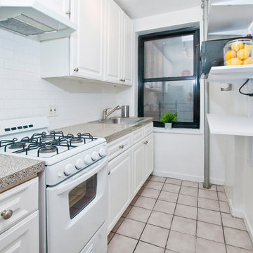
The Space Everything you need is near the apartment. Safe neighborhood. Bedroom has a queen size Tempurpedic memory foam cloud bed. Kitchen had great counter space, easy for cooking meals in. Living room has cozy couches, flat screen TV and is a great lounging and relaxing area.
There is cable and Wifi in apartment. Full bathroom-shower and tub. Just 3 blocks from an Express Subway stop (4,5,6 line) and Express and Local Bus on the same block. The subway will take you to Times Square in 5 minutes, and all the way to the Southern tip of the city (Freedom Towers - 9/11 Memorial) within 30 minutes. 59th street transit stop is close by (N,R,Q,W and the 4-5-6 lines all servicing up and downtown).
The Apartment includes
* Large living room with nice decoration. * Plasma 50"" TV LCD * Cable TV * Sofa that can be converted to queen size bed * High Speed Internet - WiFi * Fully Equipped Kitchen * Bright bathroom (shared) * High ceiling * Lot of closet space. * Table with 4 Chairs * Air-conditioning and Heating * Private parking available in the building (hourly rates) * Iron * A/C and heater * Laundry and Dry Cleaning (for a fee) across the street and in the basement
Guest access
Apartment comes fully equipped with linens, towels, blankets and sufficient furnishings, shampoo, conditioner, body wash, soap, lotion. COMPLIMENTARY
Neighborhood
Near some of New York's best shops such as Bloomingdale's, Victoria Secret, the Apple Store on Fifth Avenue. You only have 5 min walks from Central Park and the Metropolitan Museum Of Art. And you are surrounded by Restaurants and bars.
Close enough to all the tourist attractions, yet you get the quiet beauty of NYC. * Central Park is minutes away * Safe neighborhood, 3 blocks from an Express Subway stop (4,5,6 line) and Express and Local Bus on the same block. The subway will take you to Times Square in 5 minutes, and all the way to the Southern tip of the city (Freedom Towers - 9/11 Memorial) within 30 minutes. 59th street transit stop is close by (N,R,Q,W and the 4-5-6 lines all servicing up and downtown).
Interaction with Guests
This is the Master Bedroom in a 3 Bedroom apartment with ONE shared bathroom. Apartment comes fully equipped with linens, towels,blankets and sufficient furnishings. Just bring you and be right at home, in the center, of the center of the world! The Neighborhood The neighborhood is extremely central. Many restaurants, shops, entertainments and NYC distractions right on your door! Your home is the quintessential NYC location, safe and convenient, exciting and right in the middle of it all! Close To Bloomingdale's Apple Fifth Avenue Close to Rockefeller Center and Radio City Music Hall Broadway theaters are all within walking distance.
Well lit, never (ever) empty, and well policed Plenty for families to do including shopping, movies, Toys R Us, and mega candy stores Getting Around 3 blocks from an Express Subway stop (4,5,6 line) and Express and Local Bus on the same block. The subway will take you to Times Square in 5 minutes, and all the way to the Southern tip of the city (Freedom Towers - 9/11 Memorial) within 30 minutes. 59th street transit stop is close by (N,R,Q,W and the 4-5-6 lines all servicing up and downtown). Other Things to Note I lead a very busy schedule, however, I am always available to assist you with anything you may need.
I can suggest places to eat, shop and gain entertainment. You will have complete privacy, should you choose and discretion is appreciated for both parties.
Interaction with guest
We are always available to assist you with anything you may need. Regarding check-in please contact us 48h prior your arrival, to schedule your check-in with one of our concierge/agent. We can suggest places to eat, shop and gain entertainment. You will have complete privacy, should you choose and discretion is appreciated for both parties.
Rules
CHECK IN is at 4:00 PM - CHECK OUT is at 11:00AM
LATE CHECK IN FEE may apply if the check in after 8pm. Must contact us few days before arrival to arrange the check in time.
Please, be respectful of the neighbors.
Please call 48h prior to arrival to arrange key pick up by contacting booking@bedrose.com
Absolutely no smoking in the apartment.
Absolutely no parties in the apartment.
We require a 30 night min stay on this apartment.
Only guests included in your confirmed reservation are permitted to be in the apartment.
Complete names and ages of all guests should be provided before check in.
Please leave the apartment in the same condition you entered.
Have a great time, be respectful and enjoy your stay!

Sponsored
Sunbury, OH

J.Holderby - Renovations
Franklin County's Leading General Contractors - 2X Best of Houzz!
 Jeanne Schultz Design Studio
Words by Wilson Hack
The best architecture allows what has come before it to be seen and cared for while at the same time injecting something new, if not idealistic. Spartan at first glance, the interior of this stately apartment building, located on the iconic Passeig de Gràcia in Barcelona, quickly begins to unfold as a calculated series of textures, visual artifacts and perfected aesthetic continuities.
The client, a globe-trotting entrepreneur, selected Jeanne Schultz Design Studio for the remodel and requested that the space be reconditioned into a purposeful and peaceful landing pad. It was to be furnished simply using natural and sustainable materials. Schultz began by gently peeling back before adding only the essentials, resulting in a harmoniously restorative living space where darkness and light coexist and comfort reigns.
The design was initially guided by the fireplace—from there a subtle injection of matching color extends up into the thick tiered molding and ceiling trim. “The most reckless patterns live here,” remarks Schultz, referring to the checkered green and white tiles, pink-Pollack-y stone and cast iron detailing. The millwork and warm wood wall panels devour the remainder of the living room, eliminating the need for unnecessary artwork.
A curved living room chair by Kave Home punctuates playfully; its shape reveals its pleasant conformity to the human body and sits back, inviting rest and respite. “It’s good for all body types and sizes,” explains Schultz. The single sofa by Dareels is purposefully oversized, casual and inviting. A beige cover was added to soften the otherwise rectilinear edges. Additionally sourced from Dareels, a small yet centrally located side table anchors the space with its dark black wood texture, its visual weight on par with the larger pieces. The black bulbous free standing lamp converses directly with the antique chandelier above. Composed of individual black leather strips, it is seemingly harsh—yet its soft form is reminiscent of a spring tulip.
The continuation of the color palette slips softly into the dining room where velvety green chairs sit delicately on a cascade array of pointed legs. The doors that lead out to the patio were sanded down and treated so that the original shape and form could be retained. Although the same green paint was used throughout, this set of doors speaks in darker tones alongside the acute and penetrating daylight. A few different shades of white paint were used throughout the space to add additional depth and embellish this shadowy texture.
Specialty lights were added into the space to complement the existing overhead lighting. A wall sconce was added in the living room and extra lighting was placed in the kitchen. However, because of the existing barrel vaulted tile ceiling, sconces were placed on the walls rather than above to avoid penetrating the existing architecture.
 Bilotta Kitchen & Home
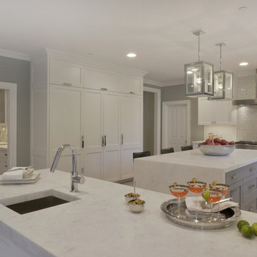
From the outside of this very traditional home in Harrison, New York, you would never expect the contemporary styling and pops of color throughout the interior, including the white feather chandelier and oversized painting of Marilyn Monroe with pink bubblegum, both of which accent the dinner table. When the client first came into meet with Bilotta designer, Danielle Florie, they had an idea of what they wanted, and what they didn’t want. They have modern/transitional taste and wanted both an aesthetically “wow” kitchen that was also very functional. Danielle made it come to life. They had been collecting photos for ten years before they decided to pull the trigger. They opted for Bilotta’s private cabinetry line, the Bilotta Collection, and selected a frameless, stepped door with double tiered wall cabinets, all accented by polished chrome rectangular pulls and square knobs. Instead of a deep corner cabinet they went with thick alumasteel shelves in the corner of the kitchen. At the peninsula they added some “bling” with the polished chrome and glass doors above the appliance garage. Also at the peninsula they decided to face their secondary, “prep” sink out towards the dinner table primarily so the kids could wash their hands before eating. There is also an undercounter beverage center to the right of that sink for easy access to drinks. Instead of going with a smooth painted finish they opted for a hand-brushed finish for a little texture. All appliances are Miele including their brand new 48” duel fuel range, smart enough on its own to tell you how to cook! The backsplash behind the range is the Stone Fox Collection from Ellen Blakeley of Ellen Blakely Studio in Santa Rosa, CA. It is a custom made tempered glass mosaic. The countertops and rest of the backsplash are White Diamond marble from Rye Marble, and the flooring is a porcelain Tile from Terra Tile. Designer: Danielle Florie. Photo Credit: Peter Krupenye
 Stone Action
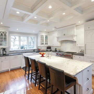
This kitchen was fabricated by Lapptops and the cabinets were done by King's Woodwork!
http://lapptops.net/
This kitchen features Calacatta marble with a polished finish on the island. The surrounding countertops are absolute black granite with a honed finish. This kitchen is so clean and bright!
Search "calacatta" or "black", see variations of this marble & granite, or other stone options: http://www.stoneaction.com
Learn more about granite to see if it’s right for you:
Granite countertops can last a lifetime. It contains no harmful chemicals and do not emit harmful radiation or gasses. Granite is heat resistant and is one of the most heat-resistant countertops on the market. You can place a hot pan out of the oven directly onto the countertop surface. Experts do recommend the use of a trivet when using appliances that emit heat for long periods of time, such as crockpots. Since the material is so dense, there is a small possibility heating one area of the top and not the entire thing, could cause the countertop to crack.
Granite is scratch resistant. You can cut on it, but it will dull your knives! Granite scores a seven on Moh’s hardness scale.
Granite countertops are considered to be a low maintenance countertop surface. The likelihood of needing to be repaired or resurfaced is low. Granite is a porous material. Most fabricators will apply a sealer to granite countertops before they are installed which will protect them from absorbing liquids too quickly. Many sealers last more than 10 years before needing to be reapplied. When they do need to be reapplied, it is something that most homeowners can do on their own as the process is similar to cleaning. Darker granites are very dense and sometimes don’t even require a sealer.
When it comes to pricing, there are a lot of variables such as edge profile, total square footage, backsplash, etc. Don’t be fooled by the stereotype that all granite is expensive. Lower-range granites will cost less than high-range laminate. Though granite countertops are not considered “low range” in pricing, there are a lot of affordable options.
If you are looking for something truly unique, consider an exotic granite. Some quarries are not easily accessible and/or only able to be quarried for short periods of time throughout the year. If these circumstances exist in a quarry with gorgeous stone, the price will be driven upward.
You won’t find a lot of solid patterns or bright colors, but both do exist. Also, watch for a large range of color and pattern within the same color of stone. It’s always a good idea to view the exact slab(s) that will be fabricated for your kitchen to make sure they are what you expected to see from the sample. Another factor is that many exotic types of granite have huge flowing waves, and a small sample will not be an accurate representation of the whole slab.
Granite countertops are very resistant to chemicals. Acids and bases will not harm the material.
Understanding Marble:
Marble is a porous, high-maintenance surface.
Be prepared to see some scratches. Marble is a softer stone. However, marble is still so beautiful with the scratches! If you’ve ever gone to Italy, you can see the beautiful marble on floors and many restaurants. It’s a classic lasting look. Even with scratches.
If you don't mind the extra work, they are a beautiful addition. Marble has a multifaceted ability to work with so many different design styles. If you're a homeowner looking for a wipe-and-go countertop, though, you'll probably want to skip this one.
It's cost-effective, depending on the type of marble you buy. Carrara marble (a grayer version with softer veins from Carrara, Italy) is one of the least expensive natural countertop materials on the market, mainly because it's readily available. Calacatta marble, which offers a whiter surface and more dramatic veining, and the price tag goes up.
Marble is heat-resistant — which is great — but you still need to be careful. Marble is heat resistant. Despite its ability to withstand high temps, you never want to place a piping hot pot on for risk of discoloring or burning the surface. We recommend always using a pot holder anyways.
We don’t want to dissuade you from using marble. In fact, I personally have a marble island in my kitchen. Stone Action solely wants you to be informed so that you’re choosing the right material for your project.
We hope you personally come check out our marble or other stone selection!
See more marble or other types of Stone Action’s stone selection:
http://www.stoneaction.com
 Barron Designs
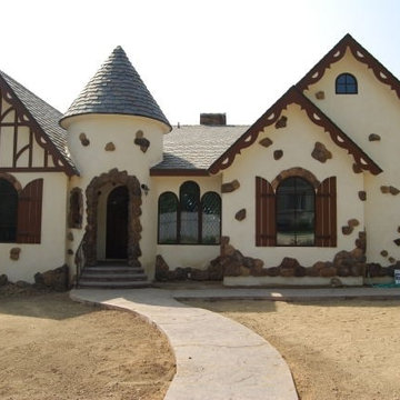
Faux wood planks mean that this Tudor owner won't have to replace the wood trim every few years like those using real wood on their exterior have to do.
Our client said, "I am pretty proud of this since I did most of it myself. I am a 58-year old woman and I never had any experience with carpentry but I have been a hobby seamstress. For this house project I made up some paper patterns and put the patterns on the wood so I would know where to cut and how to put it together. The lace cut fascia board you see, I cut out myself with a jigsaw and router, after my husband showed me how to hold the tools. Never touched them before in my life.
I also designed and cut the Tudor trim you see on the left side of the house. I also cut and put together the shutters you see flanking the windows. All a very fun project and not that difficult. My husband helped me put up the fascia board and the Tudor trim but I managed the shutters myself. I think it turned out pretty cute. No one can tell it isn't wood."
 Advance Design Studio, Ltd.
Willie & Leslie of Barrington Hills loved the location of their home. Its breathtaking views overlooked a wooded backyard and a captivating lake. They didn’t want to move, but they needed more space. But the house was missing that big family room where everyone could gather, relax and converse, and the house was completely cut off visually from the beautiful outdoor view right outside!
They knew what they wanted meant building an addition to their home. They began searching the internet and came across Advance Design Studio, and after browsing through project after project and reading one outstanding client review after another, they were sold on Advance Design. Additionally, they loved Advance Design’s “Common Sense Remodeling” process and felt confident that it would allow the Design/Build company to easily coordinate the multiple projects they wanted to complete all at one time. Willie and Leslie immediately set up a meeting with Owner Todd Jurs and Project Designer Claudia Pop. When the meeting ended, they were sure that Advance Design were the right people and the right approach for their project.
"Establishing a direction and a budget is always key in project of this size," Todd said. "This house was screaming for a family room and it didn't have one. Ultimately, it's about working together towards the same goal of a beautiful functional addition."
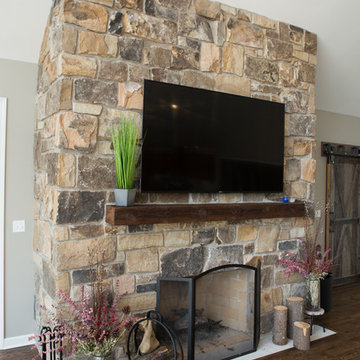
The project consisted of a significant family room addition with an extraordinary vaulted ceiling and floor to ceiling fireplace, a guest suite renovation with a luxury bath, a garage addition, and an adjoining outdoor patio renovation complete with a fantastic built in grilling station. The main goal was to add comfort and space to the existing home that would last their lifetime, and finally allow them to capture the amazing view of the backyard and lake that they never could really enjoy previously.
Willie, Leslie and Claudia paid special attention to designing the space to make sure that the footprint of the room did not interfere with the views. Floor to ceiling Pella windows were incorporated into a spectacular window wall to provide plenty of natural light.
Vaulted ceilings gave the room a bigger feel and the stunning floor to ceiling masonry fireplace was designed giving the room a rustic, comfortable feel of a Colorado Lodge. Barnwood doors and exposed wooden beams accentuate the crackling fireplace and family gathering space. An oversized statement chandelier bathes the space in soft light once the sun sets and compliments the exposed wood and fireplace perfectly.
“It simple elegant and beautiful,” Designer Claudia Pop said. “It is a great family room that captures the views perfectly. They love the fireplace, the barndoors and the openness of the space we designed for the whole family now to enjoy.”
And when warm weather beckons, the outdoor patio is a terrific place to spend an evening. The family now enjoys fall nights in front of their outdoor fireplace overlooking the quiet lake. Dekton Trillium Quartz counters tops adorn an amazing grilling bar. Nearly indestructible, they are the only manufactured stone product designed exclusively to withstand high heat in summer and extreme cold temperatures in winter.
The guest bath renovation makes Willie and Leslie’s friends and family feel like they are staying at a 5-star hotel. Carlisle colored Maple cabinets from Medallion make a roomy dual vanity more than adequate with plenty of space to get ready for the day after a peaceful night’s sleep. Cambria Quartz countertops are durable and elegant, while contrasting the neutral cabinets flawlessly. Heated flooring from Warmly Yours is the cherry on top for this cozy guest bath.
All the projects turned out better than they even imagined. Willie and Leslie now have a spacious family room with even better views of the lake and woods, a much larger garage, a fantastic relaxing outdoor patio, and a guest bath that makes it almost impossible to get the guest to leave after their stay.
Are you thinking about a remodeling project? Talk to the experts at Advance Design about the renovation of your dreams. Now is the perfect time to renovate. Check out other amazing projects here. With “Common Sense Remodeling”, the process of renovating your home has never been easier. Contact us today at 847-836-2600 or schedule an appointment to talk with us about your kitchen remodeling project, or any other home renovation you are planning. Our talented team can help you design and build the new space you’ve been dreaming about.
 Bilotta Kitchen & Home
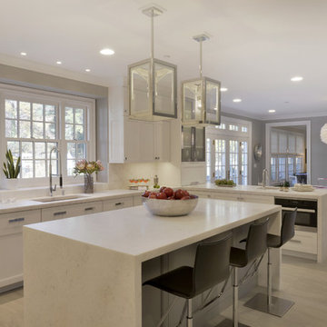
From the outside of this very traditional home in Harrison, New York, you would never expect the contemporary styling and pops of color throughout the interior, including the white feather chandelier and oversized painting of Marilyn Monroe with pink bubblegum, both of which accent the dinner table. When the client first came into meet with Bilotta designer, Danielle Florie, they had an idea of what they wanted, and what they didn’t want. They have modern/transitional taste and wanted both an aesthetically “wow” kitchen that was also very functional. Danielle made it come to life. They had been collecting photos for ten years before they decided to pull the trigger. They opted for Bilotta’s private cabinetry line, the Bilotta Collection, and selected a frameless, stepped door with double tiered wall cabinets, all accented by polished chrome rectangular pulls and square knobs. Instead of a deep corner cabinet they went with thick alumasteel shelves in the corner of the kitchen. At the peninsula they added some “bling” with the polished chrome and glass doors above the appliance garage. Also at the peninsula they decided to face their secondary, “prep” sink out towards the dinner table primarily so the kids could wash their hands before eating. There is also an undercounter beverage center to the right of that sink for easy access to drinks. Instead of going with a smooth painted finish they opted for a hand-brushed finish for a little texture. All appliances are Miele including their brand new 48” duel fuel range, smart enough on its own to tell you how to cook! The backsplash behind the range is the Stone Fox Collection from Ellen Blakeley of Ellen Blakely Studio in Santa Rosa, CA. It is a custom made tempered glass mosaic. The countertops and rest of the backsplash are White Diamond marble from Rye Marble, and the flooring is a porcelain Tile from Terra Tile. Designer: Danielle Florie. Photo Credit: Peter Krupenye
 RAJ Kitchen and Bath, LLC
 “Full apartment design”.
IF you have not yet seen this apartment conversion before, we strongly urge you to go to the bottom left of this page and click on the short 2-minutes video. It would put a lot of things into perspective when you come back and continue reading this.
It is true we were literally handed the keys and told a list of things that they wanted to have happen and we were to go into the apartment, look at the space and come up with a design that would satisfy all of that need. UNTIL we showed up! The unit had really seen some better days but we knew we had to look past that and come up with a concept that would work for them.
The immediate challenges were centered around 3 big ideas:
1. Adding a second bedroom to the already small footprint
2. Figuring out a way to make the kitchen bigger, better and brighter
3. Creating a master room walk in closet
It’s always difficult to add new rooms into existing footprint without expanding out or up and not incurring any opportunity cost. In this case, that was exactly what we had to do. Item one and two above had to be tackled as one. We went ahead and switched out the location of the dining room and eliminating an area where there was a “nook” type eat-in area. By doing so, we were able to cut right into that footprint and change the layout of the kitchen.
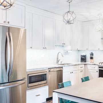
That one move allowed us to dig into the kitchen design because it was now the main focal point in the apartment. It was no longer an option to keep it in that tiny hole where it was, so we had to ensure that this design was functional and aesthetically pleasing at the same time. By adding the table into the space where an Island typically would go, we were able to both cut cost and still provide a dining experience. The Table serves as an Island as well when cooking.
We then proceeded to block in the existing doorway to the dining room. By doing this, we were able to create a full room which allowed us to put a door on the other side and called that room Bedroom #2. This was easier to do because all of the mechanicals were already in that space (light, heater and windows). By shifting things around, we also achieved a huge wall to wall closet from inside. PERFECT!
Then we moved into the Single bedroom. We thought it was a big room with a small closet, so by creatively adding an L shaped wall and steal some footprint into the bedroom side, we were able to put a door on that new room and design it for the walk-in closet. Even after this, the bedroom still holds a queen size bed with 2 night stands, a TV on the wall, a sitting chair and plenty of room to walk around. This was done by rethinking the location for the bed and night stands.
The bathroom was gutted to make sure there was no leaks and rebuild from the ground up. We kept all of the plumbing where it was, added a new vanity, medicine cabinet, tiles and lighting and it was done.
From there, the rest of the unit had new flooring all throughout, paint, and lighting. After completion and walk through, this project was handed over back to the clients.
Execution and collaboration between all the trades were: Reggie and his team from Premier Interiors and Rohan from RD Mechanical Services.
p.s. Please see our website to see the video.
47