
Search results for "Nice looking proposition" in Home Design Ideas
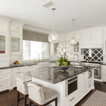
 Santa Barbara Designs of the Interior
From Tuscan to this updated, clean, more functional kitchen, this couldn't be a more dramatic change. Flanking this kitchen space is a large kitchen table that can seat 8, with an inviting patio beyond. We love the clean, crisp look, with black dramatic details.
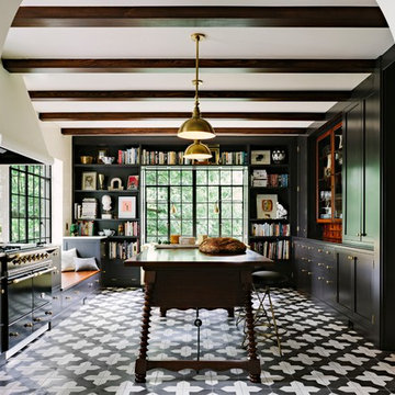
 Granada Tile
Inside a classic Portland, Oregon, condo building, Em Shephard, the project manager for Jessica Helgerson Interior Design chose our Badajoz cement tile to cover several floor spaces, including the kitchen, creating a chic, unified and graphic look. Interior Design: Jessica Helgerson Interior Design / Photograph: Lincoln Barbour / Cement Tiles: Granada Tile
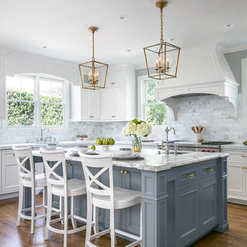
 Christine Sheldon Design
Example of a classic l-shaped dark wood floor and brown floor kitchen design in San Francisco with an undermount sink, recessed-panel cabinets, gray cabinets, white backsplash, marble backsplash, stainless steel appliances and an island
Find the right local pro for your project
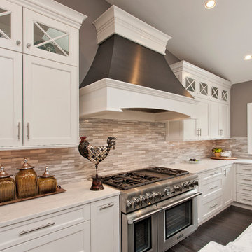
Example of a large transitional kitchen design in DC Metro with shaker cabinets, white cabinets, marble countertops, stone tile backsplash and white countertops
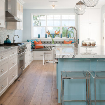
 Lauren Shadid Architecture + Interiors
Island color was custom. Countertops are Princess White Quartzite. Light fixtures over island are from Rejuvenation (exact type has been discontinued)
Photos by Holly Lepere
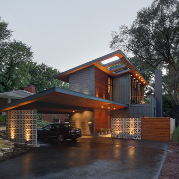
 Bruns Architecture
Tricia Shay Photography
Inspiration for a mid-sized contemporary gray two-story mixed siding house exterior remodel in Milwaukee with a shed roof
Inspiration for a mid-sized contemporary gray two-story mixed siding house exterior remodel in Milwaukee with a shed roof
 John Rogers Renovations
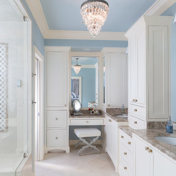
This dreamy master bath remodel in East Cobb offers generous space without going overboard in square footage. The homeowner chose to go with a large double vanity with a custom seated space as well as a nice shower with custom features and decided to forgo the typical big soaking tub.
The vanity area shown in the photos has plenty of storage within the wall cabinets and the large drawers below.
The countertop is Cedar Brown slab marble with undermount sinks. The brushed nickel metal details were done to work with the theme through out the home. The floor is a 12x24 honed Crema Marfil.
The stunning crystal chandelier draws the eye up and adds to the simplistic glamour of the bath.
The shower was done with an elegant combination of tumbled and polished Crema Marfil, two rows of Emperador Light inlay and Mirage Glass Tiles, Flower Series, Polished.

Sponsored
Columbus, OH
Free consultation for landscape design!

Peabody Landscape Group
Franklin County's Reliable Landscape Design & Contracting

 Robert Thomas Homes
This home is built by Robert Thomas Homes located in Minnesota. Our showcase models are professionally staged. Please contact Ambiance at Home for information on furniture - 952.440.6757
 TKS Design Group
Download our free ebook, Creating the Ideal Kitchen. DOWNLOAD NOW
Lakefront property in the northwest suburbs of Chicago is hard to come by, so when we were hired by this young family with exactly that, we were immediately inspired by not just the unusually large footprint of this 1950’s colonial revival but also the lovely views of the manmade lake it was sited on. The large 5-bedroom home was solidly stuck in the 1980’s, but we saw tons of potential. We started out by updating the existing staircase with a fresh coat of paint and adding new herringbone slate to the entry hall.
The powder room off the entryway also got a refresh - new flooring, new cabinets and fixtures. We ran the new slate right through into this space for some consistency. A fun wallpaper and shiplap trim add a welcoming feel and set the tone for the home.
Next, we tackled the kitchen. Located away from the rest of the first floor, the kitchen felt a little isolated, so we immediately began planning for how to better connect it to the rest of the first floor. We landed on removing the wall between the kitchen and dining room and designed a modified galley style space with separate cooking and clean up zones. The cooking zone consists of the refrigerator, prep sink and cooktop, along with a nice long run of prep space at the island. The cleanup side of the kitchen consists of the main sink and dishwasher. Both areas are situated so that the user can view the lake during prep work and cleanup!
One of the home’s main puzzles was how to incorporate the mudroom and area in front of the patio doors at the back of the house. We already had a breakfast table area, so the space by the patio doors was a bit of a no man’s land. We decided to separate the kitchen proper from what became the new mudroom with a large set of barn doors. That way you can quickly hide any mudroom messes but have easy access to the light coming in through the patio doors as well as the outdoor grilling station. We also love the impact the barn doors add to the overall space.
The homeowners’ first words to us were “it’s time to ditch the brown,” so we did! We chose a lovely blue pallet that reflects the home’s location on the lake which is also vibrant yet easy on the eye. Countertops are white quartz, and the natural oak floor works well with the other honey accents. The breakfast table was given a refresh with new chairs, chandelier and window treatments that frame the gorgeous views of the lake out the back.
We coordinated the slate mudroom flooring with that used in the home’s main entrance for a consistent feel. The storage area consists of open and closed storage to allow for some clutter control as needed.
Next on our “to do” list was revamping the dated brown bar area in the neighboring dining room. We eliminated the clutter by adding some closed cabinets and did some easy updates to help the space feel more current. One snag we ran into here was the discovery of a beam above the existing open shelving that had to be modified with a smaller structural beam to allow for our new design to work. This was an unexpected surprise, but in the end we think it was well worth it!
We kept the colors here a bit more muted to blend with the homeowner’s existing furnishings. Open shelving and polished nickel hardware add some simple detail to the new entertainment zone which also looks out onto the lake!
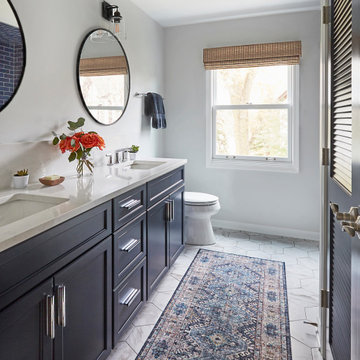
Next we tackled the upstairs starting with the homeowner’s son’s bath. The bath originally had both a tub shower and a separate shower, so we decided to swap out the shower for a new laundry area. This freed up some space downstairs in what used to be the mudroom/laundry room and is much more convenient for daily laundry needs.
We continued the blue palette here with navy cabinetry and the navy tile in the shower. Porcelain floor tile and chrome fixtures keep maintenance to a minimum while matte black mirrors and lighting add some depth the design. A low maintenance runner adds some warmth underfoot and ties the whole space together.
We added a pocket door to the bathroom to minimize interference with the door swings. The left door of the laundry closet is on a 180 degree hinge to allow for easy full access to the machines. Next we tackled the master bath which is an en suite arrangement. The original was typical of the 1980’s with the vanity outside of the bathroom, situated near the master closet. And the brown theme continued here with multiple shades of brown.
Our first move was to segment off the bath and the closet from the master bedroom. We created a short hall from the bedroom to the bathroom with his and hers walk-in closets on the left and right as well as a separate toilet closet outside of the main bathroom for privacy and flexibility.
The original bathroom had a giant soaking tub with steps (dangerous!) as well as a small shower that did not work well for our homeowner who is 6’3”. With other bathtubs in the home, they decided to eliminate the tub and create an oversized shower which takes up the space where the old tub was located. The double vanity is on the opposite wall and a bench is located under the window for morning conversations and a place to set a couple of towels.
The pallet in here is light and airy with a mix of blond wood, creamy porcelain and marble tile, and brass accents. A simple roman shade adds some texture and it’s top-down mechanism allows for light and privacy.
This large whole house remodel gave our homeowners not only the ability to maximize the potential of their home but also created a lovely new frame from which to view their fabulous lake views.
Designed by: Susan Klimala, CKD, CBD
Photography by: Michael Kaskel
For more information on kitchen and bath design ideas go to: www.kitchenstudio-ge.com
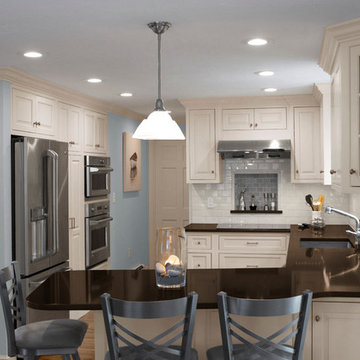
 Renovisions
 These homeowners were anxiously ready to remodel their dated 80’s kitchen and reached out to Renovisions to handle the transformation. In this new undertaking we met to discuss plans to brighten the dark room with custom painted white inset cabinets, adding more functional storage, better task lighting and GE Monogram appliances, new hardwood flooring throughout and creating a better flow into the adjacent family room. In order to open up the space, Renovisions suggested creating an angle at the peninsula. Continuing with this approach we replaced the rear door with a new one-light door that swings out instead of in to accommodate new bar stools and a better flow of traffic in and out to the deck outside. Silestone’s quartz countertops in ‘Merope’ were the perfect choice adding a nice contrast yet truly durable and low maintenance. Creating a beautifully unique subway tile niche in linen color at cooktop area and backsplash added an elegant touch to the overall look and homeowners were thrilled with this refreshing look after the Renovision.
Now their newly renovated kitchen is a showcase and nicely outfitted for family and friends.
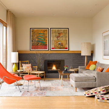
 Deering Design Studio, Inc.
Deering Design Studio, Inc.
1950s open concept light wood floor living room photo in Seattle with a tile fireplace, a standard fireplace, no tv and beige walls
1950s open concept light wood floor living room photo in Seattle with a tile fireplace, a standard fireplace, no tv and beige walls
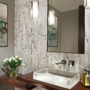
Example of a small trendy beige tile and marble tile marble floor and white floor powder room design in Phoenix with gray walls, a vessel sink, wood countertops, open cabinets, a one-piece toilet and brown countertops
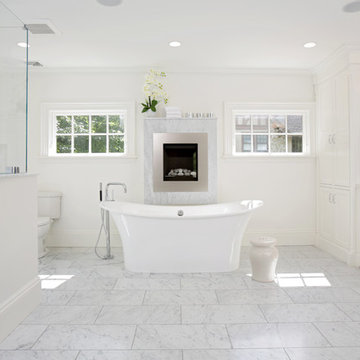
 Boston Virtual Imaging
Boston Virtual Imaging
Inspiration for a timeless master white tile freestanding bathtub remodel in Boston with recessed-panel cabinets, white cabinets, a two-piece toilet and white walls
Inspiration for a timeless master white tile freestanding bathtub remodel in Boston with recessed-panel cabinets, white cabinets, a two-piece toilet and white walls

Sponsored
Columbus, OH

Hope Restoration & General Contracting
Columbus Design-Build, Kitchen & Bath Remodeling, Historic Renovations
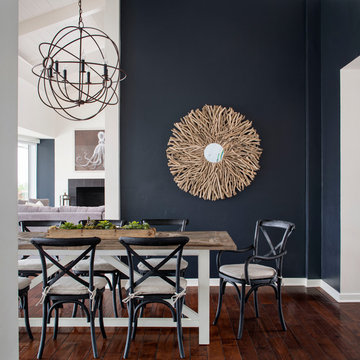
 Corine Maggio Design
This darling young family of four recently moved to a beautiful home over looking La Jolla Shores. They wanted a home that represented their simple and sophisticated style that would still function as a livable space for their children. We incorporated a subtle nautical concept to blend with the location and dramatic color and texture contrasts to show off the architecture.
Photo cred: Chipper Hatter: www.chipperhatter.com
 TKS Design Group
WATCH the time lapse video of this kitchen remodel: https://youtu.be/caemXXlauLU
Free ebook, Creating the Ideal Kitchen. DOWNLOAD NOW
This Glen Ellyn homeowner came to us, frustrated with the layout and size of their current kitchen, looking for help generating ideas for how to maximize functionality within the constraints of the space. After visiting with them and seeing the home’s layout, I realized that looking at the bigger picture of how they used the entire first floor might bring us some dramatic solutions. We ended up flipping the kitchen and family room and taking down the wall separating the two creating one big open floor plan for the family to enjoy. There is still a visual separation between the rooms because of their different lengths and the overall space now relates nicely to the dining room which was also opened up to both rooms.
The new kitchen is an L-shaped space that is no longer cramped and small and is truly a cook’s dream. The fridge is on one end, a large cooktop and sink are located along the main perimeter and double ovens located at the end of the “L” complete the layout. Ample work surface along the perimeter and on the large island makes entertaining a breeze. An existing door to the patio remains, floods the room with light and provides easy access to the existing outdoor deck for entertaining and grilling.
White cabinetry with quartz countertops, Carrera marble backsplash tile and a contrasting gray island give the space a clean and modern feel. The gray pendant lights and stainless appliances bring a slight industrial feel to the space letting you know that some serious cooking will take place here.
Once we had their Dream Kitchen design completed, the homeowners decided to tackle another project at the same time. We made plans to create a master suite upstairs by combining two existing bedrooms into a larger bedroom, bathroom and walk-in closet. The existing spaces were not overly large so getting everything on the wish list into the design was a challenge. In the end, we came up with a design that works. The two bedrooms were adjoined, one wall moved back slightly to make for a slightly larger bedroom, and the remaining space was allotted to the new bathroom and a walk in closet.
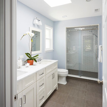
The bathroom consists of a double vanity and a large shower with a barn door shower door. A skylight brings light into the space and helps make it feel larger and more open. The new walk-in closet is accessible through the bathroom, and we even managed to fit in a small entry vestibule that houses some additional storage and makes a nice transition from the hallway. A white vanity, Carrera tops and gray floor tile make for a serene space that feels just right for this home.
Designed by: Susan Klimala, CKD, CBD
Photography by: Mike Kaskel
For more information on kitchen and bath design ideas go to: www.kitchenstudio-ge.com
 VanderHorn Architects
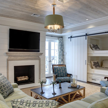
Ship-lap walls and sliding barn doors add a rustic flair to the kid-friendly recreational space.
Example of a large classic walk-out medium tone wood floor and brown floor family room design in New York with a standard fireplace, a brick fireplace and white walls
Example of a large classic walk-out medium tone wood floor and brown floor family room design in New York with a standard fireplace, a brick fireplace and white walls
 Milgard Windows & Doors
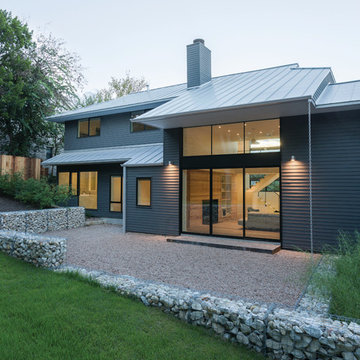
The Kiguchi family moved into their Austin, Texas home in 1994. Built in the 1980’s as part of a neighborhood development, they happily raised their family here but longed for something more contemporary. Once they became empty nesters, they decided it was time for a major remodel. After spending many years visiting Austin AIA Home Tours that highlight contemporary residential architecture, they had a lot of ideas and in 2013 were ready to interview architects and get their renovation underway.
The project turned into a major remodel due to an unstable foundation. Architects Ben Arbib and Ed Hughey, of Arbib Hughey Design were hired to solve the structural issue and look for inspiration in the bones of the house, which sat on top of a hillside and was surrounded by great views.
Unfortunately, with the old floor plan, the beautiful views were hidden by small windows that were poorly placed. In order to bring more natural light into the house the window sizes and configurations had to be addressed, all while keeping in mind the homeowners desire for a modern look and feel.
To achieve a more contemporary and sophisticated front of house, a new entry was designed that included removing a two-story bay window and porch. The entrance of the home also became more integrated with the landscape creating a template for new foliage to be planted. Older exterior materials were updated to incorporate a more muted palette of colors with a metal roof, dark grey siding in the back and white stucco in the front. Deep eaves were added over many of the new large windows for clean lines and sun protection.
“Inside it was about opening up the floor plan, expanding the views throughout the house, and updating the material palette to get a modern look that was also warm and inviting,” said Ben from Arbib Hughey Design. “Prior to the remodel, the house had the typical separation of rooms. We removed the walls between them and changed all of the windows to Milgard Thermally Improved Aluminum to connect the inside with the outside. No matter where you are you get nice views and natural light.”
The architects wanted to create some drama, which they accomplished with the window placement and opening up the interior floor plan to an open concept approach. Cabinetry was used to help delineate intimate spaces. To add warmth to an all-white living room, white-washed oak wood floors were installed and pine planks were used around the fireplace. The large windows served as artwork bringing the color of nature into the space.
An octagon shaped, elevated dining room, (named “the turret”), had a big impact on the design of the house. They architects rounded the corners and added larger window openings overlooking a new sunken garden. The great room was also softened by rounding out the corners and that circular theme continued throughout the house, being picked up in skylight wells and kitchen cabinetry. A staircase leading to a catwalk was added and the result was a two-story window wall that flooded the home with natural light.
When asked why Milgard® Thermally Improved Aluminum windows were selected, the architectural team listed many reasons:
1) Aesthetics: “We liked the slim profiles and narrow sightlines. The window frames never get in the way of the view and that was important to us. They also have a very contemporary look that went well with our design.”
2) Options: “We liked that we could get large sliding doors that matched the windows, giving us a very cohesive look and feel throughout the project.”
3) Cost Effective: “Milgard windows are affordable. You get a good product at a good price.”
4) Custom Sizes: “Milgard windows are customizable, which allowed us to get the right window for each location.”
Ready to take on your own traditional to modern home remodeling project? Arbib Hughey Design advises, “Work with a good architect. That means picking a team that is creative, communicative, listens well and is responsive. We think it’s important for an architect to listen to their clients and give them something they want, not something the architect thinks they should have. At the same time you want an architect who is willing and able to think outside the box and offer up design options that you may not have considered. Design is about a lot of back and forth, trying out ideas, getting feedback and trying again.”
The home was completely transformed into a unique, contemporary house perfectly integrated with its site. Internally the home has a natural flow for the occupants and externally it is integrated with the surroundings taking advantage of great natural light. As a side note, it was highly praised as part of the Austin AIA homes tour.
Sponsored
Sunbury, OH

J.Holderby - Renovations
Franklin County's Leading General Contractors - 2X Best of Houzz!
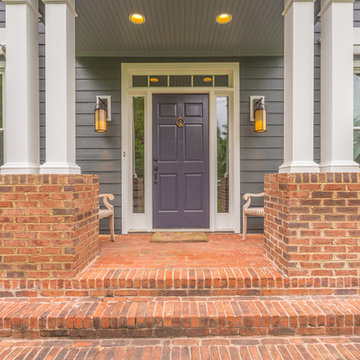
 Chattanooga eXteriors
Project Details: We completely updated the look of this home with help from James Hardie siding and Renewal by Andersen windows. Here's a list of the products and colors used.
- Iron Gray JH Lap Siding
- Boothbay Blue JH Staggered Shake
- Light Mist JH Board & Batten
- Arctic White JH Trim
- Simulated Double-Hung Farmhouse Grilles (RbA)
- Double-Hung Farmhouse Grilles (RbA)
- Front Door Color: Behr paint in the color, Script Ink
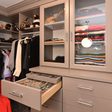
 InnovationLand
Houston Interior Designer Lisha Maxey took this Museum District condo from the dated, mirrored walls of the 1980s to Mid Century Modern with a gallery look featuring the client's art collection.
"The place was covered with glued-down, floor-to-ceiling mirrors," says Lisha Maxey, senior designer for Homescapes of Houston and principal at LGH Design Services in Houston. "When we took them off the walls, the walls came apart. We ended up taking them down to the studs."
The makeover took six months to complete, primarily because of strict condo association rules that only gave the Houston interior designers very limited access to the elevator - through which all materials and team members had to go.
"Monday through Friday, we could only be noisy from 10 a.m. to 2 p.m., and if we had to do something extra loud, like sawing or drilling, we had to schedule it with the management and they had to communicate that to the condo owners. So it was just a lot of coordination. But a lot of Inner City Loopers live in these kinds of buildings, so we're used to handling that kind of thing."
The client, a child psychiatrist in her 60s, recently moved to Houston from northeast Texas to be with friends. After being widowed three years ago, she decided it was time to let go of the traditionally styled estate that wasn't really her style anyway. An avid diver who has traveled around the world to pursue her passion, she has amassed a large collection of art from her travels. Downsizing to 1,600 feet and wanting to go more contemporary, she wanted the display - and the look - more streamlined.
"She wanted clean lines and muted colors, with the main focus being her artwork," says Maxey. "So we made the space a palette for that."
Enter the white, gallery-grade paint she chose for the walls: "It's halfway between satin and flat," explains Maxey. "It's not glossy and it's not chalky - just very smooth and clean."
Adding to the gallery theme is the satin nickel track lighting with lamps aimed to highlight pieces of art. "This lighting has no wires," notes Maxey. "It's powered by a positive and negative conduit."
The new flooring throughout is a blended-grey porcelain tile that looks like wood planks. "It's gorgeous, natural-looking and combines all the beauty of wood with the durability of tile," says Maxey. "We used it throughout the condo to unify the space."
After Maxey started looking at the client's bright, vibrant, colorful artwork, she felt the palette couldn't stay as muted anymore. Hence the Mid Century Modern orange leather sofas from West Elm and bright green chairs from Joybird, plus the throw pillows in different textures, patterns and shades of gold, orange and green.
The concave lines of the Danish-inspired chairs, she notes, help them look beautiful from all the way around - a key to designing spaces for loft living.
"The table in the living room is very interesting," notes Maxey. "It was handmade for the client in 1974 and has a signature on it from the artist. She was adamant about including the piece, which has all these hand-painted black-and-white art tiles on the top. I took one look at it and said 'It's not really going to go.'"
However, after cutting 6 inches off the bottom and making it look a little distressed, the table ended up being the perfect complement to the sofas.
The dining room table - from Design Within Reach - is a solid piece of mahogany, the chair upholstery a mix of grey velvet and leather and the legs a shiny brass. "The side chairs are leather and the end ones are velvet," says Maxey. "It's a nice textural mix that lends depth and texture."
The galley kitchen, meanwhile, has been lightened and brightened, with white quartz countertops and backsplashes mimicking the look of Carrara marble, stainless steel appliances and a velvet green bench seat for a punch of color. The cabinets are painted a cool grey color called "Silverplate."
The two bathrooms have been updated with contemporary white vanities and vessel sinks and the master bath now features a walk-in shower tiled in Dolomite white marble (the floor is Bianco Carrara marble mosaic, done in a herringbone pattern.
In the master bedroom, Homescapes of Houston knocked down a wall between two smaller closets with swing doors to make one large walk-in closet with pocket doors. The closet in the guest bedroom also came out 13 more inches.
The client's artwork throughout personalizes the space and tells the story of a life. There's a huge bowl of shells from the client's diving adventures, framed art from her child psychiatry patients and a 16th century wood carving from a monastery that's been in her family forever.
"Her collection is quite impressive," says Maxey. "There's even a framed piece of autographed songs written by John Lennon." (You can see this black-framed piece of art on the wall in the photo above of two green chairs).
"We're extremely happy with how the project turned out, and so is the client," says Maxey. "No expense was spared for her. It was a labor of love and we were excited to do it."
 studiocuvier.se
Fredrik Karlsson
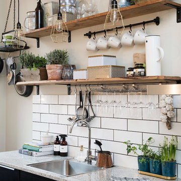
Kitchen - small rustic single-wall kitchen idea in Gothenburg with a drop-in sink, flat-panel cabinets, black cabinets, granite countertops and no island
Kitchen - small rustic single-wall kitchen idea in Gothenburg with a drop-in sink, flat-panel cabinets, black cabinets, granite countertops and no island
14