
Search results for "Noticeable increase" in Home Design Ideas
 Phoenix Home Remodeling
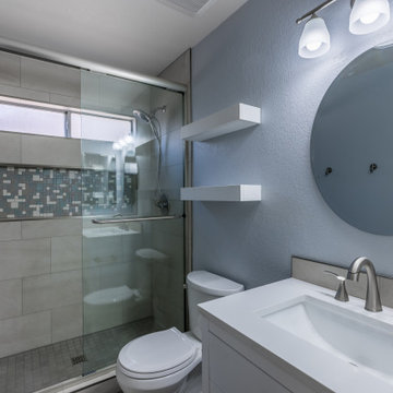
Edith’s guest bathroom was showing its age and the lack of storage. She started to notice that the shower walls and tub were not allowing her to utilize the bathroom the way she wanted to.
The dated fixtures, shower head and sink faucet were not functioning the way they once were. The tub was not allowing for easy entry and wasn’t really being used.
Her desires were to create a current, modern, and brighter bathroom with a pop of color. We used a 12x24 shower wall tile called Cemento Rasato Bianco and laid it in a horizontal 3rd offset pattern.
We also took the tile to the ceiling to allow the transition around the window to look more natural. The shower pan is a light grey.
We increased the storage space in a large niche. That pop of color mosaic is called Coastal Keytones in a sea blue color mix.
The niche tile and wall color coordinate with each other to bounce lighting around the room.
We updated the vanity to a drawer unit to help Edith organize the products she uses on a regular basis. By having drawers, she will never have the endless cavity where unused product gets lost or forgotten.
The plumbing fixtures are in the brushed nickel family. The faucet is the Delta Sandover and the shower head is the Delta In2uition. This shower head features 9 different shower sprays, from a mist to a jet stream to meet the needs of her showering experience. The large mirror and dated lighting fixture were replaced by a stylish large round mirror and LED compatible light fixture.
 Rosenhaus Design Group, Inc.
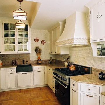
Cabinets, like family, are united in differing personalities, which can be seen here in their individual function, shape and decoration. The proportions of the cabinets, based on the Fibonacci Numbers, increase in size surrounding the hood focal point similar to the Taj Mahal. Notice that the low backsplash along the stove becomes full height behind the sink and architecturally lifts the glass cabinet to emphasize the taller ceiling area. The farm house sink is Vermont slate which contrasts with the granite counter.
 Rosenhaus Design Group, Inc.
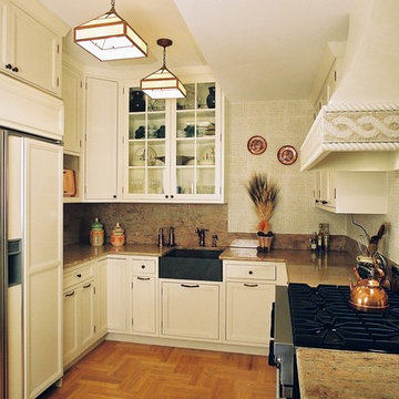
Cabinets, like family, are united in differing personalities, which can be seen here in their individual function, shape and decoration. The proportions of the cabinets, based on the Fibonacci Numbers, increase in size surrounding the hood focal point similar to the Taj Mahal. Notice that the low backsplash along the stove becomes full height behind the sink and architecturally lifts the glass cabinet to emphasize the taller ceiling area. The farm house sink is Vermont slate which contrasts with the granite counter.
Find the right local pro for your project

 Total System Service
As a manager of a building or property, you quickly learn the art of mediation. One minute you may be working with a vendor to keep the building’s operating system running efficient and smooth; the next moment you may be calming a tenant down after finding the change in the system disrupted his office’s workflow. Give and take; it’s the only way to make sure every day runs perfectly.
Overall, you have two goals to strive for in everything you do.
1. Keep the building running properly, upgrading systems as appropriate, and striving to do all you can on a pre-established budget.
2. Keep the building occupants happy, with as little disruption as possible.
While some changes are minor, barely registering on a building occupant’s mind, with HVAC challenges, that’s rarely the case. If a HVAC contractor is replacing an air handler, for instance, and disconnects one and moves to the next unit, it may cause major disruptions to sensitive areas of a building. And if the occupant wasn’t prepared for the disruption, you can have a mighty unhappy customer on your hand.
Anytime you are working on HVAC projects throughout your building, there are strategies you can put into place to keep things running smooth.
Communicate with occupants
Communication is key to any good relationship, and as a property manager, this rule is a great place to start. If you will be working with the HVAC equipment, block out the timeframe for work to be done, and understand the potential consequences of the process. Then communicate this process with every point of contact you have throughout the building. The more detail you can provide, the less surprises you’ll have throughout the process. You can also work with your building’s occupants before the process begins, finding out if there are better timeframes than others.
Establish a realistic schedule
As a property manager, its easy to provide your expectations for the HVAC project at hand, and request that the proposal be written in such a way that work is completed on your timeframe. Unfortunately, many contractors want your business and will agree to anything upfront in order to win the bid, knowing full well the work will take longer than specified. Instead of projecting your timeframes into the proposal process, ask for HVAC project bids to establish realistic schedules of how long the process will take, and what areas of your property will be most effected throughout the schedule. This will help you avoid crises between you and the contractor, and you and your tenants.
Plan for the whole system
If one small piece of your HVAC system is weak, its easy to fix that one small piece. But how will that impact your overall system? Will it cause weak spots in different parts of the building – maybe a corner office will have reduced air flow, and therefore be colder in the winter and warmer in the summer? When retrofitting new pieces with older existing systems, its easy to reduce the efficiency of your entire system. Before agreeing to certain repairs, make sure you understand how it will impact your entire system overall. An easy way of handling this problem is by working with the same HVAC contractor again and again, He will understand your system’s potential, and know when to make repairs, and when to replace.
Have points of contact available for immediate assistance
In many cases, problems arise because connections can’t be made. Can the HVAC contractor get a hold or you or another person that can make decisions at a moments notice if a problem arises? Do you have access to decision makers throughout the building that may be impacted by this change? Many projects have been put on hold simply because a person in authority can’t be found to give the go-ahead to move forward. If you have access to these people during the time of the project, you’ll be able to complete the project in record time.
Test
Finally, if you can test things in stages, or test when the potential for problems is the smallest, you reduce the chances of bigger emergency issues falling into your lap. If you’ll be installing a new terminal unit, can you make the switch on a Saturday morning when the building is largely unoccupied? If you’re replacing a large system, can you replace and test in phases so the entire project isn’t released at once?
Most issues can be avoided with just a little strategy from the beginning. If you’ve never had a HVAC maintenance team to help you stay on track with your building’s heating and cooling, now may be the time to find out how easy a team approach makes the process.
 GRECO INTERIORS
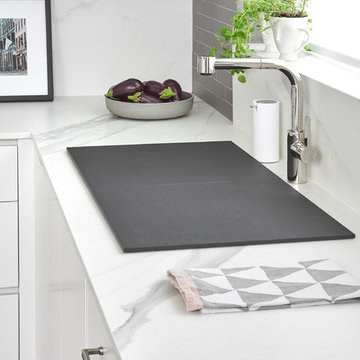
Full kitchen renovation as part of a larger renovation to modernize the client's penthouse.
It's not how much space you have; it's what you do with it! We used integrated appliances to space space and modern millwork with finger pulls to achieve a modern, streamlined design aesthetic. Adding the grey brick wall warms up the space and adds a custom touch that adds a sophisticated experience.
Designer: Greco Interiors
Photo: Stephani Buchman
 Capital Area Remodeling, LLC
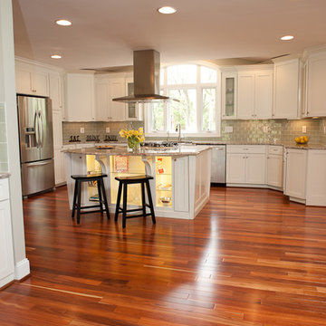
Overview of the left side of our kitchen remodel. Notice the vaulted ceilings which give the optical illusion of increased height in a restricted space. Photo by Lee Love
 Nancy Finneson | DeMane Design
The owners wanted to take advantage of their views, add more natural light, increase storage, and have the kitchen function more efficiently. From dark and feeling closed-in, it was transformed to open, inviting and a place they enjoy every day. All the wall cabinets were removed and a bank of three tall windows were added for more light and ventilation.
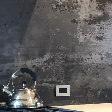
After a new layout was designed, materials and finishes were selected. The first thing that is noticed when you walk into the room is the wall behind the range. The large expanse is very unique, like a work of natural art. When viewed it can look like waves or patches of clouds. The wall is a full slab of Dekton. The color is inspired by the industrial look of oxidized steel, with shades of grey, brown and black with metallic effects.
Mixed woods and stains were used for the cabinets. Storage was maximized, each drawer and cabinet have a function. The island is a perfect landing spot for groceries, meal prep or a buffet. Floating shelves add and open look.
The elegant banquette was custom built for the space. It has a slanted back for comfort and with styled legs it keeps it airy and light. The “L” shape optimizes the space and created a natural conversation spot and view of the water.
The kitchen has French doors that access an expansive deck, perfect for entertaining. The space was designed for this active couple making it a place to entertain and live everyday with joy.
Sponsored
Columbus, OH

Hope Restoration & General Contracting
Columbus Design-Build, Kitchen & Bath Remodeling, Historic Renovations
 Phoenix Home Remodeling
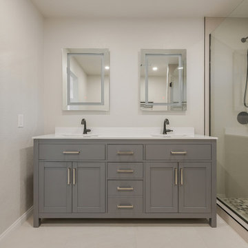
Fish & Beatrice purchased this 1980’s home and wanted to update the feel and look, starting with the master bathroom.
The bathroom was oddly shaped. The shower had a bump-out that made the shower smaller and there was wasted space behind the entry door. The dated lighting and the wasted space created dull and dark pockets.
The room had great bones but lacked in design.
Meeting with them, we learned that they wanted a classic modern style bathroom that was open and clean. We went to the drawing board and started collaborating on a design that we all loved.
In the shower we removed the bump-out, increasing the shower floor plan.
We also took the shower wall tile to the ceiling. By doing this the shower visually looked larger and custom.
By using two different shower wall tiles we created a soft juxtaposition of the soft and hard textures.
We used a fabric tile for the shower side walls. This tile is Touch Snow from Arizona Tile. The back wall tile is from Monterrey Tile called Stone Mood Silver.
These two tiles together create a calming effect as you noticed the creamy vein of the stone, compliments the Linen texture of the fabric. To compliment the walls, this pebble from Arizona Tile shows an array of colors that contrast and enhance the look.
 Paradise Found Construction
A small pinhole in the coupling of the hot water supply line from the Hot Water Heater developed and began leaking and spraying hot steamy mist. Because of its location in the seldom used Finished Full Basement, it initially went unnoticed.
By the time the homeowners noticed the leaking water, the moisture content in the ceiling sheetrock and well down the walls read 100%. The moist, warm environment proved to be ideal for colonies of mold spores to spread throughout the basement, aided by the HVAC systems return and supply lines circulating the mold spores. It didn’t take long before mold patches eventually covered all of the exposed materials and surfaces, furniture included.
The homeowners’ had protection from their insurance policy and were able to have repairs done after this unfortunate disaster.
Construction ensued. The ceiling, floors, and all of the interior and exterior walls were stripped down to the wood framing and masonry and disposed of. The 1st and 2nd Floor HVAC Ductwork was removed, and the entire existing Full Bath was gutted.
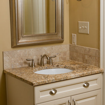
The remodeling included increasing the size of the full bath and removing the shower/tub as well as installing a large and comfortable tile shower. We added a small towel closet, and a separate entry into the adjoining room, which would now be reconfigured into a bedroom. A new EPA Water Sense-rated commode, a vanity cabinet with a natural granite countertop and an under-mount sink, a wall-hung mirror, and new sconce lights rounded out the update.
We turned the adjoining room next to the full bath into a bedroom. We added generous closet storage space and new lighting.
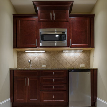
We finally turned our attention to the old kitchenette / wet bar. We took away some of the footprint to add to the full bath and designed an efficient and handsome wet bar / kitchenette.
Porcelain tile, no VOC interior paints, a complete replacement of the basement and 1st Floor HVAC ducting, air handler equipment cleaning, and green-certified carpet and pad combined to create a healthy and light-filled living environment.

 Green Home Systems
Green Home Systems recently completed a successful solar project in Bloomsburg, PA for Eric M. The project was completed in a few months and consisted of 5.04 kW of solar panels installed on the flat roof of Eric’s home.
Eric chose Green Home Systems for their competitive pricing and wide selection of solar panels. He was also impressed with their warranty and customer service. After researching online, Eric decided to go solar to reduce his utility bill, increase the value of his home, and take advantage of the easy payment terms offered by Green Home Systems.
The installation process began with an inspection of the roof to ensure it was suitable for mounting the solar panels. The inspections revealed that some minor repairs were needed before installation could begin. Green Home Systems team quickly repaired any damage to the roof and got to work installing the panels.
Once the installation was complete, Eric quickly noticed a reduction in his monthly utility bills as well as an increase in the value of his home due to having clean energy sources available. He also was very pleased with how quickly and efficiently Green Home Systems completed the project.
The team at Green Home Systems is dedicated to providing customers with top-notch service and quality products at competitive prices. We strive to make your transition from traditional energy sources to renewable energy sources as smooth as possible by providing support throughout every step of the process. If you're looking for a reliable and cost-effective way to generate clean energy for your home or business, contact us today!
 Maverick City Builders
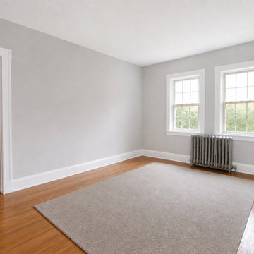
This whole home interior painting and trim upgrade project in Lancaster highlights how a professionally executed finish can completely transform the look, feel, and flow of an entire living space. The project began with a dated interior featuring worn paint, visible wall imperfections, and aging trim that no longer reflected a clean, modern aesthetic. While the home’s structure remained solid, the overall appearance felt dull and lacked the brightness, consistency, and refinement homeowners are looking for today.
Our team began with a comprehensive preparation process across the entire home, which is one of the most critical steps in achieving a high-quality and long-lasting paint finish. Every surface was carefully cleaned, patched, and sanded to create a smooth and uniform base. All floors, fixtures, and furnishings were fully protected using professional-grade coverings, and trim lines throughout the home were precisely taped to ensure sharp, clean edges. This level of preparation not only enhances the final appearance but also ensures durability and consistency from room to room.
As the project progressed, premium-quality paints were applied using a combination of rolling and precision cutting techniques to achieve a smooth, even finish across all wall and ceiling surfaces. The selected color palette focused on modern, neutral tones designed to maximize natural light and create a cohesive, open feel throughout the home. At the same time, all trim, baseboards, and interior details were upgraded with a crisp white finish, adding contrast, depth, and a polished look that ties every space together.
During the final stages, detailed touch-ups and trim refinements were completed in every room to achieve a flawless, professional-grade result. Each edge, corner, and transition was carefully inspected and perfected, ensuring consistency and craftsmanship at every level. The transformation is especially noticeable when comparing the before and after, as the home evolves from a worn, outdated environment into a bright, modern, and refreshed living space.
Once completed, the home was staged to highlight its full potential and demonstrate how a whole home painting upgrade can dramatically improve both aesthetics and functionality. The final result is a clean, cohesive, and welcoming interior that feels updated, spacious, and move-in ready.
Projects like this showcase the value of expert craftsmanship and attention to detail in full-home interior renovations. Whether you are preparing your property for sale or looking to modernize your living space, a whole home interior painting and trim upgrade remains one of the most effective ways to increase both visual appeal and overall property value in Lancaster, MA and surrounding areas.
Our team started with a detailed preparation process, which is one of the most critical steps in achieving a high-quality paint finish. All surfaces were carefully cleaned, patched, and sanded to ensure a smooth and even base. Floors and furniture were fully protected using professional-grade coverings, and trim areas were precisely taped to guarantee clean, sharp lines. This level of preparation ensures that the final result is not only visually appealing but also long-lasting.
As the painting phase progressed, high-quality paints were applied using a combination of rolling and cutting techniques to create a consistent, smooth finish across all wall surfaces. The color selection focused on modern, neutral tones that enhance natural light and create a more open, inviting atmosphere. At the same time, the trim and baseboards were upgraded with a crisp, clean white finish, adding contrast and definition throughout the space.
During the final stages, detailed touch-ups and trim work were completed to achieve a flawless result. Every corner, edge, and transition was carefully inspected and refined, ensuring a professional-grade finish that stands out. The transformation is most noticeable when comparing the before and after stages, where the room evolves from a dated and worn environment into a bright, modern living area.
The completed space was then staged to showcase its full potential, demonstrating how a simple upgrade like interior painting and trim work can dramatically improve both aesthetics and functionality. The result is a clean, polished, and welcoming environment that feels refreshed and ready for everyday living.
Projects like this demonstrate the impact of expert craftsmanship and attention to detail in interior renovations. Whether you are preparing your home for sale or simply looking to update your living space, professional painting and trim upgrades offer one of the most effective ways to enhance your home’s value and appearance.
 Paradise Found Construction
A small pinhole in the coupling of the hot water supply line from the Hot Water Heater developed and began leaking and spraying hot steamy mist. Because of its location in the seldom used Finished Full Basement, it initially went unnoticed.
By the time the homeowners noticed the leaking water, the moisture content in the ceiling sheetrock and well down the walls read 100%. The moist, warm environment proved to be ideal for colonies of mold spores to spread throughout the basement, aided by the HVAC systems return and supply lines circulating the mold spores. It didn’t take long before mold patches eventually covered all of the exposed materials and surfaces, furniture included.
The homeowners’ had protection from their insurance policy and were able to have repairs done after this unfortunate disaster.
Construction ensued. The ceiling, floors, and all of the interior and exterior walls were stripped down to the wood framing and masonry and disposed of. The 1st and 2nd Floor HVAC Ductwork was removed, and the entire existing Full Bath was gutted.
The remodeling included increasing the size of the full bath and removing the shower/tub as well as installing a large and comfortable tile shower. We added a small towel closet, and a separate entry into the adjoining room, which would now be reconfigured into a bedroom. A new EPA Water Sense-rated commode, a vanity cabinet with a natural granite countertop and an under-mount sink, a wall-hung mirror, and new sconce lights rounded out the update.
We turned the adjoining room next to the full bath into a bedroom. We added generous closet storage space and new lighting.
We finally turned our attention to the old kitchenette / wet bar. We took away some of the footprint to add to the full bath and designed an efficient and handsome wet bar / kitchenette.
Porcelain tile, no VOC interior paints, a complete replacement of the basement and 1st Floor HVAC ducting, air handler equipment cleaning, and green-certified carpet and pad combined to create a healthy and light-filled living environment.

 safe ZOnea
Ask a kitchen designer in Chicago which countertop question comes up most and you will hear the same answer: white or off-white quartz, and which shade. Homeowners walk into showrooms with a photo saved on their phone, usually a bright, veined slab from a magazine spread, and leave an hour later realizing there are a dozen versions of that same look. The confusion is not about taste. It is about the fact that "white quartz" covers a huge range of patterns, undertones, and price points, and nobody explains the differences before the sale.
Older bungalows and newer builds alike are getting stripped of their dated laminate and butcher block in favor of quartz, and the reasons are practical rather than trendy. Quartz does not need sealing, resists the kind of staining that granite can suffer over decades, and holds up to the freeze-thaw humidity swings that Chicago basements and kitchens go through every year. Once a homeowner commits to quartz, though, the real decision starts: which white, and does the pattern justify the difference in cost.
This piece walks through three specific slabs that keep showing up in Chicago renovation projects, why designers reach for them in different rooms, and what actually separates a flat white surface from one with real depth. None of this requires a design background to follow. It is mostly about paying attention to how a slab behaves under kitchen lighting, how busy the vending gets, and how it photographs versus how it looks in person.
Why White Quartz Took Over Chicago Kitchens
Ten years ago, granite dominated Chicago kitchen remodels almost by default. It was durable, it looked expensive, and every fabricator in the metro area carried a wide range of colors. Quartz has since taken over that position, and the shift happened faster than most contractors expected. Engineered stone gave homeowners a more predictable surface, since natural granite varies slab to slab while quartz is manufactured to a consistent pattern batch after batch.
The other driver is light. Chicago winters are long and gray, and a lot of kitchens, especially in older two-flats and courtyard buildings, do not get much direct sun. A dark granite countertop in a dim kitchen can make the whole room feel smaller. White and light-toned quartz reflects what little natural light comes through the windows, and it makes a galley kitchen or a north-facing space feel noticeably brighter without touching the cabinetry or the layout.
There is also a resale argument that local real estate agents bring up constantly. White quartz photographs well for listings, reads as updated and low-maintenance to buyers touring in person, and does not compete visually with whatever cabinet color the next owner might prefer. It is a safer bet than a bold veined marble look or a colored quartz that might feel dated in five years.
Arctic White and the Cost Question
Among the flatter, more uniform whites, arctic white quartz price comes up constantly in budget conversations because the slab sits at a more approachable point than the heavily veined Italian-marble-inspired patterns. It reads as clean and bright without the busy movement that some homeowners find overwhelming in a small kitchen. Fabricators in the Chicago area tend to keep it in stock precisely because demand stays steady across both new construction and remodel projects.
Part of what keeps this slab affordable relative to its heavily patterned cousins comes down to manufacturing complexity. A quartz surface with minimal veining and a consistent white base is simpler to produce at scale than one that mimics the irregular, high-contrast movement of natural Calacatta marble. That production difference shows up directly in what a homeowner pays per square foot, and it is worth asking a fabricator to walk through that pricing before assuming every white quartz costs the same.
Homeowners planning a full kitchen, including an island, backsplash, and perimeter counters, often use a flatter white like this specifically because it lets other elements carry the visual interest. A patterned tile backsplash or a bold cabinet color reads more clearly against a calm countertop than against one already fighting for attention with heavy veining. Designers frequently pair simpler whites with statement lighting fixtures for exactly this reason.
What Makes Calacatta Patterns Different
Calacatta refers to a family of marble originally quarried in Italy, known for a bright white background broken up by bold, often gold-toned veining that moves in thick, dramatic streaks rather than thin gray lines. Natural Calacatta marble is soft, porous, and expensive to maintain, which is exactly why quartz manufacturers spent years developing engineered versions that replicate the look without the upkeep headaches.
The challenge with any Calacatta-style quartz is getting the veining to look organic instead of printed. Early generations of engineered stone struggled with repetitive patterns that gave away the fact the slab was manufactured rather than cut from actual marble. Modern digital printing and layering techniques have closed that gap considerably, and the better Calacatta-inspired quartz lines now vary the veining across each slab batch so two counters in the same kitchen do not look identical.
Chicago designers gravitate toward Calacatta patterns for kitchens that function as the visual centerpiece of an open floor plan, which describes a large share of the gut renovations happening in neighborhoods like Lincoln Park, Roscoe Village, and the North Shore suburbs. When the kitchen island is visible from the living room and dining area, a dramatic veined surface becomes part of the home's overall design language rather than a purely functional work surface.
Calacatta Arno Under Kitchen Lighting
One of the more popular options in this category, calacatta arno quartz, balances a warm white base with soft gray and gold veining that avoids looking too stark under the cooler LED lighting common in newer Chicago builds. Homeowners touring showrooms sometimes make the mistake of judging a slab entirely under warm incandescent lighting, then get surprised when the same surface looks slightly different once installed under their kitchen's actual fixtures.
What separates this particular pattern from flatter competitors is how the veining clusters rather than spreading evenly across the slab. That clustering mimics the way real quarried marble forms, with denser mineral deposits in some sections and cleaner stretches in others. Fabricators cutting a large island slab from a single piece will often orient the pattern intentionally so the busiest veining lands somewhere visually interesting rather than getting cut off at an edge.
Because the background reads warmer than a stark white, this pattern tends to pair well with brass or matte gold hardware, a combination that has been showing up repeatedly in Chicago kitchen remodels over the past few renovation seasons. Cabinet painters report a similar trend, with more clients requesting warm white or greige cabinet colors specifically because they complement this kind of veined quartz better than a cooler, blue-toned white would.
Silestone's Version of the Calacatta Look
Manufacturers compete directly in this Calacatta-inspired category, and silestone eternal calacatta gold represents one brand's specific take on the pattern, distinguished by richer gold veining set against a brighter white base than some competing slabs in the same family. Silestone has built a reputation around anti-bacterial surface treatments in addition to the standard quartz durability, a detail some homeowners specifically ask about for kitchens used heavily by families with young children.
The veining in this particular slab tends to run in longer, more continuous lines compared to the clustered pattern found in some other Calacatta-style options, which gives large island surfaces a sense of visual flow from one end to the other. Fabricators working with bigger islands, the kind increasingly common in open-concept Chicago remodels, often favor patterns like this because there is less need to worry about seams interrupting a busy, disconnected pattern.
Price positioning for this slab tends to sit toward the upper end of the engineered quartz category, reflecting both the brand's manufacturing process and the complexity of replicating that continuous gold veining consistently across production batches. Homeowners weighing this option against other Calacatta-style quartz should ask their fabricator directly about batch availability, since premium patterns sometimes have longer lead times than standard stock colors.
Living With Quartz Day to Day
Beyond how a slab looks in a showroom or a listing photo, the daily experience of owning quartz countertops matters more once the renovation dust settles. Quartz resists scratching far better than laminate and holds up to the acidic spills, hot pans, and general abuse of an active kitchen without the sealing maintenance that natural stone requires every year or two. That low-maintenance reputation is a large part of why quartz overtook granite in the first place.
Heat resistance is a detail that gets less attention than it should. While quartz handles moderate heat well, manufacturers generally recommend using a trivet or pad for very hot pots straight off the stove, since sudden temperature shock can occasionally cause stress marks in the resin binder that holds the engineered stone together. This is a minor precaution rather than a major limitation, but it is worth mentioning to anyone assuming quartz is entirely indestructible.
Cleaning routines stay simple across almost every pattern in this category. A damp cloth and mild soap handle daily messes, and the nonporous surface means wine, coffee, and tomato-based sauces do not soak in the way they can with unsealed granite or marble. Homeowners moving from an older stone counter often mention how much less they worry about everyday spills once quartz is installed, which is a quality-of-life change that rarely makes it into the initial design conversation.
Choosing Between the Three
There is no single correct answer among these three slabs, and that is exactly why they keep coming up together in the same design conversations across Chicago renovation projects. A flatter white with minimal veining suits kitchens where other elements need to carry the visual interest, while a bolder Calacatta-inspired pattern makes sense when the countertop itself is meant to be the centerpiece of an open floor plan.
Budget matters too, and it is worth having a direct conversation with a fabricator about where each option lands before falling in love with a specific slab in a showroom. Lighting, cabinet color, and how the kitchen connects to the rest of the home all play into which pattern will actually look right once installation is finished rather than just in a photo.
Whatever direction a homeowner leans, seeing a full slab in person under actual kitchen lighting remains the single most useful step before signing off. Photos only go so far once the countertop is sitting in the room it will live in for years.
Sponsored
Columbus, OH
Hope Restoration & General Contracting
Columbus Design-Build, Kitchen & Bath Remodeling, Historic Renovations
 Maverick City Builders
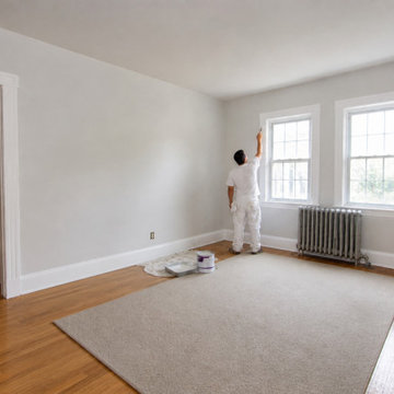
This whole home interior painting and trim upgrade project in Lancaster highlights how a professionally executed finish can completely transform the look, feel, and flow of an entire living space. The project began with a dated interior featuring worn paint, visible wall imperfections, and aging trim that no longer reflected a clean, modern aesthetic. While the home’s structure remained solid, the overall appearance felt dull and lacked the brightness, consistency, and refinement homeowners are looking for today.
Our team began with a comprehensive preparation process across the entire home, which is one of the most critical steps in achieving a high-quality and long-lasting paint finish. Every surface was carefully cleaned, patched, and sanded to create a smooth and uniform base. All floors, fixtures, and furnishings were fully protected using professional-grade coverings, and trim lines throughout the home were precisely taped to ensure sharp, clean edges. This level of preparation not only enhances the final appearance but also ensures durability and consistency from room to room.
As the project progressed, premium-quality paints were applied using a combination of rolling and precision cutting techniques to achieve a smooth, even finish across all wall and ceiling surfaces. The selected color palette focused on modern, neutral tones designed to maximize natural light and create a cohesive, open feel throughout the home. At the same time, all trim, baseboards, and interior details were upgraded with a crisp white finish, adding contrast, depth, and a polished look that ties every space together.
During the final stages, detailed touch-ups and trim refinements were completed in every room to achieve a flawless, professional-grade result. Each edge, corner, and transition was carefully inspected and perfected, ensuring consistency and craftsmanship at every level. The transformation is especially noticeable when comparing the before and after, as the home evolves from a worn, outdated environment into a bright, modern, and refreshed living space.
Once completed, the home was staged to highlight its full potential and demonstrate how a whole home painting upgrade can dramatically improve both aesthetics and functionality. The final result is a clean, cohesive, and welcoming interior that feels updated, spacious, and move-in ready.
Projects like this showcase the value of expert craftsmanship and attention to detail in full-home interior renovations. Whether you are preparing your property for sale or looking to modernize your living space, a whole home interior painting and trim upgrade remains one of the most effective ways to increase both visual appeal and overall property value in Lancaster, MA and surrounding areas.
Our team started with a detailed preparation process, which is one of the most critical steps in achieving a high-quality paint finish. All surfaces were carefully cleaned, patched, and sanded to ensure a smooth and even base. Floors and furniture were fully protected using professional-grade coverings, and trim areas were precisely taped to guarantee clean, sharp lines. This level of preparation ensures that the final result is not only visually appealing but also long-lasting.
As the painting phase progressed, high-quality paints were applied using a combination of rolling and cutting techniques to create a consistent, smooth finish across all wall surfaces. The color selection focused on modern, neutral tones that enhance natural light and create a more open, inviting atmosphere. At the same time, the trim and baseboards were upgraded with a crisp, clean white finish, adding contrast and definition throughout the space.
During the final stages, detailed touch-ups and trim work were completed to achieve a flawless result. Every corner, edge, and transition was carefully inspected and refined, ensuring a professional-grade finish that stands out. The transformation is most noticeable when comparing the before and after stages, where the room evolves from a dated and worn environment into a bright, modern living area.
The completed space was then staged to showcase its full potential, demonstrating how a simple upgrade like interior painting and trim work can dramatically improve both aesthetics and functionality. The result is a clean, polished, and welcoming environment that feels refreshed and ready for everyday living.
Projects like this demonstrate the impact of expert craftsmanship and attention to detail in interior renovations. Whether you are preparing your home for sale or simply looking to update your living space, professional painting and trim upgrades offer one of the most effective ways to enhance your home’s value and appearance.

 Five Star Tree Care
Trees are an object of supreme beauty that brings a sense of pride and character to any property. In addition to being aesthetically pleasing, they also offer a wealth of additional benefits. They can help reduce the cost of heating and cooling as well as increase the curb appeal of a property. Trees also benefit the environment by reducing pollution and providing refuge to local wildlife. If you happen to have oak trees on your property, it is especially important to make sure your trees undergo general maintenance and tree care. One of the most common problems landowners with oak trees face is oak wilt. Five Star Tree Services is here to let you know how to spot and protect your green friends from this debilitating tree ailment.
What Is Oak Wilt?
Oak wilt is a very aggressive form of tree fungus that attacks the oak species in particular. It grows on the outer sapwood of the tree and slowly starts to sap away nutrients and water from the tree itself. Left untreated, oak wilt can cause the tree to dieback or even expire completely. Oak wilt targets healthy oak trees, mature oak trees, and stressed oak trees in equal measure. It is easiest to spot the symptoms of oak wilt in the early spring or summer. The most common signs of oak wilt are bronze and wilting foliage.
Where Does Oak Wilt Start?
Most oak wilt will start along the tips of the branches and the top of the oak tree. One reason it may take so long to spot a problem is that it begins out of the usual line of sight. Most homeowners will notice a sudden decline in the health of a usually healthy tree that starts along its crown.
Another sign of oak wilt is when the outer side of the tree bark starts to develop gum. This gum attracts other pests such as birds, insects, and squirrels who then carry the fungus from sick trees to healthy trees. Along with spores, the fungus can also spread through the root system of one oak tree to the other, but it is hard to notice unless you happen to be digging around the trees for another reason.
When Are Oak Trees Most Susceptible?
Healthy and stressed oak trees are equally prone to catching oak wilt, but is it more likely to occur in the spring. It is always best to avoid pruning oak trees in the spring to reduce the chance of new fungal infections or for infections from other trees being spread to healthy trees. Wounds or environmental damage during the spring should be cared for by professionals to help reduce the chances of oak wilt infection.
Is There A Cure For Oak Wilt?
There is no cure for oak wilt, so the best method is prevention. Avoid pruning and damage during growing seasons and stick to winter pruning in Richmond Hill to cut down on infection rates. If you do have an oak tree that is showing signs of oak wilt, the best course of action is to have it removed to prevent the fungus from spreading to other trees. If you think your oak trees may be showing signs of oak wilt, give Five Star Tree Services a call at (416) 990-3355 for an in-person assessment today.
 Ernest M. Ferizi
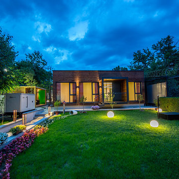
German Embassy in Pristina - Kosovo, contracted the architecture office “Ferizi + Ferizi Architects” to plan and implement an Annex Office building for their purposes. As detached part of this building is designed the waiting area, as alone standing structure.
This Office Building is constructed by assembling of Eight used office containers that were delivered on trucks and set up after only a few hours on the basis of the LEGO principle, according to the planning on strip foundations.
By removing the flexible exterior wall panels, a large room of 115 m² was created, with the counter wall as a room partition between two office spaces, each with seven workstations as well as three counters for agents on one side and a room for visitors on the other side.
With this system, room solutions can be easily implemented in all dimensions.
The container, seen as a geometric shape, is a simple, octagonal, solid box.
The standardized perfection of its dimensions is striking: 2.44 meters wide, 2.59 meters high and 6.06 meters or 12.19 meters long.
Since its introduction in 1956 by the American transport entrepreneur Malcom McLean, the container has become a standardized transport module worldwide, whether on ships, trucks or construction sites.
The shipping containers have additionally revolutionized the transport industry, pushed the globalization noticeably, and thus directly or indirectly influenced all our lives.
But after only a few years, when the first overseas containers wore out, many engineers recognized the positive properties of used shipping containers for building houses, especially since they are robust, flexible, multifunctional and second-hand relatively inexpensive to purchase. The time has long passed by to treat containers exclusively as transport objects.
As a "measure of all things", containers can hardly be ignored in construction.
Their use is no longer limited to temporary use since school containers, information containers, office containers or entire residential buildings are now part of our everyday life in the construction industry.
However, current examples of the container architecture prove that even the most demanding solutions for container building are feasible. For their specific aesthetic and spatial qualities, containers also serve as design parameters for the development of new forms of architecture and urbanity.
The office building as an extension of the visa section, characterized by modern materials and contemporary aesthetics has been designed and built mainly as a low-energy building.
Extensive insulation to achieve a comfortable and sustainable constant temperature in the interior, high window quality and low energy consumption make the building energy-efficient.
The sophisticated lighting technology, networks, heating systems and air-conditioning systems are also components of this equipment.
It creates an overall harmonic picture and guarantees the highest standard in sustainable construction, taking into consideration the fact that environmentally friendly recycling and reutilization have become an increasingly important issue in our society.
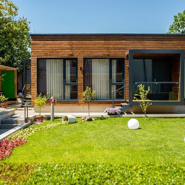
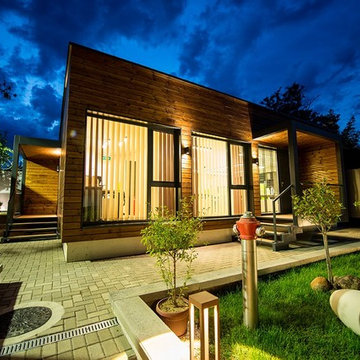
West and East side of the wooden facade is compact and has few openings, while the southern facade is completely open with lot of glass. Its spatial openness ensures a transparent, friendly work environment, which allows a lot of light into the space.
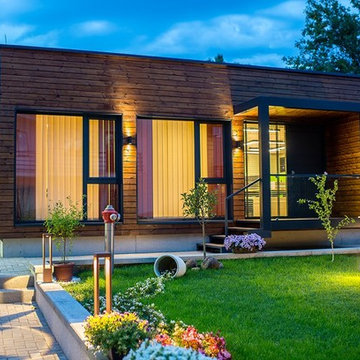
This openness allows an uninterrupted, pleasant and close-to-nature view from interior spaces into the beautiful garden. During the installation of sophisticated light sources in the garden, emphasis was not only put on functionality and security, but also on the beauty of the garden shown through the illumination in the evening.
Large, horizontal white “brisole” serve as external sun protection systems, mounted on the canopies of the entrance areas of the modular construction and the enclosure, adeptly cast shade on these areas and at the same time shape the entire architectural language.
While on one hand, the two quadratic ledges suspended in the air, are docked with steel stairs and match the wooden façade, lead the staff to their office space, the artful modern interior, on the other hand, perfectly unites the functionality, innovative technology, culture and positive effects on the employees' efficiency and wellbeing.
A lot of white, interjected by warm wooden and colored accents, determines the ambience.
In the case of the lighting solution, the mainly linear ceiling lighting is used as the overlapping design element both for the offices of the visa section as well as for the counters and the waiting area for the visitors.
They underline the puristic design in order to create a pleasant light for a desired general illumination and ensure optimal light conditions without causing disturbing reflections on the computer screens.
In addition, precisely positioned pendant luminaires are installed at the workstations, which ensure pleasant room brightness.
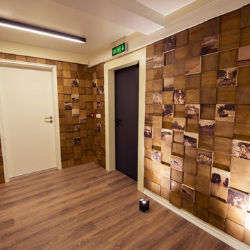
In the entrance area, the harmonic and uniform lighting effect from the ground highlights the integration of photography and architecture.
Photographs of landscapes, people, places, expressing unforgettable, impressive moments and memories have been lovingly engraved on 8 x 8cm square oak blocks.
The idea of an effective, impressive environment that stimulates and inspires the work was the premiss on which the whole design concept was based. Consequently, the modular construction was no longer viewed through its history of utilization and scars, but rather as a structure of work ambiance, art and elegance.
FERIZI + FERIZI Architects
Photo: Arben Llapashtica
 Ernest M. Ferizi
German Embassy in Pristina - Kosovo, contracted the architecture office “Ferizi + Ferizi Architects” to plan and implement an Annex Office building for their purposes. As detached part of this building is designed the waiting area, as alone standing structure.
This Office Building is constructed by assembling of Eight used office containers that were delivered on trucks and set up after only a few hours on the basis of the LEGO principle, according to the planning on strip foundations.
By removing the flexible exterior wall panels, a large room of 115 m² was created, with the counter wall as a room partition between two office spaces, each with seven workstations as well as three counters for agents on one side and a room for visitors on the other side.
With this system, room solutions can be easily implemented in all dimensions.
The container, seen as a geometric shape, is a simple, octagonal, solid box.
The standardized perfection of its dimensions is striking: 2.44 meters wide, 2.59 meters high and 6.06 meters or 12.19 meters long.
Since its introduction in 1956 by the American transport entrepreneur Malcom McLean, the container has become a standardized transport module worldwide, whether on ships, trucks or construction sites.
The shipping containers have additionally revolutionized the transport industry, pushed the globalization noticeably, and thus directly or indirectly influenced all our lives.
But after only a few years, when the first overseas containers wore out, many engineers recognized the positive properties of used shipping containers for building houses, especially since they are robust, flexible, multifunctional and second-hand relatively inexpensive to purchase. The time has long passed by to treat containers exclusively as transport objects.
As a "measure of all things", containers can hardly be ignored in construction.
Their use is no longer limited to temporary use since school containers, information containers, office containers or entire residential buildings are now part of our everyday life in the construction industry.
However, current examples of the container architecture prove that even the most demanding solutions for container building are feasible. For their specific aesthetic and spatial qualities, containers also serve as design parameters for the development of new forms of architecture and urbanity.
The office building as an extension of the visa section, characterized by modern materials and contemporary aesthetics has been designed and built mainly as a low-energy building.
Extensive insulation to achieve a comfortable and sustainable constant temperature in the interior, high window quality and low energy consumption make the building energy-efficient.
The sophisticated lighting technology, networks, heating systems and air-conditioning systems are also components of this equipment.
It creates an overall harmonic picture and guarantees the highest standard in sustainable construction, taking into consideration the fact that environmentally friendly recycling and reutilization have become an increasingly important issue in our society.
West and East side of the wooden facade is compact and has few openings, while the southern facade is completely open with lot of glass. Its spatial openness ensures a transparent, friendly work environment, which allows a lot of light into the space.
This openness allows an uninterrupted, pleasant and close-to-nature view from interior spaces into the beautiful garden. During the installation of sophisticated light sources in the garden, emphasis was not only put on functionality and security, but also on the beauty of the garden shown through the illumination in the evening.
Large, horizontal white “brisole” serve as external sun protection systems, mounted on the canopies of the entrance areas of the modular construction and the enclosure, adeptly cast shade on these areas and at the same time shape the entire architectural language.
While on one hand, the two quadratic ledges suspended in the air, are docked with steel stairs and match the wooden façade, lead the staff to their office space, the artful modern interior, on the other hand, perfectly unites the functionality, innovative technology, culture and positive effects on the employees' efficiency and wellbeing.
A lot of white, interjected by warm wooden and colored accents, determines the ambience.
In the case of the lighting solution, the mainly linear ceiling lighting is used as the overlapping design element both for the offices of the visa section as well as for the counters and the waiting area for the visitors.
They underline the puristic design in order to create a pleasant light for a desired general illumination and ensure optimal light conditions without causing disturbing reflections on the computer screens.
In addition, precisely positioned pendant luminaires are installed at the workstations, which ensure pleasant room brightness.
In the entrance area, the harmonic and uniform lighting effect from the ground highlights the integration of photography and architecture.
Photographs of landscapes, people, places, expressing unforgettable, impressive moments and memories have been lovingly engraved on 8 x 8cm square oak blocks.
The idea of an effective, impressive environment that stimulates and inspires the work was the premiss on which the whole design concept was based. Consequently, the modular construction was no longer viewed through its history of utilization and scars, but rather as a structure of work ambiance, art and elegance.
FERIZI + FERIZI Architects
Photo: Arben Llapashtica
 Ernest M. Ferizi
German Embassy in Pristina - Kosovo, contracted the architecture office “Ferizi + Ferizi Architects” to plan and implement an Annex Office building for their purposes. As detached part of this building is designed the waiting area, as alone standing structure.
This Office Building is constructed by assembling of Eight used office containers that were delivered on trucks and set up after only a few hours on the basis of the LEGO principle, according to the planning on strip foundations.
By removing the flexible exterior wall panels, a large room of 115 m² was created, with the counter wall as a room partition between two office spaces, each with seven workstations as well as three counters for agents on one side and a room for visitors on the other side.
With this system, room solutions can be easily implemented in all dimensions.
The container, seen as a geometric shape, is a simple, octagonal, solid box.
The standardized perfection of its dimensions is striking: 2.44 meters wide, 2.59 meters high and 6.06 meters or 12.19 meters long.
Since its introduction in 1956 by the American transport entrepreneur Malcom McLean, the container has become a standardized transport module worldwide, whether on ships, trucks or construction sites.
The shipping containers have additionally revolutionized the transport industry, pushed the globalization noticeably, and thus directly or indirectly influenced all our lives.
But after only a few years, when the first overseas containers wore out, many engineers recognized the positive properties of used shipping containers for building houses, especially since they are robust, flexible, multifunctional and second-hand relatively inexpensive to purchase. The time has long passed by to treat containers exclusively as transport objects.
As a "measure of all things", containers can hardly be ignored in construction.
Their use is no longer limited to temporary use since school containers, information containers, office containers or entire residential buildings are now part of our everyday life in the construction industry.
However, current examples of the container architecture prove that even the most demanding solutions for container building are feasible. For their specific aesthetic and spatial qualities, containers also serve as design parameters for the development of new forms of architecture and urbanity.
The office building as an extension of the visa section, characterized by modern materials and contemporary aesthetics has been designed and built mainly as a low-energy building.
Extensive insulation to achieve a comfortable and sustainable constant temperature in the interior, high window quality and low energy consumption make the building energy-efficient.
The sophisticated lighting technology, networks, heating systems and air-conditioning systems are also components of this equipment.
It creates an overall harmonic picture and guarantees the highest standard in sustainable construction, taking into consideration the fact that environmentally friendly recycling and reutilization have become an increasingly important issue in our society.
West and East side of the wooden facade is compact and has few openings, while the southern facade is completely open with lot of glass. Its spatial openness ensures a transparent, friendly work environment, which allows a lot of light into the space.
This openness allows an uninterrupted, pleasant and close-to-nature view from interior spaces into the beautiful garden. During the installation of sophisticated light sources in the garden, emphasis was not only put on functionality and security, but also on the beauty of the garden shown through the illumination in the evening.
Large, horizontal white “brisole” serve as external sun protection systems, mounted on the canopies of the entrance areas of the modular construction and the enclosure, adeptly cast shade on these areas and at the same time shape the entire architectural language.
While on one hand, the two quadratic ledges suspended in the air, are docked with steel stairs and match the wooden façade, lead the staff to their office space, the artful modern interior, on the other hand, perfectly unites the functionality, innovative technology, culture and positive effects on the employees' efficiency and wellbeing.
A lot of white, interjected by warm wooden and colored accents, determines the ambience.
In the case of the lighting solution, the mainly linear ceiling lighting is used as the overlapping design element both for the offices of the visa section as well as for the counters and the waiting area for the visitors.
They underline the puristic design in order to create a pleasant light for a desired general illumination and ensure optimal light conditions without causing disturbing reflections on the computer screens.
In addition, precisely positioned pendant luminaires are installed at the workstations, which ensure pleasant room brightness.
In the entrance area, the harmonic and uniform lighting effect from the ground highlights the integration of photography and architecture.
Photographs of landscapes, people, places, expressing unforgettable, impressive moments and memories have been lovingly engraved on 8 x 8cm square oak blocks.
The idea of an effective, impressive environment that stimulates and inspires the work was the premiss on which the whole design concept was based. Consequently, the modular construction was no longer viewed through its history of utilization and scars, but rather as a structure of work ambiance, art and elegance.
FERIZI + FERIZI Architects
Photo: Arben Llapashtica
 Ernest M. Ferizi
German Embassy in Pristina - Kosovo, contracted the architecture office “Ferizi + Ferizi Architects” to plan and implement an Annex Office building for their purposes. As detached part of this building is designed the waiting area, as alone standing structure.
This Office Building is constructed by assembling of Eight used office containers that were delivered on trucks and set up after only a few hours on the basis of the LEGO principle, according to the planning on strip foundations.
By removing the flexible exterior wall panels, a large room of 115 m² was created, with the counter wall as a room partition between two office spaces, each with seven workstations as well as three counters for agents on one side and a room for visitors on the other side.
With this system, room solutions can be easily implemented in all dimensions.
The container, seen as a geometric shape, is a simple, octagonal, solid box.
The standardized perfection of its dimensions is striking: 2.44 meters wide, 2.59 meters high and 6.06 meters or 12.19 meters long.
Since its introduction in 1956 by the American transport entrepreneur Malcom McLean, the container has become a standardized transport module worldwide, whether on ships, trucks or construction sites.
The shipping containers have additionally revolutionized the transport industry, pushed the globalization noticeably, and thus directly or indirectly influenced all our lives.
But after only a few years, when the first overseas containers wore out, many engineers recognized the positive properties of used shipping containers for building houses, especially since they are robust, flexible, multifunctional and second-hand relatively inexpensive to purchase. The time has long passed by to treat containers exclusively as transport objects.
As a "measure of all things", containers can hardly be ignored in construction.
Their use is no longer limited to temporary use since school containers, information containers, office containers or entire residential buildings are now part of our everyday life in the construction industry.
However, current examples of the container architecture prove that even the most demanding solutions for container building are feasible. For their specific aesthetic and spatial qualities, containers also serve as design parameters for the development of new forms of architecture and urbanity.
The office building as an extension of the visa section, characterized by modern materials and contemporary aesthetics has been designed and built mainly as a low-energy building.
Extensive insulation to achieve a comfortable and sustainable constant temperature in the interior, high window quality and low energy consumption make the building energy-efficient.
The sophisticated lighting technology, networks, heating systems and air-conditioning systems are also components of this equipment.
It creates an overall harmonic picture and guarantees the highest standard in sustainable construction, taking into consideration the fact that environmentally friendly recycling and reutilization have become an increasingly important issue in our society.
West and East side of the wooden facade is compact and has few openings, while the southern facade is completely open with lot of glass. Its spatial openness ensures a transparent, friendly work environment, which allows a lot of light into the space.
This openness allows an uninterrupted, pleasant and close-to-nature view from interior spaces into the beautiful garden. During the installation of sophisticated light sources in the garden, emphasis was not only put on functionality and security, but also on the beauty of the garden shown through the illumination in the evening.
Large, horizontal white “brisole” serve as external sun protection systems, mounted on the canopies of the entrance areas of the modular construction and the enclosure, adeptly cast shade on these areas and at the same time shape the entire architectural language.
While on one hand, the two quadratic ledges suspended in the air, are docked with steel stairs and match the wooden façade, lead the staff to their office space, the artful modern interior, on the other hand, perfectly unites the functionality, innovative technology, culture and positive effects on the employees' efficiency and wellbeing.
A lot of white, interjected by warm wooden and colored accents, determines the ambience.
In the case of the lighting solution, the mainly linear ceiling lighting is used as the overlapping design element both for the offices of the visa section as well as for the counters and the waiting area for the visitors.
They underline the puristic design in order to create a pleasant light for a desired general illumination and ensure optimal light conditions without causing disturbing reflections on the computer screens.
In addition, precisely positioned pendant luminaires are installed at the workstations, which ensure pleasant room brightness.
In the entrance area, the harmonic and uniform lighting effect from the ground highlights the integration of photography and architecture.
Photographs of landscapes, people, places, expressing unforgettable, impressive moments and memories have been lovingly engraved on 8 x 8cm square oak blocks.
The idea of an effective, impressive environment that stimulates and inspires the work was the premiss on which the whole design concept was based. Consequently, the modular construction was no longer viewed through its history of utilization and scars, but rather as a structure of work ambiance, art and elegance.
FERIZI + FERIZI Architects
Photo: Arben Llapashtica
 Ernest M. Ferizi
German Embassy in Pristina - Kosovo, contracted the architecture office “Ferizi + Ferizi Architects” to plan and implement an Annex Office building for their purposes. As detached part of this building is designed the waiting area, as alone standing structure.
This Office Building is constructed by assembling of Eight used office containers that were delivered on trucks and set up after only a few hours on the basis of the LEGO principle, according to the planning on strip foundations.
By removing the flexible exterior wall panels, a large room of 115 m² was created, with the counter wall as a room partition between two office spaces, each with seven workstations as well as three counters for agents on one side and a room for visitors on the other side.
With this system, room solutions can be easily implemented in all dimensions.
The container, seen as a geometric shape, is a simple, octagonal, solid box.
The standardized perfection of its dimensions is striking: 2.44 meters wide, 2.59 meters high and 6.06 meters or 12.19 meters long.
Since its introduction in 1956 by the American transport entrepreneur Malcom McLean, the container has become a standardized transport module worldwide, whether on ships, trucks or construction sites.
The shipping containers have additionally revolutionized the transport industry, pushed the globalization noticeably, and thus directly or indirectly influenced all our lives.
But after only a few years, when the first overseas containers wore out, many engineers recognized the positive properties of used shipping containers for building houses, especially since they are robust, flexible, multifunctional and second-hand relatively inexpensive to purchase. The time has long passed by to treat containers exclusively as transport objects.
As a "measure of all things", containers can hardly be ignored in construction.
Their use is no longer limited to temporary use since school containers, information containers, office containers or entire residential buildings are now part of our everyday life in the construction industry.
However, current examples of the container architecture prove that even the most demanding solutions for container building are feasible. For their specific aesthetic and spatial qualities, containers also serve as design parameters for the development of new forms of architecture and urbanity.
The office building as an extension of the visa section, characterized by modern materials and contemporary aesthetics has been designed and built mainly as a low-energy building.
Extensive insulation to achieve a comfortable and sustainable constant temperature in the interior, high window quality and low energy consumption make the building energy-efficient.
The sophisticated lighting technology, networks, heating systems and air-conditioning systems are also components of this equipment.
It creates an overall harmonic picture and guarantees the highest standard in sustainable construction, taking into consideration the fact that environmentally friendly recycling and reutilization have become an increasingly important issue in our society.
West and East side of the wooden facade is compact and has few openings, while the southern facade is completely open with lot of glass. Its spatial openness ensures a transparent, friendly work environment, which allows a lot of light into the space.
This openness allows an uninterrupted, pleasant and close-to-nature view from interior spaces into the beautiful garden. During the installation of sophisticated light sources in the garden, emphasis was not only put on functionality and security, but also on the beauty of the garden shown through the illumination in the evening.
Large, horizontal white “brisole” serve as external sun protection systems, mounted on the canopies of the entrance areas of the modular construction and the enclosure, adeptly cast shade on these areas and at the same time shape the entire architectural language.
While on one hand, the two quadratic ledges suspended in the air, are docked with steel stairs and match the wooden façade, lead the staff to their office space, the artful modern interior, on the other hand, perfectly unites the functionality, innovative technology, culture and positive effects on the employees' efficiency and wellbeing.
A lot of white, interjected by warm wooden and colored accents, determines the ambience.
In the case of the lighting solution, the mainly linear ceiling lighting is used as the overlapping design element both for the offices of the visa section as well as for the counters and the waiting area for the visitors.
They underline the puristic design in order to create a pleasant light for a desired general illumination and ensure optimal light conditions without causing disturbing reflections on the computer screens.
In addition, precisely positioned pendant luminaires are installed at the workstations, which ensure pleasant room brightness.
In the entrance area, the harmonic and uniform lighting effect from the ground highlights the integration of photography and architecture.
Photographs of landscapes, people, places, expressing unforgettable, impressive moments and memories have been lovingly engraved on 8 x 8cm square oak blocks.
The idea of an effective, impressive environment that stimulates and inspires the work was the premiss on which the whole design concept was based. Consequently, the modular construction was no longer viewed through its history of utilization and scars, but rather as a structure of work ambiance, art and elegance.
FERIZI + FERIZI Architects
Photo: Arben Llapashtica
7