
Search results for "Obstacle" in Home Design Ideas
 Green Bay Remodeling Inc.
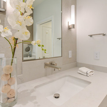
When challenges arise, Green Bay Remodeling delivers solutions! This client called us ‘problem solvers’ after we transformed their space with precision and creativity. Watch how we tackled obstacles to create a home that exceeds expectations.
 Green Bay Remodeling Inc.
When challenges arise, Green Bay Remodeling delivers solutions! This client called us ‘problem solvers’ after we transformed their space with precision and creativity. Watch how we tackled obstacles to create a home that exceeds expectations.
 Beahm & Son, Ltd.
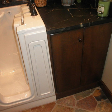
We were lucky enough to have the opportunity to help an older couple in our local community. They approached us with a project that they thought would be impossible. Turn a 6x6 first floor pantry into a fully functioning bathroom. Normally this space limitation would not be a problem but the plumbing presented a difficulty that already scared away 2 other contractors. We were able to overcome this obstacle with the help of our experienced staff who keep up to date on the newest devices and products in the remodeling industry.
We had a very enjoyable experience designing and remodeling this room. Even with the small space limitations we believe we came up with a very unique and rustic feel for their 1890's farm house. I must end on all the custom wood work that our employees made for this project. From the custom, two-sided, door to the little, wooden, wall shelf we made all of the wooden pieces you see in this project and most of them were unique creations specifically for this job.
Find the right local pro for your project
 Drury Design
Relocating from San Francisco, this young family immediately zeroed in on the wonderful historic homes around downtown Chicago. Most of the properties they saw checked a lot of wish list boxes, but none of them checked every box. The house they landed on had beautiful curb appeal, a dramatic entry with a welcoming porch and front hall, and a really nice yard. Unfortunately, it did not have a kitchen that was well set-up for cooking and entertaining. Reworking the kitchen area was the top priority.
The family had met with a few other designers and even had an architect take a crack at the space, but they were not able to come up with a viable solution. Here’s how Senior Designer Diana Burton approached the project…
Design Objectives:
Respect the home’s vintage feel while bringing the kitchen up to date
Open up the kitchen area to create an open space for gathering and entertaining
Upgrade appliances to top-of-the-line models
Include a large island with seating
Include seating for casual family meals in a space that won’t be a replacement for the adjacent formal dining room
THE REMODEL
Design Challenges:
Remove a load-bearing wall and combine smaller rooms to create one big kitchen
A powder room in the back corner of the existing kitchen was a huge obstacle to updating the layout
Maintain large windows with views of the yard while still providing ample storage
Design Solutions:
Relocating the powder room to another part of the first floor (a large closet under the stairs) opened up the space dramatically
Create space for a larger island by recessing the fridge/freezer and shifting the pantry to a space adjacent to the kitchen
A banquette saves space and offers a perfect solution for casual dining
The walnut banquette table beautifully complements the fridge/freezer armoire
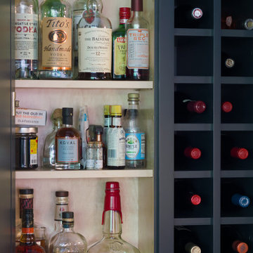
Utilize a gap created by the new fridge location to create a tall shallow cabinet for liquor storage w/ a wine cubby
Closing off one doorway into the dining room and using the “between the studs” space for a tall storage cabinet
Dish organizing drawers offer handy storage for plates, bowls, and serving dishes right by main sink and dishwasher
Cabinetry backing up to the dining room offers ample storage for glassware and functions both as a coffee station and cocktail bar
Open shelves flanking the hood add storage without blocking views and daylight
A beam was required where the wall was removed. Additional beams added architectural interest and helped integrate the beams into the space
Statement lighting adds drama and personality to the space
THE RENEWED SPACE
This project exemplifies the transformative power of good design. Simply put, good design allows you to live life artfully. The newly remodeled kitchen effortlessly combines functionality and aesthetic appeal, providing a delightful space for cooking and spending quality time together. It’s comfy for regular meals but ultimately outfitted for those special gatherings. Infused with classic finishes and a timeless charm, the kitchen emanates an enduring atmosphere that will never go out of style.
This is the special feature utilized a gap created by the new fridge location to create a tall shallow cabinet for liquor storage w/ a wine cubby

 Daniels Lawn and Landscaping Services
Daniels Lawn and Landscaping Service provides professional yard mowing with a dedication to giving superior personal service to each of our clients. We provide lawn care services to Wichita and the surrounding metro areas.
Our weekly lawn mowing service will provide curb appeal that is different than the rest. We will trim around obstacles and edging. Blowing and clearing of debris from driveways, walkways, patios, mulch and rock beds.
 Creative Design Cabinetry
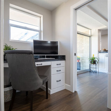
A modern update to this condo built in 1966 with a gorgeous view of Emigration Canyon in Salt Lake City.
Concrete structural columns and walls were an obstacle to incorporate into the design.
White conversion varnish finish on maple raised panel doors. Counter top is Brass Blue granite..
 Sweet Smiling Landscape Design
Located on a steep hill above downtown Ventura, this modern Spanish house features panoramic views of town with the ocean and Channel Islands beyond. While the views are amazing from a large front deck, the steep slope presented some constraints on the landscape design.
Although the property is about a third-of-an-acre, the only useable and open garden space is a small (about 500 square feet) area to the West of the house. The house sits at the back of the property, and another steep hill on the neighboring property behind is held back by a tall retaining wall, leaving just enough room for a narrow, hardscaped patio in the back yard.
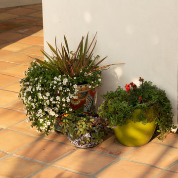
Bright plantings along the back of the property delineate the home from the neighboring property, and we chose plantings to help stabilize the soil and further develop the Spanish garden look while creating a lush, inviting feel. Additionally, we added 52 pieces of pottery to soften and add interest to the back garden and patio areas. Succulents, herbs, and California natives fill the pottery along with bright, sweet-smelling, tropical-looking, and climate-appropriate plants.
Slope stabilization was paramount for the front hill. Beyond that, finding plants that would thrive on the steep slope was the next obstacle. Finally, the aesthetics could be addressed, and we worked to find plants that meshed with the architecture—blending plants with white and orange to play off the red-tiled roofs and white-plastered walls that are emblematic of the Spanish style of this house as well as the predominate style of the neighborhood.
The flattish area to the West was designed with the idea of creating a contemporary take on the parterre garden. Reminiscent of Mediterranean gardens, this vegetable and herb garden substitutes formal hedges with formal Corten steel planters to honor the modern Spanish architecture of the house. The citrus, herbs, and vegetables serve the foodie clients well.
 Stairworks
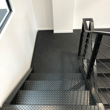
This project was a commercial law office that needed staircases to service the two floors. We designed these stairs with a lot of influence from the client as they liked the industrial look with exposed steel. We stuck with a minimalistic design which included grip tread at the top and a solid looking balustrade. One of the staircases is U-shaped, two of the stairs are L-shaped and one is a straight staircase. One of the biggest obstacles was accessing the space, so we had to roll everything around on flat ground and lift up with a spider crane. This meant we worked closely alongside the builders onsite to tackle any hurdles.
 Brooks + Scarpa Architects
Description: In early 1994, the architects began work on the project and while in construction (demolition, grading and foundations) the owner, due to circumstances beyond his control, halted all construction of the project. Seven years later the owner returned to the architects and asked them to complete the partially constructed house. Due to code changes, city ordinances and a wide variety of obstacles it was determined that the house was unable to be completed as originally designed.
After much consideration the client asked the architect if it were possible to alter/remodel the partially constructed house, which was a remodel/addition to a 1970’s ranch style house, into a project that fit into current zoning and structural codes. The owner also requested that the house’s footprint and partially constructed foundations remain to avoid the need for further entitlements and delays on an already long overdue and difficult hillside site.
The architects’ main challenge was how to alter the design that reflected an outdated philosophical approach to architecture that was nearly a decade old. How could the house be re-conceived reflecting the architect and client’s maturity on a ten-year-old footprint?
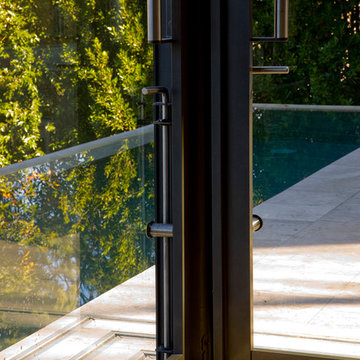
The answer was to remove almost all of the previously proposed existing interior walls and transform the existing footprint into a pavilion-like structure that allows the site to in a sense “pass through the house”. This allowed the client to take better advantage of a limited and restricted building area while capturing extraordinary panoramic views of the San Fernando Valley and Hollywood Hills. Large 22-foot high custom sliding glass doors allow the interior and exterior to become one. Even the studio is separated from the house and connected only by an exterior bridge. Private spaces are treated as loft-like spaces capturing volume and views while maintaining privacy.
Limestone floors extend from inside to outside and into the lap pool that runs the entire length of the house creating a horizon line at the edge of the view. Other natural materials such as board formed concrete, copper, steel and cherry provides softness to the objects that seem to float within the interior volume. By placing objects and materials "outside the frame," a new frame of reference deepens our sense of perception. Art does not reproduce what we see; rather it makes us see.
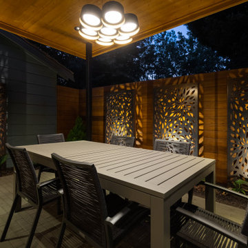
 Water & Earth Landscape Design
These are the outdeco panels that we use to cover obstacles. Here they cover the neighbors garage. With an outdoor lamp shining on them, it creates a nice shadow on the surface behind it.
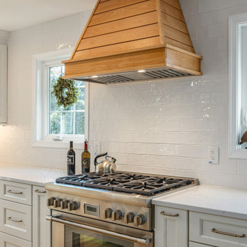
 FineLine Kitchens, Inc.
Hi, everyone we are in Reston, Virginia,
In this project, the kitchen used to be is now the living room. My clients wanted to update their kitchen, it was a little tight where it was, there were a lot of walls. We wanted to take it away and kind of give them a bigger island so they can seat the kids and they can all have a seat together, enjoy their breakfast, and so forth in a bigger, wider space.
So we also redid the entire floors throughout the house. I wanted to go with a slightly more natural look for the wood. It has a natural stain with a matte finish, which hides scratches. If you have pets or kids, we also match the wood to the floor.
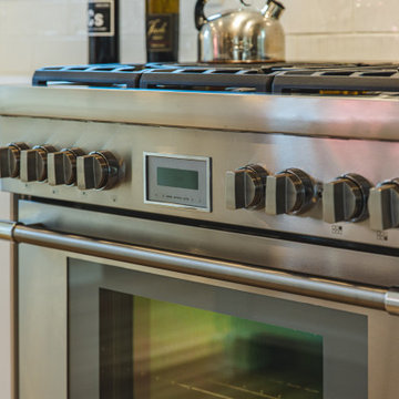
So there is a little bit of warmth around the white. We added sconces around the dining room area to the fireplace to kind of highlight that area there. And then we also paneled the fridge. It makes this line continue a little bit longer since they didn't have the longest run on this end. So it's not stopping by an obstacle that's metal or stainless steel. So that way, it kind of blends in a little bit more with everything, and you only have the range that's showing, which is the focal point
We'll see you on the next project.
Enjoy.
 FineLine Kitchens, Inc.
Hi, everyone we are in Reston, Virginia,
In this project, the kitchen used to be is now the living room. My clients wanted to update their kitchen, it was a little tight where it was, there were a lot of walls. We wanted to take it away and kind of give them a bigger island so they can seat the kids and they can all have a seat together, enjoy their breakfast, and so forth in a bigger, wider space.
So we also redid the entire floors throughout the house. I wanted to go with a slightly more natural look for the wood. It has a natural stain with a matte finish, which hides scratches. If you have pets or kids, we also match the wood to the floor.
So there is a little bit of warmth around the white. We added sconces around the dining room area to the fireplace to kind of highlight that area there. And then we also paneled the fridge. It makes this line continue a little bit longer since they didn't have the longest run on this end. So it's not stopping by an obstacle that's metal or stainless steel. So that way, it kind of blends in a little bit more with everything, and you only have the range that's showing, which is the focal point
We'll see you on the next project.
Enjoy.
 Green Bay Remodeling Inc.
When challenges arise, Green Bay Remodeling delivers solutions! This client called us ‘problem solvers’ after we transformed their space with precision and creativity. Watch how we tackled obstacles to create a home that exceeds expectations.
 Glenview Haus – Custom Doors & Wine Cellars
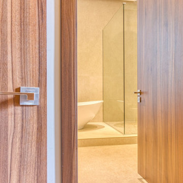
We were pleased to be brought in on this penthouse renovation in the heart of Bucktown, Chicago. The goal of this project was to revamp the space and add an additional touch of modern design through the use of warm Walnut Eco-Veneer doors. With warm tones, we were able to play on the traditional feel of the space, yet bring in modern touches with the magnetic latch hardware, concealed hinges, and flush designs. The seamlessly matching frames give an added touch of style, making these door units appear intentional and luxe. Noticed by every individual who walks through space, our Modern Interior doors are made to be an additional form of design that should complement and elevate your space.
Whenever we encounter a renovation project, we often anticipate certain obstacles. Existing design elements (flooring, wall thickness, building codes, etc.) and limited budgets can usually be tough to overcome. However, with our Modern Interior door package, we can provide flexible pricing and flexible styles and finishes that are guaranteed to complement any residence. Each door line has several different complementary designs to choose from, which can add variation throughout your home, while still providing a cohesive style that creates a meaningful flow.
Our Modern Interior door line comes equipped with everything you need for a no-fuss and effortless door buying process. One set price includes the door slab with desired solid wood veneer in finish of your choice, a matching adjustable frame, concealed hinges, and a magnetic lever set. Each door style provides a top of the line product and can exceed any and all expectations you might have. Our Modern Interior doors can provide an updated feel to your home, whether it is modern, contemporary or traditional. All elements of our Modern Interior Doors are geared towards updating your space and adding a luxury feel at an affordable price point. Glenview Haus has a mission to provide all design-savvy individuals with design elements that are highly coveted and unique to your home. Why blend in when you can stand out?
 TVL Creative Ltd.
Cramped kitchen be gone! That was the project motto and top priority. The goal was to transform the current layout from multiple smaller spaces into a connected whole that would activate the main level for our clients, a young family of four.
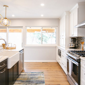
The biggest obstacle was the wall dividing the kitchen and the dining room. Removing this wall was central to opening up and integrating the main living spaces, but the existing ductwork that ran right through the center of the wall posed a design challenge, er design opportunity. The resulting design solution features a central pantry that captures the ductwork and provides valuable storage- especially when compared to the original kitchen's 18" wide pantry cabinet. The pantry also anchors the kitchen island and serves as a visual separation of space between the kitchen and homework area.
Through our design development process, we learned the formal living room was of no service to their lifestyle and therefore space they rarely spent time in. With that in mind, we proposed to eliminate the unused living room and make it the new dining room. Relocating the dining room to this space inherently felt right given the soaring ceiling and ample room for holiday dinners and celebrations. The new dining room was spacious enough for us to incorporate a conversational seating area in the warm, south-facing window alcove.
Now what to do with the old dining room?! To answer that question we took inspiration from our clients' shared profession in education and developed a craft area/homework station for both of their boys. The semi-custom cabinetry of the desk area carries over to the adjacent wall and forms window bench base with storage that we topped with butcher block for a touch of warmth. While the boys are young, the bench drawers are the perfect place for a stash of toys close to the kitchen.
The kitchen begins just beyond the window seat with their refrigerator enclosure. Opposite the refrigerator is the new pantry with twenty linear feet of shelving and space for brooms and a stick vacuum. Extending from the backside of the pantry the kitchen island design incorporates counter seating on the family room side and a cabinetry configuration on the kitchen side with drawer storage, a trashcan center, farmhouse sink, and dishwasher.
We took careful time in design and execution to align the range and sink because while it might seem like a small detail, it plays an important role in supporting the symmetrical configuration of the back wall of the kitchen. The rear wall design utilizes an appliance garage mirrors the visual impact of the refrigerator enclosure and helps keep the now open kitchen tidy. Between the appliance garage and refrigerator enclosure is the cooking zone with 30" of cabinetry and work surface on either side of the range, a chimney style vent hood, and a bold graphic tile backsplash.
The backsplash is just one of many personal touches we added to the space to reflect our client's modern eclectic style and love of color. Swooping lines of the mid-mod style barstools compliment the pendants and backsplash pattern. A pop of vibrant green on the frame of the pantry door adds a fresh wash of color to an otherwise neutral space. The big show stopper is the custom charcoal gray and copper chevron wall installation in the dining room. This was an idea our clients softly suggested, and we excitedly embraced the opportunity. It is also a kickass solution to the head-scratching design dilemma of how to fill a large and lofty wall.
We are so grateful to bring this design to life for our clients and now dear friends.

 Victor Smith
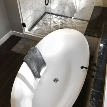
Master bathroom expansion. The original bathroom was only 30 -40 square feet. My customer asked me to expand into the adjoining closet and vanity area, more than tripling the space. There were load bearing obstacles that had to be modified and windows were added. The shower has a shower head, hand held sprayer and two body jets. The tub is large and holds up to 54 gallon and is 6 feet long.
 Whiski Kitchen Design Studio
In this 1905 Tudor home, the intent of this design was to take advantage of the classic architecture of the home and incorporate modern conveniences.
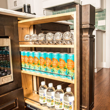
Located in the Joseph Berry Subdivision in Detroit, this stellar home presented several design challenges. The most difficult challenge to overcome was the 11” slope from one end of the kitchen to the other, caused by 110 years of settling. All new floor joists were installed and the floor by the side door was then recessed down one step. This created a cozy nook when you first enter the kitchen. A tiered ceiling with strategically planned cabinetry heights and crown molding concealed the slope of the walls at the ceiling level.
The second challenge in this historic home was the awkward foot print of the kitchen. It’s likely that this kitchen had a butler’s pantry originally. However it was remodeled sometime in the 70’s and all original character was erased. Clever pantry storage was added to an awkward corner creating a space that mimicked the essence of a butler’s pantry, while providing storage desired in kitchens today.
Keeping the large footprint of the kitchen presented obstacles with the working triangle; the distance from the sink to the cooktop is several feet. The solution was installation of a pot filler over the cooktop that added convenience and elegance (not sure about this word). Not everything in this project was a challenge; the discovery of a brick chimney hiding behind plaster was a welcome surprise and brought character back honoring the historic charm of this beautiful home.
Kitchen Designer: Rebekah Tull of Whiski Kitchen Design Studio
Remodeling Contractor: Renaissance Restorations, Inc.
Counter Top Fabricator: Lakeside Solid Surfaces - Cambria
Cabinetry: Legacy Crafted Cabinets
Photographer: Shermin Photography
Tile: TileBar.com
Cabinet Accessories: Rev-A-Shelf
 Thyme & Place Design LLC
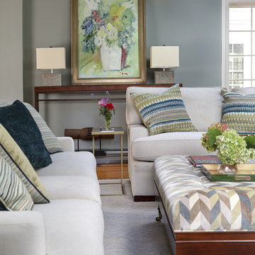
My clients always wanted a fireplace in the family room but could not build the necessary chimney due to building restrictions. To overcome this obstacle we installed an Eco Smart bio fuel fireplace. which became the focal point of the room. Next we added custom cabinetry for storage which coordinated with the kitchen (which is an open room adjacent to this space). Custom furnishings from American Leather and Hickory Chair were selected for my tall client. High performance fabrics were selected to provide worry free enjoyment of the furniture. Finishing accent pieces from Charleston Forge add a warm and contemporary vibe to the pace. The dark stain is a beautiful contrast to the lighter colorway. As you can see there are 2 skylights and 2 very large windows so light is not a problem but sun and heat are. With the height of the ceilings, we needed a large but good looking ceiling fan to control the temperature. An oversize custom ceiling fan was chosen. The walls are a coordinated blue grey to compliment the Venetian plaster finished fireplace column. The rear wall is painted a contrasting color to highlight the fireplace and the built in cherry cabinetry. a Vintage Patchwork rug defines the furniture area and helps soften the sound in the room Custom artwork by the clients mother add the final touches. Peter Rymwid Architectural Photography
 Sosna Inc
This project centered on helping a wonderful client and her equally fantastic dog transform her condo into a space that truly reflected her style and simplified her life. Eager to create a home that was both beautiful and functional, she envisioned a haven in the heart of the city.
Before: Feeling Disconnected
Before the renovation, our client felt disconnected from her condo. The builder-grade kitchen was a constant source of frustration, with an awkward peninsula that hindered the flow of the space. The condo overall felt outdated and no longer captured her vibrant personality. The foyer and laundry areas were cramped and lacked organization, while the mismatched hardwood flooring only added to the disjointed atmosphere. As for the bathrooms, they felt frozen in time, desperately needing an update.
Worries and Concerns
Like many homeowners, our client had heard her fair share of renovation horror stories—tales of projects gone awry and the frustrations of managing multiple contractors. She was understandably cautious and needed a trustworthy, experienced team she could rely on to handle the project with care and expertise.
The Solution: A Personalized Transformation
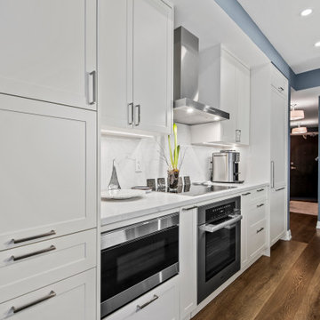
We took the time to listen carefully to our client’s needs and concerns and developed a tailored plan to address each of her pain points. For the kitchen, we preserved the existing layout but reimagined the space entirely. The awkward peninsula was redesigned to improve traffic flow and provide much-needed storage and counter space. Clever storage solutions, such as pull-outs, shelving, concealed drawers in the toe kicks, and an appliance garage, were incorporated. The kitchen now boasts a warm and inviting atmosphere, with light wood-tone lower cabinetry, off-white upper cabinets, and brushed nickel hardware that ties it all together.
The laundry room, once cramped and chaotic, was transformed into an organized, efficient space. We added custom cabinetry with pull-outs for hanging clothes, open storage above, a laundry sink, and a spacious counter for folding—no more piles of laundry!
Both the en-suite and shared bathrooms underwent complete renovations. Custom cabinetry was installed, including a floor-to-ceiling linen closet, and light grey and brown-toned tiles were selected, with contrasting hexagonal tiles for the shower floor. A heated flooring system was added for luxury and comfort year-round.
The mismatched flooring throughout the condo was replaced with cohesive vinyl and porcelain tiles, creating a seamless, modern aesthetic throughout the space.
Overcoming Challenges
As with any renovation, there were challenges to navigate. One of the key obstacles was managing the condo board’s renovation rules and policies while coordinating the delivery schedules for finishes and fixtures, especially during the busy holiday season. With careful planning, we ensured the project stayed on track. Additionally, we encountered a height variation between the tile and vinyl flooring. To resolve this, we used self-leveling material under the vinyl, ensuring a smooth and seamless transition between the two flooring types.
The Grand Reveal: A Dream Come True
The final result is simply stunning. The kitchen is now a chef’s dream, with custom-built cabinets, smooth quartz countertops, and a matching stone backsplash. Brushed nickel and stainless steel plumbing fixtures, elegant cabinet hardware, and LED lighting under the upper cabinets add the perfect finishing touches. Custom organizers in the foyer and laundry closets provide ample storage and keep everything neatly in place. The bathrooms have been transformed into spa-like retreats, with beautiful porcelain tiles and custom cabinetry. The new vinyl flooring throughout the main living areas and bedroom unifies the space, creating a cohesive and modern atmosphere.
Life Transformed
Our client’s life has been completely transformed. As a passionate cook, she now relishes spending time in her beautiful and functional kitchen. The single-bowl sink makes cleanup a breeze, and the thoughtfully designed storage solutions have brought a sense of calm and order to her home. The refreshed flooring and neutral paint palette have created a relaxing, comfortable environment she truly loves.
A Memorable Journey
This project was more than just a renovation—it was a collaboration. Our client valued our guidance throughout the design process, particularly when faced with the overwhelming number of decisions. We built a strong relationship with her, and we are immensely grateful for the trust she placed in our team.
32