
Search results for "Obvious advantageous" in Home Design Ideas

 Byggmeister Inc
Architectural designer Bill Harper worked closely with the new homeowners to reimagine the uses of the various first floor spaces:
• An obvious first measure was one we’ve done at many homes: Combine the kitchen with the separate (and too-small) adjacent dining room by eliminating the wall between. This opened up the kitchen and provided an informal eating area.
• The prior living room had an awkward shape for a living room (too long relative to its width) but was perfect as a new formal dining room.
• We moved the living room to the former lower-level dining room but connected it more elegantly (and conveniently) to the kitchen by adding a short, straight stair—and also a balcony that serves as a wider, more welcoming path from the entry foyer to the kitchen.
• Another obvious change was to eliminate the first-floor shower and take advantage of the freed-up space to create a combination laundry-powder room off the kitchen (but not right off the kitchen), thereby rescuing the washer and dryer from the basement.
-Photos by Jim Raycroft
 Little Crown Interiors
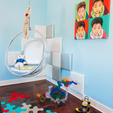
Modern light aqua blue bedroom for video game and astronaut loving 6 year old boy. To take full advantage of a large empty wall I designed a custom bookshelf to fit on top of the modern dresser. The result was playful statement piece with lots of practical and fun storage, and a display for toys and decor. We hung a acrylic bubble chair in the other corner of the room and added white and silver upholstered “pixels” for a fun video game feel and to protect the walls. One of the more obvious way we incorporated the space vibes was with life-sized astronaut bedding.
Design: Little Crown Interiors
Photos: Full Spectrum Photography
 Allbright Bullock Architects
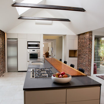
The thickness of the sapele wood kitchen countertop is expressed at the stone island counter. The existing ceilings were removed and replaced with exposed steel I-beam crossties and new cathedral ceilings, with the steel beams placed sideways to provide a cavity at the top and bottom for continuous linear light strips shining up and down. The full height windows go all the way to floor to take full advantage of the view angle down the hill. Photo by Lisa Shires.
Find the right local pro for your project
 River Valley Landscapes
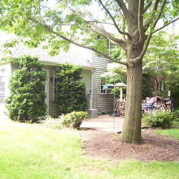
Before - After many years of having no outdoor living space and dealing with overgrown plants and trees the owner’s decided it was time to revitalize their backyard. They knew they wanted a large sitting area with a wood burning fireplace, room for outdoor dining and a place for the grill. A connecting walk would be needed to get guests from the driveway to the outdoor space. Last but not least, the owners wanted the ability to and a reason for stepping out of their unusable patio doors.
The designers decided from the start the fireplace would be the prominent feature and focal point for the entire project. A large fireplace accented with sitting walls and arbors was positioned to anchor the corner of the patio. Stone was chosen to set the fireplace apart as its own element. Brick was used for the sitting walls and brick accents were added to the fireplace to tie into the house. An inlaid herringbone brick detail was incorporated above the stone mantle to simulate artwork which is typically found above indoor fireplaces. Flagstone was used for the wall caps and hearth to match the patio and thicker flagstone tread stock was used for the mantle and top. The arbors were added to visually balance the pergolas at the opposite side of the patio.
For the patio the designers created a series of offset spaces to help subtly divide the space into two areas, sitting and dining. Two large existing trees also help dictate the shape of the patio. Cut flagstone was chosen for the surface bordered by a double soldier edge of brick. The brick edging also surrounds a decorative gravel area topped with an urn fountain which provides a secondary focal point and the sound of water. Large flagstone treads were used for the steps leading to the previously unused patio doors. Opposite the fireplace a short walk leads to a square transition area with a statue chosen by the owner. The statue provides a strong focal point when entering from the driveway. A longer walk leads from this space along the house to the driveway.
The pergolas and arbors were designed by the landscape designer as part of this project but were ultimately contracted separately by the owner. The larger square pergola was intended as an area for a bench or two separate from the main patio. The longer pergola was added later in the design phase to help provide shade to the interior of the house. The arbors at the fireplace were added to balance out the wood elements at the opposite side while adding additional architectural interest to the fireplace.
While this project was predominantly hardscaping, planting and lighting were also incorporated into the design. Several large existing trees were retained and serious of smaller understory trees were added to help enclose the space. The designer’s took advantage of the large trees to place down lights on the branches to achieve a moonlight effect at night. Additional lighting was used on the pergola, to accent focal points, to up light the smaller trees and around the patio. Massed planting of Japanese forest grass provides bold foliage color for the shady garden. A mulch path leads off behind the fireplace to another garden and a secluded area ideal for a bench or small table and chairs. Additional plantings were added along the rear property line to screen and unsightly fence.
This project has obviously completely changed the way the owners use their backyard. They now have a seamless transition from indoors to outdoors with the use of the patio doors. The large patio allows for entertaining small gatherings outdoors for the first time. The fireplace has definitely become the primary gathering place for family and friends.
 Little Crown Interiors
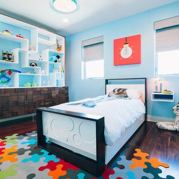
Modern light aqua blue bedroom for video game and astronaut loving 6 year old boy. To take full advantage of a large empty wall I designed a custom bookshelf to fit on top of the modern dresser. The result was playful statement piece with lots of practical and fun storage, and a display for toys and decor. We hung a acrylic bubble chair in the other corner of the room and added white and silver upholstered “pixels” for a fun video game feel and to protect the walls. One of the more obvious way we incorporated the space vibes was with life-sized astronaut bedding.
Design: Little Crown Interiors
Photos: Full Spectrum Photography

 PapersNetwork
It's known as the PISA/TIMSS voyaging convoy. Every time worldwide tests results are discharged with association tables indicating champs and failures a gaggle of scientists, scholastics and grouped kindred explorers plummet on the most astounding performing nation or instruction framework to break down and write about "world's best practice".
The objective continues evolving
One issue with thusly of deduction is that nobody framework reliably beats the rest. In light of the 1995 and 1999 TIMSS (Trends in International Math and Science Study) results, Asian instruction frameworks in Singapore, Japan, South Korea and Taiwan overwhelmed. Accordingly, the emphasis was immovably on recognizing the reasons the Asian tigers were performing so well.
In the PISA (Program for International Student Assessment) 2000 results, Finland positioned first in education, fourth in arithmetic and third in science. Finland became the overwhelming focus and specialists and scholastics ran to Helsinki to find the reasons Finnish understudies performed at or close to the highest point of the table.
By 2012, at the end of the day, an alternate training framework turned into the focal point of consideration. Finland descended the PISA rankings as another champ, Shanghai, rose as first in arithmetic, science and perusing.
Apples aren't being contrasted with apples
A second issue when making correlations is that the spots we've recognized as examples of overcoming adversity are distinctive to Australia. City-states like Singapore and instruction frameworks in profoundly performing spots like Hong Kong and Shanghai have remarkable qualities that separate them from nations like Australia, England and the USA.
Contrasts in topography, the quantities of understudies and schools, the understudy cosmetics (as far as dialect, society and financial profile) and how schools, including educational modules and appraisal, are organized and oversaw significantly affect results.
Singapore, when contrasted with Australia, is little topographically, more homogenous as far as dialect and culture and utilizes instructive practices that have long been out of support in Australia. These incorporate gushing kids in view of their abilities, and high-chance, focused tests and examinations.
As noted in a paper titled How not to prevail upon PISA information: an unexpected examination, there are additionally social components clarifying solid execution that are troublesome, if not unimaginable, to exchange starting with one instruction framework then onto the next.
Evident cases incorporate the effect of Confucian qualities and morals that stretch appreciation for power (particularly instructors), the conviction that achievement is conceivable with inspiration, fixation and diligent work, and the thought that training is focal if one is to accomplish a superior life.
Confounding circumstances and end results
Befuddling what has driven these nations to achievement speaks to the third trouble in expecting that what seems to prompt accomplishment in one nation can without much of a stretch be exchanged to another.
To expect that everything we need to do in Australia to enhance test outcomes is to lessen the impact of the Australian Education Union, while being appealing to some, is both undemocratic and blameworthy of accepting circumstances and end results.
There are a few advantages of abroad correlations
PISA and TIMSS tests have been held for a long time. Thus, there is a decent arrangement of examination recognizing the attributes of more grounded performing instruction frameworks from which states and domains can learn.
The early ethnographic work recording Japanese and American classes nitty gritty in Harvard distribution The Teaching Gap uncovers how the lessons in Asian classrooms are more unequivocal, obviously organized and sound and there is a desire that all understudies, with the essential offer and applications, some assistance with canning succeed.
A later distribution by the Grattan Institute, Catching up: gaining from the best educational systems in East Asia, likewise distinguishes imperative lessons from fruitful Asian instruction frameworks.
Positive variables incorporate giving instructors more opportunity to work cooperatively and to tutor each other, guaranteeing that educator training, course readings and the educational modules are commonly steady and concentrate on enhancing classroom rehearse.
It ought to additionally be noticed that while Australian understudies don't perform in the top level in PISA and TIMSS tests, there is some reason for festivity. Understudies in the Australian Capital Territory perform well over the Australian normal and frequently coordinate the execution of top-performing abroad instruction frameworks.
As far as lifting the execution of understudies from distraught foundations it is additionally critical to take note of that Catholic schools, in light of an investigation of the 2009 PISA results completed by the Australian Council for Educational Research, accomplish a value rating surpassing that of Finland.
About the Author: Amy Parker writes too many academic papers for people who have troubles with it. She always gives needed advices, shows the examples of the papers and helps with writing at http://papersnetwork.net
 Almesedoors
FINISH: PRIMED
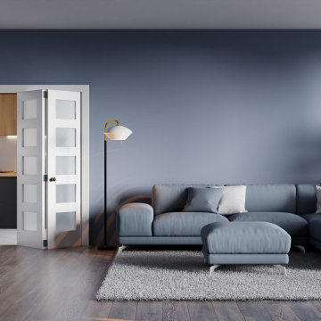
The advantages of this approach – of this type of interior door finish – are fairly obvious. Pick a color, any color that suits your projects best. Mix and apply. Re- coat whenever you feel it is necessary to do so. Touch it up. It gives you, the proud owner of these interior doors, complete freedom of choice, and the significant savings, especially where it comes to bulk orders, can be a true source of joy.
As Kurt Vonnegut mentions in one of his novels (Bluebeard, unless I’m mistaken … check it out when you get a chance), the thrill of laying on colors is a large part of the artist’s professional satisfaction. In other words, a keen pleasure.
When back in the remote past visual arts became a field dominated by professionals rather than hobbyists, the main problem of “just laying on paint” became obvious: you can’t.
The medium of choice back then was egg tempera, a permanent, fast-drying substance consisting of colored pigments mixed with a water-soluble binder medium, usually glutinous material such as egg yolk. Portraits and ornaments were executed in this medium, and the wood panel was the surface of choice. One of tempera’s interesting features is that it is not as easily absorbed by wood as other mediums. Some sort of primer was necessary, of course, but pretty much any substance that dried evenly could be used.
The drawbacks of tempera, or pintura al temple, as the Spanish call it, only became obvious with the advent of the Renaissance, when the leading representatives of the trade turned to oil (and interior doors suddenly became a great deal less crude, but that’s a story for another day).
Oil painting is the process of “painting with pigments with a medium of drying oil as the binder.” Commonly used types include linseed (highly preferable in art, though not necessarily in interior doors, mind you), poppy seed, walnut, and safflower.
Today, five hundred years later, it is safe to say that oil is more versatile than pintura al temple – by orders of magnitude. Specifically, the contrasts achieved through the former are much greater, the darks are far deeper, and three- dimensional, highly realistic images are much easier to achieve. Next time you visit a museum, take a closer look at pintura al temple portraits. All of them, without exception, come off as a bit “flat” as opposed to their latter-day counterparts.
Also, where glazing is concerned …
Glazing: a painting technique in which a transparent layer, with just a touch of pigment, is laid over a previously painted surface, allowing light to travel through the glaze and be reflected back off of the opaque layer below. Gentle shadows, subtle changes of color, smooth transitions – all these can be achieved through glazing, which was used by all artists up until the middle of the Nineteenth Century, when artist tubes were invented, revolutionizing the field, and other techniques began to be explored.
Tempera enthusiasts (it takes all kinds to make a world) will assure you that glazing is not just possible in pintura al temple but is actually the basis of the whole enterprise. Well, what are you going to do? They’re enthusiasts.
Anyway, la peinture à l'huile, as the French call it, re-introduced the ancient problem of most surface’s propensity to absorb dipingere, as the Italians call the stuff. Wood or canvas, it is all the same: you’re not going to get very far without a good primer.
Experiments were conducted, and soon rabbit skin glue emerged as the least expensive and most effective solution. It was easy to apply. It dried evenly. It made the application of the l’huile stuff on top of it a walk in the park.
There were drawbacks. Today, rabbit skin glue is considered to be a major cause of cracking by most modern conservators. (Remember, when you visited the Metropolitan Museum of Art – and did you see those interior doors? … some of them are quite something … - most “old masters” pictures are completely covered with a cobweb of cracks? There you go). Because the glue is hygroscopic, it continually absorbs moisture from the atmosphere, causing the glue to swell and shrink as ambient humidity levels change. Over many humidity cycles, this repeated flexing causes the brittle oily layers to crack.
To combat this problem, modern primers are made of acrylic materials which are guaranteed not to cause any damage to the dipingere. No bubbling, no cracks. Your interior doors are safe.


 Peter Q Brown Innovative Design
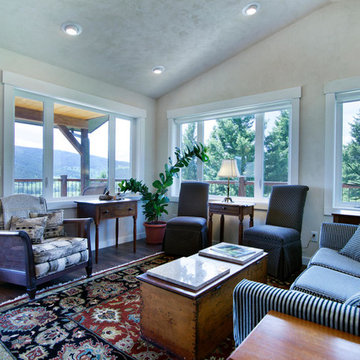
The decision to go small is about her personal values, committing to a lifestyle, and living within her means. The move to design small is a subjective decision that weighs in on a number of factors that can’t possibly be summed up in one statement, but the obvious benefits jump to the front...easier to maintain, less cleaning, less expensive, less debt, less environmental impact, less temptation to accumulate. Her design requirements were simple, small footprint less than 1000 sq. ft., garage below the living area, and take advantage of the amazing view. It’s smaller than the average house, but designed in a way that it won’t feel like a shoebox. My client thought long and hard about downsizing her home and her lifestyle, and she couldn’t be happier
 Nanette Wong
Photo: Nanette Wong © 2014 Houzz
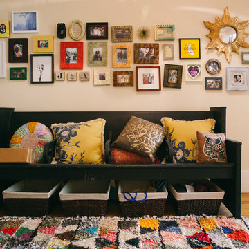
Example of an eclectic light wood floor living room design in San Francisco with beige walls
Example of an eclectic light wood floor living room design in San Francisco with beige walls


 Better Builders
When Better Builders approached this whole house remodel, the main goals were to update, brighten and refresh the home. When looking at the before and after photos of this Kent home, the space needed some serious help. The home we came into was dark and closed off. The fixtures and finishes were also extremely dated. The homeowners were ready to take on a project to bring their home up to the standards that would reflect their personal taste.
One of the biggest changes in this home was taking out the wall in front of the kitchen to open up the space. Replacing the wall with two support pillars helped bring more light and energy to the surrounding kitchen, living and dining spaces. Another major change was the transition from carpet throughout to continuous hardwood floors. While it may seem like a simple or obvious choice, the move away from carpet brings a whole new life to a room.
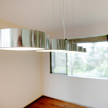
The kitchen was updated with all new appliances, cabinetry and brand new island with built-in storage. Taking advantage of all of the natural light that came with removing the walls surrounding the kitchen was paramount. Finishing the dining area with a new modern light fixture was the finishing touch for a luxurious yet understated space. The bathrooms that started off dark and out of date were transformed with new flooring, tub and shower surround, fresh bright paint and modern fixtures.
 Byggmeister Inc
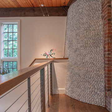
Architectural designer Bill Harper worked closely with the new homeowners to reimagine the uses of the various first floor spaces:
• An obvious first measure was one we’ve done at many homes: Combine the kitchen with the separate (and too-small) adjacent dining room by eliminating the wall between. This opened up the kitchen and provided an informal eating area.
• The prior living room had an awkward shape for a living room (too long relative to its width) but was perfect as a new formal dining room.
• We moved the living room to the former lower-level dining room but connected it more elegantly (and conveniently) to the kitchen by adding a short, straight stair—and also a balcony that serves as a wider, more welcoming path from the entry foyer to the kitchen.
• Another obvious change was to eliminate the first-floor shower and take advantage of the freed-up space to create a combination laundry-powder room off the kitchen (but not right off the kitchen), thereby rescuing the washer and dryer from the basement.
-Photos by Jim Raycroft
 Carolyn Reyes
Photo: Carolyn Reyes © 2015 Houzz
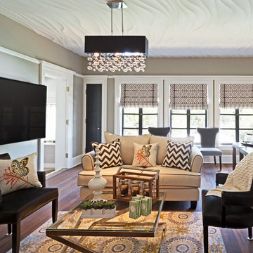
Family Room, main house
Design team: Surfaces USA
Inspiration for a timeless family room remodel in Los Angeles
Inspiration for a timeless family room remodel in Los Angeles
 Peter Q Brown Innovative Design
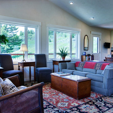
The decision to go small is about her personal values, committing to a lifestyle, and living within her means. The move to design small is a subjective decision that weighs in on a number of factors that can’t possibly be summed up in one statement, but the obvious benefits jump to the front...easier to maintain, less cleaning, less expensive, less debt, less environmental impact, less temptation to accumulate. Her design requirements were simple, small footprint less than 1000 sq. ft., garage below the living area, and take advantage of the amazing view. It’s smaller than the average house, but designed in a way that it won’t feel like a shoebox. My client thought long and hard about downsizing her home and her lifestyle, and she couldn’t be happier
 Peter Q Brown Innovative Design
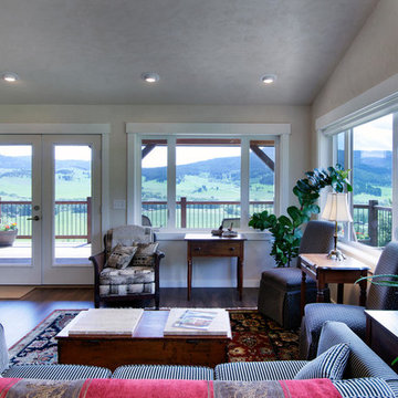
The decision to go small is about her personal values, committing to a lifestyle, and living within her means. The move to design small is a subjective decision that weighs in on a number of factors that can’t possibly be summed up in one statement, but the obvious benefits jump to the front...easier to maintain, less cleaning, less expensive, less debt, less environmental impact, less temptation to accumulate. Her design requirements were simple, small footprint less than 1000 sq. ft., garage below the living area, and take advantage of the amazing view. It’s smaller than the average house, but designed in a way that it won’t feel like a shoebox. My client thought long and hard about downsizing her home and her lifestyle, and she couldn’t be happier
 River Valley Landscapes
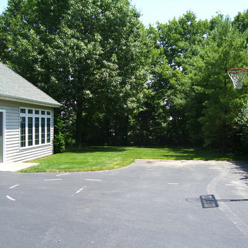
Before - After many years of having no outdoor living space and dealing with overgrown plants and trees the owner’s decided it was time to revitalize their backyard. They knew they wanted a large sitting area with a wood burning fireplace, room for outdoor dining and a place for the grill. A connecting walk would be needed to get guests from the driveway to the outdoor space. Last but not least, the owners wanted the ability to and a reason for stepping out of their unusable patio doors.
The designers decided from the start the fireplace would be the prominent feature and focal point for the entire project. A large fireplace accented with sitting walls and arbors was positioned to anchor the corner of the patio. Stone was chosen to set the fireplace apart as its own element. Brick was used for the sitting walls and brick accents were added to the fireplace to tie into the house. An inlaid herringbone brick detail was incorporated above the stone mantle to simulate artwork which is typically found above indoor fireplaces. Flagstone was used for the wall caps and hearth to match the patio and thicker flagstone tread stock was used for the mantle and top. The arbors were added to visually balance the pergolas at the opposite side of the patio.
For the patio the designers created a series of offset spaces to help subtly divide the space into two areas, sitting and dining. Two large existing trees also help dictate the shape of the patio. Cut flagstone was chosen for the surface bordered by a double soldier edge of brick. The brick edging also surrounds a decorative gravel area topped with an urn fountain which provides a secondary focal point and the sound of water. Large flagstone treads were used for the steps leading to the previously unused patio doors. Opposite the fireplace a short walk leads to a square transition area with a statue chosen by the owner. The statue provides a strong focal point when entering from the driveway. A longer walk leads from this space along the house to the driveway.
The pergolas and arbors were designed by the landscape designer as part of this project but were ultimately contracted separately by the owner. The larger square pergola was intended as an area for a bench or two separate from the main patio. The longer pergola was added later in the design phase to help provide shade to the interior of the house. The arbors at the fireplace were added to balance out the wood elements at the opposite side while adding additional architectural interest to the fireplace.
While this project was predominantly hardscaping, planting and lighting were also incorporated into the design. Several large existing trees were retained and serious of smaller understory trees were added to help enclose the space. The designer’s took advantage of the large trees to place down lights on the branches to achieve a moonlight effect at night. Additional lighting was used on the pergola, to accent focal points, to up light the smaller trees and around the patio. Massed planting of Japanese forest grass provides bold foliage color for the shady garden. A mulch path leads off behind the fireplace to another garden and a secluded area ideal for a bench or small table and chairs. Additional plantings were added along the rear property line to screen and unsightly fence.
This project has obviously completely changed the way the owners use their backyard. They now have a seamless transition from indoors to outdoors with the use of the patio doors. The large patio allows for entertaining small gatherings outdoors for the first time. The fireplace has definitely become the primary gathering place for family and friends.
 Little Crown Interiors
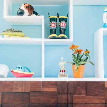
Modern light aqua blue bedroom for video game and astronaut loving 6 year old boy. To take full advantage of a large empty wall I designed a custom bookshelf to fit on top of the modern dresser. The result was playful statement piece with lots of practical and fun storage, and a display for toys and decor. We hung a acrylic bubble chair in the other corner of the room and added white and silver upholstered “pixels” for a fun video game feel and to protect the walls. One of the more obvious way we incorporated the space vibes was with life-sized astronaut bedding.
Design: Little Crown Interiors
Photos: Full Spectrum Photography
 Byggmeister Inc
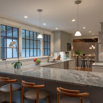
Architectural designer Bill Harper worked closely with the new homeowners to reimagine the uses of the various first floor spaces:
• An obvious first measure was one we’ve done at many homes: Combine the kitchen with the separate (and too-small) adjacent dining room by eliminating the wall between. This opened up the kitchen and provided an informal eating area.
• The prior living room had an awkward shape for a living room (too long relative to its width) but was perfect as a new formal dining room.
• We moved the living room to the former lower-level dining room but connected it more elegantly (and conveniently) to the kitchen by adding a short, straight stair—and also a balcony that serves as a wider, more welcoming path from the entry foyer to the kitchen.
• Another obvious change was to eliminate the first-floor shower and take advantage of the freed-up space to create a combination laundry-powder room off the kitchen (but not right off the kitchen), thereby rescuing the washer and dryer from the basement.
-Photos by Jim Raycroft
 Peter Q Brown Innovative Design
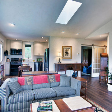
The decision to go small is about her personal values, committing to a lifestyle, and living within her means. The move to design small is a subjective decision that weighs in on a number of factors that can’t possibly be summed up in one statement, but the obvious benefits jump to the front...easier to maintain, less cleaning, less expensive, less debt, less environmental impact, less temptation to accumulate. Her design requirements were simple, small footprint less than 1000 sq. ft., garage below the living area, and take advantage of the amazing view. It’s smaller than the average house, but designed in a way that it won’t feel like a shoebox. My client thought long and hard about downsizing her home and her lifestyle, and she couldn’t be happier
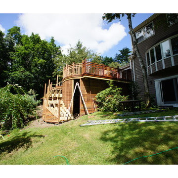
 Dvisionone Architects
under construction deck showing steeply sloping site. Ocatgonal faceted segment stair wraps backside of upper deck tier and connects to basement.
Designed by Michael Raso, AIA
3