
Search results for "Occasional update" in Home Design Ideas
 Elizabeth Frost Designs
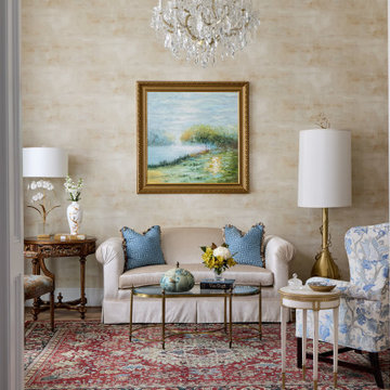
This elegant traditional sitting room blends timeless European-inspired design with a fresh, sophisticated color palette. A neutral upholstered settee anchors the space, accented with blue geometric throw pillows and a graceful blue-and-white floral accent chair. An antique-style red Persian rug adds warmth, pattern, and collected character while grounding the room’s refined furnishings.
A softly textured neutral wall treatment creates an understated backdrop for the framed landscape artwork, while an ornate crystal chandelier, warm brass lighting, carved wood furniture, and delicate occasional tables introduce layers of classic detail. The mix of antique-inspired furnishings, blue-and-white décor, brass accents, original artwork, and traditional textiles gives the room an intentionally collected-over-time aesthetic.
Designed as an intimate formal sitting room and conversation space, this interior demonstrates how traditional design can feel luxurious and inviting rather than overly formal. The thoughtful combination of European-inspired interiors, classic furnishings, layered patterns, warm neutrals, blue accents, vintage-style rugs, and sophisticated lighting creates a timeless room with an elevated residential feel.

 Zelaya Properties LLC
We used: Custom cherry cabinetry in Arts & Crafts Shaker style by Kabinart in Boulder and Espresso stains. Liberty Hardware Venetian bronze 1-1/2" cabinet knobs. KitchenAid Architect II Series 22 CF counter-depth French door refrigerator. KitchenAid Architect Series II 27" convection single wall oven. KitchenAid 36" 6-burner dual fuel freestanding commercial-style range. KitchenAid Architect II Series 24" dishwasher. Sharp Insight Pro Series 24" built-in microwave drawer (Model #KB6524PS). Crystorama Solaris 12" wide pendant lights in English bronze. Granite countertops in Brown Fantasy. 3"x6" polished marble backsplash.
Paint colors:
Walls: Glidden Silver Cloud 30YY 63/024
Ceilings/Trims/Doors: Glidden Swan White GLC23
Robert B. Narod Photography
 Elizabeth Frost Designs
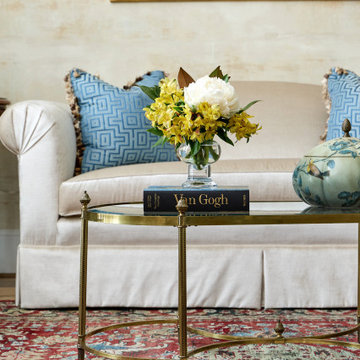
This elegant traditional sitting room blends timeless European-inspired design with a fresh, sophisticated color palette. A neutral upholstered settee anchors the space, accented with blue geometric throw pillows and a graceful blue-and-white floral accent chair. An antique-style red Persian rug adds warmth, pattern, and collected character while grounding the room’s refined furnishings.
A softly textured neutral wall treatment creates an understated backdrop for the framed landscape artwork, while an ornate crystal chandelier, warm brass lighting, carved wood furniture, and delicate occasional tables introduce layers of classic detail. The mix of antique-inspired furnishings, blue-and-white décor, brass accents, original artwork, and traditional textiles gives the room an intentionally collected-over-time aesthetic.
Designed as an intimate formal sitting room and conversation space, this interior demonstrates how traditional design can feel luxurious and inviting rather than overly formal. The thoughtful combination of European-inspired interiors, classic furnishings, layered patterns, warm neutrals, blue accents, vintage-style rugs, and sophisticated lighting creates a timeless room with an elevated residential feel.
Find the right local pro for your project
 Elizabeth Frost Designs
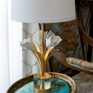
This elegant traditional sitting room blends timeless European-inspired design with a fresh, sophisticated color palette. A neutral upholstered settee anchors the space, accented with blue geometric throw pillows and a graceful blue-and-white floral accent chair. An antique-style red Persian rug adds warmth, pattern, and collected character while grounding the room’s refined furnishings.
A softly textured neutral wall treatment creates an understated backdrop for the framed landscape artwork, while an ornate crystal chandelier, warm brass lighting, carved wood furniture, and delicate occasional tables introduce layers of classic detail. The mix of antique-inspired furnishings, blue-and-white décor, brass accents, original artwork, and traditional textiles gives the room an intentionally collected-over-time aesthetic.
Designed as an intimate formal sitting room and conversation space, this interior demonstrates how traditional design can feel luxurious and inviting rather than overly formal. The thoughtful combination of European-inspired interiors, classic furnishings, layered patterns, warm neutrals, blue accents, vintage-style rugs, and sophisticated lighting creates a timeless room with an elevated residential feel.
 Elite Wallpaper Installers
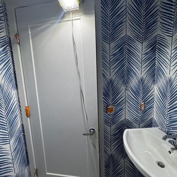
Make a stunning statement with our premium powder room wallpaper installation, designed to elevate Parker’s most stylish homes. Our expert wallpaper installers specialize in transforming compact spaces into dramatic design showcases that impress your guests.
Powder Room Wallpaper Specialties
✔ Bold Pattern Statements – Maximalist prints for high-impact style
✔ Metallic & Gloss Finishes – Reflects light beautifully in windowless spaces
✔ Textured Grasscloths – Adds sophisticated depth to small walls
✔ Humidity-Resistant Vinyls – Handles occasional splashes
✔ Ceiling-to-Floor Designs – Creates immersive, high-end appeal
The Parker Advantage
✅ 1-Day Transformations – Quick updates with zero hassle
✅ Small-Space Precision – Flawless execution in tight quarters
✅ Fixture-Perfect Installation – Seamless work around sinks and mirrors
✅ Designer Collaboration – Work with your decorator or our stylists
✅ Free Material Samples – See options in your home’s lighting
Trending Powder Room Styles
• Modern Mountain – Aspen tree silhouettes and rustic textures
• Denver Chic – High-contrast geometrics with metallic accents
• Equestrian Elegance – Subtle leather and horseshoe motifs
• Prairie Modern – Organic wheat patterns and warm neutrals
Serving Parker’s Finest Homes – From Stonegate to Canterberry. Turn your powder room into a showstopper – contact us today!
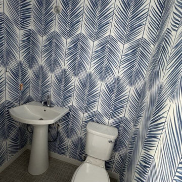 Elite Wallpaper Installers
Make a stunning statement with our premium powder room wallpaper installation, designed to elevate Parker’s most stylish homes. Our expert wallpaper installers specialize in transforming compact spaces into dramatic design showcases that impress your guests.
Powder Room Wallpaper Specialties
✔ Bold Pattern Statements – Maximalist prints for high-impact style
✔ Metallic & Gloss Finishes – Reflects light beautifully in windowless spaces
✔ Textured Grasscloths – Adds sophisticated depth to small walls
✔ Humidity-Resistant Vinyls – Handles occasional splashes
✔ Ceiling-to-Floor Designs – Creates immersive, high-end appeal
The Parker Advantage
✅ 1-Day Transformations – Quick updates with zero hassle
✅ Small-Space Precision – Flawless execution in tight quarters
✅ Fixture-Perfect Installation – Seamless work around sinks and mirrors
✅ Designer Collaboration – Work with your decorator or our stylists
✅ Free Material Samples – See options in your home’s lighting
Trending Powder Room Styles
• Modern Mountain – Aspen tree silhouettes and rustic textures
• Denver Chic – High-contrast geometrics with metallic accents
• Equestrian Elegance – Subtle leather and horseshoe motifs
• Prairie Modern – Organic wheat patterns and warm neutrals
Serving Parker’s Finest Homes – From Stonegate to Canterberry. Turn your powder room into a showstopper – contact us today!
 Elite Wallpaper Installers
Make a stunning statement with our premium powder room wallpaper installation, designed to elevate Parker’s most stylish homes. Our expert wallpaper installers specialize in transforming compact spaces into dramatic design showcases that impress your guests.
Powder Room Wallpaper Specialties
✔ Bold Pattern Statements – Maximalist prints for high-impact style
✔ Metallic & Gloss Finishes – Reflects light beautifully in windowless spaces
✔ Textured Grasscloths – Adds sophisticated depth to small walls
✔ Humidity-Resistant Vinyls – Handles occasional splashes
✔ Ceiling-to-Floor Designs – Creates immersive, high-end appeal
The Parker Advantage
✅ 1-Day Transformations – Quick updates with zero hassle
✅ Small-Space Precision – Flawless execution in tight quarters
✅ Fixture-Perfect Installation – Seamless work around sinks and mirrors
✅ Designer Collaboration – Work with your decorator or our stylists
✅ Free Material Samples – See options in your home’s lighting
Trending Powder Room Styles
• Modern Mountain – Aspen tree silhouettes and rustic textures
• Denver Chic – High-contrast geometrics with metallic accents
• Equestrian Elegance – Subtle leather and horseshoe motifs
• Prairie Modern – Organic wheat patterns and warm neutrals
Serving Parker’s Finest Homes – From Stonegate to Canterberry. Turn your powder room into a showstopper – contact us today!

 The Yellow Cape Cod
This semi-casual living space was created by Home Stylist, Sarah Macklem of The Yellow Cape Cod. Sarah created two separate zones in this large open space. One end of the room is a reading nook with a pair of accent chairs and ottoman next to the bookcase. The other end of the space is a conversation zone created by a pair of arm chairs, a sumptuous sofa and occasional tables. Touches of whimsy were incorporated to keep the mood light. More information on this space can be found at http://www.theyellowcapecod.com Photography by Sarah Macklem


 Safferstone Interiors
The Updated Traditional
Meet Kim: a partner in a downtown law firm. To say that she is short on time is a giant understatement. In the rare event she has a free moment, she wants to spend it with her kids, not fussing over home decor.
That’s my cue!
Kim is my favorite type of client. She didn’t know where to go or what to do. She leaned on me to explain and articulate design and style.
She looked to me to make her home a mirror of her best self. Easy peasy lemon squeezy. Fantastic human giving me a blank slate? Yes please!
While Kim’s traditional home had a great layout and good bones, it needed updating to make it contemporary and fresh. It needed fixtures and knobs from this century. It needed a Lulu DK roman shade in the powder room. It needed a durable, snuggle-ready sofa with tufting and little patterns of texture. It needed drapery with small-scale drama. Throw in a Thomas O’ Brian cocktail table, and now there’s no shortage of conversation pieces.
Little spaces make me happy – they are the most intimate snapshot of your entire home’s aesthetic – and this house has some good ones.
I couldn’t wait to work with the nooks and crannies of this house. Kim’s sitting room, a small den off of the master bedroom, morphed into a craveable cozy space, a quiet adult respite from the occasional chaos of raising a family. The kitchen evolved into something quite unique: playful yet modest, dressed-up but centered. We used a favorite Lucy Rose fabric and Galbraith & Paul pillows to work perfectly with a fresh color palette selected during a prior-to-me renovation. A locally made kitchen farm table fit right in with the high-fashioned quirky blend of color, texture, and pattern.
High-End + Color = Fun + Functional
This is how we articulated Kim’s style and personality. She trusted me with her inner self, allowing me to get to know her and her real, everyday life. I built her a special space to reflect the beautiful life she made for herself. Nothing too fancy or off-limits to little hands, nothing too stuffy (snore!). Everything 100% HER. #nailedit See more Safferstone stuff at www.safferstone.com. Connect with us on Facebook, get inspired on Pinterest, and share modern musings on life & design on Instagram. Or, send us a love note at hello@safferstone.com.
Photo: Angie Seckinger

 Floor Coverings International of East Lake
Example of a large classic hallway design in Tampa with yellow walls
 Safferstone Interiors
Meet Kim: a partner in a downtown law firm. To say that she is short on time is a giant understatement. In the rare event she has a free moment, she wants to spend it with her kids, not fussing over home decor.
That’s my cue!
Kim is my favorite type of client. She didn’t know where to go or what to do. She leaned on me to explain and articulate design and style.
She looked to me to make her home a mirror of her best self. Easy peasy lemon squeezy. Fantastic human giving me a blank slate? Yes please!
While Kim’s traditional home had a great layout and good bones, it needed updating to make it contemporary and fresh. It needed fixtures and knobs from this century. It needed a Lulu DK roman shade in the powder room. It needed a durable, snuggle-ready sofa with tufting and little patterns of texture. It needed drapery with small-scale drama. Throw in a Thomas O’ Brian cocktail table, and now there’s no shortage of conversation pieces.
Little spaces make me happy – they are the most intimate snapshot of your entire home’s aesthetic – and this house has some good ones.
I couldn’t wait to work with the nooks and crannies of this house. Kim’s sitting room, a small den off of the master bedroom, morphed into a craveable cozy space, a quiet adult respite from the occasional chaos of raising a family. The kitchen evolved into something quite unique: playful yet modest, dressed-up but centered. We used a favorite Lucy Rose fabric and Galbraith & Paul pillows to work perfectly with a fresh color palette selected during a prior-to-me renovation. A locally made kitchen farm table fit right in with the high-fashioned quirky blend of color, texture, and pattern.
High-End + Color = Fun + Functional
This is how we articulated Kim’s style and personality. She trusted me with her inner self, allowing me to get to know her and her real, everyday life. I built her a special space to reflect the beautiful life she made for herself. Nothing too fancy or off-limits to little hands, nothing too stuffy (snore!). Everything 100% HER. #nailedit See more Safferstone stuff at www.safferstone.com. Connect with us on Facebook, get inspired on Pinterest, and share modern musings on life & design on Instagram. Or, send us a love note at hello@safferstone.com.
Photo: Angie Seckinger
 Pierre Jean-Baptiste Interiors
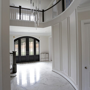
Our latest redesign of this home’s main level seamlessly blends architectural elegance with contemporary comfort. The foyer now makes a striking first impression, featuring refined wall molding, a fresh coat of paint, and a custom veneer bench seat. A breathtaking chandelier in polished nickel and crystal serves as the focal point, adding a layer of timeless sophistication. Moving into the family room, we introduced a textured Manila hemp wallpaper on the ceiling, evoking the soft movement of clouds. The fireplace was refaced in quartz while the existing mantel was carefully reapplied per the client’s request. A 14-foot curved performance fabric sofa, complemented by custom velvet throw pillows, sets the stage for a welcoming yet luxurious space. To enhance the room’s flow, we incorporated a 10-foot diameter rug that follows the sofa’s elegant curve, along with new drapery, swivel chairs, and carefully selected occasional tables.
Storage and smart functionality were key in this redesign. Custom cabinetry flanking the fireplace provides ample storage while floating shelves above, equipped with smart home-enabled LED strip lighting, showcase thoughtfully curated accessories. In the powder room, we introduced an ebony veneer push-to-open custom vanity topped with a striking Calacatta Viola marble sink. A custom mirror and premium light fixtures accentuate the rich new paint colors, elevating this small yet impactful space. The result is a refined, harmonious interior that reflects both the home’s architecture and the client’s desire for warmth and sophistication.
Tags: interior design, home renovation, foyer design, luxury interiors, modern classic style, family room makeover, fireplace redesign, custom cabinetry, smart home integration, powder room update, bespoke furniture, home decor, elegant interiors, ceiling wallpaper, LED lighting, high-end finishes, design inspiration, contemporary home, architectural details, home styling
 Safferstone Interiors
Meet Kim: a partner in a downtown law firm. To say that she is short on time is a giant understatement. In the rare event she has a free moment, she wants to spend it with her kids, not fussing over home decor.
That’s my cue!
Kim is my favorite type of client. She didn’t know where to go or what to do. She leaned on me to explain and articulate design and style.
She looked to me to make her home a mirror of her best self. Easy peasy lemon squeezy. Fantastic human giving me a blank slate? Yes please!
While Kim’s traditional home had a great layout and good bones, it needed updating to make it contemporary and fresh. It needed fixtures and knobs from this century. It needed a Lulu DK roman shade in the powder room. It needed a durable, snuggle-ready sofa with tufting and little patterns of texture. It needed drapery with small-scale drama. Throw in a Thomas O’ Brian cocktail table, and now there’s no shortage of conversation pieces.
Little spaces make me happy – they are the most intimate snapshot of your entire home’s aesthetic – and this house has some good ones.
I couldn’t wait to work with the nooks and crannies of this house. Kim’s sitting room, a small den off of the master bedroom, morphed into a craveable cozy space, a quiet adult respite from the occasional chaos of raising a family. The kitchen evolved into something quite unique: playful yet modest, dressed-up but centered. We used a favorite Lucy Rose fabric and Galbraith & Paul pillows to work perfectly with a fresh color palette selected during a prior-to-me renovation. A locally made kitchen farm table fit right in with the high-fashioned quirky blend of color, texture, and pattern.
High-End + Color = Fun + Functional
This is how we articulated Kim’s style and personality. She trusted me with her inner self, allowing me to get to know her and her real, everyday life. I built her a special space to reflect the beautiful life she made for herself. Nothing too fancy or off-limits to little hands, nothing too stuffy (snore!). Everything 100% HER. #nailedit See more Safferstone stuff at www.safferstone.com. Connect with us on Facebook, get inspired on Pinterest, and share modern musings on life & design on Instagram. Or, send us a love note at hello@safferstone.com.
Photo: Angie Seckinger
 Fiorito Interior Design
In the early days of the global pandemic of 2021, my client decided to leave a more densely populated city environment in favor of a more suburban atmosphere with fewer people, where things are less crowded. They found a Tudor-style home built in the 1980s and set about updating it to make it their own. When my client contacted me, one of her top priorities in the home was a complete kitchen renovation for which she already had some very clear ideas. She came to the project with colors and overall feel so it was a delight to collaborate with her to bring her vision to life.
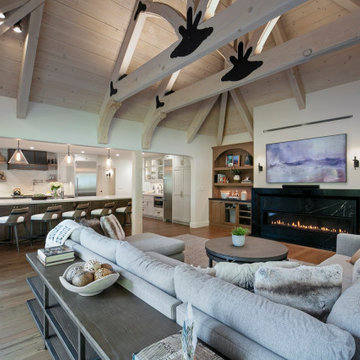
The original kitchen was wedged between a large two-story entry hall at the front, and a spacious beamed family room at the rear. Dated dark red oak and heavy 1980s cabinetry weighed down the room, and my client desperately wanted light and lightness. Working with Lewis Construction, we took down the walls that closed the kitchen off from the family room and the resulting space allowed for a generous island. We worked together to refine a cabinet color and a wood stain for the custom cabinetry by Schmitz Woodworks, and a tone of countertop material that would be a perfect compliment to our cabinetry choices. And I found lighting that speaks to the Tudor style of the house while bringing a sense of airiness—the seeded glass island pendants are perfect partners to the round wrought-iron fixture with candles in the adjoining dining room. Wood, brass, and abaca kitchen stools at the island bring a sense of history and California cool.
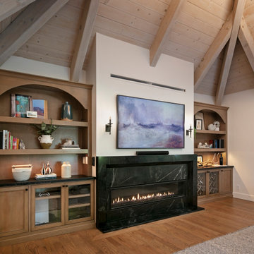
In the adjoining bland family room, my client removed an ugly river stone fireplace and replaced it with a linear gas insert. I designed built-in bookcases flanking the fireplace to give the entire wall more presence. My client fell in love with a piece of dark soapstone and I used it to design a chunky, uniquely beveled surround to ground the fire box.
The entry also got a makeover. We worked with a painter to disguise the ugly 80s red oak on the stairs, and I furnished the area with contemporary pieces that speak to a Tudor sensibility: a “quilted” chest with nail heads; an occasional chair with a quatrefoil back; a wall mirror that looks as if the Wicked Queen in Snow White used it; a rug that has the appearance of a faded heirloom; and a swarm of silver goblets creating a wall art installation that echoes the nail heads on the chest.
Photo: Rick Pharaoh
 Drury Design
Our clients were ready to update their kitchen with soft and subtle colors to blend in with the home’s recently updated interior. It was also time to improve the layout. The kitchen needed to be reconfigured in order to facilitate a three-generation family and occasional entertaining.
Design Objectives
-Brighten up to blend with the home’s interior and flow into the adjacent family room area
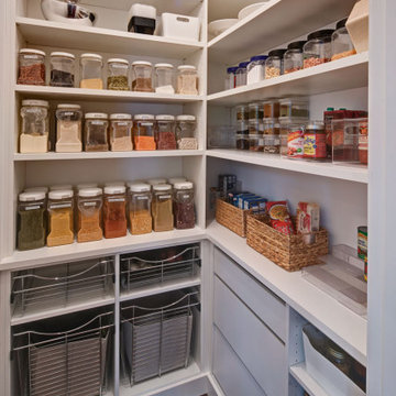
-Incorporate specific storage for pantry items like bulk ingredients and small appliances
-Designate areas for a coffee bar, multiple prep areas and seating while highlighting a dry bar for display
-Keep clutter off of counters for a seamless design that facilitates visual flow through the entire area
Design Challenges
-Make a subtle statement with contrasting cabinets and countertops
-Incorporate a stand-alone, statement-making dry bar just outside the main kitchen space
-Design a statement hood that serves as a focal point without interrupting visual flow
-Update and add lighting to add more task, accent and overhead brightness.
-Have the space be usable for different tasks by different family members at the same time
-Create a space that looks classy and formal but is still inviting.
Design Solutions
-A soft grey stain and white paint were used on all the cabinets. On only the wall cabinets flanking the window was the grey introduced on the frame to make a pop against the white paint.
-The white-painted refrigerator and freezer door panel style is a custom reeded look that adds a soft contrasting detail against the main door style. Along with the open grey-stained interior cabinet above, it looks like a piece of furniture.
-The same soft tones were used for the countertops and a full, high backsplash of Chamonix quartzite that tied everything together. It’s an elegant backdrop for the hood.
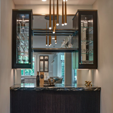
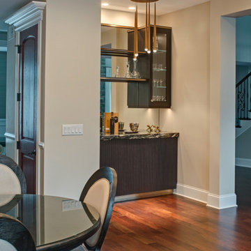
-The Dry Bar, even though showcasing a dark stained cabinet, stays open and bright with a full mirror backsplash, wood retained glass floating shelves and glass wall cabinet doors. Brushed brass trim details and a fun light fixture add a pop of character.
-The same reeded door style as the refrigerator was used on the base doors of the dry bar to tie in with the kitchen.
-About 2/3 of the existing walk-in pantry was carved out for the new dry bar footprint while still keeping a shallow-depth pantry space for storage.
-The homeowners wanted a beautiful hood but didn’t want it to dominate the design. We kept the lines of the hood simple. The soft stainless steel body has a bottom accent that incorporates both the grey stain and white-painted cabinet colors.
-Even though the Kitchen had a lot of natural light from the large window, it was important to have task and subtle feature lighting. Recessed cans provide overall lighting while clear pendants shine down on the 2nd level of the seating area on the island.
-The circular clear chandelier is the statement piece over the main island while the pendants flanking the hood emphasize the quartzite backsplash and add as accent lighting in the evening along with the interior cabinet lights.
With three generations living in the home it was important to have areas that multiple family members could use at the same time without being in each other’s way. The design incorporates different zones like the coffee bar, charging station, dry bar and refrigerator drawers.
The softness of the colors and classic feel of the wood floor keep kitchen is inviting and calming.
 Drury Design
Our clients were ready to update their kitchen with soft and subtle colors to blend in with the home’s recently updated interior. It was also time to improve the layout. The kitchen needed to be reconfigured in order to facilitate a three-generation family and occasional entertaining.
Design Objectives
-Brighten up to blend with the home’s interior and flow into the adjacent family room area
-Incorporate specific storage for pantry items like bulk ingredients and small appliances
-Designate areas for a coffee bar, multiple prep areas and seating while highlighting a dry bar for display
-Keep clutter off of counters for a seamless design that facilitates visual flow through the entire area
Design Challenges
-Make a subtle statement with contrasting cabinets and countertops
-Incorporate a stand-alone, statement-making dry bar just outside the main kitchen space
-Design a statement hood that serves as a focal point without interrupting visual flow
-Update and add lighting to add more task, accent and overhead brightness.
-Have the space be usable for different tasks by different family members at the same time
-Create a space that looks classy and formal but is still inviting.
Design Solutions
-A soft grey stain and white paint were used on all the cabinets. On only the wall cabinets flanking the window was the grey introduced on the frame to make a pop against the white paint.
-The white-painted refrigerator and freezer door panel style is a custom reeded look that adds a soft contrasting detail against the main door style. Along with the open grey-stained interior cabinet above, it looks like a piece of furniture.
-The same soft tones were used for the countertops and a full, high backsplash of Chamonix quartzite that tied everything together. It’s an elegant backdrop for the hood.
-The Dry Bar, even though showcasing a dark stained cabinet, stays open and bright with a full mirror backsplash, wood retained glass floating shelves and glass wall cabinet doors. Brushed brass trim details and a fun light fixture add a pop of character.
-The same reeded door style as the refrigerator was used on the base doors of the dry bar to tie in with the kitchen.
-About 2/3 of the existing walk-in pantry was carved out for the new dry bar footprint while still keeping a shallow-depth pantry space for storage.
-The homeowners wanted a beautiful hood but didn’t want it to dominate the design. We kept the lines of the hood simple. The soft stainless steel body has a bottom accent that incorporates both the grey stain and white-painted cabinet colors.
-Even though the Kitchen had a lot of natural light from the large window, it was important to have task and subtle feature lighting. Recessed cans provide overall lighting while clear pendants shine down on the 2nd level of the seating area on the island.
-The circular clear chandelier is the statement piece over the main island while the pendants flanking the hood emphasize the quartzite backsplash and add as accent lighting in the evening along with the interior cabinet lights.
With three generations living in the home it was important to have areas that multiple family members could use at the same time without being in each other’s way. The design incorporates different zones like the coffee bar, charging station, dry bar and refrigerator drawers.
The softness of the colors and classic feel of the wood floor keep kitchen is inviting and calming.
 Fiorito Interior Design
In the early days of the global pandemic of 2021, my client decided to leave a more densely populated city environment in favor of a more suburban atmosphere with fewer people, where things are less crowded. They found a Tudor-style home built in the 1980s and set about updating it to make it their own. When my client contacted me, one of her top priorities in the home was a complete kitchen renovation for which she already had some very clear ideas. She came to the project with colors and overall feel so it was a delight to collaborate with her to bring her vision to life.
The original kitchen was wedged between a large two-story entry hall at the front, and a spacious beamed family room at the rear. Dated dark red oak and heavy 1980s cabinetry weighed down the room, and my client desperately wanted light and lightness. Working with Lewis Construction, we took down the walls that closed the kitchen off from the family room and the resulting space allowed for a generous island. We worked together to refine a cabinet color and a wood stain for the custom cabinetry by Schmitz Woodworks, and a tone of countertop material that would be a perfect compliment to our cabinetry choices. And I found lighting that speaks to the Tudor style of the house while bringing a sense of airiness—the seeded glass island pendants are perfect partners to the round wrought-iron fixture with candles in the adjoining dining room. Wood, brass, and abaca kitchen stools at the island bring a sense of history and California cool.
In the adjoining bland family room, my client removed an ugly river stone fireplace and replaced it with a linear gas insert. I designed built-in bookcases flanking the fireplace to give the entire wall more presence. My client fell in love with a piece of dark soapstone and I used it to design a chunky, uniquely beveled surround to ground the fire box.
The entry also got a makeover. We worked with a painter to disguise the ugly 80s red oak on the stairs, and I furnished the area with contemporary pieces that speak to a Tudor sensibility: a “quilted” chest with nail heads; an occasional chair with a quatrefoil back; a wall mirror that looks as if the Wicked Queen in Snow White used it; a rug that has the appearance of a faded heirloom; and a swarm of silver goblets creating a wall art installation that echoes the nail heads on the chest.
Photo: Rick Pharaoh

 Otogawa-Anschel Design-Build
With the pending arrival of a beautiful baby girl, the homeowners of this 1928 Minneapolis Tudor wanted a basement that was conducive to a young child, but would still allow a place for family to gather and the occasional house guest. The original basement was typical; cold, lacking natural light with tiny, uncomfortably confined rooms and that “unique” basement smell. The goal was to reverse all of the ill effects of a rarely unappreciated space while increasing the performance of the older home.
The frigid temperatures and wet, mildew odor was remedied by demolishing the entire slab floor and excavating to gain an extra six inches in ceiling height. It also allowed us to insulate to R-15, moisture proof under the new slab, install a drain tile and sump pump. Within the concrete slab is a hydronic, in-floor radiant heating system which further helps to add comfort to the space. Lastly, we also sprayed a closed-cell, expanding urethane foam on the inside of the foundation walls all the way to the first floor.
To help bring more light down to the basement, we started by opening up the staircase on both sides. A curved wall bends light into the lower level while a countertop and cubbies below provide storage space for odds and ends. On the opposite wall, creatively placed cubbies provide places for paintings, ceramics and plants. We also removed the tiny 18” x 34” window on the south wall and installed a full-sized, high-efficiency, triple pane Pella egress window. To let lots of natural light into the window, we expanded the size of the cedar-lined egress well and included a built-in planter at the base to help bring life into an otherwise empty cavity.
Small, unspecified spaces that became storage areas now have purpose. The areas are defined, yet open. Upon descending down the stairs, one is greeted by a large living room with curved walls, custom design media center, built-in daybed and bookshelves. Use of paint was important in the design. Naturally in older homes basements are going to have exposed beams, soffits and a whole gambit of nooks and crannies. Instead of disguising them, we played them up, which created a layer effect with the color. The color also adds a touch of playfulness which anyone, regardless of age, can enjoy.
We scavenged the client’s garage and discovered that the previous homeowner kept the old, full-view glass front entry door in the garage. We re-installed the original glass knob and attached the door to sliding barn door hardware which was attached to the main structural beam of the lower level. On the other side of the door was the homeowners’ combined office and small fitness area. The office floor is a blend of thin strips of different colored cork. A built-in storage cabinet sits across from a site-built desk which forms to the curve of the dividing wall. A small, square hole in the curved wall provides a view to see who is coming down the stairs. Opposite of the office area and directly at the base of the stairs is a place for the homeowner’s treadmill.
Hidden is the mechanical room, which is home to many green and energy efficient products. The washing machine is a low-water consumption unit while the dryer requires less energy to operate than most standard units. Both sit atop a checkerboard pattern of different colored VCT tiles. We also replaced the aging boiler, which only heated the first and second level, with a 95% efficient heat source for the entire house—including the basement.
Behind the curved wall, the bathroom is conveniently located. A large, custom built no-formaldehyde added vanity supports the slab of remnant granite countertop. A piece of eco-resin wall panel, embedded with organic material, contains water in the shower and blends beautifully with the updated colors. Tucked under the stairs, we installed a dual-flush, low-water consumption toilet.
Through creative space planning, we packed a lot of into a rather small space. As a result, we have three very happy homeowners who are enjoying their light, clean and safe lower level of their home—however, they’ve been hard pressed to think of it as a “basement”.
highlights
Moisture management system
Insulated slab
Hydronic in-floor heat
Formaldehyde free cabinetry
MN-made custom cabinets
Ultra-low VOC paints
Wool carpet
Dual-flush toilet
Cork floor
No recessed lights
Cedar egress window well with planter
Re-used door
Eco-resin
 Drury Design
Our clients were ready to update their kitchen with soft and subtle colors to blend in with the home’s recently updated interior. It was also time to improve the layout. The kitchen needed to be reconfigured in order to facilitate a three-generation family and occasional entertaining.
Design Objectives
-Brighten up to blend with the home’s interior and flow into the adjacent family room area
-Incorporate specific storage for pantry items like bulk ingredients and small appliances
-Designate areas for a coffee bar, multiple prep areas and seating while highlighting a dry bar for display
-Keep clutter off of counters for a seamless design that facilitates visual flow through the entire area
Design Challenges
-Make a subtle statement with contrasting cabinets and countertops
-Incorporate a stand-alone, statement-making dry bar just outside the main kitchen space
-Design a statement hood that serves as a focal point without interrupting visual flow
-Update and add lighting to add more task, accent and overhead brightness.
-Have the space be usable for different tasks by different family members at the same time
-Create a space that looks classy and formal but is still inviting.
Design Solutions
-A soft grey stain and white paint were used on all the cabinets. On only the wall cabinets flanking the window was the grey introduced on the frame to make a pop against the white paint.
-The white-painted refrigerator and freezer door panel style is a custom reeded look that adds a soft contrasting detail against the main door style. Along with the open grey-stained interior cabinet above, it looks like a piece of furniture.
-The same soft tones were used for the countertops and a full, high backsplash of Chamonix quartzite that tied everything together. It’s an elegant backdrop for the hood.
-The Dry Bar, even though showcasing a dark stained cabinet, stays open and bright with a full mirror backsplash, wood retained glass floating shelves and glass wall cabinet doors. Brushed brass trim details and a fun light fixture add a pop of character.
-The same reeded door style as the refrigerator was used on the base doors of the dry bar to tie in with the kitchen.
-About 2/3 of the existing walk-in pantry was carved out for the new dry bar footprint while still keeping a shallow-depth pantry space for storage.
-The homeowners wanted a beautiful hood but didn’t want it to dominate the design. We kept the lines of the hood simple. The soft stainless steel body has a bottom accent that incorporates both the grey stain and white-painted cabinet colors.
-Even though the Kitchen had a lot of natural light from the large window, it was important to have task and subtle feature lighting. Recessed cans provide overall lighting while clear pendants shine down on the 2nd level of the seating area on the island.
-The circular clear chandelier is the statement piece over the main island while the pendants flanking the hood emphasize the quartzite backsplash and add as accent lighting in the evening along with the interior cabinet lights.
With three generations living in the home it was important to have areas that multiple family members could use at the same time without being in each other’s way. The design incorporates different zones like the coffee bar, charging station, dry bar and refrigerator drawers.
The softness of the colors and classic feel of the wood floor keep kitchen is inviting and calming.
10