
Search results for "Offer typical" in Home Design Ideas
 Smith & Ragsdale Interior Design
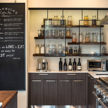
While this new home had an architecturally striking exterior, the home’s interior fell short in terms of true functionality and overall style. The most critical element in this renovation was the kitchen and dining area, which needed careful attention to bring it to the level that suited the home and the homeowners.
As a graduate of Culinary Institute of America, our client wanted a kitchen that “feels like a restaurant, with the warmth of a home kitchen,” where guests can gather over great food, great wine, and truly feel comfortable in the open concept home. Although it follows a typical chef’s galley layout, the unique design solutions and unusual materials set it apart from the typical kitchen design.
Polished countertops, laminated and stainless cabinets fronts, and professional appliances are complemented by the introduction of wood, glass, and blackened metal – materials introduced in the overall design of the house. Unique features include a wall clad in walnut for dangling heavy pots and utensils; a floating, sculptural walnut countertop piece housing an herb garden; an open pantry that serves as a coffee bar and wine station; and a hanging chalkboard that hides a water heater closet and features different coffee offerings available to guests.
The dining area addition, enclosed by windows, continues to vivify the organic elements and brings in ample natural light, enhancing the darker finishes and creating additional warmth.
Photography by Ira Montgomery
 John Rogers Renovations
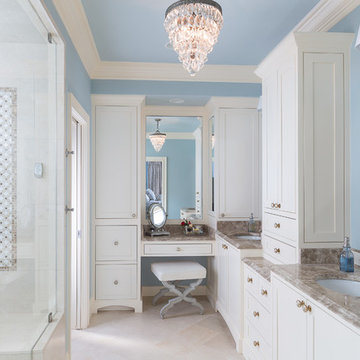
This dreamy master bath remodel in East Cobb offers generous space without going overboard in square footage. The homeowner chose to go with a large double vanity with a custom seated space as well as a nice shower with custom features and decided to forgo the typical big soaking tub.
The vanity area shown in the photos has plenty of storage within the wall cabinets and the large drawers below.
The countertop is Cedar Brown slab marble with undermount sinks. The brushed nickel metal details were done to work with the theme through out the home. The floor is a 12x24 honed Crema Marfil.
The stunning crystal chandelier draws the eye up and adds to the simplistic glamour of the bath.
The shower was done with an elegant combination of tumbled and polished Crema Marfil, two rows of Emperador Light inlay and Mirage Glass Tiles, Flower Series, Polished.
 O’Hara Interiors
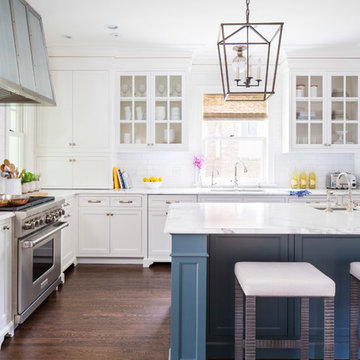
Martha O'Hara Interiors, Interior Design & Photo Styling | John Kraemer & Sons, Remodel | Troy Thies, Photography
Please Note: All “related,” “similar,” and “sponsored” products tagged or listed by Houzz are not actual products pictured. They have not been approved by Martha O’Hara Interiors nor any of the professionals credited. For information about our work, please contact design@oharainteriors.com.
Find the right local pro for your project
 Studio Shed - Live Large. Build Small.
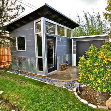
10x12 Studio Shed home office - Lifestyle Interior plus our added height option. The standard height of most models is 8'6" but you can choose to add 1 or even 2 extra feet of ceiling height. Our small kit "Pinyon" sits perpendicular to the office, holding garden tools and other supplies in a 4x8 footprint. The concrete pad, which extends to serve as the interior floor as well, was poured and stained by the home owner once the design phase of his project was complete.
 Klopf Architecture
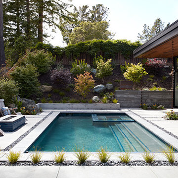
Klopf Architecture, Arterra Landscape Architects and Henry Calvert of Calvert Ventures Designed and built a new warm, modern, Eichler-inspired, open, indoor-outdoor home on a deeper-than-usual San Mateo Highlands property where an original Eichler house had burned to the ground.
The owners wanted multi-generational living and larger spaces than the original home offered, but all parties agreed that the house should respect the neighborhood and blend in stylistically with the other Eichlers. At first the Klopf team considered re-using what little was left of the original home and expanding on it. But after discussions with the owner and builder, all parties agreed that the last few remaining elements of the house were not practical to re-use, so Klopf Architecture designed a new home that pushes the Eichler approach in new directions.
One disadvantage of Eichler production homes is that the house designs were not optimized for each specific lot. A new custom home offered the team a chance to start over. In this case, a longer house that opens up sideways to the south fit the lot better than the original square-ish house that used to open to the rear (west). Accordingly, the Klopf team designed an L-shaped “bar” house with a large glass wall with large sliding glass doors that faces sideways instead of to the rear like a typical Eichler. This glass wall opens to a pool and landscaped yard designed by Arterra Landscape Architects.
Driving by the house, one might assume at first glance it is an Eichler because of the horizontality, the overhanging flat roof eaves, the dark gray vertical siding, and orange solid panel front door, but the house is designed for the 21st Century and is not meant to be a “Likeler.” You won't see any posts and beams in this home. Instead, the ceiling decking is a western red cedar that covers over all the beams. Like Eichlers, this cedar runs continuously from inside to out, enhancing the indoor / outdoor feeling of the house, but unlike Eichlers it conceals a cavity for lighting, wiring, and insulation. Ceilings are higher, rooms are larger and more open, the master bathroom is light-filled and more generous, with a separate tub and shower and a separate toilet compartment, and there is plenty of storage. The garage even easily fits two of today's vehicles with room to spare.
A massive 49-foot by 12-foot wall of glass and the continuity of materials from inside to outside enhance the inside-outside living concept, so the owners and their guests can flow freely from house to pool deck to BBQ to pool and back.
During construction in the rough framing stage, Klopf thought the front of the house appeared too tall even though the house had looked right in the design renderings (probably because the house is uphill from the street). So Klopf Architecture paid the framer to change the roofline from how we had designed it to be lower along the front, allowing the home to blend in better with the neighborhood. One project goal was for people driving up the street to pass the home without immediately noticing there is an "imposter" on this lot, and making that change was essential to achieve that goal.
This 2,606 square foot, 3 bedroom, 3 bathroom Eichler-inspired new house is located in San Mateo in the heart of the Silicon Valley.
Klopf Architecture Project Team: John Klopf, AIA, Klara Kevane
Landscape Architect: Arterra Landscape Architects
Contractor: Henry Calvert of Calvert Ventures
Photography ©2016 Mariko Reed
Location: San Mateo, CA
Year completed: 2016
 The Cousins
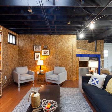
The new basement is the ultimate multi-functional space. A bar, foosball table, dartboard, and glass garage door with direct access to the back provide endless entertainment for guests; a cozy seating area with a whiteboard and pop-up television is perfect for Mike's work training sessions (or relaxing!); and a small playhouse and fun zone offer endless possibilities for the family's son, James.
 BUNNYFiSH studio
Photos by Francis and Francis Photography
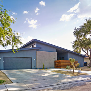
The Anderson Residence is ‘practically’ a new home in one of Las Vegas midcentury modern neighborhoods McNeil. The house is the current home of Ian Anderson the local Herman Miller dealer and Shanna Anderson of Leeland furniture family. When Ian first introduced CSPA studio to the project it was burned down house. Turns out that the house is a 1960 midcentury modern sister of two homes that was destroyed by arson in a dispute between landlord and tenant. Once inside the burned walls it was quite clear what a wonderful house it once was. Great care was taken to try and restore the house to a similar splendor. The reality is the remodel didn’t involve much of the original house, by the time the fire damage was remediated there wasn’t much left. The renovation includes an additional 1000 SF of office, guest bedroom, laundry, mudroom, guest toilet outdoor shower and a garage. The roof line was raised in order to accommodate a forced air mechanical system, but care was taken to keep the lines long and low (appearing) to match the midcentury modern style.
The House is an H-shape. Typically houses of this time period would have small rooms with long narrow hallways. However in this case with the walls burned out one can see from one side of the house to other creating a huge feeling space. It was decided to totally open the East side of the house and make the kitchen which gently spills into the living room and wood burning fireplace the public side. New windows and a huge 16’ sliding door were added all the way around the courtyard so that one can see out and across into the private side. On the west side of the house the long thin hallway is opened up by the windows to the courtyard and the long wall offers an opportunity for a gallery style art display. The long hallway opens to two bedrooms, shared bathroom and master bedroom. The end of the hallway opens to a casual living room and the swimming pool area.
The house has no formal dining room but a 15’ custom crafted table by Ian’s sculptor father that is an extension of the kitchen island.
The H-shape creates two covered areas, one is the front entry courtyard, fenced in by a Brazilian walnut enclosure and crowned by a steel art installation by Ian’s father. The rear covered courtyard is a breezy spot for chilling out on a hot desert day.
The pool was re-finished and a shallow soaking deck added. A new barbeque and covered patio added. Some of the large plant material was salvaged and nursed back to health and a complete new desert landscape was re-installed to bring the exterior to life.


 Smith & Ragsdale Interior Design
While this new home had an architecturally striking exterior, the home’s interior fell short in terms of true functionality and overall style. The most critical element in this renovation was the kitchen and dining area, which needed careful attention to bring it to the level that suited the home and the homeowners.
As a graduate of Culinary Institute of America, our client wanted a kitchen that “feels like a restaurant, with the warmth of a home kitchen,” where guests can gather over great food, great wine, and truly feel comfortable in the open concept home. Although it follows a typical chef’s galley layout, the unique design solutions and unusual materials set it apart from the typical kitchen design.
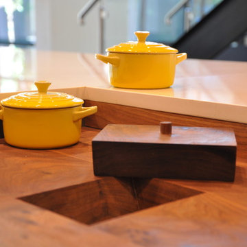
Polished countertops, laminated and stainless cabinets fronts, and professional appliances are complemented by the introduction of wood, glass, and blackened metal – materials introduced in the overall design of the house. Unique features include a wall clad in walnut for dangling heavy pots and utensils; a floating, sculptural walnut countertop piece housing an herb garden; an open pantry that serves as a coffee bar and wine station; and a hanging chalkboard that hides a water heater closet and features different coffee offerings available to guests.
The dining area addition, enclosed by windows, continues to vivify the organic elements and brings in ample natural light, enhancing the darker finishes and creating additional warmth.
Photography by Ira Montgomery
 Isla Homes
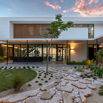
SeaThru is a new, waterfront, modern home. SeaThru was inspired by the mid-century modern homes from our area, known as the Sarasota School of Architecture.
This homes designed to offer more than the standard, ubiquitous rear-yard waterfront outdoor space. A central courtyard offer the residents a respite from the heat that accompanies west sun, and creates a gorgeous intermediate view fro guest staying in the semi-attached guest suite, who can actually SEE THROUGH the main living space and enjoy the bay views.
Noble materials such as stone cladding, oak floors, composite wood louver screens and generous amounts of glass lend to a relaxed, warm-contemporary feeling not typically common to these types of homes.
Photos by Ryan Gamma Photography
 Isla Homes
SeaThru is a new, waterfront, modern home. SeaThru was inspired by the mid-century modern homes from our area, known as the Sarasota School of Architecture.
This homes designed to offer more than the standard, ubiquitous rear-yard waterfront outdoor space. A central courtyard offer the residents a respite from the heat that accompanies west sun, and creates a gorgeous intermediate view fro guest staying in the semi-attached guest suite, who can actually SEE THROUGH the main living space and enjoy the bay views.
Noble materials such as stone cladding, oak floors, composite wood louver screens and generous amounts of glass lend to a relaxed, warm-contemporary feeling not typically common to these types of homes.
Photos by Ryan Gamma Photography
 Modal Design
Benny Chan
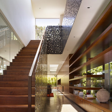
Mid-sized trendy wooden straight concrete floor and metal railing staircase photo in Los Angeles with wooden risers
Mid-sized trendy wooden straight concrete floor and metal railing staircase photo in Los Angeles with wooden risers
 Design DCA
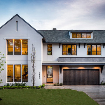
Modern Transitional residence blending a tall white stucco gable with a slim vertical slot window and large format two story black steel frame glazing on the left against a lower hipped roof volume with grey stone panel base, dark asphalt shingle roof, shed dormers, and black bracket corbels on the right. A dark wood two-car garage door sits flush in the stone base beside a black steel frame glass entry door under a flat canopy.
 Jacobs Grant Design ltd
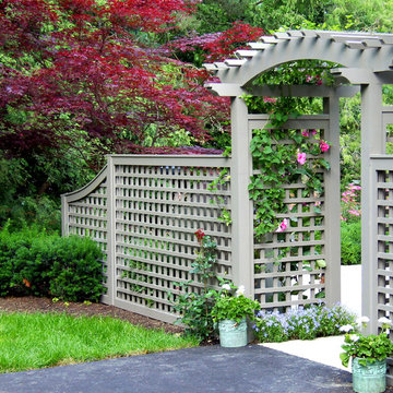
This is an example of a traditional full sun backyard landscaping in Columbus for summer.

 Smith & Ragsdale Interior Design
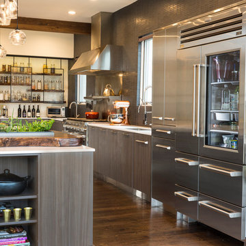
While this new home had an architecturally striking exterior, the home’s interior fell short in terms of true functionality and overall style. The most critical element in this renovation was the kitchen and dining area, which needed careful attention to bring it to the level that suited the home and the homeowners.
As a graduate of Culinary Institute of America, our client wanted a kitchen that “feels like a restaurant, with the warmth of a home kitchen,” where guests can gather over great food, great wine, and truly feel comfortable in the open concept home. Although it follows a typical chef’s galley layout, the unique design solutions and unusual materials set it apart from the typical kitchen design.
Polished countertops, laminated and stainless cabinets fronts, and professional appliances are complemented by the introduction of wood, glass, and blackened metal – materials introduced in the overall design of the house. Unique features include a wall clad in walnut for dangling heavy pots and utensils; a floating, sculptural walnut countertop piece housing an herb garden; an open pantry that serves as a coffee bar and wine station; and a hanging chalkboard that hides a water heater closet and features different coffee offerings available to guests.
The dining area addition, enclosed by windows, continues to vivify the organic elements and brings in ample natural light, enhancing the darker finishes and creating additional warmth.
Photos by Ira Montgomery
 Studio Dearborn
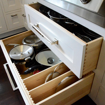
A deep pots and pans drawer under the rangetop offers movable lid dividers for custom sizing.
c 2013 Sarah Robertson
Example of a transitional kitchen design in New York
Example of a transitional kitchen design in New York
 Smith & Ragsdale Interior Design
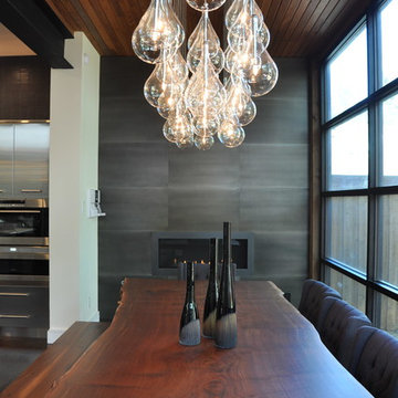
While this new home had an architecturally striking exterior, the home’s interior fell short in terms of true functionality and overall style. The most critical element in this renovation was the kitchen and dining area, which needed careful attention to bring it to the level that suited the home and the homeowners.
As a graduate of Culinary Institute of America, our client wanted a kitchen that “feels like a restaurant, with the warmth of a home kitchen,” where guests can gather over great food, great wine, and truly feel comfortable in the open concept home. Although it follows a typical chef’s galley layout, the unique design solutions and unusual materials set it apart from the typical kitchen design.
Polished countertops, laminated and stainless cabinets fronts, and professional appliances are complemented by the introduction of wood, glass, and blackened metal – materials introduced in the overall design of the house. Unique features include a wall clad in walnut for dangling heavy pots and utensils; a floating, sculptural walnut countertop piece housing an herb garden; an open pantry that serves as a coffee bar and wine station; and a hanging chalkboard that hides a water heater closet and features different coffee offerings available to guests.
The dining area addition, enclosed by windows, continues to vivify the organic elements and brings in ample natural light, enhancing the darker finishes and creating additional warmth.
Photography by Ira Montgomery
 JLF & Associates, Inc.
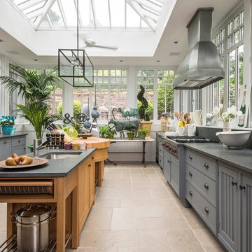
History, revived. An early 19th century Dutch farmstead, nestled in the hillside of Bucks County, Pennsylvania, offered a storied canvas on which to layer replicated additions and contemporary components. Endowed with an extensive art collection, the house and barn serve as a platform for aesthetic appreciation in all forms.
 Growsgreen Landscape Design
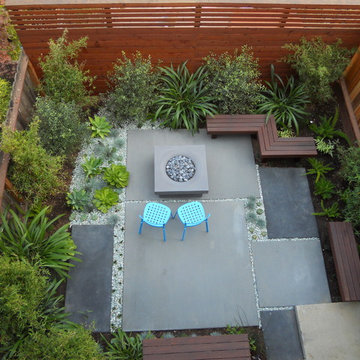
Designed by Growsgreen Landscape Design: growsgreen.com.
Example of a trendy patio design in San Francisco
Example of a trendy patio design in San Francisco
 Shakespeare Gordon Studio
Francis Dzlkowski
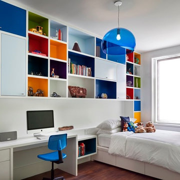
Inspiration for a bedroom contemporary boy medium tone wood floor kids' bedroom remodel in New York with white walls
Inspiration for a bedroom contemporary boy medium tone wood floor kids' bedroom remodel in New York with white walls
 Stalburg Design
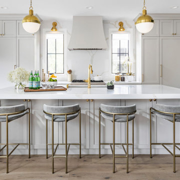
This stylish, family friendly kitchen is also an entertainer’s dream! This young family desired a bright, spacious kitchen that would function just as well for the family of 4 everyday, as it would for hosting large events (in a non-covid world). Apart from these programmatic goals, our aesthetic goal was to accommodate all the function and mess into the design so everything would be neatly hidden away behind beautiful cabinetry and panels.
The navy, bifold buffet area serves as an everyday breakfast and coffee bar, and transforms into a beautiful buffet spread during parties (we’ve been there!). The fridge drawers are great for housing milk and everyday items during the week, and both kid and adult beverages during parties while keeping the guests out of the main cooking zone. Just around the corner you’ll find the high gloss navy bar offering additional beverages, ice machine, and barware storage – cheers!
Super durable quartz with a marbled look keeps the kitchen looking neat and bright, while withstanding everyday wear and tear without a problem. The practical waterfall ends at the island offer additional damage control in bringing that hard surface all the way down to the beautiful white oak floors.
Underneath three large window walls, a built-in banquette and custom table provide a comfortable, intimate dining nook for the family and a few guests while the stunning chandelier ties in nicely with the other brass accents in the kitchen. The thin black window mullions offer a sharp, clean contrast to the crisp white walls and coordinate well with the dark banquette.
Thin, tall windows on either side of the range beautifully frame the stunningly simple, double curvature custom hood, and large windows in the bar/butler’s pantry allow additional light to really flood the space and keep and airy feel. The textured wallpaper in the bar area adds a touch of warmth, drama and interest while still keeping things simple.
1