
Search results for "Offered updates" in Home Design Ideas

 TKS Design Group
Download our free ebook, Creating the Ideal Kitchen. DOWNLOAD NOW
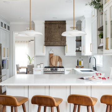
For many, extra time at home during COVID left them wanting more from their homes. Whether you realized the shortcomings of your space or simply wanted to combat boredom, a well-designed and functional home was no longer a want, it became a need. Tina found herself wanting more from her Old Irving Park home and reached out to The Kitchen Studio about adding function to her kitchen to make the most of the available real estate.
At the end of the day, there is nothing better than returning home to a bright and happy space you love. And this kitchen wasn’t that for Tina. Dark and dated, with a palette from the past and features that didn’t make the most of the available square footage, this remodel required vision and a fresh approach to the space. Lead designer, Stephanie Cole’s main design goal was better flow, while adding greater functionality with organized storage, accessible open shelving, and an overall sense of cohesion with the adjoining family room.
The original kitchen featured a large pizza oven, which was rarely used, yet its footprint limited storage space. The nearby pantry had become a catch-all, lacking the organization needed in the home. The initial plan was to keep the pizza oven, but eventually Tina realized she preferred the design possibilities that came from removing this cumbersome feature, with the goal of adding function throughout the upgraded and elevated space. Eliminating the pantry added square footage and length to the kitchen for greater function and more storage. This redesigned space reflects how she lives and uses her home, as well as her love for entertaining.
The kitchen features a classic, clean, and timeless palette. White cabinetry, with brass and bronze finishes, contrasts with rich wood flooring, and lets the large, deep blue island in Woodland’s custom color Harbor – a neutral, yet statement color – draw your eye.
The kitchen was the main priority. In addition to updating and elevating this space, Tina wanted to maximize what her home had to offer. From moving the location of the patio door and eliminating a window to removing an existing closet in the mudroom and the cluttered pantry, the kitchen footprint grew. Once the floorplan was set, it was time to bring cohesion to her home, creating connection between the kitchen and surrounding spaces.
The color palette carries into the mudroom, where we added beautiful new cabinetry, practical bench seating, and accessible hooks, perfect for guests and everyday living. The nearby bar continues the aesthetic, with stunning Carrara marble subway tile, hints of brass and bronze, and a design that further captures the vibe of the kitchen.
Every home has its unique design challenges. But with a fresh perspective and a bit of creativity, there is always a way to give the client exactly what they want [and need]. In this particular kitchen, the existing soffits and high slanted ceilings added a layer of complexity to the lighting layout and upper perimeter cabinets.
While a space needs to look good, it also needs to function well. This meant making the most of the height of the room and accounting for the varied ceiling features, while also giving Tina everything she wanted and more. Pendants and task lighting paired with an abundance of natural light amplify the bright aesthetic. The cabinetry layout and design compliments the soffits with subtle profile details that bring everything together. The tile selections add visual interest, drawing the eye to the focal area above the range. Glass-doored cabinets further customize the space and give the illusion of even more height within the room.
While her family may be grown and out of the house, Tina was focused on adding function without sacrificing a stunning aesthetic and dreamy finishes that make the kitchen the gathering place of any home. It was time to love her kitchen again, and if you’re wondering what she loves most, it’s the niche with glass door cabinetry and open shelving for display paired with the marble mosaic backsplash over the range and complimenting hood. Each of these features is a stunning point of interest within the kitchen – both brag-worthy additions to a perimeter layout that previously felt limited and lacking.
Whether your remodel is the result of special needs in your home or simply the excitement of focusing your energy on creating a fun new aesthetic, we are here for it. We love a good challenge because there is always a way to make a space better – adding function and beauty simultaneously.
 Luxe Remodel
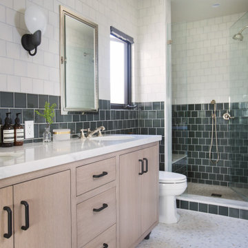
Inspiration for a mid-sized transitional master green tile white floor and double-sink bathroom remodel in Los Angeles with flat-panel cabinets, light wood cabinets, a one-piece toilet, quartz countertops, a hinged shower door, white countertops, an undermount sink and a freestanding vanity
 TKS Design Group
Download our free ebook, Creating the Ideal Kitchen. DOWNLOAD NOW
For many, extra time at home during COVID left them wanting more from their homes. Whether you realized the shortcomings of your space or simply wanted to combat boredom, a well-designed and functional home was no longer a want, it became a need. Tina found herself wanting more from her Old Irving Park home and reached out to The Kitchen Studio about adding function to her kitchen to make the most of the available real estate.
At the end of the day, there is nothing better than returning home to a bright and happy space you love. And this kitchen wasn’t that for Tina. Dark and dated, with a palette from the past and features that didn’t make the most of the available square footage, this remodel required vision and a fresh approach to the space. Lead designer, Stephanie Cole’s main design goal was better flow, while adding greater functionality with organized storage, accessible open shelving, and an overall sense of cohesion with the adjoining family room.
The original kitchen featured a large pizza oven, which was rarely used, yet its footprint limited storage space. The nearby pantry had become a catch-all, lacking the organization needed in the home. The initial plan was to keep the pizza oven, but eventually Tina realized she preferred the design possibilities that came from removing this cumbersome feature, with the goal of adding function throughout the upgraded and elevated space. Eliminating the pantry added square footage and length to the kitchen for greater function and more storage. This redesigned space reflects how she lives and uses her home, as well as her love for entertaining.
The kitchen features a classic, clean, and timeless palette. White cabinetry, with brass and bronze finishes, contrasts with rich wood flooring, and lets the large, deep blue island in Woodland’s custom color Harbor – a neutral, yet statement color – draw your eye.
The kitchen was the main priority. In addition to updating and elevating this space, Tina wanted to maximize what her home had to offer. From moving the location of the patio door and eliminating a window to removing an existing closet in the mudroom and the cluttered pantry, the kitchen footprint grew. Once the floorplan was set, it was time to bring cohesion to her home, creating connection between the kitchen and surrounding spaces.
The color palette carries into the mudroom, where we added beautiful new cabinetry, practical bench seating, and accessible hooks, perfect for guests and everyday living. The nearby bar continues the aesthetic, with stunning Carrara marble subway tile, hints of brass and bronze, and a design that further captures the vibe of the kitchen.
Every home has its unique design challenges. But with a fresh perspective and a bit of creativity, there is always a way to give the client exactly what they want [and need]. In this particular kitchen, the existing soffits and high slanted ceilings added a layer of complexity to the lighting layout and upper perimeter cabinets.
While a space needs to look good, it also needs to function well. This meant making the most of the height of the room and accounting for the varied ceiling features, while also giving Tina everything she wanted and more. Pendants and task lighting paired with an abundance of natural light amplify the bright aesthetic. The cabinetry layout and design compliments the soffits with subtle profile details that bring everything together. The tile selections add visual interest, drawing the eye to the focal area above the range. Glass-doored cabinets further customize the space and give the illusion of even more height within the room.
While her family may be grown and out of the house, Tina was focused on adding function without sacrificing a stunning aesthetic and dreamy finishes that make the kitchen the gathering place of any home. It was time to love her kitchen again, and if you’re wondering what she loves most, it’s the niche with glass door cabinetry and open shelving for display paired with the marble mosaic backsplash over the range and complimenting hood. Each of these features is a stunning point of interest within the kitchen – both brag-worthy additions to a perimeter layout that previously felt limited and lacking.
Whether your remodel is the result of special needs in your home or simply the excitement of focusing your energy on creating a fun new aesthetic, we are here for it. We love a good challenge because there is always a way to make a space better – adding function and beauty simultaneously.
Find the right local pro for your project
 Pro-Land Landscape Construction Inc.
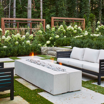
With a lengthy list of ideas about how to transform their backyard, the clients were excited to see what we could do. Existing features on site needed to be updated and in-cooperated within the design. The view from each angle of the property was already outstanding and we didn't want the design to feel out of place. We had to make the grade changes work to our advantage, each separate space had to have a purpose. The client wanted to use the property for charity events, so a large flat turf area was constructed at the back of the property, perfect for setting up tables, chairs and a stage if needed. It also created the perfect look out point into the back of the property, dropping off into a ravine. A lot of focus throughout the project was the plant selection. With a large amount of garden beds, we wanted to maintain a clean and formal look, while still offering seasonal interest. We did this by edging the beds with boxwoods, adding white hydrangeas throughout the beds for constant colour, and subtle pops of purple and yellow. This along with the already breathtaking natural backdrop of the space, is more than enough to make this project stand out.
Photographer: Jason Hartog Photography
 Rooted By Design
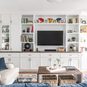
Philadelphia Row Home Renovation focusing on maximizing storage for a young family of 5. We created a "mudroom" in the front of the row home with a large living room space for family time + hosting. We used kid-friendly furnishings with performance fabrics that are durable and easy to clean. Prioritized eco-friendly selections, utilizing locally sourced + American made pieces.

 Penny Black Interiors LLC.
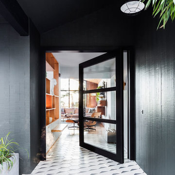
The architecture of this mid-century ranch in Portland’s West Hills oozes modernism’s core values. We wanted to focus on areas of the home that didn’t maximize the architectural beauty. The Client—a family of three, with Lucy the Great Dane, wanted to improve what was existing and update the kitchen and Jack and Jill Bathrooms, add some cool storage solutions and generally revamp the house.
We totally reimagined the entry to provide a “wow” moment for all to enjoy whilst entering the property. A giant pivot door was used to replace the dated solid wood door and side light.
We designed and built new open cabinetry in the kitchen allowing for more light in what was a dark spot. The kitchen got a makeover by reconfiguring the key elements and new concrete flooring, new stove, hood, bar, counter top, and a new lighting plan.
Our work on the Humphrey House was featured in Dwell Magazine.

Sponsored
Columbus, OH
Free consultation for landscape design!

Peabody Landscape Group
Columbus' Reliable Landscape Design & Contracting
 Katie Rosenfeld Design
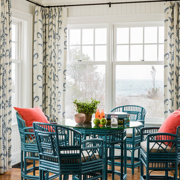
This ocean-front shingled Gambrel style house is home to a young family with little kids who lead an active, outdoor lifestyle. My goal was to create a bespoke, colorful and eclectic interior that looked sophisticated and fresh, but that was tough enough to withstand salt, sand and wet kids galore. The palette of coral and blue is an obvious choice, but we tried to translate it into a less expected, slightly updated way, hence the front door! Liberal use of indoor-outdoor fabrics created a seamless appearance while preserving the utility needed for this full time seaside residence.
photo: Michael J Lee Photography
 MILLER + MILLER Architectural Photography
Miller + Miller Real Estate
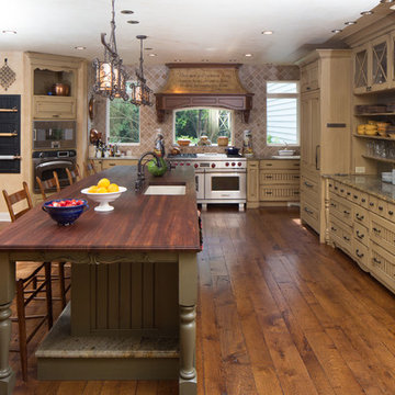
Sun-filled kitchen + breakfast room. Large windows galore offer views of waterfalls trees + wildlife (including backless china cabinet + window over range to maintain view of gardens). Distressed white oak floor. Skylights. Faux finish walls/ceiling. Kitchen with expansive Island with 13-foot hardwood counter-top and second prep sink. Two dishwashers in Island, Two Subzero 36 inch fridge/freezers, plus Two refrigerator drawers. Fully Renovated. All indoor and outdoor appliances are new in ’09.
 Decus Interiors
decus interiors
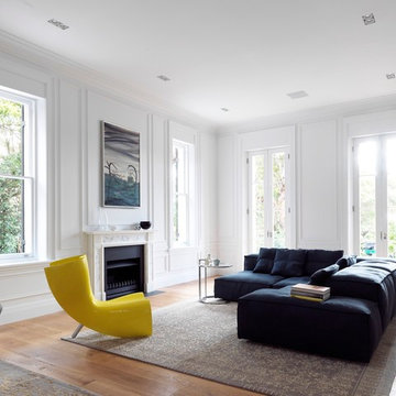
Example of an eclectic medium tone wood floor living room design in Sydney with white walls and a standard fireplace
Example of an eclectic medium tone wood floor living room design in Sydney with white walls and a standard fireplace
 Klopf Architecture
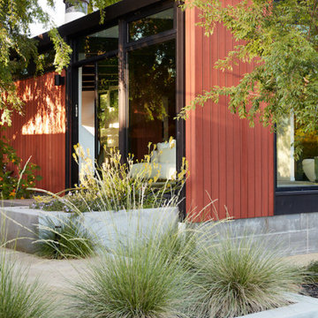
The Roger Lee designed house from 1962 was purchased by the current homeowners in almost original condition, as the previous owners elected to defer most maintenance projects over the years. The clients were able to see beyond the dated materials and finishes, single-paned glass and uninsulated walls and they approached Klopf Architecture to help them expand and update the entire home, one the family could settle into and enjoy for years to come. It was important that the new designs were aligned with Lee's original intent not only because of the client's appreciation for mid-century modern architecture, but also because the house was deemed historical. The Stanford Real Estate Office requires a stringent design review which safeguards the integrity of the community, which Klopf Architecture was happy to oblige going into their updated designs.
As with many original mid-century modern homes, the house was scaled to the 1960s lifestyle where rooms were smaller and openings to views were limited and tightly framed. The original conditions defined the direction the family of four would take in updating the house and making it comfortable for their modern lifestyle. Klopf designed a full gut remodel and major addition to bring the house into the 21st century and provide the living area needed for the client's family. The newly expanded house added just about 1,100 sf to create an airy, comfortable and family friendly house, taking full advantage of the beautiful southwestern views that extend out to the hills beyond. The enclosed garage created an additional 240 sf of covered space for long-term storage.
A cracked swimming pool created an eyesore taking up a majority of the backyard landscape, so it was one of the first elements to go during the transformation. Working with Outer Space Landscape Architects, the family asked for a mix of relaxing outdoor patio spaces that eventually blend into the native landscaping, extending their views outward toward the natural greenery of the trees beyond their property. Filling in the old pool was a smart way to expand the living spaces outward. The orientation of the house was designed to enjoy the views, but the original architecture provided the first homeowners with mere glimpses of the landscape outside.
Klopf was able to broaden those views, continuing and extending on the original architecture to take full advantage of the unobstructed natural views across the rear facade of the house. Small horizontal openings in the primary bedroom and office were replaced with much taller windows that now follow the angled roof line upward, extending across almost all of the facade. We worked with Western Windows, whose designs included an oblique-shaped, operable casement that allowed our design to rise with the slope. A new corner office added to the primary suite, offers a bright and functional work-from-home solution that looks out at the distant views and added natural light from the expanded window configuration that now wraps around the corner.
The existing lower level was designed by Lee as a utilitarian space, serving as a wet pool room with a drain in the center of the floor, bathroom, laundry and storage areas. Without the need for a pool room, Klopf was able to convert the area into a much more comfortable and functional living space with a new family room and guest suite. The new spaces enjoy easy access to a new outdoor patio through floor to ceiling, full-width glass sliders.
Continuing along the rear facade, a previously exposed deck extending from the living room and hallway provided access to the backyard through a single set of stairs leading toward the side of the house which made sense when the pool was in place. The new deck was re-envisioned as an extension of the main living room and now serves as a second outdoor living room. A new slatted pergola above provides the homeowners welcome relief from the hot afternoon sun. A second set of stairs now creates a better connection to the redesigned lower level. Klopf was able to reconfigure the spaces, extending the living room outward toward the views, where the family now claims it as the heart of the home, spending a large majority of their time outdoors.
Back inside, the original wood-burning Malm fireplace was beautifully restored and a gas burner installed to comply with California's strict air standards. It now rests in front of a wall of Heath accent tiles where a dated red brick wall used to stand. A new taller window brings more light and views into the refreshed interior living room. The original glass doors opposite the fireplace were replaced by larger sliders that when fully opened, create a seamless transition to the new outdoor living area so the two spaces feel like one connected space. The original utilitarian kitchen was needlessly tucked into the far back corner and closed-off, out of sight from the living room, so the clients asked Klopf to open it up and expand the kitchen forward so it felt more connected. Today the much larger kitchen is connected to the living area where a short wall with a cutout offers a visual glimpse into the kitchen and a handy pass-through counter for serving guests. A new breakfast nook was also added to create another spot where the family can gather for casual meals. Just outside, a new built-in outdoor grill and prep area extends the kitchen outside and connects to a new outdoor dining spot nestled amongst the trees, taking advantage of the views out back.
Klopf was able to expand the other two bedrooms, add a new laundry room and half-bath and convert the carport to an enclosed garage to add more storage areas which was lost when the pool house was converted to the family and guest room.
To maintain a historical connection to the original designs, the exterior siding was repeated on all exterior walls, a full-height stained glass window at the front entryway restored, and an interior slatted screen element repeated outside at the exterior entry courtyard and over the new outdoor living room to create a shade trellis. The new house stands proudly and shines against it's new landscaping features, while respecting and expanding on the original intent of Roger Lee's designs epitomizing the comforts of indoor-outdoor living in Northern California.
Completion year: 2020
Klopf Architecture project team: John Klopf, Klara Kevane, Noel Andrade
Contractor: ORB Construction, Brendan O'Reilly
Structural engineer: Sezen and Moon
Landscape architect: Outer space
Furnishings and decoration: Urbanism Designs
Photographer: Mariko Reed

 Northside Design Collective
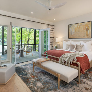
Guest Master Suite with French Doors to deck overlooking the lake and mountains. Light wood tones and accents of color in the rug, bedding and artwork. Swivel chair, ottoman and bench seating.
Sponsored
Columbus, OH
Free consultation for landscape design!
Peabody Landscape Group
Columbus' Reliable Landscape Design & Contracting
 Julian Design
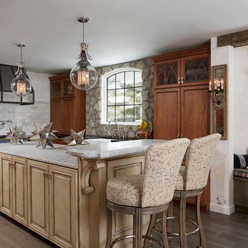
This kitchen was inspired by a french countryside cottage. We used traditional design elements, warm worn finishes, along with french industrial lighting fixtures to bring a magical element to this space. Bright patterns, bold pops of color, and unique trim details bring life to the living space.
Photography: Alyssa Lee Photography
 Julie Moir Messervy Design Studio (JMMDS)
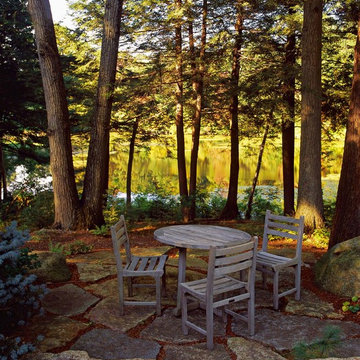
For this Boston-area former hunting lodge, featured in Outside the Not So Big House by Julie Moir Messervy and Sarah Susanka, JMMDS created a landscape design that anchors the house in the site and complements its Tuscan-inspired architectural update. An informal breakfast terrace of quarried granite offers views of the pond through pruned hemlock trees. Photo: Grey Crawford.
 Kohler Store by Supply New England
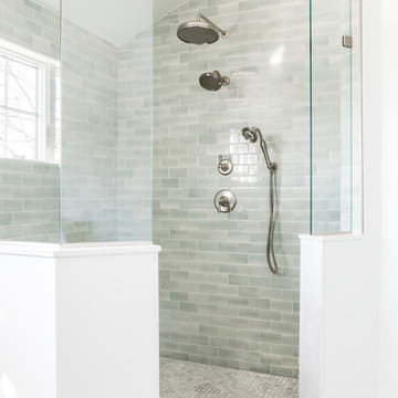
Sea glass colored tile, cool marbles, and brushed nickel create a classic and enduring design in this upscale remodel. The walk-in shower is outfitted with the Artifacts collection in brushed nickel by Kohler.
Photography by Erin Little.
 JDI Construction NW
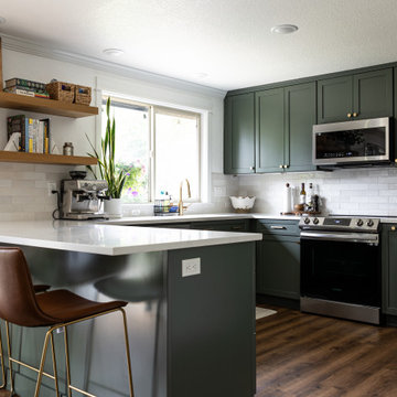
Immerse yourself in this green kitchen oasis, where luxurious gold hardware accents every corner. The striking green cabinets steal the spotlight, elegantly contrasting with the crisp white countertops and backsplash. This harmonious blend of colors and textures creates a vibrant yet sophisticated space, inviting you to enjoy both cooking and entertaining in style.

 Pineapple House Interior Design
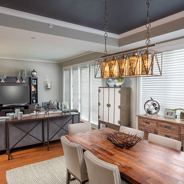
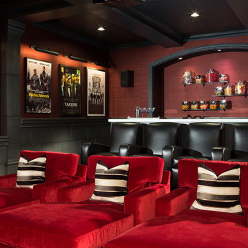
The screening room has chaise lounges, reclining theater chairs and grasscloth walls, which help absorb sound. There is a refreshment area along its back wall, directly behind the room's backlit onyx bar. The bar offers places to sit while drinking and dining.
 Metropolis Drafting and Construction Inc
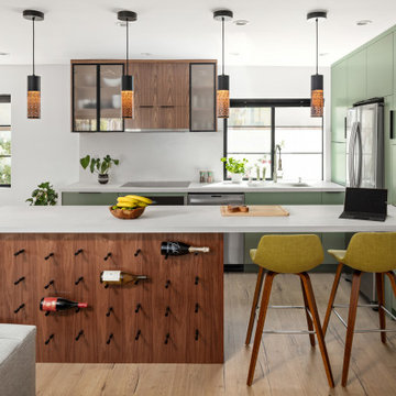
Who said that a Burbank bungalow home needs to be doll and old fashioned.
In this Burbank remodeling project we took this 1200sq. bungalow home and turned it to a wonderful mixture of European modern kitchen space and calm transitional modern farmhouse furniture and flooring.
The kitchen was a true challenge since space was a rare commodity, but with the right layout storage and work space became abundant.
A floating 5' long sitting area was constructed and even the back face of the cabinets was used for wine racks.
Exterior was updated as well with new black windows, new stucco over layer and new light fixtures all around.
both bedrooms were fitted with huge 10' sliding doors overlooking the green backyard.
 Nest Architecture Inc.
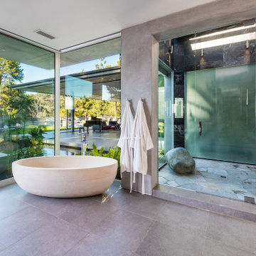
Trendy master ceramic tile and gray floor freestanding bathtub photo in Los Angeles with gray walls and a hinged shower door
15