
Search results for "Oils existing" in Home Design Ideas
 Jim Sharples Furniture
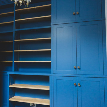
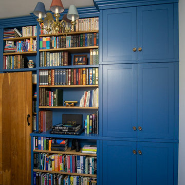
Bespoke Blue Library for a lovely cottage near Bristol.
The problem:
The room was going to be their office, it didn’t have much storage and it wasn’t very big. It had a difficult wall nib sticking out behind the door running the length of the wall and the room and had very high ceilings 3.2 metres high. This is precisely why they decided to go bespoke.
The brief:
The clients wanted lots of cabinets and shelves to make a library / bookcase for an awkward wall in a small room. The clients initially wanted ‘L’ shaped cabinets.
Lots of bookshelves, and I mean lots, like a bookcase wall and somewhere to hide office equipment like the printer and phone chargers.
Book shelves needed to be strong so they wouldn’t sag under the weight of the books – this was of utmost importance to the brief, these clients love books and reading.
Adjustable book shelves so they could fit their books exactly and change it up when needed.
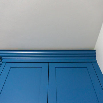
The bespoke library was to go right up to the very high ceiling and finish in a cornice.
The cornice needed a particular profile to match their existing furniture.
“It’s better than we imagined it could be” was the first thing they said when they saw it complete!
When we first visited and discussed the design for this bespoke library in Bristol with them, it became obvious that an ‘L’ shape wouldn’t work in the room, so the first draft was to have the shelves and cabinets along one wall.
There were around 5 revisions in the end, until the design was approved. The design was intricate and had to be spot on taking the wall nib and the opening door and latch into account.
The whole bookcase cabinetry was made from solid tulip wood, this is a strong and stable material to take the weight of the books. The cornice was specially commissioned to match the profile of their existing furniture. For the adjustable shelves we used brass bookcase strips.
The bookshelves are all solid English oak from our favourite local supplier a family run business called Interesting Timbers these were all finished in our rollered Osmo oil finish.
Jo hand painted the whole piece, inside and out, it in their choice of colour (Woad’ by Little Greene). Jim installed it to our meticulous standards and the clients were very happy with the results.
We are also delighted with the finished result! Do let us know what you think or get in touch if you would like to discuss your own project.

 Stacey Kocevar Designs, LLC
This space was an addition off of an existing small living space, which was designed by an architect who created a beautifully dramatic, two-story, living space by angling walls and making the living room area 2 stories high, with an overlook at the top of the spiral staircase to the second floor. The appliances were already set in place, and the homeowners did not want to move the existing plumbing, electrical, or venting, so I had to work within those parameters. They wanted a contemporary, industrial, feel for the kitchen, which I believe is described as Midcentry Modern, was acheived by using slab-style doors and drawers, mixing painted with walnut veneered finishes, along with other custom and unique items. The soapstone was a must-have for the homeowners, providing a source for the painted cabinetry color, which draws out the beautiful veins in the countertop. They needed pantry space, and as much usable storage as possible for the space, which included the angled wall that the refrigerator was on, along with not crowding the walk space between that wall and the necessary column adjacent to it. By building in the refrigerator with panels on either side to conceal the refrigerator "box", I was able to create a storage section which included a 2-drawer base for storage of larger items, with 2 pantries flanking either end, with contrasting walnut floating shelves in between. along with that custom section, in order to provide additional storage, and counter space, I created a free-standing piece, which had to feel like a part of the kitchen, yet also feel like a furniture piece, when viewed from the living room. In order to achieve that look, I used 3" wide columns to frame the piece, which I also repeated as floating shelves in the middle, to house their crockpot, but most importantly, a "home" for their roomba. The island also provided the space for separate pull-out trash and recycling bins, which I did not have space for elsewhere. Collaborating with the homeowners on this project enabled me to design a kitchen that was in a style that I hadn't had the opportunity to design in before, and I now appreciate and love this style myself!
 Stacey Kocevar Designs, LLC
This space was an addition off of an existing small living space, which was designed by an architect who created a beautifully dramatic, two-story, living space by angling walls and making the living room area 2 stories high, with an overlook at the top of the spiral staircase to the second floor. The appliances were already set in place, and the homeowners did not want to move the existing plumbing, electrical, or venting, so I had to work within those parameters. They wanted a contemporary, industrial, feel for the kitchen, which I believe is described as Midcentry Modern, was acheived by using slab-style doors and drawers, mixing painted with walnut veneered finishes, along with other custom and unique items. The soapstone was a must-have for the homeowners, providing a source for the painted cabinetry color, which draws out the beautiful veins in the countertop. They needed pantry space, and as much usable storage as possible for the space, which included the angled wall that the refrigerator was on, along with not crowding the walk space between that wall and the necessary column adjacent to it. By building in the refrigerator with panels on either side to conceal the refrigerator "box", I was able to create a storage section which included a 2-drawer base for storage of larger items, with 2 pantries flanking either end, with contrasting walnut floating shelves in between. along with that custom section, in order to provide additional storage, and counter space, I created a free-standing piece, which had to feel like a part of the kitchen, yet also feel like a furniture piece, when viewed from the living room. In order to achieve that look, I used 3" wide columns to frame the piece, which I also repeated as floating shelves in the middle, to house their crockpot, but most importantly, a "home" for their roomba. The island also provided the space for separate pull-out trash and recycling bins, which I did not have space for elsewhere. Collaborating with the homeowners on this project enabled me to design a kitchen that was in a style that I hadn't had the opportunity to design in before, and I now appreciate and love this style myself!
Find the right local pro for your project

 Maison Birmingham
The main goal of this renovation was to update an authentic mid-century home to suit a modern lifestyle, while still maintaining the original character and aesthetic of the home.
To create a more open, family friendly space also suitable for entertaining, walls between the kitchen, dining room and living room were removed to create an open area to house the 360-sq.-ft. kitchen. Upon demolition, it was noted that some areas of the original tongue and groove ceiling had aged much differently than the rest of the ceiling. Rather than stain the areas and cause them to age differently, we opted to apply oil to darken the wood so that it will all continue to age at the same pace.
Balancing new materials and tones with the existing abundance of wood was challenging, but in the end the balance was achieved with custom cabinetry in both white and anthracite matte lacquer, which is complemented by a custom floating walnut buffet in the dining area. Keeping the island and perimeter base cabinet finishes the same made the space feel more open, and presented the opportunity to create a dark focal wall for the refrigerator and pantry. These custom anthracite matte lacquer cabinets provide a striking yet subtle contrast with the white and wood, while incorporating well concealed pantry storage with microwave, as well as a Sub-Zero refrigerator.
In lieu of a typical exhaust hood, downdraft ventilation was installed in the island, and pendants were omitted to keep the space open, but also more consistent with the original design of the home. Brass globe sconces were installed on either side of the sink to bring in warmth, and frame the view of the gorgeous greenery outside.
This Project was a fantastic collaboration with Lauren Combs of The Neat Method Michigan
Proudly Featured in Detroit Home October 2017
Photography by Boswell Hardwick
 Stacey Kocevar Designs, LLC
This space was an addition off of an existing small living space, which was designed by an architect who created a beautifully dramatic, two-story, living space by angling walls and making the living room area 2 stories high, with an overlook at the top of the spiral staircase to the second floor. The appliances were already set in place, and the homeowners did not want to move the existing plumbing, electrical, or venting, so I had to work within those parameters. They wanted a contemporary, industrial, feel for the kitchen, which I believe is described as Midcentry Modern, was acheived by using slab-style doors and drawers, mixing painted with walnut veneered finishes, along with other custom and unique items. The soapstone was a must-have for the homeowners, providing a source for the painted cabinetry color, which draws out the beautiful veins in the countertop. They needed pantry space, and as much usable storage as possible for the space, which included the angled wall that the refrigerator was on, along with not crowding the walk space between that wall and the necessary column adjacent to it. By building in the refrigerator with panels on either side to conceal the refrigerator "box", I was able to create a storage section which included a 2-drawer base for storage of larger items, with 2 pantries flanking either end, with contrasting walnut floating shelves in between. along with that custom section, in order to provide additional storage, and counter space, I created a free-standing piece, which had to feel like a part of the kitchen, yet also feel like a furniture piece, when viewed from the living room. In order to achieve that look, I used 3" wide columns to frame the piece, which I also repeated as floating shelves in the middle, to house their crockpot, but most importantly, a "home" for their roomba. The island also provided the space for separate pull-out trash and recycling bins, which I did not have space for elsewhere. Collaborating with the homeowners on this project enabled me to design a kitchen that was in a style that I hadn't had the opportunity to design in before, and I now appreciate and love this style myself!

 Michelle Berwick Design
The homeowner wanted something really fun. She loves wallpaper and has a very good theory that if you have a fun and interesting wallpaper in a powder room your guests are less likely to go riffling through the cabinets.
 Stacey Kocevar Designs, LLC
This space was an addition off of an existing small living space, which was designed by an architect who created a beautifully dramatic, two-story, living space by angling walls and making the living room area 2 stories high, with an overlook at the top of the spiral staircase to the second floor. The appliances were already set in place, and the homeowners did not want to move the existing plumbing, electrical, or venting, so I had to work within those parameters. They wanted a contemporary, industrial, feel for the kitchen, which I believe is described as Midcentry Modern, was acheived by using slab-style doors and drawers, mixing painted with walnut veneered finishes, along with other custom and unique items. The soapstone was a must-have for the homeowners, providing a source for the painted cabinetry color, which draws out the beautiful veins in the countertop. They needed pantry space, and as much usable storage as possible for the space, which included the angled wall that the refrigerator was on, along with not crowding the walk space between that wall and the necessary column adjacent to it. By building in the refrigerator with panels on either side to conceal the refrigerator "box", I was able to create a storage section which included a 2-drawer base for storage of larger items, with 2 pantries flanking either end, with contrasting walnut floating shelves in between. along with that custom section, in order to provide additional storage, and counter space, I created a free-standing piece, which had to feel like a part of the kitchen, yet also feel like a furniture piece, when viewed from the living room. In order to achieve that look, I used 3" wide columns to frame the piece, which I also repeated as floating shelves in the middle, to house their crockpot, but most importantly, a "home" for their roomba. The island also provided the space for separate pull-out trash and recycling bins, which I did not have space for elsewhere. Collaborating with the homeowners on this project enabled me to design a kitchen that was in a style that I hadn't had the opportunity to design in before, and I now appreciate and love this style myself!


 Thomas J. Pearson, Inc.
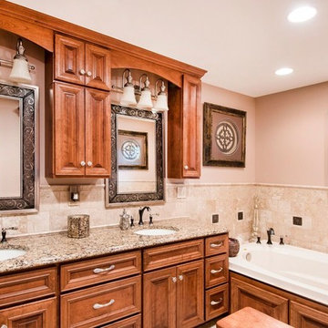
This spacious, yet extremely friendly and inviting home lacked a kitchen with personality and functionality for this growing family and their desire to entertain others. The goal for this renovation was to provide for new and larger appliances, maintain views to the rear yard, and provide family seating space within the kitchen.
The home’s existing exterior architecture provides references reminiscent Italian villas with terra cotta clay tile roofing, half-round steel windows and ornate stonework. The interior evokes similar images through the use of warm earth tone wall colors, hardwood floors, wrought-iron railings and plastered walls.
The home’s existing pallet of aged materials and their warm earth tones was reinforced with the selection of new finish materials such as: red brick, limestone veneer, linoleum flooring, African-mahogany cabinets, quartz perimeter countertops, copper sinks, exhaust hood and island counter, and oil-rubbed bronze hardware and fixtures. Because matching the exterior brick veneer was no longer a possibility, the combination of limestone veneer and copper sheet metal was selected for the new exterior; both being chosen for their warmth and timeless character. In addition, new hand-crafted wrought-iron doors and windows with energy-efficient insulated glass and ornate scrollwork were chosen in lieu of wood or clad-wood windows to replicate the home’s original steel and leaded-glass windows.
With time (and some patina), this inviting kitchen addition will blur the lines between “old” and “new.”
Project description written by Lee Constantine, Constantine Design Group.
 Douglah Designs
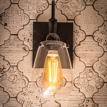
This gorgeous home renovation was a fun project to work on. The goal for the whole-house remodel was to infuse the home with a fresh new perspective while hinting at the traditional Mediterranean flare. We also wanted to balance the new and the old and help feature the customer’s existing character pieces. Let's begin with the custom front door, which is made with heavy distressing and a custom stain, along with glass and wrought iron hardware. The exterior sconces, dark light compliant, are rubbed bronze Hinkley with clear seedy glass and etched opal interior.
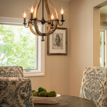
Moving on to the dining room, porcelain tile made to look like wood was installed throughout the main level. The dining room floor features a herringbone pattern inlay to define the space and add a custom touch. A reclaimed wood beam with a custom stain and oil-rubbed bronze chandelier creates a cozy and warm atmosphere.
In the kitchen, a hammered copper hood and matching undermount sink are the stars of the show. The tile backsplash is hand-painted and customized with a rustic texture, adding to the charm and character of this beautiful kitchen.
The powder room features a copper and steel vanity and a matching hammered copper framed mirror. A porcelain tile backsplash adds texture and uniqueness.
Lastly, a brick-backed hanging gas fireplace with a custom reclaimed wood mantle is the perfect finishing touch to this spectacular whole house remodel. It is a stunning transformation that truly showcases the artistry of our design and construction teams.
Project by Douglah Designs. Their Lafayette-based design-build studio serves San Francisco's East Bay areas, including Orinda, Moraga, Walnut Creek, Danville, Alamo Oaks, Diablo, Dublin, Pleasanton, Berkeley, Oakland, and Piedmont.
For more about Douglah Designs, click here: http://douglahdesigns.com/

 Nakamoto Forestry
Project Overview:
This renovation and update was designed by b Studio Architecture and features both interior and exterior applications of our Gendai siding with a black alkyd oil finish. Build by Resident LLC.
From Dwell:
“A modern home nestled in the middle of Charleston, the creation of this sanctuary was based on a desire to bring multi-generational living back to the urban core. While many historic properties in the area might have a carriage house, this home took the opposite approach. The existing small “freeman’s cottage” was restored and updated into a cozy guest cottage, while the more modern main home rises behind its historic neighbors. Nestled in the trees, this tall home creates an urban refuge to enjoy. The home’s two-story screened porch and rooftop deck connect it to the seasonally tuned weather of the south. Catching breezes and connecting the interior to nature, a large movable glass wall helps bring the outdoors into this modern urban home. Wrapped in shou sugi ban siding, tall windows, and minimalist modern fixtures, this home is still able to blend in the background and create a hidden urban utopia for the owners.”
Product: Gendai 1×6 select grade shiplap
Prefinish: Black
Application: Residential – Interior/Exterior
SF: 1850SF
Designer: b Studio Architecture
Builder: Resident LLC
Date: August 2018
Location: Charleston, SC
Photos courtesy of: Dwell
 Stacey Kocevar Designs, LLC
This space was an addition off of an existing small living space, which was designed by an architect who created a beautifully dramatic, two-story, living space by angling walls and making the living room area 2 stories high, with an overlook at the top of the spiral staircase to the second floor. The appliances were already set in place, and the homeowners did not want to move the existing plumbing, electrical, or venting, so I had to work within those parameters. They wanted a contemporary, industrial, feel for the kitchen, which I believe is described as Midcentry Modern, was acheived by using slab-style doors and drawers, mixing painted with walnut veneered finishes, along with other custom and unique items. The soapstone was a must-have for the homeowners, providing a source for the painted cabinetry color, which draws out the beautiful veins in the countertop. They needed pantry space, and as much usable storage as possible for the space, which included the angled wall that the refrigerator was on, along with not crowding the walk space between that wall and the necessary column adjacent to it. By building in the refrigerator with panels on either side to conceal the refrigerator "box", I was able to create a storage section which included a 2-drawer base for storage of larger items, with 2 pantries flanking either end, with contrasting walnut floating shelves in between. along with that custom section, in order to provide additional storage, and counter space, I created a free-standing piece, which had to feel like a part of the kitchen, yet also feel like a furniture piece, when viewed from the living room. In order to achieve that look, I used 3" wide columns to frame the piece, which I also repeated as floating shelves in the middle, to house their crockpot, but most importantly, a "home" for their roomba. The island also provided the space for separate pull-out trash and recycling bins, which I did not have space for elsewhere. Collaborating with the homeowners on this project enabled me to design a kitchen that was in a style that I hadn't had the opportunity to design in before, and I now appreciate and love this style myself!
 Jim Sharples Furniture
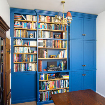
Bespoke Blue Library for a lovely cottage near Bristol.
The problem:
The room was going to be their office, it didn’t have much storage and it wasn’t very big. It had a difficult wall nib sticking out behind the door running the length of the wall and the room and had very high ceilings 3.2 metres high. This is precisely why they decided to go bespoke.
The brief:
The clients wanted lots of cabinets and shelves to make a library / bookcase for an awkward wall in a small room. The clients initially wanted ‘L’ shaped cabinets.
Lots of bookshelves, and I mean lots, like a bookcase wall and somewhere to hide office equipment like the printer and phone chargers.
Book shelves needed to be strong so they wouldn’t sag under the weight of the books – this was of utmost importance to the brief, these clients love books and reading.
Adjustable book shelves so they could fit their books exactly and change it up when needed.
The bespoke library was to go right up to the very high ceiling and finish in a cornice.
The cornice needed a particular profile to match their existing furniture.
“It’s better than we imagined it could be” was the first thing they said when they saw it complete!
When we first visited and discussed the design for this bespoke library in Bristol with them, it became obvious that an ‘L’ shape wouldn’t work in the room, so the first draft was to have the shelves and cabinets along one wall.
There were around 5 revisions in the end, until the design was approved. The design was intricate and had to be spot on taking the wall nib and the opening door and latch into account.
The whole bookcase cabinetry was made from solid tulip wood, this is a strong and stable material to take the weight of the books. The cornice was specially commissioned to match the profile of their existing furniture. For the adjustable shelves we used brass bookcase strips.
The bookshelves are all solid English oak from our favourite local supplier a family run business called Interesting Timbers these were all finished in our rollered Osmo oil finish.
Jo hand painted the whole piece, inside and out, it in their choice of colour (Woad’ by Little Greene). Jim installed it to our meticulous standards and the clients were very happy with the results.
We are also delighted with the finished result! Do let us know what you think or get in touch if you would like to discuss your own project.
 Jim Sharples Furniture
Bespoke Blue Library for a lovely cottage near Bristol.
The problem:
The room was going to be their office, it didn’t have much storage and it wasn’t very big. It had a difficult wall nib sticking out behind the door running the length of the wall and the room and had very high ceilings 3.2 metres high. This is precisely why they decided to go bespoke.
The brief:
The clients wanted lots of cabinets and shelves to make a library / bookcase for an awkward wall in a small room. The clients initially wanted ‘L’ shaped cabinets.
Lots of bookshelves, and I mean lots, like a bookcase wall and somewhere to hide office equipment like the printer and phone chargers.
Book shelves needed to be strong so they wouldn’t sag under the weight of the books – this was of utmost importance to the brief, these clients love books and reading.
Adjustable book shelves so they could fit their books exactly and change it up when needed.
The bespoke library was to go right up to the very high ceiling and finish in a cornice.
The cornice needed a particular profile to match their existing furniture.
“It’s better than we imagined it could be” was the first thing they said when they saw it complete!
When we first visited and discussed the design for this bespoke library in Bristol with them, it became obvious that an ‘L’ shape wouldn’t work in the room, so the first draft was to have the shelves and cabinets along one wall.
There were around 5 revisions in the end, until the design was approved. The design was intricate and had to be spot on taking the wall nib and the opening door and latch into account.
The whole bookcase cabinetry was made from solid tulip wood, this is a strong and stable material to take the weight of the books. The cornice was specially commissioned to match the profile of their existing furniture. For the adjustable shelves we used brass bookcase strips.
The bookshelves are all solid English oak from our favourite local supplier a family run business called Interesting Timbers these were all finished in our rollered Osmo oil finish.
Jo hand painted the whole piece, inside and out, it in their choice of colour (Woad’ by Little Greene). Jim installed it to our meticulous standards and the clients were very happy with the results.
We are also delighted with the finished result! Do let us know what you think or get in touch if you would like to discuss your own project.

 Renovisions
After several years on the remodeling to-do list, the homeowners decided to update to add a sense of style to their half-bath/laundry and called the Renovisions team in to help create their vision for this space. The main goal was to provide a clean, open and inviting feel, while adding a nice balance of texture and interest.
Upon a few visits to the Renovisions showroom, to discuss a suitable style, the final CAD design was approved and de-construction began. A new double-hung window replaced the old window, and measurements were taken for the new painted wood shutters. Out with the existing tile flooring, vanity, drop-in sink, toilet and outdated wall cabinets over laundry pair and window. In with the stylish, now taller shaker style vanity in stunning blue-green paint color. Pretty quartz countertop with under mount sink, and energy efficient comfort height toilet. The white subway wall tiles provide a classic look with timeless appeal fabulous with black porcelain floor tiles and contrasting light grey grout. Black and white provides a more dramatic look without compromising the rooms longevity.
Overall. The client is thrilled with the simple and fresh look of her now more interesting and stylish bath/laundry room. The vintage industrial design with stylish mini pendant light fixtures with clear seedy glass shades in old bronze finish is a perfect addition to this newly remodeled space and ties in nicely with the oil rubbed bronze hardware and accessories.
“The bathroom is SIMPLY BEAUTIFUL…….floor, tile, vanity, countertop, cabinets, lighting, and the faucet….I could not be more pleased!!!!!!” - Susan M. (Hanover)
 Stacey Kocevar Designs, LLC
This space was an addition off of an existing small living space, which was designed by an architect who created a beautifully dramatic, two-story, living space by angling walls and making the living room area 2 stories high, with an overlook at the top of the spiral staircase to the second floor. The appliances were already set in place, and the homeowners did not want to move the existing plumbing, electrical, or venting, so I had to work within those parameters. They wanted a contemporary, industrial, feel for the kitchen, which I believe is described as Midcentry Modern, was acheived by using slab-style doors and drawers, mixing painted with walnut veneered finishes, along with other custom and unique items. The soapstone was a must-have for the homeowners, providing a source for the painted cabinetry color, which draws out the beautiful veins in the countertop. They needed pantry space, and as much usable storage as possible for the space, which included the angled wall that the refrigerator was on, along with not crowding the walk space between that wall and the necessary column adjacent to it. By building in the refrigerator with panels on either side to conceal the refrigerator "box", I was able to create a storage section which included a 2-drawer base for storage of larger items, with 2 pantries flanking either end, with contrasting walnut floating shelves in between. along with that custom section, in order to provide additional storage, and counter space, I created a free-standing piece, which had to feel like a part of the kitchen, yet also feel like a furniture piece, when viewed from the living room. In order to achieve that look, I used 3" wide columns to frame the piece, which I also repeated as floating shelves in the middle, to house their crockpot, but most importantly, a "home" for their roomba. The island also provided the space for separate pull-out trash and recycling bins, which I did not have space for elsewhere. Collaborating with the homeowners on this project enabled me to design a kitchen that was in a style that I hadn't had the opportunity to design in before, and I now appreciate and love this style myself!
 Jim Sharples Furniture
Bespoke Blue Library for a lovely cottage near Bristol.
The problem:
The room was going to be their office, it didn’t have much storage and it wasn’t very big. It had a difficult wall nib sticking out behind the door running the length of the wall and the room and had very high ceilings 3.2 metres high. This is precisely why they decided to go bespoke.
The brief:
The clients wanted lots of cabinets and shelves to make a library / bookcase for an awkward wall in a small room. The clients initially wanted ‘L’ shaped cabinets.
Lots of bookshelves, and I mean lots, like a bookcase wall and somewhere to hide office equipment like the printer and phone chargers.
Book shelves needed to be strong so they wouldn’t sag under the weight of the books – this was of utmost importance to the brief, these clients love books and reading.
Adjustable book shelves so they could fit their books exactly and change it up when needed.
The bespoke library was to go right up to the very high ceiling and finish in a cornice.
The cornice needed a particular profile to match their existing furniture.
“It’s better than we imagined it could be” was the first thing they said when they saw it complete!
When we first visited and discussed the design for this bespoke library in Bristol with them, it became obvious that an ‘L’ shape wouldn’t work in the room, so the first draft was to have the shelves and cabinets along one wall.
There were around 5 revisions in the end, until the design was approved. The design was intricate and had to be spot on taking the wall nib and the opening door and latch into account.
The whole bookcase cabinetry was made from solid tulip wood, this is a strong and stable material to take the weight of the books. The cornice was specially commissioned to match the profile of their existing furniture. For the adjustable shelves we used brass bookcase strips.
The bookshelves are all solid English oak from our favourite local supplier a family run business called Interesting Timbers these were all finished in our rollered Osmo oil finish.
Jo hand painted the whole piece, inside and out, it in their choice of colour (Woad’ by Little Greene). Jim installed it to our meticulous standards and the clients were very happy with the results.
We are also delighted with the finished result! Do let us know what you think or get in touch if you would like to discuss your own project.
 Stacey Kocevar Designs, LLC
This space was an addition off of an existing small living space, which was designed by an architect who created a beautifully dramatic, two-story, living space by angling walls and making the living room area 2 stories high, with an overlook at the top of the spiral staircase to the second floor. The appliances were already set in place, and the homeowners did not want to move the existing plumbing, electrical, or venting, so I had to work within those parameters. They wanted a contemporary, industrial, feel for the kitchen, which I believe is described as Midcentry Modern, was acheived by using slab-style doors and drawers, mixing painted with walnut veneered finishes, along with other custom and unique items. The soapstone was a must-have for the homeowners, providing a source for the painted cabinetry color, which draws out the beautiful veins in the countertop. They needed pantry space, and as much usable storage as possible for the space, which included the angled wall that the refrigerator was on, along with not crowding the walk space between that wall and the necessary column adjacent to it. By building in the refrigerator with panels on either side to conceal the refrigerator "box", I was able to create a storage section which included a 2-drawer base for storage of larger items, with 2 pantries flanking either end, with contrasting walnut floating shelves in between. along with that custom section, in order to provide additional storage, and counter space, I created a free-standing piece, which had to feel like a part of the kitchen, yet also feel like a furniture piece, when viewed from the living room. In order to achieve that look, I used 3" wide columns to frame the piece, which I also repeated as floating shelves in the middle, to house their crockpot, but most importantly, a "home" for their roomba. The island also provided the space for separate pull-out trash and recycling bins, which I did not have space for elsewhere. Collaborating with the homeowners on this project enabled me to design a kitchen that was in a style that I hadn't had the opportunity to design in before, and I now appreciate and love this style myself!
 Douglah Designs
This gorgeous home renovation was a fun project to work on. The goal for the whole-house remodel was to infuse the home with a fresh new perspective while hinting at the traditional Mediterranean flare. We also wanted to balance the new and the old and help feature the customer’s existing character pieces. Let's begin with the custom front door, which is made with heavy distressing and a custom stain, along with glass and wrought iron hardware. The exterior sconces, dark light compliant, are rubbed bronze Hinkley with clear seedy glass and etched opal interior.
Moving on to the dining room, porcelain tile made to look like wood was installed throughout the main level. The dining room floor features a herringbone pattern inlay to define the space and add a custom touch. A reclaimed wood beam with a custom stain and oil-rubbed bronze chandelier creates a cozy and warm atmosphere.
In the kitchen, a hammered copper hood and matching undermount sink are the stars of the show. The tile backsplash is hand-painted and customized with a rustic texture, adding to the charm and character of this beautiful kitchen.
The powder room features a copper and steel vanity and a matching hammered copper framed mirror. A porcelain tile backsplash adds texture and uniqueness.
Lastly, a brick-backed hanging gas fireplace with a custom reclaimed wood mantle is the perfect finishing touch to this spectacular whole house remodel. It is a stunning transformation that truly showcases the artistry of our design and construction teams.

 diane j hewitt: design concierge
this 110 year old home was in dire need of a modern makeover while on a tight budget.
material selection was in keeping with the architectural integrity of the historic home.
key elements to this kitchen remodel:
-kitchen layout was highly functional and remained intact
-sheet vinyl floor was replaced with antique heart pine wood floors, maintaining architectural consistency throughout the house
-prior to wood floor installation, all lower cabinets were removed so flooring could run properly wall to wall; cabinets were then reinstalled
-existing oak cabinetry was in very good working condition, so the wood was embraced and renewed with a dark stain and tung oil finish
-wrap-around upper cabinets were removed from the main wall, leaving the side wall with upper storage and additional counter space
-new doors with a simple bevel edge were fabricated for the upper storage, eliminating the dated raised panel with cathedral top
-laminate countertops were replaced with hard working quartz
-opting for the strong visual statement of a field tile vs a stunted backsplash, a larger 4x8 white subway tile runs up the entire wall to the ceiling
 Renovisions
This kitchen had not been renovated since the salt box colonial house was built in the 1960’s. The new owner felt it was time for a complete refresh with some traditional details and adding in the owner’s contemporary tastes.
At initial observation, we determined the house had good bones; including high ceilings and abundant natural light from a double-hung window and three skylights overhead recently installed by our client. Mixing the homeowners desires required the skillful eyes of Cathy and Ed from Renovisions. The original kitchen had dark stained, worn cabinets, in-adequate lighting and a non-functional coat closet off the kitchen space. In order to achieve a true transitional look, Renovisions incorporated classic details with subtle, simple and cleaner line touches. For example, the backsplash mix of honed and polished 2” x 3” stone-look subway tile is outlined in brushed stainless steel strips creating an edgy feel, especially at the niche above the range. Removing the existing wall that shared the coat closet opened up the kitchen to allow adding an island for seating and entertaining guests.
We chose natural maple, shaker style flat panel cabinetry with longer stainless steel pulls instead of knobs, keeping in line with the clients desire for a sleeker design. This kitchen had to be gutted to accommodate the new layout featuring an island with pull-out trash and recycling and deeper drawers for utensils. Spatial constraints were top of mind and incorporating a convection microwave above the slide-in range made the most sense. Our client was thrilled with the ability to bake, broil and microwave from GE’s advantium oven – how convenient! A custom pull-out cabinet was built for his extensive array of spices and oils. The sink base cabinet provides plenty of area for the large rectangular stainless steel sink, single-lever multi-sprayer faucet and matching filtered water dispenser faucet. The natural, yet sleek green soapstone countertop with distinct white veining created a dynamic visual and principal focal point for the now open space.
While oak wood flooring existed in the entire first floor, as an added element of color and interest we installed multi-color slate-look porcelain tiles in the kitchen area. We also installed a fully programmable floor heating system for those chilly New England days. Overall, out client was thrilled with his Mission Transition.
77