
Search results for "On line sporting" in Home Design Ideas

 TVL Creative Ltd.
This 1950s home was sporting elements of the original kitchen and the dark space was not meeting our client’s needs. The original kitchen didn’t have much to offer in the way of functionality, so our first order of business was to create a design that would exponentially increase the usability of the kitchen. We brought in functional cabinetry, introduced uninterrupted work surfaces, and added plenty of lighting to brighten up their kitchen. They also wanted to open the new kitchen to the living room and create space for a larger dining table, so we started by removing the existing cabinetry that was visually cut the living space in two and minimized the power of the dramatic vaulted ceiling. We also extended the wood flooring into the kitchen as well to create seamless transitions between spaces. We fell in love with the idea of a two-toned cabinetry design for this kitchen and ultimately went head over heels for clean white painted base cabinets and a textured wood-look melamine on the uppers. This gave us a crisp backdrop that allowed us to bring is fun forms like the black light fixture over the table and the gorgeous silhouettes on the hardware. We played a lot with directionality in this space. The elongated open shelves and rectangular backsplash tiles give us wonderfully clean horizontal lines, but to balance those out we brought in a vertical grain pattern on the wall cabinets and added long black cabinetry pulls that emphasize the verticality of the space. The clients have a green thumb and wanted to make sure we created a home for their growing plant collection. The open shelving gives us plenty of opportunities for foliage and to showcase fun kitchen accessories. This design feels like home and brings together the clean lines and crisp finishes our clients were looking for.

 Pro Dunk Hoops
We love seeing Pro Dunk products looking like they belong. This Platinum Basketball System does just that in Tony's backyard. It looks homey, sporty, fun and professional This is a Pro Dunk Platinum Basketball System that was purchased in September of 2010. It was installed on a 20 ft wide by a 20 ft deep playing area in Kittery, ME. Browse all of Tony M's photos navigate to: http://www.produnkhoops.com/photos/albums/tony-20x20-pro-dunk-platinum-basketball-system-205/

 Eden LA Furniture and Interiors
__
We had so much fun designing in this Spanish meets beach style with wonderful clients who travel the world with their 3 sons. The clients had excellent taste and ideas they brought to the table, and were always open to Jamie's suggestions that seemed wildly out of the box at the time. The end result was a stunning mix of traditional, Meditteranean, and updated coastal that reflected the many facets of the clients. The bar area downstairs is a sports lover's dream, while the bright and beachy formal living room upstairs is perfect for book club meetings. One of the son's personal photography is tastefully framed and lines the hallway, and custom art also ensures this home is uniquely and divinely designed just for this lovely family.
__
Design by Eden LA Interiors
Photo by Kim Pritchard Photography
Find the right local pro for your project
 KCBR Design | Remodel
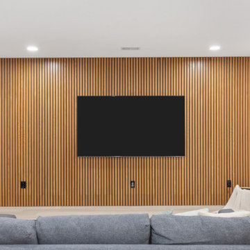
This client tore down a home in Prairie Village a few years ago and built new construction but left the basement unfinished. Our project was to finish the basement and create additional living space for the family of five, including a media area, bar, exercise room, kids’ playroom, and guest bedroom/bathroom. They wanted to finish the basement with a mid-century modern aesthetic with clean modern lines and black/white finishes with natural oak accents to resemble the way homes are finished in Finland, the client’s home country. We combined the media and bar areas to create a space perfect for watching movies and sports games. The natural oak slat wall is the highlight as you enter the basement living area. It is complemented by the black and white cabinets and graphic print backsplash tile in the bar area. The exercise room and kids’ playroom flank the sides of the media room and are hidden behind double rolling glass panel doors. Guests have a private bedroom with easy access to the full guest bathroom, which includes a rich blue herringbone shower.
 KCBR Design | Remodel
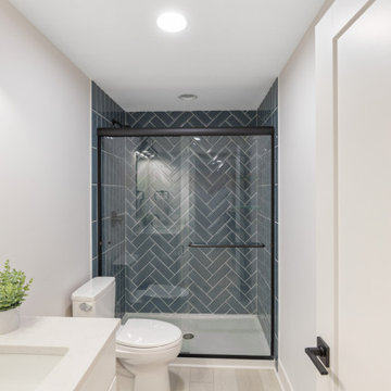
This client tore down a home in Prairie Village a few years ago and built new construction but left the basement unfinished. Our project was to finish the basement and create additional living space for the family of five, including a media area, bar, exercise room, kids’ playroom, and guest bedroom/bathroom. They wanted to finish the basement with a mid-century modern aesthetic with clean modern lines and black/white finishes with natural oak accents to resemble the way homes are finished in Finland, the client’s home country. We combined the media and bar areas to create a space perfect for watching movies and sports games. The natural oak slat wall is the highlight as you enter the basement living area. It is complemented by the black and white cabinets and graphic print backsplash tile in the bar area. The exercise room and kids’ playroom flank the sides of the media room and are hidden behind double rolling glass panel doors. Guests have a private bedroom with easy access to the full guest bathroom, which includes a rich blue herringbone shower.
 Dimensions in Wood Inc
We have completed our new Showroom display Kitchen where we highlight the latest and greatest Dimensions In Wood has to offer for your Kitchen Remodels, Wet Bar Installation, Bathroom Renovations, and more!
This display features our factory line of Bridgewood Cabinets, a Bridgewood Wooden Vent Hood, plus Carlisle Wide Plank Flooring Luxury Vinyl floor (LVP).
There is a custom pantry with sliding doors designed and built in house by Dimensions In Wood’s master craftsmen. The pantry has soft close door hardware, pull out drawer storage, TASK LED Lighting and tons more!
The eat-in kitchen island features a 5 Foot side Galley Workstation Sink with Taj Mahal Quartzite countertops.
The island even has four, soft-close drawers. This extra storage would be great in any home for devices, papers, or anything you want hidden away neatly. Friends and family will enjoying sitting at the island on bar stools.
All around the island and cabinets Task Lighting with a Voice Control Module provides illumiation. This allows you to turn your kitchen lights on and off using, Alexa, Apple Siri, Google Assistant and more! The floor lighting is also perfect for late night snacks or when you first come home.
One cabinet has a Kessebohmer Clever Storage pull down shelf. These can grant you easy access to items in tall cabinets.
A new twist for lazy susans, the Lemans II Set for Blind Corner Cabinets replaces old spinning shelves with completely accessible trays that pull out fully. These makes it super easy to access everything in your corner cabinet, while also preventing items from getting stuck in a corner.
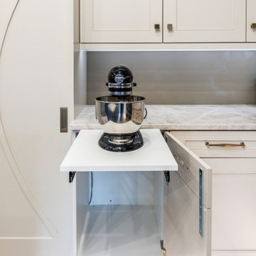
Another cabinet sports a Mixer Lift. This shelf raises up into a work surface with your baking mixer attached. It easily drops down to hide your baking mixer in the cabinet. Similar to an Appliance Garage, this allows you to keep your mixer ready and accessible without cluttering your countertop.
Spice and Utensil Storage pull out racks are hidden in columns on either side of the 48″ gas range stove! These are just such a cool feature which will wow anyone visiting your home. What would have been several inches of wasted space is now handy storage and a great party trick.
Two of the cabinets sport a glass facia with custom double bowed mullions. These glass doored cabinets are also lit by LED TASK Lighting.
This kitchen is replete with custom features that Dimensions In Wood can add to your home! Call us Today to come see our showroom in person, or schedule a video meeting.
 TVL Creative Ltd.
This 1950s home was sporting elements of the original kitchen and the dark space was not meeting our client’s needs. The original kitchen didn’t have much to offer in the way of functionality, so our first order of business was to create a design that would exponentially increase the usability of the kitchen. We brought in functional cabinetry, introduced uninterrupted work surfaces, and added plenty of lighting to brighten up their kitchen. They also wanted to open the new kitchen to the living room and create space for a larger dining table, so we started by removing the existing cabinetry that was visually cut the living space in two and minimized the power of the dramatic vaulted ceiling. We also extended the wood flooring into the kitchen as well to create seamless transitions between spaces. We fell in love with the idea of a two-toned cabinetry design for this kitchen and ultimately went head over heels for clean white painted base cabinets and a textured wood-look melamine on the uppers. This gave us a crisp backdrop that allowed us to bring is fun forms like the black light fixture over the table and the gorgeous silhouettes on the hardware. We played a lot with directionality in this space. The elongated open shelves and rectangular backsplash tiles give us wonderfully clean horizontal lines, but to balance those out we brought in a vertical grain pattern on the wall cabinets and added long black cabinetry pulls that emphasize the verticality of the space. The clients have a green thumb and wanted to make sure we created a home for their growing plant collection. The open shelving gives us plenty of opportunities for foliage and to showcase fun kitchen accessories. This design feels like home and brings together the clean lines and crisp finishes our clients were looking for.

 TVL Creative Ltd.
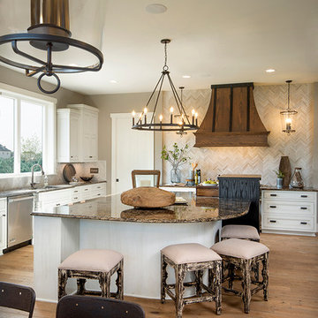
This 1950s home was sporting elements of the original kitchen and the dark space was not meeting our client’s needs. The original kitchen didn’t have much to offer in the way of functionality, so our first order of business was to create a design that would exponentially increase the usability of the kitchen. We brought in functional cabinetry, introduced uninterrupted work surfaces, and added plenty of lighting to brighten up their kitchen. They also wanted to open the new kitchen to the living room and create space for a larger dining table, so we started by removing the existing cabinetry that was visually cut the living space in two and minimized the power of the dramatic vaulted ceiling. We also extended the wood flooring into the kitchen as well to create seamless transitions between spaces. We fell in love with the idea of a two-toned cabinetry design for this kitchen and ultimately went head over heels for clean white painted base cabinets and a textured wood-look melamine on the uppers. This gave us a crisp backdrop that allowed us to bring is fun forms like the black light fixture over the table and the gorgeous silhouettes on the hardware. We played a lot with directionality in this space. The elongated open shelves and rectangular backsplash tiles give us wonderfully clean horizontal lines, but to balance those out we brought in a vertical grain pattern on the wall cabinets and added long black cabinetry pulls that emphasize the verticality of the space. The clients have a green thumb and wanted to make sure we created a home for their growing plant collection. The open shelving gives us plenty of opportunities for foliage and to showcase fun kitchen accessories. This design feels like home and brings together the clean lines and crisp finishes our clients were looking for.
 TVL Creative Ltd.
This 1950s home was sporting elements of the original kitchen and the dark space was not meeting our client’s needs. The original kitchen didn’t have much to offer in the way of functionality, so our first order of business was to create a design that would exponentially increase the usability of the kitchen. We brought in functional cabinetry, introduced uninterrupted work surfaces, and added plenty of lighting to brighten up their kitchen. They also wanted to open the new kitchen to the living room and create space for a larger dining table, so we started by removing the existing cabinetry that was visually cut the living space in two and minimized the power of the dramatic vaulted ceiling. We also extended the wood flooring into the kitchen as well to create seamless transitions between spaces. We fell in love with the idea of a two-toned cabinetry design for this kitchen and ultimately went head over heels for clean white painted base cabinets and a textured wood-look melamine on the uppers. This gave us a crisp backdrop that allowed us to bring is fun forms like the black light fixture over the table and the gorgeous silhouettes on the hardware. We played a lot with directionality in this space. The elongated open shelves and rectangular backsplash tiles give us wonderfully clean horizontal lines, but to balance those out we brought in a vertical grain pattern on the wall cabinets and added long black cabinetry pulls that emphasize the verticality of the space. The clients have a green thumb and wanted to make sure we created a home for their growing plant collection. The open shelving gives us plenty of opportunities for foliage and to showcase fun kitchen accessories. This design feels like home and brings together the clean lines and crisp finishes our clients were looking for.
 TVL Creative Ltd.
This 1950s home was sporting elements of the original kitchen and the dark space was not meeting our client’s needs. The original kitchen didn’t have much to offer in the way of functionality, so our first order of business was to create a design that would exponentially increase the usability of the kitchen. We brought in functional cabinetry, introduced uninterrupted work surfaces, and added plenty of lighting to brighten up their kitchen. They also wanted to open the new kitchen to the living room and create space for a larger dining table, so we started by removing the existing cabinetry that was visually cut the living space in two and minimized the power of the dramatic vaulted ceiling. We also extended the wood flooring into the kitchen as well to create seamless transitions between spaces. We fell in love with the idea of a two-toned cabinetry design for this kitchen and ultimately went head over heels for clean white painted base cabinets and a textured wood-look melamine on the uppers. This gave us a crisp backdrop that allowed us to bring is fun forms like the black light fixture over the table and the gorgeous silhouettes on the hardware. We played a lot with directionality in this space. The elongated open shelves and rectangular backsplash tiles give us wonderfully clean horizontal lines, but to balance those out we brought in a vertical grain pattern on the wall cabinets and added long black cabinetry pulls that emphasize the verticality of the space. The clients have a green thumb and wanted to make sure we created a home for their growing plant collection. The open shelving gives us plenty of opportunities for foliage and to showcase fun kitchen accessories. This design feels like home and brings together the clean lines and crisp finishes our clients were looking for.
 TVL Creative Ltd.
This 1950s home was sporting elements of the original kitchen and the dark space was not meeting our client’s needs. The original kitchen didn’t have much to offer in the way of functionality, so our first order of business was to create a design that would exponentially increase the usability of the kitchen. We brought in functional cabinetry, introduced uninterrupted work surfaces, and added plenty of lighting to brighten up their kitchen. They also wanted to open the new kitchen to the living room and create space for a larger dining table, so we started by removing the existing cabinetry that was visually cut the living space in two and minimized the power of the dramatic vaulted ceiling. We also extended the wood flooring into the kitchen as well to create seamless transitions between spaces. We fell in love with the idea of a two-toned cabinetry design for this kitchen and ultimately went head over heels for clean white painted base cabinets and a textured wood-look melamine on the uppers. This gave us a crisp backdrop that allowed us to bring is fun forms like the black light fixture over the table and the gorgeous silhouettes on the hardware. We played a lot with directionality in this space. The elongated open shelves and rectangular backsplash tiles give us wonderfully clean horizontal lines, but to balance those out we brought in a vertical grain pattern on the wall cabinets and added long black cabinetry pulls that emphasize the verticality of the space. The clients have a green thumb and wanted to make sure we created a home for their growing plant collection. The open shelving gives us plenty of opportunities for foliage and to showcase fun kitchen accessories. This design feels like home and brings together the clean lines and crisp finishes our clients were looking for.
 TVL Creative Ltd.
This 1950s home was sporting elements of the original kitchen and the dark space was not meeting our client’s needs. The original kitchen didn’t have much to offer in the way of functionality, so our first order of business was to create a design that would exponentially increase the usability of the kitchen. We brought in functional cabinetry, introduced uninterrupted work surfaces, and added plenty of lighting to brighten up their kitchen. They also wanted to open the new kitchen to the living room and create space for a larger dining table, so we started by removing the existing cabinetry that was visually cut the living space in two and minimized the power of the dramatic vaulted ceiling. We also extended the wood flooring into the kitchen as well to create seamless transitions between spaces. We fell in love with the idea of a two-toned cabinetry design for this kitchen and ultimately went head over heels for clean white painted base cabinets and a textured wood-look melamine on the uppers. This gave us a crisp backdrop that allowed us to bring is fun forms like the black light fixture over the table and the gorgeous silhouettes on the hardware. We played a lot with directionality in this space. The elongated open shelves and rectangular backsplash tiles give us wonderfully clean horizontal lines, but to balance those out we brought in a vertical grain pattern on the wall cabinets and added long black cabinetry pulls that emphasize the verticality of the space. The clients have a green thumb and wanted to make sure we created a home for their growing plant collection. The open shelving gives us plenty of opportunities for foliage and to showcase fun kitchen accessories. This design feels like home and brings together the clean lines and crisp finishes our clients were looking for.
 TVL Creative Ltd.
This 1950s home was sporting elements of the original kitchen and the dark space was not meeting our client’s needs. The original kitchen didn’t have much to offer in the way of functionality, so our first order of business was to create a design that would exponentially increase the usability of the kitchen. We brought in functional cabinetry, introduced uninterrupted work surfaces, and added plenty of lighting to brighten up their kitchen. They also wanted to open the new kitchen to the living room and create space for a larger dining table, so we started by removing the existing cabinetry that was visually cut the living space in two and minimized the power of the dramatic vaulted ceiling. We also extended the wood flooring into the kitchen as well to create seamless transitions between spaces. We fell in love with the idea of a two-toned cabinetry design for this kitchen and ultimately went head over heels for clean white painted base cabinets and a textured wood-look melamine on the uppers. This gave us a crisp backdrop that allowed us to bring is fun forms like the black light fixture over the table and the gorgeous silhouettes on the hardware. We played a lot with directionality in this space. The elongated open shelves and rectangular backsplash tiles give us wonderfully clean horizontal lines, but to balance those out we brought in a vertical grain pattern on the wall cabinets and added long black cabinetry pulls that emphasize the verticality of the space. The clients have a green thumb and wanted to make sure we created a home for their growing plant collection. The open shelving gives us plenty of opportunities for foliage and to showcase fun kitchen accessories. This design feels like home and brings together the clean lines and crisp finishes our clients were looking for.
Sponsored
Sunbury, OH

J.Holderby - Renovations
Franklin County's Leading General Contractors - 2X Best of Houzz!

 Paintzen, Inc.
Everyone needs a little space of their own. Whether it’s a cozy reading nook for a busy mom to curl up in at the end of a long day, a quiet corner of a living room for an artist to get inspired, or a mancave where die-hard sports fans can watch the game without distraction. Even Emmy-award winning “This Is Us” actor Sterling K. Brown was feeling like he needed a place where he could go to be productive (as well as get some peace and quiet). Sterling’s Los Angeles house is home to him, his wife, and two of their two sons – so understandably, it can feel a little crazy.
Sterling reached out to interior designer Kyle Schuneman of Apt2B to help convert his garage into a man-cave / office into a space where he could conduct some of his day-to-day tasks, run his lines, or just relax after a long day. As Schuneman began to visualize Sterling’s “creative workspace”, he and the Apt2B team reached out Paintzen to make the process a little more colorful.
The room was full of natural light, which meant we could go bolder with color. Schuneman selected a navy blue – one of the season’s most popular shades (especially for mancaves!) in a flat finish for the walls. The color was perfect for the space; it paired well with the concrete flooring, which was covered with a blue-and-white patterned area rug, and had plenty of personality. (Not to mention it makes a lovely backdrop for an Emmy, don’t you think?)
Schuneman’s furniture selection was done with the paint color in mind. He chose a bright, bold sofa in a mustard color, and used lots of wood and metal accents throughout to elevate the space and help it feel more modern and sophisticated. A work table was added – where we imagine Sterling will spend time reading scripts and getting work done – and there is plenty of space on the walls and in glass-faced cabinets, of course, to display future Emmy’s in the years to come. However, the large mounted TV and ample seating in the room means this space can just as well be used hosting get-togethers with friends.
We think you’ll agree that the final product was stunning. The rich navy walls paired with Schuneman’s decor selections resulted in a space that is smart, stylish, and masculine. Apt2B turned a standard garage into a sleek home office and Mancave for Sterling K. Brown, and our team at Paintzen was thrilled to be a part of the process.
 TVL Creative Ltd.
This 1950s home was sporting elements of the original kitchen and the dark space was not meeting our client’s needs. The original kitchen didn’t have much to offer in the way of functionality, so our first order of business was to create a design that would exponentially increase the usability of the kitchen. We brought in functional cabinetry, introduced uninterrupted work surfaces, and added plenty of lighting to brighten up their kitchen. They also wanted to open the new kitchen to the living room and create space for a larger dining table, so we started by removing the existing cabinetry that was visually cut the living space in two and minimized the power of the dramatic vaulted ceiling. We also extended the wood flooring into the kitchen as well to create seamless transitions between spaces. We fell in love with the idea of a two-toned cabinetry design for this kitchen and ultimately went head over heels for clean white painted base cabinets and a textured wood-look melamine on the uppers. This gave us a crisp backdrop that allowed us to bring is fun forms like the black light fixture over the table and the gorgeous silhouettes on the hardware. We played a lot with directionality in this space. The elongated open shelves and rectangular backsplash tiles give us wonderfully clean horizontal lines, but to balance those out we brought in a vertical grain pattern on the wall cabinets and added long black cabinetry pulls that emphasize the verticality of the space. The clients have a green thumb and wanted to make sure we created a home for their growing plant collection. The open shelving gives us plenty of opportunities for foliage and to showcase fun kitchen accessories. This design feels like home and brings together the clean lines and crisp finishes our clients were looking for.
 TVL Creative Ltd.
This 1950s home was sporting elements of the original kitchen and the dark space was not meeting our client’s needs. The original kitchen didn’t have much to offer in the way of functionality, so our first order of business was to create a design that would exponentially increase the usability of the kitchen. We brought in functional cabinetry, introduced uninterrupted work surfaces, and added plenty of lighting to brighten up their kitchen. They also wanted to open the new kitchen to the living room and create space for a larger dining table, so we started by removing the existing cabinetry that was visually cut the living space in two and minimized the power of the dramatic vaulted ceiling. We also extended the wood flooring into the kitchen as well to create seamless transitions between spaces. We fell in love with the idea of a two-toned cabinetry design for this kitchen and ultimately went head over heels for clean white painted base cabinets and a textured wood-look melamine on the uppers. This gave us a crisp backdrop that allowed us to bring is fun forms like the black light fixture over the table and the gorgeous silhouettes on the hardware. We played a lot with directionality in this space. The elongated open shelves and rectangular backsplash tiles give us wonderfully clean horizontal lines, but to balance those out we brought in a vertical grain pattern on the wall cabinets and added long black cabinetry pulls that emphasize the verticality of the space. The clients have a green thumb and wanted to make sure we created a home for their growing plant collection. The open shelving gives us plenty of opportunities for foliage and to showcase fun kitchen accessories. This design feels like home and brings together the clean lines and crisp finishes our clients were looking for.
 TVL Creative Ltd.
This 1950s home was sporting elements of the original kitchen and the dark space was not meeting our client’s needs. The original kitchen didn’t have much to offer in the way of functionality, so our first order of business was to create a design that would exponentially increase the usability of the kitchen. We brought in functional cabinetry, introduced uninterrupted work surfaces, and added plenty of lighting to brighten up their kitchen. They also wanted to open the new kitchen to the living room and create space for a larger dining table, so we started by removing the existing cabinetry that was visually cut the living space in two and minimized the power of the dramatic vaulted ceiling. We also extended the wood flooring into the kitchen as well to create seamless transitions between spaces. We fell in love with the idea of a two-toned cabinetry design for this kitchen and ultimately went head over heels for clean white painted base cabinets and a textured wood-look melamine on the uppers. This gave us a crisp backdrop that allowed us to bring is fun forms like the black light fixture over the table and the gorgeous silhouettes on the hardware. We played a lot with directionality in this space. The elongated open shelves and rectangular backsplash tiles give us wonderfully clean horizontal lines, but to balance those out we brought in a vertical grain pattern on the wall cabinets and added long black cabinetry pulls that emphasize the verticality of the space. The clients have a green thumb and wanted to make sure we created a home for their growing plant collection. The open shelving gives us plenty of opportunities for foliage and to showcase fun kitchen accessories. This design feels like home and brings together the clean lines and crisp finishes our clients were looking for.

Sponsored
Sunbury, OH
J.Holderby - Renovations
Franklin County's Leading General Contractors - 2X Best of Houzz!

 Unique Landscapes and Custom Pools
Awesome Chandler backyard that sports a huge classic pool & spa, with lots of outdoor entertaining – Ramada, outdoor kitchen, Travertine pavers, firepit & more.
This project was designed and directly supervised by Unique Landscapes’ owner Chris Griffin. Griffin designed it for an MLB pitcher, who wanted to focus on clean lines and symmetry, while matching the Traditional Tuscan design of the home.
The customer’s requests were common ones included in backyard makeovers: he wanted to enjoy the pool and spa and be able to barbeque and sit around a barwith some shade. He also wanted a fire pit seating area, in which to relax after a full day of fun and sun.
The project was a new backyard installation, which gave the designer a blank canvas with which to work. Not having to deal with removing or working around existing items makes construction easier.
The custom built pool included many features, including remote controls, automation, saltwater, ozone, a PV3 cleaning system, Pentair variable speed pumps and filters, waterfalls and fountains.
The state-of-the-art hardscapes included an outdoor kitchen with a travertine counter-top, a custom ramada and fire pit, lots of bench seating and stone work, pavers, and an acrylic “lace” patio. Meanwhile, the beautiful softscapes included grass, plants and queen palm, sissoo and tipu trees.

 McClure Tables
Handcrafted to replicate the classic Rock-Ola tables of the 1940s, the New Rock-Ola Shuffleboard Table is built using a solid wood horse collar shaped into a tear drop design. The table is made of one hundred percent North American hard maple and is guaranteed to become the focus of your game room. The green diamonds on the side of the natural maple aprons are made using a real glass inlay and the table is lined with a stainless steel metal trim. In addition to its range of wood finish options, the table also includes a lifetime polymer protective coating and climatic adjustors.
The New Rock-Ola Shuffleboard Table is available in 12, 14, 16, 18, 20 and 22-foot sizes and each comes with eight stainless steel pucks, one can of wax powder and a wooden sweeper brush. Optional add-ons include a traditional or electronic scoring unit in a matching finish.
McClure Tables shuffleboards, all made in America at a Grand Rapids, Michigan facility, are built using old world craftsmanship and the highest quality local materials.
 TVL Creative Ltd.
This 1950s home was sporting elements of the original kitchen and the dark space was not meeting our client’s needs. The original kitchen didn’t have much to offer in the way of functionality, so our first order of business was to create a design that would exponentially increase the usability of the kitchen. We brought in functional cabinetry, introduced uninterrupted work surfaces, and added plenty of lighting to brighten up their kitchen. They also wanted to open the new kitchen to the living room and create space for a larger dining table, so we started by removing the existing cabinetry that was visually cut the living space in two and minimized the power of the dramatic vaulted ceiling. We also extended the wood flooring into the kitchen as well to create seamless transitions between spaces. We fell in love with the idea of a two-toned cabinetry design for this kitchen and ultimately went head over heels for clean white painted base cabinets and a textured wood-look melamine on the uppers. This gave us a crisp backdrop that allowed us to bring is fun forms like the black light fixture over the table and the gorgeous silhouettes on the hardware. We played a lot with directionality in this space. The elongated open shelves and rectangular backsplash tiles give us wonderfully clean horizontal lines, but to balance those out we brought in a vertical grain pattern on the wall cabinets and added long black cabinetry pulls that emphasize the verticality of the space. The clients have a green thumb and wanted to make sure we created a home for their growing plant collection. The open shelving gives us plenty of opportunities for foliage and to showcase fun kitchen accessories. This design feels like home and brings together the clean lines and crisp finishes our clients were looking for.
77