
Search results for "Originates" in Home Design Ideas
 Alair Homes Plano
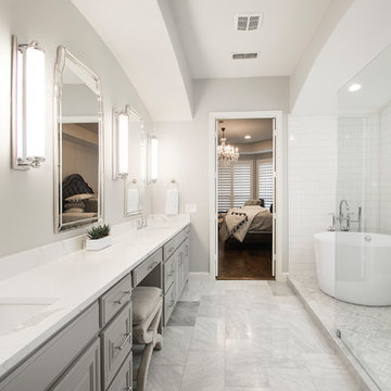
Our clients house was built in 2012, so it was not that outdated, it was just dark. The clients wanted to lighten the kitchen and create something that was their own, using more unique products. The master bath needed to be updated and they wanted the upstairs game room to be more functional for their family.
The original kitchen was very dark and all brown. The cabinets were stained dark brown, the countertops were a dark brown and black granite, with a beige backsplash. We kept the dark cabinets but lightened everything else. A new translucent frosted glass pantry door was installed to soften the feel of the kitchen. The main architecture in the kitchen stayed the same but the clients wanted to change the coffee bar into a wine bar, so we removed the upper cabinet door above a small cabinet and installed two X-style wine storage shelves instead. An undermount farm sink was installed with a 23” tall main faucet for more functionality. We replaced the chandelier over the island with a beautiful Arhaus Poppy large antique brass chandelier. Two new pendants were installed over the sink from West Elm with a much more modern feel than before, not to mention much brighter. The once dark backsplash was now a bright ocean honed marble mosaic 2”x4” a top the QM Calacatta Miel quartz countertops. We installed undercabinet lighting and added over-cabinet LED tape strip lighting to add even more light into the kitchen.
We basically gutted the Master bathroom and started from scratch. We demoed the shower walls, ceiling over tub/shower, demoed the countertops, plumbing fixtures, shutters over the tub and the wall tile and flooring. We reframed the vaulted ceiling over the shower and added an access panel in the water closet for a digital shower valve. A raised platform was added under the tub/shower for a shower slope to existing drain. The shower floor was Carrara Herringbone tile, accented with Bianco Venatino Honed marble and Metro White glossy ceramic 4”x16” tile on the walls. We then added a bench and a Kohler 8” rain showerhead to finish off the shower. The walk-in shower was sectioned off with a frameless clear anti-spot treated glass. The tub was not important to the clients, although they wanted to keep one for resale value. A Japanese soaker tub was installed, which the kids love! To finish off the master bath, the walls were painted with SW Agreeable Gray and the existing cabinets were painted SW Mega Greige for an updated look. Four Pottery Barn Mercer wall sconces were added between the new beautiful Distressed Silver leaf mirrors instead of the three existing over-mirror vanity bars that were originally there. QM Calacatta Miel countertops were installed which definitely brightened up the room!
Originally, the upstairs game room had nothing but a built-in bar in one corner. The clients wanted this to be more of a media room but still wanted to have a kitchenette upstairs. We had to remove the original plumbing and electrical and move it to where the new cabinets were. We installed 16’ of cabinets between the windows on one wall. Plank and Mill reclaimed barn wood plank veneers were used on the accent wall in between the cabinets as a backing for the wall mounted TV above the QM Calacatta Miel countertops. A kitchenette was installed to one end, housing a sink and a beverage fridge, so the clients can still have the best of both worlds. LED tape lighting was added above the cabinets for additional lighting. The clients love their updated rooms and feel that house really works for their family now.
Design/Remodel by Hatfield Builders & Remodelers | Photography by Versatile Imaging

 Merits Design Group, Inc.
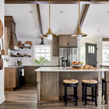
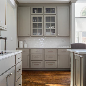
We reduced the number of glass profiles in the uppers to hide the practical items that aren't as pretty. Swapping about huge base cabinets with useful drawers offered more options for this service area.
Find the right local pro for your project
 Balboa Design Group
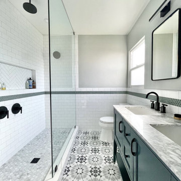
Our clients wanted a REAL master bathroom with enough space for both of them to be in there at the same time. Their house, built in the 1940’s, still had plenty of the original charm, but also had plenty of its original tiny spaces that just aren’t very functional for modern life.
The original bathroom had a tiny stall shower, and just a single vanity with very limited storage and counter space. Not to mention kitschy pink subway tile on every wall. With some creative reconfiguring, we were able to reclaim about 25 square feet of space from the bedroom. Which gave us the space we needed to introduce a double vanity with plenty of storage, and a HUGE walk-in shower that spans the entire length of the new bathroom!
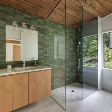
While we knew we needed to stay true to the original character of the house, we also wanted to bring in some modern flair! Pairing strong graphic floor tile with some subtle (and not so subtle) green tones gave us the perfect blend of classic sophistication with a modern glow up.
Our clients were thrilled with the look of their new space, and were even happier about how large and open it now feels!
 Flavin Architects
New Additions to Hoover + Hill
This project is a continuation of the renovation and updating work Flavin Architects had previously completed at the 1958 Wales house, designed by architect Henry Hoover and Walter Hill. Our clients, a young family, desired more space for guests, a home office, a yoga studio, and covered car parking. The challenge was to respect the architects’ original vision and not to interfere with the perfect cruciform plan of the house. To accomplish these goals, we converted the existing garage/workshop structure into a guest house and then designed a new, separate carport/storage building.
The new carport building shares the low-slope gable of the original Hoover structure. The post and beam structure characteristic of Hoover’s design is updated through the use of galvanized steel posts and I beams. The galvanized beams cantilever to support a sheltered walkway leading from the parking to a guest house terrace defined in relationship to the three structures surrounding it. The terrace is paved in slate with a central rain garden. Wood lattice clads the carport, providing good ventilation and letting the building glow like a lantern at night. Our guest house renovation celebrates the unique structural timber ceiling of the original garage. We replaced opaque plywood trusses with a slender cable truss structurally engineered by Webb Structural Services. This cable truss allows for a view of the timber ceiling. A wall of glass facing the courtyard replaced the original garage door. A murphy bed in the rear room enables quick conversion from guest quarters to weight room.
 Klopf Architecture
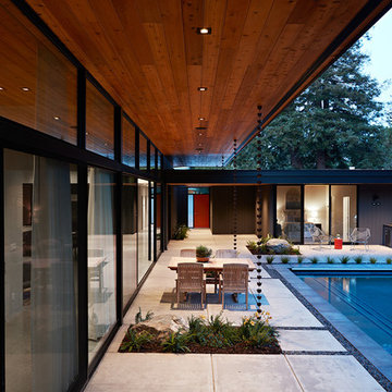
Klopf Architecture, Arterra Landscape Architects and Henry Calvert of Calvert Ventures Designed and built a new warm, modern, Eichler-inspired, open, indoor-outdoor home on a deeper-than-usual San Mateo Highlands property where an original Eichler house had burned to the ground.
The owners wanted multi-generational living and larger spaces than the original home offered, but all parties agreed that the house should respect the neighborhood and blend in stylistically with the other Eichlers. At first the Klopf team considered re-using what little was left of the original home and expanding on it. But after discussions with the owner and builder, all parties agreed that the last few remaining elements of the house were not practical to re-use, so Klopf Architecture designed a new home that pushes the Eichler approach in new directions.
One disadvantage of Eichler production homes is that the house designs were not optimized for each specific lot. A new custom home offered the team a chance to start over. In this case, a longer house that opens up sideways to the south fit the lot better than the original square-ish house that used to open to the rear (west). Accordingly, the Klopf team designed an L-shaped “bar” house with a large glass wall with large sliding glass doors that faces sideways instead of to the rear like a typical Eichler. This glass wall opens to a pool and landscaped yard designed by Arterra Landscape Architects.
Driving by the house, one might assume at first glance it is an Eichler because of the horizontality, the overhanging flat roof eaves, the dark gray vertical siding, and orange solid panel front door, but the house is designed for the 21st Century and is not meant to be a “Likeler.” You won't see any posts and beams in this home. Instead, the ceiling decking is a western red cedar that covers over all the beams. Like Eichlers, this cedar runs continuously from inside to out, enhancing the indoor / outdoor feeling of the house, but unlike Eichlers it conceals a cavity for lighting, wiring, and insulation. Ceilings are higher, rooms are larger and more open, the master bathroom is light-filled and more generous, with a separate tub and shower and a separate toilet compartment, and there is plenty of storage. The garage even easily fits two of today's vehicles with room to spare.
A massive 49-foot by 12-foot wall of glass and the continuity of materials from inside to outside enhance the inside-outside living concept, so the owners and their guests can flow freely from house to pool deck to BBQ to pool and back.
During construction in the rough framing stage, Klopf thought the front of the house appeared too tall even though the house had looked right in the design renderings (probably because the house is uphill from the street). So Klopf Architecture paid the framer to change the roofline from how we had designed it to be lower along the front, allowing the home to blend in better with the neighborhood. One project goal was for people driving up the street to pass the home without immediately noticing there is an "imposter" on this lot, and making that change was essential to achieve that goal.
This 2,606 square foot, 3 bedroom, 3 bathroom Eichler-inspired new house is located in San Mateo in the heart of the Silicon Valley.
Klopf Architecture Project Team: John Klopf, AIA, Klara Kevane
Landscape Architect: Arterra Landscape Architects
Contractor: Henry Calvert of Calvert Ventures
Photography ©2016 Mariko Reed
Location: San Mateo, CA
Year completed: 2016

Sponsored
Columbus, OH

Wannemacher Interiors
Customized Award-Winning Interior Design Solutions in Franklin Cnty OH
 Kuche+Cucina
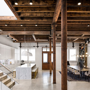
The owners of this home, purchased it from an architect, who converted an old factory, in downtown Jersey City, into a house. When the family grew, they needed to either move, or extend this house they love so much.
Being that this is a historical-preservation building, the front had to remain 'as is'.
Owners hired Fogarty Finger architects to redesign the home and Kuche+Cucina, for the kitchen, closets and the party kitchenette.
Pedini cabinets were chosen, for their sleek, minimal look, in both matte glass and matte lacquer, for different textures.
The work countertop, was done in durable quartz, while the island and the backsplash are real marble.
 Domus Constructors, LLC.
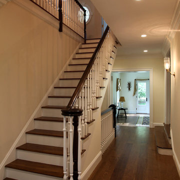
This project was a renovation of an 1824 antique farmhouse in Fairfield, CT. Additions that were constructed in the 1940's were removed, portions of the original structure including the roof and framing were selectively demolished in order to maintain the charm and beauty of the original home. Three additions were carefully designed to complement the remaining original structure and meet the space and function requirements of the homeowners.
The additions include a new lower level playroom an au-pair bedroom, and additional mechanical space. The first floor received a new kitchen, living room, great room and mud room as well as two powder rooms. The second floor is outfitted with a new bedroom, laundry room, master bedroom suite and balcony. The renovated space includes the dining room, study, butler's pantry, entry hall stair and two bedrooms. Finally, new electrical and energy efficient mechanical systems and windows and doors were installed throughout the home.
Starting with the main entry at the north side of the house, the home was totally renovated inside and out. The entire exterior of the home was restored. A new entrance portico was constructed while incorporating the original entry stoop. A custom hand built balustrade was installed on all of the balcony rail areas. Inside the dining room, the colonial feel with oversized fireplace was maintained, and the original wide-plank pine boards were reused to keep the warmth and charm of the original room intact.
The main entry ceiling was removed to create space open to the second floor. This space was adorned with a wonderful antique pendant fixture which now hangs from the second floor ceiling. Two arched stained glass doors were purchased from an architectural salvage shop and installed to separate the Entry from the Study.
 Fireclay Tile
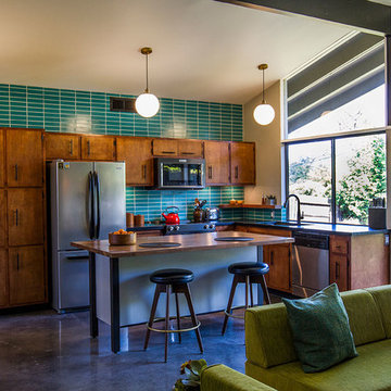
This labor of love turned out to be a mid-century masterpiece, thanks to Robert Maurer's expert eye for color and interior design
Kitchen - mid-century modern kitchen idea in Sacramento with dark wood cabinets, green backsplash, ceramic backsplash and an island
Kitchen - mid-century modern kitchen idea in Sacramento with dark wood cabinets, green backsplash, ceramic backsplash and an island
 JN Interior Spaces
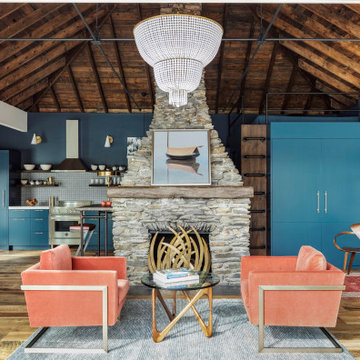
The renovation of a mid century cottage on the lake, now serves as a guest house. The renovation preserved the original architectural elements such as the ceiling and original stone fireplace to preserve the character, personality and history and provide the inspiration and canvas to which everything else would be added. To prevent the space from feeling dark & too rustic, the lines were kept clean, the furnishings modern and the use of saturated color was strategically placed throughout.
 Pure & Original Paints NA
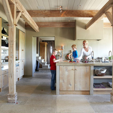
Kitchen - coastal kitchen idea in Amsterdam with flat-panel cabinets, light wood cabinets, an island and concrete countertops
 Flavin Architects
Mid-Century Remodel on Tabor Hill
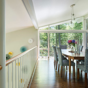
This sensitively sited house was designed by Robert Coolidge, a renowned architect and grandson of President Calvin Coolidge. The house features a symmetrical gable roof and beautiful floor to ceiling glass facing due south, smartly oriented for passive solar heating. Situated on a steep lot, the house is primarily a single story that steps down to a family room. This lower level opens to a New England exterior. Our goals for this project were to maintain the integrity of the original design while creating more modern spaces. Our design team worked to envision what Coolidge himself might have designed if he'd had access to modern materials and fixtures.
With the aim of creating a signature space that ties together the living, dining, and kitchen areas, we designed a variation on the 1950's "floating kitchen." In this inviting assembly, the kitchen is located away from exterior walls, which allows views from the floor-to-ceiling glass to remain uninterrupted by cabinetry.
We updated rooms throughout the house; installing modern features that pay homage to the fine, sleek lines of the original design. Finally, we opened the family room to a terrace featuring a fire pit. Since a hallmark of our design is the diminishment of the hard line between interior and exterior, we were especially pleased for the opportunity to update this classic work.

Sponsored
Columbus, OH
Wannemacher Interiors
Customized Award-Winning Interior Design Solutions in Franklin Cnty OH
 Rikki Snyder
Photo: Rikki Snyder © 2016 Houzz
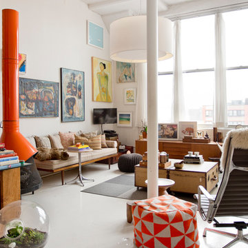
Inspiration for an eclectic living room remodel in New York
Inspiration for an eclectic living room remodel in New York

 Klopf Architecture
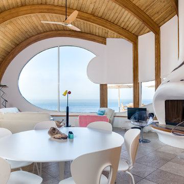
Klopf Architecture, Arterra Landscape Architects and Henry Calvert of Calvert Ventures Designed and built a new warm, modern, Eichler-inspired, open, indoor-outdoor home on a deeper-than-usual San Mateo Highlands property where an original Eichler house had burned to the ground.
The owners wanted multi-generational living and larger spaces than the original home offered, but all parties agreed that the house should respect the neighborhood and blend in stylistically with the other Eichlers. At first the Klopf team considered re-using what little was left of the original home and expanding on it. But after discussions with the owner and builder, all parties agreed that the last few remaining elements of the house were not practical to re-use, so Klopf Architecture designed a new home that pushes the Eichler approach in new directions.
One disadvantage of Eichler production homes is that the house designs were not optimized for each specific lot. A new custom home offered the team a chance to start over. In this case, a longer house that opens up sideways to the south fit the lot better than the original square-ish house that used to open to the rear (west). Accordingly, the Klopf team designed an L-shaped “bar” house with a large glass wall with large sliding glass doors that faces sideways instead of to the rear like a typical Eichler. This glass wall opens to a pool and landscaped yard designed by Arterra Landscape Architects.
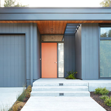
Driving by the house, one might assume at first glance it is an Eichler because of the horizontality, the overhanging flat roof eaves, the dark gray vertical siding, and orange solid panel front door, but the house is designed for the 21st Century and is not meant to be a “Likeler.” You won't see any posts and beams in this home. Instead, the ceiling decking is a western red cedar that covers over all the beams. Like Eichlers, this cedar runs continuously from inside to out, enhancing the indoor / outdoor feeling of the house, but unlike Eichlers it conceals a cavity for lighting, wiring, and insulation. Ceilings are higher, rooms are larger and more open, the master bathroom is light-filled and more generous, with a separate tub and shower and a separate toilet compartment, and there is plenty of storage. The garage even easily fits two of today's vehicles with room to spare.
A massive 49-foot by 12-foot wall of glass and the continuity of materials from inside to outside enhance the inside-outside living concept, so the owners and their guests can flow freely from house to pool deck to BBQ to pool and back.
During construction in the rough framing stage, Klopf thought the front of the house appeared too tall even though the house had looked right in the design renderings (probably because the house is uphill from the street). So Klopf Architecture paid the framer to change the roofline from how we had designed it to be lower along the front, allowing the home to blend in better with the neighborhood. One project goal was for people driving up the street to pass the home without immediately noticing there is an "imposter" on this lot, and making that change was essential to achieve that goal.
This 2,606 square foot, 3 bedroom, 3 bathroom Eichler-inspired new house is located in San Mateo in the heart of the Silicon Valley.
Klopf Architecture Project Team: John Klopf, AIA, Klara Kevane
Landscape Architect: Arterra Landscape Architects
Contractor: Henry Calvert of Calvert Ventures
Photography ©2016 Mariko Reed
Location: San Mateo, CA
Year completed: 2016
 Amelia Hallsworth Photography
Photo: Amelia Hallsworth © 2015 Houzz
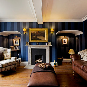
Cottage living room photo in London
Cottage living room photo in London

Sponsored
Columbus, OH
Wannemacher Interiors
Customized Award-Winning Interior Design Solutions in Franklin Cnty OH
 Custom Design & Construction
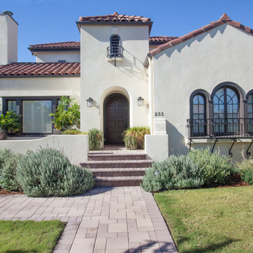
We were excited when the homeowners of this project approached us to help them with their whole house remodel as this is a historic preservation project. The historical society has approved this remodel. As part of that distinction we had to honor the original look of the home; keeping the façade updated but intact. For example the doors and windows are new but they were made as replicas to the originals. The homeowners were relocating from the Inland Empire to be closer to their daughter and grandchildren. One of their requests was additional living space. In order to achieve this we added a second story to the home while ensuring that it was in character with the original structure. The interior of the home is all new. It features all new plumbing, electrical and HVAC. Although the home is a Spanish Revival the homeowners style on the interior of the home is very traditional. The project features a home gym as it is important to the homeowners to stay healthy and fit. The kitchen / great room was designed so that the homewoners could spend time with their daughter and her children. The home features two master bedroom suites. One is upstairs and the other one is down stairs. The homeowners prefer to use the downstairs version as they are not forced to use the stairs. They have left the upstairs master suite as a guest suite.
Enjoy some of the before and after images of this project:
http://www.houzz.com/discussions/3549200/old-garage-office-turned-gym-in-los-angeles
http://www.houzz.com/discussions/3558821/la-face-lift-for-the-patio
http://www.houzz.com/discussions/3569717/la-kitchen-remodel
http://www.houzz.com/discussions/3579013/los-angeles-entry-hall
http://www.houzz.com/discussions/3592549/exterior-shots-of-a-whole-house-remodel-in-la
http://www.houzz.com/discussions/3607481/living-dining-rooms-become-a-library-and-formal-dining-room-in-la
http://www.houzz.com/discussions/3628842/bathroom-makeover-in-los-angeles-ca
http://www.houzz.com/discussions/3640770/sweet-dreams-la-bedroom-remodels
Exterior: Approved by the historical society as a Spanish Revival, the second story of this home was an addition. All of the windows and doors were replicated to match the original styling of the house. The roof is a combination of Gable and Hip and is made of red clay tile. The arched door and windows are typical of Spanish Revival. The home also features a Juliette Balcony and window.
Library / Living Room: The library offers Pocket Doors and custom bookcases.
Powder Room: This powder room has a black toilet and Herringbone travertine.
Kitchen: This kitchen was designed for someone who likes to cook! It features a Pot Filler, a peninsula and an island, a prep sink in the island, and cookbook storage on the end of the peninsula. The homeowners opted for a mix of stainless and paneled appliances. Although they have a formal dining room they wanted a casual breakfast area to enjoy informal meals with their grandchildren. The kitchen also utilizes a mix of recessed lighting and pendant lights. A wine refrigerator and outlets conveniently located on the island and around the backsplash are the modern updates that were important to the homeowners.
Master bath: The master bath enjoys both a soaking tub and a large shower with body sprayers and hand held. For privacy, the bidet was placed in a water closet next to the shower. There is plenty of counter space in this bathroom which even includes a makeup table.
Staircase: The staircase features a decorative niche
Upstairs master suite: The upstairs master suite features the Juliette balcony
Outside: Wanting to take advantage of southern California living the homeowners requested an outdoor kitchen complete with retractable awning. The fountain and lounging furniture keep it light.
Home gym: This gym comes completed with rubberized floor covering and dedicated bathroom. It also features its own HVAC system and wall mounted TV.
 McDonald Remodeling
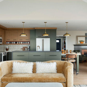
Main floor, kitchen, and dining remodel plus addition replacement by Minneapolis / St. Paul-based McDonald Remodeling. See more examples of our work and learn more at www.mcdonaldremodeling.com

31