
Search results for "Originates" in Home Design Ideas
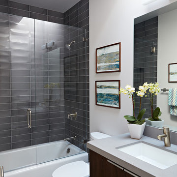
 Klopf Architecture
Klopf Architecture, Arterra Landscape Architects and Henry Calvert of Calvert Ventures Designed and built a new warm, modern, Eichler-inspired, open, indoor-outdoor home on a deeper-than-usual San Mateo Highlands property where an original Eichler house had burned to the ground.
The owners wanted multi-generational living and larger spaces than the original home offered, but all parties agreed that the house should respect the neighborhood and blend in stylistically with the other Eichlers. At first the Klopf team considered re-using what little was left of the original home and expanding on it. But after discussions with the owner and builder, all parties agreed that the last few remaining elements of the house were not practical to re-use, so Klopf Architecture designed a new home that pushes the Eichler approach in new directions.
One disadvantage of Eichler production homes is that the house designs were not optimized for each specific lot. A new custom home offered the team a chance to start over. In this case, a longer house that opens up sideways to the south fit the lot better than the original square-ish house that used to open to the rear (west). Accordingly, the Klopf team designed an L-shaped “bar” house with a large glass wall with large sliding glass doors that faces sideways instead of to the rear like a typical Eichler. This glass wall opens to a pool and landscaped yard designed by Arterra Landscape Architects.
Driving by the house, one might assume at first glance it is an Eichler because of the horizontality, the overhanging flat roof eaves, the dark gray vertical siding, and orange solid panel front door, but the house is designed for the 21st Century and is not meant to be a “Likeler.” You won't see any posts and beams in this home. Instead, the ceiling decking is a western red cedar that covers over all the beams. Like Eichlers, this cedar runs continuously from inside to out, enhancing the indoor / outdoor feeling of the house, but unlike Eichlers it conceals a cavity for lighting, wiring, and insulation. Ceilings are higher, rooms are larger and more open, the master bathroom is light-filled and more generous, with a separate tub and shower and a separate toilet compartment, and there is plenty of storage. The garage even easily fits two of today's vehicles with room to spare.
A massive 49-foot by 12-foot wall of glass and the continuity of materials from inside to outside enhance the inside-outside living concept, so the owners and their guests can flow freely from house to pool deck to BBQ to pool and back.
During construction in the rough framing stage, Klopf thought the front of the house appeared too tall even though the house had looked right in the design renderings (probably because the house is uphill from the street). So Klopf Architecture paid the framer to change the roofline from how we had designed it to be lower along the front, allowing the home to blend in better with the neighborhood. One project goal was for people driving up the street to pass the home without immediately noticing there is an "imposter" on this lot, and making that change was essential to achieve that goal.
This 2,606 square foot, 3 bedroom, 3 bathroom Eichler-inspired new house is located in San Mateo in the heart of the Silicon Valley.
Klopf Architecture Project Team: John Klopf, AIA, Klara Kevane
Landscape Architect: Arterra Landscape Architects
Contractor: Henry Calvert of Calvert Ventures
Photography ©2016 Mariko Reed
Location: San Mateo, CA
Year completed: 2016
 Alair Homes Plano
Our clients house was built in 2012, so it was not that outdated, it was just dark. The clients wanted to lighten the kitchen and create something that was their own, using more unique products. The master bath needed to be updated and they wanted the upstairs game room to be more functional for their family.
The original kitchen was very dark and all brown. The cabinets were stained dark brown, the countertops were a dark brown and black granite, with a beige backsplash. We kept the dark cabinets but lightened everything else. A new translucent frosted glass pantry door was installed to soften the feel of the kitchen. The main architecture in the kitchen stayed the same but the clients wanted to change the coffee bar into a wine bar, so we removed the upper cabinet door above a small cabinet and installed two X-style wine storage shelves instead. An undermount farm sink was installed with a 23” tall main faucet for more functionality. We replaced the chandelier over the island with a beautiful Arhaus Poppy large antique brass chandelier. Two new pendants were installed over the sink from West Elm with a much more modern feel than before, not to mention much brighter. The once dark backsplash was now a bright ocean honed marble mosaic 2”x4” a top the QM Calacatta Miel quartz countertops. We installed undercabinet lighting and added over-cabinet LED tape strip lighting to add even more light into the kitchen.
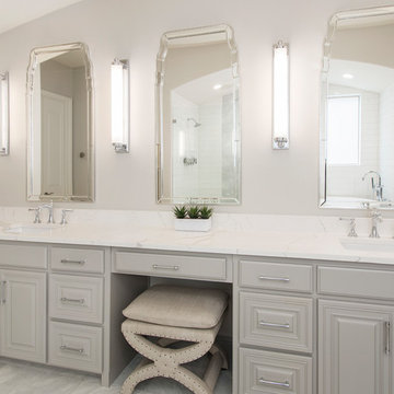
We basically gutted the Master bathroom and started from scratch. We demoed the shower walls, ceiling over tub/shower, demoed the countertops, plumbing fixtures, shutters over the tub and the wall tile and flooring. We reframed the vaulted ceiling over the shower and added an access panel in the water closet for a digital shower valve. A raised platform was added under the tub/shower for a shower slope to existing drain. The shower floor was Carrara Herringbone tile, accented with Bianco Venatino Honed marble and Metro White glossy ceramic 4”x16” tile on the walls. We then added a bench and a Kohler 8” rain showerhead to finish off the shower. The walk-in shower was sectioned off with a frameless clear anti-spot treated glass. The tub was not important to the clients, although they wanted to keep one for resale value. A Japanese soaker tub was installed, which the kids love! To finish off the master bath, the walls were painted with SW Agreeable Gray and the existing cabinets were painted SW Mega Greige for an updated look. Four Pottery Barn Mercer wall sconces were added between the new beautiful Distressed Silver leaf mirrors instead of the three existing over-mirror vanity bars that were originally there. QM Calacatta Miel countertops were installed which definitely brightened up the room!
Originally, the upstairs game room had nothing but a built-in bar in one corner. The clients wanted this to be more of a media room but still wanted to have a kitchenette upstairs. We had to remove the original plumbing and electrical and move it to where the new cabinets were. We installed 16’ of cabinets between the windows on one wall. Plank and Mill reclaimed barn wood plank veneers were used on the accent wall in between the cabinets as a backing for the wall mounted TV above the QM Calacatta Miel countertops. A kitchenette was installed to one end, housing a sink and a beverage fridge, so the clients can still have the best of both worlds. LED tape lighting was added above the cabinets for additional lighting. The clients love their updated rooms and feel that house really works for their family now.
Design/Remodel by Hatfield Builders & Remodelers | Photography by Versatile Imaging
 Origin Hardwood
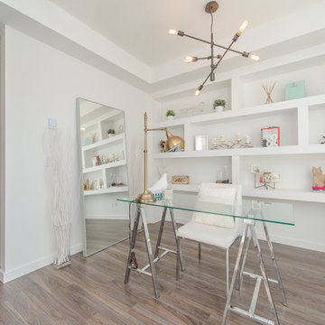
This townhouse opens to this beautiful home office. Continuous flooring through the main floor lends to an open flow that is pleasing to the eye.
Inspiration for a small contemporary freestanding desk laminate floor and brown floor home office remodel in Vancouver with white walls
Inspiration for a small contemporary freestanding desk laminate floor and brown floor home office remodel in Vancouver with white walls
Find the right local pro for your project

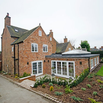
 TVL Creative Ltd.
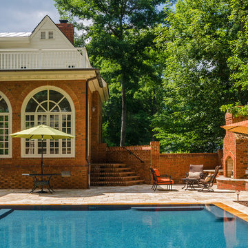
This project was such an incredible design opportunity, and instilled inspiration and excitement at every turn! Our amazing clients came to us with the challenge of converting their beloved family home into a welcoming haven for all members of the family. At the time that we met our clients, they were struggling with the difficult personal decision of the fate of the home. Their father/father-in-law had passed away and their mother/mother-in-law had recently been admitted into a nursing facility and was fighting Alzheimer’s. Resistant to loss of the home now that both parents were out of it, our clients purchased the home to keep in in the family. Despite their permanent home currently being in New Jersey, these clients dedicated themselves to keeping and revitalizing the house. We were moved by the story and became immediately passionate about bringing this dream to life.
The home was built by the parents of our clients and was only ever owned by them, making this a truly special space to the family. Our goal was to revitalize the home and to bring new energy into every room without losing the special characteristics that were original to the home when it was built. In this way, we were able to develop a house that maintains its own unique personality while offering a space of welcoming neutrality for all members of the family to enjoy over time.
The renovation touched every part of the home: the exterior, foyer, kitchen, living room, sun room, garage, six bedrooms, three bathrooms, the laundry room, and everything in between. The focus was to develop a style that carried consistently from space to space, but allowed for unique expression in the small details in every room.
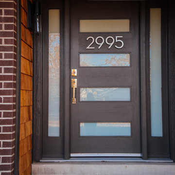
Starting at the entry, we renovated the front door and entry point to offer more presence and to bring more of the mid-century vibe to the home’s exterior. We integrated a new modern front door, cedar shingle accents, new exterior paint, and gorgeous contemporary house numbers that really allow the home to stand out. Just inside the entry, we renovated the foyer to create a playful entry point worthy of attention. Cement look tile adorns the foyer floor, and we’ve added new lighting and upgraded the entry coat storage.
Upon entering the home, one will immediately be captivated by the stunning kitchen just off the entry. We transformed this space in just about every way. While the footprint of the home ultimately remained almost identical, the aesthetics were completely turned on their head. We re-worked the kitchen to maximize storage and to create an informal dining area that is great for casual hosting or morning coffee.
We removed the entry to the garage that was once in the informal dining, and created a peninsula in its place that offers a unique division between the kitchen/informal dining and the formal dining and living areas. The simple light warm light gray cabinetry offers a bit of traditional elegance, along with the marble backsplash and quartz countertops. We extended the original wood flooring into the kitchen and stained all floors to match for a warmth that truly resonates through all spaces. We upgraded appliances, added lighting everywhere, and finished the space with some gorgeous mid century furniture pieces.
In the formal dining and living room, we really focused on maintaining the original marble fireplace as a focal point. We cleaned the marble, repaired the mortar, and refinished the original fireplace screen to give a new sleek look in black. We then integrated a new gas insert for modern heating and painted the upper portion in a rich navy blue; an accent that is carried through the home consistently as a nod to our client’s love of the color.
The former entry into the old covered porch is now an elegant glass door leading to a stunning finished sunroom. This room was completely upgraded as well. We wrapped the entire space in cozy white shiplap to keep a casual feel with brightness. We tiled the floor with large format concrete look tile, and painted the old brick fireplace a bright white. We installed a new gas burning unit, and integrated transitional style lighting to bring warmth and elegance into the space. The new black-frame windows are adorned with decorative shades that feature hand-sketched bird prints, and we’ve created a dedicated garden-ware “nook” for our client who loves to work in the yard. The far end of this space is completed with two oversized chaise loungers and overhead lights…the most perfect little reading nook!
Just off the dining room, we created an entirely new space to the home: a mudroom. The clients lacked this space and desperately needed a landing spot upon entering the home from the garage. We uniquely planned existing space in the garage to utilize for this purpose, and were able to create a small but functional entry point without losing the ability to park cars in the garage. This new space features cement-look tile, gorgeous deep brown cabinetry, and plenty of storage for all the small items one might need to store while moving in and out of the home.
The remainder of the upstairs level includes massive renovations to the guest hall bathroom and guest bedroom, upstairs master bed/bath suite, and a third bedroom that we converted into a home office for the client.
Some of the largest transformations were made in the basement, where unfinished space and lack of light were converted into gloriously lit, cozy, finished spaces. Our first task was to convert the massive basement living room into the new master bedroom for our clients. We removed existing built-ins, created an entirely new walk-in closet, painted the old brick fireplace, installed a new gas unit, added carpet, introduced new lighting, replaced windows, and upgraded every part of the aesthetic appearance. One of the most incredible features of this space is the custom double sliding barn door made by a Denver artisan. This space is truly a retreat for our clients!
We also completely transformed the laundry room, back storage room, basement master bathroom, and two bedrooms.
This home’s massive scope and ever-evolving challenges were thrilling and exciting to work with, and the result is absolutely amazing. At the end of the day, this home offers a look and feel that the clients love. Above all, though, the clients feel the spirit of their family home and have a welcoming environment for all members of the family to enjoy for years to come.
 BEVOLO GAS & ELECTRIC LIGHTS
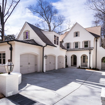
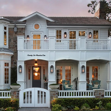
Transitional Craftsman style home featuring French Quarter Series on garage & entry columns.
Large transitional white three-story brick house exterior photo in New Orleans with a shingle roof
Large transitional white three-story brick house exterior photo in New Orleans with a shingle roof

Sponsored
Columbus, OH

Wannemacher Interiors
Customized Award-Winning Interior Design Solutions in Franklin Cnty OH
 Le jardinet
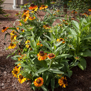
Short and Sassy helenium - new for 2014 from Skagit Gardens
Le jardinet
This is an example of a landscaping in Seattle.
This is an example of a landscaping in Seattle.

 Che Bella Interiors Design + Remodeling
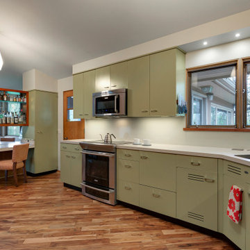
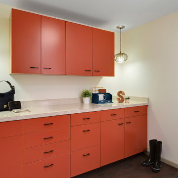
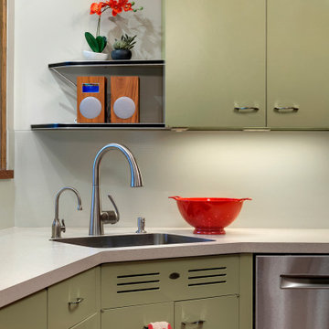
Prior to the remodel this home was 100% original and left to age while the homeowner moved on. Our clients are the second homeowner to the home, and we helped to keep the original feeling of the home as well as worked to reuse the original St. Charles steel cabinets where possible. The clients found a second steel cabinet kitchen out of state with taller upper cabinets than the original and with a lift of the original soffit we were able to combine the original and additional cabinets to create a wonderful and more functional Kitchen. Each cabinet was relocated, painted, and reinstalled. It’s hard to imagine that the Kitchen previously featured terra cotta painted cabinets with a pink countertop and backsplash 4×4 tile. The lighting, windows, and many other design details are still original throughout the home. As the home has many interesting minor angles – we had the flooring installed on an angle of its own to add a wonderful detail and not fight with the other angles within.
In the Mudroom entry near the Garage we purposefully organized several of the excess cabinets which allowed for additional storage. The terra cotta cabinet color reflected the original cabinet color in the Kitchen.

 Jon Allen Fine Metal Art
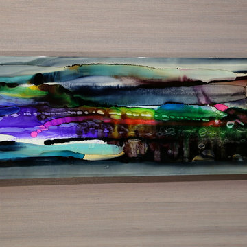
JAC 140 - Twilight in Space by Jon Allen
The Jon Allen Collection is an exclusive, hand-selected group of my most personal work to date. Each piece is hand-painted on aluminum. My art itself and my chosen medium, aluminum, are blissfully married. You may not think of the word organic when you hear the word metal, but this is some of my most organic art and that’s simply because metal allows my work to achieve true sentience. Aluminum’s naturally reflective nature enables each color, shape, and stroke to reach its full potential. A new aspect of the painting will reveal itself to you as it basks in the light that surrounds, evades, or envelops it in that moment. When you see the piece from different angles, you will appreciate how vibrant, dynamic, and environmentally influenced these pieces are. What you may see and feel by morning is not what you’ll see or feel by dusk and in many ways, and as such I feel these pieces capture the ever-ebbing and complex nature of human emotion and perception.
Some of these pieces are truly abstract while others are modern takes on traditional landscapes, marine life, and portraits. I hope you enjoy them a fraction of how much I enjoyed creating them. If you have any questions, please don’t hesitate to reach out.
Number of Pieces: 1
Dimensions: 46" x 13" x 2" off the wall
Care & Cleaning: Clean with a soft cloth and plain soap & water
Other Features: Hardware is pre-installed for simple hanging and art will “float” 2” off the wall
 Jon Allen Fine Metal Art
JAC 140 - Twilight in Space by Jon Allen
The Jon Allen Collection is an exclusive, hand-selected group of my most personal work to date. Each piece is hand-painted on aluminum. My art itself and my chosen medium, aluminum, are blissfully married. You may not think of the word organic when you hear the word metal, but this is some of my most organic art and that’s simply because metal allows my work to achieve true sentience. Aluminum’s naturally reflective nature enables each color, shape, and stroke to reach its full potential. A new aspect of the painting will reveal itself to you as it basks in the light that surrounds, evades, or envelops it in that moment. When you see the piece from different angles, you will appreciate how vibrant, dynamic, and environmentally influenced these pieces are. What you may see and feel by morning is not what you’ll see or feel by dusk and in many ways, and as such I feel these pieces capture the ever-ebbing and complex nature of human emotion and perception.
Some of these pieces are truly abstract while others are modern takes on traditional landscapes, marine life, and portraits. I hope you enjoy them a fraction of how much I enjoyed creating them. If you have any questions, please don’t hesitate to reach out.
Number of Pieces: 1
Dimensions: 46" x 13" x 2" off the wall
Care & Cleaning: Clean with a soft cloth and plain soap & water
Other Features: Hardware is pre-installed for simple hanging and art will “float” 2” off the wall

Sponsored
Columbus, OH
Wannemacher Interiors
Customized Award-Winning Interior Design Solutions in Franklin Cnty OH
 Eileen Gordon Design
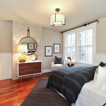
Example of a mid-sized transitional guest medium tone wood floor bedroom design in San Francisco with beige walls and no fireplace
 Powell Construction
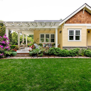
Originally built in 1938, this bungalow cottage had enduring character, but its traditional closed kitchen layout – typical of the era – didn’t align with the way the homeowners envisioned living in the space. Inspired by their travels through England’s Cotswolds, the French countryside, and Carmel’s whimsical Storybook Cottages by the Sea, the homeowners dreamed of a home that captured the romance of cottages and one that would seamlessly connect with their stunning English-style garden.
After years of attempting to reimagine the kitchen in its original location the homeowners realized it would never truly suit the way they lived & wanted to entertain. The original kitchen was historical & was built when the kitchen was the last room you wanted guests to see. It was tucked into the front corner of the home off a hallway leading to the main level bedrooms and bath. To reach the dining room, you passed through a servery swing door, then continued into the living room. While the original door had charm, it disrupted the flow and connection between the kitchen and the main living areas.
To bring the homeowners’ vision to life, the design called for a bold move—relocating the kitchen entirely. We designed a 560-square-foot addition off the living room – placing the kitchen at the heart of the home and connecting it to the gardens. The new space includes a sunlit breakfast nook, a charming butler’s pantry, a garden vestibule with its own entry porch, and a wraparound porch that encourages indoor-outdoor living. The main level remodel also redefined existing spaces: the old dining room was transformed into a cozy study library, while a former bedroom became an elegant dining room just off the new kitchen.
Every design decision honored the home’s original 1938 architecture and character. Matching the home’s original 1.5-story proportions, the new kitchen wing was designed with intersecting gables that echo the scale and pitch of the existing roofline. A stone-wrapped chimney topped with a handcrafted copper cap is straight from the pages of a storybook. Decorative corbels, intricate window trim, and cedar shake in the gable ends further connect the new architecture to the home’s historic detailing.
Finishes and fixtures were thoughtfully chosen to marry the home’s moodier, character-rich original rooms with the brighter, lighter new spaces. The result is a timeless transformation that feels as though it has always been part of the home – an enchanting blend of storybook charm, functional design, and garden-centered living.
At the ground level, a Pennsylvania bluestone porch and stone skirting ground the addition in traditional materials. Inside, a tongue-and-groove ceiling with hand-hewn beams gives purpose and intimacy to the heightened kitchen ceiling. The home’s signature arched openings were meticulously replicated in the new kitchen, breakfast nook, and dining room, ensuring a seamless transition between old and new. Every element – inside and out – was chosen to honor the original home while enhancing the charm, character, and connection to the garden.
Photos by MK Photography
 Powell Construction
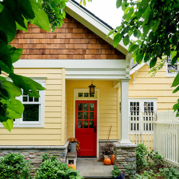
Originally built in 1938, this bungalow cottage had enduring character, but its traditional closed kitchen layout – typical of the era – didn’t align with the way the homeowners envisioned living in the space. Inspired by their travels through England’s Cotswolds, the French countryside, and Carmel’s whimsical Storybook Cottages by the Sea, the homeowners dreamed of a home that captured the romance of cottages and one that would seamlessly connect with their stunning English-style garden.
After years of attempting to reimagine the kitchen in its original location the homeowners realized it would never truly suit the way they lived & wanted to entertain. The original kitchen was historical & was built when the kitchen was the last room you wanted guests to see. It was tucked into the front corner of the home off a hallway leading to the main level bedrooms and bath. To reach the dining room, you passed through a servery swing door, then continued into the living room. While the original door had charm, it disrupted the flow and connection between the kitchen and the main living areas.
To bring the homeowners’ vision to life, the design called for a bold move—relocating the kitchen entirely. We designed a 560-square-foot addition off the living room – placing the kitchen at the heart of the home and connecting it to the gardens. The new space includes a sunlit breakfast nook, a charming butler’s pantry, a garden vestibule with its own entry porch, and a wraparound porch that encourages indoor-outdoor living. The main level remodel also redefined existing spaces: the old dining room was transformed into a cozy study library, while a former bedroom became an elegant dining room just off the new kitchen.
Every design decision honored the home’s original 1938 architecture and character. Matching the home’s original 1.5-story proportions, the new kitchen wing was designed with intersecting gables that echo the scale and pitch of the existing roofline. A stone-wrapped chimney topped with a handcrafted copper cap is straight from the pages of a storybook. Decorative corbels, intricate window trim, and cedar shake in the gable ends further connect the new architecture to the home’s historic detailing.
Finishes and fixtures were thoughtfully chosen to marry the home’s moodier, character-rich original rooms with the brighter, lighter new spaces. The result is a timeless transformation that feels as though it has always been part of the home – an enchanting blend of storybook charm, functional design, and garden-centered living.
At the ground level, a Pennsylvania bluestone porch and stone skirting ground the addition in traditional materials. Inside, a tongue-and-groove ceiling with hand-hewn beams gives purpose and intimacy to the heightened kitchen ceiling. The home’s signature arched openings were meticulously replicated in the new kitchen, breakfast nook, and dining room, ensuring a seamless transition between old and new. Every element – inside and out – was chosen to honor the original home while enhancing the charm, character, and connection to the garden.
Photos by MK Photography

Sponsored
Columbus, OH
Wannemacher Interiors
Customized Award-Winning Interior Design Solutions in Franklin Cnty OH
 Che Bella Interiors Design + Remodeling
Prior to the remodel this home was 100% original and left to age while the homeowner moved on. Our clients are the second homeowner to the home, and we helped to keep the original feeling of the home as well as worked to reuse the original St. Charles steel cabinets where possible. The clients found a second steel cabinet kitchen out of state with taller upper cabinets than the original and with a lift of the original soffit we were able to combine the original and additional cabinets to create a wonderful and more functional Kitchen. Each cabinet was relocated, painted, and reinstalled. It’s hard to imagine that the Kitchen previously featured terra cotta painted cabinets with a pink countertop and backsplash 4×4 tile. The lighting, windows, and many other design details are still original throughout the home. As the home has many interesting minor angles – we had the flooring installed on an angle of its own to add a wonderful detail and not fight with the other angles within.
In the Mudroom entry near the Garage we purposefully organized several of the excess cabinets which allowed for additional storage. The terra cotta cabinet color reflected the original cabinet color in the Kitchen.
 Che Bella Interiors Design + Remodeling
Prior to the remodel this home was 100% original and left to age while the homeowner moved on. Our clients are the second homeowner to the home, and we helped to keep the original feeling of the home as well as worked to reuse the original St. Charles steel cabinets where possible. The clients found a second steel cabinet kitchen out of state with taller upper cabinets than the original and with a lift of the original soffit we were able to combine the original and additional cabinets to create a wonderful and more functional Kitchen. Each cabinet was relocated, painted, and reinstalled. It’s hard to imagine that the Kitchen previously featured terra cotta painted cabinets with a pink countertop and backsplash 4×4 tile. The lighting, windows, and many other design details are still original throughout the home. As the home has many interesting minor angles – we had the flooring installed on an angle of its own to add a wonderful detail and not fight with the other angles within.
In the Mudroom entry near the Garage we purposefully organized several of the excess cabinets which allowed for additional storage. The terra cotta cabinet color reflected the original cabinet color in the Kitchen.
 BEVOLO GAS & ELECTRIC LIGHTS
Photos Courtesy of Brandon Architects
Transitional exterior home photo in New Orleans
Transitional exterior home photo in New Orleans
36