
Search results for "Overdoing" in Home Design Ideas
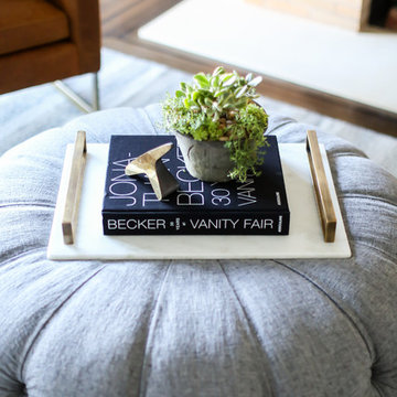
 Brooke Wagner Design
Photography: Ryan Garvin
Home design - transitional home design idea in San Francisco
Home design - transitional home design idea in San Francisco
 HC Remodel & Design
Photos by Thomas Grady Photography
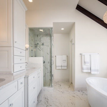
Example of a mid-sized classic master white tile and porcelain tile porcelain tile bathroom design in Omaha with furniture-like cabinets, white cabinets, a one-piece toilet, white walls, an undermount sink and quartz countertops
Example of a mid-sized classic master white tile and porcelain tile porcelain tile bathroom design in Omaha with furniture-like cabinets, white cabinets, a one-piece toilet, white walls, an undermount sink and quartz countertops
 Remcon Design Build
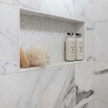
Example of a minimalist master gray tile and ceramic tile multicolored floor bathroom design in San Diego with marble countertops and white countertops
Find the right local pro for your project
 Dennisbilt Fine Cabinetry & Design
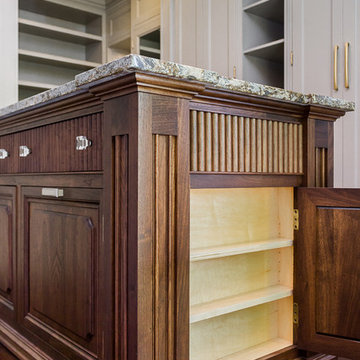
Lavish and organized luxury enhances the fine art of dressing while providing a place for everything. The cabinetry in this vestiaire was custom designed and hand crafted by Dennis Bracken of Dennisbilt Custom Cabinetry & Design with interior design executed by Interor Directions by Susan Prestia. The 108 year old home was inspiration for a timeless and classic design wiile contemporary features provide balance and sophistication. Local artists Johnathan Adams Photography and Corbin Bronze Sculptures add a touch of class and beauty.
Cabinetry features inset door and drawer fronts with exposed solid brass finial hinges. The armoire style built-ins are Maple painted with Sherwin Williams Dorian Gray with brushed brass handles. Solid Walnut island features a Cambria quartz countertop, glass knobs, and brass pulls. Custom designed 6 piece crown molding package. Vanity seating area features a velvet jewelry tray in the drawer and custom cosmetic caddy that pops out with a touch, Walnut mirror frame, and Cambria quartz top. Recessed LED lighing and beautiful contemporary chandelier. Hardwood floors are original to the home.
Environmentally friendly room! All wood in cabinetry is formaldehyde-free FSC certified as coming from sustainibly managed forests. Wall covering is a commercial grade vinyl made from recycled plastic bottles. No or Low VOC paints and stains. LED lighting and Greenguard certified Cambria quartz countertops. Adding to the eco footprint, all artists and craftsmen were local within a 50 mile radius.
Brynn Burns Photography
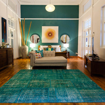

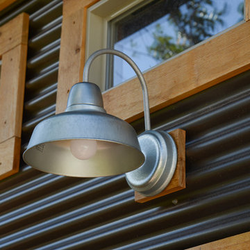
 Roy Talmage Builders
Inspiration for a mid-sized transitional detached garden shed remodel in Orange County
 American Antique Hardwoods
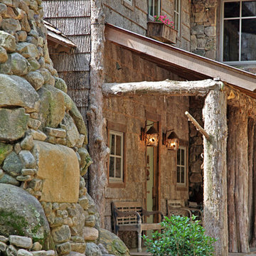
"Backwoods Bark" natural bark siding. "WeatherPlank" faded white barn siding. "Timberline Rustic Metal". Bark on locust porch posts. Reclaimed Wood and Natural Materials provided by Appalachian Antique Hardwoods. Home design by MossCreek. Photo by Erwin Loveland.
 Together Home Remodeling
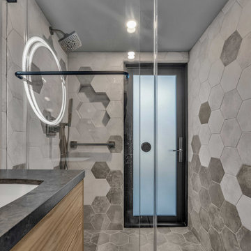
This bathroom remodel in the Sunset District was all about keeping things clean, modern, and easy to use day to day. We went with a curbless walk-in shower and frameless glass to open up the space, and used irregular hexagon tile across the walls and floor to give it a bit of character without overdoing it.
The floating wood vanity adds some warmth, and the backlit round mirror ties everything together with a simple, modern touch. Overall, a really nice balance between design and practicality.
Completed by Together Home Remodeling.
Planning a bathroom remodel in San Francisco?
Submit your inquiry - https://togetherhomeremodeling.com/
 G.B. Construction and Development, Inc.
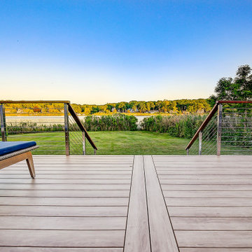
This charming ranch on the north fork of Long Island received a long overdo update. All the windows were replaced with more modern looking black framed Andersen casement windows. The front entry door and garage door compliment each other with the a column of horizontal windows. The Maibec siding really makes this house stand out while complimenting the natural surrounding. Finished with black gutters and leaders that compliment that offer function without taking away from the clean look of the new makeover. The front entry was given a streamlined entry with Timbertech decking and Viewrail railing. The rear deck, also Timbertech and Viewrail, include black lattice that finishes the rear deck with out detracting from the clean lines of this deck that spans the back of the house. The Viewrail provides the safety barrier needed without interfering with the amazing view of the water.
 G.B. Construction and Development, Inc.
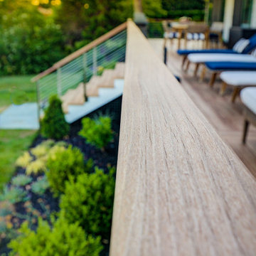
This charming ranch on the north fork of Long Island received a long overdo update. All the windows were replaced with more modern looking black framed Andersen casement windows. The front entry door and garage door compliment each other with the a column of horizontal windows. The Maibec siding really makes this house stand out while complimenting the natural surrounding. Finished with black gutters and leaders that compliment that offer function without taking away from the clean look of the new makeover. The front entry was given a streamlined entry with Timbertech decking and Viewrail railing. The rear deck, also Timbertech and Viewrail, include black lattice that finishes the rear deck with out detracting from the clean lines of this deck that spans the back of the house. The Viewrail provides the safety barrier needed without interfering with the amazing view of the water.
 DFI Interiors
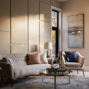
Designed to bring sophistication to this family room, these modern wood panels create an accent wall that elevate the space without overdoing it.
Example of a mid-sized trendy living room design in Boston
Example of a mid-sized trendy living room design in Boston
 Design Style Studios
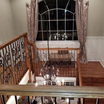
Michelle DiNicola wanted more casual look to a traditional treatment. She wanted to acknowledge the importance of the window as dictated by the architecture but not to overdo it. Robert from A Room With a View partnered with Michelle to achieve this result.
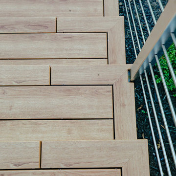 G.B. Construction and Development, Inc.
This charming ranch on the north fork of Long Island received a long overdo update. All the windows were replaced with more modern looking black framed Andersen casement windows. The front entry door and garage door compliment each other with the a column of horizontal windows. The Maibec siding really makes this house stand out while complimenting the natural surrounding. Finished with black gutters and leaders that compliment that offer function without taking away from the clean look of the new makeover. The front entry was given a streamlined entry with Timbertech decking and Viewrail railing. The rear deck, also Timbertech and Viewrail, include black lattice that finishes the rear deck with out detracting from the clean lines of this deck that spans the back of the house. The Viewrail provides the safety barrier needed without interfering with the amazing view of the water.
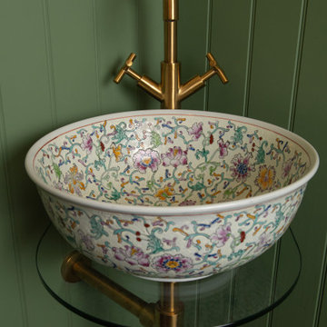
 Revival by Design
We just love it when a client comes to us and says “I’ve come to you because I want something different, I don’t want a standard bathroom companies design and layout.” For us this is brilliant, because it means we have some creative freedom to design something special.
Having worked with this client before, we knew she liked pattern and colour, specifically William Morris. Keen not to overdo it on William Morris print we considered other designs that might be of a similar look and feel, so we used Lewis and Wood for the powder room and Christopher Farr for the family bathroom, both wonderful wallpapers that offer more of a mural feel.
With the powder room we considered the adjoining rooms, the rural location and also the size of the space. When it comes to small spaces I think more really is more, so we went for it, we know our client loved green and also the London Basin Company, so those were our starting points.
The family bathroom, located in a completely different part of the house, has a more serene feel, although still embraces pattern and colour. The Christopher Farr wallpaper was finished in decorators varnish to ensure a good moisture barrier and the baked tile company tiles continue the muted colour palette.
Our client tells us that they have received lots of complements already :)
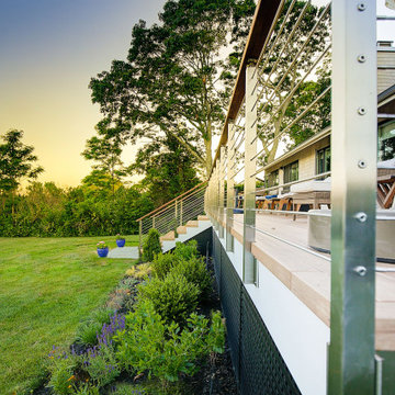 G.B. Construction and Development, Inc.
This charming ranch on the north fork of Long Island received a long overdo update. All the windows were replaced with more modern looking black framed Andersen casement windows. The front entry door and garage door compliment each other with the a column of horizontal windows. The Maibec siding really makes this house stand out while complimenting the natural surrounding. Finished with black gutters and leaders that compliment that offer function without taking away from the clean look of the new makeover. The front entry was given a streamlined entry with Timbertech decking and Viewrail railing. The rear deck, also Timbertech and Viewrail, include black lattice that finishes the rear deck with out detracting from the clean lines of this deck that spans the back of the house. The Viewrail provides the safety barrier needed without interfering with the amazing view of the water.
 Robin's Nest Interiors
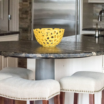
Our final installment for this project is the Lake Forest Freshen Up: Kitchen + Breakfast Area. Below is a BEFORE photo of what the Kitchen looked like when the homeowners purchased their home. The previous homeowners wanted a “lodge” look but they did overdo it a bit with the ledge stone. We lightened up the Kitchen considerably by painting the cabinetry neutral white with a glaze. Creative Finishes by Kelly did an amazing job. The lighter cabinetry contrasts nicely with the hardware floor finish and the dark granite countertops. Even the ledge stone looks great!
The island has a wonderful shape with an eating area on the end where 3 stools fit snugly underneath.
The oversized pendants are the perfect scale for the large island.
The unusual chandelier makes a statement in the Breakfast Area. We added a pop of color with the artwork and grounded this area with a fun geometric rug.
There is a lot of cabinetry in this space so we broke up the desk area by painting it Sherwin Williams’ Gauntlet Gray (SW7019), the same color we painted the island column.
The homeowners’ wine cabinet and two fun chairs that we reupholstered in a small geometric pattern finish off this area.
This Lake Forest Freshen Up: Kitchen + Breakfast Area is truly a transformation without changing the footprint. When new cabinetry is not an option or your current cabinetry is in great shape but not a great finish, you should consider painting them. This project is proof that it can change the look of your entire Kitchen – for the better! Click here and here for other projects featuring painted cabinets. Enjoy!
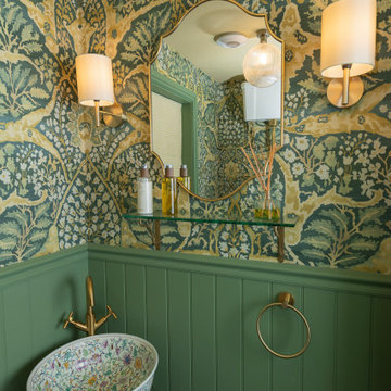 Revival by Design
We just love it when a client comes to us and says “I’ve come to you because I want something different, I don’t want a standard bathroom companies design and layout.” For us this is brilliant, because it means we have some creative freedom to design something special.
Having worked with this client before, we knew she liked pattern and colour, specifically William Morris. Keen not to overdo it on William Morris print we considered other designs that might be of a similar look and feel, so we used Lewis and Wood for the powder room and Christopher Farr for the family bathroom, both wonderful wallpapers that offer more of a mural feel.
With the powder room we considered the adjoining rooms, the rural location and also the size of the space. When it comes to small spaces I think more really is more, so we went for it, we know our client loved green and also the London Basin Company, so those were our starting points.
The family bathroom, located in a completely different part of the house, has a more serene feel, although still embraces pattern and colour. The Christopher Farr wallpaper was finished in decorators varnish to ensure a good moisture barrier and the baked tile company tiles continue the muted colour palette.
Our client tells us that they have received lots of complements already :)
 Alexandra Crafton
Photo: Alexandra Crafton © 2017 Houzz
Example of an eclectic living room design in Boston
Example of an eclectic living room design in Boston
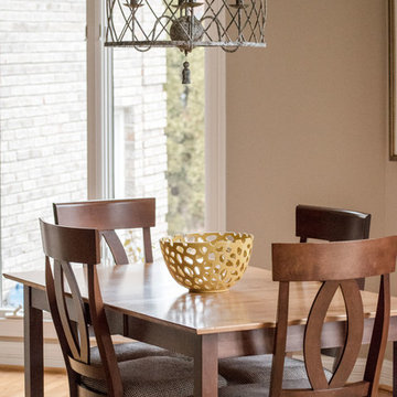 Robin's Nest Interiors
Our final installment for this project is the Lake Forest Freshen Up: Kitchen + Breakfast Area. Below is a BEFORE photo of what the Kitchen looked like when the homeowners purchased their home. The previous homeowners wanted a “lodge” look but they did overdo it a bit with the ledge stone. We lightened up the Kitchen considerably by painting the cabinetry neutral white with a glaze. Creative Finishes by Kelly did an amazing job. The lighter cabinetry contrasts nicely with the hardware floor finish and the dark granite countertops. Even the ledge stone looks great!
The island has a wonderful shape with an eating area on the end where 3 stools fit snugly underneath.
The oversized pendants are the perfect scale for the large island.
The unusual chandelier makes a statement in the Breakfast Area. We added a pop of color with the artwork and grounded this area with a fun geometric rug.
There is a lot of cabinetry in this space so we broke up the desk area by painting it Sherwin Williams’ Gauntlet Gray (SW7019), the same color we painted the island column.
The homeowners’ wine cabinet and two fun chairs that we reupholstered in a small geometric pattern finish off this area.
This Lake Forest Freshen Up: Kitchen + Breakfast Area is truly a transformation without changing the footprint. When new cabinetry is not an option or your current cabinetry is in great shape but not a great finish, you should consider painting them. This project is proof that it can change the look of your entire Kitchen – for the better! Click here and here for other projects featuring painted cabinets. Enjoy!
 Natalinadesigns.com
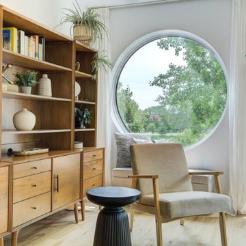
my client wanted to spruce up her living room while not overdoing it, she wanted to keep her exiting sofa and book case, i added many pieces to make the space feel homy and mid century the style she loves while throwing in a little boho.
10