
Search results for "Overlaps" in Home Design Ideas

 Lori Dennis, ASID, LEED AP
White on white, stone tile bathroom at the beach.
Drop-in bathtub - modern white tile and stone tile drop-in bathtub idea in Los Angeles with quartz countertops
Drop-in bathtub - modern white tile and stone tile drop-in bathtub idea in Los Angeles with quartz countertops

 ADM Flooring
VINTAGE WHITE - 7 1/2" European Oak
We are not your typical home flooring distributor, we offer our customers the support and consultation they need to help them create the elegant space of their dreams while staying within their budget.

 Whipple Russell Architects
Hutton Drive 2641 modern home guest bathroom
Small trendy 3/4 white floor and single-sink walk-in shower photo in Los Angeles with flat-panel cabinets, medium tone wood cabinets, a one-piece toilet, white walls, a hinged shower door, white countertops, a niche and a floating vanity
Small trendy 3/4 white floor and single-sink walk-in shower photo in Los Angeles with flat-panel cabinets, medium tone wood cabinets, a one-piece toilet, white walls, a hinged shower door, white countertops, a niche and a floating vanity
Find the right local pro for your project

 Saikley Architects
This house was a very small mid-century bungalow with previous additions that resulted in a large but chaotic layout. The owners wanted to convert the house to a super-efficient, and charming Craftsman-style, 6 bedroom home for their large family and work at home.
We achieved the space needs by moving a few walls for a more efficient, organized layout, setting up spaces for overlapping uses, and making a small upstairs addition. Every bit of square footage was optimized to meet the goals of the project without making the house huge or adding unnecessary cost.
Much thought was given to the entry sequence near the front door. A large flow-through mudroom with storage for each family member, and adjacent laundry, make it easy for children to be taught to keep their things organized and to contribute to household chores. A mail station and central home admin area at the mudroom help keep clutter down at other areas and minimize home management tasks. A garage door near the kitchen gives quick access to bulk items.
The existing house had too much view to the street from the living room through large corner windows, and too little entry transition, to the extent that the family did not feel comfortable using the living room much without shades drawn. We raised the window sills and brought the new windows in from the corner of the house, allowing plenty of light while protecting privacy and a sense of enclosure in the living room. We enlarged the front porch to create a more graceful transition from the public to private space. We located the front door so that the circulation from entry into the house would allow for furnishing the living room with a sitting circle that is not intruded upon by people walking through the room.
Sight lines through the living spaces were an important consideration in the design. The owners wanted discreet spaces for living room, kitchen, dining and family room, but also wanted the living spaces to feel connected and to be able to easily watch their children. Being able to see the children playing in the yard while getting things done inside the house was also important. While largely working with the existing structure, we opened walls and rearranged the use of spaces to make a series of connected living spaces with long views through them.
The character of the remodeled house is a contemporary Craftsman with classic materials and cool, consistent colors. A few arches echo through the house to frame spaces and soften the feeling of the rooms.
Photography: Kurt Manley
https://saikleyarchitects.com/portfolio/bungalow-expansion/


 Saikley Architects
This house was a very small mid-century bungalow with previous additions that resulted in a large but chaotic layout. The owners wanted to convert the house to a super-efficient, and charming Craftsman-style, 6 bedroom home for their large family and work at home.
We achieved the space needs by moving a few walls for a more efficient, organized layout, setting up spaces for overlapping uses, and making a small upstairs addition. Every bit of square footage was optimized to meet the goals of the project without making the house huge or adding unnecessary cost.
Much thought was given to the entry sequence near the front door. A large flow-through mudroom with storage for each family member, and adjacent laundry, make it easy for children to be taught to keep their things organized and to contribute to household chores. A mail station and central home admin area at the mudroom help keep clutter down at other areas and minimize home management tasks. A garage door near the kitchen gives quick access to bulk items.
The existing house had too much view to the street from the living room through large corner windows, and too little entry transition, to the extent that the family did not feel comfortable using the living room much without shades drawn. We raised the window sills and brought the new windows in from the corner of the house, allowing plenty of light while protecting privacy and a sense of enclosure in the living room. We enlarged the front porch to create a more graceful transition from the public to private space. We located the front door so that the circulation from entry into the house would allow for furnishing the living room with a sitting circle that is not intruded upon by people walking through the room.
Sight lines through the living spaces were an important consideration in the design. The owners wanted discreet spaces for living room, kitchen, dining and family room, but also wanted the living spaces to feel connected and to be able to easily watch their children. Being able to see the children playing in the yard while getting things done inside the house was also important. While largely working with the existing structure, we opened walls and rearranged the use of spaces to make a series of connected living spaces with long views through them.
The character of the remodeled house is a contemporary Craftsman with classic materials and cool, consistent colors. A few arches echo through the house to frame spaces and soften the feeling of the rooms.
Photography: Kurt Manley
https://saikleyarchitects.com/portfolio/bungalow-expansion/
 InnovationLand
This outdoor media room and kitchen had to meet the needs of a Houston family needing kid space and adult space.
The kids wanted an outdoor audio visual area watch TV and movies. The grownups wanted an outdoor kitchen, bar and grilling area where they could enjoy themselves while watching the kids. And they all wanted a covered patio with places to sit between dips in the pool.
However, the family had very limited space between the back of their house and their pool, and no room for anything in either of the side yards:
Stringent homeowner association rules also required that any home modifications match the existing home's architecture, color and finishing materials. The pitch of the roof also had to be such that it didn't overlap the bottom of the second-story windows above.
So here's what we came up with: A 40-foot-long by 11-foot- deep roof extension off the back of the house (longer than most, but with good engineering specs and design work, we were able to preserve the structural integrity):
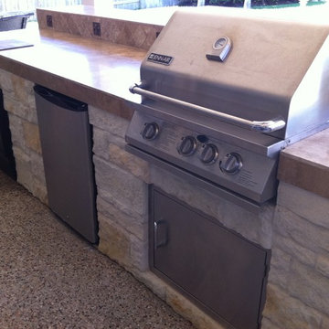
At one end of the covered patio below is a 12-foot by 8-foot outdoor living room with a custom audio-visual cabinet. At the other is an L-shaped, 8-foot-square outdoor kitchen island with a built-in commercial-grade RCS grill, a 4-by-8-foot outdoor refrigerator and a outdoor icemaker.
Keeping in line with the existing home's beige siding, white trim and brown accent façade, we helped the homeowner choose appropriate finishing materials: Austin Western limestone (mostly white with beige accents) for the TV cabinet, kitchen island and column supports; Old English travertine (beige) for the countertops) and white, fluted columns.
The Old English travertine countertop has a raised back for a bar with counter seating. The diamond-pattern tile backsplash also features inset fleur de lis accents.
The family is more than pleased with the results - two outdoor rooms with two different functions - all within the same covered outdoor living space!
Sponsored
Columbus, OH

Wannemacher Interiors
Customized Award-Winning Interior Design Solutions in Franklin Cnty OH
 Saikley Architects
This house was a very small mid-century bungalow with previous additions that resulted in a large but chaotic layout. The owners wanted to convert the house to a super-efficient, and charming Craftsman-style, 6 bedroom home for their large family and work at home.
We achieved the space needs by moving a few walls for a more efficient, organized layout, setting up spaces for overlapping uses, and making a small upstairs addition. Every bit of square footage was optimized to meet the goals of the project without making the house huge or adding unnecessary cost.
Much thought was given to the entry sequence near the front door. A large flow-through mudroom with storage for each family member, and adjacent laundry, make it easy for children to be taught to keep their things organized and to contribute to household chores. A mail station and central home admin area at the mudroom help keep clutter down at other areas and minimize home management tasks. A garage door near the kitchen gives quick access to bulk items.
The existing house had too much view to the street from the living room through large corner windows, and too little entry transition, to the extent that the family did not feel comfortable using the living room much without shades drawn. We raised the window sills and brought the new windows in from the corner of the house, allowing plenty of light while protecting privacy and a sense of enclosure in the living room. We enlarged the front porch to create a more graceful transition from the public to private space. We located the front door so that the circulation from entry into the house would allow for furnishing the living room with a sitting circle that is not intruded upon by people walking through the room.
Sight lines through the living spaces were an important consideration in the design. The owners wanted discreet spaces for living room, kitchen, dining and family room, but also wanted the living spaces to feel connected and to be able to easily watch their children. Being able to see the children playing in the yard while getting things done inside the house was also important. While largely working with the existing structure, we opened walls and rearranged the use of spaces to make a series of connected living spaces with long views through them.
The character of the remodeled house is a contemporary Craftsman with classic materials and cool, consistent colors. A few arches echo through the house to frame spaces and soften the feeling of the rooms.
Photography: Kurt Manley
https://saikleyarchitects.com/portfolio/bungalow-expansion/

 Truitt and White Window and Door Showroom
This hillside home in Piedmont, CA was remodeled to change the style from a 1940's rancher with eight foot ceilings and dark interiors, into a modern geometric composition with vast white interiors for casual living and generous daylighting for displaying the artist-owner's works.
In a city known for rigorous and difficult design review, an addition, two variances, and a full stylistic change were unanimously approved on the first round. All sloped roofs and attics were eliminated and replaced by a series of stacked and overlapping flat roofs. This made the house taller on the inside and shorter on the outside, which helped earn design review cooperation in the community. Windows were concentrated toward the rear yard views or moved up high on the side walls for daylight and privacy, benefitting the owners as well as the neighbors.
At the start, the owner husband was so enthusiastic and engaged in transforming his house into something modern that he presented the architect with a scaled foamcore model, rather than the usual magazine clippings and wish list. He participated in the design decisions throughout the process. The owner wife is the artist who did all the artwork in the house. She had been craving a display space with large walls and good natural light. Both of them loved the location and great views.
The project was an opportunity to transform the style of an older traditional home into a modern one, while solving numerous problems. By rebuilding the 1800 ft2 top of the 3-story home it was possible to change the style of the whole building, since the lower floors were a neutral base, and also to change the lifestyle of the owners, who wanted to move their master suite upstairs and live primarily on the top floor as empty nesters.
Going into the project, the architect knew there were multiple encroachments into the setbacks and potential privacy issues with close by neighbors. He approached this as a complex puzzle made up of architectural and political pieces which all had to fit together elegantly. It took many careful moves, small and large, to arrive at a serene and cohesive result that tied old and new together seamlessly.
The design-build contractor worked closely with the owners and handled all of the construction phase documents and design adjustments, adding ideas of their own to make the project really sing.
The project was a collaboration in three acts. The owner had a strong design concept from the start. The architect developed it into a realistic project and garnered the design approvals. Then the contractor executed brilliantly
 InnovationLand
This outdoor media room and kitchen had to meet the needs of a Houston family needing kid space and adult space.
The kids wanted an outdoor audio visual area watch TV and movies. The grownups wanted an outdoor kitchen, bar and grilling area where they could enjoy themselves while watching the kids. And they all wanted a covered patio with places to sit between dips in the pool.
However, the family had very limited space between the back of their house and their pool, and no room for anything in either of the side yards:
Stringent homeowner association rules also required that any home modifications match the existing home's architecture, color and finishing materials. The pitch of the roof also had to be such that it didn't overlap the bottom of the second-story windows above.
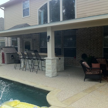
So here's what we came up with: A 40-foot-long by 11-foot- deep roof extension off the back of the house (longer than most, but with good engineering specs and design work, we were able to preserve the structural integrity):
At one end of the covered patio below is a 12-foot by 8-foot outdoor living room with a custom audio-visual cabinet. At the other is an L-shaped, 8-foot-square outdoor kitchen island with a built-in commercial-grade RCS grill, a 4-by-8-foot outdoor refrigerator and a outdoor icemaker.
Keeping in line with the existing home's beige siding, white trim and brown accent façade, we helped the homeowner choose appropriate finishing materials: Austin Western limestone (mostly white with beige accents) for the TV cabinet, kitchen island and column supports; Old English travertine (beige) for the countertops) and white, fluted columns.
The Old English travertine countertop has a raised back for a bar with counter seating. The diamond-pattern tile backsplash also features inset fleur de lis accents.
The family is more than pleased with the results - two outdoor rooms with two different functions - all within the same covered outdoor living space!
 InnovationLand
This outdoor media room and kitchen had to meet the needs of a Houston family needing kid space and adult space.
The kids wanted an outdoor audio visual area watch TV and movies. The grownups wanted an outdoor kitchen, bar and grilling area where they could enjoy themselves while watching the kids. And they all wanted a covered patio with places to sit between dips in the pool.
However, the family had very limited space between the back of their house and their pool, and no room for anything in either of the side yards:
Stringent homeowner association rules also required that any home modifications match the existing home's architecture, color and finishing materials. The pitch of the roof also had to be such that it didn't overlap the bottom of the second-story windows above.
So here's what we came up with: A 40-foot-long by 11-foot- deep roof extension off the back of the house (longer than most, but with good engineering specs and design work, we were able to preserve the structural integrity):
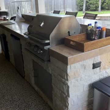
At one end of the covered patio below is a 12-foot by 8-foot outdoor living room with a custom audio-visual cabinet. At the other is an L-shaped, 8-foot-square outdoor kitchen island with a built-in commercial-grade RCS grill, a 4-by-8-foot outdoor refrigerator and a outdoor icemaker.
Keeping in line with the existing home's beige siding, white trim and brown accent façade, we helped the homeowner choose appropriate finishing materials: Austin Western limestone (mostly white with beige accents) for the TV cabinet, kitchen island and column supports; Old English travertine (beige) for the countertops) and white, fluted columns.
The Old English travertine countertop has a raised back for a bar with counter seating. The diamond-pattern tile backsplash also features inset fleur de lis accents.
The family is more than pleased with the results - two outdoor rooms with two different functions - all within the same covered outdoor living space!
 InnovationLand
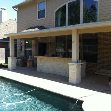
This outdoor media room and kitchen had to meet the needs of a Houston family needing kid space and adult space.
The kids wanted an outdoor audio visual area watch TV and movies. The grownups wanted an outdoor kitchen, bar and grilling area where they could enjoy themselves while watching the kids. And they all wanted a covered patio with places to sit between dips in the pool.
However, the family had very limited space between the back of their house and their pool, and no room for anything in either of the side yards:
Stringent homeowner association rules also required that any home modifications match the existing home's architecture, color and finishing materials. The pitch of the roof also had to be such that it didn't overlap the bottom of the second-story windows above.
So here's what we came up with: A 40-foot-long by 11-foot- deep roof extension off the back of the house (longer than most, but with good engineering specs and design work, we were able to preserve the structural integrity):
At one end of the covered patio below is a 12-foot by 8-foot outdoor living room with a custom audio-visual cabinet. At the other is an L-shaped, 8-foot-square outdoor kitchen island with a built-in commercial-grade RCS grill, a 4-by-8-foot outdoor refrigerator and a outdoor icemaker.
Keeping in line with the existing home's beige siding, white trim and brown accent façade, we helped the homeowner choose appropriate finishing materials: Austin Western limestone (mostly white with beige accents) for the TV cabinet, kitchen island and column supports; Old English travertine (beige) for the countertops) and white, fluted columns.
The Old English travertine countertop has a raised back for a bar with counter seating. The diamond-pattern tile backsplash also features inset fleur de lis accents.
The family is more than pleased with the results - two outdoor rooms with two different functions - all within the same covered outdoor living space!

 B&B Custom Pools
Custom freeform pool with boulder waterfall, stamped cantilever concrete decking, and custom moravian star mosaic in Hanover Township, Northampton County, PA by www.custompoolsbybarry.com

 San Luis Kitchen Co.
Giving a nod to mid-century modern styling, we created a kitchen that is both simple and refined - with just a touch of detail. The beveled inner profile of the Nova door gives it distinction, while affording the client an easy cleanability. The vaulted ceiling, with skylight and large window demand a generous volume of cabinetry to be of proper proportion. A variety of island storage options (various depth pan and utensil drawers, a pullout pantry for oils and condiments, tray storage), plus a multi-purpose pantry cabinet, and a matching desk unit provide a wealth of storage options and unify the space. With the generous island, complete with cooktop and prep sink, the kitchen is perfect for this gourmet cook to entertain their guests.
The client wanted a non-traditional top trim which would add both height and a broad horizontal line; we used a 7” high panel with applied bevel molding top and bottom. A bevel molding was also applied to the light valance: these bevel compliment the aesthetic module of the Nova door. The architect requested a large valance to house the electric window blind. The valance also incorporates light sconces which shine on the counter from a reasonable distance as the ceiling was so high; this was achieved using a matching Nova wainscot panel. The architect also wanted matching end panels on the island, yet the island cabinets did not match because they were different depths. On one side we provided 15” deep drawers and 15” wide side panel; on the opposite side we had a 24” deep pullout pantry with 15” wide side panel pulled to the front - so the question was, what to do with the 9” wide blank area? The solution: we had a 15” wide cabinet made with a 24” wide door that overlapped the blank area. By using touch latch hinges, it looks like a fixed panel flanked by two 15” panels. It’s amazing what Wood-Mode will make.
 San Luis Kitchen Co.
Giving a nod to mid-century modern styling, we created a kitchen that is both simple and refined - with just a touch of detail. The beveled inner profile of the Nova door gives it distinction, while affording the client an easy cleanability. The vaulted ceiling, with skylight and large window demand a generous volume of cabinetry to be of proper proportion. A variety of island storage options (various depth pan and utensil drawers, a pullout pantry for oils and condiments, tray storage), plus a multi-purpose pantry cabinet, and a matching desk unit provide a wealth of storage options and unify the space. With the generous island, complete with cooktop and prep sink, the kitchen is perfect for this gourmet cook to entertain their guests.
The client wanted a non-traditional top trim which would add both height and a broad horizontal line; we used a 7” high panel with applied bevel molding top and bottom. A bevel molding was also applied to the light valance: these bevel compliment the aesthetic module of the Nova door. The architect requested a large valance to house the electric window blind. The valance also incorporates light sconces which shine on the counter from a reasonable distance as the ceiling was so high; this was achieved using a matching Nova wainscot panel. The architect also wanted matching end panels on the island, yet the island cabinets did not match because they were different depths. On one side we provided 15” deep drawers and 15” wide side panel; on the opposite side we had a 24” deep pullout pantry with 15” wide side panel pulled to the front - so the question was, what to do with the 9” wide blank area? The solution: we had a 15” wide cabinet made with a 24” wide door that overlapped the blank area. By using touch latch hinges, it looks like a fixed panel flanked by two 15” panels. It’s amazing what Wood-Mode will make.

 Pacific Coast Custom Design
Custom bar niche with built-in refrigerator
Transitional family room photo in Orange County
Transitional family room photo in Orange County

 SoCal Contractor
Luxury Spa Bathroom with chrome and glass bath accessories. This expansive steam shower is wall to wall with hooks for towels.
Large minimalist master white tile and stone tile marble floor, white floor and double-sink freestanding bathtub photo in Los Angeles with flat-panel cabinets, dark wood cabinets, a one-piece toilet, white walls, an undermount sink, solid surface countertops, a hinged shower door, white countertops and a built-in vanity
Large minimalist master white tile and stone tile marble floor, white floor and double-sink freestanding bathtub photo in Los Angeles with flat-panel cabinets, dark wood cabinets, a one-piece toilet, white walls, an undermount sink, solid surface countertops, a hinged shower door, white countertops and a built-in vanity


 User
Took an old outdated bathroom and turned it into this sleek, bright bathroom. Notice all the natural light and clean lines.
Freestanding bathtub - mid-sized contemporary master white tile and ceramic tile porcelain tile freestanding bathtub idea in Nashville with an undermount sink, shaker cabinets, white cabinets, concrete countertops, a one-piece toilet and white walls
Freestanding bathtub - mid-sized contemporary master white tile and ceramic tile porcelain tile freestanding bathtub idea in Nashville with an undermount sink, shaker cabinets, white cabinets, concrete countertops, a one-piece toilet and white walls
 Saikley Architects
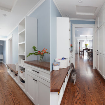
This house was a very small mid-century bungalow with previous additions that resulted in a large but chaotic layout. The owners wanted to convert the house to a super-efficient, and charming Craftsman-style, 6 bedroom home for their large family and work at home.
We achieved the space needs by moving a few walls for a more efficient, organized layout, setting up spaces for overlapping uses, and making a small upstairs addition. Every bit of square footage was optimized to meet the goals of the project without making the house huge or adding unnecessary cost.
Much thought was given to the entry sequence near the front door. A large flow-through mudroom with storage for each family member, and adjacent laundry, make it easy for children to be taught to keep their things organized and to contribute to household chores. A mail station and central home admin area at the mudroom help keep clutter down at other areas and minimize home management tasks. A garage door near the kitchen gives quick access to bulk items.
The existing house had too much view to the street from the living room through large corner windows, and too little entry transition, to the extent that the family did not feel comfortable using the living room much without shades drawn. We raised the window sills and brought the new windows in from the corner of the house, allowing plenty of light while protecting privacy and a sense of enclosure in the living room. We enlarged the front porch to create a more graceful transition from the public to private space. We located the front door so that the circulation from entry into the house would allow for furnishing the living room with a sitting circle that is not intruded upon by people walking through the room.
Sight lines through the living spaces were an important consideration in the design. The owners wanted discreet spaces for living room, kitchen, dining and family room, but also wanted the living spaces to feel connected and to be able to easily watch their children. Being able to see the children playing in the yard while getting things done inside the house was also important. While largely working with the existing structure, we opened walls and rearranged the use of spaces to make a series of connected living spaces with long views through them.
The character of the remodeled house is a contemporary Craftsman with classic materials and cool, consistent colors. A few arches echo through the house to frame spaces and soften the feeling of the rooms.
Photography: Kurt Manley
https://saikleyarchitects.com/portfolio/bungalow-expansion/
118