
Search results for "Overwhelms" in Home Design Ideas
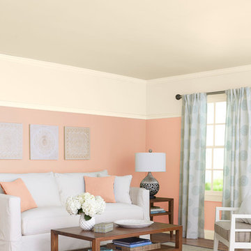
 Lowe's Home Improvement
For a space that calms, cool tones are the way to go. These shades draw in the colors of the ocean and sky to create a peaceful indoor atmosphere.
Living room - mid-sized transitional formal and enclosed medium tone wood floor living room idea in Charlotte with orange walls
Living room - mid-sized transitional formal and enclosed medium tone wood floor living room idea in Charlotte with orange walls
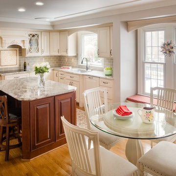
 Glickman Design Build
© John Cole Photography
Eat-in kitchen - traditional medium tone wood floor eat-in kitchen idea in DC Metro with an undermount sink, gray backsplash, subway tile backsplash and an island
Eat-in kitchen - traditional medium tone wood floor eat-in kitchen idea in DC Metro with an undermount sink, gray backsplash, subway tile backsplash and an island
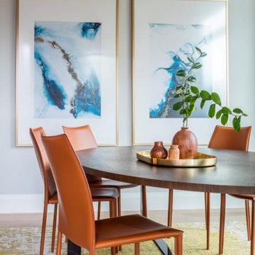
 Interiors by Popov
This newly built custom residence turned out to be spectacular. With Interiors by Popov’s magic touch, it has become a real family home that is comfortable for the grownups, safe for the kids and friendly to the little dogs that now occupy this space.The start of construction was a bumpy road for the homeowners. After the house was framed, our clients found themselves paralyzed with the million and one decisions that had to be made. Decisions about plumbing, electrical, millwork, hardware and exterior left them drained and overwhelmed. The couple needed help. It was at this point that they were referred to us by a friend.We immediately went about systematizing the selection and design process, which allowed us to streamline decision making and stay ahead of construction.
We designed every detail in this house. And when I say every detail, I mean it. We designed lighting, plumbing, millwork, hard surfaces, exterior, kitchen, bathrooms, fireplace and so much more. After the construction-related items were addressed, we moved to furniture, rugs, lamps, art, accessories, bedding and so on.
The result of our systematic approach and design vision was a client head over heels in love with their new home. The positive feedback we received from this homeowner was immensely gratifying. They said the only thing that they regret was not hiring Interiors by Popov sooner!
Find the right local pro for your project
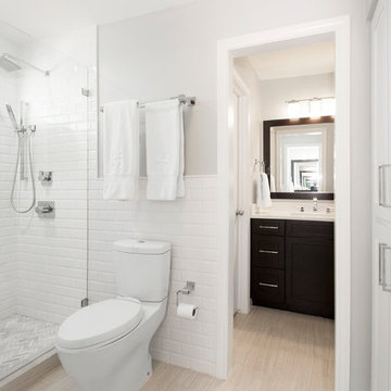
 Alair Homes Plano
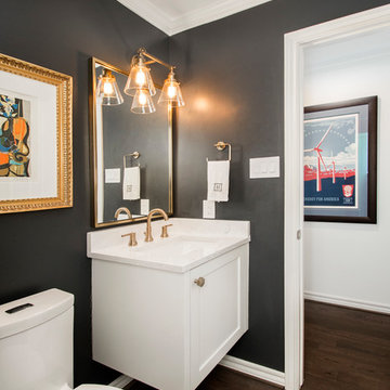
We loved updating this 1977 house giving our clients a more transitional kitchen, living room and powder bath. Our clients are very busy and didn’t want too many options. Our designers narrowed down their selections and gave them just enough options to choose from without being overwhelming.
In the kitchen, we replaced the cabinetry without changing the locations of the walls, doors openings or windows. All finished were replaced with beautiful cabinets, counter tops, sink, back splash and faucet hardware.
In the Master bathroom, we added all new finishes. There are two closets in the bathroom that did not change but everything else did. We.added pocket doors to the bedroom, where there were no doors before. Our clients wanted taller 36” height cabinets and a seated makeup vanity, so we were able to accommodate those requests without any problems. We added new lighting, mirrors, counter top and all new plumbing fixtures in addition to removing the soffits over the vanities and the shower, really opening up the space and giving it a new modern look. They had also been living with the cold and hot water reversed in the shower, so we also fixed that for them!
In their den, they wanted to update the dark paneling, remove the large stone from the curved fireplace wall and they wanted a new mantel. We flattened the wall, added a TV niche above fireplace and moved the cable connections, so they have exactly what they wanted. We left the wood paneling on the walls but painted them a light color to brighten up the room.
There was a small wet bar between the den and their family room. They liked the bar area but didn’t feel that they needed the sink, so we removed and capped the water lines and gave the bar an updated look by adding new counter tops and shelving. They had some previous water damage to their floors, so the wood flooring was replaced throughout the den and all connecting areas, making the transition from one room to the other completely seamless. In the end, the clients love their new space and are able to really enjoy their updated home and now plan stay there for a little longer!
Design/Remodel by Hatfield Builders & Remodelers | Photography by Versatile Imaging
Less
 Alair Homes Plano
We loved updating this 1977 house giving our clients a more transitional kitchen, living room and powder bath. Our clients are very busy and didn’t want too many options. Our designers narrowed down their selections and gave them just enough options to choose from without being overwhelming.
In the kitchen, we replaced the cabinetry without changing the locations of the walls, doors openings or windows. All finished were replaced with beautiful cabinets, counter tops, sink, back splash and faucet hardware.
In the Master bathroom, we added all new finishes. There are two closets in the bathroom that did not change but everything else did. We.added pocket doors to the bedroom, where there were no doors before. Our clients wanted taller 36” height cabinets and a seated makeup vanity, so we were able to accommodate those requests without any problems. We added new lighting, mirrors, counter top and all new plumbing fixtures in addition to removing the soffits over the vanities and the shower, really opening up the space and giving it a new modern look. They had also been living with the cold and hot water reversed in the shower, so we also fixed that for them!
In their den, they wanted to update the dark paneling, remove the large stone from the curved fireplace wall and they wanted a new mantel. We flattened the wall, added a TV niche above fireplace and moved the cable connections, so they have exactly what they wanted. We left the wood paneling on the walls but painted them a light color to brighten up the room.
There was a small wet bar between the den and their family room. They liked the bar area but didn’t feel that they needed the sink, so we removed and capped the water lines and gave the bar an updated look by adding new counter tops and shelving. They had some previous water damage to their floors, so the wood flooring was replaced throughout the den and all connecting areas, making the transition from one room to the other completely seamless. In the end, the clients love their new space and are able to really enjoy their updated home and now plan stay there for a little longer!
Design/Remodel by Hatfield Builders & Remodelers | Photography by Versatile Imaging
Less
 Randy Angell Designs
The subtle changes begin as soon as you walk out the back door of the house. The existing decking had a lot of what we call "tweeners"; areas that are overly generous walkways, yet not large enough to house furniture. The awkwardly small bluestone patio was expanded to accommodate a generous seating area. This was done by pushing the step-down closer to the pool.
Our talented stone mason carefully married the new bluestone into the existing portion of the patio, resulting in an imperceptible difference between the two.
As you descend the new bluestone steps to the pool level, your bare feet will be thankful for the new smooth-finished, limestone-colored concrete, with a hand cut pattern carefully etched into it's surface.
The old red brick decking was so hot that the owners could not walk around the pool with their bare feet. The brick coping was also replaced with an eased edge, Pennsylvania Premier Stone which matches the new step treads throughout the project.
Between the house and the pool, a large raised planter was reconfigured, giving additional space to the pool deck for a shaded lounge chair area. Across the pool, a bank of rather tall painted brick retaining walls were cut down, shortened and moved. This lessened the visual impact of the walls (which were overwhelming in the space) and also opened up a new seating area, nestled under the arms of the massive Pecan tree at the back of the property.
Rather than continuing solid decking around the entire pool, the area near these walls has been transformed to large stone stepper pads set in a sea of beautiful St. Augustine lawn. This creates a visually softened area that is still suited to setting tables and chairs when the guest list calls for additional seating.
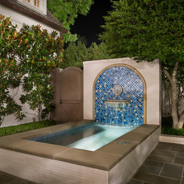
The spa area is possibly the most dramatic change on this project. Yet more raised planter walls divided this area into awkward spaces, unsuited for proper furniture placement. The planters were removed, new stone decks added, and once again expertly married into the existing decks, opening the area to house a large dining table and a newly built-in BBQ area.
The spa itself was re-imagined with the bluestone coping and painted brick veneer. The most impressive addition though is the new handmade glazed tiles that surround the existing cast stone water feature. This water feature was almost unnoticeable against the painted brick wall, but now the dramatic arch and pop of color draw the eye to this quaint little corner of the property.
Originally designed by one of the most notable landscape architects in town, this once impressive project had faltered in recent years. The pool and spa still functioned well, and the client wanted to keep it intact. In addition, they wanted to keep as much of the existing landscape as possible. But, the surrounding decks, walls and steps were fair game.
At first glance, one might think that our changes were simple material changes. However, upon closer inspection, one can see the subtle-yet-transformative changes that came together to update this classic pool in a tasteful, timeless manner, as well as to improve the flow and usability of the deck areas, while softening the feel of this massive hardscape.
 Sayler | Owens | Kerr design studio
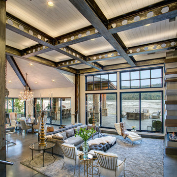
Looking down from the mid-level entry, into the living room, the view and a little of the dining room. The dominant theme is the overwhelming strength of the steel beam work. The holes add a sense of whimsy, like aircraft hanger or art deco styling. The ceiling is lit by led strips on top of the steel beam grid.
Photos by Dominque Verdier
 Tileshop
Photo credit: Atlas Concorde
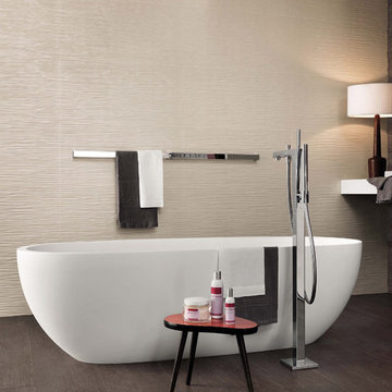
Atlas Concorde’s Decorative “Wave” in the Arty series rides the trend of structured wall tile. Used as an accent or in an entire area, it creates drama without being overwhelming. Suitable for use in dining room, living room, or bathroom interior wall applications
Tileshop
16216 Raymer Street
Van Nuys, CA 91406
Other California Locations: Berkeley and San Jose
 PC Industries Welding & Fabrication, PCI Metal
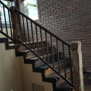
Weighing in at around 2,100 pounds this massive rebar handrail was fabricated inside the home due to its overwhelming weight.
This handrail was made out of #18 (2¼” diameter) rebar and the balusters are #10 (1¼” diameter) rebar. At the top of the stairs a 90 degree bend was required due to the post placement. Overall, this rebar handrail sets the tone for this old industrial look.
 Zola European Windows
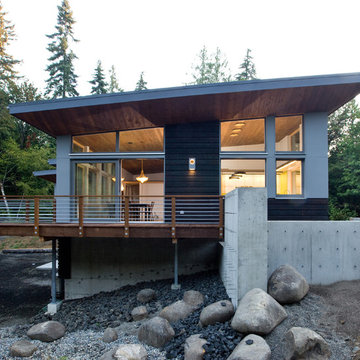
Nestled in a wooded area in the Pacific Northwest, the 1800 sf Passive Cedar Haus was built as a retirement home. The Artisans Group designed the layout of the home, mindful of aging in place, and working to ensure that the home blended in with the surrounding natural beauty. The project meets a complex program, with an unheated sleeping porch for a master bedroom, a screened porch, a 600 sf caretakers apartment/mother in law unit, large wood shop, plus a two car carport. The home seamlessly integrates a floating cedar tongue and groove roof with large sheltering overhangs, clerestory windows, and language of cedar slats for privacy screens and doors inside and out. The warm, natural materials of wood and cork for the interior palette are punctuated by lively accents and stunning fixtures.
This ultra energy efficient home relies on extremely high levels of insulation, air-tight detailing and construction, and the implementation of high performance, custom made European windows and doors by Zola Windows. Zola’s ThermoPlus Clad line, which boasts R-11 triple glazing and is thermally broken with a layer of patented German Purenit®, was selected for the project. Floor-to-ceiling windows in the main living area, gives an expansive view of the surrounding Northwest forest. The tops of these windows reveal the interior cedar clad and the up-swept soffits on the home’s exterior, creating a floating ceiling effect. Slatted spruce wood fly-overs break up the vertical areas of the great room and define separate areas that would otherwise feel like an overwhelmingly expansive space.
Photography by: Cheryl Ramsay of Ramsay Photography
 Hawk Builders
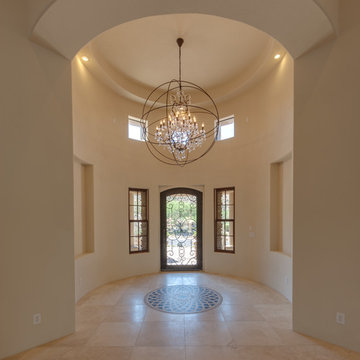
New build by Hawk Builders, LLC in Troon Highlands, Scottsdale, AZ.
Mid-sized tuscan entryway photo in Phoenix with beige walls and a dark wood front door
Mid-sized tuscan entryway photo in Phoenix with beige walls and a dark wood front door
 HIR studio
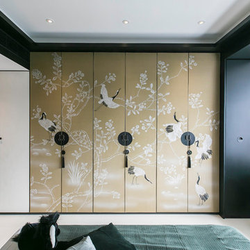
Invited by a couple moving into Parkview Hong Kong, HIR studio helped to renovate their apartment into a modern exotic retreat, by interplaying geometrical textures, colours and local crafts.
" The character is both local & western, blending in chinoiserie & exoticism ; It is very Hong Kong "
The Asian couple has an intriguing personality. Being a young entrepreneur: she is adventurous, sensitive and clear about what she aspires for; he is appreciative of cool designs.
Since they returned to HK from abroad, the couple has been overwhelmed with work every day. Travelling on vacations is the only precious time when they could take a refreshing break. From southeast Asia to Northern Africa, the escapists love to visit anywhere, and bring back pieces of souvenirs.
Photo by: HIR Studio
 Stonepocket Unique Landscapes
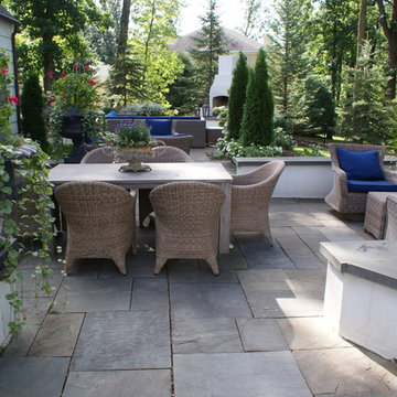
Landscape by Stonepocket located in Minnetonka, Minnesota Creating a elegant landscape to blend with a home with such character and charm was a challenge in controlled resistant. Did not want the landscape to overwhelm the home, nor did I want a typical landscape for this style that usually involves a box hedge. Utilizing light in the front to create a perennial garden give the home a sense of place. Keep the planting mostly to whites and greens in the back unifies the space.
photos by Stonepocket, Inc
 Pool Environments, Inc.
Randy Angell, Designer
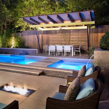
The planning phase of this modern retreat was an intense collaboration that took place over the course of more than two years. The main challenge on the site was elevation. The southeast corner of the lot stands 5'6" above the threshold of the rear door, while the northeast corner dropped a full 2' below the threshold. The backyard was also long and narrow, sloping side-to-side and toward the house. The key to the design concept was to deftly place the project in to the slope, utilize the elevation changes, but not allow them to dominate the yard, or overwhelm the senses.

 Vetter Architects
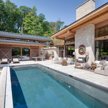
The owners requested a Private Resort that catered to their love for entertaining friends and family, a place where 2 people would feel just as comfortable as 42. Located on the western edge of a Wisconsin lake, the site provides a range of natural ecosystems from forest to prairie to water, allowing the building to have a more complex relationship with the lake - not merely creating large unencumbered views in that direction. The gently sloping site to the lake is atypical in many ways to most lakeside lots - as its main trajectory is not directly to the lake views - allowing for focus to be pushed in other directions such as a courtyard and into a nearby forest.
The biggest challenge was accommodating the large scale gathering spaces, while not overwhelming the natural setting with a single massive structure. Our solution was found in breaking down the scale of the project into digestible pieces and organizing them in a Camp-like collection of elements:
- Main Lodge: Providing the proper entry to the Camp and a Mess Hall
- Bunk House: A communal sleeping area and social space.
- Party Barn: An entertainment facility that opens directly on to a swimming pool & outdoor room.
- Guest Cottages: A series of smaller guest quarters.
- Private Quarters: The owners private space that directly links to the Main Lodge.
These elements are joined by a series green roof connectors, that merge with the landscape and allow the out buildings to retain their own identity. This Camp feel was further magnified through the materiality - specifically the use of Doug Fir, creating a modern Northwoods setting that is warm and inviting. The use of local limestone and poured concrete walls ground the buildings to the sloping site and serve as a cradle for the wood volumes that rest gently on them. The connections between these materials provided an opportunity to add a delicate reading to the spaces and re-enforce the camp aesthetic.
The oscillation between large communal spaces and private, intimate zones is explored on the interior and in the outdoor rooms. From the large courtyard to the private balcony - accommodating a variety of opportunities to engage the landscape was at the heart of the concept.
Overview
Chenequa, WI
Size
Total Finished Area: 9,543 sf
Completion Date
May 2013
Services
Architecture, Landscape Architecture, Interior Design

 Lore Patterson
squash blossoms - edible flowers | Lore Patterson
Inspiration for a traditional landscaping in Seattle.
Inspiration for a traditional landscaping in Seattle.
 The Perfect Paint Color
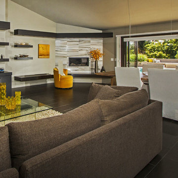
The client wanted a warm and inviting space but with a splash of contemporary color. The bright yellow adds the pop without being overwhelming.
Interior design by SPRINGFIELD DESIGN.
www.springfielddesign.com
 Sleeping Dog Properties, Inc.
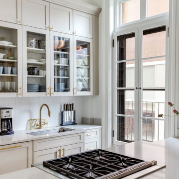
For this project, our Boston design-build team worked closely with a pair of keen-eyed clients to bring their unique vision to life. The main challenge throughout was deciding how to make the most out of the relatively small 990 ft² we had to work with.
 Vetter Architects
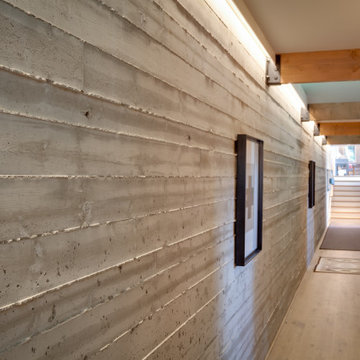
The owners requested a Private Resort that catered to their love for entertaining friends and family, a place where 2 people would feel just as comfortable as 42. Located on the western edge of a Wisconsin lake, the site provides a range of natural ecosystems from forest to prairie to water, allowing the building to have a more complex relationship with the lake - not merely creating large unencumbered views in that direction. The gently sloping site to the lake is atypical in many ways to most lakeside lots - as its main trajectory is not directly to the lake views - allowing for focus to be pushed in other directions such as a courtyard and into a nearby forest.
The biggest challenge was accommodating the large scale gathering spaces, while not overwhelming the natural setting with a single massive structure. Our solution was found in breaking down the scale of the project into digestible pieces and organizing them in a Camp-like collection of elements:
- Main Lodge: Providing the proper entry to the Camp and a Mess Hall
- Bunk House: A communal sleeping area and social space.
- Party Barn: An entertainment facility that opens directly on to a swimming pool & outdoor room.
- Guest Cottages: A series of smaller guest quarters.
- Private Quarters: The owners private space that directly links to the Main Lodge.
These elements are joined by a series green roof connectors, that merge with the landscape and allow the out buildings to retain their own identity. This Camp feel was further magnified through the materiality - specifically the use of Doug Fir, creating a modern Northwoods setting that is warm and inviting. The use of local limestone and poured concrete walls ground the buildings to the sloping site and serve as a cradle for the wood volumes that rest gently on them. The connections between these materials provided an opportunity to add a delicate reading to the spaces and re-enforce the camp aesthetic.
The oscillation between large communal spaces and private, intimate zones is explored on the interior and in the outdoor rooms. From the large courtyard to the private balcony - accommodating a variety of opportunities to engage the landscape was at the heart of the concept.
Overview
Chenequa, WI
Size
Total Finished Area: 9,543 sf
Completion Date
May 2013
Services
Architecture, Landscape Architecture, Interior Design
88