
Search results for "Pantone" in Home Design Ideas
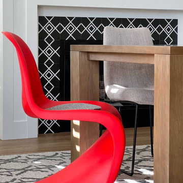
 Sandra Mijan, Dress Your Space
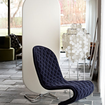
I love to mix styles and always add an element of surprise to the space. Good old Panton Chair is one of those modern timeless pieces.
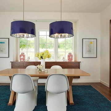
Dining room - transitional dining room idea in Las Vegas
Dining room - transitional dining room idea in Las Vegas

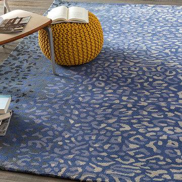
 Surya
Rug- (Bali- BAL-1943)
Designer: Peter Som
100% Wool
Backing: Cotton Canvas
Hand Tufted
Custom Sizes Available
Medium Pile
Viscose Accents
Color (Pantone TPX): Cobalt(18-3921),Charcoal(19-4005),Cobalt(17-4021),Light Gray(14-4103),Charcoal(19-4104)
Available in 4 colors
Pouf- (Fargo- FGPF-006)
100% Wool
Color (Pantone TPX): Gold(16-0946)
Available in 7 colors
Find the right local pro for your project
 FRONTGATE
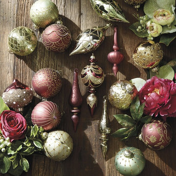
With beautifully varied finishes, our exclusive Marsala and Mint 60-Piece Ornament Collection conveys the fresh elegance of soft, contemporary tones. In this curated assortment of glass ornaments, the sparkle of metallics and hand-applied embellishments is balanced by the depth of matte, ribbed and hammered textures.
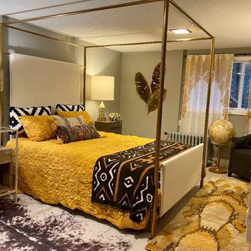
 Think Design LLC
A boho style master in a ADU apartment for guests or Mom. This build out was November of 2020 just before Pantone announced their colors of the year, grey and gold.
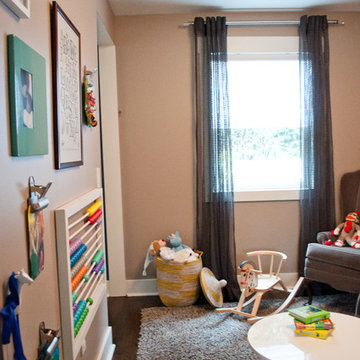
 Jennifer Gardner Design
This dining room turned playroom was designed for an energetic 2 year old. Our top priorities were maximizing a small space, providing adequate storage for toys and books and developing a design aesthetic that would be both inviting to a two year old and also flow beautifully from the adjacent living room and kitchen. We chose a warm, neutral wall color and accented it with pops of orangey red and vivid blues. Textures and patterns were incorporated to create playful visual interest. A sensory wall was added to offer stimulating play and beloved artwork was installed to add a touch of grown up sophisticated. An IKEA cabinet was painted a bold red and offers plenty of organized hidden storage. New knobs by Anthropologie were added to give the cabinet a custom feel. Large pillows in John Robshaw fabric offer a soft place to rest and the modern eiffel table and clear panton chairs become the epicenter for art, puzzles and snacks. This room is bursting with bright, bold color and a center for fun childhood experience. It was a joy to design for a very special Seattle family!
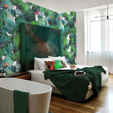
 Pixers
The Pantone Institute has announced the color of the year for 2017. The color shade Greenery has been selected, which is a change from last year's colors: pastel Rose Quartz and Serenity. The selected color in a green tone is vivid and intense and is reminiscent of spring, a time which nature comes back to life. Space enriched with wall murals in Greenery hues will gain good energy and will inspire bold and positive changes.
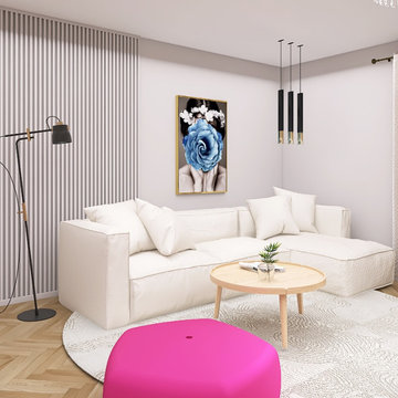
 Live your home - Interior Design
First own apartment
In this interior design project, we focused on a 2-bedroom apartment. It was the client's first own apartment as she recently moved to Vienna. She desired a feminine and minimalist interior design that was far from boring. Since it was a rental apartment, certain elements were predetermined, and we aimed to create a design that could easily be taken along in case of a move. For example, we incorporated natural white acoustic panels as accents behind the sofa and TV, providing texture without introducing color into the space.
We drew inspiration from the Pantone Color of the Year 2023, "Viva Magenta," for the accent color. Thus, we chose dining chairs and a pouf in shades from this color palette.
The kitchenette remained unchanged, but we added a beautiful floral wallpaper as an accent to the backsplash. However, the highlight of the design is undoubtedly the living plant wall. It creates a green focal point in the middle of the room. We decided against adding more plants since our client is often away for days, and regular care couldn't be guaranteed. The living wall requires less maintenance and is more manageable in this regard.
----
Erste eigene Wohnung in Wien
In diesem Einrichtungsprojekte ging es um eine 2-Zimmer-Wohnung. Es ist die erste eigene Wohnung der Kundin, die eben nach Wien gezogen ist. Sie wünschte sich ein feminines, schlichtes, jedoch nicht langweiliges Interiordesign. Da es sich um eine Mietwohnung handelt, waren einige Dinge gegeben und wir haben uns bemüht, alles so zu gestalten, dass es bei einem Umzug leicht mitgenommen werden kann. Wie z.B. die naturweißen Akustikpaneele, die als Akzent hinter dem Sofa sowie hinter dem TV angebracht wurden. Diese bieten Struktur, ohne Farbe in den Raum zu bringen.
Bei der Akzentfarbe wollten wir uns nämlich von der Pantone-Farbe 2023 “Viva Magenta” inspirieren lassen und haben somit die Esszimmer-Stühle sowie den Pouf farblich aus dieser Palette gewählt.
Die Küchenzeile blieb unverändert, jedoch haben wir der Rückwand mit einer hübschen Blüten-Tapete einen Akzent verliehen. Wahrscheinlich aber DAS Highlight ist die lebende Pflanzenwand. Diese bietet einen grünen Blickpunkt mitten im Raum. Auf weitere Pflanzen wurde verzichtet, da unsere Kunden oft tagelang nicht zuhause ist und die Pflege daher nicht garantiert wäre. Diese “Living wall” ist da weniger anspruchsvoll.


 Pixers
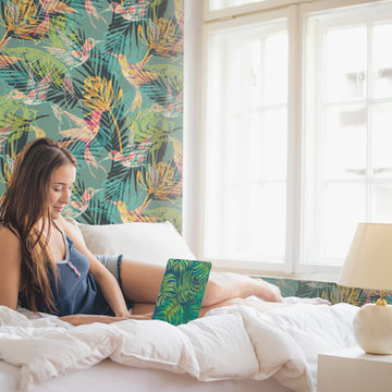
The Pantone Institute has announced the color of the year for 2017. The color shade Greenery has been selected, which is a change from last year's colors: pastel Rose Quartz and Serenity. The selected color in a green tone is vivid and intense and is reminiscent of spring, a time which nature comes back to life. Space enriched with wall murals in Greenery hues will gain good energy and will inspire bold and positive changes.
 Pixers
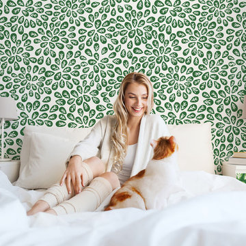
The Pantone Institute has announced the color of the year for 2017. The color shade Greenery has been selected, which is a change from last year's colors: pastel Rose Quartz and Serenity. The selected color in a green tone is vivid and intense and is reminiscent of spring, a time which nature comes back to life. Space enriched with wall murals in Greenery hues will gain good energy and will inspire bold and positive changes.
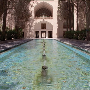
 New Ravenna
Paisley Vine, a hand cut jewel glass mosaic shown in Peridot, Quartz, Turquoise, Peacock Topaz, Tiger's Eye, Chalcedony, Garnet, Citrine, Aventurine, Tanzanite and Amber, is part of the Silk Road Collection by Sara Baldwin for New Ravenna Mosaics.
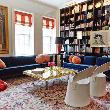
 Apsara Interior Design
Photographer Tertius Bune.
Yves Klein, Table D'Oree. 1961 Gold Leaf and Plexi. Pair of Chairs are by Nanna Ditzel. Fiberglass. Denmark 1960.
Eric Hogland Candelabrum. 1957. Sweden Painting by David Diao. "Breakers" 130 x 66. 1972 Acrylic on Canvas Painting by Robert Harms. Chairs by Verner Panton. Table by Saarinen.
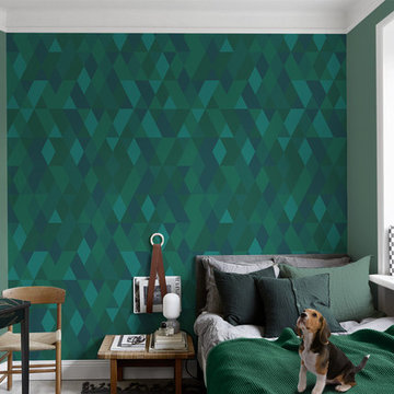 Pixers
The Pantone Institute has announced the color of the year for 2017. The color shade Greenery has been selected, which is a change from last year's colors: pastel Rose Quartz and Serenity. The selected color in a green tone is vivid and intense and is reminiscent of spring, a time which nature comes back to life. Space enriched with wall murals in Greenery hues will gain good energy and will inspire bold and positive changes.
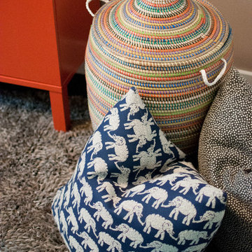 Jennifer Gardner Design
This dining room turned playroom was designed for an energetic 2 year old. Our top priorities were maximizing a small space, providing adequate storage for toys and books and developing a design aesthetic that would be both inviting to a two year old and also flow beautifully from the adjacent living room and kitchen. We chose a warm, neutral wall color and accented it with pops of orangey red and vivid blues. Textures and patterns were incorporated to create playful visual interest. A sensory wall was added to offer stimulating play and beloved artwork was installed to add a touch of grown up sophisticated. An IKEA cabinet was painted a bold red and offers plenty of organized hidden storage. New knobs by Anthropologie were added to give the cabinet a custom feel. Large pillows in John Robshaw fabric offer a soft place to rest and the modern eiffel table and clear panton chairs become the epicenter for art, puzzles and snacks. This room is bursting with bright, bold color and a center for fun childhood experience. It was a joy to design for a very special Seattle family!
 Live your home - Interior Design
First own apartment
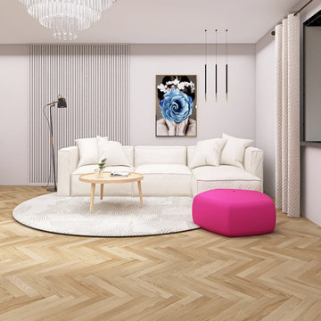
In this interior design project, we focused on a 2-bedroom apartment. It was the client's first own apartment as she recently moved to Vienna. She desired a feminine and minimalist interior design that was far from boring. Since it was a rental apartment, certain elements were predetermined, and we aimed to create a design that could easily be taken along in case of a move. For example, we incorporated natural white acoustic panels as accents behind the sofa and TV, providing texture without introducing color into the space.
We drew inspiration from the Pantone Color of the Year 2023, "Viva Magenta," for the accent color. Thus, we chose dining chairs and a pouf in shades from this color palette.
The kitchenette remained unchanged, but we added a beautiful floral wallpaper as an accent to the backsplash. However, the highlight of the design is undoubtedly the living plant wall. It creates a green focal point in the middle of the room. We decided against adding more plants since our client is often away for days, and regular care couldn't be guaranteed. The living wall requires less maintenance and is more manageable in this regard.
----
Erste eigene Wohnung in Wien
In diesem Einrichtungsprojekte ging es um eine 2-Zimmer-Wohnung. Es ist die erste eigene Wohnung der Kundin, die eben nach Wien gezogen ist. Sie wünschte sich ein feminines, schlichtes, jedoch nicht langweiliges Interiordesign. Da es sich um eine Mietwohnung handelt, waren einige Dinge gegeben und wir haben uns bemüht, alles so zu gestalten, dass es bei einem Umzug leicht mitgenommen werden kann. Wie z.B. die naturweißen Akustikpaneele, die als Akzent hinter dem Sofa sowie hinter dem TV angebracht wurden. Diese bieten Struktur, ohne Farbe in den Raum zu bringen.
Bei der Akzentfarbe wollten wir uns nämlich von der Pantone-Farbe 2023 “Viva Magenta” inspirieren lassen und haben somit die Esszimmer-Stühle sowie den Pouf farblich aus dieser Palette gewählt.
Die Küchenzeile blieb unverändert, jedoch haben wir der Rückwand mit einer hübschen Blüten-Tapete einen Akzent verliehen. Wahrscheinlich aber DAS Highlight ist die lebende Pflanzenwand. Diese bietet einen grünen Blickpunkt mitten im Raum. Auf weitere Pflanzen wurde verzichtet, da unsere Kunden oft tagelang nicht zuhause ist und die Pflege daher nicht garantiert wäre. Diese “Living wall” ist da weniger anspruchsvoll.
 Modern Sofa Beds
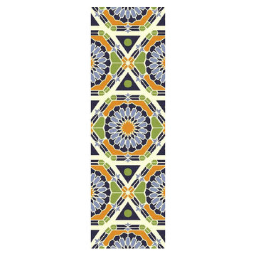
Features:
100% Wool
Hand Knotted
Made in India
Custom Sizes Available
No Pile
No Shedding, Fringe/Tassel Detail
Color (Pantone TPX): Color (Pantone TPX): Burnt Orange(16-1454), Ivory(12-5202), Lime(16-0237)
Available in 5 colors
Dimensions: 2'6'' x 8'
From www.modern-sofabeds.com
Free shipping US
 Coombs Design
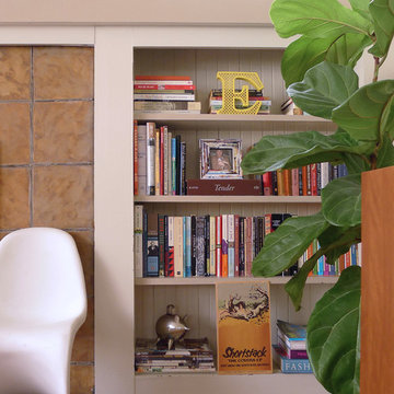
This detail shot of the living room bookcase shows that storage can be both stylish and functional. The mini Pantone chair is ideal for the youngest occupants of the house.
 JayMarc Homes
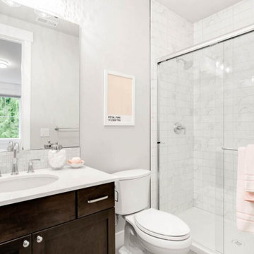
Bathroom - large craftsman white tile and ceramic tile porcelain tile bathroom idea in Seattle with shaker cabinets, dark wood cabinets, white walls, an undermount sink, quartz countertops and white countertops
26