
Search results for "Parenting style" in Home Design Ideas

 Michael Nash Design, Build & Homes
2011 CAPITAL COTY AWARD HONORABLE MENTION AWARD WINNER
Built circa 1980, a young couple with three children originally purchased this home for their growing family. After four years of karate, soccer, piano and other activities, however, the home was becoming too small to meet their needs.
Problems started upon entering the front foyer. A 25-foot long dark hallway separated the family room and the kitchen, ending in a tiny powder room stuck in the middle of the layout. The kitchen was especially isolated, a cramped L-shaped design with a box bay breakfast bump out that was literally falling apart.
The new design started with the core of the problem—the maze and separation created by the long hallways.
First, the 25’ load bearing wall separating the foyer from family room was totally taken out and replaced with a long supporting beam. A French door replaced a small door and window leading to a screen porch . This action allowed lots of light to get into family and foyer. Then, the powder room was removed and the partition wall between the kitchen and family room was taken down. This created a large open concept design and greatly increased the size of the kitchen.
The box bay was demolished and replaced with new walls and a large window. The plumbing for main sink and dishwasher got relocated into this box bay allowing a total transformation of the space. Now there are cabinets and counters on all sides.
The doorway to the dining room was reconfigured to allow a butler area on its left. While the right side was occupied with new 36” gas range top with a decorative wood hood above it. The refrigerator, microwave/oven and pantries—the space’s tall elements—occupy one wall..
A large Island with a prep sink and beverage center for the kids occupies the center of the layout. Capable of seating up to four, family and friends can now keep the cook company. A large built-in desk area lets the kids do their homework so the parents can supervise while they prepare meals.
Light cabinetry with a touch of caramel glazing and exotic granite countertops by our designers contributed to this kitchen’s elegant design. The contrasting distressed island’s darker finish matches the dinette set and other furnishings.
New hardwood floors were installed throughout the first floor for a seamless look, while recess, pendant and task lighting make the space even brighter. Importantly, there’s plenty of space for parents and kids to hang out together. The kitchen is truly the heart of their home.

 Period Architecture Ltd.
Inspiration for a large timeless brown two-story wood gable roof remodel in Philadelphia with a shingle roof
 Coco Maison Design
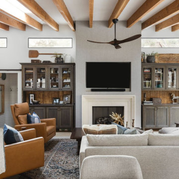
We planned a thoughtful redesign of this beautiful home while retaining many of the existing features. We wanted this house to feel the immediacy of its environment. So we carried the exterior front entry style into the interiors, too, as a way to bring the beautiful outdoors in. In addition, we added patios to all the bedrooms to make them feel much bigger. Luckily for us, our temperate California climate makes it possible for the patios to be used consistently throughout the year.
The original kitchen design did not have exposed beams, but we decided to replicate the motif of the 30" living room beams in the kitchen as well, making it one of our favorite details of the house. To make the kitchen more functional, we added a second island allowing us to separate kitchen tasks. The sink island works as a food prep area, and the bar island is for mail, crafts, and quick snacks.
We designed the primary bedroom as a relaxation sanctuary – something we highly recommend to all parents. It features some of our favorite things: a cognac leather reading chair next to a fireplace, Scottish plaid fabrics, a vegetable dye rug, art from our favorite cities, and goofy portraits of the kids.
---
Project designed by Courtney Thomas Design in La Cañada. Serving Pasadena, Glendale, Monrovia, San Marino, Sierra Madre, South Pasadena, and Altadena.
For more about Courtney Thomas Design, see here: https://www.courtneythomasdesign.com/
To learn more about this project, see here:
https://www.courtneythomasdesign.com/portfolio/functional-ranch-house-design/
Find the right local pro for your project

 TKS Design Group
Free ebook, Creating the Ideal Kitchen. DOWNLOAD NOW
Working with this Glen Ellyn client was so much fun the first time around, we were thrilled when they called to say they were considering moving across town and might need some help with a bit of design work at the new house.
The kitchen in the new house had been recently renovated, but it was not exactly what they wanted. What started out as a few tweaks led to a pretty big overhaul of the kitchen, mudroom and laundry room. Luckily, we were able to use re-purpose the old kitchen cabinetry and custom island in the remodeling of the new laundry room — win-win!
As parents of two young girls, it was important for the homeowners to have a spot to store equipment, coats and all the “behind the scenes” necessities away from the main part of the house which is a large open floor plan. The existing basement mudroom and laundry room had great bones and both rooms were very large.
To make the space more livable and comfortable, we laid slate tile on the floor and added a built-in desk area, coat/boot area and some additional tall storage. We also reworked the staircase, added a new stair runner, gave a facelift to the walk-in closet at the foot of the stairs, and built a coat closet. The end result is a multi-functional, large comfortable room to come home to!
Just beyond the mudroom is the new laundry room where we re-used the cabinets and island from the original kitchen. The new laundry room also features a small powder room that used to be just a toilet in the middle of the room.
You can see the island from the old kitchen that has been repurposed for a laundry folding table. The other countertops are maple butcherblock, and the gold accents from the other rooms are carried through into this room. We were also excited to unearth an existing window and bring some light into the room.
Designed by: Susan Klimala, CKD, CBD
Photography by: Michael Alan Kaskel
For more information on kitchen and bath design ideas go to: www.kitchenstudio-ge.com


 Lori Delisle Interior Design & Decorating
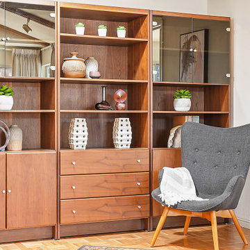
My client's mother had a love for all things 60's, 70's & 80's. Her home was overflowing with original pieces in every corner, on every wall and in every nook and cranny. It was a crazy mish mosh of pieces and styles. When my clients decided to sell their parent's beloved home the task of making the craziness look welcoming seemed overwhelming but I knew that it was not only do-able but also had the potential to look absolutely amazing.
We did a massive, and when I say massive, I mean MASSIVE, decluttering including an estate sale, many donation runs and haulers. Then it was time to use the special pieces I had reserved, along with modern new ones, some repairs and fresh paint here and there to revive this special gem in Willow Glen, CA for a new home owner to love.

 BANDD DESIGN
Designing a kids bathroom isn't always the easiest - especially when its a shared space between a brother and sister! We wanted this bathroom to appeal to both of their tastes while utilizing a design that won't need to be updated anytime soon! Lively pops of deep teal from the vanity and wallpaper were paired with subtle pastel pinks on textiles and hardware. Brass finishes and wooden accents balance out the colorful design and create a cohesive style that suits the kids and parents!
Designed by Sara Barney’s BANDD DESIGN, who are based in Austin, Texas and serving throughout Round Rock, Lake Travis, West Lake Hills, and Tarrytown.
For more about BANDD DESIGN, click here: https://bandddesign.com/
To learn more about this project, click here: https://bandddesign.com/kids-bathroom-remodel/
Sponsored
Plain City, OH

The Creative Kitchen Company
Columbus Area Kitchen Remodeling and Refacing Professional

 Axis Mundi Design
It wasn’t necessary to overthink things when Axis Mundi designed interiors for an apartment at Brooklyn’s glass-sheathed 1 Grand Army Plaza, the luxury building by Richard Meier already endowed with all the “starchitect” bells and whistles, as well as drop-dead stunning views of Brooklyn, the harbor and Prospect Park. What did require considerable aptitude was to strike the right balance between respect for these assets, particularly the panoramas, and livability. The all-white scheme doesn’t just complement Meier’s own aesthetic devotion to this purest of pure hues; it serves as a cool backdrop for the views, affording comfortable vantage points from which to enjoy them, yet not drawing attention away from the splendors of one of the world’s most distinctive boroughs. Sleek, low-lying Italian seating avoids distracting interruptions on the horizon line. But minimal color accents and pattern also sidestep what could have been a potentially antiseptic environment, making it tactile, human and luxurious.
2,200 sf
Design Team: John Beckmann, Richard Rosenbloom and Nick Messerlian
Photography: Adriana Buffi and Fran Parente
© Axis Mundi Design LLC
 Lori Delisle Interior Design & Decorating
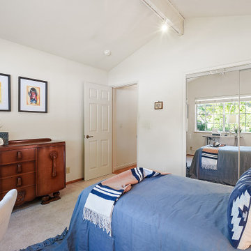
My client's mother had a love for all things 60's, 70's & 80's. Her home was overflowing with original pieces in every corner, on every wall and in every nook and cranny. It was a crazy mish mosh of pieces and styles. When my clients decided to sell their parent's beloved home the task of making the craziness look welcoming seemed overwhelming but I knew that it was not only do-able but also had the potential to look absolutely amazing.
We did a massive, and when I say massive, I mean MASSIVE, decluttering including an estate sale, many donation runs and haulers. Then it was time to use the special pieces I had reserved, along with modern new ones, some repairs and fresh paint here and there to revive this special gem in Willow Glen, CA for a new home owner to love.

 Melton Design Build
The kitchen portion of this renovation focused on improving the layout, functionality, and design. Originally a confined dated kitchen the team looked for ways to open the kitchen, incorporate industrial elements and create the feel of a modern farmhouse. Our team focused on trying to find ways to incorporate industrial moments by using a metal barn door, fun light fixtures, exposed brick, metal pipe built-ins, black windows, and more, while blending it with the rest of the transitional style home. Upgraded appliances, a butcher block counter, and large island also help the kitchen function more effectively for the chefs in the family. Also, adding in a breakfast nook, equipped with USB chargers and extra storage in the bench, has created a great “homework zone” for the kids while the parents cook.


 FineLine Kitchens, Inc.
Large transitional l-shaped light wood floor eat-in kitchen photo in DC Metro with an undermount sink, shaker cabinets, white cabinets, quartz countertops, white backsplash, subway tile backsplash, stainless steel appliances and an island
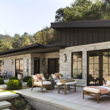 Coco Maison Design
We planned a thoughtful redesign of this beautiful home while retaining many of the existing features. We wanted this house to feel the immediacy of its environment. So we carried the exterior front entry style into the interiors, too, as a way to bring the beautiful outdoors in. In addition, we added patios to all the bedrooms to make them feel much bigger. Luckily for us, our temperate California climate makes it possible for the patios to be used consistently throughout the year.
The original kitchen design did not have exposed beams, but we decided to replicate the motif of the 30" living room beams in the kitchen as well, making it one of our favorite details of the house. To make the kitchen more functional, we added a second island allowing us to separate kitchen tasks. The sink island works as a food prep area, and the bar island is for mail, crafts, and quick snacks.
We designed the primary bedroom as a relaxation sanctuary – something we highly recommend to all parents. It features some of our favorite things: a cognac leather reading chair next to a fireplace, Scottish plaid fabrics, a vegetable dye rug, art from our favorite cities, and goofy portraits of the kids.
---
Project designed by Courtney Thomas Design in La Cañada. Serving Pasadena, Glendale, Monrovia, San Marino, Sierra Madre, South Pasadena, and Altadena.
For more about Courtney Thomas Design, see here: https://www.courtneythomasdesign.com/
To learn more about this project, see here:
https://www.courtneythomasdesign.com/portfolio/functional-ranch-house-design/
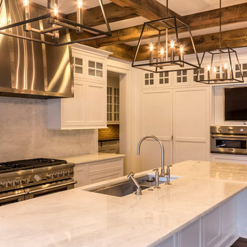


 Satin & Slate
The current home for this family was not large enough for their needs. We extended the master bedroom to create an additional walk-in closet and added a master bathroom to allow the parents to have their own retreat. We mixed the couple’s styles by introducing hints of mid-century modern and transitional elements throughout the home.
A neutral palette and clean lines are found throughout the home with splashes of color. We also focused on the functionality of the home by removing some of the walls that did not allow the home to flow, keeping it open for conversation in the main living areas. Contact us today,
(562) 444-8745.
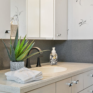 Lori Delisle Interior Design & Decorating
My client's mother had a love for all things 60's, 70's & 80's. Her home was overflowing with original pieces in every corner, on every wall and in every nook and cranny. It was a crazy mish mosh of pieces and styles. When my clients decided to sell their parent's beloved home the task of making the craziness look welcoming seemed overwhelming but I knew that it was not only do-able but also had the potential to look absolutely amazing.
We did a massive, and when I say massive, I mean MASSIVE, decluttering including an estate sale, many donation runs and haulers. Then it was time to use the special pieces I had reserved, along with modern new ones, some repairs and fresh paint here and there to revive this special gem in Willow Glen, CA for a new home owner to love.
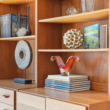 Lori Delisle Interior Design & Decorating
My client's mother had a love for all things 60's, 70's & 80's. Her home was overflowing with original pieces in every corner, on every wall and in every nook and cranny. It was a crazy mish mosh of pieces and styles. When my clients decided to sell their parent's beloved home the task of making the craziness look welcoming seemed overwhelming but I knew that it was not only do-able but also had the potential to look absolutely amazing.
We did a massive, and when I say massive, I mean MASSIVE, decluttering including an estate sale, many donation runs and haulers. Then it was time to use the special pieces I had reserved, along with modern new ones, some repairs and fresh paint here and there to revive this special gem in Willow Glen, CA for a new home owner to love.
 BANDD DESIGN
Designing a kids bathroom isn't always the easiest - especially when its a shared space between a brother and sister! We wanted this bathroom to appeal to both of their tastes while utilizing a design that won't need to be updated anytime soon! Lively pops of deep teal from the vanity and wallpaper were paired with subtle pastel pinks on textiles and hardware. Brass finishes and wooden accents balance out the colorful design and create a cohesive style that suits the kids and parents!
Designed by Sara Barney’s BANDD DESIGN, who are based in Austin, Texas and serving throughout Round Rock, Lake Travis, West Lake Hills, and Tarrytown.
For more about BANDD DESIGN, click here: https://bandddesign.com/
To learn more about this project, click here: https://bandddesign.com/kids-bathroom-remodel/
Sponsored
Columbus, OH

Hope Restoration & General Contracting
Columbus Design-Build, Kitchen & Bath Remodeling, Historic Renovations
 Axis Mundi Design
It wasn’t necessary to overthink things when Axis Mundi designed interiors for an apartment at Brooklyn’s glass-sheathed 1 Grand Army Plaza, the luxury building by Richard Meier already endowed with all the “starchitect” bells and whistles, as well as drop-dead stunning views of Brooklyn, the harbor and Prospect Park. What did require considerable aptitude was to strike the right balance between respect for these assets, particularly the panoramas, and livability. The all-white scheme doesn’t just complement Meier’s own aesthetic devotion to this purest of pure hues; it serves as a cool backdrop for the views, affording comfortable vantage points from which to enjoy them, yet not drawing attention away from the splendors of one of the world’s most distinctive boroughs. Sleek, low-lying Italian seating avoids distracting interruptions on the horizon line. But minimal color accents and pattern also sidestep what could have been a potentially antiseptic environment, making it tactile, human and luxurious.
2,200 sf
Design Team: John Beckmann, Richard Rosenbloom and Nick Messerlian
Photography: Adriana Buffi and Fran Parente
© Axis Mundi Design LLC
 BANDD DESIGN
Designing a kids bathroom isn't always the easiest - especially when its a shared space between a brother and sister! We wanted this bathroom to appeal to both of their tastes while utilizing a design that won't need to be updated anytime soon! Lively pops of deep teal from the vanity and wallpaper were paired with subtle pastel pinks on textiles and hardware. Brass finishes and wooden accents balance out the colorful design and create a cohesive style that suits the kids and parents!
Designed by Sara Barney’s BANDD DESIGN, who are based in Austin, Texas and serving throughout Round Rock, Lake Travis, West Lake Hills, and Tarrytown.
For more about BANDD DESIGN, click here: https://bandddesign.com/
To learn more about this project, click here: https://bandddesign.com/kids-bathroom-remodel/

 Kaplan Architects, AIA
Location: Oakland, CA, USA
We were asked by the client to design an addition to their existing two story Cape Cod style house. The existing house had two bedrooms with one bath on the second level. They wanted to create an in-law type space for aging parents that would be easily accessible from the main level of the house. We looked at various ways to develop the extra space they wanted, including a separate detached in-law unit. They went with a scheme that has the new space attached to the back of the house. During the planning stage, they also decided to add a second level over the new addition which converted one of the existing bedrooms into a master bedroom suite. The final scheme has a new in-law suite at the ground level and a master bedroom, bath, walk-in closet, and bonus craft room on the second level.
We designed the addition to look like it was part of the original house construction and detailed the interior and exterior with that approach in mind.
View of in law suite looking back to the hallway and the living room beyond.
Mitch Shenker Photography
95