
Search results for "Penetrating" in Home Design Ideas

 Montana Timber Products
Complimenting the beautiful Colorado fall colors, this Montana Timber Products home features prefinished ranchwood™ Tackroom, Circle Sawn texture as a vertical installation.
-
The beautiful ranchwood Tackroom color, along with the vertical installation and stone work, combine for a painter's pleasure with the fall birch colors.
-
Our flagship product, ranchwood™ is Montana Timber Products' chemical free, kiln dried, alternative milled rough stock wood.
As an ideal reclaimed lumber alternative, the aesthetically pleasing rustic barn wood ranchwood™ is the result of an environmentally safe production process.
Offering uncompromising natural, rustic beauty, ranchwood™ is typically less expensive than antique reclaimed barnwood.
-
Combined textures solidify into a beautiful rustic brew.
-
A custom millwork shop, Montana Timber Products offers many options to the customer's delight.
Circle Sawn and Wire Brushed are Montana Timber Products' common cedar siding texturizing options.
The Circle Sawn texture commonly seen on rustic reclaimed barn wood is created from the large circular saw blades used in more traditional milling practices.
The Wire Brushed option adds physical and aesthetic depth to the wood grain.
In addition to the aesthetic beauty added from the texturing process, greater surface area is created, which allows the Seal-Once, 100% NO VOC waterproofer to more effectively penetrate the wood.
Guarneteed for ten years, Seal-Once prevents water ingress and is safe for exterior and interior use, children and pets.
-
Sophistication is no stranger to rustic application if done properly, as seen here with distinct lines and harmonious collaboration of wood and stone.
-
If the environment is important to you, Montana Timber Products natural wood siding, trim, flooring, interior accents, timbers, beams -- all of our wood products -- do not use degenerative chemicals as some other companies do to achieve desired effects.
Reclaimed wood, barn wood alternatives, and faux vintage wood are popular building materials further exemplified by Montana Timber Products environmentally friendly manufacturing technique.

 Carrie Johnson
Homeowners aimed to bring the lovely outdoors into better view when they removed the two 90's dated columns that divided the kitchen from the family room and eat-in area. They also transformed the range wall when they added two wood encasement windows which frame the custom zinc hood and allow a soft light to penetrate the kitchen. Custom beaded inset cabinetry was designed with a busy family of 5 in mind. A coffee station hides behind the appliance garage, the paper towel holder is partially concealed in a rolling drawer and three custom pullout drawers with soft close hinges hold many items that would otherwise be located on the countertop or under the sink. A 48" Viking gas range took the place of a 30" electric cooktop and a Bosch microwave drawer is now located in the island to make space for the newly added beverage cooler. Due to size and budget constaints, we kept the basic footprint so every space was carefully planned for function and design. The family stayed true to their casual lifestyle with the black honed countertops but added a little bling with the rustic crystal chandelier, crystal prism arched sconces and calcutta gold herringbone backsplash. But the owner's favorite add was the custom island designed as an antique furniture piece with the essenza blue quartzite countertop cut with a demi-bull stepout. The kids can now sit at the ample sized counter and enjoy breakfast or finish homework in the comfortable cherry red swivel chairs which add a pop to the otherwise understated tones. This newly remodeled kitchen checked all the homeowner's desires.

 InForm Architecture, LLC
The goal of this project was to replace a small single-story seasonal family cottage with a year-round home that takes advantage of the views and topography of this lakefront site while providing privacy for the occupants. The program called for a large open living area, a master suite, study, a small home gym and five additional bedrooms. The style was to be distinctly contemporary.
The house is shielded from the street by the placement of the garage and by limiting the amount of window area facing the road. The main entry is recessed and glazed with frosted glass for privacy. Due to the narrowness of the site and the proximity of the neighboring houses, the windows on the sides of the house were also limited and mostly high up on the walls. The limited fenestration on the front and sides is made up for by the full wall of glass on the lake side, facing north. The house is anchored by an exposed masonry foundation. This masonry also cuts through the center of the house on the fireplace chimney to separate the public and private spaces on the first floor, becoming a primary material on the interior. The house is clad with three different siding material: horizontal longboard siding, vertical ribbed steel siding and cement board panels installed as a rain screen. The standing seam metal-clad roof rises from a low point at the street elevation to a height of 24 feet at the lakefront to capture the views and the north light.
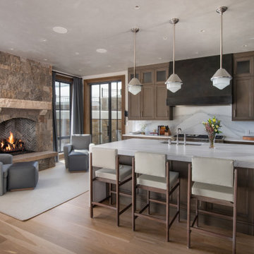
The house is organized into two levels and is entered on the upper level. This level contains the main living spaces, the master suite and the study. The angled stair railing guides visitors into the main living area. The kitchen, dining area and living area are each distinct areas within one large space. This space is visually connected to the outside by the soaring ceilings and large fireplace mass that penetrate the exterior wall. The lower level contains the children’s and guest bedrooms, a secondary living space and the home gym.
Find the right local pro for your project
 Carrie Johnson
Homeowners aimed to bring the lovely outdoors into better view when they removed the two 90's dated columns that divided the kitchen from the family room and eat-in area. They also transformed the range wall when they added two wood encasement windows which frame the custom zinc hood and allow a soft light to penetrate the kitchen. Custom beaded inset cabinetry was designed with a busy family of 5 in mind. A coffee station hides behind the appliance garage, the paper towel holder is partially concealed in a rolling drawer and three custom pullout drawers with soft close hinges hold many items that would otherwise be located on the countertops or under the sink. A 48" Viking gas range took the place of a 30" electric cooktop and a Bosch microwave drawer is now located in the island to make room for a newly added beverage cooler. Due to space and budget constraints, we kept the same basic footprint so every space was carefully planned for function and design. The family stayed true to their casual lifestyle with the black honed countertops but added a little bling with the rustic crystal chandelier, crystal prism arched sconces and calcutta gold herringbone backsplash. But the owner's favorite add was the custom island designed as an antique furniture piece with an essenza blue quartzite countertop cut with a demi-bull stepout. The kids can now sit at the ample counter and enjoy their breakfast or finish homework in the comfortable, cherry red swivel stools which add a pop of color to the otherwise understated tones. This newly remodeled kitchen checked all the homeowner's desires.
 Jeanne Schultz Design Studio
Words by Wilson Hack
The best architecture allows what has come before it to be seen and cared for while at the same time injecting something new, if not idealistic. Spartan at first glance, the interior of this stately apartment building, located on the iconic Passeig de Gràcia in Barcelona, quickly begins to unfold as a calculated series of textures, visual artifacts and perfected aesthetic continuities.
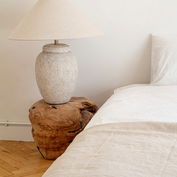
The client, a globe-trotting entrepreneur, selected Jeanne Schultz Design Studio for the remodel and requested that the space be reconditioned into a purposeful and peaceful landing pad. It was to be furnished simply using natural and sustainable materials. Schultz began by gently peeling back before adding only the essentials, resulting in a harmoniously restorative living space where darkness and light coexist and comfort reigns.
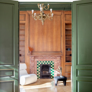
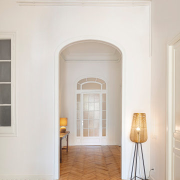
The design was initially guided by the fireplace—from there a subtle injection of matching color extends up into the thick tiered molding and ceiling trim. “The most reckless patterns live here,” remarks Schultz, referring to the checkered green and white tiles, pink-Pollack-y stone and cast iron detailing. The millwork and warm wood wall panels devour the remainder of the living room, eliminating the need for unnecessary artwork.
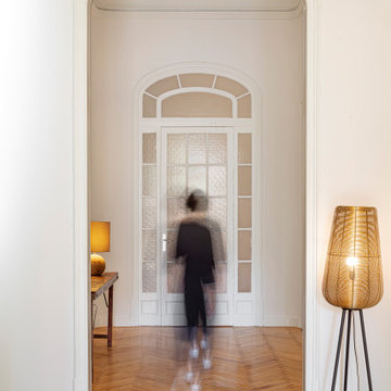
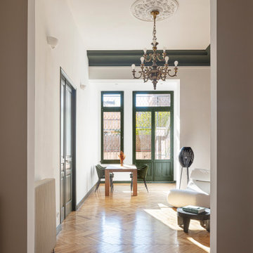
A curved living room chair by Kave Home punctuates playfully; its shape reveals its pleasant conformity to the human body and sits back, inviting rest and respite. “It’s good for all body types and sizes,” explains Schultz. The single sofa by Dareels is purposefully oversized, casual and inviting. A beige cover was added to soften the otherwise rectilinear edges. Additionally sourced from Dareels, a small yet centrally located side table anchors the space with its dark black wood texture, its visual weight on par with the larger pieces. The black bulbous free standing lamp converses directly with the antique chandelier above. Composed of individual black leather strips, it is seemingly harsh—yet its soft form is reminiscent of a spring tulip.
The continuation of the color palette slips softly into the dining room where velvety green chairs sit delicately on a cascade array of pointed legs. The doors that lead out to the patio were sanded down and treated so that the original shape and form could be retained. Although the same green paint was used throughout, this set of doors speaks in darker tones alongside the acute and penetrating daylight. A few different shades of white paint were used throughout the space to add additional depth and embellish this shadowy texture.
Specialty lights were added into the space to complement the existing overhead lighting. A wall sconce was added in the living room and extra lighting was placed in the kitchen. However, because of the existing barrel vaulted tile ceiling, sconces were placed on the walls rather than above to avoid penetrating the existing architecture.
 InForm Architecture, LLC
The goal of this project was to replace a small single-story seasonal family cottage with a year-round home that takes advantage of the views and topography of this lakefront site while providing privacy for the occupants. The program called for a large open living area, a master suite, study, a small home gym and five additional bedrooms. The style was to be distinctly contemporary.
The house is shielded from the street by the placement of the garage and by limiting the amount of window area facing the road. The main entry is recessed and glazed with frosted glass for privacy. Due to the narrowness of the site and the proximity of the neighboring houses, the windows on the sides of the house were also limited and mostly high up on the walls. The limited fenestration on the front and sides is made up for by the full wall of glass on the lake side, facing north. The house is anchored by an exposed masonry foundation. This masonry also cuts through the center of the house on the fireplace chimney to separate the public and private spaces on the first floor, becoming a primary material on the interior. The house is clad with three different siding material: horizontal longboard siding, vertical ribbed steel siding and cement board panels installed as a rain screen. The standing seam metal-clad roof rises from a low point at the street elevation to a height of 24 feet at the lakefront to capture the views and the north light.
The house is organized into two levels and is entered on the upper level. This level contains the main living spaces, the master suite and the study. The angled stair railing guides visitors into the main living area. The kitchen, dining area and living area are each distinct areas within one large space. This space is visually connected to the outside by the soaring ceilings and large fireplace mass that penetrate the exterior wall. The lower level contains the children’s and guest bedrooms, a secondary living space and the home gym.
 Natural Stone Institute
Gallegos was contacted by a client about a project where stone was not just to be an accent material, but the main visual and perceived structural element to create a timeless architectural composition. To further the endeavor: all veneers and dimension stone must be locally sourced and sustainably quarried. The design called for a moss rock veneer with cut stone trim. Sourcing the sandstone moss rock was simple because there were several local quarries to use. The problem
was with the trim pieces.
Gallegos selected Colorado Buff sandstone for the trim since the buff body was a good contrast to the moss rock and it is a stone that can be cut to size. One main concern with any sedimentary stone is hitting what is known as a “dry” layer in the ledge. This is an area in the stone between sedimentary layers that has not solidified or cemented. It is still granular and can lead to future stone failure as water penetrates these layers and creates freeze/thaw issues. To avoid this, they used
an epoxy injected into the dry layers to help solidify the material and prevent any future failures.
The client also wanted sustainable materials for their countertops and bathrooms. Many of the interior stones were either reclaimed materials or were sourced from Colorado quarries – Calacatta Lincoln was used extensively.
Gallegos sourced tiles from reclamation projects in Europe and Asia for use in the master bath and front entry areas. For many of the countertops, the owner’s interior designer spent hours looking through remnants and applied several throughout the residence.
Willow Court is a spectacular and dramatic nod to stone masonry, something the owner, architect, and builder can be proud of and, for the most part, was built with the environment in mind.
 Jeanne Schultz Design Studio
Words by Wilson Hack
The best architecture allows what has come before it to be seen and cared for while at the same time injecting something new, if not idealistic. Spartan at first glance, the interior of this stately apartment building, located on the iconic Passeig de Gràcia in Barcelona, quickly begins to unfold as a calculated series of textures, visual artifacts and perfected aesthetic continuities.
The client, a globe-trotting entrepreneur, selected Jeanne Schultz Design Studio for the remodel and requested that the space be reconditioned into a purposeful and peaceful landing pad. It was to be furnished simply using natural and sustainable materials. Schultz began by gently peeling back before adding only the essentials, resulting in a harmoniously restorative living space where darkness and light coexist and comfort reigns.
The design was initially guided by the fireplace—from there a subtle injection of matching color extends up into the thick tiered molding and ceiling trim. “The most reckless patterns live here,” remarks Schultz, referring to the checkered green and white tiles, pink-Pollack-y stone and cast iron detailing. The millwork and warm wood wall panels devour the remainder of the living room, eliminating the need for unnecessary artwork.
A curved living room chair by Kave Home punctuates playfully; its shape reveals its pleasant conformity to the human body and sits back, inviting rest and respite. “It’s good for all body types and sizes,” explains Schultz. The single sofa by Dareels is purposefully oversized, casual and inviting. A beige cover was added to soften the otherwise rectilinear edges. Additionally sourced from Dareels, a small yet centrally located side table anchors the space with its dark black wood texture, its visual weight on par with the larger pieces. The black bulbous free standing lamp converses directly with the antique chandelier above. Composed of individual black leather strips, it is seemingly harsh—yet its soft form is reminiscent of a spring tulip.
The continuation of the color palette slips softly into the dining room where velvety green chairs sit delicately on a cascade array of pointed legs. The doors that lead out to the patio were sanded down and treated so that the original shape and form could be retained. Although the same green paint was used throughout, this set of doors speaks in darker tones alongside the acute and penetrating daylight. A few different shades of white paint were used throughout the space to add additional depth and embellish this shadowy texture.
Specialty lights were added into the space to complement the existing overhead lighting. A wall sconce was added in the living room and extra lighting was placed in the kitchen. However, because of the existing barrel vaulted tile ceiling, sconces were placed on the walls rather than above to avoid penetrating the existing architecture.

 User
The 5,000 square foot private residence is located in the community of Horseshoe Bay, above the shores of Lake LBJ, and responds to the Texas Hill Country vernacular prescribed by the community: shallow metal roofs, regional materials, sensitive scale massing and water-wise landscaping. The house opens to the scenic north and north-west views and fractures and shifts in order to keep significant oak, mesquite, elm, cedar and persimmon trees, in the process creating lush private patios and limestone terraces.
The Owners desired an accessible residence built for flexibility as they age. This led to a single level home, and the challenge to nestle the step-less house into the sloping landscape.
Full height glazing opens the house to the very beautiful arid landscape, while porches and overhangs protect interior spaces from the harsh Texas sun. Expansive walls of industrial insulated glazing panels allow soft modulated light to penetrate the interior while providing visual privacy. An integral lap pool with adjacent low fenestration reflects dappled light deep into the house.
Chaste stained concrete floors and blackened steel focal elements contrast with islands of mesquite flooring, cherry casework and fir ceilings. Selective areas of exposed limestone walls, some incorporating salvaged timber lintels, and cor-ten steel components further the contrast within the uncomplicated framework.
The Owner’s object and art collection is incorporated into the residence’s sequence of connecting galleries creating a choreography of passage that alternates between the lucid expression of simple ranch house architecture and the rich accumulation of their heritage.
The general contractor for the project is local custom homebuilder Dauphine Homes. Structural Engineering is provided by Structures Inc. of Austin, Texas, and Landscape Architecture is provided by Prado Design LLC in conjunction with Jill Nokes, also of Austin.
Cecil Baker + Partners Photography
 Lincoln Lighthill Architect
 employed several discrete updates that collectively transform this existing row house.
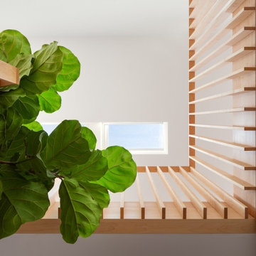
At the heart of the home, a section of floor was removed at the top level to open up the existing stair and allow light from a new skylight to penetrate deep into the home. The stair itself received a new maple guardrail and planter, with a Fiddle-leaf fig tree growing up through the opening towards the skylight.
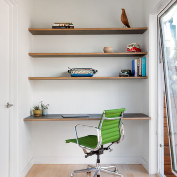
On the top living level, an awkwardly located entrance to a full bathroom directly off the main stair was moved around the corner and out of the way by removing a little used tub from the bathroom, as well as an outdated heater in the back corner. This created a more discrete entrance to the existing, now half-bath, and opened up a space for a wall of pantry cabinets with built-in refrigerator, and an office nook at the rear of the house with a huge new awning window to let in light and air.
Downstairs, the two existing bathrooms were reconfigured and recreated as dedicated master and kids baths. The kids bath uses yellow and white hexagonal Heath tile to create a pixelated celebration of color. The master bath, hidden behind a flush wall of walnut cabinetry, utilizes another Heath tile color to create a calming retreat.
Throughout the home, walnut thin-ply cabinetry creates a strong contrast to the existing maple flooring, while the exposed blond edges of the material tie the two together. Rounded edges on integral pulls and door edges create pinstripe detailing that adds richness and a sense of playfulness to the design.
This project was featured by Houzz: https://tinyurl.com/stn2hcze
 Carrie Johnson
Homeowners aimed to bring the lovely outdoors into better view when they removed the two 90's dated columns that divided the kitchen from the family room and eat-in area. They also transformed the range wall when they added two wood encasement windows which frame the custom zinc hood and allow a soft light to penetrate the kitchen. Custom beaded inset cabinetry was designed with a busy family of 5 in mind. A coffee station hides behind the appliance garage, the paper towel holder is partially concealed in a rolling drawer and three custom pullout drawers with soft close hinges hold many items that would otherwise be located on the countertop or under the sink. A 48" Viking gas range took the place of a 30" electric cooktop and a Bosch microwave drawer is now located in the island to make space for the newly added beverage cooler. Due to size and budget constaints, we kept the basic footprint so every space was carefully planned for function and design. The family stayed true to their casual lifestyle with the black honed countertops but added a little bling with the rustic crystal chandelier, crystal prism arched sconces and calcutta gold herringbone backsplash. But the owner's favorite add was the custom island designed as an antique furniture piece with the essenza blue quartzite countertop cut with a demi-bull stepout. The kids can now sit at the ample sized counter and enjoy breakfast or finish homework in the comfortable cherry red swivel chairs which add a pop to the otherwise understated tones. This newly remodeled kitchen checked all the homeowner's desires.
 Lincoln Lighthill Architect
 employed several discrete updates that collectively transform this existing row house.
At the heart of the home, a section of floor was removed at the top level to open up the existing stair and allow light from a new skylight to penetrate deep into the home. The stair itself received a new maple guardrail and planter, with a Fiddle-leaf fig tree growing up through the opening towards the skylight.
On the top living level, an awkwardly located entrance to a full bathroom directly off the main stair was moved around the corner and out of the way by removing a little used tub from the bathroom, as well as an outdated heater in the back corner. This created a more discrete entrance to the existing, now half-bath, and opened up a space for a wall of pantry cabinets with built-in refrigerator, and an office nook at the rear of the house with a huge new awning window to let in light and air.
Downstairs, the two existing bathrooms were reconfigured and recreated as dedicated master and kids baths. The kids bath uses yellow and white hexagonal Heath tile to create a pixelated celebration of color. The master bath, hidden behind a flush wall of walnut cabinetry, utilizes another Heath tile color to create a calming retreat.
Throughout the home, walnut thin-ply cabinetry creates a strong contrast to the existing maple flooring, while the exposed blond edges of the material tie the two together. Rounded edges on integral pulls and door edges create pinstripe detailing that adds richness and a sense of playfulness to the design.
This project was featured by Houzz: https://tinyurl.com/stn2hcze
 InForm Architecture, LLC
The goal of this project was to replace a small single-story seasonal family cottage with a year-round home that takes advantage of the views and topography of this lakefront site while providing privacy for the occupants. The program called for a large open living area, a master suite, study, a small home gym and five additional bedrooms. The style was to be distinctly contemporary.
The house is shielded from the street by the placement of the garage and by limiting the amount of window area facing the road. The main entry is recessed and glazed with frosted glass for privacy. Due to the narrowness of the site and the proximity of the neighboring houses, the windows on the sides of the house were also limited and mostly high up on the walls. The limited fenestration on the front and sides is made up for by the full wall of glass on the lake side, facing north. The house is anchored by an exposed masonry foundation. This masonry also cuts through the center of the house on the fireplace chimney to separate the public and private spaces on the first floor, becoming a primary material on the interior. The house is clad with three different siding material: horizontal longboard siding, vertical ribbed steel siding and cement board panels installed as a rain screen. The standing seam metal-clad roof rises from a low point at the street elevation to a height of 24 feet at the lakefront to capture the views and the north light.
The house is organized into two levels and is entered on the upper level. This level contains the main living spaces, the master suite and the study. The angled stair railing guides visitors into the main living area. The kitchen, dining area and living area are each distinct areas within one large space. This space is visually connected to the outside by the soaring ceilings and large fireplace mass that penetrate the exterior wall. The lower level contains the children’s and guest bedrooms, a secondary living space and the home gym.
 Jeanne Schultz Design Studio
Words by Wilson Hack
The best architecture allows what has come before it to be seen and cared for while at the same time injecting something new, if not idealistic. Spartan at first glance, the interior of this stately apartment building, located on the iconic Passeig de Gràcia in Barcelona, quickly begins to unfold as a calculated series of textures, visual artifacts and perfected aesthetic continuities.
The client, a globe-trotting entrepreneur, selected Jeanne Schultz Design Studio for the remodel and requested that the space be reconditioned into a purposeful and peaceful landing pad. It was to be furnished simply using natural and sustainable materials. Schultz began by gently peeling back before adding only the essentials, resulting in a harmoniously restorative living space where darkness and light coexist and comfort reigns.
The design was initially guided by the fireplace—from there a subtle injection of matching color extends up into the thick tiered molding and ceiling trim. “The most reckless patterns live here,” remarks Schultz, referring to the checkered green and white tiles, pink-Pollack-y stone and cast iron detailing. The millwork and warm wood wall panels devour the remainder of the living room, eliminating the need for unnecessary artwork.
A curved living room chair by Kave Home punctuates playfully; its shape reveals its pleasant conformity to the human body and sits back, inviting rest and respite. “It’s good for all body types and sizes,” explains Schultz. The single sofa by Dareels is purposefully oversized, casual and inviting. A beige cover was added to soften the otherwise rectilinear edges. Additionally sourced from Dareels, a small yet centrally located side table anchors the space with its dark black wood texture, its visual weight on par with the larger pieces. The black bulbous free standing lamp converses directly with the antique chandelier above. Composed of individual black leather strips, it is seemingly harsh—yet its soft form is reminiscent of a spring tulip.
The continuation of the color palette slips softly into the dining room where velvety green chairs sit delicately on a cascade array of pointed legs. The doors that lead out to the patio were sanded down and treated so that the original shape and form could be retained. Although the same green paint was used throughout, this set of doors speaks in darker tones alongside the acute and penetrating daylight. A few different shades of white paint were used throughout the space to add additional depth and embellish this shadowy texture.
Specialty lights were added into the space to complement the existing overhead lighting. A wall sconce was added in the living room and extra lighting was placed in the kitchen. However, because of the existing barrel vaulted tile ceiling, sconces were placed on the walls rather than above to avoid penetrating the existing architecture.
 InForm Architecture, LLC
The goal of this project was to replace a small single-story seasonal family cottage with a year-round home that takes advantage of the views and topography of this lakefront site while providing privacy for the occupants. The program called for a large open living area, a master suite, study, a small home gym and five additional bedrooms. The style was to be distinctly contemporary.
The house is shielded from the street by the placement of the garage and by limiting the amount of window area facing the road. The main entry is recessed and glazed with frosted glass for privacy. Due to the narrowness of the site and the proximity of the neighboring houses, the windows on the sides of the house were also limited and mostly high up on the walls. The limited fenestration on the front and sides is made up for by the full wall of glass on the lake side, facing north. The house is anchored by an exposed masonry foundation. This masonry also cuts through the center of the house on the fireplace chimney to separate the public and private spaces on the first floor, becoming a primary material on the interior. The house is clad with three different siding material: horizontal longboard siding, vertical ribbed steel siding and cement board panels installed as a rain screen. The standing seam metal-clad roof rises from a low point at the street elevation to a height of 24 feet at the lakefront to capture the views and the north light.
The house is organized into two levels and is entered on the upper level. This level contains the main living spaces, the master suite and the study. The angled stair railing guides visitors into the main living area. The kitchen, dining area and living area are each distinct areas within one large space. This space is visually connected to the outside by the soaring ceilings and large fireplace mass that penetrate the exterior wall. The lower level contains the children’s and guest bedrooms, a secondary living space and the home gym.
 Lincoln Lighthill Architect
 employed several discrete updates that collectively transform this existing row house.
At the heart of the home, a section of floor was removed at the top level to open up the existing stair and allow light from a new skylight to penetrate deep into the home. The stair itself received a new maple guardrail and planter, with a Fiddle-leaf fig tree growing up through the opening towards the skylight.
On the top living level, an awkwardly located entrance to a full bathroom directly off the main stair was moved around the corner and out of the way by removing a little used tub from the bathroom, as well as an outdated heater in the back corner. This created a more discrete entrance to the existing, now half-bath, and opened up a space for a wall of pantry cabinets with built-in refrigerator, and an office nook at the rear of the house with a huge new awning window to let in light and air.
Downstairs, the two existing bathrooms were reconfigured and recreated as dedicated master and kids baths. The kids bath uses yellow and white hexagonal Heath tile to create a pixelated celebration of color. The master bath, hidden behind a flush wall of walnut cabinetry, utilizes another Heath tile color to create a calming retreat.
Throughout the home, walnut thin-ply cabinetry creates a strong contrast to the existing maple flooring, while the exposed blond edges of the material tie the two together. Rounded edges on integral pulls and door edges create pinstripe detailing that adds richness and a sense of playfulness to the design.
This project was featured by Houzz: https://tinyurl.com/stn2hcze
 Jeanne Schultz Design Studio
Words by Wilson Hack
The best architecture allows what has come before it to be seen and cared for while at the same time injecting something new, if not idealistic. Spartan at first glance, the interior of this stately apartment building, located on the iconic Passeig de Gràcia in Barcelona, quickly begins to unfold as a calculated series of textures, visual artifacts and perfected aesthetic continuities.
The client, a globe-trotting entrepreneur, selected Jeanne Schultz Design Studio for the remodel and requested that the space be reconditioned into a purposeful and peaceful landing pad. It was to be furnished simply using natural and sustainable materials. Schultz began by gently peeling back before adding only the essentials, resulting in a harmoniously restorative living space where darkness and light coexist and comfort reigns.
The design was initially guided by the fireplace—from there a subtle injection of matching color extends up into the thick tiered molding and ceiling trim. “The most reckless patterns live here,” remarks Schultz, referring to the checkered green and white tiles, pink-Pollack-y stone and cast iron detailing. The millwork and warm wood wall panels devour the remainder of the living room, eliminating the need for unnecessary artwork.
A curved living room chair by Kave Home punctuates playfully; its shape reveals its pleasant conformity to the human body and sits back, inviting rest and respite. “It’s good for all body types and sizes,” explains Schultz. The single sofa by Dareels is purposefully oversized, casual and inviting. A beige cover was added to soften the otherwise rectilinear edges. Additionally sourced from Dareels, a small yet centrally located side table anchors the space with its dark black wood texture, its visual weight on par with the larger pieces. The black bulbous free standing lamp converses directly with the antique chandelier above. Composed of individual black leather strips, it is seemingly harsh—yet its soft form is reminiscent of a spring tulip.
The continuation of the color palette slips softly into the dining room where velvety green chairs sit delicately on a cascade array of pointed legs. The doors that lead out to the patio were sanded down and treated so that the original shape and form could be retained. Although the same green paint was used throughout, this set of doors speaks in darker tones alongside the acute and penetrating daylight. A few different shades of white paint were used throughout the space to add additional depth and embellish this shadowy texture.
Specialty lights were added into the space to complement the existing overhead lighting. A wall sconce was added in the living room and extra lighting was placed in the kitchen. However, because of the existing barrel vaulted tile ceiling, sconces were placed on the walls rather than above to avoid penetrating the existing architecture.
 Jeanne Schultz Design Studio
Words by Wilson Hack
The best architecture allows what has come before it to be seen and cared for while at the same time injecting something new, if not idealistic. Spartan at first glance, the interior of this stately apartment building, located on the iconic Passeig de Gràcia in Barcelona, quickly begins to unfold as a calculated series of textures, visual artifacts and perfected aesthetic continuities.
The client, a globe-trotting entrepreneur, selected Jeanne Schultz Design Studio for the remodel and requested that the space be reconditioned into a purposeful and peaceful landing pad. It was to be furnished simply using natural and sustainable materials. Schultz began by gently peeling back before adding only the essentials, resulting in a harmoniously restorative living space where darkness and light coexist and comfort reigns.
The design was initially guided by the fireplace—from there a subtle injection of matching color extends up into the thick tiered molding and ceiling trim. “The most reckless patterns live here,” remarks Schultz, referring to the checkered green and white tiles, pink-Pollack-y stone and cast iron detailing. The millwork and warm wood wall panels devour the remainder of the living room, eliminating the need for unnecessary artwork.
A curved living room chair by Kave Home punctuates playfully; its shape reveals its pleasant conformity to the human body and sits back, inviting rest and respite. “It’s good for all body types and sizes,” explains Schultz. The single sofa by Dareels is purposefully oversized, casual and inviting. A beige cover was added to soften the otherwise rectilinear edges. Additionally sourced from Dareels, a small yet centrally located side table anchors the space with its dark black wood texture, its visual weight on par with the larger pieces. The black bulbous free standing lamp converses directly with the antique chandelier above. Composed of individual black leather strips, it is seemingly harsh—yet its soft form is reminiscent of a spring tulip.
The continuation of the color palette slips softly into the dining room where velvety green chairs sit delicately on a cascade array of pointed legs. The doors that lead out to the patio were sanded down and treated so that the original shape and form could be retained. Although the same green paint was used throughout, this set of doors speaks in darker tones alongside the acute and penetrating daylight. A few different shades of white paint were used throughout the space to add additional depth and embellish this shadowy texture.
Specialty lights were added into the space to complement the existing overhead lighting. A wall sconce was added in the living room and extra lighting was placed in the kitchen. However, because of the existing barrel vaulted tile ceiling, sconces were placed on the walls rather than above to avoid penetrating the existing architecture.
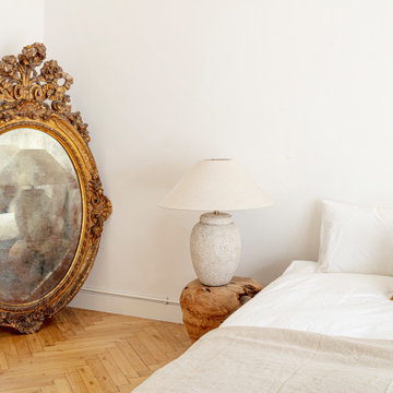 Jeanne Schultz Design Studio
Words by Wilson Hack
The best architecture allows what has come before it to be seen and cared for while at the same time injecting something new, if not idealistic. Spartan at first glance, the interior of this stately apartment building, located on the iconic Passeig de Gràcia in Barcelona, quickly begins to unfold as a calculated series of textures, visual artifacts and perfected aesthetic continuities.
The client, a globe-trotting entrepreneur, selected Jeanne Schultz Design Studio for the remodel and requested that the space be reconditioned into a purposeful and peaceful landing pad. It was to be furnished simply using natural and sustainable materials. Schultz began by gently peeling back before adding only the essentials, resulting in a harmoniously restorative living space where darkness and light coexist and comfort reigns.
The design was initially guided by the fireplace—from there a subtle injection of matching color extends up into the thick tiered molding and ceiling trim. “The most reckless patterns live here,” remarks Schultz, referring to the checkered green and white tiles, pink-Pollack-y stone and cast iron detailing. The millwork and warm wood wall panels devour the remainder of the living room, eliminating the need for unnecessary artwork.
A curved living room chair by Kave Home punctuates playfully; its shape reveals its pleasant conformity to the human body and sits back, inviting rest and respite. “It’s good for all body types and sizes,” explains Schultz. The single sofa by Dareels is purposefully oversized, casual and inviting. A beige cover was added to soften the otherwise rectilinear edges. Additionally sourced from Dareels, a small yet centrally located side table anchors the space with its dark black wood texture, its visual weight on par with the larger pieces. The black bulbous free standing lamp converses directly with the antique chandelier above. Composed of individual black leather strips, it is seemingly harsh—yet its soft form is reminiscent of a spring tulip.
The continuation of the color palette slips softly into the dining room where velvety green chairs sit delicately on a cascade array of pointed legs. The doors that lead out to the patio were sanded down and treated so that the original shape and form could be retained. Although the same green paint was used throughout, this set of doors speaks in darker tones alongside the acute and penetrating daylight. A few different shades of white paint were used throughout the space to add additional depth and embellish this shadowy texture.
Specialty lights were added into the space to complement the existing overhead lighting. A wall sconce was added in the living room and extra lighting was placed in the kitchen. However, because of the existing barrel vaulted tile ceiling, sconces were placed on the walls rather than above to avoid penetrating the existing architecture.
 Carrie Johnson
Homeowners aimed to bring the lovely outdoors into better view when they removed the two 90's dated columns that divided the kitchen from the family room and eat-in area. They also transformed the range wall when they added two wood encasement windows which frame the custom zinc hood and allow a soft light to penetrate the kitchen. Custom beaded inset cabinetry was designed with a busy family of 5 in mind. A coffee station hides behind the appliance garage, the paper towel holder is partially concealed in a rolling drawer and three custom pullout drawers with soft close hinges hold many items that would otherwise be located on the countertops or under the sink. A 48" Viking gas range took the place of a 30" electric cooktop and a Bosch microwave drawer is now located in the island to make room for a newly added beverage cooler. Due to space and budget constraints, we kept the same basic footprint so every space was carefully planned for function and design. The family stayed true to their casual lifestyle with the black honed countertops but added a little bling with the rustic crystal chandelier, crystal prism arched sconces and calcutta gold herringbone backsplash. But the owner's favorite add was the custom island designed as an antique furniture piece with an essenza blue quartzite countertop cut with a demi-bull stepout. The kids can now sit at the ample counter and enjoy their breakfast or finish homework in the comfortable, cherry red swivel stools which add a pop of color to the otherwise understated tones. This newly remodeled kitchen checked all the homeowner's desires.
81