
Search results for "Penetrating" in Home Design Ideas

 InForm Architecture, LLC
The goal of this project was to replace a small single-story seasonal family cottage with a year-round home that takes advantage of the views and topography of this lakefront site while providing privacy for the occupants. The program called for a large open living area, a master suite, study, a small home gym and five additional bedrooms. The style was to be distinctly contemporary.
The house is shielded from the street by the placement of the garage and by limiting the amount of window area facing the road. The main entry is recessed and glazed with frosted glass for privacy. Due to the narrowness of the site and the proximity of the neighboring houses, the windows on the sides of the house were also limited and mostly high up on the walls. The limited fenestration on the front and sides is made up for by the full wall of glass on the lake side, facing north. The house is anchored by an exposed masonry foundation. This masonry also cuts through the center of the house on the fireplace chimney to separate the public and private spaces on the first floor, becoming a primary material on the interior. The house is clad with three different siding material: horizontal longboard siding, vertical ribbed steel siding and cement board panels installed as a rain screen. The standing seam metal-clad roof rises from a low point at the street elevation to a height of 24 feet at the lakefront to capture the views and the north light.
The house is organized into two levels and is entered on the upper level. This level contains the main living spaces, the master suite and the study. The angled stair railing guides visitors into the main living area. The kitchen, dining area and living area are each distinct areas within one large space. This space is visually connected to the outside by the soaring ceilings and large fireplace mass that penetrate the exterior wall. The lower level contains the children’s and guest bedrooms, a secondary living space and the home gym.
 Lincoln Lighthill Architect
 employed several discrete updates that collectively transform this existing row house.
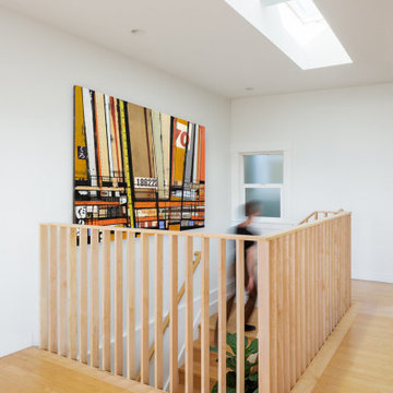
At the heart of the home, a section of floor was removed at the top level to open up the existing stair and allow light from a new skylight to penetrate deep into the home. The stair itself received a new maple guardrail and planter, with a Fiddle-leaf fig tree growing up through the opening towards the skylight.
On the top living level, an awkwardly located entrance to a full bathroom directly off the main stair was moved around the corner and out of the way by removing a little used tub from the bathroom, as well as an outdated heater in the back corner. This created a more discrete entrance to the existing, now half-bath, and opened up a space for a wall of pantry cabinets with built-in refrigerator, and an office nook at the rear of the house with a huge new awning window to let in light and air.
Downstairs, the two existing bathrooms were reconfigured and recreated as dedicated master and kids baths. The kids bath uses yellow and white hexagonal Heath tile to create a pixelated celebration of color. The master bath, hidden behind a flush wall of walnut cabinetry, utilizes another Heath tile color to create a calming retreat.
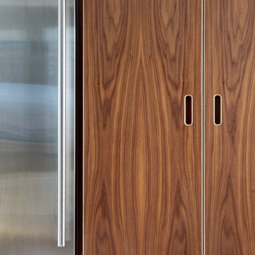
Throughout the home, walnut thin-ply cabinetry creates a strong contrast to the existing maple flooring, while the exposed blond edges of the material tie the two together. Rounded edges on integral pulls and door edges create pinstripe detailing that adds richness and a sense of playfulness to the design.
This project was featured by Houzz: https://tinyurl.com/stn2hcze
 InForm Architecture, LLC
The goal of this project was to replace a small single-story seasonal family cottage with a year-round home that takes advantage of the views and topography of this lakefront site while providing privacy for the occupants. The program called for a large open living area, a master suite, study, a small home gym and five additional bedrooms. The style was to be distinctly contemporary.
The house is shielded from the street by the placement of the garage and by limiting the amount of window area facing the road. The main entry is recessed and glazed with frosted glass for privacy. Due to the narrowness of the site and the proximity of the neighboring houses, the windows on the sides of the house were also limited and mostly high up on the walls. The limited fenestration on the front and sides is made up for by the full wall of glass on the lake side, facing north. The house is anchored by an exposed masonry foundation. This masonry also cuts through the center of the house on the fireplace chimney to separate the public and private spaces on the first floor, becoming a primary material on the interior. The house is clad with three different siding material: horizontal longboard siding, vertical ribbed steel siding and cement board panels installed as a rain screen. The standing seam metal-clad roof rises from a low point at the street elevation to a height of 24 feet at the lakefront to capture the views and the north light.
The house is organized into two levels and is entered on the upper level. This level contains the main living spaces, the master suite and the study. The angled stair railing guides visitors into the main living area. The kitchen, dining area and living area are each distinct areas within one large space. This space is visually connected to the outside by the soaring ceilings and large fireplace mass that penetrate the exterior wall. The lower level contains the children’s and guest bedrooms, a secondary living space and the home gym.
Find the right local pro for your project
 InForm Architecture, LLC
The goal of this project was to replace a small single-story seasonal family cottage with a year-round home that takes advantage of the views and topography of this lakefront site while providing privacy for the occupants. The program called for a large open living area, a master suite, study, a small home gym and five additional bedrooms. The style was to be distinctly contemporary.
The house is shielded from the street by the placement of the garage and by limiting the amount of window area facing the road. The main entry is recessed and glazed with frosted glass for privacy. Due to the narrowness of the site and the proximity of the neighboring houses, the windows on the sides of the house were also limited and mostly high up on the walls. The limited fenestration on the front and sides is made up for by the full wall of glass on the lake side, facing north. The house is anchored by an exposed masonry foundation. This masonry also cuts through the center of the house on the fireplace chimney to separate the public and private spaces on the first floor, becoming a primary material on the interior. The house is clad with three different siding material: horizontal longboard siding, vertical ribbed steel siding and cement board panels installed as a rain screen. The standing seam metal-clad roof rises from a low point at the street elevation to a height of 24 feet at the lakefront to capture the views and the north light.
The house is organized into two levels and is entered on the upper level. This level contains the main living spaces, the master suite and the study. The angled stair railing guides visitors into the main living area. The kitchen, dining area and living area are each distinct areas within one large space. This space is visually connected to the outside by the soaring ceilings and large fireplace mass that penetrate the exterior wall. The lower level contains the children’s and guest bedrooms, a secondary living space and the home gym.
 User
A young couple, owner of this duplex located near the Jean Talon market in Montreal’s little Italy, asked for Agence Imagine’s help and expertise to turn it into a single family home. Big renovations as well as an extension on the backyard have been made in order to offer today a large, comfortable home bathed in a lot of natural light.
The main floor’s layout is based on a linear structure that guides visitors into the living room and separates the kitchen area. A structural beam covered in a walnut veneer allows to maximize and open the living areas and gives a fluid circulation throughout the space.
Noble and raw materials and finishes such as wood, natural stone and quartz embellish this contemporary universe. The addition of a large patio door as well as a couple rectangular windows give a new sight toward the outside and allow natural light to penetrate the open area.
The installation of a 3 sided gas fireplace accentuates the warm hearted aspect of the space.
The kitchen, a mix of walnut and Italian lacquer, includes a spacious kitchen island where the owners like to cook and gather around with friends. Lots of organising spaces as well as a pantry have been thought out in order to optimize the use of space.
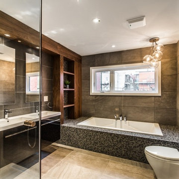
The upstairs includes a master’s bedroom with a walk-in and an access to the roof top terrace built on top of the main floor’s extension. On the 2nd floor we also find two bedrooms and a large bathroom. Spacious and functional, the bathroom offers calm and relaxation thanks to its podium bathtub and large Italian shower. The harmonious mix between the porcelain, the mosaic and the walnut veneer inspire serenity and elegance.
Photo Credit: Guillaume Gorini | Point de vue Studio
 InForm Architecture, LLC
The goal of this project was to replace a small single-story seasonal family cottage with a year-round home that takes advantage of the views and topography of this lakefront site while providing privacy for the occupants. The program called for a large open living area, a master suite, study, a small home gym and five additional bedrooms. The style was to be distinctly contemporary.
The house is shielded from the street by the placement of the garage and by limiting the amount of window area facing the road. The main entry is recessed and glazed with frosted glass for privacy. Due to the narrowness of the site and the proximity of the neighboring houses, the windows on the sides of the house were also limited and mostly high up on the walls. The limited fenestration on the front and sides is made up for by the full wall of glass on the lake side, facing north. The house is anchored by an exposed masonry foundation. This masonry also cuts through the center of the house on the fireplace chimney to separate the public and private spaces on the first floor, becoming a primary material on the interior. The house is clad with three different siding material: horizontal longboard siding, vertical ribbed steel siding and cement board panels installed as a rain screen. The standing seam metal-clad roof rises from a low point at the street elevation to a height of 24 feet at the lakefront to capture the views and the north light.
The house is organized into two levels and is entered on the upper level. This level contains the main living spaces, the master suite and the study. The angled stair railing guides visitors into the main living area. The kitchen, dining area and living area are each distinct areas within one large space. This space is visually connected to the outside by the soaring ceilings and large fireplace mass that penetrate the exterior wall. The lower level contains the children’s and guest bedrooms, a secondary living space and the home gym.
 Lincoln Lighthill Architect
 employed several discrete updates that collectively transform this existing row house.
At the heart of the home, a section of floor was removed at the top level to open up the existing stair and allow light from a new skylight to penetrate deep into the home. The stair itself received a new maple guardrail and planter, with a Fiddle-leaf fig tree growing up through the opening towards the skylight.
On the top living level, an awkwardly located entrance to a full bathroom directly off the main stair was moved around the corner and out of the way by removing a little used tub from the bathroom, as well as an outdated heater in the back corner. This created a more discrete entrance to the existing, now half-bath, and opened up a space for a wall of pantry cabinets with built-in refrigerator, and an office nook at the rear of the house with a huge new awning window to let in light and air.
Downstairs, the two existing bathrooms were reconfigured and recreated as dedicated master and kids baths. The kids bath uses yellow and white hexagonal Heath tile to create a pixelated celebration of color. The master bath, hidden behind a flush wall of walnut cabinetry, utilizes another Heath tile color to create a calming retreat.
Throughout the home, walnut thin-ply cabinetry creates a strong contrast to the existing maple flooring, while the exposed blond edges of the material tie the two together. Rounded edges on integral pulls and door edges create pinstripe detailing that adds richness and a sense of playfulness to the design.
This project was featured by Houzz: https://tinyurl.com/stn2hcze

 Carrie Johnson
Homeowners aimed to bring the lovely outdoors into better view when they removed the two 90's dated columns that divided the kitchen from the family room and eat-in area. They also transformed the range wall when they added two wood encasement windows which frame the custom zinc hood and allow a soft light to penetrate the kitchen. Custom beaded inset cabinetry was designed with a busy family of 5 in mind. A coffee station hides behind the appliance garage, the paper towel holder is partially concealed in a rolling drawer and three custom pullout drawers with soft close hinges hold many items that would otherwise be located on the countertop or under the sink. A 48" Viking gas range took the place of a 30" electric cooktop and a Bosch microwave drawer is now located in the island to make space for the newly added beverage cooler. Due to size and budget constaints, we kept the basic footprint so every space was carefully planned for function and design. The family stayed true to their casual lifestyle with the black honed countertops but added a little bling with the rustic crystal chandelier, crystal prism arched sconces and calcutta gold herringbone backsplash. But the owner's favorite add was the custom island designed as an antique furniture piece with the essenza blue quartzite countertop cut with a demi-bull stepout. The kids can now sit at the ample sized counter and enjoy breakfast or finish homework in the comfortable cherry red swivel chairs which add a pop to the otherwise understated tones. This newly remodeled kitchen checked all the homeowner's desires.

 Reflections Water Gardens
After two years of fighting with a failing pond liner, the resident decided to replace the liner in the pond. This 150’ x 115’pond sat above and flowed into a larger pond which was lined with PVC liner. We were replacing this with a 45 mil epdm fishsafe rubber liner. This presented a problem: there is no way to adhere the new rubber liner to the existing PVC liner in the lower pond. The solution was to pour a cement 18” wide x 2’ deep footing next to the wier damn between the two ponds in order to connect the two liners together. The old liner was placed on the top of the footing and a water-block sealant was used. The new rubber liner was placed on top and another layer of sealant along with stainless steel bars were laid atop the two materials in order to press them together to maintain a water-tight junction. A drain tile system was installed beneath the liner to relieve ground water pressure and vent off any gasses. Water tight seals also had to be provided for multiple plumbing penetrations through the liner. Non-woven geotextile planting media bags were used to prevent erosion around the perimeter of the pond. As the pond was landscaped with lawn and perennials, these had to be removed and preserved and maintained throughout the project in order to return them upon completion of the lining. All trenching work and removal of plant material was done by hand in order to maintain the surrounding landscape; great care was taken throughout the project in order to protect existing hard and softscape, so that upon completion, the area appeared almost exactly as it had been before work began.
Photo by Larry Carnes

 ELEVATIONS | Design Solutions by Myers
Visit Our Showroom
8000 Locust Mill St.
Ellicott City, MD 21043
Cambria Oakhampton, Cambria Canterbury Quartz Stone Countertop
Description:
Cambria is a natural stone surface that is elegant and practical. Cambria is an ideal choice for homeowners looking for a maintenance free countertop with stunning aesthetics. Composed of 93% natural quartz and 7% pigments and epoxy resin, Cambria is an extremely durable material.
STRENGTH & DURABILITY
Cambria has performed numerous laboratory tests to prove that Cambria natural quartz surfaces are twice as strong as granite. It's a surface that is truly everlasting.
MAINTENANCE FREE
No sealing, polishing or reconditioning is needed. Simply wash with warm water. It's that simple. Cambria will resist stains from fruit juices, food coloring, coffee, tea, wine, grape juice, nail polish and felt tip markers.
coffee, tea, wine, grape juice, nail polish and felt tip markers.
FOOD SAFE
Cambria has been certified by NSF International for use as a food preparation surface. Cambria is totally non-porous, making cleanup easy and preventing food and moisture from penetrating its surface — the main source of growth for harmful bacteria.
NATURAL
Cambria is created from natural quartz, an extremely hard stone crystal mined directly from the earth. In fact, quartz is the hardest non-precious stone that can be found in the earth's surface
Elevations Design Solutions by Myers is the go-to inspirational, high-end showroom for the best in cabinetry, flooring, window and door design. Visit our showroom with your architect, contractor or designer to explore the brands and products that best reflects your personal style. We can assist in product selection, in-home measurements, estimating and design, as well as providing referrals to professional remodelers and designers.
 InForm Architecture, LLC
The goal of this project was to replace a small single-story seasonal family cottage with a year-round home that takes advantage of the views and topography of this lakefront site while providing privacy for the occupants. The program called for a large open living area, a master suite, study, a small home gym and five additional bedrooms. The style was to be distinctly contemporary.
The house is shielded from the street by the placement of the garage and by limiting the amount of window area facing the road. The main entry is recessed and glazed with frosted glass for privacy. Due to the narrowness of the site and the proximity of the neighboring houses, the windows on the sides of the house were also limited and mostly high up on the walls. The limited fenestration on the front and sides is made up for by the full wall of glass on the lake side, facing north. The house is anchored by an exposed masonry foundation. This masonry also cuts through the center of the house on the fireplace chimney to separate the public and private spaces on the first floor, becoming a primary material on the interior. The house is clad with three different siding material: horizontal longboard siding, vertical ribbed steel siding and cement board panels installed as a rain screen. The standing seam metal-clad roof rises from a low point at the street elevation to a height of 24 feet at the lakefront to capture the views and the north light.
The house is organized into two levels and is entered on the upper level. This level contains the main living spaces, the master suite and the study. The angled stair railing guides visitors into the main living area. The kitchen, dining area and living area are each distinct areas within one large space. This space is visually connected to the outside by the soaring ceilings and large fireplace mass that penetrate the exterior wall. The lower level contains the children’s and guest bedrooms, a secondary living space and the home gym.
 Reflections Water Gardens
After two years of fighting with a failing pond liner, the resident decided to replace the liner in the pond. This 150’ x 115’pond sat above and flowed into a larger pond which was lined with PVC liner. We were replacing this with a 45 mil epdm fishsafe rubber liner. This presented a problem: there is no way to adhere the new rubber liner to the existing PVC liner in the lower pond. The solution was to pour a cement 18” wide x 2’ deep footing next to the wier damn between the two ponds in order to connect the two liners together. The old liner was placed on the top of the footing and a water-block sealant was used. The new rubber liner was placed on top and another layer of sealant along with stainless steel bars were laid atop the two materials in order to press them together to maintain a water-tight junction. A drain tile system was installed beneath the liner to relieve ground water pressure and vent off any gasses. Water tight seals also had to be provided for multiple plumbing penetrations through the liner. Non-woven geotextile planting media bags were used to prevent erosion around the perimeter of the pond. As the pond was landscaped with lawn and perennials, these had to be removed and preserved and maintained throughout the project in order to return them upon completion of the lining. All trenching work and removal of plant material was done by hand in order to maintain the surrounding landscape; great care was taken throughout the project in order to protect existing hard and softscape, so that upon completion, the area appeared almost exactly as it had been before work began.
Photo by Larry Carnes
 FINNE Architects
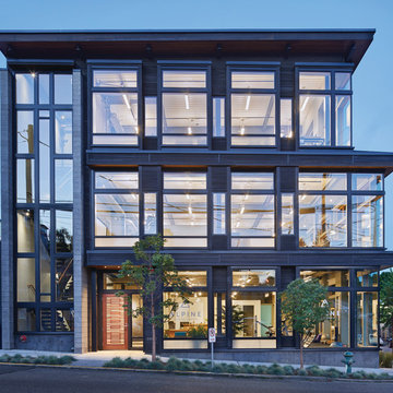
The FINNE Svendsen Building is a striking and highly energy-efficient loft building in Seattle’s Fremont neighborhood.
The design and building process was unusual, since architect Nils Finne was both designer and builder owner. The client-architect meetings were brief!
The building occupies a corner lot, with street facades on the south and west. The two street facades have a nuanced play of light and shadow. The walls of glass and wood are treated as folded planes, with each façade folding back and forth within an overall depth dimension of about 10”. On floors one and three, the large glass panels project forward, while on floor two, the glass is recessed. The pattern on floor two is an inverted version of floors one and three. The wood spandrel panels are custom-milled Western Red Cedar with a blackened stain.
The live-work building creates large, open loft spaces on three floors, with high ceilings, huge windows and exposed long-span steel structure. The building can accommodate a range of uses, both present and future.
The three floors of the building have 12-ft ceilings and 11-ft high windows with exposed structural steel supports and steel decking ceilings. The floors are clear-span without internal columns interrupting the work space. Mechanical air distribution is limited to the linear core on the northern side of the building, so work areas have clean metal decking ceilings with no ductwork. The building has in-floor radiant heating and cooling, resulting in minimal energy usage.
Operating windows are placed strategically throughout the façade, allowing the building to be naturally ventilated in Seattle’s mild climate. The oversized window walls on the south and west also allow natural lighting to penetrate deeply onto the floor plate, keeping lights turned off for much of the daylight hours.
A custom sapele wood front door presents a warm contrast to the building’s blackened wood cladding. A delicate screen of wood slats filters light into the main building lobby. The 3-story stair opens directly from the lobby and has been designed to encourage use on a daily basis, keeping elevator usage to a minimum. A three-story glass wall floods the stairwell with natural light, and the all-steel stair floats in the space. Custom-designed perforations in the steel stair railing panels provide unexpected shadow patterns when the late-afternoon sun shines into the stairwell.
The building was designed to be a sustainable structure from the start, with 40% higher insulation values than required by code, efficient natural ventilation, large amounts of natural lighting, water-conserving plumbing fixtures, LED lighting, and locally sourced materials. Windows have high-performance Low-E insulated glazing and are equipped with concealed shades. The building roof has been equipped with photovoltaic panels for electrical production, averaging about 850 Kwh per year. The modest initial amount of PV panels will be expanded over time.
The radiant hydronic heating and cooling system allows lower operating temperatures and higher occupant comfort levels. The 6” thick concrete slabs for the radiant tubes conserve both heat in the winter and cooling in the summer and provide great comfort for the feet. During the winter months, the radiant heating system keeps overall energy consumption to a very low level. The 9000 SF building costs about $35/month to heat! During the summer, the passive strategies of natural ventilation combine with the radiant slab cooling to minimize air conditioning load. Deep roof overhangs, built-in shades and high operating clerestory windows are also used to reduce heat gain in summer months.
During the winter, the lower sun angle is able to penetrate into work spaces and passively warm the concrete floor. Low VOC paints and stains have been used throughout the building. The high level of craft evident in the building reflects another key principle of sustainable design: eschew “throw-away-ism” and make the building last many years!
 InForm Architecture, LLC
The goal of this project was to replace a small single-story seasonal family cottage with a year-round home that takes advantage of the views and topography of this lakefront site while providing privacy for the occupants. The program called for a large open living area, a master suite, study, a small home gym and five additional bedrooms. The style was to be distinctly contemporary.
The house is shielded from the street by the placement of the garage and by limiting the amount of window area facing the road. The main entry is recessed and glazed with frosted glass for privacy. Due to the narrowness of the site and the proximity of the neighboring houses, the windows on the sides of the house were also limited and mostly high up on the walls. The limited fenestration on the front and sides is made up for by the full wall of glass on the lake side, facing north. The house is anchored by an exposed masonry foundation. This masonry also cuts through the center of the house on the fireplace chimney to separate the public and private spaces on the first floor, becoming a primary material on the interior. The house is clad with three different siding material: horizontal longboard siding, vertical ribbed steel siding and cement board panels installed as a rain screen. The standing seam metal-clad roof rises from a low point at the street elevation to a height of 24 feet at the lakefront to capture the views and the north light.
The house is organized into two levels and is entered on the upper level. This level contains the main living spaces, the master suite and the study. The angled stair railing guides visitors into the main living area. The kitchen, dining area and living area are each distinct areas within one large space. This space is visually connected to the outside by the soaring ceilings and large fireplace mass that penetrate the exterior wall. The lower level contains the children’s and guest bedrooms, a secondary living space and the home gym.

 Automated Computer Interior Design and Planning
3d rendering of a modern in home interior design production office space! A repurposed bedroom, transitioned with a cased opening closet , showcasing tools, materials, and accents used in the interior design and the production of their presentation. The new design features varying table top workspace on wheels which allows this furniture to double as rolling carts for the arrival or delivery of hard to handle merchandise, can be transported to set up table top workspace on project site, and can easily be moved around the room to accommodate the changing storage needs of inventory for new projects! Lots of great light fixtures provide ample lighting needed throughout this office. These fixtures include several wall sconces, which provide efficient light for viewing project display boards, the shelving units are translucent and allow some light to penetrate through them which is provided from the string lights hidden by the translucent side walls and a back wall, and a recessed overhead florescent fixture over the work desk area. For the walls we decided a streamlined stained wood pattern keeps this room simple, professional and gives the project designer the ability to remain focused, with out personal impressionable décor influences. The molding, the doors, and window casing and their finishes simply coincide with the rest of the downstairs theme. I emailed this rendition of the office space to my client and she now owns a complete illustration she can present to her contractors for bidding, show friends and family her exciting new future office and begin her project with realistic expectations of the finished product.
 Lincoln Lighthill Architect
 employed several discrete updates that collectively transform this existing row house.
At the heart of the home, a section of floor was removed at the top level to open up the existing stair and allow light from a new skylight to penetrate deep into the home. The stair itself received a new maple guardrail and planter, with a Fiddle-leaf fig tree growing up through the opening towards the skylight.
On the top living level, an awkwardly located entrance to a full bathroom directly off the main stair was moved around the corner and out of the way by removing a little used tub from the bathroom, as well as an outdated heater in the back corner. This created a more discrete entrance to the existing, now half-bath, and opened up a space for a wall of pantry cabinets with built-in refrigerator, and an office nook at the rear of the house with a huge new awning window to let in light and air.
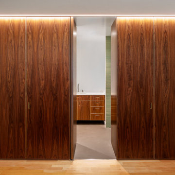
Downstairs, the two existing bathrooms were reconfigured and recreated as dedicated master and kids baths. The kids bath uses yellow and white hexagonal Heath tile to create a pixelated celebration of color. The master bath, hidden behind a flush wall of walnut cabinetry, utilizes another Heath tile color to create a calming retreat.
Throughout the home, walnut thin-ply cabinetry creates a strong contrast to the existing maple flooring, while the exposed blond edges of the material tie the two together. Rounded edges on integral pulls and door edges create pinstripe detailing that adds richness and a sense of playfulness to the design.
This project was featured by Houzz: https://tinyurl.com/stn2hcze
 Robert M. Cain, Architect
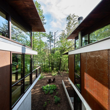
Holly Hill, a retirement home, whose owner's hobbies are gardening and restoration of classic cars, is nestled into the site contours to maximize views of the lake and minimize impact on the site.
Holly Hill is comprised of three wings joined by bridges: A wing facing a master garden to the east, another wing with workshop and a central activity, living, dining wing. Similar to a radiator the design increases the amount of exterior wall maximizing opportunities for natural ventilation during temperate months.
Other passive solar design features will include extensive eaves, sheltering porches and high-albedo roofs, as strategies for considerably reducing solar heat gain.
Daylighting with clerestories and solar tubes reduce daytime lighting requirements. Ground source geothermal heat pumps and superior to code insulation ensure minimal space conditioning costs. Corten steel siding and concrete foundation walls satisfy client requirements for low maintenance and durability. All light fixtures are LEDs.
Open and screened porches are strategically located to allow pleasant outdoor use at any time of day, particular season or, if necessary, insect challenge. Dramatic cantilevers allow the porches to project into the site’s beautiful mixed hardwood tree canopy without damaging root systems.
Guest arrive by vehicle with glimpses of the house and grounds through penetrations in the concrete wall enclosing the garden. One parked they are led through a garden composed of pavers, a fountain, benches, sculpture and plants. Views of the lake can be seen through and below the bridges.
Primary client goals were a sustainable low-maintenance house, primarily single floor living, orientation to views, natural light to interiors, maximization of individual privacy, creation of a formal outdoor space for gardening, incorporation of a full workshop for cars, generous indoor and outdoor social space for guests and parties.
 Strom Architects
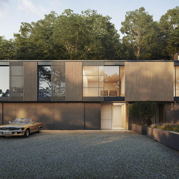
Waystation is a new-build family home that replaces a dilapidated 1960’s modernist house in Kent. The existing house has some architectural merit but fails to respond to the family’s needs. The entrance level and bedrooms are disconnected from the living space which makes for torturous circulation and a lack of connection with the garden. After full evaluation, it has proved to be too expensive to adapt and repair the existing house.
Starting from scratch gave us the opportunity to develop a detailed brief with our client, to create a warm and open family home that maximises the site’s potential and forms a meaningful connection to the garden.
The design of the proposed house seeks to acknowledge the legacy of the existing with a clarity of form and elegant use of natural materials. The horizontal design respects the form and ethos of the existing house, with the timber cladding providing a warm and contemporary aesthetic. The upper and lower forms are proposed in a contrasting black render.
The design concept seeks to create a building with a deliberately lightweight appearance which floats above the landscape and sits harmoniously in the wooded setting.
The lower ground floor contains garage, entrance, guest rooms and ancillary spaces. The upper ground floor comprises the children’s bedrooms and the open plan living spaces which connect seamlessly to the outdoor terrace and garden. The master bedroom suite at first floor is orientated south and designed with an intimate terrace that enjoys panoramic views of the countryside.
For the external spaces, the design intention is to create a sense of space and elegance, allowing light to penetrate the areas around the house but also to create a great sense of privacy and calm. Thus, architecture and landscape combine to create a place for the family to come together and enjoy.
The house is scheduled to start on site late spring 2020.
 InForm Architecture, LLC
The goal of this project was to replace a small single-story seasonal family cottage with a year-round home that takes advantage of the views and topography of this lakefront site while providing privacy for the occupants. The program called for a large open living area, a master suite, study, a small home gym and five additional bedrooms. The style was to be distinctly contemporary.
The house is shielded from the street by the placement of the garage and by limiting the amount of window area facing the road. The main entry is recessed and glazed with frosted glass for privacy. Due to the narrowness of the site and the proximity of the neighboring houses, the windows on the sides of the house were also limited and mostly high up on the walls. The limited fenestration on the front and sides is made up for by the full wall of glass on the lake side, facing north. The house is anchored by an exposed masonry foundation. This masonry also cuts through the center of the house on the fireplace chimney to separate the public and private spaces on the first floor, becoming a primary material on the interior. The house is clad with three different siding material: horizontal longboard siding, vertical ribbed steel siding and cement board panels installed as a rain screen. The standing seam metal-clad roof rises from a low point at the street elevation to a height of 24 feet at the lakefront to capture the views and the north light.
The house is organized into two levels and is entered on the upper level. This level contains the main living spaces, the master suite and the study. The angled stair railing guides visitors into the main living area. The kitchen, dining area and living area are each distinct areas within one large space. This space is visually connected to the outside by the soaring ceilings and large fireplace mass that penetrate the exterior wall. The lower level contains the children’s and guest bedrooms, a secondary living space and the home gym.

 All Surface Restoration
All brands of polymeric sand are NOT equal. Don’t waste money on inferior quality polymeric sand that will cause surface hazing or wash away during a heavy rain. Your brick paver patio, walkway or driveway deserves the best finish possible.
Many types of polymeric sand rely on Portland cement, which often causes hazing, & cracking. Portland cement does not surpass a cohesion threshold that will prevent rain or strong wind from causing washout of the sand.
All Surface Restoration has tested every major brand of polymeric sand on the market in Michigan’s climate for cohesion, adhesion & set up. The most durable, longest lasting type of polymeric sand is Poly Sweep.
Poly Sweep is a different blend of sands with high quality synthetic polymers specially formulated to allow joints to expand & contract with extreme freeze thaw cycles common in Michigan. No sealer is required to keep the sand hard & stable.
Poly Sweep Polymeric Sand has an advanced clear set technology, which uses high quality clear polymers that don’t leave a white haze.
Poly Sweep proved it had a significantly stronger set up than ALL other brands.
It reduces overall maintenance by inhibiting weed growth & deterring insects.
Salt & deicing chemicals do not affect performance. Poly Sweep is available in Tan or Gray to blend with the color of your brick pavers.
Searching for solution to prevent weeds, moss & water penetration in brick pavers in Michigan? Contact the paver maintenance experts at All Surface Restoration to request a free estimate today on cleaning & installing Poly Sweep Polymeric Sand.
Michigan residents request a free estimate at: www.surfacerestoration.com/contact or call 248-475-0004
83