
Search results for "Penetrating" in Home Design Ideas

 Carrie Johnson
Homeowners aimed to bring the lovely outdoors into better view when they removed the two 90's dated columns that divided the kitchen from the family room and eat-in area. They also transformed the range wall when they added two wood encasement windows which frame the custom zinc hood and allow a soft light to penetrate the kitchen. Custom beaded inset cabinetry was designed with a busy family of 5 in mind. A coffee station hides behind the appliance garage, the paper towel holder is partially concealed in a rolling drawer and three custom pullout drawers with soft close hinges hold many items that would otherwise be located on the countertops or under the sink. A 48" Viking gas range took the place of a 30" electric cooktop and a Bosch microwave drawer is now located in the island to make room for a newly added beverage cooler. Due to space and budget constraints, we kept the same basic footprint so every space was carefully planned for function and design. The family stayed true to their casual lifestyle with the black honed countertops but added a little bling with the rustic crystal chandelier, crystal prism arched sconces and calcutta gold herringbone backsplash. But the owner's favorite add was the custom island designed as an antique furniture piece with an essenza blue quartzite countertop cut with a demi-bull stepout. The kids can now sit at the ample counter and enjoy their breakfast or finish homework in the comfortable, cherry red swivel stools which add a pop of color to the otherwise understated tones. This newly remodeled kitchen checked all the homeowner's desires.
 Lincoln Lighthill Architect
 employed several discrete updates that collectively transform this existing row house.
At the heart of the home, a section of floor was removed at the top level to open up the existing stair and allow light from a new skylight to penetrate deep into the home. The stair itself received a new maple guardrail and planter, with a Fiddle-leaf fig tree growing up through the opening towards the skylight.
On the top living level, an awkwardly located entrance to a full bathroom directly off the main stair was moved around the corner and out of the way by removing a little used tub from the bathroom, as well as an outdated heater in the back corner. This created a more discrete entrance to the existing, now half-bath, and opened up a space for a wall of pantry cabinets with built-in refrigerator, and an office nook at the rear of the house with a huge new awning window to let in light and air.
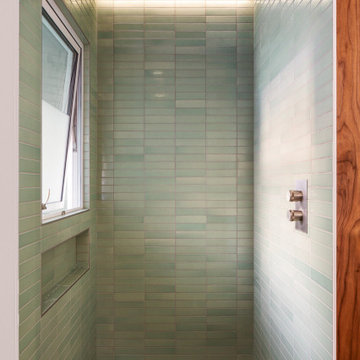
Downstairs, the two existing bathrooms were reconfigured and recreated as dedicated master and kids baths. The kids bath uses yellow and white hexagonal Heath tile to create a pixelated celebration of color. The master bath, hidden behind a flush wall of walnut cabinetry, utilizes another Heath tile color to create a calming retreat.
Throughout the home, walnut thin-ply cabinetry creates a strong contrast to the existing maple flooring, while the exposed blond edges of the material tie the two together. Rounded edges on integral pulls and door edges create pinstripe detailing that adds richness and a sense of playfulness to the design.
This project was featured by Houzz: https://tinyurl.com/stn2hcze
 Jeanne Schultz Design Studio
Words by Wilson Hack
The best architecture allows what has come before it to be seen and cared for while at the same time injecting something new, if not idealistic. Spartan at first glance, the interior of this stately apartment building, located on the iconic Passeig de Gràcia in Barcelona, quickly begins to unfold as a calculated series of textures, visual artifacts and perfected aesthetic continuities.
The client, a globe-trotting entrepreneur, selected Jeanne Schultz Design Studio for the remodel and requested that the space be reconditioned into a purposeful and peaceful landing pad. It was to be furnished simply using natural and sustainable materials. Schultz began by gently peeling back before adding only the essentials, resulting in a harmoniously restorative living space where darkness and light coexist and comfort reigns.
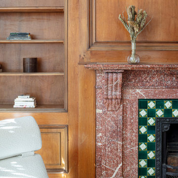
The design was initially guided by the fireplace—from there a subtle injection of matching color extends up into the thick tiered molding and ceiling trim. “The most reckless patterns live here,” remarks Schultz, referring to the checkered green and white tiles, pink-Pollack-y stone and cast iron detailing. The millwork and warm wood wall panels devour the remainder of the living room, eliminating the need for unnecessary artwork.
A curved living room chair by Kave Home punctuates playfully; its shape reveals its pleasant conformity to the human body and sits back, inviting rest and respite. “It’s good for all body types and sizes,” explains Schultz. The single sofa by Dareels is purposefully oversized, casual and inviting. A beige cover was added to soften the otherwise rectilinear edges. Additionally sourced from Dareels, a small yet centrally located side table anchors the space with its dark black wood texture, its visual weight on par with the larger pieces. The black bulbous free standing lamp converses directly with the antique chandelier above. Composed of individual black leather strips, it is seemingly harsh—yet its soft form is reminiscent of a spring tulip.
The continuation of the color palette slips softly into the dining room where velvety green chairs sit delicately on a cascade array of pointed legs. The doors that lead out to the patio were sanded down and treated so that the original shape and form could be retained. Although the same green paint was used throughout, this set of doors speaks in darker tones alongside the acute and penetrating daylight. A few different shades of white paint were used throughout the space to add additional depth and embellish this shadowy texture.
Specialty lights were added into the space to complement the existing overhead lighting. A wall sconce was added in the living room and extra lighting was placed in the kitchen. However, because of the existing barrel vaulted tile ceiling, sconces were placed on the walls rather than above to avoid penetrating the existing architecture.
Find the right local pro for your project
 Tom Brzoskwinia
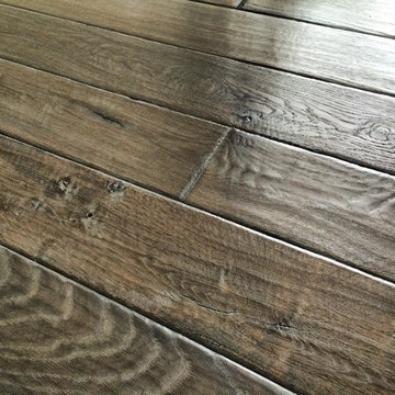
One of the most popular hardwood floor finishing which offers Tom & Peter Flooring is provided by WOCA. If you’ve decided that you want a natural looking wooden floor that is lacquer-free, then the likelihood is that you’ve chosen oil as your way of protecting your wood and making your floor look great at the same time. WOCA for wood flooring comes in various forms and is a great way of making sure that your wood is protected, but at the same time looks natural. A highly popular as well as effective way of treating wood floors, oils effectively penetrate into the wood and in some cases harden into the surface of the floor to stop damage and to maintain the wood in its optimum condition.
WOCA Oil finish hardwood flooring has taken the United States market by in 2014 and shows no signs of slowing down in 2016 and now. Here are some of the most common questions we have regarding this type of finish which we will I’m to answer in today’s my blog:
Is oil finish as durable as traditional factory urethane finishes with aluminum oxide?
When it comes to durability, oil finish flooring tackles the issue with a completely different method. The penetrating oil serves as protection from moisture and wear while allowing the user to feel the wood grains in their bare feet. If compared directly to factory finished aluminum oxide finish, the oil finish flooring will not perform as well to abrasion and impact. However, the beauty of this finish is the fact that it will camouflage any scratches which will inevitably accumulate over time.
Will this finish evaporate over time and will this be harmful for indoor air quality?
Another concern for oil finished floors its effect on indoor air quality. For on-site applications, some varieties suggest several coats which typically require the residents to be out of the home due to mild odors. However, there are factory finished UV-cured or single coat applications which lessen the downtime. Despite the odors produced during the drying process, oil finish floors rank amongst the lowest for VOC (volatile organic compound) emissions. Certain brands even boast true zero VOC. This fact alone makes oil finished floors one of the best options for green building solutions.
“WOCA products are certified by independent laboratories, the German Institute for Biological Building Materials, and are in accordance with DIN–Norm 53–160. WOCA WoodCare Denmark products meet or exceed the most stringent U.S. standards for volatile organic compounds.” –WOCA Oil Finish Manufacture
Does this type of finish require additional maintenance which I am not familiar with?
For weekly cleaning, oiled floors use a special cleaner which contains an oil and soap mixture. After a period of 12-18 months some oil may evaporate causing the wood grains to appear dry. An additional layer of oil can be reapplied to keep the floor looking fresh. Although oil finished floors require more involvement in periodic maintenance in high traffic areas, this maintenance can be done much easier than the equivalent of an onsite sand and refinish.
WOCA Master Color Oil contains pigment, which provides a single-step hardwood floor staining process. Laying down the stain and the finish in one step.
This product comes 14 different colors, from Black to Extra White, and you can mix them freely to create various color palettes that will meet the demands of any job.
Below are some pictures of the finished job…
 Natural Stone Institute
Gallegos was contacted by a client about a project where stone was not just to be an accent material, but the main visual and perceived structural element to create a timeless architectural composition. To further the endeavor: all veneers and dimension stone must be locally sourced and sustainably quarried. The design called for a moss rock veneer with cut stone trim. Sourcing the sandstone moss rock was simple because there were several local quarries to use. The problem
was with the trim pieces.
Gallegos selected Colorado Buff sandstone for the trim since the buff body was a good contrast to the moss rock and it is a stone that can be cut to size. One main concern with any sedimentary stone is hitting what is known as a “dry” layer in the ledge. This is an area in the stone between sedimentary layers that has not solidified or cemented. It is still granular and can lead to future stone failure as water penetrates these layers and creates freeze/thaw issues. To avoid this, they used
an epoxy injected into the dry layers to help solidify the material and prevent any future failures.
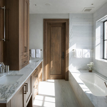
The client also wanted sustainable materials for their countertops and bathrooms. Many of the interior stones were either reclaimed materials or were sourced from Colorado quarries – Calacatta Lincoln was used extensively.
Gallegos sourced tiles from reclamation projects in Europe and Asia for use in the master bath and front entry areas. For many of the countertops, the owner’s interior designer spent hours looking through remnants and applied several throughout the residence.
Willow Court is a spectacular and dramatic nod to stone masonry, something the owner, architect, and builder can be proud of and, for the most part, was built with the environment in mind.
 Jeanne Schultz Design Studio
Words by Wilson Hack
The best architecture allows what has come before it to be seen and cared for while at the same time injecting something new, if not idealistic. Spartan at first glance, the interior of this stately apartment building, located on the iconic Passeig de Gràcia in Barcelona, quickly begins to unfold as a calculated series of textures, visual artifacts and perfected aesthetic continuities.
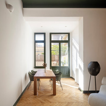
The client, a globe-trotting entrepreneur, selected Jeanne Schultz Design Studio for the remodel and requested that the space be reconditioned into a purposeful and peaceful landing pad. It was to be furnished simply using natural and sustainable materials. Schultz began by gently peeling back before adding only the essentials, resulting in a harmoniously restorative living space where darkness and light coexist and comfort reigns.
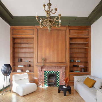
The design was initially guided by the fireplace—from there a subtle injection of matching color extends up into the thick tiered molding and ceiling trim. “The most reckless patterns live here,” remarks Schultz, referring to the checkered green and white tiles, pink-Pollack-y stone and cast iron detailing. The millwork and warm wood wall panels devour the remainder of the living room, eliminating the need for unnecessary artwork.
A curved living room chair by Kave Home punctuates playfully; its shape reveals its pleasant conformity to the human body and sits back, inviting rest and respite. “It’s good for all body types and sizes,” explains Schultz. The single sofa by Dareels is purposefully oversized, casual and inviting. A beige cover was added to soften the otherwise rectilinear edges. Additionally sourced from Dareels, a small yet centrally located side table anchors the space with its dark black wood texture, its visual weight on par with the larger pieces. The black bulbous free standing lamp converses directly with the antique chandelier above. Composed of individual black leather strips, it is seemingly harsh—yet its soft form is reminiscent of a spring tulip.
The continuation of the color palette slips softly into the dining room where velvety green chairs sit delicately on a cascade array of pointed legs. The doors that lead out to the patio were sanded down and treated so that the original shape and form could be retained. Although the same green paint was used throughout, this set of doors speaks in darker tones alongside the acute and penetrating daylight. A few different shades of white paint were used throughout the space to add additional depth and embellish this shadowy texture.
Specialty lights were added into the space to complement the existing overhead lighting. A wall sconce was added in the living room and extra lighting was placed in the kitchen. However, because of the existing barrel vaulted tile ceiling, sconces were placed on the walls rather than above to avoid penetrating the existing architecture.
 Jeanne Schultz Design Studio
Written by Wilson Hack
The best architecture allows what has come before it to be seen and cared for while at the same time injecting something new, if not idealistic. Spartan at first glance, the interior of this stately apartment building, located on the iconic Passeig de Gràcia in Barcelona, quickly begins to unfold as a calculated series of textures, visual artifacts and perfected aesthetic continuities.
The client, a globe-trotting entrepreneur, selected Jeanne Schultz Design Studio for the remodel and requested that the space be reconditioned into a purposeful and peaceful landing pad. It was to be furnished simply using natural and sustainable materials. Schultz began by gently peeling back before adding only the essentials, resulting in a harmoniously restorative living space where darkness and light coexist and comfort reigns.
The design was initially guided by the fireplace—from there a subtle injection of matching color extends up into the thick tiered molding and ceiling trim. “The most reckless patterns live here,” remarks Schultz, referring to the checkered green and white tiles, pink-Pollack-y stone and cast iron detailing. The millwork and warm wood wall panels devour the remainder of the living room, eliminating the need for unnecessary artwork.
A curved living room chair by Kave Home punctuates playfully; its shape reveals its pleasant conformity to the human body and sits back, inviting rest and respite. “It’s good for all body types and sizes,” explains Schultz. The single sofa by Dareels is purposefully oversized, casual and inviting. A beige cover was added to soften the otherwise rectilinear edges. Additionally sourced from Dareels, a small yet centrally located side table anchors the space with its dark black wood texture, its visual weight on par with the larger pieces. The black bulbous free standing lamp converses directly with the antique chandelier above. Composed of individual black leather strips, it is seemingly harsh—yet its soft form is reminiscent of a spring tulip.
The continuation of the color palette slips softly into the dining room where velvety green chairs sit delicately on a cascade array of pointed legs. The doors that lead out to the patio were sanded down and treated so that the original shape and form could be retained. Although the same green paint was used throughout, this set of doors speaks in darker tones alongside the acute and penetrating daylight. A few different shades of white paint were used throughout the space to add additional depth and embellish this shadowy texture.
Specialty lights were added into the space to complement the existing overhead lighting. A wall sconce was added in the living room and extra lighting was placed in the kitchen. However, because of the existing barrel vaulted tile ceiling, sconces were placed on the walls rather than above to avoid penetrating the existing architecture.
 Lincoln Lighthill Architect
 employed several discrete updates that collectively transform this existing row house.
At the heart of the home, a section of floor was removed at the top level to open up the existing stair and allow light from a new skylight to penetrate deep into the home. The stair itself received a new maple guardrail and planter, with a Fiddle-leaf fig tree growing up through the opening towards the skylight.
On the top living level, an awkwardly located entrance to a full bathroom directly off the main stair was moved around the corner and out of the way by removing a little used tub from the bathroom, as well as an outdated heater in the back corner. This created a more discrete entrance to the existing, now half-bath, and opened up a space for a wall of pantry cabinets with built-in refrigerator, and an office nook at the rear of the house with a huge new awning window to let in light and air.
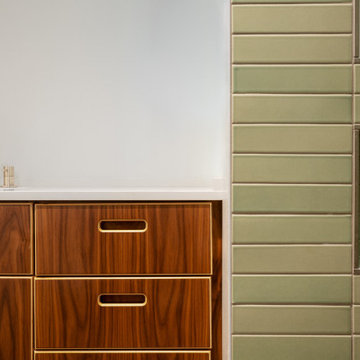
Downstairs, the two existing bathrooms were reconfigured and recreated as dedicated master and kids baths. The kids bath uses yellow and white hexagonal Heath tile to create a pixelated celebration of color. The master bath, hidden behind a flush wall of walnut cabinetry, utilizes another Heath tile color to create a calming retreat.
Throughout the home, walnut thin-ply cabinetry creates a strong contrast to the existing maple flooring, while the exposed blond edges of the material tie the two together. Rounded edges on integral pulls and door edges create pinstripe detailing that adds richness and a sense of playfulness to the design.
This project was featured by Houzz: https://tinyurl.com/stn2hcze

 Texas Hometown Remodeling
The Crema Antiqua Travertine Collection has been tumbled and left unfilled which gives the surface of the stone an antiqued appearance. The addition of natural stone tiles can revamp any space. Characteristics of natural stone include variances in shade, color, and hardness. Transforming this Master Shower with a wide range of sizes, colors, and styles. By using the Crema Antiqua Small Pencil Travertine Bullnose (1/2" x 5/8" x 12") for trim travertine tiles with convex radius one edge for finishing the turning of a built-in soap caddy and outside corners of the shower for that finish look. The Crema Antiqua tumbled travertine tile flooring (4" x 4" x 3/8") follows along with the travertine bullnose. By Rush River Stone® the travertine shower walls has a clay-colored, uneven-chiseled edge brick mosaic tiles (12" x 12" sheet) with a smooth finish giving an old world feel that works extremely well with the Crema Antiqua Collection by Casa Antica®. Natural Stones must be sealed with a penetrating sealer.
Speakman's signature silhouette, updated with modern contours, this Icon Shower Head S-2252 in Oil Rubbed Bronze has 6 precision jets that transform water into 48 full-coverage sprays. The sculpted arm rotates effortlessly in either direction allowing you to transition between intense needling, gentle rain and drenching flood spray. The 360-degree rotation also serves as a self-cleaning mechanism, ensuring each stream is delivered at its intended pressure. Giving you that "Luxury Hotel Experience" shower by Speakman®
Using 3/8" Clear Frameless Shower Enclosure with Oil Rubbed Bronze Hardware and a 30" door. Let's not forget DFI® - Protective coating applied to all inside glass surface to inhibit hard-water spots from etching glass (5 yr warranty). To see more pictures please visit us at www.TexasHometown Remodeling.com.
Photo Credit: Marc Vandendriessche
 Jeanne Schultz Design Studio
Words by Wilson Hack
The best architecture allows what has come before it to be seen and cared for while at the same time injecting something new, if not idealistic. Spartan at first glance, the interior of this stately apartment building, located on the iconic Passeig de Gràcia in Barcelona, quickly begins to unfold as a calculated series of textures, visual artifacts and perfected aesthetic continuities.
The client, a globe-trotting entrepreneur, selected Jeanne Schultz Design Studio for the remodel and requested that the space be reconditioned into a purposeful and peaceful landing pad. It was to be furnished simply using natural and sustainable materials. Schultz began by gently peeling back before adding only the essentials, resulting in a harmoniously restorative living space where darkness and light coexist and comfort reigns.
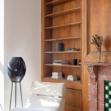
The design was initially guided by the fireplace—from there a subtle injection of matching color extends up into the thick tiered molding and ceiling trim. “The most reckless patterns live here,” remarks Schultz, referring to the checkered green and white tiles, pink-Pollack-y stone and cast iron detailing. The millwork and warm wood wall panels devour the remainder of the living room, eliminating the need for unnecessary artwork.
A curved living room chair by Kave Home punctuates playfully; its shape reveals its pleasant conformity to the human body and sits back, inviting rest and respite. “It’s good for all body types and sizes,” explains Schultz. The single sofa by Dareels is purposefully oversized, casual and inviting. A beige cover was added to soften the otherwise rectilinear edges. Additionally sourced from Dareels, a small yet centrally located side table anchors the space with its dark black wood texture, its visual weight on par with the larger pieces. The black bulbous free standing lamp converses directly with the antique chandelier above. Composed of individual black leather strips, it is seemingly harsh—yet its soft form is reminiscent of a spring tulip.
The continuation of the color palette slips softly into the dining room where velvety green chairs sit delicately on a cascade array of pointed legs. The doors that lead out to the patio were sanded down and treated so that the original shape and form could be retained. Although the same green paint was used throughout, this set of doors speaks in darker tones alongside the acute and penetrating daylight. A few different shades of white paint were used throughout the space to add additional depth and embellish this shadowy texture.
Specialty lights were added into the space to complement the existing overhead lighting. A wall sconce was added in the living room and extra lighting was placed in the kitchen. However, because of the existing barrel vaulted tile ceiling, sconces were placed on the walls rather than above to avoid penetrating the existing architecture.
 Tom Brzoskwinia
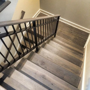
One of the most popular hardwood floor finishing which offers Tom & Peter Flooring is provided by WOCA. If you’ve decided that you want a natural looking wooden floor that is lacquer-free, then the likelihood is that you’ve chosen oil as your way of protecting your wood and making your floor look great at the same time. WOCA for wood flooring comes in various forms and is a great way of making sure that your wood is protected, but at the same time looks natural. A highly popular as well as effective way of treating wood floors, oils effectively penetrate into the wood and in some cases harden into the surface of the floor to stop damage and to maintain the wood in its optimum condition.
WOCA Oil finish hardwood flooring has taken the United States market by in 2014 and shows no signs of slowing down in 2016 and now. Here are some of the most common questions we have regarding this type of finish which we will I’m to answer in today’s my blog:
Is oil finish as durable as traditional factory urethane finishes with aluminum oxide?
When it comes to durability, oil finish flooring tackles the issue with a completely different method. The penetrating oil serves as protection from moisture and wear while allowing the user to feel the wood grains in their bare feet. If compared directly to factory finished aluminum oxide finish, the oil finish flooring will not perform as well to abrasion and impact. However, the beauty of this finish is the fact that it will camouflage any scratches which will inevitably accumulate over time.
Will this finish evaporate over time and will this be harmful for indoor air quality?
Another concern for oil finished floors its effect on indoor air quality. For on-site applications, some varieties suggest several coats which typically require the residents to be out of the home due to mild odors. However, there are factory finished UV-cured or single coat applications which lessen the downtime. Despite the odors produced during the drying process, oil finish floors rank amongst the lowest for VOC (volatile organic compound) emissions. Certain brands even boast true zero VOC. This fact alone makes oil finished floors one of the best options for green building solutions.
“WOCA products are certified by independent laboratories, the German Institute for Biological Building Materials, and are in accordance with DIN–Norm 53–160. WOCA WoodCare Denmark products meet or exceed the most stringent U.S. standards for volatile organic compounds.” –WOCA Oil Finish Manufacture
Does this type of finish require additional maintenance which I am not familiar with?
For weekly cleaning, oiled floors use a special cleaner which contains an oil and soap mixture. After a period of 12-18 months some oil may evaporate causing the wood grains to appear dry. An additional layer of oil can be reapplied to keep the floor looking fresh. Although oil finished floors require more involvement in periodic maintenance in high traffic areas, this maintenance can be done much easier than the equivalent of an onsite sand and refinish.
WOCA Master Color Oil contains pigment, which provides a single-step hardwood floor staining process. Laying down the stain and the finish in one step.
This product comes 14 different colors, from Black to Extra White, and you can mix them freely to create various color palettes that will meet the demands of any job.
Below are some pictures of the finished job…

 Cameo Kitchens, Inc.
Kelly Keul Duer
Example of a large trendy medium tone wood floor kitchen design in DC Metro with an undermount sink, beaded inset cabinets, white cabinets, granite countertops, gray backsplash, stainless steel appliances and an island
Example of a large trendy medium tone wood floor kitchen design in DC Metro with an undermount sink, beaded inset cabinets, white cabinets, granite countertops, gray backsplash, stainless steel appliances and an island
 InForm Architecture, LLC
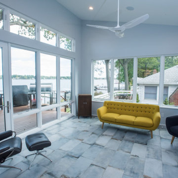
The goal of this project was to replace a small single-story seasonal family cottage with a year-round home that takes advantage of the views and topography of this lakefront site while providing privacy for the occupants. The program called for a large open living area, a master suite, study, a small home gym and five additional bedrooms. The style was to be distinctly contemporary.
The house is shielded from the street by the placement of the garage and by limiting the amount of window area facing the road. The main entry is recessed and glazed with frosted glass for privacy. Due to the narrowness of the site and the proximity of the neighboring houses, the windows on the sides of the house were also limited and mostly high up on the walls. The limited fenestration on the front and sides is made up for by the full wall of glass on the lake side, facing north. The house is anchored by an exposed masonry foundation. This masonry also cuts through the center of the house on the fireplace chimney to separate the public and private spaces on the first floor, becoming a primary material on the interior. The house is clad with three different siding material: horizontal longboard siding, vertical ribbed steel siding and cement board panels installed as a rain screen. The standing seam metal-clad roof rises from a low point at the street elevation to a height of 24 feet at the lakefront to capture the views and the north light.
The house is organized into two levels and is entered on the upper level. This level contains the main living spaces, the master suite and the study. The angled stair railing guides visitors into the main living area. The kitchen, dining area and living area are each distinct areas within one large space. This space is visually connected to the outside by the soaring ceilings and large fireplace mass that penetrate the exterior wall. The lower level contains the children’s and guest bedrooms, a secondary living space and the home gym.
 Jeanne Schultz Design Studio
Words by Wilson Hack
The best architecture allows what has come before it to be seen and cared for while at the same time injecting something new, if not idealistic. Spartan at first glance, the interior of this stately apartment building, located on the iconic Passeig de Gràcia in Barcelona, quickly begins to unfold as a calculated series of textures, visual artifacts and perfected aesthetic continuities.
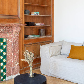
The client, a globe-trotting entrepreneur, selected Jeanne Schultz Design Studio for the remodel and requested that the space be reconditioned into a purposeful and peaceful landing pad. It was to be furnished simply using natural and sustainable materials. Schultz began by gently peeling back before adding only the essentials, resulting in a harmoniously restorative living space where darkness and light coexist and comfort reigns.
The design was initially guided by the fireplace—from there a subtle injection of matching color extends up into the thick tiered molding and ceiling trim. “The most reckless patterns live here,” remarks Schultz, referring to the checkered green and white tiles, pink-Pollack-y stone and cast iron detailing. The millwork and warm wood wall panels devour the remainder of the living room, eliminating the need for unnecessary artwork.
A curved living room chair by Kave Home punctuates playfully; its shape reveals its pleasant conformity to the human body and sits back, inviting rest and respite. “It’s good for all body types and sizes,” explains Schultz. The single sofa by Dareels is purposefully oversized, casual and inviting. A beige cover was added to soften the otherwise rectilinear edges. Additionally sourced from Dareels, a small yet centrally located side table anchors the space with its dark black wood texture, its visual weight on par with the larger pieces. The black bulbous free standing lamp converses directly with the antique chandelier above. Composed of individual black leather strips, it is seemingly harsh—yet its soft form is reminiscent of a spring tulip.
The continuation of the color palette slips softly into the dining room where velvety green chairs sit delicately on a cascade array of pointed legs. The doors that lead out to the patio were sanded down and treated so that the original shape and form could be retained. Although the same green paint was used throughout, this set of doors speaks in darker tones alongside the acute and penetrating daylight. A few different shades of white paint were used throughout the space to add additional depth and embellish this shadowy texture.
Specialty lights were added into the space to complement the existing overhead lighting. A wall sconce was added in the living room and extra lighting was placed in the kitchen. However, because of the existing barrel vaulted tile ceiling, sconces were placed on the walls rather than above to avoid penetrating the existing architecture.
 InForm Architecture, LLC
The goal of this project was to replace a small single-story seasonal family cottage with a year-round home that takes advantage of the views and topography of this lakefront site while providing privacy for the occupants. The program called for a large open living area, a master suite, study, a small home gym and five additional bedrooms. The style was to be distinctly contemporary.
The house is shielded from the street by the placement of the garage and by limiting the amount of window area facing the road. The main entry is recessed and glazed with frosted glass for privacy. Due to the narrowness of the site and the proximity of the neighboring houses, the windows on the sides of the house were also limited and mostly high up on the walls. The limited fenestration on the front and sides is made up for by the full wall of glass on the lake side, facing north. The house is anchored by an exposed masonry foundation. This masonry also cuts through the center of the house on the fireplace chimney to separate the public and private spaces on the first floor, becoming a primary material on the interior. The house is clad with three different siding material: horizontal longboard siding, vertical ribbed steel siding and cement board panels installed as a rain screen. The standing seam metal-clad roof rises from a low point at the street elevation to a height of 24 feet at the lakefront to capture the views and the north light.
The house is organized into two levels and is entered on the upper level. This level contains the main living spaces, the master suite and the study. The angled stair railing guides visitors into the main living area. The kitchen, dining area and living area are each distinct areas within one large space. This space is visually connected to the outside by the soaring ceilings and large fireplace mass that penetrate the exterior wall. The lower level contains the children’s and guest bedrooms, a secondary living space and the home gym.
 Retropassion21
PLEASE NOTE: Shipping method and cost depends on where you live. Shipping will not be added at check out but calculated and billed separately after I know what your zip code is. Please send your zip code if you would like a quote before purchasing.
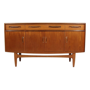
Outstanding small teak credenza. It was designed in the 1960s by Victor Bramwell Wilkins for G Plan's Fresco Range. It has original light blue baize which is in good condition.
Style: Danish Modern.
It is in very good condition. There is a slight color difference on between the doors and the drawers. There are some lines on the top finish but is does not penetrate the teak veneer. Minor signs of wear consistent with age and use. (Please see pictures below).
Dimensions:
L(D) x W x H
18" x 60" (5 ft) x 33"
A NOTE ABOUT CONSTRUCTION:
Almost all mid century modern furniture is teak / rosewood veneer over secondary wood or particleboard. Please contact us if you want to know more about how the furniture was constructed.
SHIPPING
Shipping cost will be billed separately. Shipping to mainland continental USA will be blanket wrap. We also use Greyhound Package Express to a Greyhound station near you for smaller items. Please send your zip code for a quote.
White glove service (movers place the items inside your house) is also available at additional cost.
We can also ship to Canada: Please send postal code for a quote.

 Reflections Water Gardens
After two years of fighting with a failing pond liner, the resident decided to replace the liner in the pond. This 150’ x 115’pond sat above and flowed into a larger pond which was lined with PVC liner. We were replacing this with a 45 mil epdm fishsafe rubber liner. This presented a problem: there is no way to adhere the new rubber liner to the existing PVC liner in the lower pond. The solution was to pour a cement 18” wide x 2’ deep footing next to the wier damn between the two ponds in order to connect the two liners together. The old liner was placed on the top of the footing and a water-block sealant was used. The new rubber liner was placed on top and another layer of sealant along with stainless steel bars were laid atop the two materials in order to press them together to maintain a water-tight junction. A drain tile system was installed beneath the liner to relieve ground water pressure and vent off any gasses. Water tight seals also had to be provided for multiple plumbing penetrations through the liner. Non-woven geotextile planting media bags were used to prevent erosion around the perimeter of the pond. As the pond was landscaped with lawn and perennials, these had to be removed and preserved and maintained throughout the project in order to return them upon completion of the lining. All trenching work and removal of plant material was done by hand in order to maintain the surrounding landscape; great care was taken throughout the project in order to protect existing hard and softscape, so that upon completion, the area appeared almost exactly as it had been before work began.
Photo by Larry Carnes
 Tom Brzoskwinia
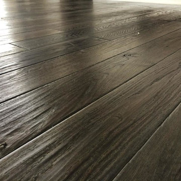
One of the most popular hardwood floor finishing which offers Tom & Peter Flooring is provided by WOCA. If you’ve decided that you want a natural looking wooden floor that is lacquer-free, then the likelihood is that you’ve chosen oil as your way of protecting your wood and making your floor look great at the same time. WOCA for wood flooring comes in various forms and is a great way of making sure that your wood is protected, but at the same time looks natural. A highly popular as well as effective way of treating wood floors, oils effectively penetrate into the wood and in some cases harden into the surface of the floor to stop damage and to maintain the wood in its optimum condition.
WOCA Oil finish hardwood flooring has taken the United States market by in 2014 and shows no signs of slowing down in 2016 and now. Here are some of the most common questions we have regarding this type of finish which we will I’m to answer in today’s my blog:
Is oil finish as durable as traditional factory urethane finishes with aluminum oxide?
When it comes to durability, oil finish flooring tackles the issue with a completely different method. The penetrating oil serves as protection from moisture and wear while allowing the user to feel the wood grains in their bare feet. If compared directly to factory finished aluminum oxide finish, the oil finish flooring will not perform as well to abrasion and impact. However, the beauty of this finish is the fact that it will camouflage any scratches which will inevitably accumulate over time.
Will this finish evaporate over time and will this be harmful for indoor air quality?
Another concern for oil finished floors its effect on indoor air quality. For on-site applications, some varieties suggest several coats which typically require the residents to be out of the home due to mild odors. However, there are factory finished UV-cured or single coat applications which lessen the downtime. Despite the odors produced during the drying process, oil finish floors rank amongst the lowest for VOC (volatile organic compound) emissions. Certain brands even boast true zero VOC. This fact alone makes oil finished floors one of the best options for green building solutions.
“WOCA products are certified by independent laboratories, the German Institute for Biological Building Materials, and are in accordance with DIN–Norm 53–160. WOCA WoodCare Denmark products meet or exceed the most stringent U.S. standards for volatile organic compounds.” –WOCA Oil Finish Manufacture
Does this type of finish require additional maintenance which I am not familiar with?
For weekly cleaning, oiled floors use a special cleaner which contains an oil and soap mixture. After a period of 12-18 months some oil may evaporate causing the wood grains to appear dry. An additional layer of oil can be reapplied to keep the floor looking fresh. Although oil finished floors require more involvement in periodic maintenance in high traffic areas, this maintenance can be done much easier than the equivalent of an onsite sand and refinish.
WOCA Master Color Oil contains pigment, which provides a single-step hardwood floor staining process. Laying down the stain and the finish in one step.
This product comes 14 different colors, from Black to Extra White, and you can mix them freely to create various color palettes that will meet the demands of any job.
Below are some pictures of the finished job…
 InForm Architecture, LLC
The goal of this project was to replace a small single-story seasonal family cottage with a year-round home that takes advantage of the views and topography of this lakefront site while providing privacy for the occupants. The program called for a large open living area, a master suite, study, a small home gym and five additional bedrooms. The style was to be distinctly contemporary.
The house is shielded from the street by the placement of the garage and by limiting the amount of window area facing the road. The main entry is recessed and glazed with frosted glass for privacy. Due to the narrowness of the site and the proximity of the neighboring houses, the windows on the sides of the house were also limited and mostly high up on the walls. The limited fenestration on the front and sides is made up for by the full wall of glass on the lake side, facing north. The house is anchored by an exposed masonry foundation. This masonry also cuts through the center of the house on the fireplace chimney to separate the public and private spaces on the first floor, becoming a primary material on the interior. The house is clad with three different siding material: horizontal longboard siding, vertical ribbed steel siding and cement board panels installed as a rain screen. The standing seam metal-clad roof rises from a low point at the street elevation to a height of 24 feet at the lakefront to capture the views and the north light.
The house is organized into two levels and is entered on the upper level. This level contains the main living spaces, the master suite and the study. The angled stair railing guides visitors into the main living area. The kitchen, dining area and living area are each distinct areas within one large space. This space is visually connected to the outside by the soaring ceilings and large fireplace mass that penetrate the exterior wall. The lower level contains the children’s and guest bedrooms, a secondary living space and the home gym.
 InForm Architecture, LLC
The goal of this project was to replace a small single-story seasonal family cottage with a year-round home that takes advantage of the views and topography of this lakefront site while providing privacy for the occupants. The program called for a large open living area, a master suite, study, a small home gym and five additional bedrooms. The style was to be distinctly contemporary.
The house is shielded from the street by the placement of the garage and by limiting the amount of window area facing the road. The main entry is recessed and glazed with frosted glass for privacy. Due to the narrowness of the site and the proximity of the neighboring houses, the windows on the sides of the house were also limited and mostly high up on the walls. The limited fenestration on the front and sides is made up for by the full wall of glass on the lake side, facing north. The house is anchored by an exposed masonry foundation. This masonry also cuts through the center of the house on the fireplace chimney to separate the public and private spaces on the first floor, becoming a primary material on the interior. The house is clad with three different siding material: horizontal longboard siding, vertical ribbed steel siding and cement board panels installed as a rain screen. The standing seam metal-clad roof rises from a low point at the street elevation to a height of 24 feet at the lakefront to capture the views and the north light.
The house is organized into two levels and is entered on the upper level. This level contains the main living spaces, the master suite and the study. The angled stair railing guides visitors into the main living area. The kitchen, dining area and living area are each distinct areas within one large space. This space is visually connected to the outside by the soaring ceilings and large fireplace mass that penetrate the exterior wall. The lower level contains the children’s and guest bedrooms, a secondary living space and the home gym.
82