
Search results for "People start" in Home Design Ideas

 Darling Residential Architecture and Design
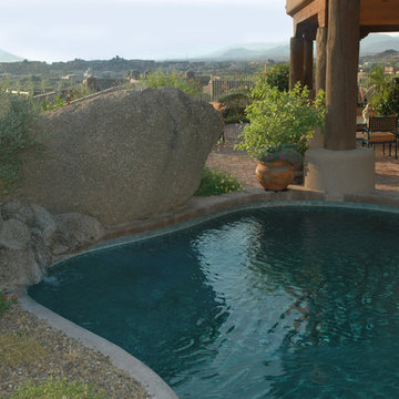
The massive granite boulder at the North end of the pool was actually the starting point of the design for the entire project. Ron walked the lot in it's natural state and felt placing the pool at the base of this impressive upside down pyramid granite boulder was vital to the feel and flow of every other element of this home. The owners agreed and now, tucked deep into the natural boulder pile the pool is so private most people on the golf course never realize it's there.
 John Lum Architecture, Inc. AIA
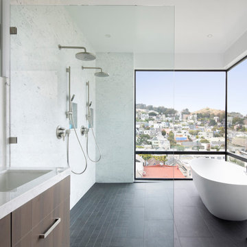
Modern bathroom. Photo by Paul Dyer
Freestanding bathtub - contemporary black floor freestanding bathtub idea in San Francisco with flat-panel cabinets, dark wood cabinets, an undermount sink and white countertops
Freestanding bathtub - contemporary black floor freestanding bathtub idea in San Francisco with flat-panel cabinets, dark wood cabinets, an undermount sink and white countertops
Find the right local pro for your project
 Rikki Snyder
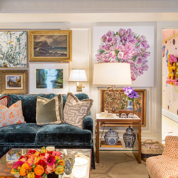
Photo: Rikki Snyder © 2018 Houzz
https://www.houzz.com/ideabooks/108513781/list/bold-and-daring-designs-at-the-2018-kips-bay-decorator-show-house
 Bradford Smith - High Rock Real Estate
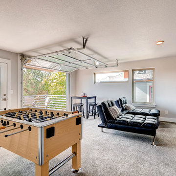
$8,000 Builder credit paid to you towards window coverings, closing costs or interest buy-down! Magazine quality kitchen w/ expensive high gloss white finish, frosted glass showcase and soft close / pull-out cabinetry * Upgraded touch faucet * Upgraded composite granite sink for durability * Upgraded GE Cafe SS appliances * Upgraded 4" solid hardwood flooring * Upgraded slimline fireplace * Upgraded tankless water heater for high efficiency* Upgraded solid core doors throughout (twice the price of standard hollow core) * Upgraded custom handmade wrought-iron rail / with butcher block wood stairsystem * Rec/Media Room w/ upgraded roll-up garage door double pane & insulated for energy efficiency * Expansive patio with panoramic unobstructed city skyline AND mountain views perfect for entertaining* Full wet bar w/ wine refrigerator, sink and storage * 4 bedroom potential (call broker for specs) * 2 car detached garage * Ample storage space in 14' garage and temp controlled 3' crawl space.
 Barnes Walker Ltd - Landscape Architects
Barnes Walker Ltd
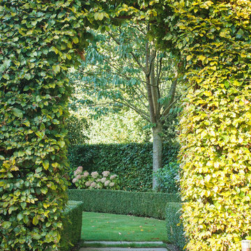
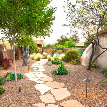
Inspiration for a traditional landscaping in Manchester.
Inspiration for a traditional landscaping in Manchester.
 Staging2Sell
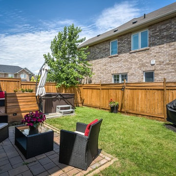
"When people are house hunting, they are imagining a fresh start, keeping the lawn properly trimmed and edged ~make your home more appealing to buyers"
Photo via Anthony Rego
 Décor Aid
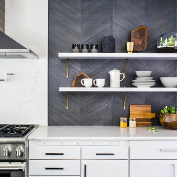
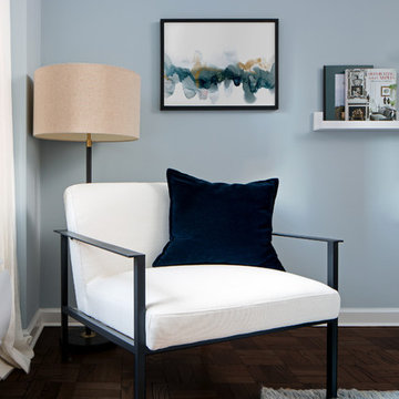
“Immediately upon seeing the space, I knew that we needed to create a narrative that allowed the design to control how you moved through the space,” reports Kimberly, senior interior designer.
After surveying each room and learning a bit more about their personal style, we started with the living room remodel. It was clear that the couple wanted to infuse mid-century modern into the design plan. Sourcing the Room & Board Jasper Sofa with its narrow arms and tapered legs, it offered the mid-century look, with the modern comfort the clients are used to. Velvet accent pillows from West Elm and Crate & Barrel add pops of colors but also a subtle touch of luxury, while framed pictures from the couple’s honeymoon personalize the space.
Moving to the dining room next, Kimberly decided to add a blue accent wall to emphasize the Horchow two piece Percussion framed art that was to be the focal point of the dining area. The Seno sideboard from Article perfectly accentuated the mid-century style the clients loved while providing much-needed storage space. The palette used throughout both rooms were very New York style, grays, blues, beiges, and whites, to add depth, Kimberly sourced decorative pieces in a mixture of different metals.
“The artwork above their bureau in the bedroom is photographs that her father took,”
Moving into the bedroom renovation, our designer made sure to continue to stick to the client’s style preference while once again creating a personalized, warm and comforting space by including the photographs taken by the client’s father. The Avery bed added texture and complimented the other colors in the room, while a hidden drawer at the foot pulls out for attached storage, which thrilled the clients. A deco-inspired Faceted mirror from West Elm was a perfect addition to the bedroom due to the illusion of space it provides. The result was a bedroom that was full of mid-century design, personality, and area so they can freely move around.
The project resulted in the form of a layered mid-century modern design with touches of luxury but a space that can not only be lived in but serves as an extension of the people who live there. Our designer was able to take a very narrowly shaped Manhattan apartment and revamp it into a spacious home that is great for sophisticated entertaining or comfortably lazy nights in.
 GIA Bathrooms & Kitchens
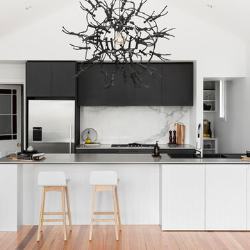
Example of a mid-sized trendy galley medium tone wood floor and brown floor open concept kitchen design in Melbourne with an integrated sink, flat-panel cabinets, stainless steel countertops, white backsplash, stainless steel appliances, a peninsula, marble backsplash and white countertops
 Thomas Roszak Architecture, LLC
Photo credit: Scott McDonald @ Hedrich Blessing
7RR-Ecohome:
The design objective was to build a house for a couple recently married who both had kids from previous marriages. How to bridge two families together?
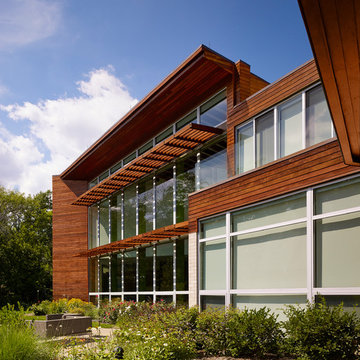
The design looks forward in terms of how people live today. The home is an experiment in transparency and solid form; removing borders and edges from outside to inside the house, and to really depict “flowing and endless space”. The house floor plan is derived by pushing and pulling the house’s form to maximize the backyard and minimize the public front yard while welcoming the sun in key rooms by rotating the house 45-degrees to true north. The angular form of the house is a result of the family’s program, the zoning rules, the lot’s attributes, and the sun’s path. We wanted to construct a house that is smart and efficient in terms of construction and energy, both in terms of the building and the user. We could tell a story of how the house is built in terms of the constructability, structure and enclosure, with a nod to Japanese wood construction in the method in which the siding is installed and the exposed interior beams are placed in the double height space. We engineered the house to be smart which not only looks modern but acts modern; every aspect of user control is simplified to a digital touch button, whether lights, shades, blinds, HVAC, communication, audio, video, or security. We developed a planning module based on a 6-foot square room size and a 6-foot wide connector called an interstitial space for hallways, bathrooms, stairs and mechanical, which keeps the rooms pure and uncluttered. The house is 6,200 SF of livable space, plus garage and basement gallery for a total of 9,200 SF. A large formal foyer celebrates the entry and opens up to the living, dining, kitchen and family rooms all focused on the rear garden. The east side of the second floor is the Master wing and a center bridge connects it to the kid’s wing on the west. Second floor terraces and sunscreens provide views and shade in this suburban setting. The playful mathematical grid of the house in the x, y and z axis also extends into the layout of the trees and hard-scapes, all centered on a suburban one-acre lot.
Many green attributes were designed into the home; Ipe wood sunscreens and window shades block out unwanted solar gain in summer, but allow winter sun in. Patio door and operable windows provide ample opportunity for natural ventilation throughout the open floor plan. Minimal windows on east and west sides to reduce heat loss in winter and unwanted gains in summer. Open floor plan and large window expanse reduces lighting demands and maximizes available daylight. Skylights provide natural light to the basement rooms. Durable, low-maintenance exterior materials include stone, ipe wood siding and decking, and concrete roof pavers. Design is based on a 2' planning grid to minimize construction waste. Basement foundation walls and slab are highly insulated. FSC-certified walnut wood flooring was used. Light colored concrete roof pavers to reduce cooling loads by as much as 15%. 2x6 framing allows for more insulation and energy savings. Super efficient windows have low-E argon gas filled units, and thermally insulated aluminum frames. Permeable brick and stone pavers reduce the site’s storm-water runoff. Countertops use recycled composite materials. Energy-Star rated furnaces and smart thermostats are located throughout the house to minimize duct runs and avoid energy loss. Energy-Star rated boiler that heats up both radiant floors and domestic hot water. Low-flow toilets and plumbing fixtures are used to conserve water usage. No VOC finish options and direct venting fireplaces maintain a high interior air quality. Smart home system controls lighting, HVAC, and shades to better manage energy use. Plumbing runs through interior walls reducing possibilities of heat loss and freezing problems. A large food pantry was placed next to kitchen to reduce trips to the grocery store. Home office reduces need for automobile transit and associated CO2 footprint. Plan allows for aging in place, with guest suite than can become the master suite, with no need to move as family members mature.
 Klopf Architecture
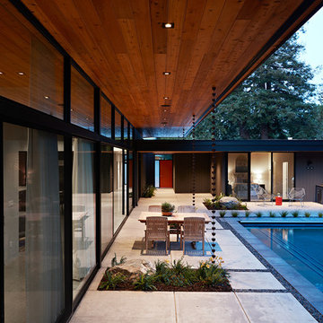
Klopf Architecture, Arterra Landscape Architects and Henry Calvert of Calvert Ventures Designed and built a new warm, modern, Eichler-inspired, open, indoor-outdoor home on a deeper-than-usual San Mateo Highlands property where an original Eichler house had burned to the ground.
The owners wanted multi-generational living and larger spaces than the original home offered, but all parties agreed that the house should respect the neighborhood and blend in stylistically with the other Eichlers. At first the Klopf team considered re-using what little was left of the original home and expanding on it. But after discussions with the owner and builder, all parties agreed that the last few remaining elements of the house were not practical to re-use, so Klopf Architecture designed a new home that pushes the Eichler approach in new directions.
One disadvantage of Eichler production homes is that the house designs were not optimized for each specific lot. A new custom home offered the team a chance to start over. In this case, a longer house that opens up sideways to the south fit the lot better than the original square-ish house that used to open to the rear (west). Accordingly, the Klopf team designed an L-shaped “bar” house with a large glass wall with large sliding glass doors that faces sideways instead of to the rear like a typical Eichler. This glass wall opens to a pool and landscaped yard designed by Arterra Landscape Architects.
Driving by the house, one might assume at first glance it is an Eichler because of the horizontality, the overhanging flat roof eaves, the dark gray vertical siding, and orange solid panel front door, but the house is designed for the 21st Century and is not meant to be a “Likeler.” You won't see any posts and beams in this home. Instead, the ceiling decking is a western red cedar that covers over all the beams. Like Eichlers, this cedar runs continuously from inside to out, enhancing the indoor / outdoor feeling of the house, but unlike Eichlers it conceals a cavity for lighting, wiring, and insulation. Ceilings are higher, rooms are larger and more open, the master bathroom is light-filled and more generous, with a separate tub and shower and a separate toilet compartment, and there is plenty of storage. The garage even easily fits two of today's vehicles with room to spare.
A massive 49-foot by 12-foot wall of glass and the continuity of materials from inside to outside enhance the inside-outside living concept, so the owners and their guests can flow freely from house to pool deck to BBQ to pool and back.
During construction in the rough framing stage, Klopf thought the front of the house appeared too tall even though the house had looked right in the design renderings (probably because the house is uphill from the street). So Klopf Architecture paid the framer to change the roofline from how we had designed it to be lower along the front, allowing the home to blend in better with the neighborhood. One project goal was for people driving up the street to pass the home without immediately noticing there is an "imposter" on this lot, and making that change was essential to achieve that goal.
This 2,606 square foot, 3 bedroom, 3 bathroom Eichler-inspired new house is located in San Mateo in the heart of the Silicon Valley.
Klopf Architecture Project Team: John Klopf, AIA, Klara Kevane
Landscape Architect: Arterra Landscape Architects
Contractor: Henry Calvert of Calvert Ventures
Photography ©2016 Mariko Reed
Location: San Mateo, CA
Year completed: 2016

 LMB Interiors
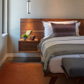
Wallpaper on bed wall: Phillip Jeffries, vinyl, color: Belgian Linen Khaki
Photo by Eric Rorer
While we adore all of our clients and the beautiful structures which we help fill and adorn, like a parent adores all of their children, this recent mid-century modern interior design project was a particular delight.
This client, a smart, energetic, creative, happy person, a man who, in-person, presents as refined and understated — he wanted color. Lots of color. When we introduced some color, he wanted even more color: Bright pops; lively art.
In fact, it started with the art.
This new homeowner was shopping at SLATE ( https://slateart.net) for art one day… many people choose art as the finishing touches to an interior design project, however this man had not yet hired a designer.
He mentioned his predicament to SLATE principal partner (and our dear partner in art sourcing) Danielle Fox, and she promptly referred him to us.
At the time that we began our work, the client and his architect, Jack Backus, had finished up a massive remodel, a thoughtful and thorough update of the elegant, iconic mid-century structure (originally designed by Ratcliff & Ratcliff) for modern 21st-century living.
And when we say, “the client and his architect” — we mean it. In his professional life, our client owns a metal fabrication company; given his skills and knowledge of engineering, build, and production, he elected to act as contractor on the project.
His eye for metal and form made its way into some of our furniture selections, in particular the coffee table in the living room, fabricated and sold locally by Turtle and Hare.
Color for miles: One of our favorite aspects of the project was the long hallway. By choosing to put nothing on the walls, and adorning the length of floor with an amazing, vibrant, patterned rug, we created a perfect venue. The rug stands out, drawing attention to the art on the floor.
In fact, the rugs in each room were as thoughtfully selected for color and design as the art on the walls. In total, on this project, we designed and decorated the living room, family room, master bedroom, and patio.
While my design firm is known for our work with traditional and transitional architecture, and we love those projects, I think it is clear from this project that Modern is also our cup of tea.
If you have a Modern house and are thinking about how to make it more vibrantly YOU, contact us for a consultation.


 Data Led Designs
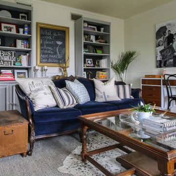
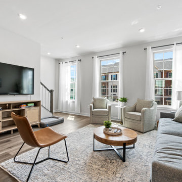
For this Short Term Rental home, or Airbnb we started by leveraging market insights and the development of a the ideal guest for this market leading us to create a family and large group oriented design. We focused on how guests would enjoy the space and maximized the number of people it could host with king and queen sized beds, and pull out sofa. Design is comfortable, durable and modern.

 Lauren C
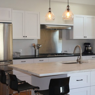
We JUST finished our kitchen and need to decorate and redo the floors. (The lighting in my photos also is a bit of a disservice.) But I wanted to thank the amazing people that helped -- truly all professional artisans who took great care with the project. It was seamless start to finish. Helder Torquato Assumpcao of Ipê Decking and Remodel in Everett did the install and some custom pieces. Dave Brushett of Central New England Soapstone the countertops. The cabinets are Semihandmade Doors/IKEA.
 Simply Home Decorating
This beautiful North Vancouver home belongs to a nature-loving and health-conscious couple, Emma and Vince (names changed), their two young children, and their dog, Jasper. When they contacted us about renovating and furnishing their kitchen and family room, we walked in and saw a world of potential waiting to be uncovered.
Before: Larkhall Crescent Home:
Like many original North Vancouver homes, the interior was definitely dated. We encountered late ‘80s finishes in powder pink and teal green, old carpet, and a kitchen that wasn’t maximized to suit this family’s modern-day lifestyle. However, the size of the rooms offered us a ton of space with which to get creative.
Knowing our clients’ love of cooking, need for work spaces (Emma and Vince both work remotely), and growing family, we developed a design concept that would increase usable space, optimize storage, and create intimacy in this large area. As for the style, we were inspired by their European roots, inventing a new and modern take on “Belgian Farmhouse” style. Now, the home is truly one-of-a-kind.
After: Warm & Cozy Family Room:
Fresh, bright, and comfortable, this living area has been transformed! We started with the fireplace as a focal point, selecting aged brick tiles for added texture and a crisp wood mantle. The taupe-coloured sectional infuses the room with visual warmth and serves the added purpose of separating the family room from the kitchen.
Emma and Vince were also keen on using non-toxic materials in their home, and we were happy to oblige. To meet their needs, we sourced natural wood elements and sought out Canadian-made products - that adhere to high health standards - whenever possible.
Look closer at the elements of this space, and you will find this stunning, honeycomb-patterned rug in earthy gold, beige, and charcoal tones. It’s plush to the touch and full of visual texture that brings this room’s colour palette together. We sourced these two-tone chairs with caning, petrified wood side table, black sconces, and botanical prints in greyscale from local artist, Heather Johnston.
We topped off the space with this dark wood and rattan console that offers storage facing the kitchen and presents an opportunity to display cherished items. The result is a cozy lounging space brimming with comfort and functionality. It’s perfect for enjoying quality family time, or Emma can simply slide the coffee table away to make room for her morning yoga practice.
Now, let’s turn around and give some attention to the kitchen. Do you remember what the original kitchen looked like? If not, scroll back up, because the transformation is shocking…
Moody & Welcoming Kitchen for Healthy Living:
This kitchen looks very different from how it started, right? Though we didn’t touch any walls, the kitchen has almost doubled in usable space! We created a long, extended island with storage, an outlet for small appliances, and seating for comfortable prep, after-school snacking, or mingling among friends.
On the other side of the island, the family has even more storage and an integrated dishwasher within easy reach of the sink, perfect for quick clean-up. From this angle, you can also see the expansive custom Shaker cabinetry in white and the integrated double ovens. These facilitate their cooking experience and gave us the opportunity to add an additional surprise…
A coffee garage station and more hidden storage! Keeping these items located along the perimeter allows them to be accessed by the family or their guests without someone getting under the cook’s feet. These are the little details that make everyday life easier and more enjoyable.
Moving deeper into the kitchen, the seamless induction cooktop topped with a freestanding concealed hood fan commands attention in a soft yet prominent way. The natural wood accent mirrors the fireplace mantle, and the choice of off-black wood-grain cabinets not only continues our black-and-white colour palette but adds a sense of depth and contrast. The corner sink is located to the right and perfectly positioned with a view of their thriving backyard.
To invite more of this family’s character into the space, we mixed metals for interest — matte black, dark pewter, and warm brass — and created open shelves in white oak for their plants and decor. You can also glimpse the tumbled edge of the backsplash tile, which echoes the rustic brick of the fireplace. It adds that farmhouse charm while still feeling timeless and sophisticated.
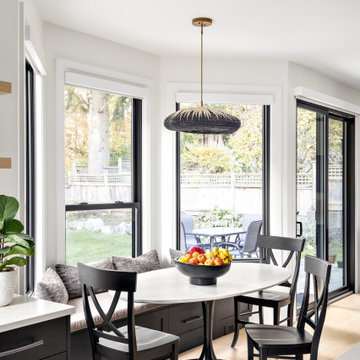
Last but not least, we designed this dining banquette in the bay window (with integrated bench storage, of course), where the family can share a meal together, the kids can do homework, or Emma and Vince can work and enjoy a change of scenery from their offices. Like the other spaces in the home, it was designed to be beautiful, multi-functional, and long-lasting.
Praise from Our Clients:
It is clear that we love this home, but what did our clients have to say?
“Lori is a visionary and masters execution to the finest detail all at the same time. When she first met us to know more about who we are and how we live, she could right away envision how we could use the space in our kitchen and living room…The results exceeded our expectations.
Lori and her team were also a delight to work with — coordination with all the trades, fast problem-solving, regular updates, professional and friendly attitude of her entire team — made it the dream team. Thank you SHD for making our space so beautiful!”
In turn, we are so grateful for this family’s trust, their open communication, and for being wonderful people with whom to work. (So, thank you!)
18