
Search results for "Perceive" in Home Design Ideas
 Keenan & Co. Studio
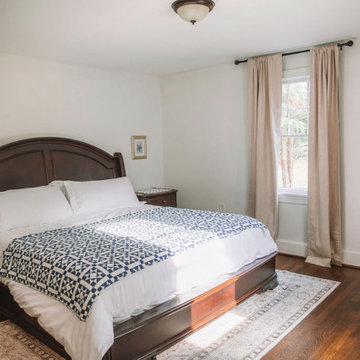
Set in the heart of Virginia wine country, Valley View Cottage was created as a place for guests to disconnect from daily life and reconnect with close friends and family. The brand was intentionally built at the intersection of Blue Ridge mountain terrain and elevated residential comfort, blending natural depth with refined ease.
We anchored the environment in deep blues to reflect the surrounding landscape and layered warm neutrals to create intimacy and welcome. Every detail was curated to move the experience beyond a place to sleep. This property was designed to evoke a feeling. In a saturated short term rental market, guests do not choose square footage. They choose emotion.
Through intentional brand positioning, cohesive storytelling, and thoughtful design execution, Valley View Cottage increased perceived value, strengthened its visual identity, and elevated the overall guest experience. The result was higher quality bookings, stronger guest reviews, justified premium nightly rates, and a growing social media presence driven by a space that photographs beautifully.
This project demonstrates how a short term rental can operate as boutique hospitality. When strategy and atmosphere align, a STR becomes more than accommodation. It becomes an experience guests remember and return to.
 Keenan & Co. Studio
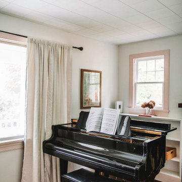
Set in the heart of Virginia wine country, Valley View Cottage was created as a place for guests to disconnect from daily life and reconnect with close friends and family. The brand was intentionally built at the intersection of Blue Ridge mountain terrain and elevated residential comfort, blending natural depth with refined ease.
We anchored the environment in deep blues to reflect the surrounding landscape and layered warm neutrals to create intimacy and welcome. Every detail was curated to move the experience beyond a place to sleep. This property was designed to evoke a feeling. In a saturated short term rental market, guests do not choose square footage. They choose emotion.
Through intentional brand positioning, cohesive storytelling, and thoughtful design execution, Valley View Cottage increased perceived value, strengthened its visual identity, and elevated the overall guest experience. The result was higher quality bookings, stronger guest reviews, justified premium nightly rates, and a growing social media presence driven by a space that photographs beautifully.
This project demonstrates how a short term rental can operate as boutique hospitality. When strategy and atmosphere align, a STR becomes more than accommodation. It becomes an experience guests remember and return to.
 LONDON Architecture + Design
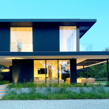
Casa Noir is situated across from a marina in a charming east-end village. The clients, having resided next door for many years, were intimately familiar with the site. When the property became available, they seized the opportunity to enhance it. Their vision involved elevating the grade to achieve a harmonious integration between properties. The result is a distinctive residential compound featuring naturalistic landscaping. To the west, the site is anchored by an existing white transitional modern residence, while to the east, the newly designed Casa Noir presents a sleek, black modern aesthetic. Centrally located between the two structures is an existing pool and spa, now designed for shared use. Casa Noir is clad in a matte black Sapele Mahogany rainscreen and features 10’ slimline aluminum-framed doors with retractable screens. Interior features include a floor-to-ceiling glass wine display and a double-sided fireplace that delineate the living area from the kitchen and dining spaces. The dining table conveniently converts into a billiards table, adding versatility to the space. A 20-foot expanse of glass slides past polished concrete floors, into a pocket, seamlessly connecting the interior living room with an outdoor seating pavilion overlooking the adjacent pool and shared lawn. A sunken firepit and trellis promote a smooth transition between the elevated and lower lawn areas. The freestanding garage, initially perceived as a minimalist cube, reveals a concealed speakeasy bar when a wall lifts on hydraulic pistons. This hidden space, illuminated for evening gatherings, adds a playful and sophisticated and sophisticated touch to the property.
Find the right local pro for your project
 Platinum Companies
Todd Photography
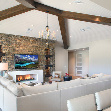
Large arts and crafts open concept light wood floor and brown floor family room photo in Phoenix with white walls, a stone fireplace, a wall-mounted tv and a ribbon fireplace
Large arts and crafts open concept light wood floor and brown floor family room photo in Phoenix with white walls, a stone fireplace, a wall-mounted tv and a ribbon fireplace
 Donald Lococo Architects
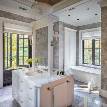
Awarded by the Classical institute of art and architecture , the linnean house has a restrained and simple elevation of doors and windows. Nestled in the Forest Hills neighborhood of Washington, D.C., the Linnean House is classical in both plan and elevation throughout its award-winning house plans. The main mass, comprising of the most formal and public spaces, is a spatial triptych along a symmetrical main axis. Inside the luxury home, the limestone façade, simple but well-proportioned with classical elements, extends itself into both the entry portico and main foyer with consistent proportions and materiality. This introduction allows the flanking living and dining rooms to be perceived as separate pavilions, each equipped with eight equal-proportioned French doors symmetrical of the main axis.
Beyond the classical spaces are two wings which lead to the master suite and a kitchen/family space, respectively. Both of which are situated to queue from the French door axis, a focal feature in the repeatedly published home design. At the entry foyer, the stark stone luxury architecture is warmed by two symmetrical wood armoire-like freestanding sculptural objects, a persistent theme throughout the luxury house. In the kitchen, for instance, stand four similar wood armoire objects at opposite corners that act as columns and help give this space a sense of boundary and enclosure. The master bath vanity, in similar fashion, is introduced as a central free-standing form anchoring itself as a notable presence in the space. Lastly, the wine room is designed as a series of free-standing heavy wood cavity walls spanned only by a hint of glass.
 Solatube International, Inc.
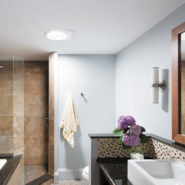
Here is a bathroom with the Solatube 160 DS with a vent kit added on. This is designed to deliver sunlight to smaller spaces. The Ventilation Add-On Kit combines daylighting and ventilation into one attractive fixture, leaving your rooms humidity-free and your ceiling looking orderly and uncluttered.
 Natural Stone Institute
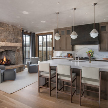
Gallegos was contacted by a client about a project where stone was not just to be an accent material, but the main visual and perceived structural element to create a timeless architectural composition. To further the endeavor: all veneers and dimension stone must be locally sourced and sustainably quarried. The design called for a moss rock veneer with cut stone trim. Sourcing the sandstone moss rock was simple because there were several local quarries to use. The problem
was with the trim pieces.
Gallegos selected Colorado Buff sandstone for the trim since the buff body was a good contrast to the moss rock and it is a stone that can be cut to size. One main concern with any sedimentary stone is hitting what is known as a “dry” layer in the ledge. This is an area in the stone between sedimentary layers that has not solidified or cemented. It is still granular and can lead to future stone failure as water penetrates these layers and creates freeze/thaw issues. To avoid this, they used
an epoxy injected into the dry layers to help solidify the material and prevent any future failures.
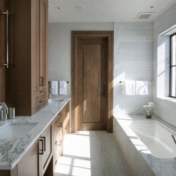
The client also wanted sustainable materials for their countertops and bathrooms. Many of the interior stones were either reclaimed materials or were sourced from Colorado quarries – Calacatta Lincoln was used extensively.
Gallegos sourced tiles from reclamation projects in Europe and Asia for use in the master bath and front entry areas. For many of the countertops, the owner’s interior designer spent hours looking through remnants and applied several throughout the residence.
Willow Court is a spectacular and dramatic nod to stone masonry, something the owner, architect, and builder can be proud of and, for the most part, was built with the environment in mind.
 Natural Stone Institute
Gallegos was contacted by a client about a project where stone was not just to be an accent material, but the main visual and perceived structural element to create a timeless architectural composition. To further the endeavor: all veneers and dimension stone must be locally sourced and sustainably quarried. The design called for a moss rock veneer with cut stone trim. Sourcing the sandstone moss rock was simple because there were several local quarries to use. The problem
was with the trim pieces.
Gallegos selected Colorado Buff sandstone for the trim since the buff body was a good contrast to the moss rock and it is a stone that can be cut to size. One main concern with any sedimentary stone is hitting what is known as a “dry” layer in the ledge. This is an area in the stone between sedimentary layers that has not solidified or cemented. It is still granular and can lead to future stone failure as water penetrates these layers and creates freeze/thaw issues. To avoid this, they used
an epoxy injected into the dry layers to help solidify the material and prevent any future failures.
The client also wanted sustainable materials for their countertops and bathrooms. Many of the interior stones were either reclaimed materials or were sourced from Colorado quarries – Calacatta Lincoln was used extensively.
Gallegos sourced tiles from reclamation projects in Europe and Asia for use in the master bath and front entry areas. For many of the countertops, the owner’s interior designer spent hours looking through remnants and applied several throughout the residence.
Willow Court is a spectacular and dramatic nod to stone masonry, something the owner, architect, and builder can be proud of and, for the most part, was built with the environment in mind.
 Donald Lococo Architects
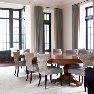
Awarded by the Classical institute of art and architecture , the linnean house has a restrained and simple elevation of doors and windows. Nestled in the Forest Hills neighborhood of Washington, D.C., the Linnean House is classical in both plan and elevation throughout its award-winning house plans. The main mass, comprising of the most formal and public spaces, is a spatial triptych along a symmetrical main axis. Inside the luxury home, the limestone façade, simple but well-proportioned with classical elements, extends itself into both the entry portico and main foyer with consistent proportions and materiality. This introduction allows the flanking living and dining rooms to be perceived as separate pavilions, each equipped with eight equal-proportioned French doors symmetrical of the main axis.
Beyond the classical spaces are two wings which lead to the master suite and a kitchen/family space, respectively. Both of which are situated to queue from the French door axis, a focal feature in the repeatedly published home design. At the entry foyer, the stark stone luxury architecture is warmed by two symmetrical wood armoire-like freestanding sculptural objects, a persistent theme throughout the luxury house. In the kitchen, for instance, stand four similar wood armoire objects at opposite corners that act as columns and help give this space a sense of boundary and enclosure. The master bath vanity, in similar fashion, is introduced as a central free-standing form anchoring itself as a notable presence in the space. Lastly, the wine room is designed as a series of free-standing heavy wood cavity walls spanned only by a hint of glass.

 Donald Lococo Architects
Awarded by the Classical institute of art and architecture , the linnean house has a restrained and simple elevation of doors and windows. Nestled in the Forest Hills neighborhood of Washington, D.C., the Linnean House is classical in both plan and elevation throughout its award-winning house plans. The main mass, comprising of the most formal and public spaces, is a spatial triptych along a symmetrical main axis. Inside the luxury home, the limestone façade, simple but well-proportioned with classical elements, extends itself into both the entry portico and main foyer with consistent proportions and materiality. This introduction allows the flanking living and dining rooms to be perceived as separate pavilions, each equipped with eight equal-proportioned French doors symmetrical of the main axis.
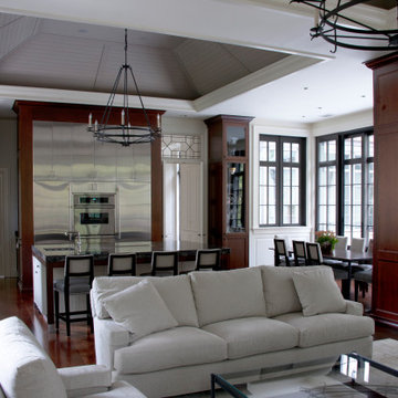
Beyond the classical spaces are two wings which lead to the master suite and a kitchen/family space, respectively. Both of which are situated to queue from the French door axis, a focal feature in the repeatedly published home design. At the entry foyer, the stark stone luxury architecture is warmed by two symmetrical wood armoire-like freestanding sculptural objects, a persistent theme throughout the luxury house. In the kitchen, for instance, stand four similar wood armoire objects at opposite corners that act as columns and help give this space a sense of boundary and enclosure. The master bath vanity, in similar fashion, is introduced as a central free-standing form anchoring itself as a notable presence in the space. Lastly, the wine room is designed as a series of free-standing heavy wood cavity walls spanned only by a hint of glass.
 Donald Lococo Architects
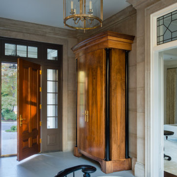
Awarded by the Classical institute of art and architecture , the linnean house has a restrained and simple elevation of doors and windows. Nestled in the Forest Hills neighborhood of Washington, D.C., the Linnean House is classical in both plan and elevation throughout its award-winning house plans. The main mass, comprising of the most formal and public spaces, is a spatial triptych along a symmetrical main axis. Inside the luxury home, the limestone façade, simple but well-proportioned with classical elements, extends itself into both the entry portico and main foyer with consistent proportions and materiality. This introduction allows the flanking living and dining rooms to be perceived as separate pavilions, each equipped with eight equal-proportioned French doors symmetrical of the main axis.
Beyond the classical spaces are two wings which lead to the master suite and a kitchen/family space, respectively. Both of which are situated to queue from the French door axis, a focal feature in the repeatedly published home design. At the entry foyer, the stark stone luxury architecture is warmed by two symmetrical wood armoire-like freestanding sculptural objects, a persistent theme throughout the luxury house. In the kitchen, for instance, stand four similar wood armoire objects at opposite corners that act as columns and help give this space a sense of boundary and enclosure. The master bath vanity, in similar fashion, is introduced as a central free-standing form anchoring itself as a notable presence in the space. Lastly, the wine room is designed as a series of free-standing heavy wood cavity walls spanned only by a hint of glass.
 Solar Luminance
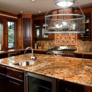
Solar Luminance – Semi-Custom Daylight Light Fixture
Model#: DLF-149
Style: Semi-Flush Pendant
Finish: Polished Chrome
Semi-Custom Product Shipment Lead Time: 6-10 Weeks*
The Solar Luminance DLF-149, is an Architectural Element Transitional Semi Flush Pendant, designed to assist the home owner, retail location and/or office location, the ability to benefit from Natural Daylight available with Tubular Skylight systems, while also reflecting your custom interior design and décor theme and needs.
Natural Daylight provides incredible mental and physical health and wellness benefits that help the human body and mind maintain a sense of time, absorb natural vitamins, and work with the human eye to perceive color and definition in clarity and contrast to increase visual awareness. Our hope is that your friends, colleagues and guests will be “Inspired & Design” in a way that is both elegant and considerate of the impact we have on the earth and its resources.
The DLF-149 is a Semi-Custom Fixture. Full Custom Versions and Options are available for price quote. Please feel free to contact a Solar Luminance Design Assistant for Full Custom Options.
 SkyWindows & Aluminum Products
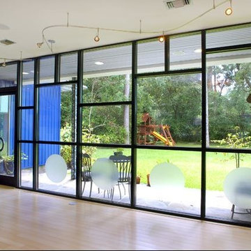
When a potential customer takes that first glimpse at a storefront, an initial impression is being formed and expectations are being set. Our work brings the added value that businesses require in order to showcase their products and increase their sales. The striking designs, that we are known for, are specifically created not only to be aesthetically pleasing, but to lure shoppers into your place of business.
Many individual business owners are unaware of the fact that creating the design that a potential customer sees from the street is an exact science when displaying products and constructing an eye catching visual presentation. We also understand that each business that we work with is unique when it comes to the way potential customers perceive that store. If a storefronts appearance is not constructed correctly, a potential customer may immediately dismiss that particular store as “unprofessional” or worse, they might not even register the presence of that store at all when it just blends into the background!
This is the main reason why we pride ourselves so highly on the work that we do for our clients. The professionals at our company understand the complex guidelines that dictate what attracts buyers with a perfect visual approach to a particular design. But, of course, the quality will also need to be superior so that fading and overall deterioration of that design will not become a detriment to the goals of a business owner. This is why we utilize only the best materials and exact construction standards that will allow a store owner’s exterior presentation to be visually pleasing to the eye for years to come.
Whether you need our assistance just to keep your store front from closing improperly or more extensive construction, we’re here to help you with all your business needs when it comes to the visual perception of your store.
 SkyWindows & Aluminum Products
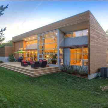
When a potential customer takes that first glimpse at a storefront, an initial impression is being formed and expectations are being set. Our work brings the added value that businesses require in order to showcase their products and increase their sales. The striking designs, that we are known for, are specifically created not only to be aesthetically pleasing, but to lure shoppers into your place of business.
Many individual business owners are unaware of the fact that creating the design that a potential customer sees from the street is an exact science when displaying products and constructing an eye catching visual presentation. We also understand that each business that we work with is unique when it comes to the way potential customers perceive that store. If a storefronts appearance is not constructed correctly, a potential customer may immediately dismiss that particular store as “unprofessional” or worse, they might not even register the presence of that store at all when it just blends into the background!
This is the main reason why we pride ourselves so highly on the work that we do for our clients. The professionals at our company understand the complex guidelines that dictate what attracts buyers with a perfect visual approach to a particular design. But, of course, the quality will also need to be superior so that fading and overall deterioration of that design will not become a detriment to the goals of a business owner. This is why we utilize only the best materials and exact construction standards that will allow a store owner’s exterior presentation to be visually pleasing to the eye for years to come.
Whether you need our assistance just to keep your store front from closing improperly or more extensive construction, we’re here to help you with all your business needs when it comes to the visual perception of your store.
 Creation Cabinetry
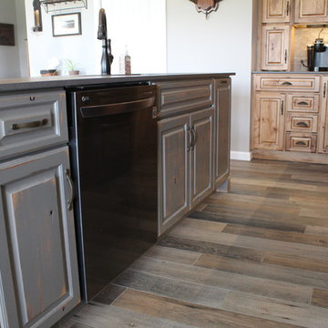
This Modern Rustic Kitchen is full of character with a rustic maple cabinetry, a rubbed through island, and countertops from Dekton by Cosentino!
Andrew Long
 Donald Lococo Architects
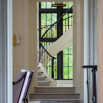
Awarded by the Classical institute of art and architecture , the linnean house has a restrained and simple elevation of doors and windows. Nestled in the Forest Hills neighborhood of Washington, D.C., the Linnean House is classical in both plan and elevation throughout its award-winning house plans. The main mass, comprising of the most formal and public spaces, is a spatial triptych along a symmetrical main axis. Inside the luxury home, the limestone façade, simple but well-proportioned with classical elements, extends itself into both the entry portico and main foyer with consistent proportions and materiality. This introduction allows the flanking living and dining rooms to be perceived as separate pavilions, each equipped with eight equal-proportioned French doors symmetrical of the main axis.
Beyond the classical spaces are two wings which lead to the master suite and a kitchen/family space, respectively. Both of which are situated to queue from the French door axis, a focal feature in the repeatedly published home design. At the entry foyer, the stark stone luxury architecture is warmed by two symmetrical wood armoire-like freestanding sculptural objects, a persistent theme throughout the luxury house. In the kitchen, for instance, stand four similar wood armoire objects at opposite corners that act as columns and help give this space a sense of boundary and enclosure. The master bath vanity, in similar fashion, is introduced as a central free-standing form anchoring itself as a notable presence in the space. Lastly, the wine room is designed as a series of free-standing heavy wood cavity walls spanned only by a hint of glass.
 SkyWindows & Aluminum Products
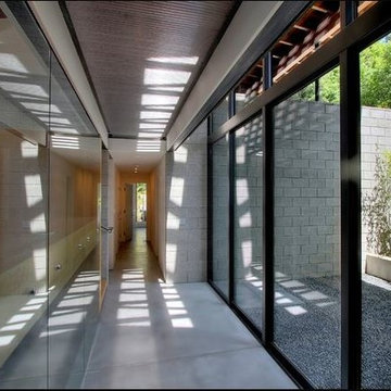
When a potential customer takes that first glimpse at a storefront, an initial impression is being formed and expectations are being set. Our work brings the added value that businesses require in order to showcase their products and increase their sales. The striking designs, that we are known for, are specifically created not only to be aesthetically pleasing, but to lure shoppers into your place of business.
Many individual business owners are unaware of the fact that creating the design that a potential customer sees from the street is an exact science when displaying products and constructing an eye catching visual presentation. We also understand that each business that we work with is unique when it comes to the way potential customers perceive that store. If a storefronts appearance is not constructed correctly, a potential customer may immediately dismiss that particular store as “unprofessional” or worse, they might not even register the presence of that store at all when it just blends into the background!
This is the main reason why we pride ourselves so highly on the work that we do for our clients. The professionals at our company understand the complex guidelines that dictate what attracts buyers with a perfect visual approach to a particular design. But, of course, the quality will also need to be superior so that fading and overall deterioration of that design will not become a detriment to the goals of a business owner. This is why we utilize only the best materials and exact construction standards that will allow a store owner’s exterior presentation to be visually pleasing to the eye for years to come.
Whether you need our assistance just to keep your store front from closing improperly or more extensive construction, we’re here to help you with all your business needs when it comes to the visual perception of your store.
 Natural Stone Institute
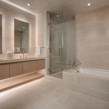
Gallegos was contacted by a client about a project where stone was not just to be an accent material, but the main visual and perceived structural element to create a timeless architectural composition. To further the endeavor: all veneers and dimension stone must be locally sourced and sustainably quarried. The design called for a moss rock veneer with cut stone trim. Sourcing the sandstone moss rock was simple because there were several local quarries to use. The problem
was with the trim pieces.
Gallegos selected Colorado Buff sandstone for the trim since the buff body was a good contrast to the moss rock and it is a stone that can be cut to size. One main concern with any sedimentary stone is hitting what is known as a “dry” layer in the ledge. This is an area in the stone between sedimentary layers that has not solidified or cemented. It is still granular and can lead to future stone failure as water penetrates these layers and creates freeze/thaw issues. To avoid this, they used
an epoxy injected into the dry layers to help solidify the material and prevent any future failures.
The client also wanted sustainable materials for their countertops and bathrooms. Many of the interior stones were either reclaimed materials or were sourced from Colorado quarries – Calacatta Lincoln was used extensively.
Gallegos sourced tiles from reclamation projects in Europe and Asia for use in the master bath and front entry areas. For many of the countertops, the owner’s interior designer spent hours looking through remnants and applied several throughout the residence.
Willow Court is a spectacular and dramatic nod to stone masonry, something the owner, architect, and builder can be proud of and, for the most part, was built with the environment in mind.
 Natural Stone Institute
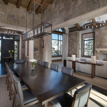
Gallegos was contacted by a client about a project where stone was not just to be an accent material, but the main visual and perceived structural element to create a timeless architectural composition. To further the endeavor: all veneers and dimension stone must be locally sourced and sustainably quarried. The design called for a moss rock veneer with cut stone trim. Sourcing the sandstone moss rock was simple because there were several local quarries to use. The problem
was with the trim pieces.
Gallegos selected Colorado Buff sandstone for the trim since the buff body was a good contrast to the moss rock and it is a stone that can be cut to size. One main concern with any sedimentary stone is hitting what is known as a “dry” layer in the ledge. This is an area in the stone between sedimentary layers that has not solidified or cemented. It is still granular and can lead to future stone failure as water penetrates these layers and creates freeze/thaw issues. To avoid this, they used
an epoxy injected into the dry layers to help solidify the material and prevent any future failures.
The client also wanted sustainable materials for their countertops and bathrooms. Many of the interior stones were either reclaimed materials or were sourced from Colorado quarries – Calacatta Lincoln was used extensively.
Gallegos sourced tiles from reclamation projects in Europe and Asia for use in the master bath and front entry areas. For many of the countertops, the owner’s interior designer spent hours looking through remnants and applied several throughout the residence.
Willow Court is a spectacular and dramatic nod to stone masonry, something the owner, architect, and builder can be proud of and, for the most part, was built with the environment in mind.
39