
Search results for "Physical appearance" in Home Design Ideas


 KINGDOM WOODWORKS
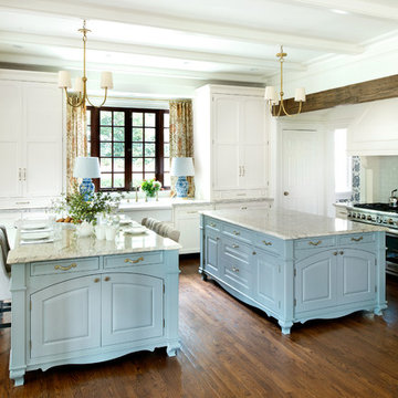
Collaboration with Canonbury Homes and Frank Neely Design Associates.
Inspiration for a timeless open concept kitchen remodel in Atlanta with beaded inset cabinets and two islands
Inspiration for a timeless open concept kitchen remodel in Atlanta with beaded inset cabinets and two islands
 Tile Doctor Ltd
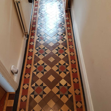
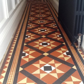
This client had just moved into a property in York and having pulled back the old carpet revealed a lovely old period Victorian tiled floor she didn’t know existed when she bought the house!
I went over at the beginning of this year to survey the floor and could see that fortunately, no glue or carpet grips had been used to secure the carpet; additionally the floor was in good physical condition considering its age with no cracks or loose tiles. The tiles were however very dusty and dirty with ingrained dirt and so had probably been covered with carpet for a very long time. The hallway was quite dark I’m afraid with little natural light so apologies for the photographs.
With old houses like this you never know what you are going to find so whilst I was there surveying the floor, I took some moisture readings with a damp meter on the floors and walls. The readings came back low so no sign of damp which was a relief to the owner.
We agreed a price for the work, and I arranged to come back the following week.
I must admit I do like York, its steeped in history and famous for its Cathedral and Viking museum. The houses in the city have loads of character and period features like this floor are quite common.
I deep cleaned the floor with a strong 1:3 dilution of Tile Doctor Pro-Clean worked in with a black scrubbing pad fitted to a rotary machine. Initially the solution was left to soak into the tile before being agitated by the machine. The soil was then rinsed off with minimal water and then extracted with a wet vacuum.
I followed this up with an Acid Wash using Tile Doctor Acid Gel to further clean up the tiles and help inhibit any potential efflorescent salt issues which are common in floors of this age due to the absence of the damp proof membrane. The floor was given a further rinse and extraction and allowed to dry out fully overnight. I needed the floor to be dry for the next day so it could be sealed.
I came back the next day and started by taking more damp readings which showed similar readings to the day before. Given the low readings I was able to move straight onto sealing which was done using four coats of Tile Doctor Seal and Go. This product works really well on old Victorian Tiles like these and being water based it doesn’t leave a smell as it dries.
Once the final coat of sealer had dried there was a significant improvement in the appearance of the floor which was much appreciated by client who was very happy with the end result.
For aftercare I recommended the use of Tile Doctor Neutral Tile Cleaner to maintain the floor, it has a nice fresh smell and can be used regularly due to its pH neutral nature which won’t prematurely erode the sealer like stronger bleach based cleaners.
Nigel Stoker
North West Yorkshire Tile Doctor
Find the right local pro for your project
 Cummings Architecture + Interiors
When Cummings Architects first met with the owners of this understated country farmhouse, the building’s layout and design was an incoherent jumble. The original bones of the building were almost unrecognizable. All of the original windows, doors, flooring, and trims – even the country kitchen – had been removed. Mathew and his team began a thorough design discovery process to find the design solution that would enable them to breathe life back into the old farmhouse in a way that acknowledged the building’s venerable history while also providing for a modern living by a growing family.
The redesign included the addition of a new eat-in kitchen, bedrooms, bathrooms, wrap around porch, and stone fireplaces. To begin the transforming restoration, the team designed a generous, twenty-four square foot kitchen addition with custom, farmers-style cabinetry and timber framing. The team walked the homeowners through each detail the cabinetry layout, materials, and finishes. Salvaged materials were used and authentic craftsmanship lent a sense of place and history to the fabric of the space.
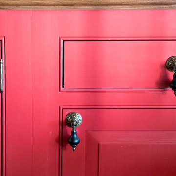
The new master suite included a cathedral ceiling showcasing beautifully worn salvaged timbers. The team continued with the farm theme, using sliding barn doors to separate the custom-designed master bath and closet. The new second-floor hallway features a bold, red floor while new transoms in each bedroom let in plenty of light. A summer stair, detailed and crafted with authentic details, was added for additional access and charm.
Finally, a welcoming farmer’s porch wraps around the side entry, connecting to the rear yard via a gracefully engineered grade. This large outdoor space provides seating for large groups of people to visit and dine next to the beautiful outdoor landscape and the new exterior stone fireplace.
Though it had temporarily lost its identity, with the help of the team at Cummings Architects, this lovely farmhouse has regained not only its former charm but also a new life through beautifully integrated modern features designed for today’s family.
Photo by Eric Roth

 McCullough's Flooring
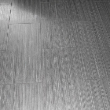
Gorgeous master bath finished with Dal-Tile's Fabrique porcelain tile in the color Noir Linen polished. Tile size is 12"x24" installed in a brick joint pattern. The floor boasts underfloor heating on a timed thermostat.
 RAJ Kitchen and Bath, LLC
**Check out the video of this transformation on our website**
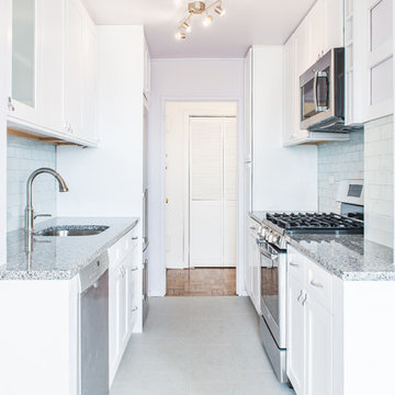
This small kitchen was way too small for this 2 bedrooms, 2 bathrooms apartment. Not only was it a very small kitchen, but the physical location of it made it very difficult to make it any bigger. There wasn't much that could have been done without incurring astronomical cost, which would get little or no return on the investment. The client wanted a kitchen that can be optimized in its current location to add a ton of value for resale.
This was difficult to do, because there was no moving of any mechanical around in the kitchen and even if we wanted to, the management of the building would not allow. For those of you who live in condos, co-ops or apartment building, you know how difficult it is to rework these foot prints. When we showed up, we saw the problems, but we also saw a huge opportunity where we can achieve those goals in the small space. This was accomplished by making some key changes and to incorporate some new things that was not possible when this kitchen was built years ago.
The crucial part of the design that would drive the entire new layout, was selecting the only appliance; that was the Refrigerator. Once we nailed down that refrigerator, we then proceeded to design the kitchen around it. We moved it to the other side of the wall where the sink was so that we can tap into the water line from the sink plumbing. It was crucial that it stays exactly 24" deep, not an inch more because we had to keep the entry as open as possible. Also, it was going to be directly in front of another big storage unit - The pantry. It is not ideal in most cases, but we needed the rest of the space to ramp up the design and open feel towards the side where all of the activities would take place, which happend to be the dining room and the view.
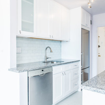
Once all that was figured out, we re-positioned the sink, dishwasher and the range and proceeded to wrap the cabinets around the columns to integrate them into the space. Thirty- six inches cabinets height was used so that they can be installed higher towards the ceiling height to give more room rather than the standard 18" required height between the counter tops. This was done to make the room feel a lot bigger than it really was. Not to mention, we also didn't want the faucet to be buried under the cabinets so that was also a necessary design detail for the space.
We then lowered both knee walls so that the counter top can sit on top of them, by removing that stop point that would have otherwise defined the kitchen area. This allowed us to pick up that extra footprint into the room for added prep space and enabled us to create the illusion of a kitchen that is looking longer than it really is. Every inch mattered when designing this kitchen and we made a conscious decision to use every one of that inch.
White cabinets were selected to do just what white cabinets are design to do; make a small or dark room appear bigger, brighter and more open. In this kitchen, this was amplified the more because of the kitchen location. It was perfect! We knew we did justice to the space because while we were there taking some photos, a few potential buyers walked in and went straight for the kitchen! They said its design just to fit the apartment.
Pantry roll out shelving, Double recycle bin, fancy handles, LED lighting, Quartz counter top, beautiful backslash tiles and grey linen floors finished off the kitchen which looked over a beautiful view of the George Washington Bridge from the top of this lovely 4th floor apartment.
Credit to Masterpiece Tile and Marble (Annmarie on the selection of Tiles and countertop and Val on the Construction to complete this project).
Davor Kokic Photography
 RAJ Kitchen and Bath, LLC
**Check out the video of this transformation on our website**
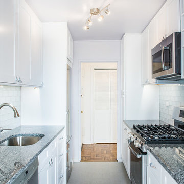
This small kitchen was way too small for this 2 bedrooms, 2 bathrooms apartment. Not only was it a very small kitchen, but the physical location of it made it very difficult to make it any bigger. There wasn't much that could have been done without incurring astronomical cost, which would get little or no return on the investment. The client wanted a kitchen that can be optimized in its current location to add a ton of value for resale.
This was difficult to do, because there was no moving of any mechanical around in the kitchen and even if we wanted to, the management of the building would not allow. For those of you who live in condos, co-ops or apartment building, you know how difficult it is to rework these foot prints. When we showed up, we saw the problems, but we also saw a huge opportunity where we can achieve those goals in the small space. This was accomplished by making some key changes and to incorporate some new things that was not possible when this kitchen was built years ago.
The crucial part of the design that would drive the entire new layout, was selecting the only appliance; that was the Refrigerator. Once we nailed down that refrigerator, we then proceeded to design the kitchen around it. We moved it to the other side of the wall where the sink was so that we can tap into the water line from the sink plumbing. It was crucial that it stays exactly 24" deep, not an inch more because we had to keep the entry as open as possible. Also, it was going to be directly in front of another big storage unit - The pantry. It is not ideal in most cases, but we needed the rest of the space to ramp up the design and open feel towards the side where all of the activities would take place, which happend to be the dining room and the view.
Once all that was figured out, we re-positioned the sink, dishwasher and the range and proceeded to wrap the cabinets around the columns to integrate them into the space. Thirty- six inches cabinets height was used so that they can be installed higher towards the ceiling height to give more room rather than the standard 18" required height between the counter tops. This was done to make the room feel a lot bigger than it really was. Not to mention, we also didn't want the faucet to be buried under the cabinets so that was also a necessary design detail for the space.
We then lowered both knee walls so that the counter top can sit on top of them, by removing that stop point that would have otherwise defined the kitchen area. This allowed us to pick up that extra footprint into the room for added prep space and enabled us to create the illusion of a kitchen that is looking longer than it really is. Every inch mattered when designing this kitchen and we made a conscious decision to use every one of that inch.
White cabinets were selected to do just what white cabinets are design to do; make a small or dark room appear bigger, brighter and more open. In this kitchen, this was amplified the more because of the kitchen location. It was perfect! We knew we did justice to the space because while we were there taking some photos, a few potential buyers walked in and went straight for the kitchen! They said its design just to fit the apartment.
Pantry roll out shelving, Double recycle bin, fancy handles, LED lighting, Quartz counter top, beautiful backslash tiles and grey linen floors finished off the kitchen which looked over a beautiful view of the George Washington Bridge from the top of this lovely 4th floor apartment.
Credit to Masterpiece Tile and Marble (Annmarie on the selection of Tiles and countertop and Val on the Construction to complete this project).
Davor Kokic Photography
 CairnsCraft Design & Remodel
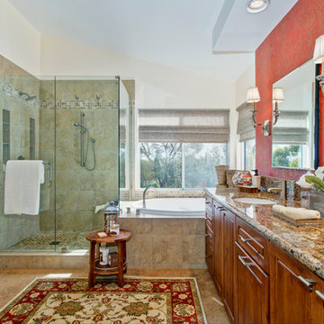
Great spacious bathroom with lot of amenities.
Photographer: Jon Upson
Large elegant master beige tile and porcelain tile drop-in bathtub photo in San Diego with an undermount sink, raised-panel cabinets, medium tone wood cabinets, granite countertops, beige walls and a two-piece toilet
Large elegant master beige tile and porcelain tile drop-in bathtub photo in San Diego with an undermount sink, raised-panel cabinets, medium tone wood cabinets, granite countertops, beige walls and a two-piece toilet
 RAJ Kitchen and Bath, LLC
**Check out the video of this transformation on our website**
This small kitchen was way too small for this 2 bedrooms, 2 bathrooms apartment. Not only was it a very small kitchen, but the physical location of it made it very difficult to make it any bigger. There wasn't much that could have been done without incurring astronomical cost, which would get little or no return on the investment. The client wanted a kitchen that can be optimized in its current location to add a ton of value for resale.
This was difficult to do, because there was no moving of any mechanical around in the kitchen and even if we wanted to, the management of the building would not allow. For those of you who live in condos, co-ops or apartment building, you know how difficult it is to rework these foot prints. When we showed up, we saw the problems, but we also saw a huge opportunity where we can achieve those goals in the small space. This was accomplished by making some key changes and to incorporate some new things that was not possible when this kitchen was built years ago.
The crucial part of the design that would drive the entire new layout, was selecting the only appliance; that was the Refrigerator. Once we nailed down that refrigerator, we then proceeded to design the kitchen around it. We moved it to the other side of the wall where the sink was so that we can tap into the water line from the sink plumbing. It was crucial that it stays exactly 24" deep, not an inch more because we had to keep the entry as open as possible. Also, it was going to be directly in front of another big storage unit - The pantry. It is not ideal in most cases, but we needed the rest of the space to ramp up the design and open feel towards the side where all of the activities would take place, which happend to be the dining room and the view.
Once all that was figured out, we re-positioned the sink, dishwasher and the range and proceeded to wrap the cabinets around the columns to integrate them into the space. Thirty- six inches cabinets height was used so that they can be installed higher towards the ceiling height to give more room rather than the standard 18" required height between the counter tops. This was done to make the room feel a lot bigger than it really was. Not to mention, we also didn't want the faucet to be buried under the cabinets so that was also a necessary design detail for the space.
We then lowered both knee walls so that the counter top can sit on top of them, by removing that stop point that would have otherwise defined the kitchen area. This allowed us to pick up that extra footprint into the room for added prep space and enabled us to create the illusion of a kitchen that is looking longer than it really is. Every inch mattered when designing this kitchen and we made a conscious decision to use every one of that inch.
White cabinets were selected to do just what white cabinets are design to do; make a small or dark room appear bigger, brighter and more open. In this kitchen, this was amplified the more because of the kitchen location. It was perfect! We knew we did justice to the space because while we were there taking some photos, a few potential buyers walked in and went straight for the kitchen! They said its design just to fit the apartment.
Pantry roll out shelving, Double recycle bin, fancy handles, LED lighting, Quartz counter top, beautiful backslash tiles and grey linen floors finished off the kitchen which looked over a beautiful view of the George Washington Bridge from the top of this lovely 4th floor apartment.
Credit to Masterpiece Tile and Marble (Annmarie on the selection of Tiles and countertop and Val on the Construction to complete this project).
Davor Kokic Photography
 Tile Doctor Ltd
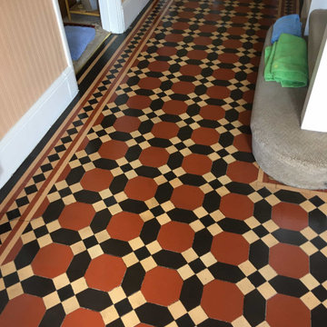
This Victorian floor in Twickenham, Middlesex was in good physical condition for its age but needed a good deep clean. Our customer had informed us that they had never cleaned or sealed the floor in the sixteen years that they had lived there so it was well overdue.
I went over to survey the floor and completed a test clean on a small section of tiling to see which products/techniques would work best. I like to do this as it demonstrates to the client what can be done, and it allows me to come up with an accurate price for doing the work.
As you can see from the pictures, there was quite a difference in the test patch compared to the rest of the floor. Years of foot traffic from the street had taken its’ toll and the floor was very dirty. Luckily, the floor was in very good condition and had not worn too badly.
Once they had seen the test patch, they were confident that it would be worth go ahead with my quote. It would ensure that the period feature was retained for many years to come. The colours on the floor were quite faded so it would be nice to get it restored.
I started the cleaning process by first taping up the surrounding skirting boards and doors to ensure they were protected from potential splashing. Cleaning involved spraying the Victorian tiles with a strong dilution of Tile Doctor Pro-Clean which is a dedicated Tile and Grout cleaning product. This was left to soak in for about ten minutes and then scrubbed in using a black pad fitted to a heavy-duty rotary scrubber.
This gives the floor a good mechanical scrub and works wonders releasing the ground-in dirt and soil from the tiles. The strong dilution of Pro-Clean will also remove any remaining sealers from the tile, however after sixteen years I doubted there would much trace of sealer left. Once done the floor was rinsed with water and all the soils removed with a wet vacuum.
Following the initial clean the colours were already much stronger. Next step however was to improve on that by giving the floor an acid rinse using Tile Doctor Grout Clean-Up. This removes mineral deposits and generally brightens up the appearance of the tile. After another round of scrubbing the floor was rinsed with our high-pressure washer and then vacuumed, extracting all of the dirty water and dirt away in one go. The floor was looking a lot better and was left to dry overnight.
After allowing the floor to dry overnight, we returned the next day to seal the floor. First, checking the floor was dry using the damp meter. Floors of this age can take a little longer to dry as there is no damp-proof membrane so it’s always worth checking as applying a sealer to damp tiles is not a good idea.
Once I was satisfied it was dry eight coats of Tile Doctor Seal and Go sheen finish sealer were applied. This takes a while to do as each coat needs to dry before applying the next. The sealer will protect the Victorian tiles for dirt and stains, it also enhanced the colours in the tile and will make it easier to keep the floor clean going forward.
My client was very pleased with the floor and mentioned that they should have called me in sooner! For aftercare cleaning I recommended Tile Doctor Neutral Clean which is an effective cleaner with a neutral pH, its designed for cleaning tiles without degrading the sealer.
Jonathan Oldham
South Middlesex Tile Doctor
 Interior Pros - Design Studio
The grey trend has evolved in the last twelve months. Nowadays browns, beige and a touch of grey are in demand. Greige is the new buzzword.
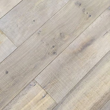
Heavier hand scraped or contoured products, the rage that started around 2005 has taken a back seat in most areas, while a softer wire brushed "ceruse effect" seen mostly on White Oak has been remarkably strong showing no effects of becoming “dated” like the others mentioned.
Ceruse Color Possibilities
There are numerous color combinations to the "cerused" process with the most popular being white or off white. This design trend in hardwood flooring can have darker gray white oak with a mild ceruse off white effect.
There are limitless possibilities in either a prefinished hardwood floor or with what we can create for you in a custom on-site finished hardwood floor.
If something suits your fancy, contact us and we can work on creating just the look and sense of style you are looking for.
 Natural Stone Institute
Tucker Design Awards celebrate the innovation and vision that designers bring to their projects through the specification and use of natural stone materials. For members of the Natural Stone Institute, acknowledgement as a contributor to a Tucker Design Awards winning project is a genuine tribute to their traditional values, physicality of work and dedication to precise specifications required in the realization of such accomplished architectural design.
Landscape Architect
Design Workshop, Aspen, CO
Architect
Poss Architecture, Aspen, CO
Landscape Contractor
Landscape Workshop, Carbondale, CO
Stone Supplier/Installer
Gallegos Corporation, Wolcott, CO
Stone Quarry
Arkins Park Stone, Loveland, CO
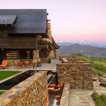
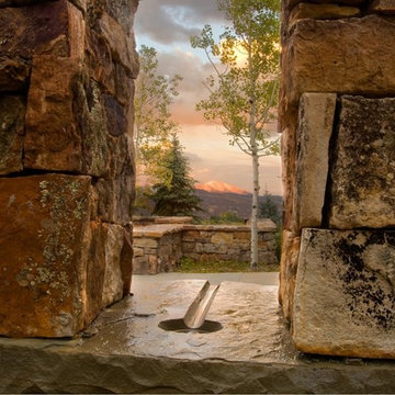
Within walled boundaries, Woody Creek Garden embraces its high alpine environment through explorations of stone and water that serve as unifying elements of form in the design of the various outdoor spaces. Through striking and distinctively detailed stonework, water is portrayed in its various states and forms – atmospheric mist, single rivulets, cascades, and still pools. Two courtyards interlink the residence allowing each room to enjoy the visual landscape. In the entrance courtyard, the sound from a carved 24”x 24” cut-granite fountain reverberates throughout the walled space. Placed for gathering and quiet contemplation, a pin-wheel arrangement of sculptural, granite slabs provide a honed surface for sitting while providing year-round interest. Each stone was individually specified with intentionally spaced core fractures, utilizing the extraction method to serve as sculpted details. Large sandstone pavers, set in sand and cut in an irregular, but geometric fashion bring a sense of modernity to the space. Throughout the property, stone detailing seek to heighten one’s experience of the landscape and views. Upon the home’s entry, an 18” rectilinear cut in the freestanding stone wall frames a distant peak, creating a singular reference to the outside world in this encased space. Emerging from the center of an organically-shaped carved sandstone slab, water is carried along a narrow 2” runnel sandstone cap, disappearing into the framed horizon. This glimpse to the west is the only opening in the tightly enclosed courtyard. From its opposite aspect, the feature creates a welcoming gesture at the home’s front entrance. The slender rivulet of water trickles from the sandstone slab above onto a honed granite plane, set within a sandstone terrace In contrast, a second promontory courtyard commands a strong presence over its alpine setting, leaving the steeply sloping site undisturbed. A 12’x 40’ reflecting pool – a thin sheet of water over honed black granite – captures the form and silence of the everchanging natural environment on its taut surface. Along its edge, water flows over a ½” radius edge, disappearing into a recirculating slot. Commissioned by Italian artist Bruno Romeda, a bronze sculpture rests upon an elevated granite plinth. Along its western edge, designers crafted a two-tiered, infinity edge detail. In the first vertical drop, water flows between the pool and perimeter stone walls, landing onto an intermediate bench, while the second drop introduces a chamfered edge, allowing water to embrace the vertical relief without splashing. Sandstone terraces provide continuous access to the various landscape features of the garden. At the base of the battered perimeter walls, a sandstone path leads to a fire pit, encircled by lichen-covered boulders. Along the courtyard’s eastern perimeter, water appears to emerge from the hillside, fracturing and falling against the irregular vertical stone wall, melting in a curtain-like formation behind the spa. The colors, distinctive detailing and striking stonework were selected based on their appropriateness to the context. From above, a rectilinear pool lies behind the wall, silently mirroring the sky above and offering no ostensible connection to the structure or to its source.
 Natural Stone Institute
Tucker Design Awards celebrate the innovation and vision that designers bring to their projects through the specification and use of natural stone materials. For members of the Natural Stone Institute, acknowledgement as a contributor to a Tucker Design Awards winning project is a genuine tribute to their traditional values, physicality of work and dedication to precise specifications required in the realization of such accomplished architectural design.
Landscape Architect
Design Workshop, Aspen, CO
Architect
Poss Architecture, Aspen, CO
Landscape Contractor
Landscape Workshop, Carbondale, CO
Stone Supplier/Installer
Gallegos Corporation, Wolcott, CO
Stone Quarry
Arkins Park Stone, Loveland, CO
Within walled boundaries, Woody Creek Garden embraces its high alpine environment through explorations of stone and water that serve as unifying elements of form in the design of the various outdoor spaces. Through striking and distinctively detailed stonework, water is portrayed in its various states and forms – atmospheric mist, single rivulets, cascades, and still pools. Two courtyards interlink the residence allowing each room to enjoy the visual landscape. In the entrance courtyard, the sound from a carved 24”x 24” cut-granite fountain reverberates throughout the walled space. Placed for gathering and quiet contemplation, a pin-wheel arrangement of sculptural, granite slabs provide a honed surface for sitting while providing year-round interest. Each stone was individually specified with intentionally spaced core fractures, utilizing the extraction method to serve as sculpted details. Large sandstone pavers, set in sand and cut in an irregular, but geometric fashion bring a sense of modernity to the space. Throughout the property, stone detailing seek to heighten one’s experience of the landscape and views. Upon the home’s entry, an 18” rectilinear cut in the freestanding stone wall frames a distant peak, creating a singular reference to the outside world in this encased space. Emerging from the center of an organically-shaped carved sandstone slab, water is carried along a narrow 2” runnel sandstone cap, disappearing into the framed horizon. This glimpse to the west is the only opening in the tightly enclosed courtyard. From its opposite aspect, the feature creates a welcoming gesture at the home’s front entrance. The slender rivulet of water trickles from the sandstone slab above onto a honed granite plane, set within a sandstone terrace In contrast, a second promontory courtyard commands a strong presence over its alpine setting, leaving the steeply sloping site undisturbed. A 12’x 40’ reflecting pool – a thin sheet of water over honed black granite – captures the form and silence of the everchanging natural environment on its taut surface. Along its edge, water flows over a ½” radius edge, disappearing into a recirculating slot. Commissioned by Italian artist Bruno Romeda, a bronze sculpture rests upon an elevated granite plinth. Along its western edge, designers crafted a two-tiered, infinity edge detail. In the first vertical drop, water flows between the pool and perimeter stone walls, landing onto an intermediate bench, while the second drop introduces a chamfered edge, allowing water to embrace the vertical relief without splashing. Sandstone terraces provide continuous access to the various landscape features of the garden. At the base of the battered perimeter walls, a sandstone path leads to a fire pit, encircled by lichen-covered boulders. Along the courtyard’s eastern perimeter, water appears to emerge from the hillside, fracturing and falling against the irregular vertical stone wall, melting in a curtain-like formation behind the spa. The colors, distinctive detailing and striking stonework were selected based on their appropriateness to the context. From above, a rectilinear pool lies behind the wall, silently mirroring the sky above and offering no ostensible connection to the structure or to its source.
 Tile Doctor Ltd
Here’s a job I completed just before Christmas last year, at a house in Northampton which has a rich history and mix of architectural styles. The run up to Christmas is always popular as people try to get their household projects finished off in time for celebrating the festive season with family so this is always a busy time for Tile Doctor.
The photos below show a neglected Victorian Quarry tiled floor in need of repair, with cracked tiles along the edges. These were caused by somebody in the past using brute force to remove carpet gripper rods which had been glued to the tiles. These cracks were present around the edges of the entire hallway, however; this particular type of tile is very hard to get hold of. Furthermore, it is a costly process to replace the tiles as the skirting boards would have had to have been removed.
As well as the physical issues the floor had a dull appearance due to the build-up of builder’s dust and the general wearing down of the paintwork over time. I agreed with the client that the best course of action would be to fill the tiles, and paint the damaged tiles using a colour that matched as close as possible. Many of my Tile Doctor colleagues would disagree with this approach opting to source the correct tile and rebuild the damaged section however unfortunately in this case we didn’t have the time or the budget.
My first action was to use a brush and vacuum to remove as much loose debris and dust as possible. I followed this by agitating the tiles with a dilution of Tile Doctor Pro Clean which is a strong alkaline product and safe to use on tile and stone. I use a combination of a coarse burnishing pad fitted to a rotary machine and hand held brushes, in order to get the floor clean. The resulting slurry was then rinsed and removed using a wet vacuum. This process was repeated twice followed by a thorough rinse to ensure any trace of cleaning agent had been removed and the floor neutralised.
As this was such an old property, I then used a steamer to heat up the tiles in order to draw out any contaminants and assist with the drying process. I installed a fan to dry the floor before starting repairs, mixing up some coloured grout and filling all holes and cracks along the edges, including the doormat area.
I allowed the coloured grout to dry overnight, before hand painting the black and Terracotta tiles. These were then given time to dry (about a couple of hours). Following this, I carefully painted in the other colours: brown and cream. The overall effect was quite convincing and you had to look very closely to notice.
Due to the fact that there were other tradesmen working in the house at the time, the floors were sheeted up to protect from additional dust and muck. I then left the house for a week, allowing the floor ample time to dry completely in preparation for sealing.
Upon my return, I took damp meter readings, and once satisfied with the dryness of the tiles, I began the sealing process with the impregnating, colour-enhancing sealer Tile Doctor Colour Grow. The sealer provides both durable surface protection and an aesthetically pleasing matte finish.
The below photos show how the product has enriched the colours with the two coats applied.
The process of restoring this wonderful Victorian Quarry tiled floor was certainly time consuming, but very rewarding. I am exceptionally pleased with the results myself, and my client couldn’t have been happier and I’m sure the newly revitalised hallway will have been a talking point for all their visitors during the Christmas break.
Phil Vissian
Northamptonshire Tile Doctor
 Natural Stone Institute
Tucker Design Awards celebrate the innovation and vision that designers bring to their projects through the specification and use of natural stone materials. For members of the Natural Stone Institute, acknowledgement as a contributor to a Tucker Design Awards winning project is a genuine tribute to their traditional values, physicality of work and dedication to precise specifications required in the realization of such accomplished architectural design.
Landscape Architect
Design Workshop, Aspen, CO
Architect
Poss Architecture, Aspen, CO
Landscape Contractor
Landscape Workshop, Carbondale, CO
Stone Supplier/Installer
Gallegos Corporation, Wolcott, CO
Stone Quarry
Arkins Park Stone, Loveland, CO
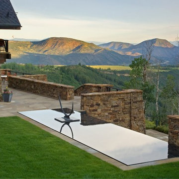
Within walled boundaries, Woody Creek Garden embraces its high alpine environment through explorations of stone and water that serve as unifying elements of form in the design of the various outdoor spaces. Through striking and distinctively detailed stonework, water is portrayed in its various states and forms – atmospheric mist, single rivulets, cascades, and still pools. Two courtyards interlink the residence allowing each room to enjoy the visual landscape. In the entrance courtyard, the sound from a carved 24”x 24” cut-granite fountain reverberates throughout the walled space. Placed for gathering and quiet contemplation, a pin-wheel arrangement of sculptural, granite slabs provide a honed surface for sitting while providing year-round interest. Each stone was individually specified with intentionally spaced core fractures, utilizing the extraction method to serve as sculpted details. Large sandstone pavers, set in sand and cut in an irregular, but geometric fashion bring a sense of modernity to the space. Throughout the property, stone detailing seek to heighten one’s experience of the landscape and views. Upon the home’s entry, an 18” rectilinear cut in the freestanding stone wall frames a distant peak, creating a singular reference to the outside world in this encased space. Emerging from the center of an organically-shaped carved sandstone slab, water is carried along a narrow 2” runnel sandstone cap, disappearing into the framed horizon. This glimpse to the west is the only opening in the tightly enclosed courtyard. From its opposite aspect, the feature creates a welcoming gesture at the home’s front entrance. The slender rivulet of water trickles from the sandstone slab above onto a honed granite plane, set within a sandstone terrace In contrast, a second promontory courtyard commands a strong presence over its alpine setting, leaving the steeply sloping site undisturbed. A 12’x 40’ reflecting pool – a thin sheet of water over honed black granite – captures the form and silence of the everchanging natural environment on its taut surface. Along its edge, water flows over a ½” radius edge, disappearing into a recirculating slot. Commissioned by Italian artist Bruno Romeda, a bronze sculpture rests upon an elevated granite plinth. Along its western edge, designers crafted a two-tiered, infinity edge detail. In the first vertical drop, water flows between the pool and perimeter stone walls, landing onto an intermediate bench, while the second drop introduces a chamfered edge, allowing water to embrace the vertical relief without splashing. Sandstone terraces provide continuous access to the various landscape features of the garden. At the base of the battered perimeter walls, a sandstone path leads to a fire pit, encircled by lichen-covered boulders. Along the courtyard’s eastern perimeter, water appears to emerge from the hillside, fracturing and falling against the irregular vertical stone wall, melting in a curtain-like formation behind the spa. The colors, distinctive detailing and striking stonework were selected based on their appropriateness to the context. From above, a rectilinear pool lies behind the wall, silently mirroring the sky above and offering no ostensible connection to the structure or to its source.
 Natural Stone Institute
Tucker Design Awards celebrate the innovation and vision that designers bring to their projects through the specification and use of natural stone materials. For members of the Natural Stone Institute, acknowledgement as a contributor to a Tucker Design Awards winning project is a genuine tribute to their traditional values, physicality of work and dedication to precise specifications required in the realization of such accomplished architectural design.
Landscape Architect
Design Workshop, Aspen, CO
Architect
Poss Architecture, Aspen, CO
Landscape Contractor
Landscape Workshop, Carbondale, CO
Stone Supplier/Installer
Gallegos Corporation, Wolcott, CO
Stone Quarry
Arkins Park Stone, Loveland, CO
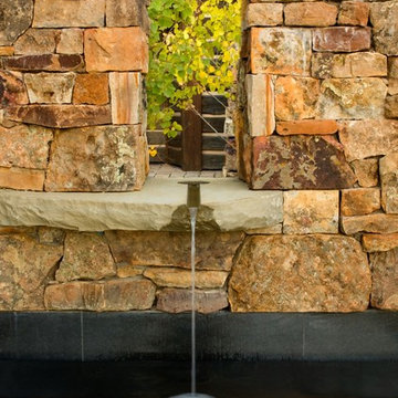
Within walled boundaries, Woody Creek Garden embraces its high alpine environment through explorations of stone and water that serve as unifying elements of form in the design of the various outdoor spaces. Through striking and distinctively detailed stonework, water is portrayed in its various states and forms – atmospheric mist, single rivulets, cascades, and still pools. Two courtyards interlink the residence allowing each room to enjoy the visual landscape. In the entrance courtyard, the sound from a carved 24”x 24” cut-granite fountain reverberates throughout the walled space. Placed for gathering and quiet contemplation, a pin-wheel arrangement of sculptural, granite slabs provide a honed surface for sitting while providing year-round interest. Each stone was individually specified with intentionally spaced core fractures, utilizing the extraction method to serve as sculpted details. Large sandstone pavers, set in sand and cut in an irregular, but geometric fashion bring a sense of modernity to the space. Throughout the property, stone detailing seek to heighten one’s experience of the landscape and views. Upon the home’s entry, an 18” rectilinear cut in the freestanding stone wall frames a distant peak, creating a singular reference to the outside world in this encased space. Emerging from the center of an organically-shaped carved sandstone slab, water is carried along a narrow 2” runnel sandstone cap, disappearing into the framed horizon. This glimpse to the west is the only opening in the tightly enclosed courtyard. From its opposite aspect, the feature creates a welcoming gesture at the home’s front entrance. The slender rivulet of water trickles from the sandstone slab above onto a honed granite plane, set within a sandstone terrace In contrast, a second promontory courtyard commands a strong presence over its alpine setting, leaving the steeply sloping site undisturbed. A 12’x 40’ reflecting pool – a thin sheet of water over honed black granite – captures the form and silence of the everchanging natural environment on its taut surface. Along its edge, water flows over a ½” radius edge, disappearing into a recirculating slot. Commissioned by Italian artist Bruno Romeda, a bronze sculpture rests upon an elevated granite plinth. Along its western edge, designers crafted a two-tiered, infinity edge detail. In the first vertical drop, water flows between the pool and perimeter stone walls, landing onto an intermediate bench, while the second drop introduces a chamfered edge, allowing water to embrace the vertical relief without splashing. Sandstone terraces provide continuous access to the various landscape features of the garden. At the base of the battered perimeter walls, a sandstone path leads to a fire pit, encircled by lichen-covered boulders. Along the courtyard’s eastern perimeter, water appears to emerge from the hillside, fracturing and falling against the irregular vertical stone wall, melting in a curtain-like formation behind the spa. The colors, distinctive detailing and striking stonework were selected based on their appropriateness to the context. From above, a rectilinear pool lies behind the wall, silently mirroring the sky above and offering no ostensible connection to the structure or to its source.
 RAJ Kitchen and Bath, LLC
**Check out the video of this transformation on our website**
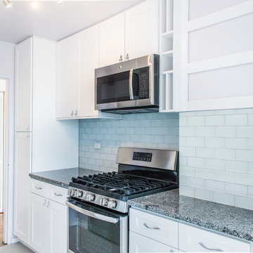
This small kitchen was way too small for this 2 bedrooms, 2 bathrooms apartment. Not only was it a very small kitchen, but the physical location of it made it very difficult to make it any bigger. There wasn't much that could have been done without incurring astronomical cost, which would get little or no return on the investment. The client wanted a kitchen that can be optimized in its current location to add a ton of value for resale.
This was difficult to do, because there was no moving of any mechanical around in the kitchen and even if we wanted to, the management of the building would not allow. For those of you who live in condos, co-ops or apartment building, you know how difficult it is to rework these foot prints. When we showed up, we saw the problems, but we also saw a huge opportunity where we can achieve those goals in the small space. This was accomplished by making some key changes and to incorporate some new things that was not possible when this kitchen was built years ago.
The crucial part of the design that would drive the entire new layout, was selecting the only appliance; that was the Refrigerator. Once we nailed down that refrigerator, we then proceeded to design the kitchen around it. We moved it to the other side of the wall where the sink was so that we can tap into the water line from the sink plumbing. It was crucial that it stays exactly 24" deep, not an inch more because we had to keep the entry as open as possible. Also, it was going to be directly in front of another big storage unit - The pantry. It is not ideal in most cases, but we needed the rest of the space to ramp up the design and open feel towards the side where all of the activities would take place, which happend to be the dining room and the view.
Once all that was figured out, we re-positioned the sink, dishwasher and the range and proceeded to wrap the cabinets around the columns to integrate them into the space. Thirty- six inches cabinets height was used so that they can be installed higher towards the ceiling height to give more room rather than the standard 18" required height between the counter tops. This was done to make the room feel a lot bigger than it really was. Not to mention, we also didn't want the faucet to be buried under the cabinets so that was also a necessary design detail for the space.
We then lowered both knee walls so that the counter top can sit on top of them, by removing that stop point that would have otherwise defined the kitchen area. This allowed us to pick up that extra footprint into the room for added prep space and enabled us to create the illusion of a kitchen that is looking longer than it really is. Every inch mattered when designing this kitchen and we made a conscious decision to use every one of that inch.
White cabinets were selected to do just what white cabinets are design to do; make a small or dark room appear bigger, brighter and more open. In this kitchen, this was amplified the more because of the kitchen location. It was perfect! We knew we did justice to the space because while we were there taking some photos, a few potential buyers walked in and went straight for the kitchen! They said its design just to fit the apartment.
Pantry roll out shelving, Double recycle bin, fancy handles, LED lighting, Quartz counter top, beautiful backslash tiles and grey linen floors finished off the kitchen which looked over a beautiful view of the George Washington Bridge from the top of this lovely 4th floor apartment.
Credit to Masterpiece Tile and Marble (Annmarie on the selection of Tiles and countertop and Val on the Construction to complete this project).
Davor Kokic Photography
 RAJ Kitchen and Bath, LLC
**Check out the video of this transformation on our website**
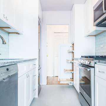
This small kitchen was way too small for this 2 bedrooms, 2 bathrooms apartment. Not only was it a very small kitchen, but the physical location of it made it very difficult to make it any bigger. There wasn't much that could have been done without incurring astronomical cost, which would get little or no return on the investment. The client wanted a kitchen that can be optimized in its current location to add a ton of value for resale.
This was difficult to do, because there was no moving of any mechanical around in the kitchen and even if we wanted to, the management of the building would not allow. For those of you who live in condos, co-ops or apartment building, you know how difficult it is to rework these foot prints. When we showed up, we saw the problems, but we also saw a huge opportunity where we can achieve those goals in the small space. This was accomplished by making some key changes and to incorporate some new things that was not possible when this kitchen was built years ago.
The crucial part of the design that would drive the entire new layout, was selecting the only appliance; that was the Refrigerator. Once we nailed down that refrigerator, we then proceeded to design the kitchen around it. We moved it to the other side of the wall where the sink was so that we can tap into the water line from the sink plumbing. It was crucial that it stays exactly 24" deep, not an inch more because we had to keep the entry as open as possible. Also, it was going to be directly in front of another big storage unit - The pantry. It is not ideal in most cases, but we needed the rest of the space to ramp up the design and open feel towards the side where all of the activities would take place, which happend to be the dining room and the view.
Once all that was figured out, we re-positioned the sink, dishwasher and the range and proceeded to wrap the cabinets around the columns to integrate them into the space. Thirty- six inches cabinets height was used so that they can be installed higher towards the ceiling height to give more room rather than the standard 18" required height between the counter tops. This was done to make the room feel a lot bigger than it really was. Not to mention, we also didn't want the faucet to be buried under the cabinets so that was also a necessary design detail for the space.
We then lowered both knee walls so that the counter top can sit on top of them, by removing that stop point that would have otherwise defined the kitchen area. This allowed us to pick up that extra footprint into the room for added prep space and enabled us to create the illusion of a kitchen that is looking longer than it really is. Every inch mattered when designing this kitchen and we made a conscious decision to use every one of that inch.
White cabinets were selected to do just what white cabinets are design to do; make a small or dark room appear bigger, brighter and more open. In this kitchen, this was amplified the more because of the kitchen location. It was perfect! We knew we did justice to the space because while we were there taking some photos, a few potential buyers walked in and went straight for the kitchen! They said its design just to fit the apartment.
Pantry roll out shelving, Double recycle bin, fancy handles, LED lighting, Quartz counter top, beautiful backslash tiles and grey linen floors finished off the kitchen which looked over a beautiful view of the George Washington Bridge from the top of this lovely 4th floor apartment.
Credit to Masterpiece Tile and Marble (Annmarie on the selection of Tiles and countertop and Val on the Construction to complete this project).
Davor Kokic Photography
 Spire North
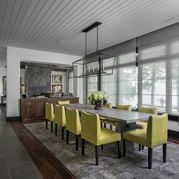
Tucked away in the backwoods of Torch Lake, this home marries “rustic” with the sleek elegance of modern. The combination of wood, stone and metal textures embrace the charm of a classic farmhouse. Although this is not your average farmhouse. The home is outfitted with a high performing system that seamlessly works with the design and architecture.
The tall ceilings and windows allow ample natural light into the main room. Spire Integrated Systems installed Lutron QS Wireless motorized shades paired with Hartmann & Forbes windowcovers to offer privacy and block harsh light. The custom 18′ windowcover’s woven natural fabric complements the organic esthetics of the room. The shades are artfully concealed in the millwork when not in use.
Spire installed B&W in-ceiling speakers and Sonance invisible in-wall speakers to deliver ambient music that emanates throughout the space with no visual footprint. Spire also installed a Sonance Landscape Audio System so the homeowner can enjoy music outside.
Each system is easily controlled using Savant. Spire personalized the settings to the homeowner’s preference making controlling the home efficient and convenient.
5