
Search results for "Physics" in Home Design Ideas
 Studio Zung
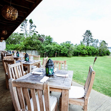
The concept and design of the hotel and restaurant was done in collaboration with Sean MacPherson to transform the aging but extraordinary property into an authentic surf shack. The architectural goal was to create simplicity out of natural materials while allowing the physical expansiveness of the location to shine through. This involved extracting the design down to the wood structure, framing, and elements. Locally sourced cedar lines the rooms, absorbing the summer and early fall quality of light, allowing the inside and outside to blue and age together in natural harmony. The perfection of the space embodied in the imperfections.

 Magikflame
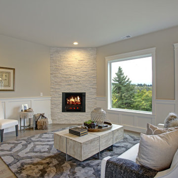
With the 28" Insert Only inspired by MagikFlame, you can upgrade your home décor and stay warm all winter long. Its easy-to-use controls and realistic flame effects make it a perfect addition to any living space. Discover MagikFlame electric fireplaces: https://magikflame.com/product-category/buy-electric-fireplaces/
Dimensions: 28"W x 32"T x 12"D
Our patented HoloFlame technology is a real game-changer. Others use a mechanical means to recreate the look of fire. Instead, we use actual video of real fire which we then project onto a physical log set making it look like those logs are actually burning. Therefore, you get all the details you would with real fire like wispy smoke and even burning embers which other fireplaces are not capable of producing. We spent 5 years of R&D to produce this cutting-edge technology.
At MagikFlame, our goal is to create the most realistic electric fireplaces ever made. We also believe in improving quality of life by providing people with the best possible cozy and relaxing environment every night. Using our patented holoflame technology, we've innovated the electric fireplace to bring you effortless cozy with friends and family. Because quality family time and relaxation after a hard workday or activity is life changing.
Experience 30 Flames. Built-In Heater. Sound.
Subscribe to our channel for tips on how to enhance your interior design, accessories, and focal points. Learn more about fireplace technology and the cozy, relaxation, and family atmosphere improvements to your home. We have everything you need to guide you on a journey to forge the American home and better living atmosphere.
Shop With Us Online: https://magikflame.com
Like MagikFlame on Facebook: https://www.facebook.com/MagikFlame
Follow MagikFlame on Instagram: https://www.instagram.com/magikflamefireplaces/
Tweet With Us: https://twitter.com/MagikFlameFire
Pin With Us: https://www.pinterest.com/MagikFlameElectricFireplaces
We attempt to be as accurate as possible. However, MagikFlame cannot guarantee that product descriptions, images or other content of products or services are 100% accurate, complete, reliable, current, or error-free. Some items may appear slightly larger or smaller than the actual size due to screen defaults and photography techniques. This also includes any momentary stutters or artifacts in frames of the flame video loop. Other items may be represented at a larger than the actual size in order to clearly show details, or smaller than the actual size to show the entire item.
Find the right local pro for your project
 studioWTA
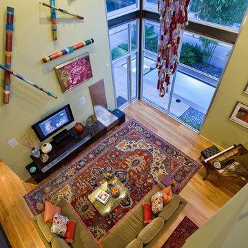
The double-height living space benefits from an enormous window providing visual and physical connection to a paved terrace and lap pool.
Photo by Jeff Johnston
 MCDW + Architecture
Kitchen Cube 1
Upper East- Residence
Work: Full Gut renovation- 2 apartments- in the same ‘S’ line
Size: 650 Sq Ft of space in both apartments, 5S and 4S
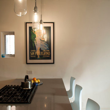
Using the Frankfurt Kitchen of 1926 for inspiration, Ms.Cianfaglione began asking herself how the typology of the NYC kitchenette for her building, in the ‘S’ line, needed to be upgraded to fit today’s physical and aesthetic needs. The Frankfurt Kitchen was the forerunner of modern fitted kitchens and had an unified concept to enable efficient work, consolidating a woman’s efforts and allowing her more time to spend else ware. But unlike the Frankfurt kitchen, Ms. Cianfaglione wanted to take this a step further and open it up rather than concealing it, and its user, inside a room. This would showcase the designer’s evolved notion of “cooking”,that would now become an orchestrated dance to be put on display.
Ms. Cianfaglione had a typical NYC kitchenette, a small room with an air grille for ventilation, and in this case, there was a small window that was currently blocked by a refrigerator. There was also the problem of the foyer space, which was just a waste in an apartment this small, and the structural wall that could not be removed. Ms. Cianfaglione responded to these conditions by designing the kitchen to become a wrap around condition, in an ‘L’ shape, that would use the foyer more effectively and at the same time, face the living area, and all the while concealing the structural wall that separates them.
The interesting thing about the ‘L’ shape was that it allows for a beautifully orchestrated flow that makes cooking look like a beautiful dance that moves back and forth along the’ L.’
The appliances are designed within the cabinetry to give a tailored look that does not allow for distraction, and you instead focus on the user. This renovation made the otherwise small, unused foyer and ineffective kitchen, now a focal point that dictates movement throughout. The kitchen has unified and designed an otherwise standard one bedroom apartment and seeks to become a new standard in this building’s typology.
 Montana Timber Products
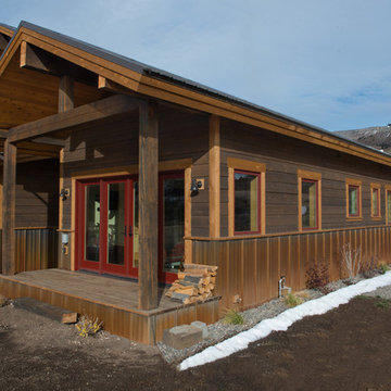
Views can’t get much better than this, especially framed by Montana Timber Products ranchwood™ Timbers. This magnificent rustic home perched over the highlands of Wyoming exhibits all that our company is about.
The Ranchwood Prairie finish was chosen to accentuate the natural beauty surrounding this high-mountain Wyoming cabin. Montana Timber Products has the ability to work with Timbers in both Douglas Fir and Western Red Cedar and we have several texturing options from a very smooth surfaced option to a Pioneer texture that will look like it lived through a shootout at the OK Saloon.
Our flagship product, ranchwood™ is Montana Timber Products’ chemical free, kiln dried, alternative milled rough stock wood.
As an ideal reclaimed lumber alternative, the aesthetically pleasing rustic barn wood ranchwood™ is the result of an environmentally safe production process.
Offering uncompromising natural, rustic beauty, ranchwood™ is typically less expensive than antique reclaimed barnwood.
Here we see a horizontal square edge lap siding finished in Ranchwood Eastern and hi-lighted by the Ranchwood Prairie natural wood columns. Montana Timber Products is an excellent choice to provide a variety of exposed beams and exposed timber accents, both for exterior and interior applications.
Wire Brushed and Circle Sawn are Montana Timber Products typical texturizing options, but Montana Timber Products is a custom millwork shop that caters to our customer’s needs.
Circle Sawn texture seen on Montana Timber Products natural wood siding is created by large circular saw blades used in more traditional milling practices.
Added physical and aesthetic depth to the wood grain is available as the Wire Brushed option.
Greater surface area is added during the texturizing process, allowing Seal-Once, 100% NO VOC waterfproofer to more effectively penetrate the wood.
Seal-Once is guaranteed for ten years from water ingress and is safe for exterior and interior use, pets and children.
Montana Timber Products receives repeat orders from contractors who appreciate the fast turnaround time, the custom pre-finishes, variety of color options, and the ability to handle small columns or large ridge beams such a 10″ x 30″ beam applied to this project.
If the environmentally friendly and the renewable aspect of natural wood siding is important to you, be sure to do your homework when choosing your siding, interior accents, trim, timbers, or other wood siding products. Some companies choose to use degenerative chemicals to achieve the desired look and texture of rustic wood siding. This is not the case with Montana Timber Products.
Vintage wood, reclaimed barn wood and reclaimed barn wood alternatives are very popular building materials due to their aesthetic beauty, traditional look, and chemical free finish.

 LiLu Interiors
LiLu transformed a St. Anthony Park neighborhood church into this sanctuary for treatment. The interior offers a balance of old and new: referencing the historic setting while creating a contemporary environment that appeals to a youthful spirit. LiLu’s design also meets the residents’ medical needs, offering space for social interaction and self-reflection to enhance both physical and emotional healing.
----
Project designed by Minneapolis interior design studio LiLu Interiors. They serve the Minneapolis-St. Paul area including Wayzata, Edina, and Rochester, and they travel to the far-flung destinations that their upscale clientele own second homes in.
----
For more about LiLu Interiors, click here: https://www.liluinteriors.com/
---
To learn more about this project, click here:
https://www.liluinteriors.com/blog/portfolio-items/healing-haven/
 Lamont Bros. Design & Construction
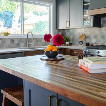
This Portland kitchen transformation focused on reimagining the flow and functionality of the space, while also refreshing its look and feel. The original layout featured a peninsula that created a visual and physical barrier between the cooking and dining areas—and the patio outside—limiting both movement and social interaction.
The homeowners goal was to remove this dividing element and replacing it with a thoughtfully designed custom island that serves as both a functional workspace and a natural gathering point. This strategic change opened up the entire space, creating a seamless flow while maintaining distinct zones for cooking and dining.
Because one of the homeowners is a talented woodworker, we were able to incorporate some really lovely, custom handmade elements throughout the kitchen and dining room.
The result is a kitchen that not only functions better but creates a more inviting environment for both everyday living and entertaining.
 KB Design +
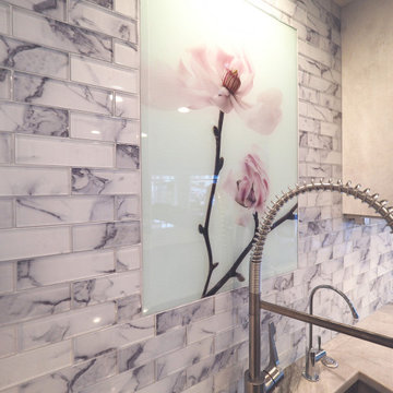
A city condo needed an uplift, all finishes started to feel outdated, the kitchen's layout did not work for a dynamic couple who love to entertain and play Bridge with their friends on the regular basis.
We developed a plan how to provide a luxurious experience and necessary changes in the limited space. The condo has some physical limitations as well, such as the load bearing walls could not be changed, the duct work had to stay in place, and the floor finishes had to satisfy strict sound restrictions.
 Lanson B. Jones & Co, Inc.
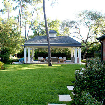
Primarily English in style with French leanings, this manor boasts two grand outdoor scaled rooms with each centered on two separate lawns allowing the entire space to be visually and physically tied together. Custom cut stone was used to create a "green pathway" by allowing ground cover (or in this case, lawn) to exist between stepping pads, making the path appear to be "floating".
 RAJ Kitchen and Bath, LLC
**Check out the video of this transformation on our website**
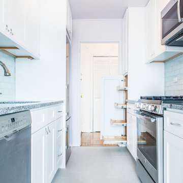
This small kitchen was way too small for this 2 bedrooms, 2 bathrooms apartment. Not only was it a very small kitchen, but the physical location of it made it very difficult to make it any bigger. There wasn't much that could have been done without incurring astronomical cost, which would get little or no return on the investment. The client wanted a kitchen that can be optimized in its current location to add a ton of value for resale.
This was difficult to do, because there was no moving of any mechanical around in the kitchen and even if we wanted to, the management of the building would not allow. For those of you who live in condos, co-ops or apartment building, you know how difficult it is to rework these foot prints. When we showed up, we saw the problems, but we also saw a huge opportunity where we can achieve those goals in the small space. This was accomplished by making some key changes and to incorporate some new things that was not possible when this kitchen was built years ago.
The crucial part of the design that would drive the entire new layout, was selecting the only appliance; that was the Refrigerator. Once we nailed down that refrigerator, we then proceeded to design the kitchen around it. We moved it to the other side of the wall where the sink was so that we can tap into the water line from the sink plumbing. It was crucial that it stays exactly 24" deep, not an inch more because we had to keep the entry as open as possible. Also, it was going to be directly in front of another big storage unit - The pantry. It is not ideal in most cases, but we needed the rest of the space to ramp up the design and open feel towards the side where all of the activities would take place, which happend to be the dining room and the view.
Once all that was figured out, we re-positioned the sink, dishwasher and the range and proceeded to wrap the cabinets around the columns to integrate them into the space. Thirty- six inches cabinets height was used so that they can be installed higher towards the ceiling height to give more room rather than the standard 18" required height between the counter tops. This was done to make the room feel a lot bigger than it really was. Not to mention, we also didn't want the faucet to be buried under the cabinets so that was also a necessary design detail for the space.
We then lowered both knee walls so that the counter top can sit on top of them, by removing that stop point that would have otherwise defined the kitchen area. This allowed us to pick up that extra footprint into the room for added prep space and enabled us to create the illusion of a kitchen that is looking longer than it really is. Every inch mattered when designing this kitchen and we made a conscious decision to use every one of that inch.
White cabinets were selected to do just what white cabinets are design to do; make a small or dark room appear bigger, brighter and more open. In this kitchen, this was amplified the more because of the kitchen location. It was perfect! We knew we did justice to the space because while we were there taking some photos, a few potential buyers walked in and went straight for the kitchen! They said its design just to fit the apartment.
Pantry roll out shelving, Double recycle bin, fancy handles, LED lighting, Quartz counter top, beautiful backslash tiles and grey linen floors finished off the kitchen which looked over a beautiful view of the George Washington Bridge from the top of this lovely 4th floor apartment.
Credit to Masterpiece Tile and Marble (Annmarie on the selection of Tiles and countertop and Val on the Construction to complete this project).
Davor Kokic Photography
 Irene Designs
Kitchen — Project Description (Bolton, CT)
(Full Renovation • Reconfiguration • Architectural Corrections)
The original kitchen suffered from spatial imbalance and limited functionality: the right side was visually and physically heavy with cabinetry and appliances, the 135-degree angled walls lacked symmetry due to a missing window on the driveway side, and the small island could only seat two. Circulation was obstructed by a desk positioned in the main traffic flow, and the low French door felt disproportionate in scale compared to the large windows and adjacent two-story Great Room.
Major Structural & Functional Improvements
Repositioned window on the front elevation to the right, creating a long-desired view to the driveway while freeing space for a centered cooktop and statement hood — visually aligning with the Great Room’s redesigned fireplace focal wall.
Installed a new custom sliding door, significantly taller and wider than the original French door. This upgrade enhances natural light, visually opens the kitchen to the deck, and provides unobstructed traffic flow thanks to its sliding operation.
New Kitchen Layout & Enhanced Functionality
Designed an entirely new layout centered around a 10' double-slab island, providing expansive workspace and a natural gathering zone.
Added conversational seating for the whole family, allowing comfortable interaction on all sides of the island.
Introduced purpose-designed storage solutions, including pullouts, rollouts, spice towers, tray organizers, and deep drawers to maximize usability.
Reallocated the desk area to a dedicated window spot overlooking the backyard, removing it from traffic paths and improving both functionality and comfort.
Cabinetry & Architectural Detailing
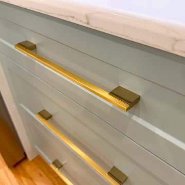
Custom two-tone cabinetry in soft white and a serene blue-green tone reflects the visual language of the adjacent Great Room, creating whole-home cohesion.
Installed lit upper glass cabinets along the entire perimeter, balancing vertical proportions and creating an elegant display band throughout the kitchen.
A custom range hood was designed and painted to match the base cabinetry, becoming a focal point framed by symmetrical windows.
Surfaces, Lighting & Finishes
The island features a double-thickness quartz slab with a soft ogee radius for a timeless, furniture-like feel.
A full-height, handcrafted aqua subway tile backsplash introduces depth, texture, and a gentle reflective quality.
New layered lighting concept, including recessed lights, pendants, task lighting, and integrated cabinet lighting, ensures a warm and functional workspace at any time of day.
 Disney Construction Company
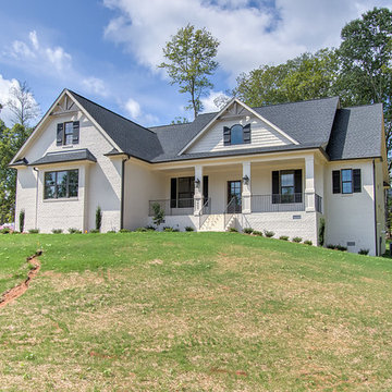
Mid-sized transitional white two-story brick exterior home photo in Other with a shingle roof
 Utopia 360 Studio
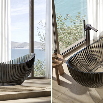
Leader Online, a UK-based company, approached us to support the launch of Nosa, a new sanitary ware brand targeting the British market.
With competition in the sector increasing, they required a cohesive set of visuals for their numerous products to establish a consistent visual language across e-commerce platforms, catalogs, and promotional materials.
It was a complete brand creation from scratch, and we pulled it off.
Key tasks:
- Develop a cohesive visual brand identity for Nosa
- Produce over 2,000 high-quality 3D visualizations
within five months
- Optimize workflows for high efficiency and a unified
visual standard
Our approach:
To efficiently manage high production volumes and accelerate feedback, we implemented an optimized workflow system. This transformed our render production into an assembly line, drastically cutting individual product processing time while upholding top image quality.
Nosa's unique marble, with its distinct veins and inclusions, was central to their brand. Since no existing textures matched, we requested physical samples.
Upon receiving the stone, we set up an improvised photo studio, capturing every detail. Our goal was
not just to replicate the marble in 3D, but to preserve
its raw, organic beauty.
We applied the same meticulous process to metal materials for accurate shade representation. Nosa prioritized authenticity, ensuring buyers saw the true material, not an over-polished version.
Result:
Nosa's market entry surpassed all expectations.
Fueled by its compelling visual identity, the brand achieved strong initial sales and is now rapidly expanding its product range, cementing its presence.
We are proud to continue our partnership with Nosa
to this day.
 Art Drenched Life
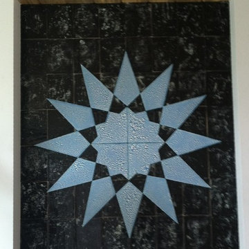
This tile installation anchored a functional thermal mass to a gas fireplace. We designed a geometric star form held in relief against a glassy, black background sprinkled with white reflective highlights that simultaneously evoked a night sky sprinkled with stars, and shallow black water glistening in moonlight. The star itself is glazed in a vivid blue with white tesselations sinking seamlessly into the blue and is mounted physically in the foreground of the piece. Photo by Michael Linsley
 Sosna Inc
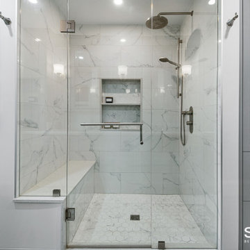
ouble the bathroom trouble in this 1990’s home … solved with this Sosna renovation!
Our clients, empty-nesters desiring the peace and ease of retirement, were instead frustrated and exhausted with leaky bathroom plumbing from a previous renovation that would just not go away.
Their Shared Bathroom, renovated by their friend years ago, was not done correctly, causing repetitive leaking with damage to their Kitchen ceiling below. They had had enough of trying to fix it themselves. To say this couple was leery of hiring another renovator was an understatement.
But they also knew it was time to fix this problem and decided to update their Master Bathroom while they were at it.
Our initial plan included minimal demolition by re-organizing the walls between the 2 Bathrooms and keeping the existing plumbing rough-ins in place, while updating the fixtures.
However, unwelcome surprises are sometimes inevitable in renovations. Even though we conducted a thorough investigation during the planning stage, we were faced with plumbing in the Shared Bathroom that was not done correctly and may even have been illegal.
Because of this, relocating the rough-ins in the Shared Bathroom were necessary after all, which then meant re-planning the walls in between the 2 Bathrooms.
These are exactly the kinds of problems we love to solve. Why? Because we know that we’re not just fixing the physical problems that can be seen; we know we are also restoring this family’s faith in quality craftsmanship and good service, and that it’s possible to enjoy the renovation process.
This is why we don’t vary from our tried and true Renovating the Sosna Way™ process.
Because it works. For everyone.
For the Masons, we ended up renovating two bathrooms and completing a number of smaller projects that were causing them great pain to find a renovator for.
At the end of the day, we have another happy client. The Masons have two new bathrooms that better fit their life stage and style, and the “Honey-Do” list is empty!
When you and your home are ready for an upgrade, we're the Renovator You Can Count On™. It's our promise. Contact us to get started!
 LBK Design Build
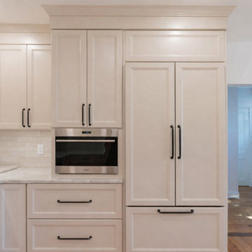
This kitchen was reimagined to improve flow, increase usable storage, and create a cleaner, more cohesive layout while maintaining the existing footprint. The original space felt segmented with a closed-off pantry, heavy stone elements, and inconsistent cabinetry that limited function. The new design removes visual and physical barriers, introduces a more efficient working layout, and incorporates a warm, neutral palette with layered textures. A mix of painted cabinetry, natural wood tones, and copper accents creates contrast while still feeling cohesive. The addition of a peninsula adds prep space and casual seating, while improved lighting and a taller window bring more light into the space.
 Granit Architects + Interiors
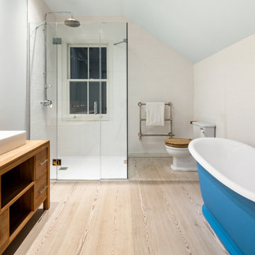
We are delighted to have completed the radical transformation of a tired detached property in South Croydon.
When they appointed Granit, our clients were living in the property which had previously been divided into a number of flats.
The historic sub-division had resulted in an extremely poor use of space with redundant staircases, kitchens and bathrooms throughout.
Our clients sought to reconfigure the property back into a single dwelling for his growing family.
Our client had an eye for design and was keen to balance contemporary design whilst maintaining as much of the character of the original house.
Maximising natural light, space and establishing a visual and physical connection were also key drivers for the design. Owing to the size of the property, it became apparent that reconfiguration rather than extension provided the solution to meet the brief.
A metal clad ‘intervention’ was introduced to the rear facade. This created a strong horizontal element creating a visual balance with the vertical nature of the three storey gable.
The metal cladding specified echoed the colour of the red brick string courses tying old with new. Slender frame sliding doors provide access and views of the large garden.
The central circulation space was transformed by the introduction of a double height glazed slot wrapping up the rear facade and onto the roof. This allows daylight to permeate into the heart of the otherwise dark deep floor plan. The staircase was reconfigured into a series of landings looking down over the main void space below and out towards the tree canopies at the rear of the garden.
The introduction of double pocket doors throughout the ground floor creates a series of interconnected spaces and the whitewashed Larch flooring flows seamlessly from room to room. A bold palette of colours and materials lends character and texture throughout the property.
The end result is a spacious yet cosy environment for the family to inhabit for years to come.
 The Rug Company
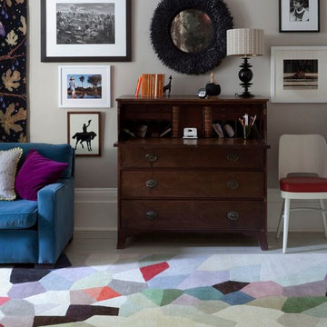
"Palette and Zap depict an explosion of colour that developed out of painted and collaged forms combined with computer manipulation. So much of our visual experience now is rooted in the saturation of images via screen-based technology. My intention therefore, was to transform this visual experience of colour into a physical and tactile one via the beauty of the natural materials and their appeal to the sense of touch." Fiona Curran
 RWH Architect PLLC
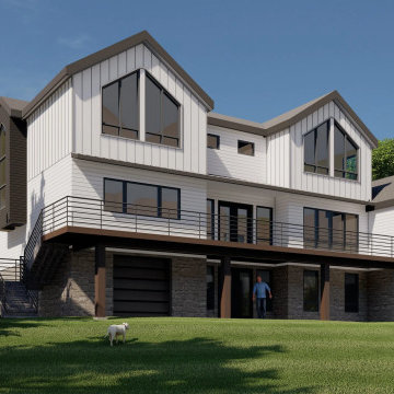
Residing on the shores of Canobie Lake, this custom-designed lakefront home represents a refined balance between architectural precision, site constraints, and the Client’s vision for everyday living and entertaining. Situated on a compact 0.62-acre sloped lot, the project presented a clear and demanding challenge: every room in the home was required to capture a meaningful view of the lake.
RWH Architect addressed this challenge by carefully angling the home’s footprint to maximize the site’s 130 feet of waterfront while framing expansive views of sunsets and seasonal fireworks. The resulting form embraces the slope of the land, allowing the architecture to step naturally with the terrain while opening interior spaces toward the water. This strategic orientation ensured that no space felt disconnected from the lake, transforming the view into a defining architectural element rather than an afterthought.
Designed with entertaining at its core, the home features open-concept living spaces that flow effortlessly toward the shoreline. The kitchen anchors the main living level with top-of-the-line appliances and generous workspace, supporting both daily use and large gatherings. A sleek linear propane fireplace defines the living room seating area, adding warmth without interrupting sightlines to the water beyond. Large expanses of glass dissolve the boundary between indoors and out, guiding guests toward uninterrupted lake views from nearly every vantage point.
The first-floor primary suite is conceived as a private retreat, combining comfort and luxury with direct visual and physical connections to the lake. Expansive glass doors open toward the shoreline, while the suite includes a walk-in closet, a spa-inspired bathroom with walk-in shower, and a double vanity, all oriented to maintain a sense of calm and retreat.
On the second floor, guest bedrooms continue the home’s commitment to water-focused design, each offering panoramic lake views. Two full bathrooms and a welcoming den create flexible spaces for family and guests, reinforcing the home’s role as both a personal residence and a destination for gathering.
A two-car garage provides protected parking and ample storage for lake equipment, completing a design that is both elegant and highly functional. Through thoughtful planning and a deep understanding of the site, RWH Architect transformed a challenging footprint into a cohesive lakefront home where architecture, landscape, and lifestyle are seamlessly aligned.
89