
Search results for "Physics" in Home Design Ideas
 Granit Architects + Interiors
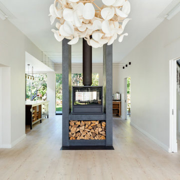
We are delighted to have completed the radical transformation of a tired detached property in South Croydon.
When they appointed Granit, our clients were living in the property which had previously been divided into a number of flats.
The historic sub-division had resulted in an extremely poor use of space with redundant staircases, kitchens and bathrooms throughout.
Our clients sought to reconfigure the property back into a single dwelling for his growing family.
Our client had an eye for design and was keen to balance contemporary design whilst maintaining as much of the character of the original house.
Maximising natural light, space and establishing a visual and physical connection were also key drivers for the design. Owing to the size of the property, it became apparent that reconfiguration rather than extension provided the solution to meet the brief.
A metal clad ‘intervention’ was introduced to the rear facade. This created a strong horizontal element creating a visual balance with the vertical nature of the three storey gable.
The metal cladding specified echoed the colour of the red brick string courses tying old with new. Slender frame sliding doors provide access and views of the large garden.
The central circulation space was transformed by the introduction of a double height glazed slot wrapping up the rear facade and onto the roof. This allows daylight to permeate into the heart of the otherwise dark deep floor plan. The staircase was reconfigured into a series of landings looking down over the main void space below and out towards the tree canopies at the rear of the garden.
The introduction of double pocket doors throughout the ground floor creates a series of interconnected spaces and the whitewashed Larch flooring flows seamlessly from room to room. A bold palette of colours and materials lends character and texture throughout the property.
The end result is a spacious yet cosy environment for the family to inhabit for years to come.
 Holmes Fine Gardens
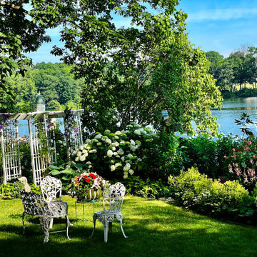
This wooded, lakeside home plays an influential role in the homeowners artistic vision as a magical realist painter. By providing an environment that comes alive with the sights and sounds of nature, the artist is able to closely study as an explorer would by uncovering, recording, and rearranging the beauty of the natural world and the beauty of human beings.
This connection to nature comes from a horticultural interest manifested in the daily ritual of digging and pruning in her Connecticut garden. A daily ritual of physical immersion with the dirt and the worms of life contrasts with the otherworldly fantastical spaces the artist creates for her paintings. The paradoxical character of these two places imbues her paintings with an alluring mystery.
 Architect Fred M Fargotstein
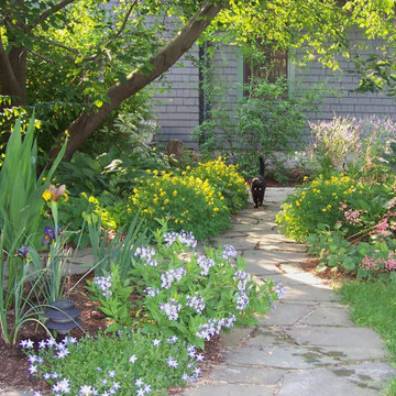
The essential importance of connecting a building to its landscape—both visually and physically— is an underlying philosophy in all of my work. This concept is reflected in my garden by the way in which windows and french doors link both the master bedroom and the studio to the private deck that is nestled between them. The notion is further reinforced by the flowering vine-covered trellis that screens the deck from an adjacent property, and by broad steps that lead from the deck to the patio and shade garden below. Overarching birch limbs provide shade and frame views of the valley to the east, while a border of various dense shrubs shields this tiny urban sanctuary from passersby.
Find the right local pro for your project
 Irene Designs
Kitchen — Project Description (Bolton, CT)
(Full Renovation • Reconfiguration • Architectural Corrections)
The original kitchen suffered from spatial imbalance and limited functionality: the right side was visually and physically heavy with cabinetry and appliances, the 135-degree angled walls lacked symmetry due to a missing window on the driveway side, and the small island could only seat two. Circulation was obstructed by a desk positioned in the main traffic flow, and the low French door felt disproportionate in scale compared to the large windows and adjacent two-story Great Room.
Major Structural & Functional Improvements
Repositioned window on the front elevation to the right, creating a long-desired view to the driveway while freeing space for a centered cooktop and statement hood — visually aligning with the Great Room’s redesigned fireplace focal wall.
Installed a new custom sliding door, significantly taller and wider than the original French door. This upgrade enhances natural light, visually opens the kitchen to the deck, and provides unobstructed traffic flow thanks to its sliding operation.
New Kitchen Layout & Enhanced Functionality
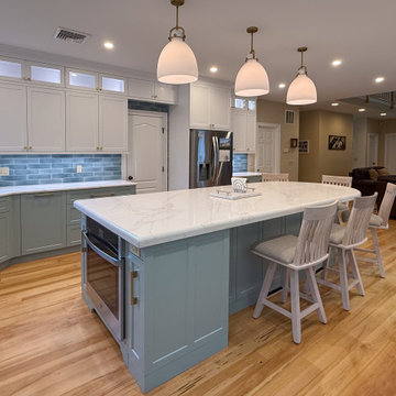
Designed an entirely new layout centered around a 10' double-slab island, providing expansive workspace and a natural gathering zone.
Added conversational seating for the whole family, allowing comfortable interaction on all sides of the island.
Introduced purpose-designed storage solutions, including pullouts, rollouts, spice towers, tray organizers, and deep drawers to maximize usability.
Reallocated the desk area to a dedicated window spot overlooking the backyard, removing it from traffic paths and improving both functionality and comfort.
Cabinetry & Architectural Detailing
Custom two-tone cabinetry in soft white and a serene blue-green tone reflects the visual language of the adjacent Great Room, creating whole-home cohesion.
Installed lit upper glass cabinets along the entire perimeter, balancing vertical proportions and creating an elegant display band throughout the kitchen.
A custom range hood was designed and painted to match the base cabinetry, becoming a focal point framed by symmetrical windows.
Surfaces, Lighting & Finishes
The island features a double-thickness quartz slab with a soft ogee radius for a timeless, furniture-like feel.
A full-height, handcrafted aqua subway tile backsplash introduces depth, texture, and a gentle reflective quality.
New layered lighting concept, including recessed lights, pendants, task lighting, and integrated cabinet lighting, ensures a warm and functional workspace at any time of day.
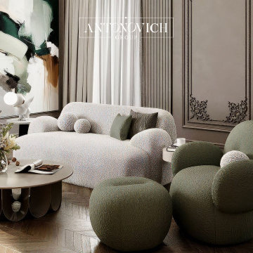
 Luxury Antonovich Design AE
In the realm of high-end residential design, few spaces hold as much personal significance as the master bedroom. Antonovich Group has mastered the art of transforming these intimate spaces into luxurious sanctuaries that perfectly balance opulent aesthetics with ultimate comfort, setting new standards for sophisticated bedroom environments.
Defining Luxury in Bedroom Interior Design Dubai
The evolution of bedroom interior design Dubai has reached unprecedented heights under Antonovich Group's expert guidance. Their approach goes far beyond traditional luxury, creating spaces that serve as personal retreats where every detail contributes to an atmosphere of refined elegance and tranquil sophistication.
Each bedroom project begins with understanding the client's lifestyle and personal preferences, then translating these insights into cohesive design narratives. Rich textures, carefully curated color palettes, and bespoke furnishings come together to create environments that feel both grand and intimately personal. The integration of premium materials—from hand-selected marbles to custom millwork—ensures that every surface reflects the highest standards of craftsmanship.
The Art of Modern Bedroom Design Dubai
Antonovich Group's modern bedroom design Dubai projects showcase how contemporary aesthetics can enhance rather than compromise luxury and comfort. Their modern approach embraces clean lines, sophisticated neutral palettes, and innovative spatial arrangements while maintaining the warmth and intimacy essential to bedroom environments.
Floor-to-ceiling windows frame carefully designed views, while strategic lighting creates multiple moods throughout the day and evening. Built-in storage solutions maintain the clean aesthetic while providing practical functionality, and integrated technology systems allow for seamless control of lighting, climate, and entertainment without compromising the room's serene atmosphere.
The modern bedroom design philosophy extends to the selection of furnishings, where streamlined silhouettes and exceptional materials create focal points that feel both contemporary and timeless. Custom headboards become sculptural elements, while carefully chosen accent pieces add personality without cluttering the peaceful environment.
Comprehensive Fitout Excellence
The fitout process represents where Antonovich Group's attention to detail truly shines. Every element, from custom closet systems to integrated lighting solutions, is designed and installed with precision that reflects their commitment to perfection. The result is bedrooms that function as seamlessly as they inspire, with every practical need anticipated and elegantly addressed.
Their fitout approach includes sophisticated climate control systems that maintain optimal comfort year-round, advanced acoustic treatments that ensure peaceful rest, and integrated technology that enhances convenience without intruding on the room's aesthetic harmony. Custom storage solutions maximize space efficiency while maintaining the clean lines essential to luxury design.
Beyond the Bedroom: Creating Complete Suites
Antonovich Group's bedroom projects often encompass entire master suite environments, including luxurious en-suite bathrooms, private sitting areas, and walk-in closets that rival high-end boutiques. These connected spaces flow seamlessly together, creating comprehensive private retreats that serve multiple functions while maintaining design cohesion.
The integration of wellness elements—from spa-inspired bathroom features to meditation corners—reflects their understanding that modern luxury bedrooms must support both physical comfort and mental well-being. Each suite becomes a complete lifestyle environment designed to refresh and restore.
Timeless Luxury with Contemporary Relevance
What sets Antonovich Group apart in the competitive luxury design market is their ability to create bedrooms that feel both timelessly elegant and completely contemporary. Their designs avoid fleeting trends in favor of sophisticated approaches that will remain beautiful and relevant for years to come.
The careful balance of classic luxury elements with modern functionality ensures that these bedrooms serve as both stunning showcases of design excellence and deeply comfortable personal spaces where clients can truly relax and recharge.
 Let's Remodel
Re Pixs
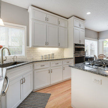
Example of a mid-sized transitional l-shaped light wood floor and brown floor enclosed kitchen design in Portland with a drop-in sink, shaker cabinets, white cabinets, quartz countertops, white backsplash, subway tile backsplash, an island and stainless steel appliances
Example of a mid-sized transitional l-shaped light wood floor and brown floor enclosed kitchen design in Portland with a drop-in sink, shaker cabinets, white cabinets, quartz countertops, white backsplash, subway tile backsplash, an island and stainless steel appliances
 Spin Design Limited
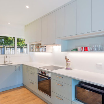
Removing a wall in a small two-bedroom unit has resulted in a significant transformation. By opening up the space, a seamless connection has been established between the kitchen, dining area, and living room, creating a multi-functional and versatile area. The removal of the wall has eliminated the physical barriers that previously separated these spaces, fostering a sense of openness and facilitating better communication and interaction among family members.
The kitchen extension resulting from the removal of the wall has provided several practical benefits. Firstly, it has allowed for the expansion of the bench space, providing more room for meal preparation, cooking, and other kitchen activities. Additionally, the kitchen extension has led to an improvement in storage capacity. This means that kitchen utensils, appliances, and ingredients can be neatly organized and easily accessible, reducing clutter and enhancing efficiency in the kitchen.
 Reader & Swartz Architects, P.C.
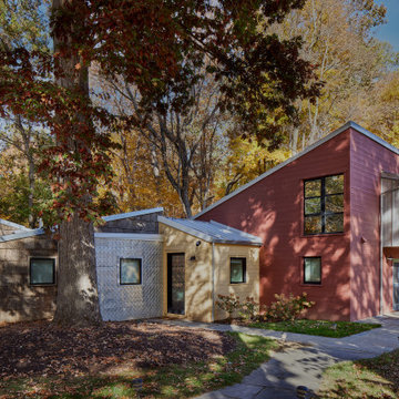
The goal of the project was to address the physical and perceptual challenges of aging in place while preserving and honoring the original design of the compound. The additions were designed to be compatible with the existing guest house, complement its small scale, and clearly read as new construction. The new volumes were purposely clad in contrasting materials, such as poplar bark shingles, thermally modified pine, stamped zinc-coated metal, and Shou Sugi Ban siding, to distinguish between the existing and the new, while still complementing the original materials palette. In consultation with arborists, the additions were designed to jog around and preserve the mature existing trees.
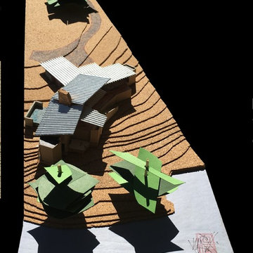
 Pfirman Architecture
cork, paper, cardboard, and homosote physical model of creekfront home in Wilmington, NC
Mid-sized modern one-story exterior home idea in Other
Mid-sized modern one-story exterior home idea in Other
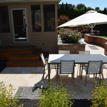
 Peabody Landscape Group
Before any stone was laid or wood cut, our team delved into sketches, 3D renders, and physical models. This step ensured we had a clear vision for the space and how each element would harmonize within it.
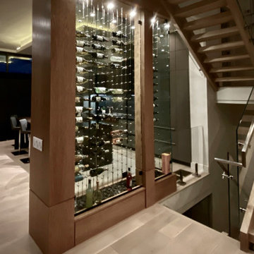
 IWA Wine Accessories
This glass wine cellar uses cable racking for a dramatic suspended design and holds up to 144 bottles. Its primary goal is to achieve a "wine as art" visual effect, with transparent shelves.
The project had some challenges: dimensions were different in the physical space from the design, and there were lighting fixtures to navigate around. The installer and manufacturer worked together to resolve the issue.
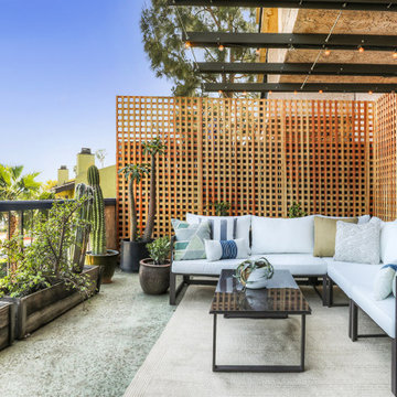
 Erik Hagen, Architect
The million dollar view. Bringing the inside out to this spacious 200 SF patio deck. Second living room and dining room in one. Best to fill up with as many plants as possible. Add a water feature for white noise from the street below and the neighbors above. A little lattice to add more separation to the adjacent neighbors. The trellis above can hold typical canvas or cloth sails. Be sure to ask the HOA for permission before physically attaching anything to the structure.
 O'Hanlon Kitchen & Bath
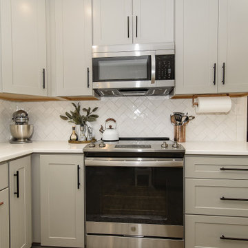
Nothing says "I love you" more than a kitchen renovation! These homeowners decided to celebrate their nuptials in the best possible way- with a new kitchen! We love how elegant the space is with the Pewter finish by Wolf Cabinetry, the classic white quartz, and herringbone tile backsplash. We wish you many years of beautiful memories- enjoy!
Cabinets: Wolf Classic Dartmouth 5 piece in Pewter.
Countertop: Calacatta Verona Q Stone
Backsplash: Herringbone- Emma White 3X6 Subway
Flooring: Mannington Vinyl plank- AduraMax Lakeview/Treeline MAX093
Additional project notes: Wolf soft close rollout, double trash pullout, wire tray divider
Thoughts from the customers:
1. What were you looking for in your remodel?
We were looking to completely redo the space. We knew we needed a new layout to accommodate the need for more storage, but also to update the extremely outdated cabinets, flooring, etc. to bring it out of 1960 and into 2020.
2. What do you love most about your remodel?
I obviously love that everything is brand new. My favorite physical feature is definitely the new backsplash and countertops that we chose! I also have never had soft close drawers so those are spectacular!
3. What was your main concern when deciding on a remodeling company?
We really just didn’t want it to take a long time! We were at home during the whole thing because of the pandemic, so it was not realistic to live without a kitchen for months.
4. What made you choose O’Hanlon Kitchens? Would you recommend O’Hanlon Kitchens?
Tracy was a great designer, and we ultimately went with O’Hanlon because she discovered some details about the kitchen and it’s functional space that others overlooked and even we didn’t notice. She was then able to render a very nice drawing of what we could expect our kitchen to look like, which was helpful. Yes, I would recommend O’Hanlon!
Photos & Video: Julia Transue
www.facebook.com/ThePhotoHouse.Art
www.thephotohouse.net
thephotohouse@comcast.net
 Criss Kline, AKBD
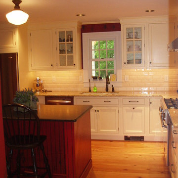
The client’s red dining room acted as the inspiration for the kitchen’s color palette. The Cherry Cobbler Red, physically distressed island appears to have been added after the perimeter Buttermilk Yellow cabinets, which contributes to the authenticity of the farmhouse. Two dishwashers were included to assist with the clean up of frequent entertaining.
 KVD+ Architecture
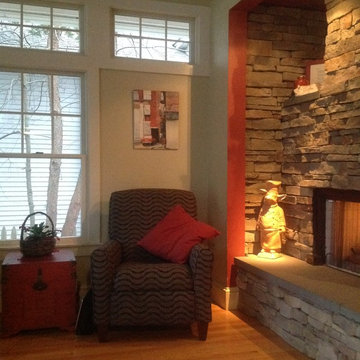
A place to regenerate
Kitchen Sitting Area
Family room - small transitional open concept medium tone wood floor family room idea in Philadelphia with beige walls, a two-sided fireplace, a stone fireplace and no tv
Family room - small transitional open concept medium tone wood floor family room idea in Philadelphia with beige walls, a two-sided fireplace, a stone fireplace and no tv
 RAJ Kitchen and Bath, LLC
**Check out the video of this transformation on our website**
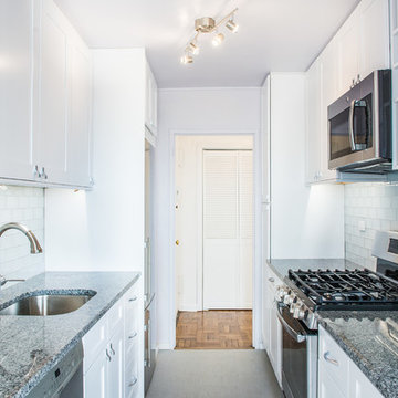
This small kitchen was way too small for this 2 bedrooms, 2 bathrooms apartment. Not only was it a very small kitchen, but the physical location of it made it very difficult to make it any bigger. There wasn't much that could have been done without incurring astronomical cost, which would get little or no return on the investment. The client wanted a kitchen that can be optimized in its current location to add a ton of value for resale.
This was difficult to do, because there was no moving of any mechanical around in the kitchen and even if we wanted to, the management of the building would not allow. For those of you who live in condos, co-ops or apartment building, you know how difficult it is to rework these foot prints. When we showed up, we saw the problems, but we also saw a huge opportunity where we can achieve those goals in the small space. This was accomplished by making some key changes and to incorporate some new things that was not possible when this kitchen was built years ago.
The crucial part of the design that would drive the entire new layout, was selecting the only appliance; that was the Refrigerator. Once we nailed down that refrigerator, we then proceeded to design the kitchen around it. We moved it to the other side of the wall where the sink was so that we can tap into the water line from the sink plumbing. It was crucial that it stays exactly 24" deep, not an inch more because we had to keep the entry as open as possible. Also, it was going to be directly in front of another big storage unit - The pantry. It is not ideal in most cases, but we needed the rest of the space to ramp up the design and open feel towards the side where all of the activities would take place, which happend to be the dining room and the view.
Once all that was figured out, we re-positioned the sink, dishwasher and the range and proceeded to wrap the cabinets around the columns to integrate them into the space. Thirty- six inches cabinets height was used so that they can be installed higher towards the ceiling height to give more room rather than the standard 18" required height between the counter tops. This was done to make the room feel a lot bigger than it really was. Not to mention, we also didn't want the faucet to be buried under the cabinets so that was also a necessary design detail for the space.
We then lowered both knee walls so that the counter top can sit on top of them, by removing that stop point that would have otherwise defined the kitchen area. This allowed us to pick up that extra footprint into the room for added prep space and enabled us to create the illusion of a kitchen that is looking longer than it really is. Every inch mattered when designing this kitchen and we made a conscious decision to use every one of that inch.
White cabinets were selected to do just what white cabinets are design to do; make a small or dark room appear bigger, brighter and more open. In this kitchen, this was amplified the more because of the kitchen location. It was perfect! We knew we did justice to the space because while we were there taking some photos, a few potential buyers walked in and went straight for the kitchen! They said its design just to fit the apartment.
Pantry roll out shelving, Double recycle bin, fancy handles, LED lighting, Quartz counter top, beautiful backslash tiles and grey linen floors finished off the kitchen which looked over a beautiful view of the George Washington Bridge from the top of this lovely 4th floor apartment.
Credit to Masterpiece Tile and Marble (Annmarie on the selection of Tiles and countertop and Val on the Construction to complete this project).
Davor Kokic Photography
 Decor & More, LLC
Debbie Slovin
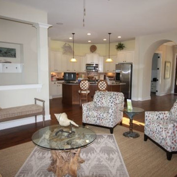
Local builder wanted a model home furnished. With furniture from Coastal Home the model was done in just two weeks working with furniture physically at the store. No time for special orders.

 Donald Lococo Architects
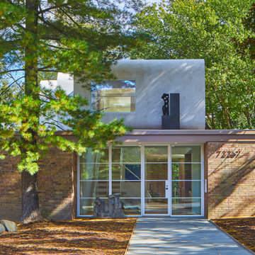
Designed in 1970 for an art collector, the existing referenced 70’s architectural principles. With its cadence of ‘70’s brick masses punctuated by a garage and a 4-foot-deep entrance recess. This recess, however, didn’t convey to the interior, which was occupied by disjointed service spaces. To solve, service spaces are moved and reorganized in open void in the garage. (See plan) This also organized the home: Service & utility on the left, reception central, and communal living spaces on the right.
To maintain clarity of the simple one-story 70’s composition, the second story add is recessive. A flex-studio/extra bedroom and office are designed ensuite creating a slender form and orienting them front to back and setting it back allows the add recede. Curves create a definite departure from the 70s home and by detailing it to "hover like a thought" above the first-floor roof and mentally removable sympathetic add.Existing unrelenting interior walls and a windowless entry, although ideal for fine art was unconducive for the young family of three. Added glass at the front recess welcomes light view and the removal of interior walls not only liberate rooms to communicate with each other but also reinform the cleared central entry space as a hub.
Even though the renovation reinforms its relationship with art, the joy and appreciation of art was not dismissed. A metal sculpture lost in the corner of the south side yard bumps the sculpture at the front entrance to the kitchen terrace over an added pedestal. (See plans) Since the roof couldn’t be railed without compromising the one-story '70s composition, the sculpture garden remains physically inaccessible however mirrors flanking the chimney allow the sculptures to be appreciated in three dimensions. The mirrors also afford privacy from the adjacent Tudor's large master bedroom addition 16-feet away.
 Countrywide Construction & Design LLC
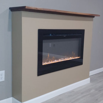
An electric fireplace was added to this finished basement to provide aesthetic charm and some physical warmth. The mantel is black walnut.
Transitional vinyl floor and gray floor family room photo in Other with gray walls, a standard fireplace and a plaster fireplace
Transitional vinyl floor and gray floor family room photo in Other with gray walls, a standard fireplace and a plaster fireplace
90