
Search results for "Piece problem" in Home Design Ideas
 Wills Company
Wiff Harmer
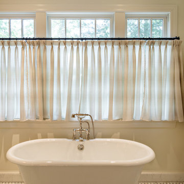
Example of a huge transitional master green tile and ceramic tile marble floor bathroom design in Nashville with an undermount sink, flat-panel cabinets, white cabinets, marble countertops, a one-piece toilet and white walls
Example of a huge transitional master green tile and ceramic tile marble floor bathroom design in Nashville with an undermount sink, flat-panel cabinets, white cabinets, marble countertops, a one-piece toilet and white walls
 hurst visual solutions
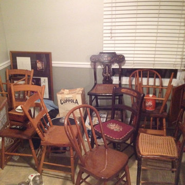
I counted and I've got 13 chairs. I cherish them all... what to do? Some are family pieces, some I bought but I don't think I can part with all but maybe one. ;-/ oh my!!
 Alair Homes Plano
We loved updating this 1977 house giving our clients a more transitional kitchen, living room and powder bath. Our clients are very busy and didn’t want too many options. Our designers narrowed down their selections and gave them just enough options to choose from without being overwhelming.
In the kitchen, we replaced the cabinetry without changing the locations of the walls, doors openings or windows. All finished were replaced with beautiful cabinets, counter tops, sink, back splash and faucet hardware.
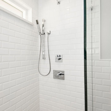
In the Master bathroom, we added all new finishes. There are two closets in the bathroom that did not change but everything else did. We.added pocket doors to the bedroom, where there were no doors before. Our clients wanted taller 36” height cabinets and a seated makeup vanity, so we were able to accommodate those requests without any problems. We added new lighting, mirrors, counter top and all new plumbing fixtures in addition to removing the soffits over the vanities and the shower, really opening up the space and giving it a new modern look. They had also been living with the cold and hot water reversed in the shower, so we also fixed that for them!
In their den, they wanted to update the dark paneling, remove the large stone from the curved fireplace wall and they wanted a new mantel. We flattened the wall, added a TV niche above fireplace and moved the cable connections, so they have exactly what they wanted. We left the wood paneling on the walls but painted them a light color to brighten up the room.
There was a small wet bar between the den and their family room. They liked the bar area but didn’t feel that they needed the sink, so we removed and capped the water lines and gave the bar an updated look by adding new counter tops and shelving. They had some previous water damage to their floors, so the wood flooring was replaced throughout the den and all connecting areas, making the transition from one room to the other completely seamless. In the end, the clients love their new space and are able to really enjoy their updated home and now plan stay there for a little longer!
Design/Remodel by Hatfield Builders & Remodelers | Photography by Versatile Imaging
Less
Find the right local pro for your project
 Alair Homes Plano
This 1964 Preston Hollow home was in the perfect location and had great bones but was not perfect for this family that likes to entertain. They wanted to open up their kitchen up to the den and entry as much as possible, as it was small and completely closed off. They needed significant wine storage and they did want a bar area but not where it was currently located. They also needed a place to stage food and drinks outside of the kitchen. There was a formal living room that was not necessary and a formal dining room that they could take or leave. Those spaces were opened up, the previous formal dining became their new home office, which was previously in the master suite. The master suite was completely reconfigured, removing the old office, and giving them a larger closet and beautiful master bathroom. The game room, which was converted from the garage years ago, was updated, as well as the bathroom, that used to be the pool bath. The closet space in that room was redesigned, adding new built-ins, and giving us more space for a larger laundry room and an additional mudroom that is now accessible from both the game room and the kitchen! They desperately needed a pool bath that was easily accessible from the backyard, without having to walk through the game room, which they had to previously use. We reconfigured their living room, adding a full bathroom that is now accessible from the backyard, fixing that problem. We did a complete overhaul to their downstairs, giving them the house they had dreamt of!
As far as the exterior is concerned, they wanted better curb appeal and a more inviting front entry. We changed the front door, and the walkway to the house that was previously slippery when wet and gave them a more open, yet sophisticated entry when you walk in. We created an outdoor space in their backyard that they will never want to leave! The back porch was extended, built a full masonry fireplace that is surrounded by a wonderful seating area, including a double hanging porch swing. The outdoor kitchen has everything they need, including tons of countertop space for entertaining, and they still have space for a large outdoor dining table. The wood-paneled ceiling and the mix-matched pavers add a great and unique design element to this beautiful outdoor living space. Scapes Incorporated did a fabulous job with their backyard landscaping, making it a perfect daily escape. They even decided to add turf to their entire backyard, keeping minimal maintenance for this busy family. The functionality this family now has in their home gives the true meaning to Living Better Starts Here™.
 The Homeowners Helper LLC
We transformed an unfinished basement into a functional oasis, our recent project encompassed the creation of a recreation room, bedroom, and a jack and jill bathroom with a tile look vinyl surround. We also completed the staircase, addressing plumbing issues that emerged during the process with expert problem-solving. Customizing the layout to work around structural beams, we optimized every inch of space, resulting in a harmonious and spacious living area.
 Pinnacle Design & Remodeling
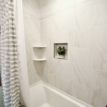
We completely gutted this main floor bathroom. There sadly wasn't saving anything as there was some water and mold problems and if we were going to sell we new it had to be done right. We helped update the space while being cost effective. A prefab double vanity, porcelain white tile that had some brown veining throughout for the floors and shower walls helped make the space feel large. We also did a deeper three wall bathtub alcove to help add that touch of design and mixing high and low cost items.
 Debby Cook Interiors
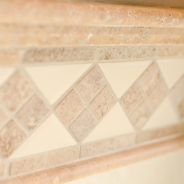
The client wanted to use the old tub space to make a larger shower. The problem was the window. The wood trim was removed with tile trim replacing it. The large tiles are 20x20 size with accents of sliced stone in the shower floor and banding around the shower walls. The shower seat it topped with a quartz solid surface.
Sponsored
Columbus, OH

Wannemacher Interiors
Customized Award-Winning Interior Design Solutions in Franklin Cnty OH
 Debby Cook Interiors
The client wanted to use the old tub space to make a larger shower. The problem was the window. The wood trim was removed with tile trim replacing it. The large tiles are 20x20 size with accents of sliced stone in the shower floor and banding around the shower walls. The shower seat it topped with a quartz solid surface.
 Remodeling Contractors
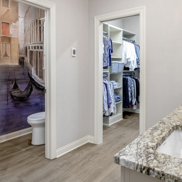
As with many homes, a lack of useful closet space was a real problem for these homeowners. After the decision to build an addition for a closet was made, the design of the master bathroom was next. New vanities, granite countertops, mirrors, and tile flooring were changed to match the level of the new closet.
Upon completion of the master suite the homeowners were left to ponder updating the kitchen. With new cabinets, countertops, and a modern feel the kitchen is a big hit. Features include knotty alder cabinetry, a custom range hood. The final hurdle was the fireplace, after simplifying the design of the built-ins a elegant tile was installed with a floating mantle.
After going through a large portion of this main floor, creating storage solutions and modernizing the feel of the space it left us to now wonder, what’s next?
 Next Level Austin
Twist Tour
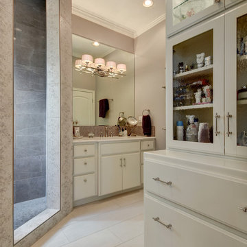
Small transitional master beige tile and porcelain tile porcelain tile doorless shower photo in Austin with flat-panel cabinets, white cabinets, a two-piece toilet, beige walls, an undermount sink and solid surface countertops
Small transitional master beige tile and porcelain tile porcelain tile doorless shower photo in Austin with flat-panel cabinets, white cabinets, a two-piece toilet, beige walls, an undermount sink and solid surface countertops
 Rebecca Mitchell Interiors
Laura Garner
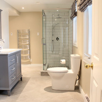
Example of a large transitional beige tile and ceramic tile ceramic tile corner shower design in Montreal with shaker cabinets, blue cabinets, a one-piece toilet, beige walls, an undermount sink and marble countertops
Example of a large transitional beige tile and ceramic tile ceramic tile corner shower design in Montreal with shaker cabinets, blue cabinets, a one-piece toilet, beige walls, an undermount sink and marble countertops
 Debby Cook Interiors
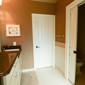
The client wanted to use the old tub space to make a larger shower. The problem was the window. The wood trim was removed with tile trim replacing it. The large tiles are 20x20 size with accents of sliced stone in the shower floor and banding around the shower walls. The shower seat it topped with a quartz solid surface.
 TVL Creative Ltd.
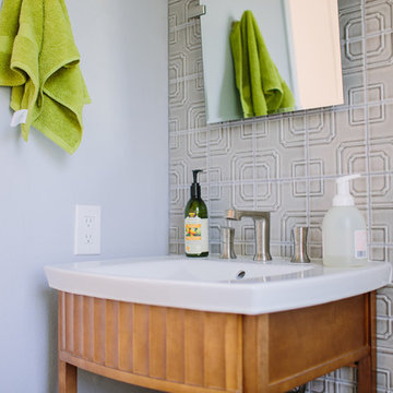
We were excited to take on this full home remodel with our Arvada clients! They have been living in their home for years, and were ready to delve into some major construction to make their home a perfect fit. This home had a lot of its original 1970s features, and we were able to work together to make updates throughout their home to make it fit their more modern tastes. We started by lowering their raised living room to make it level with the rest of their first floor; this not only removed a major tripping hazard, but also gave them a lot more flexibility when it came to placing furniture. To make their newly leveled first floor feel more cohesive we also replaced their mixed flooring with a gorgeous engineered wood flooring throughout the whole first floor. But the second floor wasn’t left out, we also updated their carpet with a subtle patterned grey beauty that tied in with the colors we utilized on the first floor. New taller baseboards throughout their entire home also helped to unify the spaces and brought the update full circle. One of the most dramatic changes we made was to take down all of the original wood railings and replace them custom steel railings. Our goal was to design a staircase that felt lighter and created less of a visual barrier between spaces. We painted the existing stringer a crisp white, and to balance out the cool steel finish, we opted for a wooden handrail. We also replaced the original carpet wrapped steps with dark wooden steps that coordinate with the finish of the handrail. Lighting has a major impact on how we feel about the space we’re in, and we took on this home’s lighting problems head on. By adding recessed lighting to the family room, and replacing all of the light fixtures on the first floor we were able to create more even lighting throughout their home as well as add in a few fun accents in the dining room and stairwell. To update the fireplace in the family room we replaced the original mantel with a dark solid wood beam to clean up the lines of the fireplace. We also replaced the original mirrored gold doors with a more contemporary dark steel finished to help them blend in better. The clients also wanted to tackle their powder room, and already had a beautiful new vanity selected, so we were able to design the rest of the space around it. Our favorite touch was the new accent tile installed from floor to ceiling behind the vanity adding a touch of texture and a clear focal point to the space. Little changes like replacing all of their door hardware, removing the popcorn ceiling, painting the walls, and updating the wet bar by painting the cabinets and installing a new quartz counter went a long way towards making this home a perfect fit for our clients


 S Squared Design, LLC
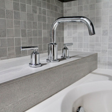
This bathroom was the final space to be designed for this client by me. We did space planning and furniture when they first moved in, a couple years later we did a full kitchen remodel and now we finally did the bathroom. This wasn't a full remodel so we kept some of the items that were in good condition and updated the rest. First thing we focused on was the shower, with some existing functional problems we made sure the incorporate storage and a bench for this walk in shower. That allowed space for bottles and a seat. With the existing vanity cabinet and counter tops staying I wanted to coordinate the dark counter with adding some dark elements elsewhere to tie they in together. We did a dark charcoal hex shower floor and also used that tile in the back of the niches. Since the shower was a dark place we added a light in shower and used a much lighter tile on the wall and bench. this tile was carried into the rest of the bathroom on the floor and the smaller version for the tub surround in a 2"x2" mosaic. The wall color before was dark and client loved it so we did a new dark grey but brightened the space with a white ceiling. New chrome faucets throughout to give a reflective element. This bathroom truly feels more relaxing for a bath or a quick shower!
 Let's Remodel
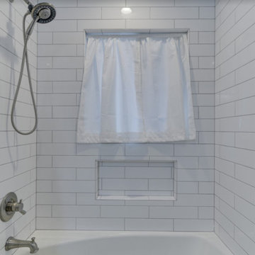
In this space, we updated the guest bathroom with new floors, painted walls, new plumbing fixtures, a blue vanity, and a new shower. This helped create a relaxed feeling in the space. Adding in light walls instead of the previous wallpaper helped lighten and brighten up the bathroom. We took out the old linoleum and replaced with marble look porcelain tile. Subway tile was the tile choice for both bathrooms. In the guest bathroom we created a tiled niche for bathroom products underneath the existing window. We updated the dated the plumbing fixtures from the same stainless steel finish as the cabinet hardware, curtain rod, and towel holder.
 S & S Homes, Inc.
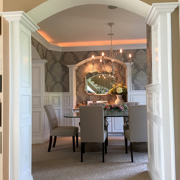
This room encompasses one of the most technical examples of woodwork we’ve seen in a long time. Normally, to create a raised panel wainscot wall, pieces of 1x wood are cut and used to create the boxes, and panel moldings are installed inside the frames to finish off the look. This can be done by typical finish carpenters. The problem is that over time, the numerous joints separate and look bad. In the case of this project, we wanted to avoid that pitfall and do something exquisite AND long-lasting. Over several days, each section of the wall was laid out to determine the appropriate size of each panel. Electrical outlets or switch plates that weren’t centered were moved. Each panel was then specially made at the shop out of 3/4” MDF because its smooth surface is ideal for painting. The raised panels (the pieces that go into each square opening) as well as the panel mouldings (the pieces that frame out each interior panel) were fabricated off site at the shop. Between the set-up, fabrication and the installation, two skilled craftsmen required three solid weeks to make each aspect absolutely perfect. Other finishing details including using a “Back Band” moulding to cap the top of the wainscot and using matching moldings (base, window casings and crown moldings) in areas that needed it for continuity of design.
This room’s woodwork is an exquisite example of true craftsmanship. Words and pictures cannot describe the level of skill required for this project. Once everything was completed, it was sprayed with white enamel paint and wallpaper was installed above the wood wainscot to finish off the room. In a nutshell, each wall panel was constructed like a custom made high end cabinet. Literally.
 One Kings Lane
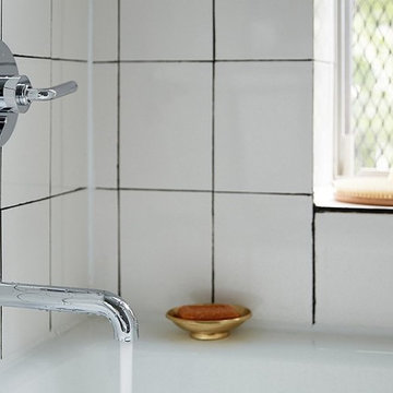
Step 3: A Bit of Problem-Solving: Our plumber also replaced the shower fixtures. It turned out that in order to swap out the shower hardware we also needed to replace a valve behind the wall. That sounds scary, but it’s not, especially when you hire a pro to do it for you! I provided our plumber with a few extra tiles, and he was able to open up the wall, change the valve, and patch it with matching tiles. Because our tile was so basic, finding a few matching ones at the home improvement store was an inexpensive and easy fix.
Photo by Manuel Rodriguez

 Renovisions
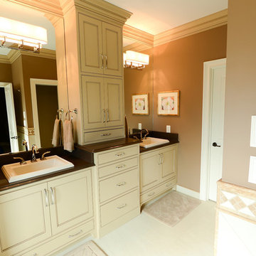
This master bath ‘Renovision’ came with three main requests from the homeowner: more storage, a larger shower and a luxurious look that feels like being at an upscale hotel. The Renovisions team accomplished these wishes and exceeded the clients expectations.
Request number 1: more storage. The existing closet was reconfigured to accommodate better storage for towels and bath supplies making it both functional and attractive. The custom built pull-out hamper was perfect. The long vanity and center tower offers much more cabinet space and drawer storage compared to what they had, especially with the increased vanity height.
Request number 2: A larger shower. Working within the existing footprint we were able to build a shower that is nearly a foot deeper as space was available. Creating a large rectangular cubby provides plenty of space for shampoos and soaps. The frameless sliding glass shower enclosure keeps the space open and airy while allowing the beautiful Carrera-look porcelain wall tiles to be the focus of this master bath.
Request number 3: a luxurious look. Turning their once boring, builder grade bathroom into an upscale hotel-like space was challenging, however, not a problem for the Renovisions team and their creative ways of resolving design snags along the way. Re-locating the doorway to the bathroom was one way to create a more spacious flow in and out of the space. Having the right design to start was half the battle – installing the beautiful products right the first time to ensure a proper fit and finish worthy of the upscale feel is the other half. The delicate tile detail in the shower cubby is the ‘jewelry’ in the room – the soft curves of this 2-tone wave design tile adds a dramatic feel and enlightened mood this client loves.
Overall, the homeowner was happy with every solution-based approach to all requests – their once dated builders bath is now bright, open and airy with a soft grey wall color adding to the soothing feel of this master bath.
 Pinnacle Design & Remodeling
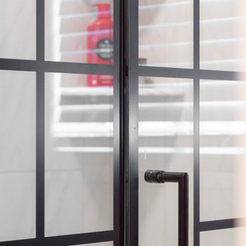
Another referral from one of our favorite clients!
The clients wanted to update their teenage son's bathroom which had a few wear and tear issues.
There was talk to paint or replace cabinetry as the client had a vision and the current stain seemed to be in the way of that. They also wanted to be cost-effective, so we designed around the existing stained cabinetry.
Tschida Construction helped with the execution and helped with some creative behind-the-scenes problems that popped up. Having a design-build team that works together is so important and Nick and his team are awesome.
Photographer- Height Advantages
 First Option Design Build LLC
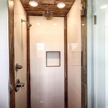
The Master Shower. The tile is the same 6 x 36 inch wood like porcelain plank that was used on the floor.
The massive 33 x 33 inch high gloss tiles used on the walls make this 36 x 36 shower seem bigger, brighter and cleaner than it would feel otherwise.
Carrying the floor tile through the shower gives the shower a feeling of being included and makes it a focal point, instead of a only being a utilitarian shower stall.
I used a floor tile for the window sill.
Setting the Vanity posed an unusual problem, as the room was an inch narrower than the vanity! We removed the drywall from both sides of the room, then restored it after we installed the vanity.
32