
Search results for "Placing jackie's" in Home Design Ideas
 Broadpoint Custom Homes
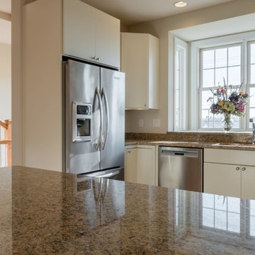
Denniston Place is an 8-unit luxury townhome project in Lewes, Delaware. Located on Savannah road, Denniston Place is within walking distance of Lewes Beach and various dining and shopping options.
 Visbeen Architects
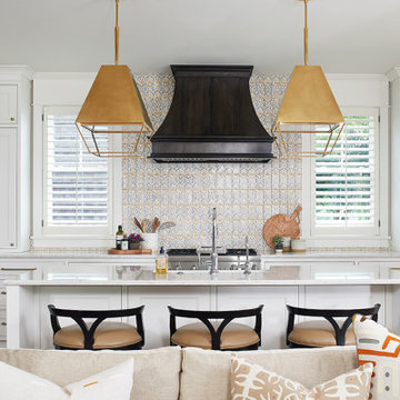
This cozy lake cottage skillfully incorporates a number of features that would normally be restricted to a larger home design. A glance of the exterior reveals a simple story and a half gable running the length of the home, enveloping the majority of the interior spaces. To the rear, a pair of gables with copper roofing flanks a covered dining area that connects to a screened porch. Inside, a linear foyer reveals a generous staircase with cascading landing. Further back, a centrally placed kitchen is connected to all of the other main level entertaining spaces through expansive cased openings. A private study serves as the perfect buffer between the homes master suite and living room. Despite its small footprint, the master suite manages to incorporate several closets, built-ins, and adjacent master bath complete with a soaker tub flanked by separate enclosures for shower and water closet. Upstairs, a generous double vanity bathroom is shared by a bunkroom, exercise space, and private bedroom. The bunkroom is configured to provide sleeping accommodations for up to 4 people. The rear facing exercise has great views of the rear yard through a set of windows that overlook the copper roof of the screened porch below.
Builder: DeVries & Onderlinde Builders
Interior Designer: Vision Interiors by Visbeen
Photographer: Ashley Avila Photography
 Thyme & Place Design LLC
When my client had to move from her company office to work at home, she set up in the dining room. Despite her best efforts, this was not the long-term solution she was looking for. My client realized she needed a dedicated space not on the main floor of the home. On one hand, having your office space right next to the kitchen is handy. On the other hand, it made separating work and home life was not that easy.
The house was a ranch. In essence, the basement would run entire length of the home. As we came down the steps, we entered a time capsule. The house was built in the 1950’s. The walls were covered with original knotty pine paneling. There was a wood burning fireplace and considering this was a basement, high ceilings. In addition, there was everything her family could not store at their own homes. As we wound though the space, I though “wow this has potential”, Eventually, after walking through the laundry room we came to a small nicely lit room. This would be the office.
My client looked at me and asked what I thought. Undoubtedly, I said, this can be a great workspace, but do you really want to walk through this basement and laundry to get here? Without reservation, my client said where do we start?
Once the design was in place, we started the renovation. The knotty pine paneling had to go. Specifically, to add some insulation and control the dampness and humidity. The laundry room wall was relocated to create a hallway to the office.
At the far end of the room, we designated a workout zone. Weights, mats, exercise bike and television are at the ready for morning or afternoon workouts. The space can be concealed by a folding screen for party time. Doors to an old closet under the stairs were relocated to the workout area for hidden storage. Now we had nice wall for a beautiful console and mirror for storage and serving during parties.
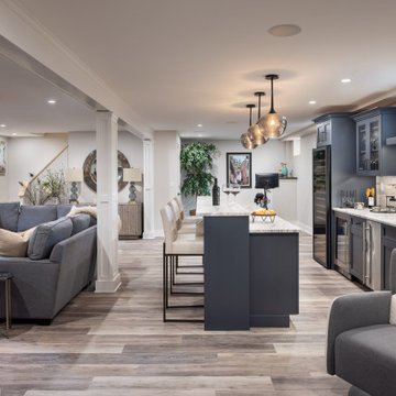
In order to add architectural details, we covered the old ugly support columns with simple recessed millwork panels. This detail created a visual division between the bar area and the seating area in front of the fireplace. The old red brick on the fireplace surround was replaced with stack stone. A mantle was made from reclaimed wood. Additional reclaimed wood floating shelves left and right of the fireplace provides decorative display while maintaining a rustic element balancing the copper end table and leather swivel rocker.
We found an amazing rug which tied all of the colors together further defining the gathering space. Russet and burnt orange became the accent color unifying each space. With a bit of whimsy, a rather unusual light fixture which looks like roots from a tree growing through the ceiling is a conversation piece.
The office space is quite and removed from the main part of the basement. There is a desk large enough for multiple screens, a small bookcase holding office supplies and a comfortable chair for conference calls. Because working from home requires many online meetings, we added a shiplap wall painted in Hale Navy to contrast with the orange fabric on the chair. We finished the décor with a painting from my client’s father. This is the background online visitors will see.
The last and best part of the renovation is the beautiful bar. My client is an avid collector of wine. She already had the EuroCave refrigerator, so I incorporated it into the design. The cabinets are painted Temptation Grey from Benjamin Moore. The counter tops are my favorite hard working quartzite Brown Fantasy. The backsplash is a combination of rustic wood and old tin ceiling like porcelain tiles. Together with the textures of the reclaimed wood and hide poofs balanced against the smooth finish of the cabinets, we created a comfortable luxury for relaxing.
There is ample storage for bottles, cans, glasses, and anything else you can think of for a great party. In addition to the wine storage, we incorporated a beverage refrigerator, an ice maker, and a sink. Floating shelves with integrated lighting illuminate the back bar. The raised height of the front bar provides the perfect wine tasting and paring spot. I especially love the pendant lights which look like wine glasses.
Finally, I selected carpet for the stairs and office. It is perfect for noise reduction. Meanwhile for the overall flooring, I specifically selected a high-performance vinyl plank floor. We often use this product as it is perfect to install on a concrete floor. It is soft to walk on, easy to clean and does not reduce the overall height of the space.
Find the right local pro for your project
 Architectural Collaborative
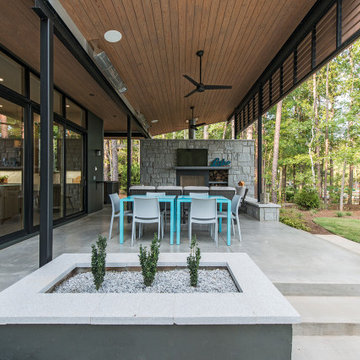
We designed this 3,162 square foot home for empty-nesters who love lake life. Functionally, the home accommodates multiple generations. Elderly in-laws stay for prolonged periods, and the homeowners are thinking ahead to their own aging in place. This required two master suites on the first floor. Accommodations were made for visiting children upstairs. Aside from the functional needs of the occupants, our clients desired a home which maximizes indoor connection to the lake, provides covered outdoor living, and is conducive to entertaining. Our concept celebrates the natural surroundings through materials, views, daylighting, and building massing.
We placed all main public living areas along the rear of the house to capitalize on the lake views while efficiently stacking the bedrooms and bathrooms in a two-story side wing. Secondary support spaces are integrated across the front of the house with the dramatic foyer. The front elevation, with painted green and natural wood siding and soffits, blends harmoniously with wooded surroundings. The lines and contrasting colors of the light granite wall and silver roofline draws attention toward the entry and through the house to the real focus: the water. The one-story roof over the garage and support spaces takes flight at the entry, wraps the two-story wing, turns, and soars again toward the lake as it approaches the rear patio. The granite wall extending from the entry through the interior living space is mirrored along the opposite end of the rear covered patio. These granite bookends direct focus to the lake.
 Tiffany Brooks, HGTV Host & Interior Designer
Inquire About Our Design Services
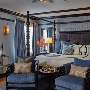
When we first started talking in the spring of 2015, I was impressed. She was witty, realistic, and understood that as much as she loves my shows on HGTV, design does not does not happen in 43 minutes! She told me about her space, and how she felt that her bedroom seemed “blah” to her. She had no retreat. Molly desperately longed for a place that she could spend time in, read in, play in and above all, relax in.
What we did:
Many people are terrified of hiring a designer. Rightfully so, they are investing a pretty penny in their homes. They want to make sure that everything, down to the last floral arrangement, is to their liking, because they will have to live it (and pay for it). Unfortunately, a client can unintentionally stifle a designer’s creativity through micro-management. This can produce lackluster results and ultimately cause more time (and money) to be spent on a project than is really necessary.
With Molly, that was never an issue. Before she even showed me the room in question, she said that I could have full creative license to do what I needed to do to her bedroom. SAY WHAAH!?
With Molly giving me complete creative freedom, I planned everything out and got down to business. The result: Bite-your-bottom-lip sexy. I don’t get jealous of too many of my clients’ spaces, but this one still takes my breath away every time I look at the pics!
The craziest part was that by adding more furniture, it actually made the space feel larger.
Molly and her husband Patrick loved the finished space, and promised me I will be back to finish the rest of the house!
Here’s the highlights of the rest of the project:
I came up with a space plan with three options.
Next, we reviewed mood boards and fabric schemes that would work for both Molly and her hubby Patrick.
We started with the bed. My goal was to add edge to its otherwise traditional style.
We decided to spice things up by painting the trim work in the room black.
We built in layers of lighting with dimmers. In a bedroom everything should be on dimmers, right? Right.
We designed and customized bedding, chairs and window treatments.
Together with Molly, we selected the most perfect wallpaper. This geometric “grasscloth” adds so much depth and dimension that was just missing before.
What I love:
That light fixture. I mean it is really, really amazing in person.
The porcupine mirror. This thing came packaged like it was the hope diamond, and everyone was terrified to handle it. But it really became a highlight of the room.
 By Design Custom Home Concierge
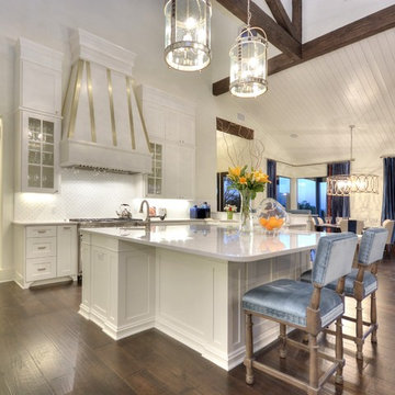
Light, bright and open the main kitchen is a great gathering place for chefs and foodies alike. Warm wood floors, gleaming tile from Spain and sparkling light fixtures all add to the sophisticated by comfortable feel in this kitchen.
 DHD Architecture and Interior Design
Montgomery Place Townhouse
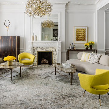
The unique and exclusive property on Montgomery Place, located between Eighth Avenue and Prospect Park West, was designed in 1898 by the architecture firm Babb, Cook & Willard. It contains an expansive seven bedrooms, five bathrooms, and two powder rooms. The firm was simultaneously working on the East 91st Street Andrew Carnegie Mansion during the period, and ensured the 30.5’ wide limestone at Montgomery Place would boast landmark historic details, including six fireplaces, an original Otis elevator, and a grand spiral staircase running across the four floors. After a two and half year renovation, which had modernized the home – adding five skylights, a wood burning fireplace, an outfitted butler’s kitchen and Waterworks fixtures throughout – the landmark mansion was sold in 2014. DHD Architecture and Interior Design were hired by the buyers, a young family who had moved from their Tribeca Loft, to further renovate and create a fresh, modern home, without compromising the structure’s historic features. The interiors were designed with a chic, bold, yet warm aesthetic in mind, mixing vibrant palettes into livable spaces.
Photography: Guillaume Gaudet www.guillaumegaudet.com
© DHD / ALL RIGHTS RESERVED.

Sponsored
Columbus, OH

Structural Remodeling
Franklin County's Heavy Timber Specialists | Best of Houzz 2020!
 Robin LaMonte/Rooms Revamped
Wing Wong
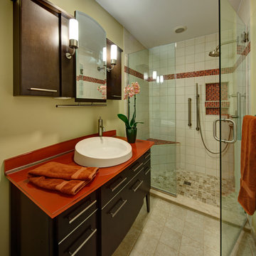
This small bathroom was renovated using some aging in place design. We added a bench, a second handheld shower next to the bench, and used a raised height toilet. I wanted the shower to be curbless, but to keep the costs down (avoiding redoing the pitch in the floor) we had a minimum curb.
The doors were widened to 36" in case my client needs to use a wheelchair.
The frameless shower and beige tile and walls opened up the bathroom. The reddish orange glass vanity and upper cabinet is modern looking but full of functional storage solutions. the red/orange accent tile pulled the glass top color into the shower.
 Monarch Builders & Remodelers
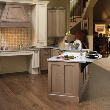
This aging-in-place kitchen and both beautiful and functional with wheelchair accessible cook top and sink apron. The lower-cabinet lazy susan and trash bin are within easy reach. The tri-level counter top is at once serviceable and accessible for the entire family.
Monarch Builders and Remodelers, Inc. is SW Florida’s specialist in providing state-of-the-art "Aging in Place" building design services and techniques, including a full range of home-remodeling services. With a prime goal of interpreting the needs and desires in an aesthetically pleasing way, Monarch Builders creates an environment in which homeowners can live and work positively and independently. Monarch knows there’s no place like home and people 50 and older want to remain living in their own home - comfortably, safely, and independently; it all comes down to design that keep one’s house a home. Monarch brings care, respect, and empathy into the designer-client relationship. By providing innovation and excellence, Monarch works to make your home function beautifully.
 Harrell Design + Build
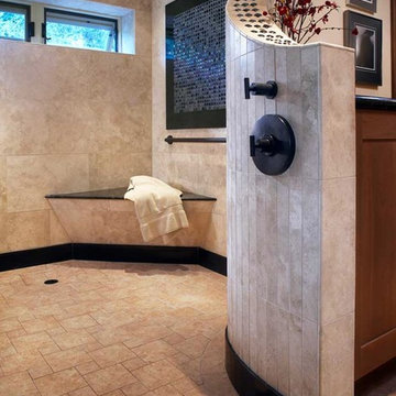
Aging gracefully...in your home. We asked Senior Designer, and Certified Aging in Place Specialist, Genie Nowicki about key ideas for bathroom design that include Aging/ Living in Place. (Universal Design)
Here are just a few of her suggestions!
1. Comfort Height Toilets (perhaps wall-hung).
2. Curb-less/walk-in showers
3. Hand-held shower heads on a bar for use at varying heights
4. Wall-hung sinks to allow seated use
5. Motion activated faucets
6. Grab Bars and Towel Bars at comfortable heights
7. Storage with easy access features, such as roll-outs.
8. Electrical outlets in drawers for convenience
9. Bidet accessories (“washlets”) on toilets for personal hygiene.
Or take a peek at our website page dedicated to this important and timely topic! ➡️ https://lnkd.in/ghRtcAr
 Midtown Cabinetry & Designs
Midtown Cabinetry & Designs
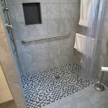
Doorless shower - small traditional 3/4 gray tile and porcelain tile porcelain tile doorless shower idea in Houston with gray walls, flat-panel cabinets, white cabinets, a one-piece toilet and a wall-mount sink
Doorless shower - small traditional 3/4 gray tile and porcelain tile porcelain tile doorless shower idea in Houston with gray walls, flat-panel cabinets, white cabinets, a one-piece toilet and a wall-mount sink
 Architectural Workshop
Front Fire Place Room
LaCasse Photography
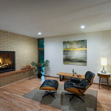
Example of a 1960s open concept light wood floor family room design in Denver with white walls, a standard fireplace, a brick fireplace and no tv
Example of a 1960s open concept light wood floor family room design in Denver with white walls, a standard fireplace, a brick fireplace and no tv
 LJS Design Inc
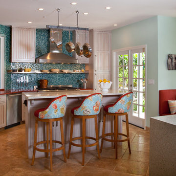
This Cardiff Family Kitchen is designed to be a fun central meeting place for many of the days activities. The french doors give everyone direct access to the exterior patio and ocean breezes. while the large picture window overlooks a more intimate patio that holds the spa. The large chefs range serves to be flexible enough to prepare large dinners for entertaining many or everyday family dinners. The center prep island counter suits this floor plan well as it redirects traffic out of the cooking zone while keeping everyone close enough for conversation.

 User
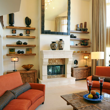
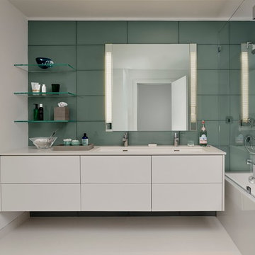
UserASID Design Excellence First Place Residential – Kitchen and Bathroom: Michael Merrill Design Studio was approached three years ago by the homeowner to redesign her kitchen. Although she was dissatisfied with some aspects of her home, she still loved it dearly. As we discovered her passion for design, we began to rework her entire home for consistency including this bathroom.
 Susan Yeley Homes
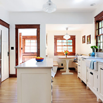
Like most of our projects, we can't gush about this reno—a new kitchen and mudroom, ensuite closet and pantry—without gushing about the people who live there. The best projects, we always say, are the ones in which client, contractor and design team are all present throughout, conception to completion, each bringing their particular expertise to the table and forming a cohesive, trustworthy team that is mutually invested in a smooth and successful process. They listen to each other, give the benefit of the doubt to each other, do what they say they'll do. This project exemplified that kind of team, and it shows in the results.
Most obvious is the opening up of the kitchen to the dining room, decompartmentalizing somewhat a century-old bungalow that was originally quite purposefully compartmentalized. As a result, the kitchen had to become a place one wanted to see clear through from the front door. Inset cabinets and carefully selected details make the functional heart of the house equal in elegance to the more "public" gathering spaces, with their craftsman depth and detail. An old back porch was converted to interior space, creating a mudroom and a much-needed ensuite walk-in closet. A new, larger deck went on: Phase One of an extensive design for outdoor living, that we all hope will be realized over the next few years. Finally, a duplicative back stairwell was repurposed into a walk-in pantry.
Modernizing often means opening spaces up for more casual living and entertaining, and/or making better use of dead space. In this re-conceptualized old house, we did all of that, creating a back-of-the-house that is now bright and cheerful and new, while carefully incorporating meaningful vintage and personal elements.
The best result of all: the clients are thrilled. And everyone who went in to the project came out of it friends.
Contractor: Stumpner Building Services
Cabinetry: Stoll’s Woodworking
Photographer: Gina Rogers
 BC&J Architecture
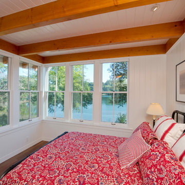
The Back Bay House is comprised of two main structures, a nocturnal wing and a daytime wing, joined by a glass gallery space. The daytime wing maintains an informal living arrangement that includes the dining space placed in an intimate alcove, a large country kitchen and relaxing seating area which opens to a classic covered porch and on to the water’s edge. The nocturnal wing houses three bedrooms. The master at the water side enjoys views and sounds of the wildlife and the shore while the two subordinate bedrooms soak in views of the garden and neighboring meadow.
To bookend the scale and mass of the house, a whimsical tower was included to the nocturnal wing. The tower accommodates flex space for a bunk room, office or studio space. Materials and detailing of this house are based on a classic cottage vernacular language found in these sorts of buildings constructed in pre-war north america and harken back to a simpler time and scale. Eastern white cedar shingles, white painted trim and moulding collectively add a layer of texture and richness not found in today’s lexicon of detail. The house is 1,628 sf plus a 228 sf tower and a detached, two car garage which employs massing, detail and scale to allow the main house to read as dominant but not overbearing.
Designed by BC&J Architecture.
 Kitchen Design Partners, Inc.
Photo Credit: Dennis Jourdan
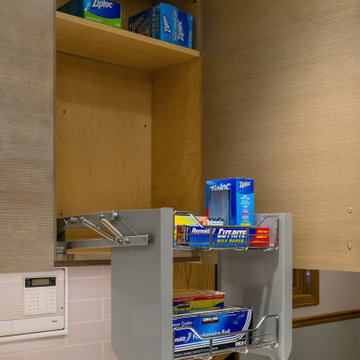
Example of a mid-sized trendy u-shaped porcelain tile and multicolored floor eat-in kitchen design in Chicago with a single-bowl sink, flat-panel cabinets, medium tone wood cabinets, quartz countertops, gray backsplash, porcelain backsplash, stainless steel appliances, a peninsula and gray countertops
Example of a mid-sized trendy u-shaped porcelain tile and multicolored floor eat-in kitchen design in Chicago with a single-bowl sink, flat-panel cabinets, medium tone wood cabinets, quartz countertops, gray backsplash, porcelain backsplash, stainless steel appliances, a peninsula and gray countertops

 Eric Ross Interiors, LLC
Marty Paoletta, ProMedia Tours
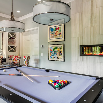
Inspiration for a transitional family room remodel in Nashville with a ribbon fireplace, a tile fireplace and white walls
Inspiration for a transitional family room remodel in Nashville with a ribbon fireplace, a tile fireplace and white walls
 Southeast Interior Design, Inc.
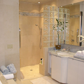
This client requested to design with aging in place details Note walk-in curbless shower,, shower benches to sit and place toiletries. Hand held showers in two locations, one at bench and standing shower options. Grab bars are placed vertically to grab onto in shower. Blue Marble shower accentuates the vanity counter top marble. Under-mount sinks allow for easy counter top cleanup. Glass block incorporated rather than clear glass. AS aging occurs clear glass is hard to detect. Also water spray is not as noticeable. Travertine walls and floors.

9