
Search results for "Platforms continually" in Home Design Ideas
 Klopf Architecture
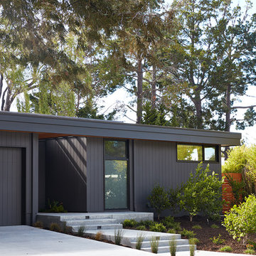
Klopf Architecture, Arterra Landscape Architects and Henry Calvert of Calvert Ventures Designed and built a new warm, modern, Eichler-inspired, open, indoor-outdoor home on a deeper-than-usual San Mateo Highlands property where an original Eichler house had burned to the ground.
The owners wanted multi-generational living and larger spaces than the original home offered, but all parties agreed that the house should respect the neighborhood and blend in stylistically with the other Eichlers. At first the Klopf team considered re-using what little was left of the original home and expanding on it. But after discussions with the owner and builder, all parties agreed that the last few remaining elements of the house were not practical to re-use, so Klopf Architecture designed a new home that pushes the Eichler approach in new directions.
One disadvantage of Eichler production homes is that the house designs were not optimized for each specific lot. A new custom home offered the team a chance to start over. In this case, a longer house that opens up sideways to the south fit the lot better than the original square-ish house that used to open to the rear (west). Accordingly, the Klopf team designed an L-shaped “bar” house with a large glass wall with large sliding glass doors that faces sideways instead of to the rear like a typical Eichler. This glass wall opens to a pool and landscaped yard designed by Arterra Landscape Architects.
Driving by the house, one might assume at first glance it is an Eichler because of the horizontality, the overhanging flat roof eaves, the dark gray vertical siding, and orange solid panel front door, but the house is designed for the 21st Century and is not meant to be a “Likeler.” You won't see any posts and beams in this home. Instead, the ceiling decking is a western red cedar that covers over all the beams. Like Eichlers, this cedar runs continuously from inside to out, enhancing the indoor / outdoor feeling of the house, but unlike Eichlers it conceals a cavity for lighting, wiring, and insulation. Ceilings are higher, rooms are larger and more open, the master bathroom is light-filled and more generous, with a separate tub and shower and a separate toilet compartment, and there is plenty of storage. The garage even easily fits two of today's vehicles with room to spare.
A massive 49-foot by 12-foot wall of glass and the continuity of materials from inside to outside enhance the inside-outside living concept, so the owners and their guests can flow freely from house to pool deck to BBQ to pool and back.
During construction in the rough framing stage, Klopf thought the front of the house appeared too tall even though the house had looked right in the design renderings (probably because the house is uphill from the street). So Klopf Architecture paid the framer to change the roofline from how we had designed it to be lower along the front, allowing the home to blend in better with the neighborhood. One project goal was for people driving up the street to pass the home without immediately noticing there is an "imposter" on this lot, and making that change was essential to achieve that goal.
This 2,606 square foot, 3 bedroom, 3 bathroom Eichler-inspired new house is located in San Mateo in the heart of the Silicon Valley.
Klopf Architecture Project Team: John Klopf, AIA, Klara Kevane
Landscape Architect: Arterra Landscape Architects
Contractor: Henry Calvert of Calvert Ventures
Photography ©2016 Mariko Reed
Location: San Mateo, CA
Year completed: 2016
 k+co LIVING - Interiors by Karen B Wolf
Raquel Langworthy
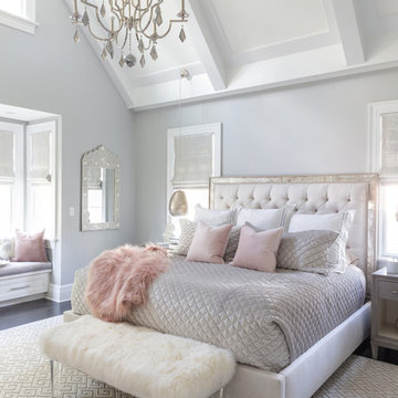
Example of a small beach style master medium tone wood floor and brown floor bedroom design in New York with gray walls
Example of a small beach style master medium tone wood floor and brown floor bedroom design in New York with gray walls

Find the right local pro for your project
 Jamie Nesbitt-Weber Interior Design
Photo by Tim Williams
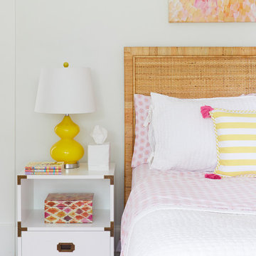
Kids' room - mid-sized coastal girl medium tone wood floor kids' room idea in New York with white walls
Kids' room - mid-sized coastal girl medium tone wood floor kids' room idea in New York with white walls

 JNMRustic Designs
JNMRustic Designs Reclaimed Wood Headboard with Lexington Clothing Co. Bedding and Linens.
Example of a large beach style guest bedroom design in Minneapolis with white walls
Example of a large beach style guest bedroom design in Minneapolis with white walls
 ICF Custom Homes
Robyn Hayley
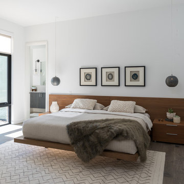
Example of a trendy master medium tone wood floor bedroom design in Dallas with white walls
Example of a trendy master medium tone wood floor bedroom design in Dallas with white walls
 Trillium Enterprises, INC.
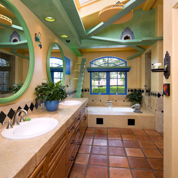
Mater bath features his/her sinks, whirlpool tub and catwalks. © Holly Lepere
Eclectic beige tile and stone tile terra-cotta tile corner shower photo in Santa Barbara with a drop-in sink, shaker cabinets, medium tone wood cabinets, beige walls and an undermount tub
Eclectic beige tile and stone tile terra-cotta tile corner shower photo in Santa Barbara with a drop-in sink, shaker cabinets, medium tone wood cabinets, beige walls and an undermount tub
 Pineapple House Interior Design
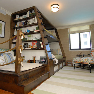
This bunk sleeps five adults. There is a single mattress on top, and below there is a queen size mattress. A second queen size is in the trundle "hidden" in the pull-out drawer below. It is currently closed.
Mon Amour Photography
 Kimball Starr Interior Design
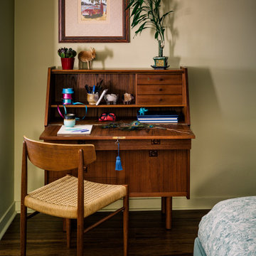
Upstairs in the loft's bedroom, the idea of the Moroccan bazaar continues, with a Turkish hand-knotted rug combined with a mid-century modern chair in front of a desk. The large platform bed is flanked by a pair of bedside table lamps on mismatched tables.
 ZeroEnergy Design
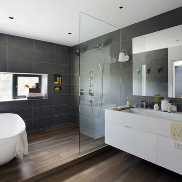
The reconfiguration of the master bathroom opened up the space by pairing a platform shower with a freestanding tub. The open shower, wall-hung vanity, and wall-hung water closet create continuous flooring and an expansive feeling. The result is a welcoming space with a calming aesthetic.
 Janet Brooks Design
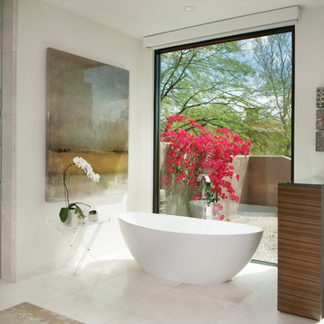
A freestanding tub anchored by art on one wall and a cabinet with storage and display shelves on the other end has a wonderful view of the back patio and distant views.
 Isla Homes
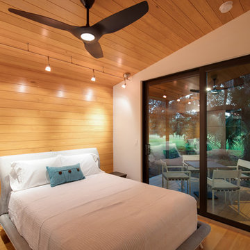
I built this on my property for my aging father who has some health issues. Handicap accessibility was a factor in design. His dream has always been to try retire to a cabin in the woods. This is what he got.
It is a 1 bedroom, 1 bath with a great room. It is 600 sqft of AC space. The footprint is 40' x 26' overall.
The site was the former home of our pig pen. I only had to take 1 tree to make this work and I planted 3 in its place. The axis is set from root ball to root ball. The rear center is aligned with mean sunset and is visible across a wetland.
The goal was to make the home feel like it was floating in the palms. The geometry had to simple and I didn't want it feeling heavy on the land so I cantilevered the structure beyond exposed foundation walls. My barn is nearby and it features old 1950's "S" corrugated metal panel walls. I used the same panel profile for my siding. I ran it vertical to match the barn, but also to balance the length of the structure and stretch the high point into the canopy, visually. The wood is all Southern Yellow Pine. This material came from clearing at the Babcock Ranch Development site. I ran it through the structure, end to end and horizontally, to create a seamless feel and to stretch the space. It worked. It feels MUCH bigger than it is.
I milled the material to specific sizes in specific areas to create precise alignments. Floor starters align with base. Wall tops adjoin ceiling starters to create the illusion of a seamless board. All light fixtures, HVAC supports, cabinets, switches, outlets, are set specifically to wood joints. The front and rear porch wood has three different milling profiles so the hypotenuse on the ceilings, align with the walls, and yield an aligned deck board below. Yes, I over did it. It is spectacular in its detailing. That's the benefit of small spaces.
Concrete counters and IKEA cabinets round out the conversation.
For those who cannot live tiny, I offer the Tiny-ish House.
Photos by Ryan Gamma
Staging by iStage Homes
Design Assistance Jimmy Thornton
 Alair Homes Plano
Our clients house was built in 2012, so it was not that outdated, it was just dark. The clients wanted to lighten the kitchen and create something that was their own, using more unique products. The master bath needed to be updated and they wanted the upstairs game room to be more functional for their family.
The original kitchen was very dark and all brown. The cabinets were stained dark brown, the countertops were a dark brown and black granite, with a beige backsplash. We kept the dark cabinets but lightened everything else. A new translucent frosted glass pantry door was installed to soften the feel of the kitchen. The main architecture in the kitchen stayed the same but the clients wanted to change the coffee bar into a wine bar, so we removed the upper cabinet door above a small cabinet and installed two X-style wine storage shelves instead. An undermount farm sink was installed with a 23” tall main faucet for more functionality. We replaced the chandelier over the island with a beautiful Arhaus Poppy large antique brass chandelier. Two new pendants were installed over the sink from West Elm with a much more modern feel than before, not to mention much brighter. The once dark backsplash was now a bright ocean honed marble mosaic 2”x4” a top the QM Calacatta Miel quartz countertops. We installed undercabinet lighting and added over-cabinet LED tape strip lighting to add even more light into the kitchen.
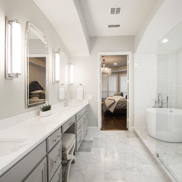
We basically gutted the Master bathroom and started from scratch. We demoed the shower walls, ceiling over tub/shower, demoed the countertops, plumbing fixtures, shutters over the tub and the wall tile and flooring. We reframed the vaulted ceiling over the shower and added an access panel in the water closet for a digital shower valve. A raised platform was added under the tub/shower for a shower slope to existing drain. The shower floor was Carrara Herringbone tile, accented with Bianco Venatino Honed marble and Metro White glossy ceramic 4”x16” tile on the walls. We then added a bench and a Kohler 8” rain showerhead to finish off the shower. The walk-in shower was sectioned off with a frameless clear anti-spot treated glass. The tub was not important to the clients, although they wanted to keep one for resale value. A Japanese soaker tub was installed, which the kids love! To finish off the master bath, the walls were painted with SW Agreeable Gray and the existing cabinets were painted SW Mega Greige for an updated look. Four Pottery Barn Mercer wall sconces were added between the new beautiful Distressed Silver leaf mirrors instead of the three existing over-mirror vanity bars that were originally there. QM Calacatta Miel countertops were installed which definitely brightened up the room!
Originally, the upstairs game room had nothing but a built-in bar in one corner. The clients wanted this to be more of a media room but still wanted to have a kitchenette upstairs. We had to remove the original plumbing and electrical and move it to where the new cabinets were. We installed 16’ of cabinets between the windows on one wall. Plank and Mill reclaimed barn wood plank veneers were used on the accent wall in between the cabinets as a backing for the wall mounted TV above the QM Calacatta Miel countertops. A kitchenette was installed to one end, housing a sink and a beverage fridge, so the clients can still have the best of both worlds. LED tape lighting was added above the cabinets for additional lighting. The clients love their updated rooms and feel that house really works for their family now.
Design/Remodel by Hatfield Builders & Remodelers | Photography by Versatile Imaging
 StudioLAB
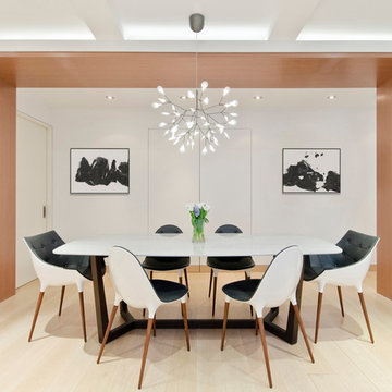
Steps from Riverside Park, the existing apartment had previously not been renovated for 30 years and was in dire need of a complete overhaul. StudioLAB was presented with the challenge of re-designing the space to fit a modern family’s lifestyle today with the flexibility to adjust as they evolve into their tomorrow. The existing formal closed kitchen and dining room were combined and opened up to allow the owners to entertain in an open living environment and allow natural light to permeate throughout different exposures of the apartment. Bathrooms were gutted, enlarged and reconfigured. Central air conditioning was added with minimal ducting as to be hidden and not seem clunky. Built-in bookshelves run the length of the perimeter walls below windows, concealing radiators and providing extra valuable storage in every room. A neutral color palette, minimalist details, and refined materials create a warm, modern atmosphere. Light brown oak veneered archways as well as LED cove ceilings are used to separate programmatic spaces visually without the use of physical partitions. A charcoal stained cube built-in was designed with in the foyer to create deep storage while continuing into the kitchen to hide the built-in refrigerator and pantry visually connecting the two spaces. The family’s two children share one large bedroom in order to create a playroom in the other which can also serves as a guest room when needed. The master bedroom features a full height grey stained ash veneered wall unit that serves as the predominant clothes storage. A panel housing the TV slides to reveal more clothes storage behind. To utilize the exiting formal maid’s room behind the kitchen, a small study and powder room were created that house laundry machines as well.
 Organized Living
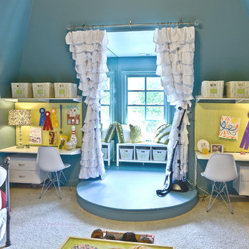
Professional Organizer, Amanda LeBlanc, created this beautiful playroom for her children. She used Organized Living freedomRail organizing systems because they are “easy to install and provide freedom to adjust as they grow.” See more ways Amanda uses Organized Living to organize her home and life: http://youtu.be/MsfCY_iRDb8
 Lori Dennis, ASID, LEED AP
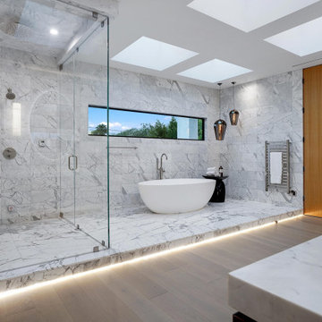
Large and modern master bathroom primary bathroom. Grey and white marble paired with warm wood flooring and door. Expansive curbless shower and freestanding tub sit on raised platform with LED light strip. Modern glass pendants and small black side table add depth to the white grey and wood bathroom. Large skylights act as modern coffered ceiling flooding the room with natural light.
 Rasmussen / Su Architects
Halkin Mason Photography
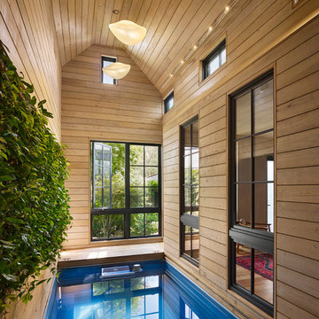
Trendy indoor rectangular pool house photo in Philadelphia
Trendy indoor rectangular pool house photo in Philadelphia
 Ryan Duebber Architect, LLC
McAlpin Loft- Powder Room
RVP Photography
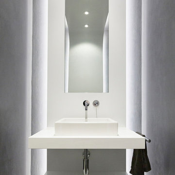
Powder room - industrial concrete floor and gray floor powder room idea in Cincinnati with gray walls, a vessel sink, quartz countertops and open cabinets
Powder room - industrial concrete floor and gray floor powder room idea in Cincinnati with gray walls, a vessel sink, quartz countertops and open cabinets
 Howell Custom Building Group
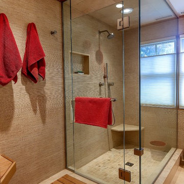
The original master bathroom in this 1980’s home was small, cramped and dated. It was divided into two compartments that also included a linen closet. The goal was to reconfigure the space to create a larger, single compartment space that exudes a calming, natural and contemporary style. The bathroom was remodeled into a larger, single compartment space using earth tones and soft textures to create a simple, yet sleek look. A continuous shallow shelf above the vanity provides a space for soft ambient down lighting. Large format wall tiles with a grass cloth pattern complement red grass cloth wall coverings. Both balance the horizontal grain of the white oak cabinetry. The small bath offers a spa-like setting, with a Scandinavian style white oak drying platform alongside the shower, inset into limestone with a white oak bench. The shower features a full custom glass surround with built-in niches and a cantilevered limestone bench. The spa-like styling was carried over to the bathroom door when the original 6 panel door was refaced with horizontal white oak paneling on the bathroom side, while the bedroom side was maintained as a 6 panel door to match existing doors in the hallway outside. The room features White oak trim with a clear finish.
 Andrea West Design
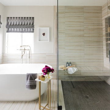
Transitional beige tile beige floor bathroom photo in Salt Lake City with beige walls and a hinged shower door
2