
Search results for "Poor decision making" in Home Design Ideas
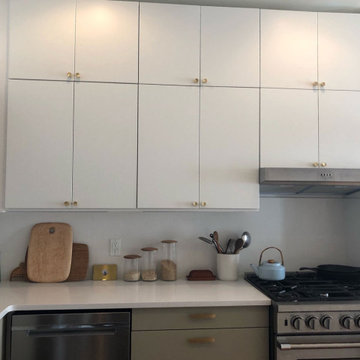
 INSPIRED KITCHEN DESIGN
Another design need for her IKEA kitchen was an easier-to-clean countertop, Shoko says.
“Our original counter was brown, making it very difficult to spot messes, spills, and crumbs. That’s why we opted for a white counter with matching backsplash (which is all one piece),” she says.
In fact, the Caesarstone in Blizzard runs from the sink to the stove area, giving ample space for food prep and is complemented by the matching backsplash and the custom butcher block seating area on the other side of the stove.
“Clean up is so much quicker and easier with the new countertops,” she says.
The counter area is further brightened by under cabinet lighting strips from IKEA.
For new IKEA renovators, Shoko wants to share some useful tips from her IKEA experience.
“The first thing I would say to others is do not be intimidated by the renovation process! There are so many resources available that can help simplify an IKEA renovation project. I’d also suggest asking a lot of questions, including asking how you plan on using the space,” she says.
She also says that working with design professionals was the best decision for her IKEA kitchen.
“The kitchen specialists at IKEA were very knowledgeable, and, of course the staff at IKD explained all the options, materials, and demystified the IKEA ordering process,” she adds.
She concludes: “Ultimately, we chose IKEA cabinetry for the ease and the price. Since our apartment isn’t a forever home, we didn’t think it made sense to go for custom cabinets. We were looking for something simple, clean, and affordable, and for a project (and a space) of this size, IKEA’s options were a great fit for us!”
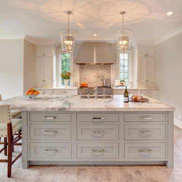
 collaborative interiors
Cabinet design by: Collaborative Interiors |
Kitchen design by: Beverly Bradshaw Interiors |
Remodeler: McKinney Group |
Photographer: Tom Marks Photo |
***Please visit the Houzz page of Beverly Bradshaw Interiors for any info regarding this project***
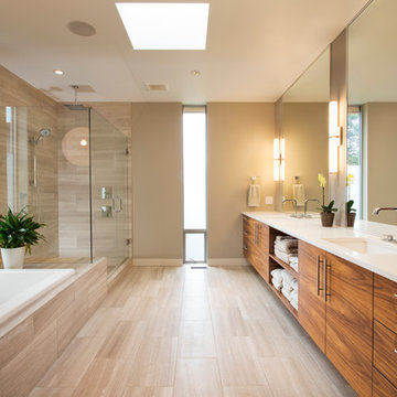
 FLASHhouse Inc
Gary McKinstry
Example of a trendy beige tile beige floor bathroom design in Vancouver with an undermount sink, flat-panel cabinets, beige walls and medium tone wood cabinets
Example of a trendy beige tile beige floor bathroom design in Vancouver with an undermount sink, flat-panel cabinets, beige walls and medium tone wood cabinets
Find the right local pro for your project
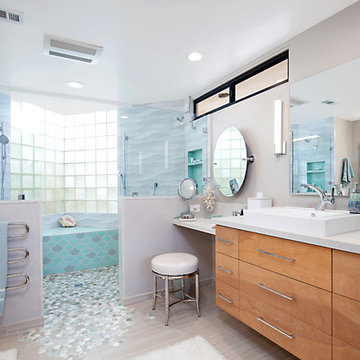
 B Home Design
Stunning master bathroom remodel in Encinitas. Project was completely customized to homeowner's specifications. His and Hers floating beech vanities with quartz counters, include a drop down make up vanity on Her side. Custom recessed solid maple medicine cabinets behind the mirror. Both vanities feature large rimmed vessel sinks and polished chrome faucets. The spacious 2 person shower showcases a custom pebble mosaic puddle at the entrance, 3D wave tile walls and hand painted Moroccan fish scale tile accenting the bench and oversized shampoo niches. Each end of the shower is outfitted with it's own set of shower head and valve, as well as a hand shower with slide bar.
 We Make It Our Home
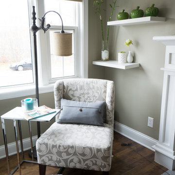
The living room was long and narrow but with an amazing bay window. Instead of a galley style living room used by the previous owner, we decided to change the furniture arrangement by putting one big comfy L-shaped sectional all the way to one side to create a pass-through area enabling a better foot traffic. We then added two side chairs for extra seats. We also mounted our TV on top of the fireplace to gain more space. Although it's not my favorite design choice to have TV on top of the fireplace because I think it takes away from the fireplace but we had to work within the limitation of the space.
For the fireplace, we bought wood stove insert and inserted it into the existing masonry fireplace. The look was updated by granite tiles around the insert and custom built wood mantel.
Buying wood fireplace insert was the best decision we made. First of all, it created a memorable space in our home. I LOVE the sound of wood cracking and the smell of wood burning. In winter nights we would sit around the fireplace and make s'mores like it's a campfire. Second, it's a clean burning and efficient heater. You don't lose the majority the fire’s heat up the chimney thereby saving money on your heating bill.
The coffee table is purchased from Wicker Emporium and it's made from reclaimed pine timbers giving the house a rustic feel.
The side chair by the fireplace is the perfect spot for me to relax, put my feet up on the large ball shaped knitted foot rest and enjoy a cup of cappuccino or cozy up with a good book.
 JL Interiors
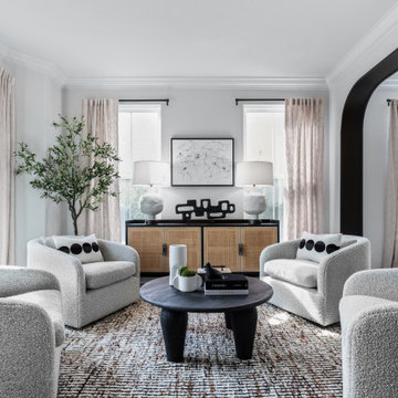
Contemporary formal living room. JL Interiors is a LA-based creative/diverse firm that specializes in residential interiors. JL Interiors empowers homeowners to design their dream home that they can be proud of! The design isn’t just about making things beautiful; it’s also about making things work beautifully. Contact us for a free consultation Hello@JLinteriors.design _ 310.390.6849
 Jennifer Gilmer Kitchen & Bath
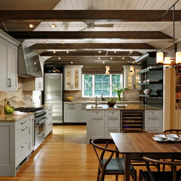
Design by #JGKB in McLean, Virginia.
Photography by Bob Narod.
Example of a large transitional l-shaped medium tone wood floor open concept kitchen design in DC Metro with recessed-panel cabinets, white cabinets, beige backsplash, stainless steel appliances, an island, an undermount sink, granite countertops and limestone backsplash
Example of a large transitional l-shaped medium tone wood floor open concept kitchen design in DC Metro with recessed-panel cabinets, white cabinets, beige backsplash, stainless steel appliances, an island, an undermount sink, granite countertops and limestone backsplash


 Design Connection, Inc.
Laminate cabinet fronts and Corian were the rage when this Overland Park home was built. With an out dated kitchen this beautiful California styled home required a gut and redo in the main kitchen area. The decision making process was extensive, but the client felt like she achieved a beautiful new kitchen with the guidance and hard work of Arlene Ladegaard and the Design Connection, Inc. team. From the beautiful white inset cabinet doors to the seamless look of the built in refrigerator to the antique brass faucets and pulls this kitchen is complete. Arlene and her team worked hard from the designing phase to the project management to the completion of new kitchen remodel. The client says” Thank you and I love it!”
Design Connection, Inc. provided- Kitchen design, space planning, elevations, tile, plumbing, cabinet design, counter top selections, bar stools, and installation of all products including project management.
The newly remodeled white kitchen is on trend in the world of design. A point of emphasis was designed by Design Connection, Inc. through cross glass front cabinets that were extended all the way to the ceiling and lowered a little towards the counter top.
Design Connection, Inc. provided- Kitchen design, space planning, elevations, tile, plumbing, cabinet design, counter top selections, bar stools, and installation of all products including project management.
The custom cabinetry for the client was important to update the space. Beautifully designed cabinets with inset doors and a custom finish hardware to match the faucet the client loved.
Design Connection, Inc. provided- Kitchen design, space planning, elevations, tile, plumbing, cabinet design, counter top selections, bar stools, and installation of all products including project management.
The backsplash was extended all the way up to the ceiling creating a point of emphasis for the kitchen.
Design Connection, Inc. provided- Kitchen design, space planning, elevations, tile, plumbing, cabinet design, counter top selections, bar stools, and installation of all products including project management.

 Michael Nash Design, Build & Homes
2013 NARI CAPITAL COTY, FINALIST AWARD WINNER, RESIDENTIAL BATH UNDER $30,000
A colonial home recently built in the suburb of Leesburg had a run of the mill 10’x11’ bathroom connected to the seating room of the master suite.
The clients disliked both the builder grade soaking tub and small shower, in fact, preferring to sacrifice the tub for a much bigger spa-like shower stall. In general, they wanted more space and more storage. To increase the footprint for the remodel, a decision was made to “steal” some space from the seating room.
The new layout features a large, walk-in shower with a frameless glass enclosure. A rain shower, body sprays and bench seating meet all of the homeowners’ desires.
Large linen cabinets surround a large new vanity, touting a granite top, vessel sinks and wall-mounted faucets. Mirrored, embedded medicine cabinets are wrapped in glass tile and illuminated by hanging lights. The opposite wall features floating dressing cabinets which serve as a new make-up area.
Smart use of lighting, such as pendants, sconces, and recess lights has made the space brighter than ever. Designers at Michael Nash Design, Build & Homes used large, light color porcelain tiles and enhanced the look with complementary glass tiles on accents walls, niches and other areas.
 Nancy Finneson | DeMane Design
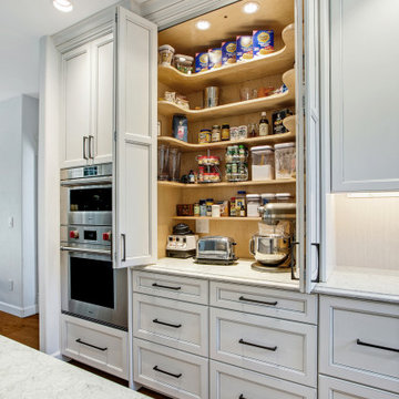
This kitchen has a new layout which resulted in more organized storage and work space. A flush mounted ceiling hood give it an open feel. A custom baking center keeps like items in their proper place and accessible. Off white glazed cabinets and ogee edged quartz countertops make an elegant statement. A raised live-edge bar and beverage cooler make entertaining a breeze.
 JMorris Design LLC
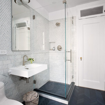
The bathroom was previously closed in and had a large tub off the door. Making this a glass stand up shower, left the space brighter and more spacious. Other tricks like the wall mount faucet and light finishes add to the open clean feel.
 3north
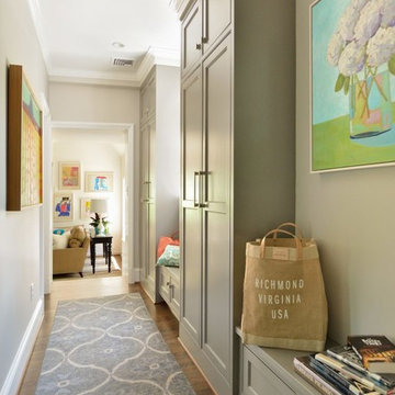
Do you move to the suburbs, make do, or add on? For a couple who wanted more kitchen and room to spread out and entertain, the decision was made to stay and grow. An addition was made behind their home that created an entirely new kitchen and family room, complete with vaulted ceilings and custom light fixtures. The addition itself is also not highly visible from the road, cutting down on the “hunchback” look of so many older city homes with massive additions. Windows give the space abundant natural light, with doors that inconspicuously blend indoor and outdoor living – an all in the home and neighborhood the couple loves best.
 TVL Creative Ltd.
This project was such an incredible design opportunity, and instilled inspiration and excitement at every turn! Our amazing clients came to us with the challenge of converting their beloved family home into a welcoming haven for all members of the family. At the time that we met our clients, they were struggling with the difficult personal decision of the fate of the home. Their father/father-in-law had passed away and their mother/mother-in-law had recently been admitted into a nursing facility and was fighting Alzheimer’s. Resistant to loss of the home now that both parents were out of it, our clients purchased the home to keep in in the family. Despite their permanent home currently being in New Jersey, these clients dedicated themselves to keeping and revitalizing the house. We were moved by the story and became immediately passionate about bringing this dream to life.
The home was built by the parents of our clients and was only ever owned by them, making this a truly special space to the family. Our goal was to revitalize the home and to bring new energy into every room without losing the special characteristics that were original to the home when it was built. In this way, we were able to develop a house that maintains its own unique personality while offering a space of welcoming neutrality for all members of the family to enjoy over time.
The renovation touched every part of the home: the exterior, foyer, kitchen, living room, sun room, garage, six bedrooms, three bathrooms, the laundry room, and everything in between. The focus was to develop a style that carried consistently from space to space, but allowed for unique expression in the small details in every room.
Starting at the entry, we renovated the front door and entry point to offer more presence and to bring more of the mid-century vibe to the home’s exterior. We integrated a new modern front door, cedar shingle accents, new exterior paint, and gorgeous contemporary house numbers that really allow the home to stand out. Just inside the entry, we renovated the foyer to create a playful entry point worthy of attention. Cement look tile adorns the foyer floor, and we’ve added new lighting and upgraded the entry coat storage.
Upon entering the home, one will immediately be captivated by the stunning kitchen just off the entry. We transformed this space in just about every way. While the footprint of the home ultimately remained almost identical, the aesthetics were completely turned on their head. We re-worked the kitchen to maximize storage and to create an informal dining area that is great for casual hosting or morning coffee.
We removed the entry to the garage that was once in the informal dining, and created a peninsula in its place that offers a unique division between the kitchen/informal dining and the formal dining and living areas. The simple light warm light gray cabinetry offers a bit of traditional elegance, along with the marble backsplash and quartz countertops. We extended the original wood flooring into the kitchen and stained all floors to match for a warmth that truly resonates through all spaces. We upgraded appliances, added lighting everywhere, and finished the space with some gorgeous mid century furniture pieces.
In the formal dining and living room, we really focused on maintaining the original marble fireplace as a focal point. We cleaned the marble, repaired the mortar, and refinished the original fireplace screen to give a new sleek look in black. We then integrated a new gas insert for modern heating and painted the upper portion in a rich navy blue; an accent that is carried through the home consistently as a nod to our client’s love of the color.
The former entry into the old covered porch is now an elegant glass door leading to a stunning finished sunroom. This room was completely upgraded as well. We wrapped the entire space in cozy white shiplap to keep a casual feel with brightness. We tiled the floor with large format concrete look tile, and painted the old brick fireplace a bright white. We installed a new gas burning unit, and integrated transitional style lighting to bring warmth and elegance into the space. The new black-frame windows are adorned with decorative shades that feature hand-sketched bird prints, and we’ve created a dedicated garden-ware “nook” for our client who loves to work in the yard. The far end of this space is completed with two oversized chaise loungers and overhead lights…the most perfect little reading nook!
Just off the dining room, we created an entirely new space to the home: a mudroom. The clients lacked this space and desperately needed a landing spot upon entering the home from the garage. We uniquely planned existing space in the garage to utilize for this purpose, and were able to create a small but functional entry point without losing the ability to park cars in the garage. This new space features cement-look tile, gorgeous deep brown cabinetry, and plenty of storage for all the small items one might need to store while moving in and out of the home.
The remainder of the upstairs level includes massive renovations to the guest hall bathroom and guest bedroom, upstairs master bed/bath suite, and a third bedroom that we converted into a home office for the client.
Some of the largest transformations were made in the basement, where unfinished space and lack of light were converted into gloriously lit, cozy, finished spaces. Our first task was to convert the massive basement living room into the new master bedroom for our clients. We removed existing built-ins, created an entirely new walk-in closet, painted the old brick fireplace, installed a new gas unit, added carpet, introduced new lighting, replaced windows, and upgraded every part of the aesthetic appearance. One of the most incredible features of this space is the custom double sliding barn door made by a Denver artisan. This space is truly a retreat for our clients!
We also completely transformed the laundry room, back storage room, basement master bathroom, and two bedrooms.
This home’s massive scope and ever-evolving challenges were thrilling and exciting to work with, and the result is absolutely amazing. At the end of the day, this home offers a look and feel that the clients love. Above all, though, the clients feel the spirit of their family home and have a welcoming environment for all members of the family to enjoy for years to come.

Sponsored
Columbus, OH

Hope Restoration & General Contracting
Columbus Design-Build, Kitchen & Bath Remodeling, Historic Renovations
 Gallery Of Shades
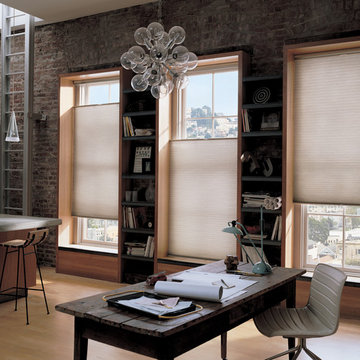
At Gallery of Shades, we provide high quality and stylish window coverings for any room. Our philosophy is simple and that is to provide our clients with the best products and services at a fair price in order to enrich their home environment. We have been servicing Scottsdale and its surrounding areas for over 25 years.
We have a large selection of window treatments including shutters, blinds, shades, screens, draperies and even tints. Regardless of the windows size or shape, you can rest assured Gallery of Shades has the perfect solution for them. Our design consultants will help you to select the right window covering for any room by bringing the showroom to you. This enables you to get the right look, feel and functionality in your window treatments, and beautify your space while protecting it from the harsh Arizona sun.
Our products are guaranteed for a lifetime. At Gallery of Shades, our top priority is giving our customers more value than they expect. This is measured by price, performance, quality, features and services rendered. This goal is the core of our beliefs and guides us in everything we do. We know making decisions in your home can sometimes be overwhelming so we do our best to make your window covering experience a positive one that you won’t forget.
 Davetta Moore Designs
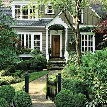
So charming - love the little path to the front door.
Beautiful color combination:
Have you ever noticed that the colors we see can be described simply in two different types of categories? Natural and unnatural. I noticed while shopping last weekend some really unattractive color combinations and I said to myself why oh why did someone think that looks good because looking at this is painful to my eyes. So let me give you a few tips of what to lookout for when you are making your color decisions.
Image from http://www.lizmarieblog.com/2013/06/favorite-things-friday-24/
Join periodic email updates at https://www.facebook.com/davettamooredesigns/app_141428856257
 RAJ Kitchen and Bath, LLC
**Check out the video of this transformation on our website**
This small kitchen was way too small for this 2 bedrooms, 2 bathrooms apartment. Not only was it a very small kitchen, but the physical location of it made it very difficult to make it any bigger. There wasn't much that could have been done without incurring astronomical cost, which would get little or no return on the investment. The client wanted a kitchen that can be optimized in its current location to add a ton of value for resale.
This was difficult to do, because there was no moving of any mechanical around in the kitchen and even if we wanted to, the management of the building would not allow. For those of you who live in condos, co-ops or apartment building, you know how difficult it is to rework these foot prints. When we showed up, we saw the problems, but we also saw a huge opportunity where we can achieve those goals in the small space. This was accomplished by making some key changes and to incorporate some new things that was not possible when this kitchen was built years ago.
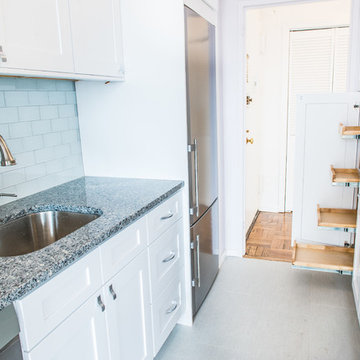
The crucial part of the design that would drive the entire new layout, was selecting the only appliance; that was the Refrigerator. Once we nailed down that refrigerator, we then proceeded to design the kitchen around it. We moved it to the other side of the wall where the sink was so that we can tap into the water line from the sink plumbing. It was crucial that it stays exactly 24" deep, not an inch more because we had to keep the entry as open as possible. Also, it was going to be directly in front of another big storage unit - The pantry. It is not ideal in most cases, but we needed the rest of the space to ramp up the design and open feel towards the side where all of the activities would take place, which happend to be the dining room and the view.
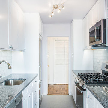
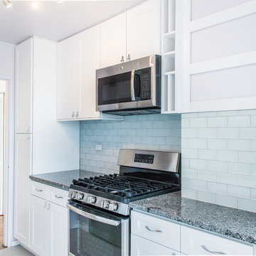
Once all that was figured out, we re-positioned the sink, dishwasher and the range and proceeded to wrap the cabinets around the columns to integrate them into the space. Thirty- six inches cabinets height was used so that they can be installed higher towards the ceiling height to give more room rather than the standard 18" required height between the counter tops. This was done to make the room feel a lot bigger than it really was. Not to mention, we also didn't want the faucet to be buried under the cabinets so that was also a necessary design detail for the space.
We then lowered both knee walls so that the counter top can sit on top of them, by removing that stop point that would have otherwise defined the kitchen area. This allowed us to pick up that extra footprint into the room for added prep space and enabled us to create the illusion of a kitchen that is looking longer than it really is. Every inch mattered when designing this kitchen and we made a conscious decision to use every one of that inch.
White cabinets were selected to do just what white cabinets are design to do; make a small or dark room appear bigger, brighter and more open. In this kitchen, this was amplified the more because of the kitchen location. It was perfect! We knew we did justice to the space because while we were there taking some photos, a few potential buyers walked in and went straight for the kitchen! They said its design just to fit the apartment.
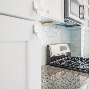
Pantry roll out shelving, Double recycle bin, fancy handles, LED lighting, Quartz counter top, beautiful backslash tiles and grey linen floors finished off the kitchen which looked over a beautiful view of the George Washington Bridge from the top of this lovely 4th floor apartment.
Credit to Masterpiece Tile and Marble (Annmarie on the selection of Tiles and countertop and Val on the Construction to complete this project).
Davor Kokic Photography
 RAJ Kitchen and Bath, LLC
**Check out the video of this transformation on our website**
This small kitchen was way too small for this 2 bedrooms, 2 bathrooms apartment. Not only was it a very small kitchen, but the physical location of it made it very difficult to make it any bigger. There wasn't much that could have been done without incurring astronomical cost, which would get little or no return on the investment. The client wanted a kitchen that can be optimized in its current location to add a ton of value for resale.
This was difficult to do, because there was no moving of any mechanical around in the kitchen and even if we wanted to, the management of the building would not allow. For those of you who live in condos, co-ops or apartment building, you know how difficult it is to rework these foot prints. When we showed up, we saw the problems, but we also saw a huge opportunity where we can achieve those goals in the small space. This was accomplished by making some key changes and to incorporate some new things that was not possible when this kitchen was built years ago.
The crucial part of the design that would drive the entire new layout, was selecting the only appliance; that was the Refrigerator. Once we nailed down that refrigerator, we then proceeded to design the kitchen around it. We moved it to the other side of the wall where the sink was so that we can tap into the water line from the sink plumbing. It was crucial that it stays exactly 24" deep, not an inch more because we had to keep the entry as open as possible. Also, it was going to be directly in front of another big storage unit - The pantry. It is not ideal in most cases, but we needed the rest of the space to ramp up the design and open feel towards the side where all of the activities would take place, which happend to be the dining room and the view.
Once all that was figured out, we re-positioned the sink, dishwasher and the range and proceeded to wrap the cabinets around the columns to integrate them into the space. Thirty- six inches cabinets height was used so that they can be installed higher towards the ceiling height to give more room rather than the standard 18" required height between the counter tops. This was done to make the room feel a lot bigger than it really was. Not to mention, we also didn't want the faucet to be buried under the cabinets so that was also a necessary design detail for the space.
We then lowered both knee walls so that the counter top can sit on top of them, by removing that stop point that would have otherwise defined the kitchen area. This allowed us to pick up that extra footprint into the room for added prep space and enabled us to create the illusion of a kitchen that is looking longer than it really is. Every inch mattered when designing this kitchen and we made a conscious decision to use every one of that inch.
White cabinets were selected to do just what white cabinets are design to do; make a small or dark room appear bigger, brighter and more open. In this kitchen, this was amplified the more because of the kitchen location. It was perfect! We knew we did justice to the space because while we were there taking some photos, a few potential buyers walked in and went straight for the kitchen! They said its design just to fit the apartment.
Pantry roll out shelving, Double recycle bin, fancy handles, LED lighting, Quartz counter top, beautiful backslash tiles and grey linen floors finished off the kitchen which looked over a beautiful view of the George Washington Bridge from the top of this lovely 4th floor apartment.
Credit to Masterpiece Tile and Marble (Annmarie on the selection of Tiles and countertop and Val on the Construction to complete this project).
Davor Kokic Photography

 RAJ Kitchen and Bath, LLC
**Check out the video of this transformation on our website**
This small kitchen was way too small for this 2 bedrooms, 2 bathrooms apartment. Not only was it a very small kitchen, but the physical location of it made it very difficult to make it any bigger. There wasn't much that could have been done without incurring astronomical cost, which would get little or no return on the investment. The client wanted a kitchen that can be optimized in its current location to add a ton of value for resale.
This was difficult to do, because there was no moving of any mechanical around in the kitchen and even if we wanted to, the management of the building would not allow. For those of you who live in condos, co-ops or apartment building, you know how difficult it is to rework these foot prints. When we showed up, we saw the problems, but we also saw a huge opportunity where we can achieve those goals in the small space. This was accomplished by making some key changes and to incorporate some new things that was not possible when this kitchen was built years ago.
The crucial part of the design that would drive the entire new layout, was selecting the only appliance; that was the Refrigerator. Once we nailed down that refrigerator, we then proceeded to design the kitchen around it. We moved it to the other side of the wall where the sink was so that we can tap into the water line from the sink plumbing. It was crucial that it stays exactly 24" deep, not an inch more because we had to keep the entry as open as possible. Also, it was going to be directly in front of another big storage unit - The pantry. It is not ideal in most cases, but we needed the rest of the space to ramp up the design and open feel towards the side where all of the activities would take place, which happend to be the dining room and the view.
Once all that was figured out, we re-positioned the sink, dishwasher and the range and proceeded to wrap the cabinets around the columns to integrate them into the space. Thirty- six inches cabinets height was used so that they can be installed higher towards the ceiling height to give more room rather than the standard 18" required height between the counter tops. This was done to make the room feel a lot bigger than it really was. Not to mention, we also didn't want the faucet to be buried under the cabinets so that was also a necessary design detail for the space.
We then lowered both knee walls so that the counter top can sit on top of them, by removing that stop point that would have otherwise defined the kitchen area. This allowed us to pick up that extra footprint into the room for added prep space and enabled us to create the illusion of a kitchen that is looking longer than it really is. Every inch mattered when designing this kitchen and we made a conscious decision to use every one of that inch.
White cabinets were selected to do just what white cabinets are design to do; make a small or dark room appear bigger, brighter and more open. In this kitchen, this was amplified the more because of the kitchen location. It was perfect! We knew we did justice to the space because while we were there taking some photos, a few potential buyers walked in and went straight for the kitchen! They said its design just to fit the apartment.
Pantry roll out shelving, Double recycle bin, fancy handles, LED lighting, Quartz counter top, beautiful backslash tiles and grey linen floors finished off the kitchen which looked over a beautiful view of the George Washington Bridge from the top of this lovely 4th floor apartment.
Credit to Masterpiece Tile and Marble (Annmarie on the selection of Tiles and countertop and Val on the Construction to complete this project).
Davor Kokic Photography
 highland
Creating the perfect fall home design, Pedrovazpaulo Real Estate and floorplan is one of the best ways to make your living space warm, functional, and visually attractive during the cozy autumn season. Fall is the time when families spend more time indoors, enjoy warm colors, and focus on comfort. A well-planned home layout not only improves beauty but also increases convenience for everyday living. A smart fall home design and floorplan should include open spaces, natural lighting, warm textures, and practical room arrangements. Whether you are building a new home or renovating your current one, choosing the right layout is essential. Modern homeowners also look for stylish house design plan options that combine beauty with efficiency. In this article, we will explore how to create the perfect fall home design and floorplan, discuss modern layout trends, and explain how house plan design, home architecture design, home design plans, and home plan design work together to build a dream home.
Why Fall Home Design Matters
A good fall home design and floorplan helps your house feel welcoming and peaceful. During autumn, people prefer warm interiors, comfortable seating areas, and rooms that allow better natural light. A thoughtful layout supports these needs while improving the overall value of the property. Fall-inspired homes often include earthy tones like brown, beige, orange, and cream. Large windows are also common because they allow sunlight to brighten indoor spaces. Open kitchens connected to dining and living rooms are another popular feature in modern house design plan ideas. When your fall home design and floorplan is properly planned, every room serves a purpose while maintaining visual harmony.
Key Features of a Perfect Floorplan
1. Open Living Spaces
One major part of a strong fall home design and floorplan is an open-concept living area. Combining the kitchen, dining room, and living room creates a spacious feeling and improves family interaction. Modern house plan design focuses on flexibility. Open spaces make entertaining guests easier and allow better furniture arrangement for seasonal decorations.
2. Functional Entryway
Your entrance should feel warm and organized. A good mudroom or foyer is essential in any fall home design and floorplan because it helps manage shoes, coats, and seasonal accessories. This practical idea is often included in professional home design plans for families who want both beauty and convenience.
3. Cozy Bedrooms
Bedrooms should provide comfort and privacy. Soft lighting, warm colors, and smart furniture placement improve relaxation. A strong home plan design ensures bedrooms are away from noisy areas for better peace.
4. Outdoor Connection
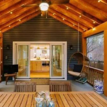
Fall is perfect for enjoying patios, balconies, and garden views. Many experts in home architecture design recommend adding sliding glass doors or covered patios to connect indoor and outdoor spaces. This improves both beauty and property value.
Importance of House Design Planning
A successful fall home design and floorplan starts with a detailed house design plan. Without proper planning, homes may look attractive but fail in functionality. A professional house design plan includes room sizes, traffic flow, ventilation, and furniture placement. It also ensures your budget is used wisely. Many homeowners regret skipping this step because poor layouts create long-term inconvenience. Good planning also supports future needs such as children, guests, or work-from-home spaces.
Role of Home Architecture Design
Strong home architecture design gives personality to your house. It combines exterior beauty with interior efficiency. The roof style, wall structure, windows, and natural light all affect the success of your fall home design and floorplan. For example, homes with high ceilings and large windows feel brighter and more open during fall. Natural materials like wood and stone also add warmth and seasonal charm. Professional home architecture design creates a balance between modern trends and personal lifestyle needs.
Choosing the Right Home Design Plans
Selecting the right home design plans helps avoid expensive mistakes. Your plan should match your land size, family size, and future goals. Single-story homes are ideal for small families and elderly residents, while double-story layouts work better for growing families. Your fall home design and floorplan should also include storage spaces, laundry areas, and practical bathroom locations. Customized home design plans are often better than copied layouts because they reflect your exact needs.
Modern Trends in Home Plan Design
Today’s home plan design focuses on simplicity, energy efficiency, and natural comfort. Some popular trends include:
- Minimalist kitchens with hidden storage
- Multi-purpose rooms for office and guest use
- Energy-saving windows and insulation
- Smart lighting systems
- Indoor plants and natural decoration
Conclusion
A well-planned fall home design and floorplan creates a home that feels warm, beautiful, and highly functional. From open living spaces to cozy bedrooms and outdoor connections, every detail matters when designing a seasonal home. Using a smart house design plan, strong house plan design, creative home architecture design, detailed home design plans, and practical home plan design helps you achieve the perfect balance of style and comfort. Whether you are building from scratch or improving your current house, investing in the right fall home design and floorplan will bring long-term satisfaction and better living quality. A thoughtful home is not just a place to live—it becomes a place to truly enjoy every season. Also you can read in homemaxe website for Pedrovazpaulo Real Estate
FAQs
1. What is a fall home design and floorplan?
A fall home design and floorplan is a home layout designed to create warmth, comfort, and functionality during the autumn season using cozy interiors and smart room arrangements.
2. Why is a house design plan important?
A house design plan helps organize room sizes, movement flow, lighting, and budget management before construction begins.
3. How does home architecture design improve a house?
Home architecture design improves both exterior appearance and interior comfort by balancing beauty, structure, and natural lighting.
4. What should be included in home design plans?
Good home design plans should include bedrooms, bathrooms, kitchen layout, storage spaces, outdoor areas, and future family needs.
5. What makes a modern home plan design successful?
A successful home plan design focuses on comfort, energy efficiency
 RAJ Kitchen and Bath, LLC
**Check out the video of this transformation on our website**
This small kitchen was way too small for this 2 bedrooms, 2 bathrooms apartment. Not only was it a very small kitchen, but the physical location of it made it very difficult to make it any bigger. There wasn't much that could have been done without incurring astronomical cost, which would get little or no return on the investment. The client wanted a kitchen that can be optimized in its current location to add a ton of value for resale.
This was difficult to do, because there was no moving of any mechanical around in the kitchen and even if we wanted to, the management of the building would not allow. For those of you who live in condos, co-ops or apartment building, you know how difficult it is to rework these foot prints. When we showed up, we saw the problems, but we also saw a huge opportunity where we can achieve those goals in the small space. This was accomplished by making some key changes and to incorporate some new things that was not possible when this kitchen was built years ago.
The crucial part of the design that would drive the entire new layout, was selecting the only appliance; that was the Refrigerator. Once we nailed down that refrigerator, we then proceeded to design the kitchen around it. We moved it to the other side of the wall where the sink was so that we can tap into the water line from the sink plumbing. It was crucial that it stays exactly 24" deep, not an inch more because we had to keep the entry as open as possible. Also, it was going to be directly in front of another big storage unit - The pantry. It is not ideal in most cases, but we needed the rest of the space to ramp up the design and open feel towards the side where all of the activities would take place, which happend to be the dining room and the view.
Once all that was figured out, we re-positioned the sink, dishwasher and the range and proceeded to wrap the cabinets around the columns to integrate them into the space. Thirty- six inches cabinets height was used so that they can be installed higher towards the ceiling height to give more room rather than the standard 18" required height between the counter tops. This was done to make the room feel a lot bigger than it really was. Not to mention, we also didn't want the faucet to be buried under the cabinets so that was also a necessary design detail for the space.
We then lowered both knee walls so that the counter top can sit on top of them, by removing that stop point that would have otherwise defined the kitchen area. This allowed us to pick up that extra footprint into the room for added prep space and enabled us to create the illusion of a kitchen that is looking longer than it really is. Every inch mattered when designing this kitchen and we made a conscious decision to use every one of that inch.
White cabinets were selected to do just what white cabinets are design to do; make a small or dark room appear bigger, brighter and more open. In this kitchen, this was amplified the more because of the kitchen location. It was perfect! We knew we did justice to the space because while we were there taking some photos, a few potential buyers walked in and went straight for the kitchen! They said its design just to fit the apartment.
Pantry roll out shelving, Double recycle bin, fancy handles, LED lighting, Quartz counter top, beautiful backslash tiles and grey linen floors finished off the kitchen which looked over a beautiful view of the George Washington Bridge from the top of this lovely 4th floor apartment.
Credit to Masterpiece Tile and Marble (Annmarie on the selection of Tiles and countertop and Val on the Construction to complete this project).
Davor Kokic Photography
43