
Search results for "Poor functionality" in Home Design Ideas
 Wellstudio Architecture
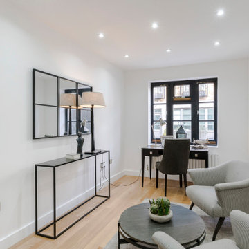
Renovation of an existing mews house, transforming it from a poorly planned out and finished property to a highly desirable residence that creates wellbeing for its occupants.
Wellstudio demolished the existing bedrooms on the first floor of the property to create a spacious new open plan kitchen living dining area which enables residents to relax together and connect.
Wellstudio inserted two new windows between the garage and the corridor on the ground floor and increased the glazed area of the garage door, opening up the space to bring in more natural light and thus allowing the garage to be used for a multitude of functions.
Wellstudio replanned the rest of the house to optimise the space, adding two new compact bathrooms and a utility room into the layout.
 Designs by KS
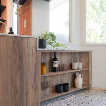
When our clients came to us with their renovation project asking for a pink kitchen, we were thrilled at the opportunity to create a unique, bright and colourful kitchen. It’s not something you see everyday, and we live for it! Being that they are a young family, who loves to cook but felt secluded and overwhelmed when in this space, we knew that this was going to be an epic transformation, not just aesthetically but also for their day-to-day life.
This renovation transformed a closed off, cramped, and poorly laid-out kitchen into a colourful, bright, open, and inviting space that combines functionality with vibrant colours and character. The redesign focused on maximizing storage, improving layout efficiency, and infusing the space with unique design elements that make it both practical and fun.
 Sue Oda
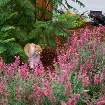
After one of the family took a fall on a slippery, sloped and painted walkway, our clients decided it was time to update their home's entry walkway. A large cedar tree, in poor health, also dripped sap on the sidewalk and parked cars, creating a sticky mess. We replaced the tree and water wasting lawn with drought tolerant alternatives and created a lighted, flagstone pathway, with custom steel railing leading to the front door.
In the backyard, our clients wanted to create a space for entertaining, hanging out with their grandchildren, and growing their own vegetables. The yard was replaced with a flagstone patio including a large raised bed. We also hid the air conditiong unit to create a convivial and functional area.
Find the right local pro for your project
 Amsted Design-Build
Previously renovated with a two-story addition in the 80’s, the home’s square footage had been increased, but the current homeowners struggled to integrate the old with the new.
An oversized fireplace and awkward jogged walls added to the challenges on the main floor, along with dated finishes. While on the second floor, a poorly configured layout was not functional for this expanding family.
From the front entrance, we can see the fireplace was removed between the living room and dining rooms, creating greater sight lines and allowing for more traditional archways between rooms.
At the back of the home, we created a new mudroom area, and updated the kitchen with custom two-tone millwork, countertops and finishes. These main floor changes work together to create a home more reflective of the homeowners’ tastes.
On the second floor, the master suite was relocated and now features a beautiful custom ensuite, walk-in closet and convenient adjacency to the new laundry room.
Gordon King Photography
 Reico Kitchen & Bath
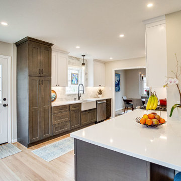
Designed by Marc Jean-Michel of Reico Kitchen & Bath in Bethesda, MD in collaboration with Liz Forgione of MMD Construction, this small transitional kitchen features Green Forest cabinets in the Park Place shaker door style in two finishes. The base cabinets feature a Summit Grey finish and the wall cabinets a White finish. The kitchen countertops are MSI Artic White Quartz.
The kitchen includes a Maravilla/Alvetian Isles Honed Marble 4x16 tile backsplash along with GE and Frigidaire appliances.
“The hardest part was envisioning a new functional space in an old kitchen with a poor layout and use of space,” said the client. “I love most the transformation in the flow of the whole first floor. The kitchen entries are wide, more inviting and create a lot of great light! There is so much great storage in a small kitchen! Marc was great to work with. I loved all of his ideas.”
Photos courtesy of BTW Images LLC.
 Saikley Architects
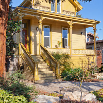
This beautiful 1881 Alameda Victorian cottage, wonderfully embodying the Transitional Gothic-Eastlake era, had most of its original features intact. Our clients, one of whom is a painter, wanted to preserve the beauty of the historic home while modernizing its flow and function.
From several small rooms, we created a bright, open artist’s studio. We dug out the basement for a large workshop, extending a new run of stair in keeping with the existing original staircase. While keeping the bones of the house intact, we combined small spaces into large rooms, closed off doorways that were in awkward places, removed unused chimneys, changed the circulation through the house for ease and good sightlines, and made new high doorways that work gracefully with the eleven foot high ceilings. We removed inconsistent picture railings to give wall space for the clients’ art collection and to enhance the height of the rooms. From a poorly laid out kitchen and adjunct utility rooms, we made a large kitchen and family room with nine-foot-high glass doors to a new large deck. A tall wood screen at one end of the deck, fire pit, and seating give the sense of an outdoor room, overlooking the owners’ intensively planted garden. A previous mismatched addition at the side of the house was removed and a cozy outdoor living space made where morning light is received. The original house was segmented into small spaces; the new open design lends itself to the clients’ lifestyle of entertaining groups of people, working from home, and enjoying indoor-outdoor living.
Photography by Kurt Manley.
https://saikleyarchitects.com/portfolio/artists-victorian/
 Enchanted Kitchens, LLC
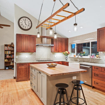
The space was unusable for family and entertaining. It was too small, with poor space planning. This complete remodel required structural wall removal, appliance relocate, floor replace and refinish. The peninsula was replaced with island for better traffic flow. The bridge at hood avoided the need for tile to the ceiling. The client was a fireman and the ladder makes him feel right at home!

Sponsored
Columbus, OH

Structural Remodeling
Franklin County's Heavy Timber Specialists | Best of Houzz 2020!
 The Home Co.
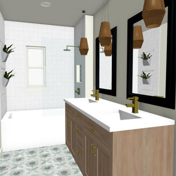
We ? bathroom renovations! This initially drab space was so poorly laid-out that it fit only a tiny vanity for a family of four!
Working in the existing footprint, and in a matter of a few weeks, we were able to design and renovate this space to accommodate a double vanity (SO important when it is the only bathroom in the house!). In addition, we snuck in a private toilet room for added functionality. Now this bath is a stunning workhorse!
 Amsted Design-Build
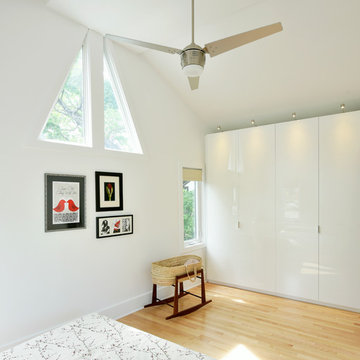
Previously renovated with a two-story addition in the 80’s, the home’s square footage had been increased, but the current homeowners struggled to integrate the old with the new.
An oversized fireplace and awkward jogged walls added to the challenges on the main floor, along with dated finishes. While on the second floor, a poorly configured layout was not functional for this expanding family.
From the front entrance, we can see the fireplace was removed between the living room and dining rooms, creating greater sight lines and allowing for more traditional archways between rooms.
At the back of the home, we created a new mudroom area, and updated the kitchen with custom two-tone millwork, countertops and finishes. These main floor changes work together to create a home more reflective of the homeowners’ tastes.
On the second floor, the master suite was relocated and now features a beautiful custom ensuite, walk-in closet and convenient adjacency to the new laundry room.
Gordon King Photography
 Saikley Architects
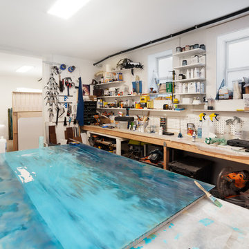
This beautiful 1881 Alameda Victorian cottage, wonderfully embodying the Transitional Gothic-Eastlake era, had most of its original features intact. Our clients, one of whom is a painter, wanted to preserve the beauty of the historic home while modernizing its flow and function.
From several small rooms, we created a bright, open artist’s studio. We dug out the basement for a large workshop, extending a new run of stair in keeping with the existing original staircase. While keeping the bones of the house intact, we combined small spaces into large rooms, closed off doorways that were in awkward places, removed unused chimneys, changed the circulation through the house for ease and good sightlines, and made new high doorways that work gracefully with the eleven foot high ceilings. We removed inconsistent picture railings to give wall space for the clients’ art collection and to enhance the height of the rooms. From a poorly laid out kitchen and adjunct utility rooms, we made a large kitchen and family room with nine-foot-high glass doors to a new large deck. A tall wood screen at one end of the deck, fire pit, and seating give the sense of an outdoor room, overlooking the owners’ intensively planted garden. A previous mismatched addition at the side of the house was removed and a cozy outdoor living space made where morning light is received. The original house was segmented into small spaces; the new open design lends itself to the clients’ lifestyle of entertaining groups of people, working from home, and enjoying indoor-outdoor living.
Photography by Kurt Manley.
https://saikleyarchitects.com/portfolio/artists-victorian/
 Designs by KS
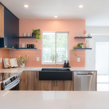
When our clients came to us with their renovation project asking for a pink kitchen, we were thrilled at the opportunity to create a unique, bright and colourful kitchen. It’s not something you see everyday, and we live for it! Being that they are a young family, who loves to cook but felt secluded and overwhelmed when in this space, we knew that this was going to be an epic transformation, not just aesthetically but also for their day-to-day life.
This renovation transformed a closed off, cramped, and poorly laid-out kitchen into a colourful, bright, open, and inviting space that combines functionality with vibrant colours and character. The redesign focused on maximizing storage, improving layout efficiency, and infusing the space with unique design elements that make it both practical and fun.
 Enchanted Kitchens, LLC
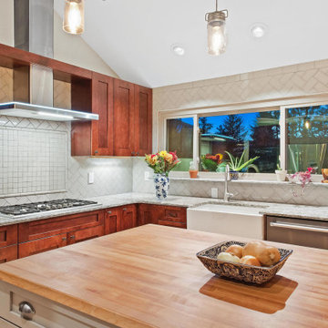
The space was unusable for family and entertaining. It was too small, with poor space planning. This complete remodel required structural wall removal, appliance relocate, floor replace and refinish. The peninsula was replaced with island for better traffic flow. The bridge at hood avoided the need for tile to the ceiling. The client was a fireman and the ladder makes him feel right at home!
 New Era Builders Inc
Here’s a polished paragraph for you:
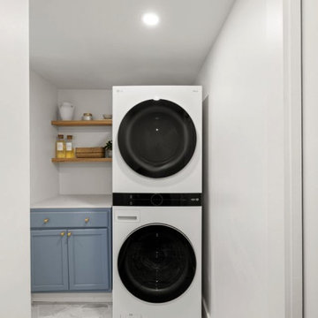
We took what was once a poorly finished flipper’s space and transformed it into a properly built, functional laundry room and bathroom designed with this growing family in mind. With a newborn on the way, every detail mattered — from creating an open, accessible layout for effortless laundry, to building a comfortable, safe area to bathe the baby. Thoughtful design, quality craftsmanship, and smart planning came together to deliver a space that not only works beautifully today, but will make life easier for this family as they continue to grow.


 MMW Architects
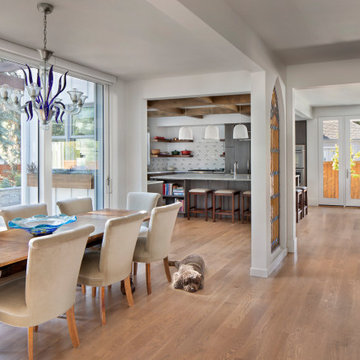
What the owners of the Madeline Ave Residence loved about the home when they bought it was the charm of the original 1920’s structure. However, a dissonance addition from the 1970’s shifted original charm to aesthetic awkwardness and poor flow. While maintaining the feel of the front façade, the rest of the home was reconfigured and choreographed to offer beauty and meet functional needs. Like many homes in historic districts, the homes grow organically to meet needs. Multiple forms and roof lines result.
Due to incorporating these same moves, this renovation fits seamlessly into the neighborhood. It is formal where it needs to be yet comfortable for the daily life. The people, the dog, the cats, the wine: all were carefully tended to throughout the design of the home. The spacious rooms and crisp white palette set the stage for vibrant tile and offers many locations for large scale art. Easy connections to the exterior spaces offer all-season gathering under the shade of the trellis or while making s’mores around the fire pit.
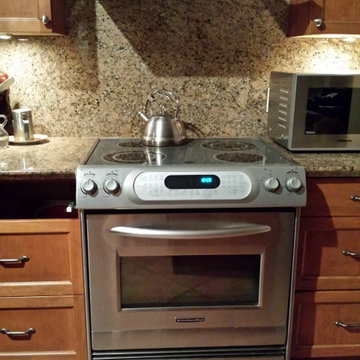
 Image To Interior Inc.
A poorly laid out kitchen whose colours and finishes didn't match the rest of the traditional home was given an incredibly functional and beautiful update.
The floorplan was adjusted without moving any walls or the flooring only the addition of new cabinets, extended breakfast bar island, granite counters, brick backsplash, lighting, appliances, trim, crown and paint. Voila!
 Michael Nash Design, Build & Homes
2010 REGIONAL AWARD WINNER
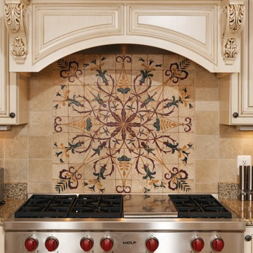
Built in 2000, this center hall colonial in Fairfax Station, Virginia had a kitchen that was neither functional nor aesthetically pleasing.
First, the floor plan was poorly rationalized. The work triangle was inefficient, a large pantry took up too much floor space, and a series of railings between the kitchen and family room obstructed traffic flow.
Aesthetically, the space was dated. Dutch cabinetry, floral wallpaper and a faux Victorian chandelier all cried for an update. Additionally, the homeowners wanted to incorporate high-end appliances and other amenities like a wine cooler and steam cooker.
Overall, the owners were seeking to replace worn out-of-style kitchen with a substantially upgraded “open” facility that combines traditional and contemporary features configured to support multiple social and culinary needs.
Working with Michael Nash Design, Build & Homes, they decided to implement a series of strategic revisions that would support their new use goals.
First, they removed an obstructive bearing wall between the existing kitchen and mudroom, creating a recessed niche for a new 48” gas range with custom hood. An unused desk taken out provided a spot for the new 48” two-drawer refrigerator/freezer.
A custom-designed L-shaped granite-surfaced island with bar sink, icemaker and mini-drawer refrigerator takes center stage in the space and offers seating for six. Now the chef can entertain guests while preparing the meal.
From an aesthetic point of view, the interior features are nothing less than stunning. Softly painted walls, decorative ceramic tile backsplashes and granite surfaces combine with custom made cabinets to create an elegant space. Antiqued soft-opaque cabinet facings, wood panel refrigerator door inserts, glass-facing display cabinets and a custom mantle range hood are true works of craftsmanship. Fine detail is expressed with flutes and corbels. Beauty is truly in the details of this award-winning kitchen.
 Reico Kitchen & Bath
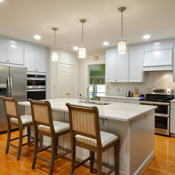
Designed by Jen Gallagher of Reico Kitchen & Bath in Fredericksburg, VA in collaboration with Abby Construction, this transitional style kitchen remodeling project features Merillat Masterpiece cabinets in the Knoxville door style with Surfside finish. Kitchen countertops are Silestone quartz in the color Helix. For the client, what they like best is the new layout. "It was a large space but poorly designed. It's now much more functional with lots of storage space and yet it feels more open. I could not have designed it without Jen's help. Jen told me to make a list of all my kitchen items and decide where they would go. It was the best piece of advice I received. I was able to make sure that I had enough cabinets for everything, it helped me choose accessories for the cabinets and once the remodel was completed it made putting everything away so much quicker." Photos courtesy of Tim Snyder Photography.
 MMW Architects
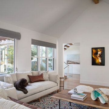
What the owners of the Madeline Ave Residence loved about the home when they bought it was the charm of the original 1920’s structure. However, a dissonance addition from the 1970’s shifted original charm to aesthetic awkwardness and poor flow. While maintaining the feel of the front façade, the rest of the home was reconfigured and choreographed to offer beauty and meet functional needs. Like many homes in historic districts, the homes grow organically to meet needs. Multiple forms and roof lines result.
Due to incorporating these same moves, this renovation fits seamlessly into the neighborhood. It is formal where it needs to be yet comfortable for the daily life. The people, the dog, the cats, the wine: all were carefully tended to throughout the design of the home. The spacious rooms and crisp white palette set the stage for vibrant tile and offers many locations for large scale art. Easy connections to the exterior spaces offer all-season gathering under the shade of the trellis or while making s’mores around the fire pit.
 Amsted Design-Build
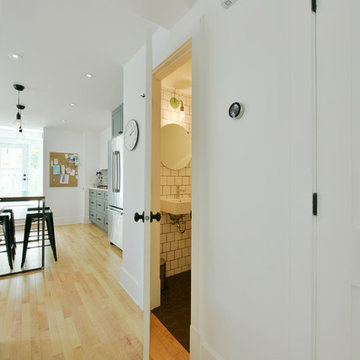
Previously renovated with a two-story addition in the 80’s, the home’s square footage had been increased, but the current homeowners struggled to integrate the old with the new.
An oversized fireplace and awkward jogged walls added to the challenges on the main floor, along with dated finishes. While on the second floor, a poorly configured layout was not functional for this expanding family.
From the front entrance, we can see the fireplace was removed between the living room and dining rooms, creating greater sight lines and allowing for more traditional archways between rooms.
At the back of the home, we created a new mudroom area, and updated the kitchen with custom two-tone millwork, countertops and finishes. These main floor changes work together to create a home more reflective of the homeowners’ tastes.
On the second floor, the master suite was relocated and now features a beautiful custom ensuite, walk-in closet and convenient adjacency to the new laundry room.
Gordon King Photography
 MMW Architects
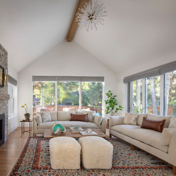
What the owners of the Madeline Ave Residence loved about the home when they bought it was the charm of the original 1920’s structure. However, a dissonance addition from the 1970’s shifted original charm to aesthetic awkwardness and poor flow. While maintaining the feel of the front façade, the rest of the home was reconfigured and choreographed to offer beauty and meet functional needs. Like many homes in historic districts, the homes grow organically to meet needs. Multiple forms and roof lines result.
Due to incorporating these same moves, this renovation fits seamlessly into the neighborhood. It is formal where it needs to be yet comfortable for the daily life. The people, the dog, the cats, the wine: all were carefully tended to throughout the design of the home. The spacious rooms and crisp white palette set the stage for vibrant tile and offers many locations for large scale art. Easy connections to the exterior spaces offer all-season gathering under the shade of the trellis or while making s’mores around the fire pit.
50