
Search results for "Poor functionality" in Home Design Ideas
 Michael Nash Design, Build & Homes
2010 REGIONAL AWARD WINNER
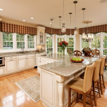
Built in 2000, this center hall colonial in Fairfax Station, Virginia had a kitchen that was neither functional nor aesthetically pleasing.
First, the floor plan was poorly rationalized. The work triangle was inefficient, a large pantry took up too much floor space, and a series of railings between the kitchen and family room obstructed traffic flow.
Aesthetically, the space was dated. Dutch cabinetry, floral wallpaper and a faux Victorian chandelier all cried for an update. Additionally, the homeowners wanted to incorporate high-end appliances and other amenities like a wine cooler and steam cooker.
Overall, the owners were seeking to replace worn out-of-style kitchen with a substantially upgraded “open” facility that combines traditional and contemporary features configured to support multiple social and culinary needs.
Working with Michael Nash Design, Build & Homes, they decided to implement a series of strategic revisions that would support their new use goals.
First, they removed an obstructive bearing wall between the existing kitchen and mudroom, creating a recessed niche for a new 48” gas range with custom hood. An unused desk taken out provided a spot for the new 48” two-drawer refrigerator/freezer.
A custom-designed L-shaped granite-surfaced island with bar sink, icemaker and mini-drawer refrigerator takes center stage in the space and offers seating for six. Now the chef can entertain guests while preparing the meal.
From an aesthetic point of view, the interior features are nothing less than stunning. Softly painted walls, decorative ceramic tile backsplashes and granite surfaces combine with custom made cabinets to create an elegant space. Antiqued soft-opaque cabinet facings, wood panel refrigerator door inserts, glass-facing display cabinets and a custom mantle range hood are true works of craftsmanship. Fine detail is expressed with flutes and corbels. Beauty is truly in the details of this award-winning kitchen.
 Nip Tuck Remodeling
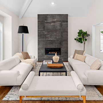
This home had dated and falling apart finishes, an insignificant fireplace in a giant living room, and a poor layout in the family room. Not to mention the primary bath covered in bamboo wallpaper.
The clients wanted a functional, updated and good-looking kitchen, a more adult family room, an updated serene primary bath. The remaining baths to be updated and modern. And, to make it feel like a holistic update, they wanted a welcoming staircase/entry.
As with most clients, stretching their dollar as far as possible was important. They didn't want to enlarge any footprint or move walls - we had to stay within existing bounds. With a whole home remodel costs can add up quickly depending on where we start & stop. For this family it made sense to do all the work at once to avoid repeat remodels. It was either buy new and still have to customize, or remodel to their exact needs and wants. The remodel was more affordable and made just for them.
Many finishes are clean, simple, and modern. A window was removed! in the family room to allow for a symmetrical entertainment center. A dramatic floor to ceiling fireplace surround was created in the Living room. The staircase was totally redone in both shape and style! The primary bath was reworked to get a two-person shower, and soaking tub. Serene /quiet finishes in the primary helped achieve a mellow /calming atmosphere. All new doors and trim throughout.
 Bel Air Construction
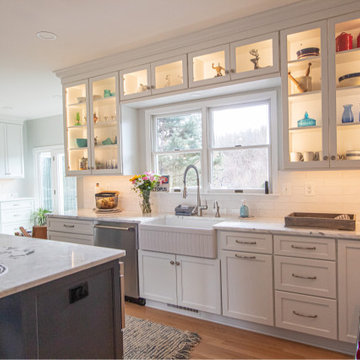
The homeowner’s goal for this kitchen remodel was to improve functionality and increase the home’s value. The existing kitchen was old and needed an update – cabinets were falling apart, the downdraft on the Jenn-Air range made it difficult to cook items correctly, there was little to no storage, lighting was insufficient. A poor layout dominated by a hook-shaped peninsula inhibited the ability to work efficiently
Find the right local pro for your project
 Voar Construction
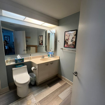
Before – Guest Bathroom: Outdated and Lacking Accessibility
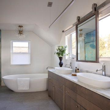
The guest bathroom originally featured an old tub, dark and outdated tiles, and poor lighting. The finishes and colors were no longer in style, and the space lacked the functionality and accessibility needed for the clients. The transformation included replacing the tub with a modern shower and rethinking the layout to bring brightness, safety, and a more contemporary design.
 MMW Architects
What the owners of the Madeline Ave Residence loved about the home when they bought it was the charm of the original 1920’s structure. However, a dissonance addition from the 1970’s shifted original charm to aesthetic awkwardness and poor flow. While maintaining the feel of the front façade, the rest of the home was reconfigured and choreographed to offer beauty and meet functional needs. Like many homes in historic districts, the homes grow organically to meet needs. Multiple forms and roof lines result.
Due to incorporating these same moves, this renovation fits seamlessly into the neighborhood. It is formal where it needs to be yet comfortable for the daily life. The people, the dog, the cats, the wine: all were carefully tended to throughout the design of the home. The spacious rooms and crisp white palette set the stage for vibrant tile and offers many locations for large scale art. Easy connections to the exterior spaces offer all-season gathering under the shade of the trellis or while making s’mores around the fire pit.
 Kitchen Solvers of Spring Hill
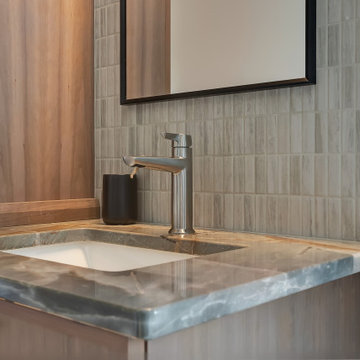
These homeowners were ready to completely transform their master bathroom. The existing space felt cramped and outdated, with an impractical linen closet, a small vanity, poor lighting, a bulky tub, and a shower that had seen better days. Their vision was clear—they wanted a warm, inviting, spa-inspired retreat with natural elements, rich textures, and a unique wood feature wall, rather than the all-white look that has become so common.
The finished design brings that vision to life through a beautiful blend of color, texture, and thoughtful details. A stunning cherry vanity and counter stack, topped with luxurious quartzite countertops, create warmth and elegance. The feature wall, finished in 1" x 3" Articulo tile, adds depth and visual interest, while large-format floor tiles provide a clean, modern foundation.
The curbless shower features coordinating hex tile flooring and niches, complemented by porcelain slab walls and glass panels that create an open, airy feel. A spacious freestanding tub offers the perfect place to relax and unwind. To maximize functionality, the doorway was relocated to accommodate a larger vanity, and custom barn and closet doors were added to enhance the room's character.
Programmable lighting tailored to the homeowners' lifestyle, along with a custom wood feature wall designed to showcase decorative plants, transformed a once-empty wall into a stunning focal point. What was once a dreaded space is now a beautiful spa-like retreat and one of the homeowners' favorite rooms in the house.
 Coastal Home Design Studio
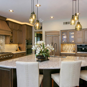
This kitchen started as a builder basic with no personality or charm. The layout didn't have the best function and the island was poorly placed. The homeowners purchased this house with remodeling and upgrading in mind. The layout was changed to accommodate two people cooking together. Zones were created for meal prepping, cooking and baking. The island was expanded to fill the space and utilize bar seating. The walk through butlers pantry was turned in to a wine bar with a fridge, storage and custom glass cabinets. A medium toned hardwood floor was layed throughout the entire lower level


 Amsted Design-Build
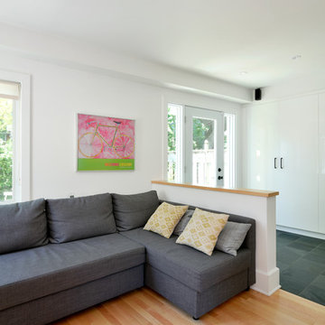
Previously renovated with a two-story addition in the 80’s, the home’s square footage had been increased, but the current homeowners struggled to integrate the old with the new.
An oversized fireplace and awkward jogged walls added to the challenges on the main floor, along with dated finishes. While on the second floor, a poorly configured layout was not functional for this expanding family.
From the front entrance, we can see the fireplace was removed between the living room and dining rooms, creating greater sight lines and allowing for more traditional archways between rooms.
At the back of the home, we created a new mudroom area, and updated the kitchen with custom two-tone millwork, countertops and finishes. These main floor changes work together to create a home more reflective of the homeowners’ tastes.
On the second floor, the master suite was relocated and now features a beautiful custom ensuite, walk-in closet and convenient adjacency to the new laundry room.
Gordon King Photography
 Kaufman Construction Design and Build
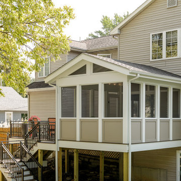
Emily and Steve have remodeled several pieces of their home and because they love Kaufman’s process so much, they keep coming back. In past years, we’ve remodeled most of their main floor including an updated living space and staircase, and a completely remodeled powder room and kitchen with a nice big island that’s perfect for entertaining. Their most recent project was this year when we remodeled their deck. The major pain points Steve and Emily dealt with before the remodel was lack of functionality due to poor design and because the previous owners had built the deck themselves, there were quite a few safety concerns. Throughout the design process, we decided to remove the existing deck completely and start fresh with a screened in porch, Emily’s Porch, and a deck off the porch with stairs going down to the beautiful backyard – one of the factors that motivated them to make this house their home to begin with.
 Art Garden Design
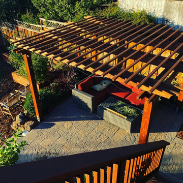
This Oakland backyard was overgrown with 5’ tall grasses, it had an uneven concrete slab with a giant shed, brick edging and poorly located concrete retaining walls. After finalizing the design, a two-weeklong demolition took place. Unnecessary debris was removed and the property was terraced to provide defined areas of entertaining and play for the adults, children, and pets. The transformation from an unusable backyard to a functioning landscape was highlighted by an entertainment patio, redwood arbor, medicinal herbs, fruit trees, and a curvilinear shaped lawn. After the house remodel, we continued to unify the landscape with a new backdoor landing, moss rock retaining walls, and a flagstone pathway planted with shade tolerant ground covers.
 Wellstudio Architecture
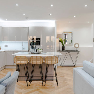
Renovation of an existing mews house, transforming it from a poorly planned out and finished property to a highly desirable residence that creates wellbeing for its occupants.
Wellstudio demolished the existing bedrooms on the first floor of the property to create a spacious new open plan kitchen living dining area which enables residents to relax together and connect.
Wellstudio inserted two new windows between the garage and the corridor on the ground floor and increased the glazed area of the garage door, opening up the space to bring in more natural light and thus allowing the garage to be used for a multitude of functions.
Wellstudio replanned the rest of the house to optimise the space, adding two new compact bathrooms and a utility room into the layout.
 MMW Architects
What the owners of the Madeline Ave Residence loved about the home when they bought it was the charm of the original 1920’s structure. However, a dissonance addition from the 1970’s shifted original charm to aesthetic awkwardness and poor flow. While maintaining the feel of the front façade, the rest of the home was reconfigured and choreographed to offer beauty and meet functional needs. Like many homes in historic districts, the homes grow organically to meet needs. Multiple forms and roof lines result.
Due to incorporating these same moves, this renovation fits seamlessly into the neighborhood. It is formal where it needs to be yet comfortable for the daily life. The people, the dog, the cats, the wine: all were carefully tended to throughout the design of the home. The spacious rooms and crisp white palette set the stage for vibrant tile and offers many locations for large scale art. Easy connections to the exterior spaces offer all-season gathering under the shade of the trellis or while making s’mores around the fire pit.
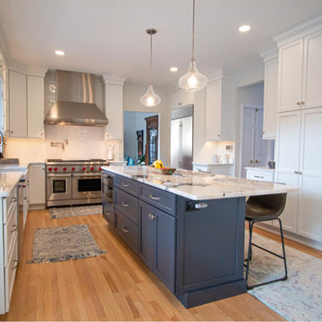 Bel Air Construction
The homeowner’s goal for this kitchen remodel was to improve functionality and increase the home’s value. The existing kitchen was old and needed an update – cabinets were falling apart, the downdraft on the Jenn-Air range made it difficult to cook items correctly, there was little to no storage, lighting was insufficient. A poor layout dominated by a hook-shaped peninsula inhibited the ability to work efficiently

Sponsored
Columbus, OH

Structural Remodeling
Franklin County's Heavy Timber Specialists | Best of Houzz 2020!
 Saikley Architects
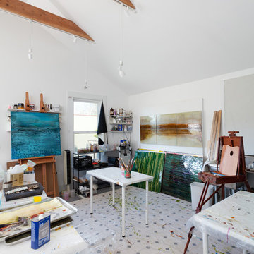
This beautiful 1881 Alameda Victorian cottage, wonderfully embodying the Transitional Gothic-Eastlake era, had most of its original features intact. Our clients, one of whom is a painter, wanted to preserve the beauty of the historic home while modernizing its flow and function.
From several small rooms, we created a bright, open artist’s studio. We dug out the basement for a large workshop, extending a new run of stair in keeping with the existing original staircase. While keeping the bones of the house intact, we combined small spaces into large rooms, closed off doorways that were in awkward places, removed unused chimneys, changed the circulation through the house for ease and good sightlines, and made new high doorways that work gracefully with the eleven foot high ceilings. We removed inconsistent picture railings to give wall space for the clients’ art collection and to enhance the height of the rooms. From a poorly laid out kitchen and adjunct utility rooms, we made a large kitchen and family room with nine-foot-high glass doors to a new large deck. A tall wood screen at one end of the deck, fire pit, and seating give the sense of an outdoor room, overlooking the owners’ intensively planted garden. A previous mismatched addition at the side of the house was removed and a cozy outdoor living space made where morning light is received. The original house was segmented into small spaces; the new open design lends itself to the clients’ lifestyle of entertaining groups of people, working from home, and enjoying indoor-outdoor living.
Photography by Kurt Manley.
https://saikleyarchitects.com/portfolio/artists-victorian/
 Home Restoration Services, Inc.
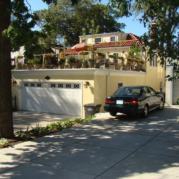
A poorly-placed structural post (installed when cars were smaller), prevented this homeowner from having a functional garage. They also wanted a Mud Room transition between the attached Garage and Kitchen. Designed by Lee Meyer Architects. Photos by Greg Schmidt
 Designs by KS
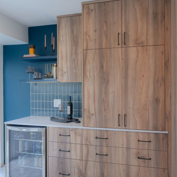
When our clients came to us with their renovation project asking for a pink kitchen, we were thrilled at the opportunity to create a unique, bright and colourful kitchen. It’s not something you see everyday, and we live for it! Being that they are a young family, who loves to cook but felt secluded and overwhelmed when in this space, we knew that this was going to be an epic transformation, not just aesthetically but also for their day-to-day life.
This renovation transformed a closed off, cramped, and poorly laid-out kitchen into a colourful, bright, open, and inviting space that combines functionality with vibrant colours and character. The redesign focused on maximizing storage, improving layout efficiency, and infusing the space with unique design elements that make it both practical and fun.
 New Era Builders Inc
Here’s a polished paragraph for you:
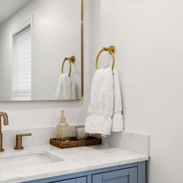
We took what was once a poorly finished flipper’s space and transformed it into a properly built, functional laundry room and bathroom designed with this growing family in mind. With a newborn on the way, every detail mattered — from creating an open, accessible layout for effortless laundry, to building a comfortable, safe area to bathe the baby. Thoughtful design, quality craftsmanship, and smart planning came together to deliver a space that not only works beautifully today, but will make life easier for this family as they continue to grow.
 Walczak Design And Build
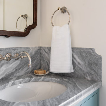
When this family came to us, they loved their home — but their bathrooms were failing them. The kids' bathroom had a non-functioning tub, a serious problem with two young children in the house. The primary bathroom was battling an active shower leak, a poor layout, and finishes well past their prime. Both spaces needed to be gutted. We got to work.
The Primary Bath: Elevated, Effortless, Unmistakably Theirs
Our clients arrived with a clear vision and a beautiful, refined sense of style. The layout was reconfigured from the ground up, and at the heart of the room sits a custom double vanity in a soft, sophisticated sage, topped with a stunning marble countertop and coordinating backsplash. Paired with elegant walnut-framed mirrors, a sculptural black and brass sconce, and wall-mounted polished nickel faucets, the vanity wall is a showpiece. Custom woven shades add warmth without sacrificing light.
The walk-in shower delivers — floor-to-ceiling white subway tile, a mosaic marble floor, transom windows, and frameless glass. Schluter DITRA radiant floor heating adds the kind of quiet luxury you feel every morning. Both marble surfaces were professionally sealed with StoneGuard to protect the investment for the long haul.
The Kids' Bath: Cheerful, Timeless, Built to Last
The girls' bathroom is designed with just as much intention as any room in the house. A warm white oak vanity with marble countertop anchors the space, paired with an antique brass-framed mirror and raspberry custom sconce shades that bring personality without being precious. A botanical-print Roman shade layers in pattern and charm.
The fully rebuilt tub-shower features wall-to-wall white subway tile, polished nickel fixtures, and a beautiful geometric floor tile in cream and warm taupe. A glass-front wall cabinet keeps things tidy, and tile wainscoting wraps the room for durability where it counts. Schluter DITRA radiant heat runs underfoot here too — because warm floors aren't just for adults.
Two bathrooms. Completely distinct. Completely intentional. Built for a family that already loved their home — and loves it even more now.
 LaMantia Design and Remodeling
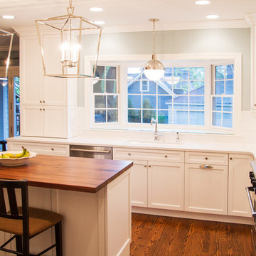
The clients found a house they loved for two reasons…location, location, location (first reason) and the exterior style was similar to a beloved childhood home. They came to LaMantia inquiring as to the possibilities for the first floor. Armed with the clients’ “wants and desires” LaMantia designers Jackie Prazak and Andy LaMantia went about redesigning most of the first floor into an open floor plan fit for the young family.
LaMantia & Prazak found the key to providing the enlarged feeling was through the poorly designed existing home addition. The additional living space was difficult to access, thus providing no useful function to the home.
Completely removing the original exterior walls of the home that blocked access into the addition was the first step in the plan. With the walls removed, the original walled-off space became a part of the home. Relocating the first floor Powder Room, revising the entry closet, removing the wall into the kitchen and resizing the Living Room all were key components to the final rebirth of the larger picture.
To finalize the new kitchen space, it was suggested to raise the Bay window unit thus allowing the relocated sink location. With all the revisions, the Kitchen now could easily accommodate a stretched out “L” layout with a large seated Island and a separate desk area.
With the final plans in place, the clients were amazed to find that within the existing walls of their newly purchased home they had gained so much extra use. And…the very last prize they gained was a dreamed of Mudroom!
 Art Garden Design
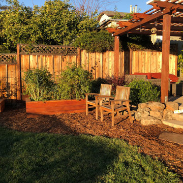
This Oakland backyard was overgrown with 5’ tall grasses, it had an uneven concrete slab with a giant shed, brick edging and poorly located concrete retaining walls. After finalizing the design, a two-weeklong demolition took place. Unnecessary debris was removed and the property was terraced to provide defined areas of entertaining and play for the adults, children, and pets. The transformation from an unusable backyard to a functioning landscape was highlighted by an entertainment patio, redwood arbor, medicinal herbs, fruit trees, and a curvilinear shaped lawn. After the house remodel, we continued to unify the landscape with a new backdoor landing, moss rock retaining walls, and a flagstone pathway planted with shade tolerant ground covers.
49