
Search results for "Poor functionality" in Home Design Ideas
 TVL Creative Ltd.
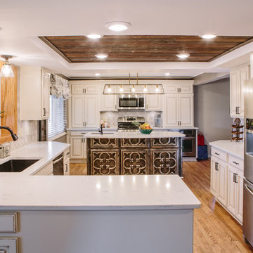
This challenging kitchen came our way at the same time as another similarly located Centennial kitchen. It was apparent that both houses had been built by the same builder: tight space, low ceilings, awkward arrangement, and poor building materials. Our client here is a single mother of three boys with an incredibly demanding work life. Once finally home at the end of a busy day, our client was virtually unable to use her kitchen. Cabinet doors were falling off, limited storage and workspace offered her little opportunity to cook and prep for her children, and the dark and low ceiling created an atmosphere that can only be described as depressing. Our client is also from Louisiana and has always dreamed of a kitchen that reminds her of home warmth and hospitality. Our goal was not only to expand functional storage and workspace, but bring in the southern NOLA appeal that reminds our client so much of home. To do this, we removed the wall between the formal dining room and kitchen to create an extended kitchen that runs the full length of both spaces. The back wall of what used to be the dining room is now the cooking zone for our client: we've relocated her range and microwave, and have created an island full of storage where her children can sit and socialize. We've also lifted up the low ceiling to create a tray ceiling that we have finished with ghostwood. The cabinetry is an off-white color with a hazelnut glaze that offers a more traditional, warm appearance. The island and mini work nook feature dramatic, handmade tin ceiling tiles for a dramatic texture and color. We've finished the space with functional quartz countertops and an arabesque two-toned marble backspalsh. The sinks, faucets and hardware are all in a matte black finish that offer a dramatic pop throughout the space. Little touches of Parisian flair add to this Cajun-French aesthetic and we are so thrilled with the final result!
 Architectural Resource LLC
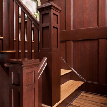
The Brooke Residence ‘Addi- tion by Subtraction’ remodeling project was recognized with numerous regional and national awards and was selected for Fine Homebuilding’s Annual Issue on Houses.
This 1920’s Craftsman Bungalow had been poorly modified in the 70’s in an attempt to address poor energy performance with a scabbed on solarium. The design solution removed the solarium and completely reimagined the floor plan: The kitchen was relocated to the rear; the stairway was relocated to enhance function, and a better connection to the family room was created.
 McCabe By Design LLC
Our client purchased what had been a custom home built in 1973 on a high bank waterfront lot. They did their due diligence with respect to the septic system, well and the existing underground fuel tank but little did they know, they had purchased a house that would fit into the Three Little Pigs Story book.
The original idea was to do a thorough cosmetic remodel to bring the home up to date using all high durability/low maintenance materials and provide the homeowners with a flexible floor plan that would allow them to live in the home for as long as they chose to, not how long the home would allow them to stay safely. However, there was one structure element that had to change, the staircase.
The staircase blocked the beautiful water/mountain few from the kitchen and part of the dining room. It also bisected the second-floor master suite creating a maze of small dysfunctional rooms with a very narrow (and unsafe) top stair landing. In the process of redesigning the stairs and reviewing replacement options for the 1972 custom milled one inch thick cupped and cracked cedar siding, it was discovered that the house had no seismic support and that the dining/family room/hot tub room and been a poorly constructed addition and required significant structural reinforcement. It should be noted that it is not uncommon for this home to be subjected to 60-100 mile an hour winds and that the geographic area is in a known earthquake zone.
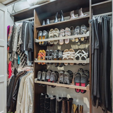
Once the structural engineering was complete, the redesign of the home became an open pallet. The homeowners top requests included: no additional square footage, accessibility, high durability/low maintenance materials, high performance mechanicals and appliances, water and energy efficient fixtures and equipment and improved lighting incorporated into: two master suites (one upstairs and one downstairs), a healthy kitchen (appliances that preserve fresh food nutrients and materials that minimize bacterial growth), accessible bathing and toileting, functionally designed closets and storage, a multi-purpose laundry room, an exercise room, a functionally designed home office, a catio (second floor balcony on the front of the home), with an exterior that was not just code compliant but beautiful and easy to maintain.
All of this was achieved and more. The finished project speaks for itself.
Find the right local pro for your project
 Stacey Kocevar Designs, LLC
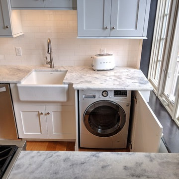
The existing, builder-grade, kitchen was not functional, as it was poorly lit, much needed storage space was underutilized, and un-safe, as the microwave was hung over the sink, causing the homeowners to hit their heads while working at the sink. Being a unit in an historic building, I was unable to move any of the existing plumbing & electrical, but could add to, as we did with the recessed and under cabinet LED lighting, I moved the microwave to a safe location, off of the counter and next to the refrigerator, and took the cabinetry to the ceiling, gaining an additional 12" of vertical storage along the main wall of the kitchen. Due to a supply vent being on the wall above the refrigerator, we had to get creative in how we brought it through the crown molding build-up, which led to a custom vent cover, that was designed and then fabricated to fit perfectly. This kitchen is packed with details that all came together to create a stunning, yet functional, new kitchen.
 TVL Creative Ltd.
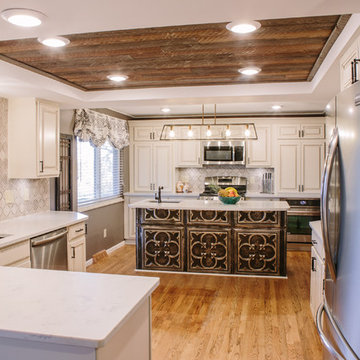
This challenging kitchen came our way at the same time as another similarly located Centennial kitchen. It was apparent that both houses had been built by the same builder: tight space, low ceilings, awkward arrangement, and poor building materials. Our client here is a single mother of three boys with an incredibly demanding work life. Once finally home at the end of a busy day, our client was virtually unable to use her kitchen. Cabinet doors were falling off, limited storage and workspace offered her little opportunity to cook and prep for her children, and the dark and low ceiling created an atmosphere that can only be described as depressing. Our client is also from Louisiana and has always dreamed of a kitchen that reminds her of home warmth and hospitality. Our goal was not only to expand functional storage and workspace, but bring in the southern NOLA appeal that reminds our client so much of home. To do this, we removed the wall between the formal dining room and kitchen to create an extended kitchen that runs the full length of both spaces. The back wall of what used to be the dining room is now the cooking zone for our client: we've relocated her range and microwave, and have created an island full of storage where her children can sit and socialize. We've also lifted up the low ceiling to create a tray ceiling that we have finished with ghostwood. The cabinetry is an off-white color with a hazelnut glaze that offers a more traditional, warm appearance. The island and mini work nook feature dramatic, handmade tin ceiling tiles for a dramatic texture and color. We've finished the space with functional quartz countertops and an arabesque two-toned marble backspalsh. The sinks, faucets and hardware are all in a matte black finish that offer a dramatic pop throughout the space. Little touches of Parisian flair add to this Cajun-French aesthetic and we are so thrilled with the final result!
 CITYDESKSTUDIO, Inc.
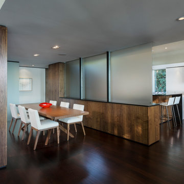
This home enjoys stunning views of Sweeney Lake from almost anywhere in the home; however it was in need of repair and a significant reorganization of the plan to take full advantage of site. The project is about the complete restoration and rethinking of this vintage 1965 mid-century gem. The house is deceivingly large with a full finished lower level and an indoor pool room; however it lived cramped and broken up. The entry was uninviting and small, the poolroom unused and poorly heated, the kitchen undersized, and the bedrooms and baths poorly accessed.
Our task was to open up the home through the rethinking of the floor plan and the introduction of a new central axis connecting and organizing the homes functions and spaces around view corridors and existing or new focal points. The home had beautiful features to build upon; the central brick fireplace, the raised roofs over the living and pool rooms, and the view to the lake itself. A fully redone exterior and interior preserve the homes proportion and scale, while at the same time bring greater connection to the site and a much needed clarity to the homes organization.
Project Team:
Ben Awes AIA, Principal-In-Charge
Bob Ganser AIA
Christian Dean AIA
Nate Dodge
 C-Starr Construction
This was a very outdated, poorly designed bathroom that we wanted to update with a much more modern, functional design; but keep a bit of a rustic appeal to fit in this comfy country home. We combined a small 1 1/2 bathroom design into a much larger open bathroom. By moving the wet area, we were able to give them a more functional design, with plenty of badly needed storage space. We used a distressed wood look porcelain tile to keep the rustic appeal, while incorporating some cleaner lines and modern features.

Sponsored
Columbus, OH

Structural Remodeling
Franklin County's Heavy Timber Specialists | Best of Houzz 2020!
 Creative Design Landscapes
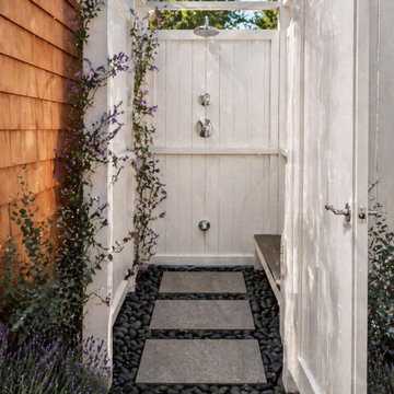
This project involved the removal of an aging wood shower enclosure and surrounding fencing, which had begun to deteriorate and contribute to poor drainage conditions. The existing area retained moisture, creating a muddy, unstable surface that impacted both usability and long-term durability.
The redesigned space introduces a fully upgraded outdoor shower system positioned discreetly behind a new white privacy enclosure. The structure was selected for its clean architectural lines, low-maintenance material, and ability to brighten and modernize the space while maintaining privacy.
A primary focus of the project was drainage correction. The ground plane was regraded and rebuilt using a permeable system consisting of oversized stone slabs set within polished black river rock. This layout allows water to move efficiently through the surface while maintaining a stable, clean, and visually refined finish. The contrast between the large-format slabs and the dark stone creates a structured, intentional foundation that elevates the overall design.
Planting was incorporated with both aesthetic and functional intent. Lavender was installed and trained along the enclosure to soften the structure and introduce seasonal fragrance. In addition to its visual contribution, it serves as a natural pest deterrent, helping to reduce mosquito activity and improve comfort within the space. Supporting plant material was kept minimal and scaled appropriately to maintain a clean, uncluttered environment.
The result is a fully integrated outdoor feature that transforms a previously underperforming area into a functional, durable, and visually cohesive extension of the home. The space now supports consistent use while delivering a refined, spa-like experience aligned with the surrounding landscape.
 TVL Creative Ltd.
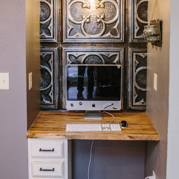
This challenging kitchen came our way at the same time as another similarly located Centennial kitchen. It was apparent that both houses had been built by the same builder: tight space, low ceilings, awkward arrangement, and poor building materials. Our client here is a single mother of three boys with an incredibly demanding work life. Once finally home at the end of a busy day, our client was virtually unable to use her kitchen. Cabinet doors were falling off, limited storage and workspace offered her little opportunity to cook and prep for her children, and the dark and low ceiling created an atmosphere that can only be described as depressing. Our client is also from Louisiana and has always dreamed of a kitchen that reminds her of home warmth and hospitality. Our goal was not only to expand functional storage and workspace, but bring in the southern NOLA appeal that reminds our client so much of home. To do this, we removed the wall between the formal dining room and kitchen to create an extended kitchen that runs the full length of both spaces. The back wall of what used to be the dining room is now the cooking zone for our client: we've relocated her range and microwave, and have created an island full of storage where her children can sit and socialize. We've also lifted up the low ceiling to create a tray ceiling that we have finished with ghostwood. The cabinetry is an off-white color with a hazelnut glaze that offers a more traditional, warm appearance. The island and mini work nook feature dramatic, handmade tin ceiling tiles for a dramatic texture and color. We've finished the space with functional quartz countertops and an arabesque two-toned marble backspalsh. The sinks, faucets and hardware are all in a matte black finish that offer a dramatic pop throughout the space. Little touches of Parisian flair add to this Cajun-French aesthetic and we are so thrilled with the final result!
 Fowler Outdoor Co
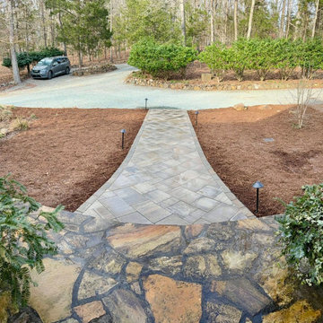
Drainage Solutions & Curb Appeal Transformation
This project focused on solving a persistent drainage issue that was impacting both the usability and appearance of the property. Standing water and poor grading were creating functional problems while diminishing the home’s overall curb appeal—an issue many homeowners face when water isn’t properly directed away from the home.
Fowler Outdoor Co. approached the project with a design-build mindset, addressing the root cause of the drainage problem through proper grading, water management, and structural solutions. By integrating effective drainage systems with thoughtfully designed hardscape elements, the team was able to redirect water flow, protect the property, and create a more stable foundation for the landscape.
Beyond functionality, the transformation elevated the front yard’s appearance with clean lines, intentional materials, and a cohesive layout that complements the home. The result is a space that not only performs better during heavy rain but also delivers a polished, welcoming first impression.
This project is a great example of how solving underlying issues like drainage can completely transform both the look and long-term performance of an outdoor space.
 N Sabella Inc
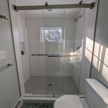
Sometimes the smartest renovation isn’t adding space—it’s rethinking it. This project transformed one large, poorly laid-out bathroom into two bright, fully functional baths, giving this busy family the breathing room they needed.
Now, each space has its own clean lines, thoughtful flow and one with natural light. What was once cramped and inefficient is now practical, comfortable, and tailored to real-life routines.
One bathroom split into two, a simple reconfiguration, a huge improvement in daily living.
 SDG | Schlosser Design Group, LLC.
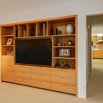
This contemporary home got a face lift with a fully gutted kitchen, laundry and den. The original kitchen had a poor layout with a corner sink cab that swallowed up valuable storage space. The added center island had limited clearance causing the owners to bump into it at every turn. The storage was poorly planned and non-functional. We were able to relocate the sink, adjust the angle of the peninsula allowing a better more open flow for this busy family while provided more storage with fewer cabinets than they had before.
 Michael Nash Design, Build & Homes
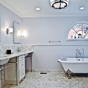
Starting Each Day Clean and Refreshed In This Classically-Modern, Marble Masterpiece
In 1985, the previous owner of the house had added an addition of which part included a 17 feet by 13 feet space off the master bedroom for both a master bath and walk-in closet. Irrespective of the dated red carpet that blanketed the entire bathroom of this 1964 colonial in Annandale, VA, the combination bathroom/closet space had its other oddities, primarily in that there was no shower. The current homeowners -- a family of five, who has been in the home for 7 years, was tired of going down the hall to use the kids’ bathroom to take a shower before work. The renovation that they have created now is a bright and luxurious space that one could bask in all day. They used this bathroom renovation opportunity to total remake the layout and function of this essential room that sets the tone for the day ahead.
Prior to the renovation, the existing bathroom oddly had two entrances, a typical one off of the master bedroom, but another straight off the upstairs hallway. As the toilet was out in the open in the previous design, ensuring that this second door was closed when company was in town was essential and a nuisance. As you entered the room, situated below the arc window, a large soaking tub that was covered on three sides with wooden steps dominated the room from the corner it projected. A relatively small 42” single bowl sink did not leave much space for his and hers toiletries, and there was no other linen closet or cabinetry for storage in the bathroom. The 8 foot by 5 foot closet with accordion doors had poorly laid out rungs not letting the storage space to be fully utilized. At over 220 square feet, the room did offer considerable space to work with, yet the existing layout, which even included a partition wall behind the vanity, felt cramped and dysfunctional.
The homeowners wished to create a classic yet modern, private, deluxe bathroom that would better integrate into their master suite and enable them to start and end each day in a luxurious way. They wanted to maintain having a soaking tub, add in a large shower, have an enclosed commode, expand to include double sinks, and add more storage for toiletries and linens. We worked with the customer to develop a creative design with extensive plumbing rework that accomplished all these needs and more.
The first order of business was to gut out all the carpet, tub, cabinetry, and non-load bearing partition walls. The new tub would be generally in the same location, but as the previous walk-in closet would be repurposed for the commode and the walk-in shower additional water lines, plumbing, and draining needed to be added; fortunately the room below is the garage, which enabled the team to frame out some bulkheads to accomplish this complex plumbing. Following the framing, including walling up the second entrance to the bathroom, adding in a pocket door for the commode, and creating the shape of the new shower, the team also laid down the wiring for one of the luxuries of this room – heated flooring. A glossy percaline boarder, and two-inch hexagon shape percaline tiles cover the entire floor, making it much easier and cleaner than the previous carpet.
Marble look tile is predominant throughout the bathroom as despite the angled frameless glass door, the entire shower is covered in 18 inch polished marble look tiles. The shower coats the user in water from either the overhead rain head, large main showerhead and/or the hand held sprayer. Over 7 feet of white Italian Statuetto marble countertop, enable the couple to have two sink bowls and plenty of room on each side. The bowls are exposed in this stainless steel console sink design which required the team to ensure that the exposed plumbing looked pristine, and painting the bottom of the porcelain bowl to match the coloring.
The white cast-iron 72-inch Cecilia claw-foot soaking tub and its chrome lion’s paws complement that other chrome and white used throughout the room. A tall, almost floor-to-ceiling linen closet finished in arctic white is nestled in the corner near the tub, enabling ample storage of towels, etc. Other cabinetry includes an 18 inch-wide vanity with decorative footing is centered between the two sinks, and a 27 inch wall mounted cabinet with shelf is above the Kohler Devonshire elongated toilet.
Billowing cloud colored grey blue paint was a great choice for this room to pick up on the veining in the marble. Mirrored medicine chests, a chandelier, wall sconces, and overhead recessed lighting also were incorporated into the design and function of the new room.
The artful combination of classic design from material choices, such as free-standing Victorian claw-foot tub along with the modern design as seen in the angled shower, frameless medicine cabinet mirrors, and frosted glass pocket door on the commode, make this bathroom quite a masterpiece.
The clients are enjoying having their private space and not having the use the kids’ bathroom anymore.


 Nip Tuck Remodeling
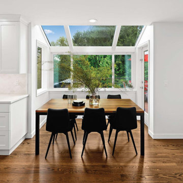
This home had dated and falling apart finishes, an insignificant fireplace in a giant living room, and a poor layout in the family room. Not to mention the primary bath covered in bamboo wallpaper.
The clients wanted a functional, updated and good-looking kitchen, a more adult family room, an updated serene primary bath. The remaining baths to be updated and modern. And, to make it feel like a holistic update, they wanted a welcoming staircase/entry.
As with most clients, stretching their dollar as far as possible was important. They didn't want to enlarge any footprint or move walls - we had to stay within existing bounds. With a whole home remodel costs can add up quickly depending on where we start & stop. For this family it made sense to do all the work at once to avoid repeat remodels. It was either buy new and still have to customize, or remodel to their exact needs and wants. The remodel was more affordable and made just for them.
Many finishes are clean, simple, and modern. A window was removed! in the family room to allow for a symmetrical entertainment center. A dramatic floor to ceiling fireplace surround was created in the Living room. The staircase was totally redone in both shape and style! The primary bath was reworked to get a two-person shower, and soaking tub. Serene /quiet finishes in the primary helped achieve a mellow /calming atmosphere. All new doors and trim throughout.
 Alair Homes Plano
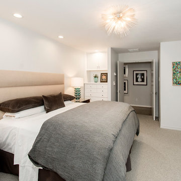
This home had a previous master bathroom remodel and addition with poor layout. Our homeowners wanted a whole new suite that was functional and beautiful. They wanted the new bathroom to feel bigger with more functional space. Their current bathroom was choppy with too many walls. The lack of storage in the bathroom and the closet was a problem and they hated the cabinets. They have a really nice large back yard and the views from the bathroom should take advantage of that.
We decided to move the main part of the bathroom to the rear of the bathroom that has the best view and combine the closets into one closet, which required moving all of the plumbing, as well as the entrance to the new bathroom. Where the old toilet, tub and shower were is now the new extra-large closet. We had to frame in the walls where the glass blocks were once behind the tub and the old doors that once went to the shower and water closet. We installed a new soft close pocket doors going into the water closet and the new closet. A new window was added behind the tub taking advantage of the beautiful backyard. In the partial frameless shower we installed a fogless mirror, shower niches and a large built in bench. . An articulating wall mount TV was placed outside of the closet, to be viewed from anywhere in the bathroom.
The homeowners chose some great floating vanity cabinets to give their new bathroom a more modern feel that went along great with the large porcelain tile flooring. A decorative tumbled marble mosaic tile was chosen for the shower walls, which really makes it a wow factor! New recessed can lights were added to brighten up the room, as well as four new pendants hanging on either side of the three mirrors placed above the seated make-up area and sinks.
Design/Remodel by Hatfield Builders & Remodelers | Photography by Versatile Imaging
 Riverside Construction, LLC
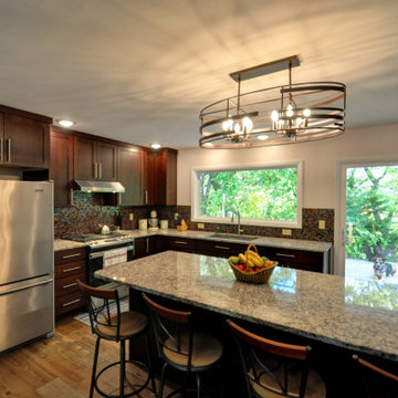
Many West Lafayette homeowners want to change their kitchens, whether because it functions poorly, their tastes have evolved, the kitchen is deteriorating, or they simply want to change.
Tackling several common pain points in their older kitchen, these West Lafayette homeowners approached Riverside Construction with a desire to open up their living area and update all the kitchen amenities including the fixtures, cabinets, and appliances. With peninsula-like counters that were too low, the kitchen also lacked much-needed countertop space. Still yet, the homeowners wanted to add a larger window above the sink to bring in natural light and expand the view of the ravine in the backyard.
Riverside Construction took out the wall separating the living room from the kitchen, and changed the layout (from U-shaped to L-shaped) to create the larger, more functional space our clients were looking for. We swapped the old white cabinetry for new custom Wellborn shaker-style cabinets in a coffee stain and installed a 'City Lights Tokyo' Daltile tile backsplash. The countertops were topped with Giallo Verona granite.
An oversize island was designed into the space to match the new custom cabinetry and provided comfortable seating for five, also eliminating the need for a kitchen table. The old back door was replaced with a large sliding glass door letting in more natural light.
Other highlights of this kitchen remodel include a beautiful Maglia Bronze chandelier that creates a stunning focal point, along with warm and durable Bella Cera Sisters chester engineered hickory hardwood flooring throughout.
 Ravenwood Construction Ltd
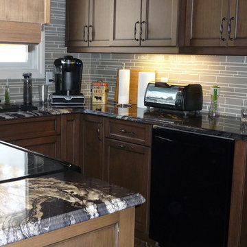
As seen in another photo within this project showing the before picture, this kitchen suffered from poor flow and felt quite cramped. During the first consultation, there was discussion about knocking walls down and including the dining room as part of the kitchen. We went to the design board and came up with the most economical solution we could to meet all the requirements. No walls needed to be removed.
We redesigned the entire kitchen to allow for better flow and space. The end product is still amazing. A few of the changes included the relocation of the dishwasher, fridge and the centering of the sink. Originally the dishwasher and sink were located on the same wall making it very cramped and non-functional. By moving the dishwasher to where the fridge originally was located and then centering the sink allows for a comfortable and functional use of space.
Lighting was an essential part of the design with the addition of numerous recessed lights and under cabinet lighting all with the ability to dim. This allows for a full range of ambient lighting.
A good portion of the budget went to installing the granite counter tops. The movement is unique in every piece and draws the eye immediately. The glass mosaic tile back splash adds glamour without taking anything away from the granite. The use of different size upper cabinets accentuates the crown molding and gives the kitchen a more custom look but helped stay on budget by using standard sizes. A new Delta kitchen faucet with two wave technology locations make clean up easy when your hands are dirty, and filling a pot less straining on the wrist as you just place it under the faucet and the water turns on automatically. Finishing the kitchen off is the Mannington vinyl tile flooring that requires grouting. Laid on a diagonal, again raises the level of this kitchen to a more custom feel.
 Michael Nash Design, Build & Homes
Starting Each Day Clean and Refreshed In This Classically-Modern, Marble Masterpiece
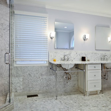
In 1985, the previous owner of the house had added an addition of which part included a 17 feet by 13 feet space off the master bedroom for both a master bath and walk-in closet. Irrespective of the dated red carpet that blanketed the entire bathroom of this 1964 colonial in Annandale, VA, the combination bathroom/closet space had its other oddities, primarily in that there was no shower. The current homeowners -- a family of five, who has been in the home for 7 years, was tired of going down the hall to use the kids’ bathroom to take a shower before work. The renovation that they have created now is a bright and luxurious space that one could bask in all day. They used this bathroom renovation opportunity to total remake the layout and function of this essential room that sets the tone for the day ahead.
Prior to the renovation, the existing bathroom oddly had two entrances, a typical one off of the master bedroom, but another straight off the upstairs hallway. As the toilet was out in the open in the previous design, ensuring that this second door was closed when company was in town was essential and a nuisance. As you entered the room, situated below the arc window, a large soaking tub that was covered on three sides with wooden steps dominated the room from the corner it projected. A relatively small 42” single bowl sink did not leave much space for his and hers toiletries, and there was no other linen closet or cabinetry for storage in the bathroom. The 8 foot by 5 foot closet with accordion doors had poorly laid out rungs not letting the storage space to be fully utilized. At over 220 square feet, the room did offer considerable space to work with, yet the existing layout, which even included a partition wall behind the vanity, felt cramped and dysfunctional.
The homeowners wished to create a classic yet modern, private, deluxe bathroom that would better integrate into their master suite and enable them to start and end each day in a luxurious way. They wanted to maintain having a soaking tub, add in a large shower, have an enclosed commode, expand to include double sinks, and add more storage for toiletries and linens. We worked with the customer to develop a creative design with extensive plumbing rework that accomplished all these needs and more.
The first order of business was to gut out all the carpet, tub, cabinetry, and non-load bearing partition walls. The new tub would be generally in the same location, but as the previous walk-in closet would be repurposed for the commode and the walk-in shower additional water lines, plumbing, and draining needed to be added; fortunately the room below is the garage, which enabled the team to frame out some bulkheads to accomplish this complex plumbing. Following the framing, including walling up the second entrance to the bathroom, adding in a pocket door for the commode, and creating the shape of the new shower, the team also laid down the wiring for one of the luxuries of this room – heated flooring. A glossy percaline boarder, and two-inch hexagon shape percaline tiles cover the entire floor, making it much easier and cleaner than the previous carpet.
Marble look tile is predominant throughout the bathroom as despite the angled frameless glass door, the entire shower is covered in 18 inch polished marble look tiles. The shower coats the user in water from either the overhead rain head, large main showerhead and/or the hand held sprayer. Over 7 feet of white Italian Statuetto marble countertop, enable the couple to have two sink bowls and plenty of room on each side. The bowls are exposed in this stainless steel console sink design which required the team to ensure that the exposed plumbing looked pristine, and painting the bottom of the porcelain bowl to match the coloring.
The white cast-iron 72-inch Cecilia claw-foot soaking tub and its chrome lion’s paws complement that other chrome and white used throughout the room. A tall, almost floor-to-ceiling linen closet finished in arctic white is nestled in the corner near the tub, enabling ample storage of towels, etc. Other cabinetry includes an 18 inch-wide vanity with decorative footing is centered between the two sinks, and a 27 inch wall mounted cabinet with shelf is above the Kohler Devonshire elongated toilet.
Billowing cloud colored grey blue paint was a great choice for this room to pick up on the veining in the marble. Mirrored medicine chests, a chandelier, wall sconces, and overhead recessed lighting also were incorporated into the design and function of the new room.
The artful combination of classic design from material choices, such as free-standing Victorian claw-foot tub along with the modern design as seen in the angled shower, frameless medicine cabinet mirrors, and frosted glass pocket door on the commode, make this bathroom quite a masterpiece.
The clients are enjoying having their private space and not having the use the kids’ bathroom anymore.
 Stacey Kocevar Designs, LLC
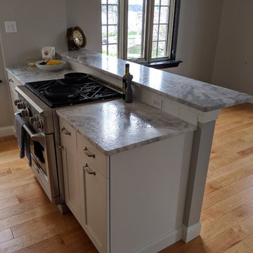
The existing, builder-grade, kitchen was not functional, as it was poorly lit, much needed storage space was underutilized, and un-safe, as the microwave was hung over the sink, causing the homeowners to hit their heads while working at the sink. Being a unit in an historic building, I was unable to move any of the existing plumbing & electrical, but could add to, as we did with the recessed and under cabinet LED lighting, I moved the microwave to a safe location, off of the counter and next to the refrigerator, and took the cabinetry to the ceiling, gaining an additional 12" of vertical storage along the main wall of the kitchen. Due to a supply vent being on the wall above the refrigerator, we had to get creative in how we brought it through the crown molding build-up, which led to a custom vent cover, that was designed and then fabricated to fit perfectly. This kitchen is packed with details that all came together to create a stunning, yet functional, new kitchen.
 Michael Nash Design, Build & Homes
Starting Each Day Clean and Refreshed In This Classically-Modern, Marble Masterpiece
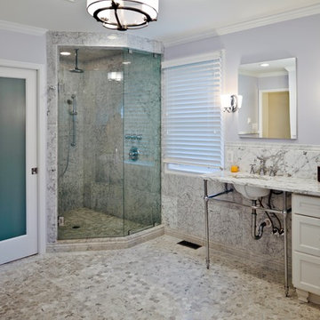
In 1985, the previous owner of the house had added an addition of which part included a 17 feet by 13 feet space off the master bedroom for both a master bath and walk-in closet. Irrespective of the dated red carpet that blanketed the entire bathroom of this 1964 colonial in Annandale, VA, the combination bathroom/closet space had its other oddities, primarily in that there was no shower. The current homeowners -- a family of five, who has been in the home for 7 years, was tired of going down the hall to use the kids’ bathroom to take a shower before work. The renovation that they have created now is a bright and luxurious space that one could bask in all day. They used this bathroom renovation opportunity to total remake the layout and function of this essential room that sets the tone for the day ahead.
Prior to the renovation, the existing bathroom oddly had two entrances, a typical one off of the master bedroom, but another straight off the upstairs hallway. As the toilet was out in the open in the previous design, ensuring that this second door was closed when company was in town was essential and a nuisance. As you entered the room, situated below the arc window, a large soaking tub that was covered on three sides with wooden steps dominated the room from the corner it projected. A relatively small 42” single bowl sink did not leave much space for his and hers toiletries, and there was no other linen closet or cabinetry for storage in the bathroom. The 8 foot by 5 foot closet with accordion doors had poorly laid out rungs not letting the storage space to be fully utilized. At over 220 square feet, the room did offer considerable space to work with, yet the existing layout, which even included a partition wall behind the vanity, felt cramped and dysfunctional.
The homeowners wished to create a classic yet modern, private, deluxe bathroom that would better integrate into their master suite and enable them to start and end each day in a luxurious way. They wanted to maintain having a soaking tub, add in a large shower, have an enclosed commode, expand to include double sinks, and add more storage for toiletries and linens. We worked with the customer to develop a creative design with extensive plumbing rework that accomplished all these needs and more.
The first order of business was to gut out all the carpet, tub, cabinetry, and non-load bearing partition walls. The new tub would be generally in the same location, but as the previous walk-in closet would be repurposed for the commode and the walk-in shower additional water lines, plumbing, and draining needed to be added; fortunately the room below is the garage, which enabled the team to frame out some bulkheads to accomplish this complex plumbing. Following the framing, including walling up the second entrance to the bathroom, adding in a pocket door for the commode, and creating the shape of the new shower, the team also laid down the wiring for one of the luxuries of this room – heated flooring. A glossy percaline boarder, and two-inch hexagon shape percaline tiles cover the entire floor, making it much easier and cleaner than the previous carpet.
Marble look tile is predominant throughout the bathroom as despite the angled frameless glass door, the entire shower is covered in 18 inch polished marble look tiles. The shower coats the user in water from either the overhead rain head, large main showerhead and/or the hand held sprayer. Over 7 feet of white Italian Statuetto marble countertop, enable the couple to have two sink bowls and plenty of room on each side. The bowls are exposed in this stainless steel console sink design which required the team to ensure that the exposed plumbing looked pristine, and painting the bottom of the porcelain bowl to match the coloring.
The white cast-iron 72-inch Cecilia claw-foot soaking tub and its chrome lion’s paws complement that other chrome and white used throughout the room. A tall, almost floor-to-ceiling linen closet finished in arctic white is nestled in the corner near the tub, enabling ample storage of towels, etc. Other cabinetry includes an 18 inch-wide vanity with decorative footing is centered between the two sinks, and a 27 inch wall mounted cabinet with shelf is above the Kohler Devonshire elongated toilet.
Billowing cloud colored grey blue paint was a great choice for this room to pick up on the veining in the marble. Mirrored medicine chests, a chandelier, wall sconces, and overhead recessed lighting also were incorporated into the design and function of the new room.
The artful combination of classic design from material choices, such as free-standing Victorian claw-foot tub along with the modern design as seen in the angled shower, frameless medicine cabinet mirrors, and frosted glass pocket door on the commode, make this bathroom quite a masterpiece.
The clients are enjoying having their private space and not having the use the kids’ bathroom anymore.
18