
Search results for "Poor functionality" in Home Design Ideas
 Gordon Reese Design Build
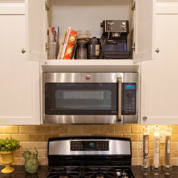
Our clients have lived in this Bay Area home for over 20 years and their kitchen had all the charm of that '70''s style; it no longer showcased their personal style or provided the functionality they needed. Outdated features included inset fluorescent ceiling lighting, uninspired cabinet style, and poor layout and functionality. This kitchen received a First Place Award from the National Association of Remodeling Industry's REMMIES in October 2013.
 McCabe By Design LLC
Our client purchased what had been a custom home built in 1973 on a high bank waterfront lot. They did their due diligence with respect to the septic system, well and the existing underground fuel tank but little did they know, they had purchased a house that would fit into the Three Little Pigs Story book.
The original idea was to do a thorough cosmetic remodel to bring the home up to date using all high durability/low maintenance materials and provide the homeowners with a flexible floor plan that would allow them to live in the home for as long as they chose to, not how long the home would allow them to stay safely. However, there was one structure element that had to change, the staircase.
The staircase blocked the beautiful water/mountain few from the kitchen and part of the dining room. It also bisected the second-floor master suite creating a maze of small dysfunctional rooms with a very narrow (and unsafe) top stair landing. In the process of redesigning the stairs and reviewing replacement options for the 1972 custom milled one inch thick cupped and cracked cedar siding, it was discovered that the house had no seismic support and that the dining/family room/hot tub room and been a poorly constructed addition and required significant structural reinforcement. It should be noted that it is not uncommon for this home to be subjected to 60-100 mile an hour winds and that the geographic area is in a known earthquake zone.
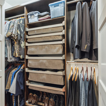
Once the structural engineering was complete, the redesign of the home became an open pallet. The homeowners top requests included: no additional square footage, accessibility, high durability/low maintenance materials, high performance mechanicals and appliances, water and energy efficient fixtures and equipment and improved lighting incorporated into: two master suites (one upstairs and one downstairs), a healthy kitchen (appliances that preserve fresh food nutrients and materials that minimize bacterial growth), accessible bathing and toileting, functionally designed closets and storage, a multi-purpose laundry room, an exercise room, a functionally designed home office, a catio (second floor balcony on the front of the home), with an exterior that was not just code compliant but beautiful and easy to maintain.
All of this was achieved and more. The finished project speaks for itself.
 Stacey Kocevar Designs, LLC
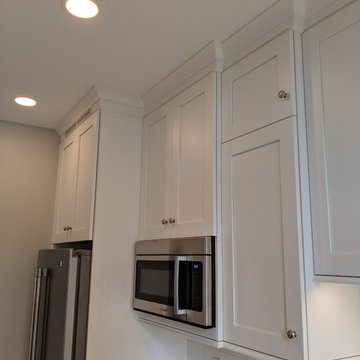
The existing, builder-grade, kitchen was not functional, as it was poorly lit, much needed storage space was underutilized, and un-safe, as the microwave was hung over the sink, causing the homeowners to hit their heads while working at the sink. Being a unit in an historic building, I was unable to move any of the existing plumbing & electrical, but could add to, as we did with the recessed and under cabinet LED lighting, I moved the microwave to a safe location, off of the counter and next to the refrigerator, and took the cabinetry to the ceiling, gaining an additional 12" of vertical storage along the main wall of the kitchen. Due to a supply vent being on the wall above the refrigerator, we had to get creative in how we brought it through the crown molding build-up, which led to a custom vent cover, that was designed and then fabricated to fit perfectly. This kitchen is packed with details that all came together to create a stunning, yet functional, new kitchen.
Find the right local pro for your project
 Alair Homes Plano
This home had a previous master bathroom remodel and addition with poor layout. Our homeowners wanted a whole new suite that was functional and beautiful. They wanted the new bathroom to feel bigger with more functional space. Their current bathroom was choppy with too many walls. The lack of storage in the bathroom and the closet was a problem and they hated the cabinets. They have a really nice large back yard and the views from the bathroom should take advantage of that.
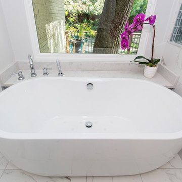
We decided to move the main part of the bathroom to the rear of the bathroom that has the best view and combine the closets into one closet, which required moving all of the plumbing, as well as the entrance to the new bathroom. Where the old toilet, tub and shower were is now the new extra-large closet. We had to frame in the walls where the glass blocks were once behind the tub and the old doors that once went to the shower and water closet. We installed a new soft close pocket doors going into the water closet and the new closet. A new window was added behind the tub taking advantage of the beautiful backyard. In the partial frameless shower we installed a fogless mirror, shower niches and a large built in bench. . An articulating wall mount TV was placed outside of the closet, to be viewed from anywhere in the bathroom.
The homeowners chose some great floating vanity cabinets to give their new bathroom a more modern feel that went along great with the large porcelain tile flooring. A decorative tumbled marble mosaic tile was chosen for the shower walls, which really makes it a wow factor! New recessed can lights were added to brighten up the room, as well as four new pendants hanging on either side of the three mirrors placed above the seated make-up area and sinks.
Design/Remodel by Hatfield Builders & Remodelers | Photography by Versatile Imaging
 Penny Lawns
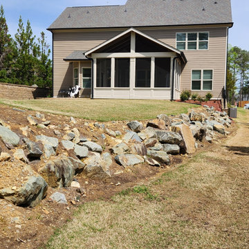
Before view of side yard - The terrain in Kennesaw, GA is notoriously difficult for landscaping due to dense red clay and deeply embedded granite. These rocky conditions often require heavy machinery, like jackhammers or rock saws, to break through large stones just beneath the surface. What looks like a manageable yard can quickly reveal solid rock layers that slow down grading and increase labor. The clay and rock also create poor drainage, leading to water pooling that must be addressed with solutions like dry creek beds or advanced regrading. Despite the challenge, with the right tools and planning, even the toughest Kennesaw yards can be transformed into functional, beautiful spaces.
 Stacey Kocevar Designs, LLC
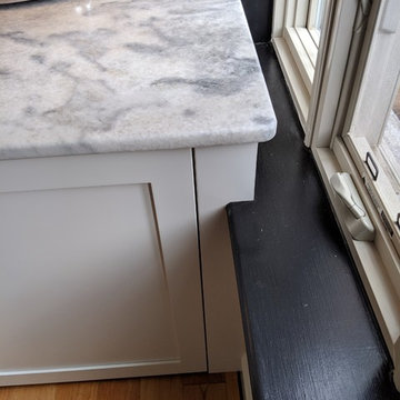
The existing, builder-grade, kitchen was not functional, as it was poorly lit, much needed storage space was underutilized, and un-safe, as the microwave was hung over the sink, causing the homeowners to hit their heads while working at the sink. Being a unit in an historic building, I was unable to move any of the existing plumbing & electrical, but could add to, as we did with the recessed and under cabinet LED lighting, I moved the microwave to a safe location, off of the counter and next to the refrigerator, and took the cabinetry to the ceiling, gaining an additional 12" of vertical storage along the main wall of the kitchen. Due to a supply vent being on the wall above the refrigerator, we had to get creative in how we brought it through the crown molding build-up, which led to a custom vent cover, that was designed and then fabricated to fit perfectly. This kitchen is packed with details that all came together to create a stunning, yet functional, new kitchen.
 Stacey Kocevar Designs, LLC
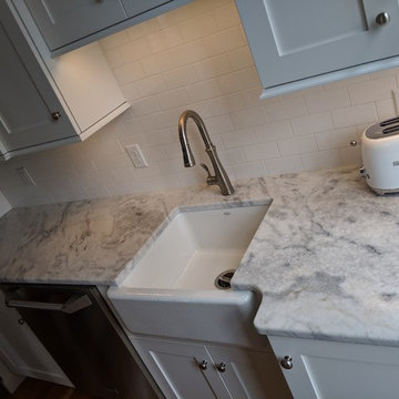
The existing, builder-grade, kitchen was not functional, as it was poorly lit, much needed storage space was underutilized, and un-safe, as the microwave was hung over the sink, causing the homeowners to hit their heads while working at the sink. Being a unit in an historic building, I was unable to move any of the existing plumbing & electrical, but could add to, as we did with the recessed and under cabinet LED lighting, I moved the microwave to a safe location, off of the counter and next to the refrigerator, and took the cabinetry to the ceiling, gaining an additional 12" of vertical storage along the main wall of the kitchen. Due to a supply vent being on the wall above the refrigerator, we had to get creative in how we brought it through the crown molding build-up, which led to a custom vent cover, that was designed and then fabricated to fit perfectly. This kitchen is packed with details that all came together to create a stunning, yet functional, new kitchen.

Sponsored
Columbus, OH

Structural Remodeling
Franklin County's Heavy Timber Specialists | Best of Houzz 2020!
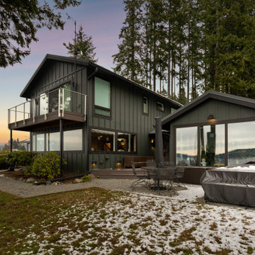
 McCabe By Design LLC
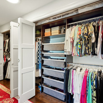
Our client purchased what had been a custom home built in 1973 on a high bank waterfront lot. They did their due diligence with respect to the septic system, well and the existing underground fuel tank but little did they know, they had purchased a house that would fit into the Three Little Pigs Story book.
The original idea was to do a thorough cosmetic remodel to bring the home up to date using all high durability/low maintenance materials and provide the homeowners with a flexible floor plan that would allow them to live in the home for as long as they chose to, not how long the home would allow them to stay safely. However, there was one structure element that had to change, the staircase.
The staircase blocked the beautiful water/mountain few from the kitchen and part of the dining room. It also bisected the second-floor master suite creating a maze of small dysfunctional rooms with a very narrow (and unsafe) top stair landing. In the process of redesigning the stairs and reviewing replacement options for the 1972 custom milled one inch thick cupped and cracked cedar siding, it was discovered that the house had no seismic support and that the dining/family room/hot tub room and been a poorly constructed addition and required significant structural reinforcement. It should be noted that it is not uncommon for this home to be subjected to 60-100 mile an hour winds and that the geographic area is in a known earthquake zone.
Once the structural engineering was complete, the redesign of the home became an open pallet. The homeowners top requests included: no additional square footage, accessibility, high durability/low maintenance materials, high performance mechanicals and appliances, water and energy efficient fixtures and equipment and improved lighting incorporated into: two master suites (one upstairs and one downstairs), a healthy kitchen (appliances that preserve fresh food nutrients and materials that minimize bacterial growth), accessible bathing and toileting, functionally designed closets and storage, a multi-purpose laundry room, an exercise room, a functionally designed home office, a catio (second floor balcony on the front of the home), with an exterior that was not just code compliant but beautiful and easy to maintain.
All of this was achieved and more. The finished project speaks for itself.
 McCabe By Design LLC
Our client purchased what had been a custom home built in 1973 on a high bank waterfront lot. They did their due diligence with respect to the septic system, well and the existing underground fuel tank but little did they know, they had purchased a house that would fit into the Three Little Pigs Story book.
The original idea was to do a thorough cosmetic remodel to bring the home up to date using all high durability/low maintenance materials and provide the homeowners with a flexible floor plan that would allow them to live in the home for as long as they chose to, not how long the home would allow them to stay safely. However, there was one structure element that had to change, the staircase.
The staircase blocked the beautiful water/mountain few from the kitchen and part of the dining room. It also bisected the second-floor master suite creating a maze of small dysfunctional rooms with a very narrow (and unsafe) top stair landing. In the process of redesigning the stairs and reviewing replacement options for the 1972 custom milled one inch thick cupped and cracked cedar siding, it was discovered that the house had no seismic support and that the dining/family room/hot tub room and been a poorly constructed addition and required significant structural reinforcement. It should be noted that it is not uncommon for this home to be subjected to 60-100 mile an hour winds and that the geographic area is in a known earthquake zone.
Once the structural engineering was complete, the redesign of the home became an open pallet. The homeowners top requests included: no additional square footage, accessibility, high durability/low maintenance materials, high performance mechanicals and appliances, water and energy efficient fixtures and equipment and improved lighting incorporated into: two master suites (one upstairs and one downstairs), a healthy kitchen (appliances that preserve fresh food nutrients and materials that minimize bacterial growth), accessible bathing and toileting, functionally designed closets and storage, a multi-purpose laundry room, an exercise room, a functionally designed home office, a catio (second floor balcony on the front of the home), with an exterior that was not just code compliant but beautiful and easy to maintain.
All of this was achieved and more. The finished project speaks for itself.
 Architectural Resource LLC
The Brooke Residence ‘Addi- tion by Subtraction’ remodeling project was recognized with numerous regional and national awards and was selected for Fine Homebuilding’s Annual Issue on Houses.
This 1920’s Craftsman Bungalow had been poorly modified in the 70’s in an attempt to address poor energy performance with a scabbed on solarium. The design solution removed the solarium and completely reimagined the floor plan: The kitchen was relocated to the rear; the stairway was relocated to enhance function, and a better connection to the family room was created.
 TVL Creative Ltd.
This challenging kitchen came our way at the same time as another similarly located Centennial kitchen. It was apparent that both houses had been built by the same builder: tight space, low ceilings, awkward arrangement, and poor building materials. Our client here is a single mother of three boys with an incredibly demanding work life. Once finally home at the end of a busy day, our client was virtually unable to use her kitchen. Cabinet doors were falling off, limited storage and workspace offered her little opportunity to cook and prep for her children, and the dark and low ceiling created an atmosphere that can only be described as depressing. Our client is also from Louisiana and has always dreamed of a kitchen that reminds her of home warmth and hospitality. Our goal was not only to expand functional storage and workspace, but bring in the southern NOLA appeal that reminds our client so much of home. To do this, we removed the wall between the formal dining room and kitchen to create an extended kitchen that runs the full length of both spaces. The back wall of what used to be the dining room is now the cooking zone for our client: we've relocated her range and microwave, and have created an island full of storage where her children can sit and socialize. We've also lifted up the low ceiling to create a tray ceiling that we have finished with ghostwood. The cabinetry is an off-white color with a hazelnut glaze that offers a more traditional, warm appearance. The island and mini work nook feature dramatic, handmade tin ceiling tiles for a dramatic texture and color. We've finished the space with functional quartz countertops and an arabesque two-toned marble backspalsh. The sinks, faucets and hardware are all in a matte black finish that offer a dramatic pop throughout the space. Little touches of Parisian flair add to this Cajun-French aesthetic and we are so thrilled with the final result!
 STUDIO NINE & CO.
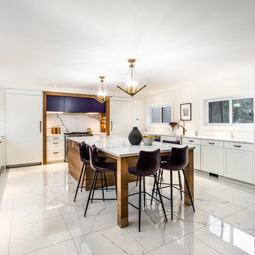
When this family of 7 bought their home, they came to us and said "We want a purple kitchen!". Naturally we jumped at the opportunity to create something outside of the box. With 5 young children, functionality and storage was imperative. We designed the kitchen to accommodate our client's lifestyle and busy household. It houses, 3 floor to ceiling storage compartments, each with its own individual function. First, the "Chef's Pantry", complete with top to bottom pullouts. Secondly, the "Breakfast Pantry", that houses everyday appliances, dinner ware, breakfast cereals and spreads. Finally, the once closet, converted 'Walk In Pantry". The oak frame around the range was specifically designed to allow for quick & easy access to everyday cooking essentials, and serve as a focal point in the space. Additional accessories included in the design were a double garbage pull out bin, retractable shelf for smaller, yet heavy appliances, Tupperware organizer, 2 spice pulls, and 2 Le Mans corner organizers. We opted for bespoke cabinetry, with an HDF painted & and oak construction, paired with purple and champagne bronze accents to tie it all together. Overall, this once dull and poorly organized kitchen is now the embodiment of bright, bold and beautiful, offering this colorful family comfort and convenience as they live life as an expression of their values.
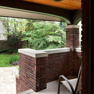
 Architectural Resource LLC
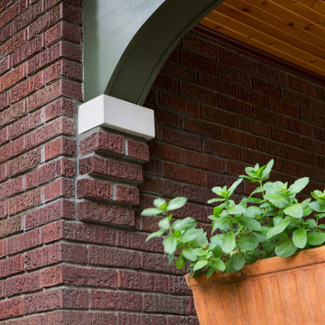
The Brooke Residence ‘Addi- tion by Subtraction’ remodeling project was recognized with numerous regional and national awards and was selected for Fine Homebuilding’s Annual Issue on Houses.
This 1920’s Craftsman Bungalow had been poorly modified in the 70’s in an attempt to address poor energy performance with a scabbed on solarium. The design solution removed the solarium and completely reimagined the floor plan: The kitchen was relocated to the rear; the stairway was relocated to enhance function, and a better connection to the family room was created.


 Alair Homes Plano
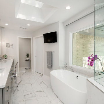
This home had a previous master bathroom remodel and addition with poor layout. Our homeowners wanted a whole new suite that was functional and beautiful. They wanted the new bathroom to feel bigger with more functional space. Their current bathroom was choppy with too many walls. The lack of storage in the bathroom and the closet was a problem and they hated the cabinets. They have a really nice large back yard and the views from the bathroom should take advantage of that.
We decided to move the main part of the bathroom to the rear of the bathroom that has the best view and combine the closets into one closet, which required moving all of the plumbing, as well as the entrance to the new bathroom. Where the old toilet, tub and shower were is now the new extra-large closet. We had to frame in the walls where the glass blocks were once behind the tub and the old doors that once went to the shower and water closet. We installed a new soft close pocket doors going into the water closet and the new closet. A new window was added behind the tub taking advantage of the beautiful backyard. In the partial frameless shower we installed a fogless mirror, shower niches and a large built in bench. . An articulating wall mount TV was placed outside of the closet, to be viewed from anywhere in the bathroom.
The homeowners chose some great floating vanity cabinets to give their new bathroom a more modern feel that went along great with the large porcelain tile flooring. A decorative tumbled marble mosaic tile was chosen for the shower walls, which really makes it a wow factor! New recessed can lights were added to brighten up the room, as well as four new pendants hanging on either side of the three mirrors placed above the seated make-up area and sinks.
Design/Remodel by Hatfield Builders & Remodelers | Photography by Versatile Imaging
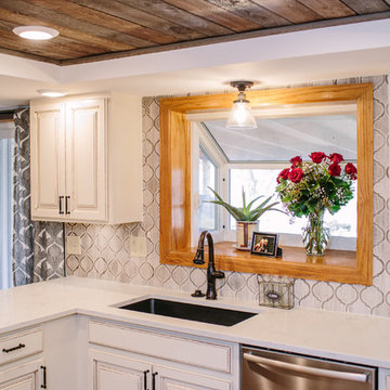
 TVL Creative Ltd.
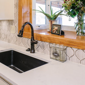
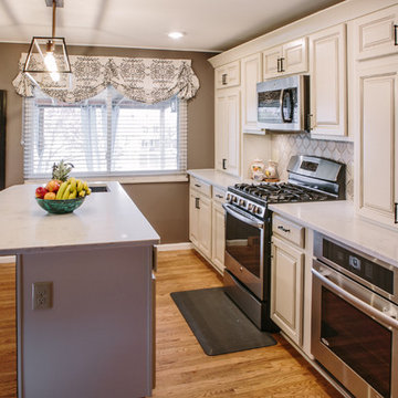
This challenging kitchen came our way at the same time as another similarly located Centennial kitchen. It was apparent that both houses had been built by the same builder: tight space, low ceilings, awkward arrangement, and poor building materials. Our client here is a single mother of three boys with an incredibly demanding work life. Once finally home at the end of a busy day, our client was virtually unable to use her kitchen. Cabinet doors were falling off, limited storage and workspace offered her little opportunity to cook and prep for her children, and the dark and low ceiling created an atmosphere that can only be described as depressing. Our client is also from Louisiana and has always dreamed of a kitchen that reminds her of home warmth and hospitality. Our goal was not only to expand functional storage and workspace, but bring in the southern NOLA appeal that reminds our client so much of home. To do this, we removed the wall between the formal dining room and kitchen to create an extended kitchen that runs the full length of both spaces. The back wall of what used to be the dining room is now the cooking zone for our client: we've relocated her range and microwave, and have created an island full of storage where her children can sit and socialize. We've also lifted up the low ceiling to create a tray ceiling that we have finished with ghostwood. The cabinetry is an off-white color with a hazelnut glaze that offers a more traditional, warm appearance. The island and mini work nook feature dramatic, handmade tin ceiling tiles for a dramatic texture and color. We've finished the space with functional quartz countertops and an arabesque two-toned marble backspalsh. The sinks, faucets and hardware are all in a matte black finish that offer a dramatic pop throughout the space. Little touches of Parisian flair add to this Cajun-French aesthetic and we are so thrilled with the final result!
 TVL Creative Ltd.
This challenging kitchen came our way at the same time as another similarly located Centennial kitchen. It was apparent that both houses had been built by the same builder: tight space, low ceilings, awkward arrangement, and poor building materials. Our client here is a single mother of three boys with an incredibly demanding work life. Once finally home at the end of a busy day, our client was virtually unable to use her kitchen. Cabinet doors were falling off, limited storage and workspace offered her little opportunity to cook and prep for her children, and the dark and low ceiling created an atmosphere that can only be described as depressing. Our client is also from Louisiana and has always dreamed of a kitchen that reminds her of home warmth and hospitality. Our goal was not only to expand functional storage and workspace, but bring in the southern NOLA appeal that reminds our client so much of home. To do this, we removed the wall between the formal dining room and kitchen to create an extended kitchen that runs the full length of both spaces. The back wall of what used to be the dining room is now the cooking zone for our client: we've relocated her range and microwave, and have created an island full of storage where her children can sit and socialize. We've also lifted up the low ceiling to create a tray ceiling that we have finished with ghostwood. The cabinetry is an off-white color with a hazelnut glaze that offers a more traditional, warm appearance. The island and mini work nook feature dramatic, handmade tin ceiling tiles for a dramatic texture and color. We've finished the space with functional quartz countertops and an arabesque two-toned marble backspalsh. The sinks, faucets and hardware are all in a matte black finish that offer a dramatic pop throughout the space. Little touches of Parisian flair add to this Cajun-French aesthetic and we are so thrilled with the final result!
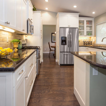 Gordon Reese Design Build
Our clients have lived in this Bay Area home for over 20 years and their kitchen had all the charm of that '70''s style; it no longer showcased their personal style or provided the functionality they needed. Outdated features included inset fluorescent ceiling lighting, uninspired cabinet style, and poor layout and functionality. This kitchen received a First Place Award from the National Association of Remodeling Industry's REMMIES in October 2013.
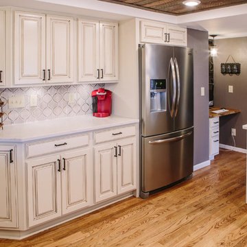 TVL Creative Ltd.
This challenging kitchen came our way at the same time as another similarly located Centennial kitchen. It was apparent that both houses had been built by the same builder: tight space, low ceilings, awkward arrangement, and poor building materials. Our client here is a single mother of three boys with an incredibly demanding work life. Once finally home at the end of a busy day, our client was virtually unable to use her kitchen. Cabinet doors were falling off, limited storage and workspace offered her little opportunity to cook and prep for her children, and the dark and low ceiling created an atmosphere that can only be described as depressing. Our client is also from Louisiana and has always dreamed of a kitchen that reminds her of home warmth and hospitality. Our goal was not only to expand functional storage and workspace, but bring in the southern NOLA appeal that reminds our client so much of home. To do this, we removed the wall between the formal dining room and kitchen to create an extended kitchen that runs the full length of both spaces. The back wall of what used to be the dining room is now the cooking zone for our client: we've relocated her range and microwave, and have created an island full of storage where her children can sit and socialize. We've also lifted up the low ceiling to create a tray ceiling that we have finished with ghostwood. The cabinetry is an off-white color with a hazelnut glaze that offers a more traditional, warm appearance. The island and mini work nook feature dramatic, handmade tin ceiling tiles for a dramatic texture and color. We've finished the space with functional quartz countertops and an arabesque two-toned marble backspalsh. The sinks, faucets and hardware are all in a matte black finish that offer a dramatic pop throughout the space. Little touches of Parisian flair add to this Cajun-French aesthetic and we are so thrilled with the final result!
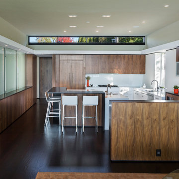
 CITYDESKSTUDIO, Inc.
This home enjoys stunning views of Sweeney Lake from almost anywhere in the home; however it was in need of repair and a significant reorganization of the plan to take full advantage of site. The project is about the complete restoration and rethinking of this vintage 1965 mid-century gem. The house is deceivingly large with a full finished lower level and an indoor pool room; however it lived cramped and broken up. The entry was uninviting and small, the poolroom unused and poorly heated, the kitchen undersized, and the bedrooms and baths poorly accessed.
Our task was to open up the home through the rethinking of the floor plan and the introduction of a new central axis connecting and organizing the homes functions and spaces around view corridors and existing or new focal points. The home had beautiful features to build upon; the central brick fireplace, the raised roofs over the living and pool rooms, and the view to the lake itself. A fully redone exterior and interior preserve the homes proportion and scale, while at the same time bring greater connection to the site and a much needed clarity to the homes organization.
Project Team:
Ben Awes AIA, Principal-In-Charge
Bob Ganser AIA
Christian Dean AIA
Nate Dodge
 Paintzen, Inc.
For many, professional interior design is a luxury. Whether your home’s design project is large or small, having the ability to transform your house, apartment or condo into a beautiful, unique space is a wonderful opportunity for self-expression. Even if it is a just simple accent wall painted in a color that speaks to you, or a complete renovation of your cabinets to achieve the kitchen of your dreams, interior design allows you to create an environment that is both personal and comfortable.
That is exactly how interior designer and founder of Design Exchange Sean Carlson Perry feels about what he does for a living. “The reason that I love designing spaces, and value the impact of space design on people, is the way the spaces make us feel, the visceral appeal of good design. Good design should stimulate the senses and generate an emotionally engaging experience. As a designer, I get to massage and sculpt people’s experience of space!” Perry shared with us.
In late 2017, the Paintzen team connected with Perry regarding a very special design project he was working on. Design Exchange was renovating, redesigning and re-furnishing The Ali Forney Center. The Ali Forney Center, based in New York City, is the largest and most comprehensive organization dedicated to housing homeless LGBTQ youth. Nearly 40% of the homeless youth population is LGBTQ. Homeless LGBTQ youth are eight times more likely to experience violence, discrimination, and suicide. AFC houses 124 youths each night and provides services to over 1,400 homeless young people per year.
Although the organization does an incredible job to provide safety and shelter to homeless youth, Perry and his team felt the space itself could use some updating and could feel more welcoming. Rooms were dark, cold, and lacked proper storage. Furniture was in poor shape and didn’t work. The rooms were being under-utilized; overall, there was so much more that could be done within the walls of the AFC that could be improved using interior design & paint!
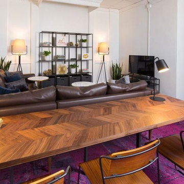
We at Paintzen were excited to partner with Design Exchange to do our part in this transformation. The dark, paneled walls were re-painted white. This entirely opened up the space, making it brighter, warmer and more welcoming. The white walls also served as a much better backdrop for smart lighting, as well as for the furniture, wall decor, and new flooring. Beyond painting, Perry and his team used FLOR carpet tiles for durability in a bright Fuchsia shade for a pop of color. They created a more functional layout to maximize the space and make better use of its architectural details and added new furniture including lamps, tables, throws, a sofa, a TV and a Roku to make the space beautiful, and even fun.
“Design increases connection and community,” Perry told us. “When we revamp a shelter space, history tells us that the residents spend more time in the space, more time with their peers, building connections and community; a greater sense of home.” Perry’s goal was to create an environment that set its residents up for success by improving their quality of life, outlook and self-esteem.
“This isn’t extreme home makeover (although I wish I had that budget!). It’s about improving the aesthetics of the space to create a better environment and experience for people who are going through challenging times. I’ve been lucky enough to have an amount of work that allows me to donate a portion of profits to Design Exchange Projects.”
Sean Carlson Perry founded Design Exchange as a way to use his talent, passion, and skills to help those who are struggling, or in a place of immediate need. He was searching to bring deeper meaning and a humanitarian component to his work. Perry has worked with clients in New York, San Francisco, and Los Angeles. “Good design—functionally, aesthetically and ergonomically—promotes a better quality of life.” This is a mantra that describes why Perry does what he does through Design Exchange, working to help the underserved of New York City and other cities across the country.
“I grew up gay in Nebraska, and have gone through some hard times when I was younger, but I can’t imagine going through what these kids go through – rejection from family, being kicked out of the house for being who they are, homeless and having nowhere else to turn,” said Perry. “Luckily, there is The Ali Forney Center. Doing these projects for AFC strikes close to home for me, so they are extra special and close to my heart.”
21