
Search results for "Pose challenges" in Home Design Ideas
 Blue Eye Interiors
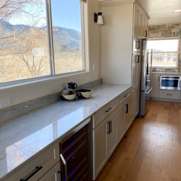
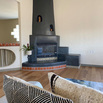
Transform this cramped kitchen into an open-concept living space. The only hiccup is that this is upstairs! Hauling appliances, stone slabs, and 6ft beams up a curved staircase posed its own challenges. We were able to finish this remodel quickly with a great result.
 Shearon Design Collective
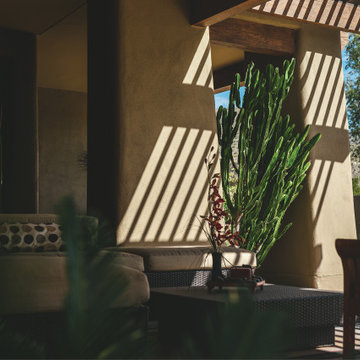
This project was driven by a commitment to sustainability and repurposing existing materials, seamlessly blending the old with the new while minimizing waste. The goal was to transform the backyard into a lush garden oasis with a low-water and low-maintenance design. Despite challenges posed by the property's proximity to the golf course and specific guidelines, a harmonious integration of desert plant life and low-water lush plants was achieved. Reusing existing materials and replacing natural grass with synthetic turf minimized water usage, while strategic plant placement utilized run-off water for sustainable irrigation. Navigating the constraints imposed by the Country Club, the project created a cohesive outdoor space and repurposed cobblestones to bridge the gap between the golf course and the rear of the property. This project achieved a balance between ecological consciousness and aesthetic beauty, allowing the garden oasis to coexist harmoniously with the golf course backdrop, providing the clients with a serene and vibrant landscape that aligns with their vision and respects the natural resources of the community.
 kul grilles
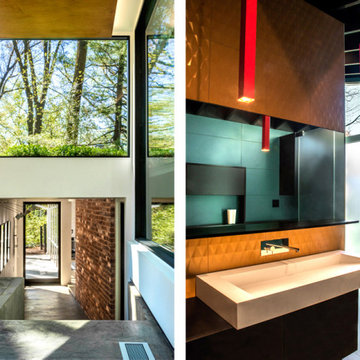
Located in Highview Court, in Silver Spring, MD sits a one-of-a-kind, piece of art. This renovation and addition to the Architect’s own 1950 mid-century modern house, designed by Charles Goodman, included two phases.
The existing Goodman structure was first renovated five years ago, with a new kitchen, bathroom, and windows. The original floor plan was preserved, except for the kitchen being opened to the main living room. The just-completed addition extends the living space to include a library, an office that doubles as the kids’ hangout space, along with two new full bathrooms and a laundry room.
This unique union of structures combined with a multi-level footprint, open concept design, and concrete floors would naturally pose some unique heating, ventilation and air conditioning challenges. Finding the right air quality solution was critical to the flow, literally and aesthetically.
From a visual design perspective, floor vent covers in open-areas must blend into the surroundings. Not to create sightline disruptions. Where would the design team find unintrusive, clean-lined, sleek modern floor grilles? What floor registers would be best to use on these concrete floors? Enter kul grilles!
Find the right local pro for your project
 Muse Design Studio, LLC
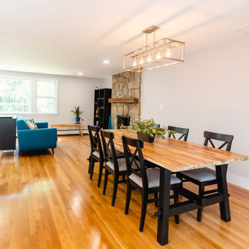
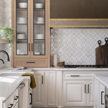
In the quiet embrace of their first home, a young professional couple embarked on a transformative journey—one that would transcend mere renovation. Their vision, crystalline and unwavering, sought to infuse every corner with a sense of purpose and elegance. The canvas: an open-concept kitchen and a master bath. Our skilled team orchestrated a symphony of change. Walls yielded to possibility as we dismantled a load-bearing barrier, seamlessly connecting the kitchen to an earlier addition—the family room. Within the kitchen’s modest footprint, we wielded design magic: opening up spaces, introducing a double-sided island, and inviting the family room into the culinary dance. A half wall, elegantly serving as a buffet-style counter, bridged the dining area, amplifying the sense of openness. The master bathroom, nestled within the original house, posed its own challenges. Our design, however, was resolute: a private toilet enclave, a grand walk-in shower, and a dual-person vanity adorned with linen storage.
 Swatch Design Group
This full first-floor renovation transformed a family home in Northwest Indiana, originally built in the early 2000s, into a personalized, highly functional space that better reflects the lifestyle and taste of its four residents. The remodel included the kitchen, living room, a reimagined dining room turned sitting room, office, mudroom, and laundry room.
The clients’ main objective was to move beyond dated, builder-grade finishes and create a home that felt curated, warm, and distinctive—infused with layered textures, custom details, and a sense of ease. The living room posed the biggest design challenge, with awkward furniture placement due to two structural columns. We used these features to anchor a revised layout, integrating custom built-ins for storage and balance, and adding mixed metals and refined textures for visual depth.
A former dining room was transformed into a moody sitting room—contrasting the neutral palette used throughout the rest of the main floor, while still complementing it. The mudroom was reworked from a tight, underutilized space into a practical, polished drop zone with custom cabinetry and stylish utility.
Throughout the renovation, our team focused on improving flow, enhancing functionality, and blending each room’s unique character into a cohesive, elevated whole—resulting in a home that’s as livable as it is beautifully tailored.
 Eagleson Landscape Co.
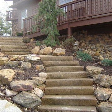
A steep sloping backyard posed in interesting and challenging project to allow this lake front home access to their dock. These sandstone steps made for an easy and gorgeous walk down to the water.
 Klopf Architecture
Set in a quiet neighborhood and framed by mature trees, this residence presented a unique opportunity: to thoughtfully evolve a custom mid-century modern home into a space that supports the everyday rhythms of a growing family. With a deep respect for the home’s original architecture, Klopf Architecture reimagined the house to better meet the needs of its owners—introducing functional improvements while preserving the spirit and character of its mid-century roots.
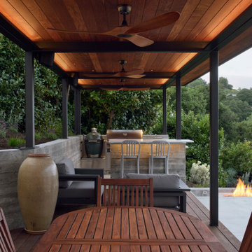
The clients approached Klopf Architecture with a clear vision: refresh their home while seamlessly integrating new programmatic elements. Key goals included clarifying and enhancing the entry sequence; connecting the detached garage to the main house with a practical yet architecturally intentional intervention; adding functional spaces such as a mudroom and laundry room; expanding and remodeling the primary suite’s bathroom and closet; and creating a more engaging outdoor space that capitalized on the site’s impressive views, featuring a fire pit and outdoor kitchen.
As a couple with distinct yet complementary perspectives—one focused on modern functionality and technology, and the other dedicated to preserving the home’s architectural integrity—their collaboration with Klopf Architecture resulted in a solution that harmonized both ideals. Their shared commitment to improving the livability of their home led to a design dialogue rooted in balance. This dynamic partnership shaped the direction of the renovation, ensuring that every decision honored the spirit of the original home while aligning with the practical needs of their growing family.
Designing within the constraints of the sloped site posed one of the project’s central challenges. The detached garage sat at a higher elevation than the main house, requiring a solution that ensured architectural and geometric compatibility between the two structures. Rather than create a purely utilitarian link, Klopf Architecture introduced an intentional connection that contributes to the overall architectural language. A notable pinch point in the plan—where differing geometries converged—was treated as a hinge point, turning a potentially awkward juncture into an architectural feature. This area now functions as both a transition and a moment of design interest that unifies the overall plan.
The design also addressed the underutilized outdoor area, which was located in a shadowed portion of the site with geometrical limitations. A new connection to the rear deck was created in this same area, making the outdoor space more useful and inviting. Klopf Architecture introduced carefully positioned openings and spatial improvements that forged a strong visual and functional connection between indoor and outdoor spaces. The outdoor area now reads as a deliberate extension of the home, embracing natural light and emphasizing the dramatic views.
Working through multiple design iterations, Klopf Architecture crafted a solution that preserved the architectural language of the original home while supporting the functional needs of modern life. The garage-to-house connection became more than a passage—it evolved into an architectural moment of transition. A new mudroom and laundry space enhanced convenience without compromising the clean lines of the design. The primary suite was expanded to create a private, serene retreat. The reimagined backyard, complete with fire pit and kitchen, now plays a vital role in the family’s daily routine and social life.
Outcomes and Lasting Impact
The result is a home that balances heritage with contemporary design, technical precision with design sensibility. The redesign not only met the clients’ initial goals but also exceeded expectations in its ability to seamlessly blend past and present, function and beauty, making the outdoor kitchen a favorite gathering place.
Beyond aesthetics, the renovation has significantly improved daily life for the family. The newly integrated garage connection has streamlined routines, providing a seamless transition between arriving home, storing belongings, and entering the main living spaces. The expanded primary suite offers a retreat-like atmosphere, creating a private space to unwind at the end of the day. The redesigned outdoor areas have also become an extension of their lifestyle—whether it's casual family dinners around the fire pit, entertaining friends in the outdoor kitchen, or simply enjoying the view from the reimagined backyard.
Through a thoughtful and strategic approach, the house has been successfully evolved into a home that remains true to its mid-century modern roots while enhancing livability, functionality, and the overall quality of life for the modern-day owners.
Klopf Architecture Team: Geoffrey Campen, Fernanda Bernardes
Architectural Interior Design: Klopf Architecture
Structural Engineer: Base Design Inc.
Contractor: Golden Snail Builders
Photography: Mariko Reed
Year Completed:2022


 Clay Imports
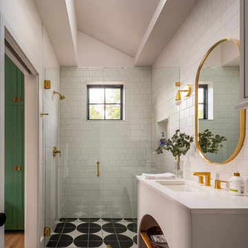
The Casa Cava Project's bathroom posed a budget challenge, pushing the design-build couple to focus on shape and form over expensive materials. They chose arcs as the theme to create a softer and more inviting space, inspired by the contrast between rectilinear man-made structures and the natural world's curves.
They chose our Clay Imports quarter circle tiles.
Design by Hatch Works.
 Blue Eye Interiors
Transform this cramped kitchen into an open-concept living space. The only hiccup is that this is upstairs! Hauling appliances, stone slabs, and 6ft beams up a curved staircase posed its own challenges. We were able to finish this remodel quickly with a great result.
 Klopf Architecture
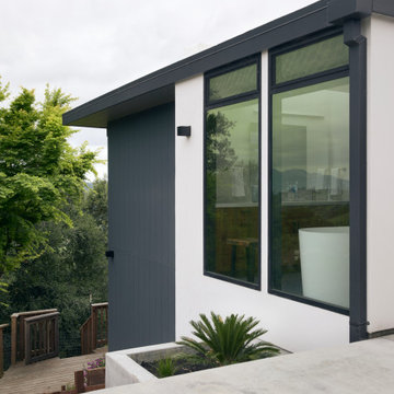
Set in a quiet neighborhood and framed by mature trees, this residence presented a unique opportunity: to thoughtfully evolve a custom mid-century modern home into a space that supports the everyday rhythms of a growing family. With a deep respect for the home’s original architecture, Klopf Architecture reimagined the house to better meet the needs of its owners—introducing functional improvements while preserving the spirit and character of its mid-century roots.
The clients approached Klopf Architecture with a clear vision: refresh their home while seamlessly integrating new programmatic elements. Key goals included clarifying and enhancing the entry sequence; connecting the detached garage to the main house with a practical yet architecturally intentional intervention; adding functional spaces such as a mudroom and laundry room; expanding and remodeling the primary suite’s bathroom and closet; and creating a more engaging outdoor space that capitalized on the site’s impressive views, featuring a fire pit and outdoor kitchen.
As a couple with distinct yet complementary perspectives—one focused on modern functionality and technology, and the other dedicated to preserving the home’s architectural integrity—their collaboration with Klopf Architecture resulted in a solution that harmonized both ideals. Their shared commitment to improving the livability of their home led to a design dialogue rooted in balance. This dynamic partnership shaped the direction of the renovation, ensuring that every decision honored the spirit of the original home while aligning with the practical needs of their growing family.
Designing within the constraints of the sloped site posed one of the project’s central challenges. The detached garage sat at a higher elevation than the main house, requiring a solution that ensured architectural and geometric compatibility between the two structures. Rather than create a purely utilitarian link, Klopf Architecture introduced an intentional connection that contributes to the overall architectural language. A notable pinch point in the plan—where differing geometries converged—was treated as a hinge point, turning a potentially awkward juncture into an architectural feature. This area now functions as both a transition and a moment of design interest that unifies the overall plan.
The design also addressed the underutilized outdoor area, which was located in a shadowed portion of the site with geometrical limitations. A new connection to the rear deck was created in this same area, making the outdoor space more useful and inviting. Klopf Architecture introduced carefully positioned openings and spatial improvements that forged a strong visual and functional connection between indoor and outdoor spaces. The outdoor area now reads as a deliberate extension of the home, embracing natural light and emphasizing the dramatic views.
Working through multiple design iterations, Klopf Architecture crafted a solution that preserved the architectural language of the original home while supporting the functional needs of modern life. The garage-to-house connection became more than a passage—it evolved into an architectural moment of transition. A new mudroom and laundry space enhanced convenience without compromising the clean lines of the design. The primary suite was expanded to create a private, serene retreat. The reimagined backyard, complete with fire pit and kitchen, now plays a vital role in the family’s daily routine and social life.
Outcomes and Lasting Impact
The result is a home that balances heritage with contemporary design, technical precision with design sensibility. The redesign not only met the clients’ initial goals but also exceeded expectations in its ability to seamlessly blend past and present, function and beauty, making the outdoor kitchen a favorite gathering place.
Beyond aesthetics, the renovation has significantly improved daily life for the family. The newly integrated garage connection has streamlined routines, providing a seamless transition between arriving home, storing belongings, and entering the main living spaces. The expanded primary suite offers a retreat-like atmosphere, creating a private space to unwind at the end of the day. The redesigned outdoor areas have also become an extension of their lifestyle—whether it's casual family dinners around the fire pit, entertaining friends in the outdoor kitchen, or simply enjoying the view from the reimagined backyard.
Through a thoughtful and strategic approach, the house has been successfully evolved into a home that remains true to its mid-century modern roots while enhancing livability, functionality, and the overall quality of life for the modern-day owners.
Klopf Architecture Team: Geoffrey Campen, Fernanda Bernardes
Architectural Interior Design: Klopf Architecture
Structural Engineer: Base Design Inc.
Contractor: Golden Snail Builders
Photography: Mariko Reed
Year Completed:2022
 Maugel DeStefano Architects
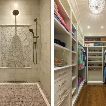
Crafted with a relaxed and effortless charm, this 5,600 SF shingle-style home offers views to the Isles of Shoals. The clients' goal was to create a warm and welcoming home that radiated both elegance and comfort while easily accommodating their newest additions to the family: their grandchildren.
Despite the challenge posed by the lot's unique shape, the team worked hard so that the design seamlessly integrates with the property, avoiding any sense of imposition to the land or its inhabitants. To overcome this obstacle, the design team incorporated a custom fit angle into the floor plan, defining the open-concept rooms and perfectly aligning with the clients' vision of a friendly and casual space.
The heart of the home lies in the open kitchen, with a generous granite island, a cozy breakfast nook, and adjacent open sitting areas. To ensure that the beauty of the Seacoast is always within sight, 30 strategically placed windows grace the waterside of the home, capturing the essence of the Shoals and inviting refreshing sea breezes into the interior.
 TVL Creative Ltd.
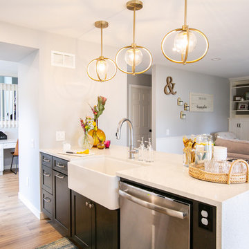
Cramped kitchen be gone! That was the project motto and top priority. The goal was to transform the current layout from multiple smaller spaces into a connected whole that would activate the main level for our clients, a young family of four.
The biggest obstacle was the wall dividing the kitchen and the dining room. Removing this wall was central to opening up and integrating the main living spaces, but the existing ductwork that ran right through the center of the wall posed a design challenge, er design opportunity. The resulting design solution features a central pantry that captures the ductwork and provides valuable storage- especially when compared to the original kitchen's 18" wide pantry cabinet. The pantry also anchors the kitchen island and serves as a visual separation of space between the kitchen and homework area.
Through our design development process, we learned the formal living room was of no service to their lifestyle and therefore space they rarely spent time in. With that in mind, we proposed to eliminate the unused living room and make it the new dining room. Relocating the dining room to this space inherently felt right given the soaring ceiling and ample room for holiday dinners and celebrations. The new dining room was spacious enough for us to incorporate a conversational seating area in the warm, south-facing window alcove.
Now what to do with the old dining room?! To answer that question we took inspiration from our clients' shared profession in education and developed a craft area/homework station for both of their boys. The semi-custom cabinetry of the desk area carries over to the adjacent wall and forms window bench base with storage that we topped with butcher block for a touch of warmth. While the boys are young, the bench drawers are the perfect place for a stash of toys close to the kitchen.
The kitchen begins just beyond the window seat with their refrigerator enclosure. Opposite the refrigerator is the new pantry with twenty linear feet of shelving and space for brooms and a stick vacuum. Extending from the backside of the pantry the kitchen island design incorporates counter seating on the family room side and a cabinetry configuration on the kitchen side with drawer storage, a trashcan center, farmhouse sink, and dishwasher.
We took careful time in design and execution to align the range and sink because while it might seem like a small detail, it plays an important role in supporting the symmetrical configuration of the back wall of the kitchen. The rear wall design utilizes an appliance garage mirrors the visual impact of the refrigerator enclosure and helps keep the now open kitchen tidy. Between the appliance garage and refrigerator enclosure is the cooking zone with 30" of cabinetry and work surface on either side of the range, a chimney style vent hood, and a bold graphic tile backsplash.
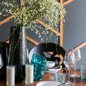
The backsplash is just one of many personal touches we added to the space to reflect our client's modern eclectic style and love of color. Swooping lines of the mid-mod style barstools compliment the pendants and backsplash pattern. A pop of vibrant green on the frame of the pantry door adds a fresh wash of color to an otherwise neutral space. The big show stopper is the custom charcoal gray and copper chevron wall installation in the dining room. This was an idea our clients softly suggested, and we excitedly embraced the opportunity. It is also a kickass solution to the head-scratching design dilemma of how to fill a large and lofty wall.
We are so grateful to bring this design to life for our clients and now dear friends.
 Bear Trap Design
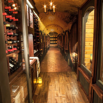
Catch-all Storage Closet Transforms into Elegant Wine Cellar
It was a typical unused space with bare studs and exposed insulation located at the base of the lower level stairs, next to the mechanical room. The entire lower level floor is covered with multi-color slate which contained in-floor heat. This posed a problem for the new wine cellar.
The challenge was overcome by placing a layer of foam insulation with a vapor barrier over the slate floor, walls, and ceiling. Then, a plywood subfloor was glued in. A wall space vented into the adjacent laundry room was created to house a cooling unit, which maintains a perfect temperature within the wine cellar.
The location of this wine cellar was a wonderful opportunity to create a showpiece that could be viewed from the upper level. An old fashioned store front, complete with two large windows and a faux painted shingle roof, was designed and built to draw attention and allow the viewer to see inside.
Tami found a wall mural of an authentic wine cave and had it sized to fit the side wall of the new wine cellar, providing an illusion of continuing space and setting the tone of what was about to come.
A rustic wood floor and a tongue and groove barrel ceiling, faux painted to resemble brick, were installed - all coinciding with the wall mural.
Custom cabinetry filled the interior, holding wine bottles and boxes of such. A copper sink was inlayed into a wood counter top. Faux painted bricks highlight an oiled rubbed bronze faucet and a leaded seedy glass cabinet above is designed to hold various types of scotch whiskey.
Ambient lighting enhances the cabinetry while a rustic mini chandelier hangs from the center of the barrel ceiling. This once “catch-all” storage closet is no more. A small, old world wine cellar has emerged and now, is quite a show piece.
 OakWood Design-Build
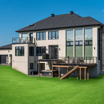
This home doesn’t just look great - it’s actually a NET ZERO READY HOME. What does that mean? Well, net zero ready homes are built to be extremely energy efficient. Meaning it’s sealed well, it’s easy to heat and keep cool, it’s air tight, and features water saving systems and energy efficient appliances.
Those big windows are an incredible feature, but posed a bit of a challenge. In the winter, they’re great, and will provide lots of solar gain. But in the summer that will put pressure on the A/C - so to counteract that, the OakWood team increased the amount of insulation behind the walls, increased the airtightness of the home AND installed triple pane windows with blinds to keep the solar gain out during the summer.
 Fairfield House & Garden Co
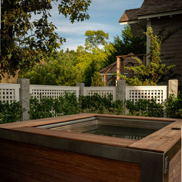
This waterfront recording cottage is a remarkable feat of engineering and design, built in just nine months, despite the challenges posed by its location on an island with limited vehicular access. Our team worked closely with an Architect, Landscape Architect, Studio Designer & Audio Visual team to create a space that is truly one of a kind.
The cottage features a sound isolated live room and an isolation booth that are fully equipped with top-of-the-line recording equipment. The recording space is fully integrated with multi-room control, enabling the user to monitor the recording process from any room in the cottage. In addition, it is equipped with two kitchenettes, one and a half baths and a state-of-the-art Lutron lighting system, adding ambiance to the space, and setting the right mood for the musicians. The result of this custom build is a recording studio that is both functional and aesthetically pleasing, providing the perfect space for creativity.
 Fernanda Zulzke Interiores
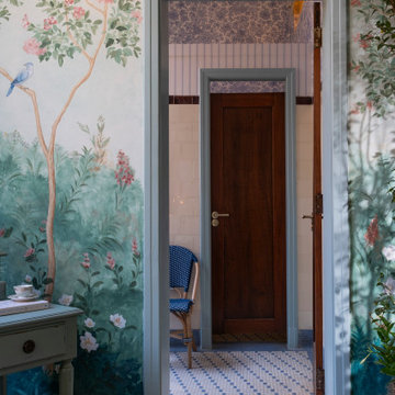
Fernanda Zulzke gifted São Paulo with an authentic experience by preserving the original 1920s tiles and architecture of the building. Many broken tiles were replaced, and missing ones were carefully sourced to breathe new life into a long-forgotten space. The floor tiles received the same care, though they posed an even greater challenge, as the original baseboard pieces could not be found even in the city’s largest tile archives. Beyond mere maintenance, the decoration aims to show visitors that history and its imperfections bring beauty, vitality, originality, and exclusivity to a space—a combination that can never be replicated, a luxury in its essence.
In the realm of restoration, the solid wood bathroom doors were personally tended to by Flávio Galli, a skilled designer and expert in raw materials, who followed the guidelines of the Parque da Água Branca manual. Four days of cleaning, sanding, and varnishing brought the doors back to life. In terms of carpentry, damaged baseboards and frames were crafted by Construverde using the building’s original wood—a true gift that Fernanda Zulzke was determined to offer the public and the park.
Completing the bathroom’s composition, imported wallpapers from Cordão Decor and a Roman curtain in cambric demonstrate the decorator’s ability to honor history while making bold, unexpected choices. Few can combine vintage, classic, and diverse colors and patterns in such a small space, transforming it into a light and fresh work of art, like the eucalyptus resting atop the marble and classic encyclopedias.
 TVL Creative Ltd.
Cramped kitchen be gone! That was the project motto and top priority. The goal was to transform the current layout from multiple smaller spaces into a connected whole that would activate the main level for our clients, a young family of four.
The biggest obstacle was the wall dividing the kitchen and the dining room. Removing this wall was central to opening up and integrating the main living spaces, but the existing ductwork that ran right through the center of the wall posed a design challenge, er design opportunity. The resulting design solution features a central pantry that captures the ductwork and provides valuable storage- especially when compared to the original kitchen's 18" wide pantry cabinet. The pantry also anchors the kitchen island and serves as a visual separation of space between the kitchen and homework area.
Through our design development process, we learned the formal living room was of no service to their lifestyle and therefore space they rarely spent time in. With that in mind, we proposed to eliminate the unused living room and make it the new dining room. Relocating the dining room to this space inherently felt right given the soaring ceiling and ample room for holiday dinners and celebrations. The new dining room was spacious enough for us to incorporate a conversational seating area in the warm, south-facing window alcove.
Now what to do with the old dining room?! To answer that question we took inspiration from our clients' shared profession in education and developed a craft area/homework station for both of their boys. The semi-custom cabinetry of the desk area carries over to the adjacent wall and forms window bench base with storage that we topped with butcher block for a touch of warmth. While the boys are young, the bench drawers are the perfect place for a stash of toys close to the kitchen.
The kitchen begins just beyond the window seat with their refrigerator enclosure. Opposite the refrigerator is the new pantry with twenty linear feet of shelving and space for brooms and a stick vacuum. Extending from the backside of the pantry the kitchen island design incorporates counter seating on the family room side and a cabinetry configuration on the kitchen side with drawer storage, a trashcan center, farmhouse sink, and dishwasher.
We took careful time in design and execution to align the range and sink because while it might seem like a small detail, it plays an important role in supporting the symmetrical configuration of the back wall of the kitchen. The rear wall design utilizes an appliance garage mirrors the visual impact of the refrigerator enclosure and helps keep the now open kitchen tidy. Between the appliance garage and refrigerator enclosure is the cooking zone with 30" of cabinetry and work surface on either side of the range, a chimney style vent hood, and a bold graphic tile backsplash.
The backsplash is just one of many personal touches we added to the space to reflect our client's modern eclectic style and love of color. Swooping lines of the mid-mod style barstools compliment the pendants and backsplash pattern. A pop of vibrant green on the frame of the pantry door adds a fresh wash of color to an otherwise neutral space. The big show stopper is the custom charcoal gray and copper chevron wall installation in the dining room. This was an idea our clients softly suggested, and we excitedly embraced the opportunity. It is also a kickass solution to the head-scratching design dilemma of how to fill a large and lofty wall.
We are so grateful to bring this design to life for our clients and now dear friends.
 Shearon Design Collective
This project was driven by a commitment to sustainability and repurposing existing materials, seamlessly blending the old with the new while minimizing waste. The goal was to transform the backyard into a lush garden oasis with a low-water and low-maintenance design. Despite challenges posed by the property's proximity to the golf course and specific guidelines, a harmonious integration of desert plant life and low-water lush plants was achieved. Reusing existing materials and replacing natural grass with synthetic turf minimized water usage, while strategic plant placement utilized run-off water for sustainable irrigation. Navigating the constraints imposed by the Country Club, the project created a cohesive outdoor space and repurposed cobblestones to bridge the gap between the golf course and the rear of the property. This project achieved a balance between ecological consciousness and aesthetic beauty, allowing the garden oasis to coexist harmoniously with the golf course backdrop, providing the clients with a serene and vibrant landscape that aligns with their vision and respects the natural resources of the community.
 BLDG Workshop Inc.
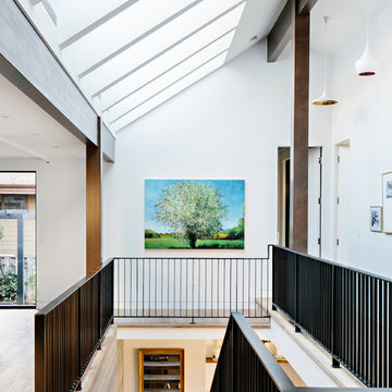
A home built on one of Canada's most beautiful lakes posed a design challenge. The home had originally been built almost directly in opposition to natural light and views to the lake. While most opinions were to tear the existing home down, BLDG Workshop worked closely with the client to recreate the home in a way that opened it up and became more fitting to the site.
 Klopf Architecture
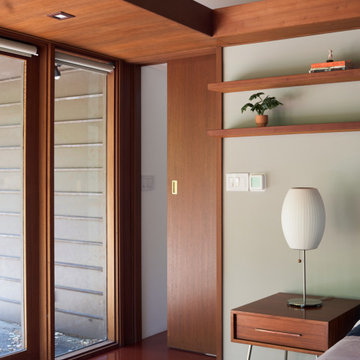
Nestled in the hills of Orinda, California, this 1951 residence is one of only seven extant homes, now known as “The Magnificent Seven”, designed by architect Olof Dahlstrand, a protégé of Frank Lloyd Wright. With its low-slung rooflines, natural materials, and deep integration with the sloping landscape, the home is a pristine example of mid-century modern design inspired by Wright’s organic principles. Over the years, prior homeowners have emphasized preservation, ensuring that the house remained relatively untouched. Each owner has respected the original architecture and stayed true to Dahlstrand’s intent. When a family of five—two college-aged sons and a middle school-aged daughter—acquired the property, they were captivated by its history, legacy of care, and architectural significance. While they appreciated Dahlstrand’s original vision, they also recognized the need to adapt the home for contemporary living while preserving its design integrity.
The remodel was conceived as a thoughtful response to the past—an effort to bring the house into the 21st century without compromising its soul. The primary mandate was to maintain architectural continuity while improving the functionality, comfort, and livability for a modern family. The design team—architects and contractor alike—worked with a shared reverence for the original architecture, allowing that mindset to guide even the most technical or pragmatic decisions.
A key objective was to increase natural light in the kitchen—a departure from Wrightian principles of enclosed, intimate cooking spaces—while maintaining the home’s architectural language. The kitchen was reconfigured to foster a stronger connection to adjacent living spaces while retaining the underlying concept of spatial separation. One of the most transformative architectural changes was the removal of a ridge beam that was originally planned to remain visible through the kitchen. During construction, the team collaborated on a better solution: a wide-flanged steel beam concealed within the roof envelope. This subtle move preserved the clean lines and ceiling continuity, a modern update carried out with utmost respect for the existing framework.
The home’s original powder room, previously accessible only through the kitchen, was relocated for better flow and privacy. A new powder room was carved out of former kitchen cabinetry—a narrow, interior space that could have felt dark and enclosed. To avoid this, the design extended the line of original transom windows into the new powder room and added a skylight above the vanity. The result is a bright and airy space that feels consistent with the rest of the home. Other updates included the installation of new solid-core interior doors with veneers carefully matched to the original mahogany, enhancing the continuity of the interiors. Even smaller decisions, such as placing the door knobs at 42 inches high, mirrored the original proportions. Every choice reflected a shared belief between the architect, contractor, and client: that new work should serve the integrity of the old.
The home’s extensive interior redwood millwork and paneling was meticulously restored. Where new materials were introduced—such as the replacement redwood soffit paneling—the contractor took pains to find finish nails that matched the original, rather than using modern equivalents. This level of craftsmanship and collaboration defined the project. It extended even to the detailing of a blind door to the new powder room, which had to disappear into the existing redwood board-and-batten wall. It was a team effort: the owner found a suitable handle, the architects devised the custom in-swing mechanism, and the contractor executed it so the door aligned precisely with the battens. Throughout, the homeowners were deeply engaged in the design process. One, a meticulous design enthusiast, focused on aesthetic integrity and historic detail. The other brought a practical and function-driven perspective, ensuring that new fixtures and materials would be durable and require minimal maintenance.
While the home’s location posed no major site challenges, sustainability was a key concern. The team upgraded the roof insulation, installed solar panels with battery storage, and added ductless mini-split cooling systems. Lighting was another area where modern technology was woven into a historic framework: new square LED fixtures echo the original custom perimeter soffit lights, maintaining the design language while offering advanced performance.
A planned expansion of a bedroom into suite with a bathroom had to be shelved due to budget constraints and the high cost of below-grade foundation work. Still, the team focused their efforts on making the most of the existing footprint, resolving constraints through design ingenuity rather than adding square footage. This renovation represents a collaborative achievement in preserving and evolving a historically significant home. Every decision was shaped by a shared ethos among clients, architects, and contractor: to maintain the home’s architectural soul while updating it for contemporary life. The result is a timeless modernist residence that continues Olof Dahlstrand’s legacy, remaining grounded in nature, craftsmanship, and human-scale design.
Klopf Architecture Team: John Klopf, AIA, Klara Kevane, Fernanda Bernardes
Interior Architectural Design: Klopf Architecture
Structural Engineer: Daniel Bastiao
Contractor: Don Larwood, Larwood Construction
Photography: Mariko Reed
Year Completed: 2022
34