
Search results for "Pose challenges" in Home Design Ideas
 John R. Schroeder, AIA
Photography by Caryn B. Davis
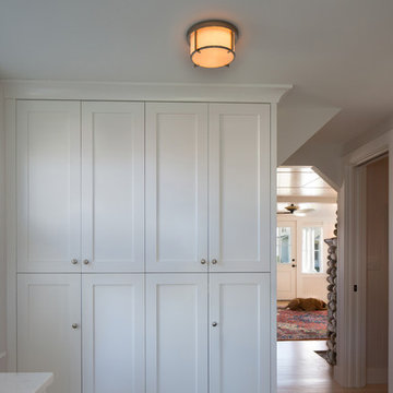
Located in the Cornfield Point area of Old Saybrook along Long Island Sound, this project brought a classic, yet forgotten beach house back to life. Through a little detective work and some creative ingenuity, we restored and enhanced the exterior to it’s former glory and transformed the interior to a highly efficient and functional home all the while uplifting its quaint cottage charm. On the exterior, we recreated a wonderful, airy front porch with cozy bench seats that look out to the water. The white cedar shingle siding is pre-bleached with a subtle flair at the bottom and a delicate break at mid-elevation. The asphalt shingles are not only beautifully matched with the siding, but offer superior reflective qualities to dissipate the heat of the summer sun. On the interior, we joined the front seasonal porch with the family room to form a larger, open living and dining space with paneled walls and ceilings anchored by the original round stone fireplace. In the rear, we carefully crafted a galley kitchen and laundry space with an adjacent first floor master suite. The diminutive house and property posed multiple practical and regulatory challenges which were overcome by a strong team effort, due diligence, and a commitment to the process.
John R. Schroeder, AIA is a professional design firm specializing in architecture, interiors, and planning. We have over 30 years experience with projects of all types, sizes, and levels of complexity. Because we love what we do, we approach our work with enthusiasm and dedication. We are committed to the highest level of design and service on each and every project. We engage our clients in positive and rewarding collaborations. We strive to exceed expectations through our attention to detail, our understanding of the “big picture”, and our ability to effectively manage a team of design professionals, industry representatives, and building contractors. We carefully analyze budgets and project objectives to assist clients with wise fund allocation.
We continually monitor and research advances in technology, materials, and construction methods, both sustainable and otherwise, to provide a responsible, well-suited, and cost effective product. Our design solutions are highly functional using both innovative and traditional approaches. Our aesthetic style is flexible and open, blending cues from client desires, building function, site context, and material properties, making each project unique, personalized, and enduring.
 TVL Creative Ltd.
Cramped kitchen be gone! That was the project motto and top priority. The goal was to transform the current layout from multiple smaller spaces into a connected whole that would activate the main level for our clients, a young family of four.
The biggest obstacle was the wall dividing the kitchen and the dining room. Removing this wall was central to opening up and integrating the main living spaces, but the existing ductwork that ran right through the center of the wall posed a design challenge, er design opportunity. The resulting design solution features a central pantry that captures the ductwork and provides valuable storage- especially when compared to the original kitchen's 18" wide pantry cabinet. The pantry also anchors the kitchen island and serves as a visual separation of space between the kitchen and homework area.
Through our design development process, we learned the formal living room was of no service to their lifestyle and therefore space they rarely spent time in. With that in mind, we proposed to eliminate the unused living room and make it the new dining room. Relocating the dining room to this space inherently felt right given the soaring ceiling and ample room for holiday dinners and celebrations. The new dining room was spacious enough for us to incorporate a conversational seating area in the warm, south-facing window alcove.
Now what to do with the old dining room?! To answer that question we took inspiration from our clients' shared profession in education and developed a craft area/homework station for both of their boys. The semi-custom cabinetry of the desk area carries over to the adjacent wall and forms window bench base with storage that we topped with butcher block for a touch of warmth. While the boys are young, the bench drawers are the perfect place for a stash of toys close to the kitchen.
The kitchen begins just beyond the window seat with their refrigerator enclosure. Opposite the refrigerator is the new pantry with twenty linear feet of shelving and space for brooms and a stick vacuum. Extending from the backside of the pantry the kitchen island design incorporates counter seating on the family room side and a cabinetry configuration on the kitchen side with drawer storage, a trashcan center, farmhouse sink, and dishwasher.
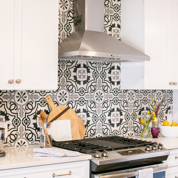
We took careful time in design and execution to align the range and sink because while it might seem like a small detail, it plays an important role in supporting the symmetrical configuration of the back wall of the kitchen. The rear wall design utilizes an appliance garage mirrors the visual impact of the refrigerator enclosure and helps keep the now open kitchen tidy. Between the appliance garage and refrigerator enclosure is the cooking zone with 30" of cabinetry and work surface on either side of the range, a chimney style vent hood, and a bold graphic tile backsplash.
The backsplash is just one of many personal touches we added to the space to reflect our client's modern eclectic style and love of color. Swooping lines of the mid-mod style barstools compliment the pendants and backsplash pattern. A pop of vibrant green on the frame of the pantry door adds a fresh wash of color to an otherwise neutral space. The big show stopper is the custom charcoal gray and copper chevron wall installation in the dining room. This was an idea our clients softly suggested, and we excitedly embraced the opportunity. It is also a kickass solution to the head-scratching design dilemma of how to fill a large and lofty wall.
We are so grateful to bring this design to life for our clients and now dear friends.
 Rylex Custom Cabinetry and Closets
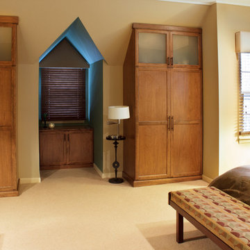
Bedrooms with sloped ceilings are charming, but most often pose a design challenge. With the need for additional storage, it makes perfect sense to tuck floor-to-ceiling cabinets beneath the steep slope and take advantage of every inch of space available. Likewise, the dormer provides a perfect location for shoe storage.
Kara Lashuay
Find the right local pro for your project
 BLDG Workshop Inc.
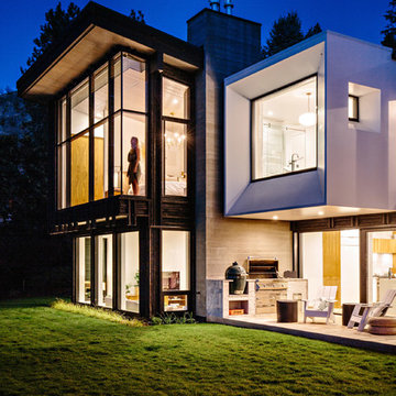
A home built on one of Canada's most beautiful lakes posed a design challenge. The home had originally been built almost directly in opposition to natural light and views to the lake. While most opinions were to tear the existing home down, BLDG Workshop worked closely with the client to recreate the home in a way that opened it up and became more fitting to the site.
 Fairfield House & Garden Co
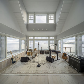
This waterfront recording cottage is a remarkable feat of engineering and design, built in just nine months, despite the challenges posed by its location on an island with limited vehicular access. Our team worked closely with an Architect, Landscape Architect, Studio Designer & Audio Visual team to create a space that is truly one of a kind.
The cottage features a sound isolated live room and an isolation booth that are fully equipped with top-of-the-line recording equipment. The recording space is fully integrated with multi-room control, enabling the user to monitor the recording process from any room in the cottage. In addition, it is equipped with two kitchenettes, one and a half baths and a state-of-the-art Lutron lighting system, adding ambiance to the space, and setting the right mood for the musicians. The result of this custom build is a recording studio that is both functional and aesthetically pleasing, providing the perfect space for creativity.
 Klopf Architecture
Nestled in the hills of Orinda, California, this 1951 residence is one of only seven extant homes, now known as “The Magnificent Seven”, designed by architect Olof Dahlstrand, a protégé of Frank Lloyd Wright. With its low-slung rooflines, natural materials, and deep integration with the sloping landscape, the home is a pristine example of mid-century modern design inspired by Wright’s organic principles. Over the years, prior homeowners have emphasized preservation, ensuring that the house remained relatively untouched. Each owner has respected the original architecture and stayed true to Dahlstrand’s intent. When a family of five—two college-aged sons and a middle school-aged daughter—acquired the property, they were captivated by its history, legacy of care, and architectural significance. While they appreciated Dahlstrand’s original vision, they also recognized the need to adapt the home for contemporary living while preserving its design integrity.
The remodel was conceived as a thoughtful response to the past—an effort to bring the house into the 21st century without compromising its soul. The primary mandate was to maintain architectural continuity while improving the functionality, comfort, and livability for a modern family. The design team—architects and contractor alike—worked with a shared reverence for the original architecture, allowing that mindset to guide even the most technical or pragmatic decisions.
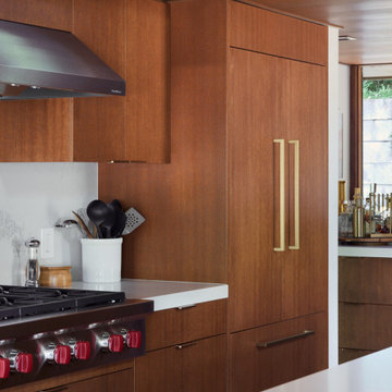
A key objective was to increase natural light in the kitchen—a departure from Wrightian principles of enclosed, intimate cooking spaces—while maintaining the home’s architectural language. The kitchen was reconfigured to foster a stronger connection to adjacent living spaces while retaining the underlying concept of spatial separation. One of the most transformative architectural changes was the removal of a ridge beam that was originally planned to remain visible through the kitchen. During construction, the team collaborated on a better solution: a wide-flanged steel beam concealed within the roof envelope. This subtle move preserved the clean lines and ceiling continuity, a modern update carried out with utmost respect for the existing framework.
The home’s original powder room, previously accessible only through the kitchen, was relocated for better flow and privacy. A new powder room was carved out of former kitchen cabinetry—a narrow, interior space that could have felt dark and enclosed. To avoid this, the design extended the line of original transom windows into the new powder room and added a skylight above the vanity. The result is a bright and airy space that feels consistent with the rest of the home. Other updates included the installation of new solid-core interior doors with veneers carefully matched to the original mahogany, enhancing the continuity of the interiors. Even smaller decisions, such as placing the door knobs at 42 inches high, mirrored the original proportions. Every choice reflected a shared belief between the architect, contractor, and client: that new work should serve the integrity of the old.
The home’s extensive interior redwood millwork and paneling was meticulously restored. Where new materials were introduced—such as the replacement redwood soffit paneling—the contractor took pains to find finish nails that matched the original, rather than using modern equivalents. This level of craftsmanship and collaboration defined the project. It extended even to the detailing of a blind door to the new powder room, which had to disappear into the existing redwood board-and-batten wall. It was a team effort: the owner found a suitable handle, the architects devised the custom in-swing mechanism, and the contractor executed it so the door aligned precisely with the battens. Throughout, the homeowners were deeply engaged in the design process. One, a meticulous design enthusiast, focused on aesthetic integrity and historic detail. The other brought a practical and function-driven perspective, ensuring that new fixtures and materials would be durable and require minimal maintenance.
While the home’s location posed no major site challenges, sustainability was a key concern. The team upgraded the roof insulation, installed solar panels with battery storage, and added ductless mini-split cooling systems. Lighting was another area where modern technology was woven into a historic framework: new square LED fixtures echo the original custom perimeter soffit lights, maintaining the design language while offering advanced performance.
A planned expansion of a bedroom into suite with a bathroom had to be shelved due to budget constraints and the high cost of below-grade foundation work. Still, the team focused their efforts on making the most of the existing footprint, resolving constraints through design ingenuity rather than adding square footage. This renovation represents a collaborative achievement in preserving and evolving a historically significant home. Every decision was shaped by a shared ethos among clients, architects, and contractor: to maintain the home’s architectural soul while updating it for contemporary life. The result is a timeless modernist residence that continues Olof Dahlstrand’s legacy, remaining grounded in nature, craftsmanship, and human-scale design.
Klopf Architecture Team: John Klopf, AIA, Klara Kevane, Fernanda Bernardes
Interior Architectural Design: Klopf Architecture
Structural Engineer: Daniel Bastiao
Contractor: Don Larwood, Larwood Construction
Photography: Mariko Reed
Year Completed: 2022
 Advanced Home Improvement, Inc.
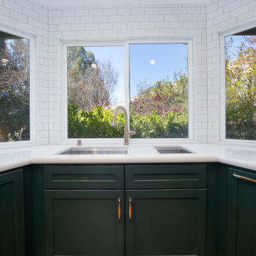
Our project seamlessly blended functionality and aesthetics through the use of Crystal Premium Custom Cabinets, skillfully crafted to harmonize with the captivating Color Per Sample program to match Sherwin Williams Roycroft Bottle Green. The primary goal was to overcome the challenges posed by tricky angles and accommodate a spacious 45" workstation sink within the design.


 Klopf Architecture
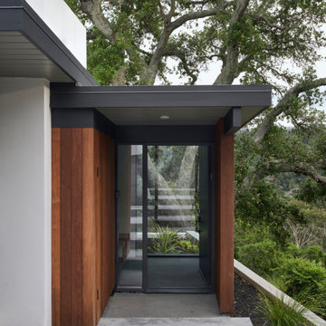
Set in a quiet neighborhood and framed by mature trees, this residence presented a unique opportunity: to thoughtfully evolve a custom mid-century modern home into a space that supports the everyday rhythms of a growing family. With a deep respect for the home’s original architecture, Klopf Architecture reimagined the house to better meet the needs of its owners—introducing functional improvements while preserving the spirit and character of its mid-century roots.
The clients approached Klopf Architecture with a clear vision: refresh their home while seamlessly integrating new programmatic elements. Key goals included clarifying and enhancing the entry sequence; connecting the detached garage to the main house with a practical yet architecturally intentional intervention; adding functional spaces such as a mudroom and laundry room; expanding and remodeling the primary suite’s bathroom and closet; and creating a more engaging outdoor space that capitalized on the site’s impressive views, featuring a fire pit and outdoor kitchen.
As a couple with distinct yet complementary perspectives—one focused on modern functionality and technology, and the other dedicated to preserving the home’s architectural integrity—their collaboration with Klopf Architecture resulted in a solution that harmonized both ideals. Their shared commitment to improving the livability of their home led to a design dialogue rooted in balance. This dynamic partnership shaped the direction of the renovation, ensuring that every decision honored the spirit of the original home while aligning with the practical needs of their growing family.
Designing within the constraints of the sloped site posed one of the project’s central challenges. The detached garage sat at a higher elevation than the main house, requiring a solution that ensured architectural and geometric compatibility between the two structures. Rather than create a purely utilitarian link, Klopf Architecture introduced an intentional connection that contributes to the overall architectural language. A notable pinch point in the plan—where differing geometries converged—was treated as a hinge point, turning a potentially awkward juncture into an architectural feature. This area now functions as both a transition and a moment of design interest that unifies the overall plan.
The design also addressed the underutilized outdoor area, which was located in a shadowed portion of the site with geometrical limitations. A new connection to the rear deck was created in this same area, making the outdoor space more useful and inviting. Klopf Architecture introduced carefully positioned openings and spatial improvements that forged a strong visual and functional connection between indoor and outdoor spaces. The outdoor area now reads as a deliberate extension of the home, embracing natural light and emphasizing the dramatic views.
Working through multiple design iterations, Klopf Architecture crafted a solution that preserved the architectural language of the original home while supporting the functional needs of modern life. The garage-to-house connection became more than a passage—it evolved into an architectural moment of transition. A new mudroom and laundry space enhanced convenience without compromising the clean lines of the design. The primary suite was expanded to create a private, serene retreat. The reimagined backyard, complete with fire pit and kitchen, now plays a vital role in the family’s daily routine and social life.
Outcomes and Lasting Impact
The result is a home that balances heritage with contemporary design, technical precision with design sensibility. The redesign not only met the clients’ initial goals but also exceeded expectations in its ability to seamlessly blend past and present, function and beauty, making the outdoor kitchen a favorite gathering place.
Beyond aesthetics, the renovation has significantly improved daily life for the family. The newly integrated garage connection has streamlined routines, providing a seamless transition between arriving home, storing belongings, and entering the main living spaces. The expanded primary suite offers a retreat-like atmosphere, creating a private space to unwind at the end of the day. The redesigned outdoor areas have also become an extension of their lifestyle—whether it's casual family dinners around the fire pit, entertaining friends in the outdoor kitchen, or simply enjoying the view from the reimagined backyard.
Through a thoughtful and strategic approach, the house has been successfully evolved into a home that remains true to its mid-century modern roots while enhancing livability, functionality, and the overall quality of life for the modern-day owners.
Klopf Architecture Team: Geoffrey Campen, Fernanda Bernardes
Architectural Interior Design: Klopf Architecture
Structural Engineer: Base Design Inc.
Contractor: Golden Snail Builders
Photography: Mariko Reed
Year Completed:2022
 Newport Collaborative Architects
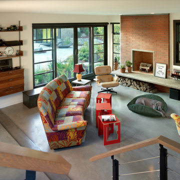
NCA’s design approach for the new residential project utilizes wood construction and steel elements. The plan combines sustainable architecture and Shingle Style touches in a pastoral setting. Working with the original footprint, connecting indoors and outdoors, incorporating Green elements and reflecting the clients’ affinity for modern art posed the greatest challenges. Sliding barn doors punctuate the facade with bold color.
 TVL Creative Ltd.
Cramped kitchen be gone! That was the project motto and top priority. The goal was to transform the current layout from multiple smaller spaces into a connected whole that would activate the main level for our clients, a young family of four.
The biggest obstacle was the wall dividing the kitchen and the dining room. Removing this wall was central to opening up and integrating the main living spaces, but the existing ductwork that ran right through the center of the wall posed a design challenge, er design opportunity. The resulting design solution features a central pantry that captures the ductwork and provides valuable storage- especially when compared to the original kitchen's 18" wide pantry cabinet. The pantry also anchors the kitchen island and serves as a visual separation of space between the kitchen and homework area.
Through our design development process, we learned the formal living room was of no service to their lifestyle and therefore space they rarely spent time in. With that in mind, we proposed to eliminate the unused living room and make it the new dining room. Relocating the dining room to this space inherently felt right given the soaring ceiling and ample room for holiday dinners and celebrations. The new dining room was spacious enough for us to incorporate a conversational seating area in the warm, south-facing window alcove.
Now what to do with the old dining room?! To answer that question we took inspiration from our clients' shared profession in education and developed a craft area/homework station for both of their boys. The semi-custom cabinetry of the desk area carries over to the adjacent wall and forms window bench base with storage that we topped with butcher block for a touch of warmth. While the boys are young, the bench drawers are the perfect place for a stash of toys close to the kitchen.
The kitchen begins just beyond the window seat with their refrigerator enclosure. Opposite the refrigerator is the new pantry with twenty linear feet of shelving and space for brooms and a stick vacuum. Extending from the backside of the pantry the kitchen island design incorporates counter seating on the family room side and a cabinetry configuration on the kitchen side with drawer storage, a trashcan center, farmhouse sink, and dishwasher.
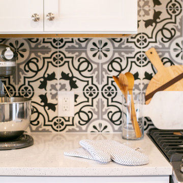
We took careful time in design and execution to align the range and sink because while it might seem like a small detail, it plays an important role in supporting the symmetrical configuration of the back wall of the kitchen. The rear wall design utilizes an appliance garage mirrors the visual impact of the refrigerator enclosure and helps keep the now open kitchen tidy. Between the appliance garage and refrigerator enclosure is the cooking zone with 30" of cabinetry and work surface on either side of the range, a chimney style vent hood, and a bold graphic tile backsplash.
The backsplash is just one of many personal touches we added to the space to reflect our client's modern eclectic style and love of color. Swooping lines of the mid-mod style barstools compliment the pendants and backsplash pattern. A pop of vibrant green on the frame of the pantry door adds a fresh wash of color to an otherwise neutral space. The big show stopper is the custom charcoal gray and copper chevron wall installation in the dining room. This was an idea our clients softly suggested, and we excitedly embraced the opportunity. It is also a kickass solution to the head-scratching design dilemma of how to fill a large and lofty wall.
We are so grateful to bring this design to life for our clients and now dear friends.
 StudioLAB
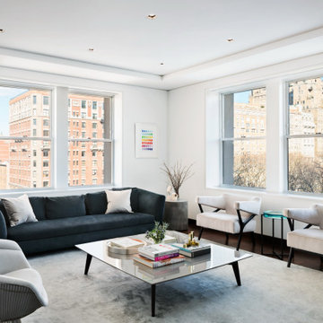
Boasting views of the Museum of Natural History and Central Park, the Beaux Arts and French Renaissance style building built in 1900 was once home to a luxury hotel. Over the years multiple hotel rooms were combined into the larger apartment residences that exist today. The resulting units, while large in size, lacked the continuity of a single formed space. StudioLAB was presented with the challenge of re-designing the space to fit a modern family’s lifestyle today with the flexibility to adjust as they evolve into their tomorrow. Thus, the existing configuration was completely abandoned with new programmatic elements being relocated in each and every corner of the space. For clients that are big wine connoisseurs, the focal point of entry and circulation lies in a 400 bottle, custom built, blackened steel and glass, temperature controlled wine cabinet. The once enclosed living room was demolished to create one main entertaining space that includes a new dining area and open kitchen. Hafele bi-folding pocket door slides were used in the Living room wall unit to conceal the television, bar and display shelves when not in use. Posing as kitchen cabinetry, a hidden integrated door opens to reveal a guest bedroom with an en suite bathroom. Down the hallway of wide plank ebony stained walnut flooring, a compact powder room was built to house an original Paul Villinski installation of small butterflies cut from recycled aluminum cans, entitled Mistral. Continuing down the hall, and through one of the walnut veneered doors, is the shared kids bedroom where a custom-built bunk bed with integrated storage steps and desk was designed to allow for play space and a reading corner. The kids bathroom across the hall is decorated with custom Lego inspired hand cast concrete tiles and integrated pull-out footstools residing underneath the floating vanity. The master suite features a bio-ethanol fireplace wrapped in blackened steel and integrated into the Tabu veneered built-in. The spacious walk-in closet serves several purposes, which include housing the apartment’s new central HVAC system as well as a sleeping spot for the family’s dog. An integrated URC control system paired with Lutron Radio RA lighting keypads were installed to control the AV, HVAC, lighting and solar shades all by the use of smartphones.
 Beroli Construction, LLC
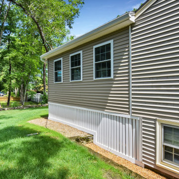
We had the pleasure of working with the Vigliotti family to create a beautiful new 4-season room addition.
This project began with the careful demolition of existing structures to make way for a space designed to be enjoyed year-round. From the outset, we focused on maintaining transparency and open communication, ensuring the Vigliottis were involved and informed at every step. Despite the challenges posed by large rocks and ledges in the ground, our team expertly navigated the terrain to ensure a solid foundation, remaining committed to delivering a space that not only met but exceeded their expectations.
Key features of this addition include:
• Energy Efficiency: High-efficiency windows and spray foam insulation were installed throughout to maximize energy savings.
• Mudroom: A practical and welcoming mudroom area was created, perfect for managing the transition from outdoors to indoors.
• Composite Deck: The new composite deck, complete with all required flashing and solid PVC skirts, promises durability and low maintenance for years to come.
• Modern Lighting: We installed all-new electrical systems, featuring recessed LED ceiling lights that provide a sleek and modern touch.
• Exposed Beams & Cathedral Ceiling: The room’s exposed finished beams and cathedral ceiling add a sense of grandeur and spaciousness, making the space feel open and airy.
• Integrated HVAC: The addition was seamlessly connected to the existing central air system, ensuring consistent comfort throughout the home.
• Patio Finish: A beautifully finished patio area was added to complement the inviting backyard, creating a perfect space for the family to enjoy outdoor gatherings.
The Vigliottis were highly engaged throughout the project, and their kind words about our honesty, trustworthiness, and customer-focused approach mean the world to us.
In their review, they mentioned that they’ve worked with several contractors over the years, but Beroli stands out as the best. We are incredibly proud to have earned such high praise and to have delivered a home addition that the Vigliotti family can enjoy for years to come.
 Klopf Architecture
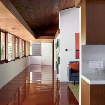
Nestled in the hills of Orinda, California, this 1951 residence is one of only seven extant homes, now known as “The Magnificent Seven”, designed by architect Olof Dahlstrand, a protégé of Frank Lloyd Wright. With its low-slung rooflines, natural materials, and deep integration with the sloping landscape, the home is a pristine example of mid-century modern design inspired by Wright’s organic principles. Over the years, prior homeowners have emphasized preservation, ensuring that the house remained relatively untouched. Each owner has respected the original architecture and stayed true to Dahlstrand’s intent. When a family of five—two college-aged sons and a middle school-aged daughter—acquired the property, they were captivated by its history, legacy of care, and architectural significance. While they appreciated Dahlstrand’s original vision, they also recognized the need to adapt the home for contemporary living while preserving its design integrity.
The remodel was conceived as a thoughtful response to the past—an effort to bring the house into the 21st century without compromising its soul. The primary mandate was to maintain architectural continuity while improving the functionality, comfort, and livability for a modern family. The design team—architects and contractor alike—worked with a shared reverence for the original architecture, allowing that mindset to guide even the most technical or pragmatic decisions.
A key objective was to increase natural light in the kitchen—a departure from Wrightian principles of enclosed, intimate cooking spaces—while maintaining the home’s architectural language. The kitchen was reconfigured to foster a stronger connection to adjacent living spaces while retaining the underlying concept of spatial separation. One of the most transformative architectural changes was the removal of a ridge beam that was originally planned to remain visible through the kitchen. During construction, the team collaborated on a better solution: a wide-flanged steel beam concealed within the roof envelope. This subtle move preserved the clean lines and ceiling continuity, a modern update carried out with utmost respect for the existing framework.
The home’s original powder room, previously accessible only through the kitchen, was relocated for better flow and privacy. A new powder room was carved out of former kitchen cabinetry—a narrow, interior space that could have felt dark and enclosed. To avoid this, the design extended the line of original transom windows into the new powder room and added a skylight above the vanity. The result is a bright and airy space that feels consistent with the rest of the home. Other updates included the installation of new solid-core interior doors with veneers carefully matched to the original mahogany, enhancing the continuity of the interiors. Even smaller decisions, such as placing the door knobs at 42 inches high, mirrored the original proportions. Every choice reflected a shared belief between the architect, contractor, and client: that new work should serve the integrity of the old.
The home’s extensive interior redwood millwork and paneling was meticulously restored. Where new materials were introduced—such as the replacement redwood soffit paneling—the contractor took pains to find finish nails that matched the original, rather than using modern equivalents. This level of craftsmanship and collaboration defined the project. It extended even to the detailing of a blind door to the new powder room, which had to disappear into the existing redwood board-and-batten wall. It was a team effort: the owner found a suitable handle, the architects devised the custom in-swing mechanism, and the contractor executed it so the door aligned precisely with the battens. Throughout, the homeowners were deeply engaged in the design process. One, a meticulous design enthusiast, focused on aesthetic integrity and historic detail. The other brought a practical and function-driven perspective, ensuring that new fixtures and materials would be durable and require minimal maintenance.
While the home’s location posed no major site challenges, sustainability was a key concern. The team upgraded the roof insulation, installed solar panels with battery storage, and added ductless mini-split cooling systems. Lighting was another area where modern technology was woven into a historic framework: new square LED fixtures echo the original custom perimeter soffit lights, maintaining the design language while offering advanced performance.
A planned expansion of a bedroom into suite with a bathroom had to be shelved due to budget constraints and the high cost of below-grade foundation work. Still, the team focused their efforts on making the most of the existing footprint, resolving constraints through design ingenuity rather than adding square footage. This renovation represents a collaborative achievement in preserving and evolving a historically significant home. Every decision was shaped by a shared ethos among clients, architects, and contractor: to maintain the home’s architectural soul while updating it for contemporary life. The result is a timeless modernist residence that continues Olof Dahlstrand’s legacy, remaining grounded in nature, craftsmanship, and human-scale design.
Klopf Architecture Team: John Klopf, AIA, Klara Kevane, Fernanda Bernardes
Interior Architectural Design: Klopf Architecture
Structural Engineer: Daniel Bastiao
Contractor: Don Larwood, Larwood Construction
Photography: Mariko Reed
Year Completed: 2022
 BLDG Workshop Inc.
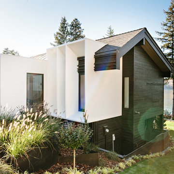
A home built on one of Canada's most beautiful lakes posed a design challenge. The home had originally been built almost directly in opposition to natural light and views to the lake. While most opinions were to tear the existing home down, BLDG Workshop worked closely with the client to recreate the home in a way that opened it up and became more fitting to the site.
 T&A Property Development
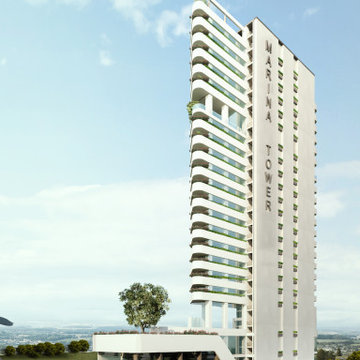
Marina Residential Complex, is a thoughtfully designed development set on a 1,400-sqm land plot within the Anzali Free Zone of Gilan Province. With a total built area of 10,000 sqm, this complex boasts remarkable features such as high-rise and transparent towers, balconies offering breathtaking views of the surrounding landscape and sea, as well as a harmonious flow of spaces.
The structure showcases an appealing architectural form, carefully crafted to overcome the challenges posed by the project site. Maximizing the use of natural light within the interiors, while effectively managing radiations on the east and west wings—housing the largest walls—led to the division of the land plot into two sections.
Marina Residential Complex is more than just a building; it's an interactive project. Exclusive amenities await, including a gym, swimming pool, and sauna located on the first mezzanine floor, a versatile multipurpose ballroom on the first floor, and enchanting roof gardens on the 10th and 13th floors.
 Highland Design+Build
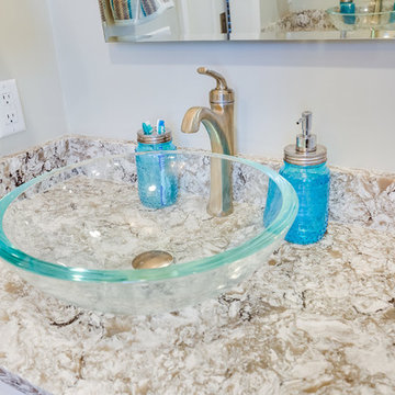
This typical 1980͛s master bath was a 5͛ x 8͛ foot space with a single vanity, small, angled shower and modest linen closet. The homeowner͛s desire was to have two sinks, a soaking tub, shower and toilet all in the same 5͛ x 8͛ space. This certainly posed a design challenge. Deleting the linen closet and relocating the toilet allowed for a ͚wet room͛ design concept. This enabled the homeowner͛s to incorporate both a soaking tub and a tile shower with a frameless glass enclosure. A sliding barn door replaced the old existing inswing door making room for his & her vanities opposite each other. The 12 x 24 porcelain tile covers the bath floor and wraps the shower walls to the ceiling. This adds visual depth to this small space. A glass and metal hexagon accent band create a pop of color and texture in the shower. This bath was made complete with Cambria Bellingham quartz countertops, glass vessel bowls and coordinating glass knobs on the vanity cabinetry.
205 Photography
 Fairfield House & Garden Co
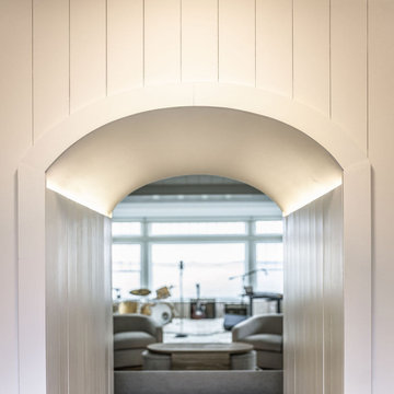
This waterfront recording cottage is a remarkable feat of engineering and design, built in just nine months, despite the challenges posed by its location on an island with limited vehicular access. Our team worked closely with an Architect, Landscape Architect, Studio Designer & Audio Visual team to create a space that is truly one of a kind.
The cottage features a sound isolated live room and an isolation booth that are fully equipped with top-of-the-line recording equipment. The recording space is fully integrated with multi-room control, enabling the user to monitor the recording process from any room in the cottage. In addition, it is equipped with two kitchenettes, one and a half baths and a state-of-the-art Lutron lighting system, adding ambiance to the space, and setting the right mood for the musicians. The result of this custom build is a recording studio that is both functional and aesthetically pleasing, providing the perfect space for creativity.
 Klopf Architecture
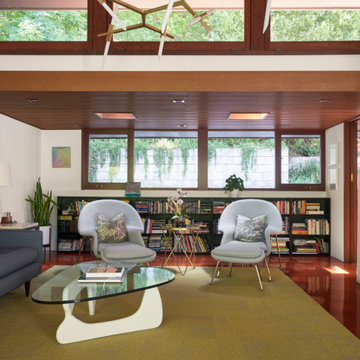
Nestled in the hills of Orinda, California, this 1951 residence is one of only seven extant homes, now known as “The Magnificent Seven”, designed by architect Olof Dahlstrand, a protégé of Frank Lloyd Wright. With its low-slung rooflines, natural materials, and deep integration with the sloping landscape, the home is a pristine example of mid-century modern design inspired by Wright’s organic principles. Over the years, prior homeowners have emphasized preservation, ensuring that the house remained relatively untouched. Each owner has respected the original architecture and stayed true to Dahlstrand’s intent. When a family of five—two college-aged sons and a middle school-aged daughter—acquired the property, they were captivated by its history, legacy of care, and architectural significance. While they appreciated Dahlstrand’s original vision, they also recognized the need to adapt the home for contemporary living while preserving its design integrity.
The remodel was conceived as a thoughtful response to the past—an effort to bring the house into the 21st century without compromising its soul. The primary mandate was to maintain architectural continuity while improving the functionality, comfort, and livability for a modern family. The design team—architects and contractor alike—worked with a shared reverence for the original architecture, allowing that mindset to guide even the most technical or pragmatic decisions.
A key objective was to increase natural light in the kitchen—a departure from Wrightian principles of enclosed, intimate cooking spaces—while maintaining the home’s architectural language. The kitchen was reconfigured to foster a stronger connection to adjacent living spaces while retaining the underlying concept of spatial separation. One of the most transformative architectural changes was the removal of a ridge beam that was originally planned to remain visible through the kitchen. During construction, the team collaborated on a better solution: a wide-flanged steel beam concealed within the roof envelope. This subtle move preserved the clean lines and ceiling continuity, a modern update carried out with utmost respect for the existing framework.
The home’s original powder room, previously accessible only through the kitchen, was relocated for better flow and privacy. A new powder room was carved out of former kitchen cabinetry—a narrow, interior space that could have felt dark and enclosed. To avoid this, the design extended the line of original transom windows into the new powder room and added a skylight above the vanity. The result is a bright and airy space that feels consistent with the rest of the home. Other updates included the installation of new solid-core interior doors with veneers carefully matched to the original mahogany, enhancing the continuity of the interiors. Even smaller decisions, such as placing the door knobs at 42 inches high, mirrored the original proportions. Every choice reflected a shared belief between the architect, contractor, and client: that new work should serve the integrity of the old.
The home’s extensive interior redwood millwork and paneling was meticulously restored. Where new materials were introduced—such as the replacement redwood soffit paneling—the contractor took pains to find finish nails that matched the original, rather than using modern equivalents. This level of craftsmanship and collaboration defined the project. It extended even to the detailing of a blind door to the new powder room, which had to disappear into the existing redwood board-and-batten wall. It was a team effort: the owner found a suitable handle, the architects devised the custom in-swing mechanism, and the contractor executed it so the door aligned precisely with the battens. Throughout, the homeowners were deeply engaged in the design process. One, a meticulous design enthusiast, focused on aesthetic integrity and historic detail. The other brought a practical and function-driven perspective, ensuring that new fixtures and materials would be durable and require minimal maintenance.
While the home’s location posed no major site challenges, sustainability was a key concern. The team upgraded the roof insulation, installed solar panels with battery storage, and added ductless mini-split cooling systems. Lighting was another area where modern technology was woven into a historic framework: new square LED fixtures echo the original custom perimeter soffit lights, maintaining the design language while offering advanced performance.
A planned expansion of a bedroom into suite with a bathroom had to be shelved due to budget constraints and the high cost of below-grade foundation work. Still, the team focused their efforts on making the most of the existing footprint, resolving constraints through design ingenuity rather than adding square footage. This renovation represents a collaborative achievement in preserving and evolving a historically significant home. Every decision was shaped by a shared ethos among clients, architects, and contractor: to maintain the home’s architectural soul while updating it for contemporary life. The result is a timeless modernist residence that continues Olof Dahlstrand’s legacy, remaining grounded in nature, craftsmanship, and human-scale design.
Klopf Architecture Team: John Klopf, AIA, Klara Kevane, Fernanda Bernardes
Interior Architectural Design: Klopf Architecture
Structural Engineer: Daniel Bastiao
Contractor: Don Larwood, Larwood Construction
Photography: Mariko Reed
Year Completed: 2022
 Klopf Architecture
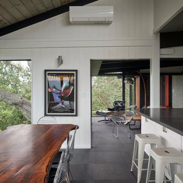
Set in a quiet neighborhood and framed by mature trees, this residence presented a unique opportunity: to thoughtfully evolve a custom mid-century modern home into a space that supports the everyday rhythms of a growing family. With a deep respect for the home’s original architecture, Klopf Architecture reimagined the house to better meet the needs of its owners—introducing functional improvements while preserving the spirit and character of its mid-century roots.
The clients approached Klopf Architecture with a clear vision: refresh their home while seamlessly integrating new programmatic elements. Key goals included clarifying and enhancing the entry sequence; connecting the detached garage to the main house with a practical yet architecturally intentional intervention; adding functional spaces such as a mudroom and laundry room; expanding and remodeling the primary suite’s bathroom and closet; and creating a more engaging outdoor space that capitalized on the site’s impressive views, featuring a fire pit and outdoor kitchen.
As a couple with distinct yet complementary perspectives—one focused on modern functionality and technology, and the other dedicated to preserving the home’s architectural integrity—their collaboration with Klopf Architecture resulted in a solution that harmonized both ideals. Their shared commitment to improving the livability of their home led to a design dialogue rooted in balance. This dynamic partnership shaped the direction of the renovation, ensuring that every decision honored the spirit of the original home while aligning with the practical needs of their growing family.
Designing within the constraints of the sloped site posed one of the project’s central challenges. The detached garage sat at a higher elevation than the main house, requiring a solution that ensured architectural and geometric compatibility between the two structures. Rather than create a purely utilitarian link, Klopf Architecture introduced an intentional connection that contributes to the overall architectural language. A notable pinch point in the plan—where differing geometries converged—was treated as a hinge point, turning a potentially awkward juncture into an architectural feature. This area now functions as both a transition and a moment of design interest that unifies the overall plan.
The design also addressed the underutilized outdoor area, which was located in a shadowed portion of the site with geometrical limitations. A new connection to the rear deck was created in this same area, making the outdoor space more useful and inviting. Klopf Architecture introduced carefully positioned openings and spatial improvements that forged a strong visual and functional connection between indoor and outdoor spaces. The outdoor area now reads as a deliberate extension of the home, embracing natural light and emphasizing the dramatic views.
Working through multiple design iterations, Klopf Architecture crafted a solution that preserved the architectural language of the original home while supporting the functional needs of modern life. The garage-to-house connection became more than a passage—it evolved into an architectural moment of transition. A new mudroom and laundry space enhanced convenience without compromising the clean lines of the design. The primary suite was expanded to create a private, serene retreat. The reimagined backyard, complete with fire pit and kitchen, now plays a vital role in the family’s daily routine and social life.
Outcomes and Lasting Impact
The result is a home that balances heritage with contemporary design, technical precision with design sensibility. The redesign not only met the clients’ initial goals but also exceeded expectations in its ability to seamlessly blend past and present, function and beauty, making the outdoor kitchen a favorite gathering place.
Beyond aesthetics, the renovation has significantly improved daily life for the family. The newly integrated garage connection has streamlined routines, providing a seamless transition between arriving home, storing belongings, and entering the main living spaces. The expanded primary suite offers a retreat-like atmosphere, creating a private space to unwind at the end of the day. The redesigned outdoor areas have also become an extension of their lifestyle—whether it's casual family dinners around the fire pit, entertaining friends in the outdoor kitchen, or simply enjoying the view from the reimagined backyard.
Through a thoughtful and strategic approach, the house has been successfully evolved into a home that remains true to its mid-century modern roots while enhancing livability, functionality, and the overall quality of life for the modern-day owners.
Klopf Architecture Team: Geoffrey Campen, Fernanda Bernardes
Architectural Interior Design: Klopf Architecture
Structural Engineer: Base Design Inc.
Contractor: Golden Snail Builders
Photography: Mariko Reed
Year Completed:2022
 Highland Design+Build
This typical 1980͛s master bath was a 5͛ x 8͛ foot space with a single vanity, small, angled shower and modest linen closet. The homeowner͛s desire was to have two sinks, a soaking tub, shower and toilet all in the same 5͛ x 8͛ space. This certainly posed a design challenge. Deleting the linen closet and relocating the toilet allowed for a ͚wet room͛ design concept. This enabled the homeowner͛s to incorporate both a soaking tub and a tile shower with a frameless glass enclosure. A sliding barn door replaced the old existing inswing door making room for his & her vanities opposite each other. The 12 x 24 porcelain tile covers the bath floor and wraps the shower walls to the ceiling. This adds visual depth to this small space. A glass and metal hexagon accent band create a pop of color and texture in the shower. This bath was made complete with Cambria Bellingham quartz countertops, glass vessel bowls and coordinating glass knobs on the vanity cabinetry.
205 Photography
35