
Search results for "Potential fresh" in Home Design Ideas
 Sceltas Custom Homes
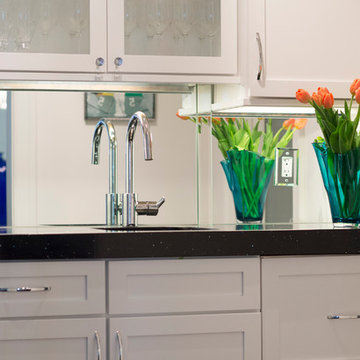
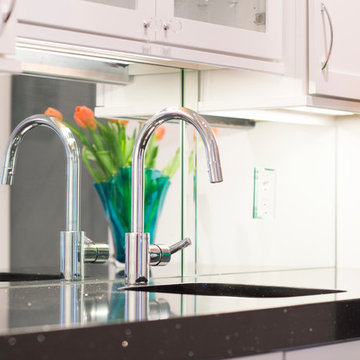
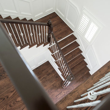
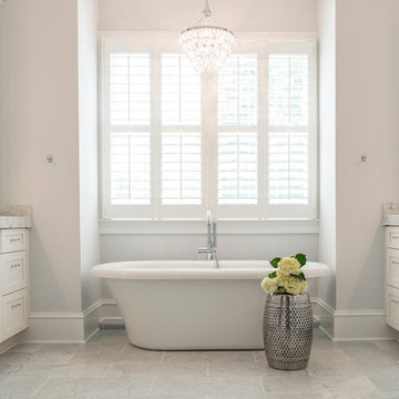
This fairly new home was built on Daniel Island right on beautiful Smythe Park. The homeowners purchased the five-year-old home because of its location and potential, but they had great plans to make it more modern and unique to their styles by incorporating transitional and modern design. They decided to go very white, creating a sleek, clean look while contrasting it against stained, dark hardwood floors.
The project included adding new hardware, applying a fresh coat of paint to the entire interior (walls and ceilings), adding new light fixtures, refinishing the floors throughout the home and remodeling the master bathroom, morning kitchen, main kitchen and butler’s pantry cabinetry with newly refinished cabinetry, countertops and fixtures. What a remarkable transformation! The family able to create a fresh new look while keeping the architectural bones of the home in tact.
Photography by: Brennan Wesley
 Spiotta Construction Management Corp
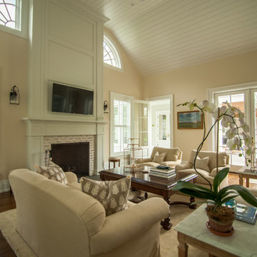
Example of a mid-sized open concept dark wood floor and brown floor living room design in New York with beige walls, a standard fireplace, a brick fireplace and a wall-mounted tv
 TVL Creative Ltd.
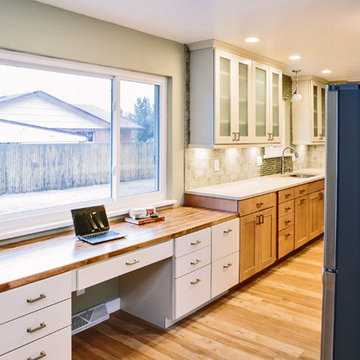
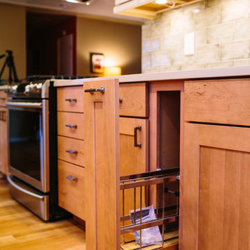
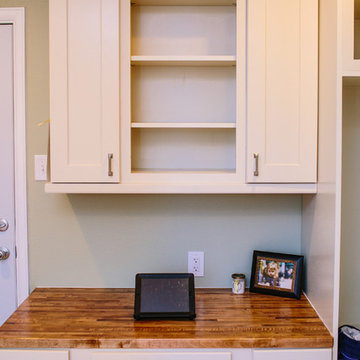
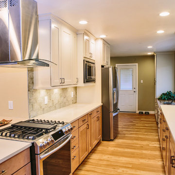
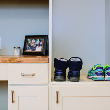
This remodel took an extremely dark & dated kitchen and transformed it into a bright and airy happy place for our client. The existing conditions created a dark, hall-like kitchen that greatly lacked in function and did little to optimize storage. Realizing the potential of this truly massive space, we created a design that utilizes every inch of the kitchen and creates functional cooking and prep space as well as pantry storage and work nooks. Our first order of business was to demo out the blocky corner that separated the kitchen from the living room. This involved removing an existing fireplace, re-structuring a wall, and having an entirely new furnace installed in the basement to eliminate a duct running right through the corner we hoped to eliminate. After opening up the space, we focused on highlighting and brightening the room. New NuCore flooring was installed to give the kitchen a fresh look while offering optimal function and cleanability. Two-toned cabinets in a honey maple and painted silk were used to create a warm and comfortable balance throughout the space. New quartz countertops in MSI's canvas were installed, and butcher block was installed on the two desk areas to offer a warm visual relief and casual work surface. The color palette for the kitchen is reminiscent of a cozy apothecary; we utilized fresh greens with Sherwin Williams paint on the walls and Treviso Gray Sage glazed subway tiles on the backsplash. Over the sink, we designed a playful highlight with counter-to-ceiling mini brick mosaic in a dark crackle green. We introduced additional lighting throughout including new recessed lights, over-sink light, and under-cabinet lights. New appliances were introduced to the space as well, and we complimented the stainless steel of these fixtures to the transitional nickel hardware on the cabinets. This space now feels open and inviting, and is visible from the second you enter the front door! We are so proud of this result and so happy that our clients can enjoy this gorgeous kitchen for years to come.
Find the right local pro for your project
 Sceltas Custom Homes
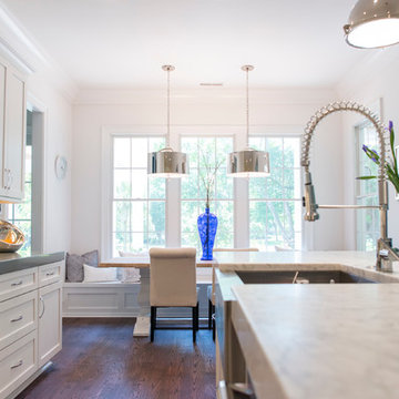
This fairly new home was built on Daniel Island right on beautiful Smythe Park. The homeowners purchased the five-year-old home because of its location and potential, but they had great plans to make it more modern and unique to their styles by incorporating transitional and modern design. They decided to go very white, creating a sleek, clean look while contrasting it against stained, dark hardwood floors.
The project included adding new hardware, applying a fresh coat of paint to the entire interior (walls and ceilings), adding new light fixtures, refinishing the floors throughout the home and remodeling the master bathroom, morning kitchen, main kitchen and butler’s pantry cabinetry with newly refinished cabinetry, countertops and fixtures. What a remarkable transformation! The family able to create a fresh new look while keeping the architectural bones of the home in tact.
Photography by: Brennan Wesley
 Sceltas Custom Homes
This fairly new home was built on Daniel Island right on beautiful Smythe Park. The homeowners purchased the five-year-old home because of its location and potential, but they had great plans to make it more modern and unique to their styles by incorporating transitional and modern design. They decided to go very white, creating a sleek, clean look while contrasting it against stained, dark hardwood floors.
The project included adding new hardware, applying a fresh coat of paint to the entire interior (walls and ceilings), adding new light fixtures, refinishing the floors throughout the home and remodeling the master bathroom, morning kitchen, main kitchen and butler’s pantry cabinetry with newly refinished cabinetry, countertops and fixtures. What a remarkable transformation! The family able to create a fresh new look while keeping the architectural bones of the home in tact.
Photography by: Brennan Wesley
 Sceltas Custom Homes
This fairly new home was built on Daniel Island right on beautiful Smythe Park. The homeowners purchased the five-year-old home because of its location and potential, but they had great plans to make it more modern and unique to their styles by incorporating transitional and modern design. They decided to go very white, creating a sleek, clean look while contrasting it against stained, dark hardwood floors.
The project included adding new hardware, applying a fresh coat of paint to the entire interior (walls and ceilings), adding new light fixtures, refinishing the floors throughout the home and remodeling the master bathroom, morning kitchen, main kitchen and butler’s pantry cabinetry with newly refinished cabinetry, countertops and fixtures. What a remarkable transformation! The family able to create a fresh new look while keeping the architectural bones of the home in tact.
Photography by: Brennan Wesley
 TVL Creative Ltd.
This remodel took an extremely dark & dated kitchen and transformed it into a bright and airy happy place for our client. The existing conditions created a dark, hall-like kitchen that greatly lacked in function and did little to optimize storage. Realizing the potential of this truly massive space, we created a design that utilizes every inch of the kitchen and creates functional cooking and prep space as well as pantry storage and work nooks. Our first order of business was to demo out the blocky corner that separated the kitchen from the living room. This involved removing an existing fireplace, re-structuring a wall, and having an entirely new furnace installed in the basement to eliminate a duct running right through the corner we hoped to eliminate. After opening up the space, we focused on highlighting and brightening the room. New NuCore flooring was installed to give the kitchen a fresh look while offering optimal function and cleanability. Two-toned cabinets in a honey maple and painted silk were used to create a warm and comfortable balance throughout the space. New quartz countertops in MSI's canvas were installed, and butcher block was installed on the two desk areas to offer a warm visual relief and casual work surface. The color palette for the kitchen is reminiscent of a cozy apothecary; we utilized fresh greens with Sherwin Williams paint on the walls and Treviso Gray Sage glazed subway tiles on the backsplash. Over the sink, we designed a playful highlight with counter-to-ceiling mini brick mosaic in a dark crackle green. We introduced additional lighting throughout including new recessed lights, over-sink light, and under-cabinet lights. New appliances were introduced to the space as well, and we complimented the stainless steel of these fixtures to the transitional nickel hardware on the cabinets. This space now feels open and inviting, and is visible from the second you enter the front door! We are so proud of this result and so happy that our clients can enjoy this gorgeous kitchen for years to come.

Sponsored
Columbus, OH

Wannemacher Interiors
Customized Award-Winning Interior Design Solutions in Franklin Cnty OH
 Sceltas Custom Homes
This fairly new home was built on Daniel Island right on beautiful Smythe Park. The homeowners purchased the five-year-old home because of its location and potential, but they had great plans to make it more modern and unique to their styles by incorporating transitional and modern design. They decided to go very white, creating a sleek, clean look while contrasting it against stained, dark hardwood floors.
The project included adding new hardware, applying a fresh coat of paint to the entire interior (walls and ceilings), adding new light fixtures, refinishing the floors throughout the home and remodeling the master bathroom, morning kitchen, main kitchen and butler’s pantry cabinetry with newly refinished cabinetry, countertops and fixtures. What a remarkable transformation! The family able to create a fresh new look while keeping the architectural bones of the home in tact.
Photography by: Brennan Wesley
 TVL Creative Ltd.
This remodel took an extremely dark & dated kitchen and transformed it into a bright and airy happy place for our client. The existing conditions created a dark, hall-like kitchen that greatly lacked in function and did little to optimize storage. Realizing the potential of this truly massive space, we created a design that utilizes every inch of the kitchen and creates functional cooking and prep space as well as pantry storage and work nooks. Our first order of business was to demo out the blocky corner that separated the kitchen from the living room. This involved removing an existing fireplace, re-structuring a wall, and having an entirely new furnace installed in the basement to eliminate a duct running right through the corner we hoped to eliminate. After opening up the space, we focused on highlighting and brightening the room. New NuCore flooring was installed to give the kitchen a fresh look while offering optimal function and cleanability. Two-toned cabinets in a honey maple and painted silk were used to create a warm and comfortable balance throughout the space. New quartz countertops in MSI's canvas were installed, and butcher block was installed on the two desk areas to offer a warm visual relief and casual work surface. The color palette for the kitchen is reminiscent of a cozy apothecary; we utilized fresh greens with Sherwin Williams paint on the walls and Treviso Gray Sage glazed subway tiles on the backsplash. Over the sink, we designed a playful highlight with counter-to-ceiling mini brick mosaic in a dark crackle green. We introduced additional lighting throughout including new recessed lights, over-sink light, and under-cabinet lights. New appliances were introduced to the space as well, and we complimented the stainless steel of these fixtures to the transitional nickel hardware on the cabinets. This space now feels open and inviting, and is visible from the second you enter the front door! We are so proud of this result and so happy that our clients can enjoy this gorgeous kitchen for years to come.
 TVL Creative Ltd.
This remodel took an extremely dark & dated kitchen and transformed it into a bright and airy happy place for our client. The existing conditions created a dark, hall-like kitchen that greatly lacked in function and did little to optimize storage. Realizing the potential of this truly massive space, we created a design that utilizes every inch of the kitchen and creates functional cooking and prep space as well as pantry storage and work nooks. Our first order of business was to demo out the blocky corner that separated the kitchen from the living room. This involved removing an existing fireplace, re-structuring a wall, and having an entirely new furnace installed in the basement to eliminate a duct running right through the corner we hoped to eliminate. After opening up the space, we focused on highlighting and brightening the room. New NuCore flooring was installed to give the kitchen a fresh look while offering optimal function and cleanability. Two-toned cabinets in a honey maple and painted silk were used to create a warm and comfortable balance throughout the space. New quartz countertops in MSI's canvas were installed, and butcher block was installed on the two desk areas to offer a warm visual relief and casual work surface. The color palette for the kitchen is reminiscent of a cozy apothecary; we utilized fresh greens with Sherwin Williams paint on the walls and Treviso Gray Sage glazed subway tiles on the backsplash. Over the sink, we designed a playful highlight with counter-to-ceiling mini brick mosaic in a dark crackle green. We introduced additional lighting throughout including new recessed lights, over-sink light, and under-cabinet lights. New appliances were introduced to the space as well, and we complimented the stainless steel of these fixtures to the transitional nickel hardware on the cabinets. This space now feels open and inviting, and is visible from the second you enter the front door! We are so proud of this result and so happy that our clients can enjoy this gorgeous kitchen for years to come.
 TVL Creative Ltd.
This remodel took an extremely dark & dated kitchen and transformed it into a bright and airy happy place for our client. The existing conditions created a dark, hall-like kitchen that greatly lacked in function and did little to optimize storage. Realizing the potential of this truly massive space, we created a design that utilizes every inch of the kitchen and creates functional cooking and prep space as well as pantry storage and work nooks. Our first order of business was to demo out the blocky corner that separated the kitchen from the living room. This involved removing an existing fireplace, re-structuring a wall, and having an entirely new furnace installed in the basement to eliminate a duct running right through the corner we hoped to eliminate. After opening up the space, we focused on highlighting and brightening the room. New NuCore flooring was installed to give the kitchen a fresh look while offering optimal function and cleanability. Two-toned cabinets in a honey maple and painted silk were used to create a warm and comfortable balance throughout the space. New quartz countertops in MSI's canvas were installed, and butcher block was installed on the two desk areas to offer a warm visual relief and casual work surface. The color palette for the kitchen is reminiscent of a cozy apothecary; we utilized fresh greens with Sherwin Williams paint on the walls and Treviso Gray Sage glazed subway tiles on the backsplash. Over the sink, we designed a playful highlight with counter-to-ceiling mini brick mosaic in a dark crackle green. We introduced additional lighting throughout including new recessed lights, over-sink light, and under-cabinet lights. New appliances were introduced to the space as well, and we complimented the stainless steel of these fixtures to the transitional nickel hardware on the cabinets. This space now feels open and inviting, and is visible from the second you enter the front door! We are so proud of this result and so happy that our clients can enjoy this gorgeous kitchen for years to come.
 Finesse, Inc.
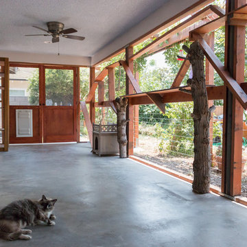
Our client wanted an outdoor living space for her Border Collies and rescued cats. We used her existing patio and gave it a good power washing, fresh paint and we brought in Rough Sawn Redwood to create the fence and cat walks. We also added the trellis to support her healthy plants that would provide shade during the hotter months and bring several hummingbirds to home. PC: Aaron Gilless
 TKS Design Group
Download our free ebook, Creating the Ideal Kitchen. DOWNLOAD NOW
Lakefront property in the northwest suburbs of Chicago is hard to come by, so when we were hired by this young family with exactly that, we were immediately inspired by not just the unusually large footprint of this 1950’s colonial revival but also the lovely views of the manmade lake it was sited on. The large 5-bedroom home was solidly stuck in the 1980’s, but we saw tons of potential. We started out by updating the existing staircase with a fresh coat of paint and adding new herringbone slate to the entry hall.
The powder room off the entryway also got a refresh - new flooring, new cabinets and fixtures. We ran the new slate right through into this space for some consistency. A fun wallpaper and shiplap trim add a welcoming feel and set the tone for the home.
Next, we tackled the kitchen. Located away from the rest of the first floor, the kitchen felt a little isolated, so we immediately began planning for how to better connect it to the rest of the first floor. We landed on removing the wall between the kitchen and dining room and designed a modified galley style space with separate cooking and clean up zones. The cooking zone consists of the refrigerator, prep sink and cooktop, along with a nice long run of prep space at the island. The cleanup side of the kitchen consists of the main sink and dishwasher. Both areas are situated so that the user can view the lake during prep work and cleanup!
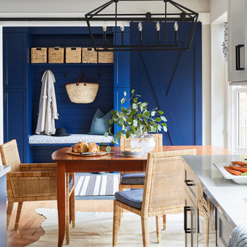
One of the home’s main puzzles was how to incorporate the mudroom and area in front of the patio doors at the back of the house. We already had a breakfast table area, so the space by the patio doors was a bit of a no man’s land. We decided to separate the kitchen proper from what became the new mudroom with a large set of barn doors. That way you can quickly hide any mudroom messes but have easy access to the light coming in through the patio doors as well as the outdoor grilling station. We also love the impact the barn doors add to the overall space.
The homeowners’ first words to us were “it’s time to ditch the brown,” so we did! We chose a lovely blue pallet that reflects the home’s location on the lake which is also vibrant yet easy on the eye. Countertops are white quartz, and the natural oak floor works well with the other honey accents. The breakfast table was given a refresh with new chairs, chandelier and window treatments that frame the gorgeous views of the lake out the back.
We coordinated the slate mudroom flooring with that used in the home’s main entrance for a consistent feel. The storage area consists of open and closed storage to allow for some clutter control as needed.
Next on our “to do” list was revamping the dated brown bar area in the neighboring dining room. We eliminated the clutter by adding some closed cabinets and did some easy updates to help the space feel more current. One snag we ran into here was the discovery of a beam above the existing open shelving that had to be modified with a smaller structural beam to allow for our new design to work. This was an unexpected surprise, but in the end we think it was well worth it!
We kept the colors here a bit more muted to blend with the homeowner’s existing furnishings. Open shelving and polished nickel hardware add some simple detail to the new entertainment zone which also looks out onto the lake!
Next we tackled the upstairs starting with the homeowner’s son’s bath. The bath originally had both a tub shower and a separate shower, so we decided to swap out the shower for a new laundry area. This freed up some space downstairs in what used to be the mudroom/laundry room and is much more convenient for daily laundry needs.
We continued the blue palette here with navy cabinetry and the navy tile in the shower. Porcelain floor tile and chrome fixtures keep maintenance to a minimum while matte black mirrors and lighting add some depth the design. A low maintenance runner adds some warmth underfoot and ties the whole space together.
We added a pocket door to the bathroom to minimize interference with the door swings. The left door of the laundry closet is on a 180 degree hinge to allow for easy full access to the machines. Next we tackled the master bath which is an en suite arrangement. The original was typical of the 1980’s with the vanity outside of the bathroom, situated near the master closet. And the brown theme continued here with multiple shades of brown.
Our first move was to segment off the bath and the closet from the master bedroom. We created a short hall from the bedroom to the bathroom with his and hers walk-in closets on the left and right as well as a separate toilet closet outside of the main bathroom for privacy and flexibility.
The original bathroom had a giant soaking tub with steps (dangerous!) as well as a small shower that did not work well for our homeowner who is 6’3”. With other bathtubs in the home, they decided to eliminate the tub and create an oversized shower which takes up the space where the old tub was located. The double vanity is on the opposite wall and a bench is located under the window for morning conversations and a place to set a couple of towels.
The pallet in here is light and airy with a mix of blond wood, creamy porcelain and marble tile, and brass accents. A simple roman shade adds some texture and it’s top-down mechanism allows for light and privacy.
This large whole house remodel gave our homeowners not only the ability to maximize the potential of their home but also created a lovely new frame from which to view their fabulous lake views.
Designed by: Susan Klimala, CKD, CBD
Photography by: Michael Kaskel
For more information on kitchen and bath design ideas go to: www.kitchenstudio-ge.com
Sponsored
Columbus, OH
Wannemacher Interiors
Customized Award-Winning Interior Design Solutions in Franklin Cnty OH

 Steve Masley Consulting and Design
Eggplants thrive in terra-cotta pots. Photo by Steve Masley.
Photo of a traditional landscaping in San Francisco.
Photo of a traditional landscaping in San Francisco.
 TKS Design Group
Download our free ebook, Creating the Ideal Kitchen. DOWNLOAD NOW
Lakefront property in the northwest suburbs of Chicago is hard to come by, so when we were hired by this young family with exactly that, we were immediately inspired by not just the unusually large footprint of this 1950’s colonial revival but also the lovely views of the manmade lake it was sited on. The large 5-bedroom home was solidly stuck in the 1980’s, but we saw tons of potential. We started out by updating the existing staircase with a fresh coat of paint and adding new herringbone slate to the entry hall.
The powder room off the entryway also got a refresh - new flooring, new cabinets and fixtures. We ran the new slate right through into this space for some consistency. A fun wallpaper and shiplap trim add a welcoming feel and set the tone for the home.
Next, we tackled the kitchen. Located away from the rest of the first floor, the kitchen felt a little isolated, so we immediately began planning for how to better connect it to the rest of the first floor. We landed on removing the wall between the kitchen and dining room and designed a modified galley style space with separate cooking and clean up zones. The cooking zone consists of the refrigerator, prep sink and cooktop, along with a nice long run of prep space at the island. The cleanup side of the kitchen consists of the main sink and dishwasher. Both areas are situated so that the user can view the lake during prep work and cleanup!
One of the home’s main puzzles was how to incorporate the mudroom and area in front of the patio doors at the back of the house. We already had a breakfast table area, so the space by the patio doors was a bit of a no man’s land. We decided to separate the kitchen proper from what became the new mudroom with a large set of barn doors. That way you can quickly hide any mudroom messes but have easy access to the light coming in through the patio doors as well as the outdoor grilling station. We also love the impact the barn doors add to the overall space.
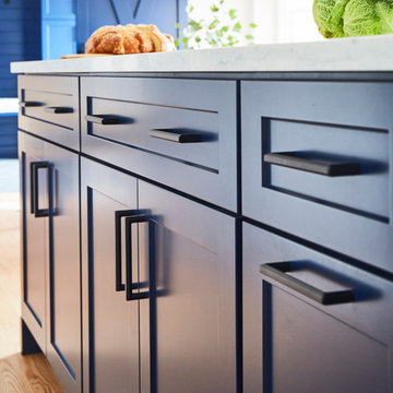
The homeowners’ first words to us were “it’s time to ditch the brown,” so we did! We chose a lovely blue pallet that reflects the home’s location on the lake which is also vibrant yet easy on the eye. Countertops are white quartz, and the natural oak floor works well with the other honey accents. The breakfast table was given a refresh with new chairs, chandelier and window treatments that frame the gorgeous views of the lake out the back.
We coordinated the slate mudroom flooring with that used in the home’s main entrance for a consistent feel. The storage area consists of open and closed storage to allow for some clutter control as needed.
Next on our “to do” list was revamping the dated brown bar area in the neighboring dining room. We eliminated the clutter by adding some closed cabinets and did some easy updates to help the space feel more current. One snag we ran into here was the discovery of a beam above the existing open shelving that had to be modified with a smaller structural beam to allow for our new design to work. This was an unexpected surprise, but in the end we think it was well worth it!
We kept the colors here a bit more muted to blend with the homeowner’s existing furnishings. Open shelving and polished nickel hardware add some simple detail to the new entertainment zone which also looks out onto the lake!
Next we tackled the upstairs starting with the homeowner’s son’s bath. The bath originally had both a tub shower and a separate shower, so we decided to swap out the shower for a new laundry area. This freed up some space downstairs in what used to be the mudroom/laundry room and is much more convenient for daily laundry needs.
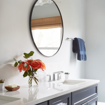
We continued the blue palette here with navy cabinetry and the navy tile in the shower. Porcelain floor tile and chrome fixtures keep maintenance to a minimum while matte black mirrors and lighting add some depth the design. A low maintenance runner adds some warmth underfoot and ties the whole space together.
We added a pocket door to the bathroom to minimize interference with the door swings. The left door of the laundry closet is on a 180 degree hinge to allow for easy full access to the machines. Next we tackled the master bath which is an en suite arrangement. The original was typical of the 1980’s with the vanity outside of the bathroom, situated near the master closet. And the brown theme continued here with multiple shades of brown.
Our first move was to segment off the bath and the closet from the master bedroom. We created a short hall from the bedroom to the bathroom with his and hers walk-in closets on the left and right as well as a separate toilet closet outside of the main bathroom for privacy and flexibility.
The original bathroom had a giant soaking tub with steps (dangerous!) as well as a small shower that did not work well for our homeowner who is 6’3”. With other bathtubs in the home, they decided to eliminate the tub and create an oversized shower which takes up the space where the old tub was located. The double vanity is on the opposite wall and a bench is located under the window for morning conversations and a place to set a couple of towels.
The pallet in here is light and airy with a mix of blond wood, creamy porcelain and marble tile, and brass accents. A simple roman shade adds some texture and it’s top-down mechanism allows for light and privacy.
This large whole house remodel gave our homeowners not only the ability to maximize the potential of their home but also created a lovely new frame from which to view their fabulous lake views.
Designed by: Susan Klimala, CKD, CBD
Photography by: Michael Kaskel
For more information on kitchen and bath design ideas go to: www.kitchenstudio-ge.com
 TKS Design Group
Download our free ebook, Creating the Ideal Kitchen. DOWNLOAD NOW
Lakefront property in the northwest suburbs of Chicago is hard to come by, so when we were hired by this young family with exactly that, we were immediately inspired by not just the unusually large footprint of this 1950’s colonial revival but also the lovely views of the manmade lake it was sited on. The large 5-bedroom home was solidly stuck in the 1980’s, but we saw tons of potential. We started out by updating the existing staircase with a fresh coat of paint and adding new herringbone slate to the entry hall.
The powder room off the entryway also got a refresh - new flooring, new cabinets and fixtures. We ran the new slate right through into this space for some consistency. A fun wallpaper and shiplap trim add a welcoming feel and set the tone for the home.
Next, we tackled the kitchen. Located away from the rest of the first floor, the kitchen felt a little isolated, so we immediately began planning for how to better connect it to the rest of the first floor. We landed on removing the wall between the kitchen and dining room and designed a modified galley style space with separate cooking and clean up zones. The cooking zone consists of the refrigerator, prep sink and cooktop, along with a nice long run of prep space at the island. The cleanup side of the kitchen consists of the main sink and dishwasher. Both areas are situated so that the user can view the lake during prep work and cleanup!
One of the home’s main puzzles was how to incorporate the mudroom and area in front of the patio doors at the back of the house. We already had a breakfast table area, so the space by the patio doors was a bit of a no man’s land. We decided to separate the kitchen proper from what became the new mudroom with a large set of barn doors. That way you can quickly hide any mudroom messes but have easy access to the light coming in through the patio doors as well as the outdoor grilling station. We also love the impact the barn doors add to the overall space.
The homeowners’ first words to us were “it’s time to ditch the brown,” so we did! We chose a lovely blue pallet that reflects the home’s location on the lake which is also vibrant yet easy on the eye. Countertops are white quartz, and the natural oak floor works well with the other honey accents. The breakfast table was given a refresh with new chairs, chandelier and window treatments that frame the gorgeous views of the lake out the back.
We coordinated the slate mudroom flooring with that used in the home’s main entrance for a consistent feel. The storage area consists of open and closed storage to allow for some clutter control as needed.
Next on our “to do” list was revamping the dated brown bar area in the neighboring dining room. We eliminated the clutter by adding some closed cabinets and did some easy updates to help the space feel more current. One snag we ran into here was the discovery of a beam above the existing open shelving that had to be modified with a smaller structural beam to allow for our new design to work. This was an unexpected surprise, but in the end we think it was well worth it!
We kept the colors here a bit more muted to blend with the homeowner’s existing furnishings. Open shelving and polished nickel hardware add some simple detail to the new entertainment zone which also looks out onto the lake!
Next we tackled the upstairs starting with the homeowner’s son’s bath. The bath originally had both a tub shower and a separate shower, so we decided to swap out the shower for a new laundry area. This freed up some space downstairs in what used to be the mudroom/laundry room and is much more convenient for daily laundry needs.
We continued the blue palette here with navy cabinetry and the navy tile in the shower. Porcelain floor tile and chrome fixtures keep maintenance to a minimum while matte black mirrors and lighting add some depth the design. A low maintenance runner adds some warmth underfoot and ties the whole space together.
We added a pocket door to the bathroom to minimize interference with the door swings. The left door of the laundry closet is on a 180 degree hinge to allow for easy full access to the machines. Next we tackled the master bath which is an en suite arrangement. The original was typical of the 1980’s with the vanity outside of the bathroom, situated near the master closet. And the brown theme continued here with multiple shades of brown.
Our first move was to segment off the bath and the closet from the master bedroom. We created a short hall from the bedroom to the bathroom with his and hers walk-in closets on the left and right as well as a separate toilet closet outside of the main bathroom for privacy and flexibility.
The original bathroom had a giant soaking tub with steps (dangerous!) as well as a small shower that did not work well for our homeowner who is 6’3”. With other bathtubs in the home, they decided to eliminate the tub and create an oversized shower which takes up the space where the old tub was located. The double vanity is on the opposite wall and a bench is located under the window for morning conversations and a place to set a couple of towels.
The pallet in here is light and airy with a mix of blond wood, creamy porcelain and marble tile, and brass accents. A simple roman shade adds some texture and it’s top-down mechanism allows for light and privacy.
This large whole house remodel gave our homeowners not only the ability to maximize the potential of their home but also created a lovely new frame from which to view their fabulous lake views.
Designed by: Susan Klimala, CKD, CBD
Photography by: Michael Kaskel
For more information on kitchen and bath design ideas go to: www.kitchenstudio-ge.com
 Advance Design Studio, Ltd.
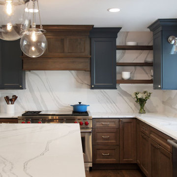
Our clients in Tower Lakes, IL, needed more storage and functionality from their kitchen. They were primarily focused on finding the right combination of cabinets, shelves, and drawers that fit all their cookware, flatware, and appliances. They wanted a brighter, bigger space with a natural cooking flow and plenty of storage. Soffits and crown molding needed to be removed to make the kitchen feel larger. Redesign elements included: relocating the fridge, adding a baking station and coffee bar, and placing the microwave in the kitchen island.
Advance Design Studio’s Claudia Pop offered functional, creative, and unique solutions to the homeowners’ problems. Our clients wanted a unique kitchen that was not completely white, a balance of design and function. Claudia offered functional, creative, and unique solutions to Chad and Karen’s kitchen design challenges. The first thing to go was soffits. Today, most kitchens can benefit from the added height and space; removing soffits is nearly always step one. Steely gray-blue was the color of choice for a freshly unique look bringing a sophisticated-looking space to wrap around the fresh new kitchen. Cherry cabinetry in a true brown stain compliments the stormy accents with sharp contrasting white Cambria quartz top balancing out the space with a dramatic flair.
“We wanted something unique and special in this space, something none of the neighbors would have,” said Claudia.
The dramatic veined Cambria countertops continue upward into a backsplash behind three complimentary open shelves. These countertops provide visual texture and movement in the kitchen. The kitchen includes two larder cabinets for both the coffee bar and baking station. The kitchen is now functional and unique in design.
“When we design a new kitchen space, as designers, we are always looking for ways to balance interesting design elements with practical functionality,” Claudia said. “This kitchen’s new design is not only way more functional but is stunning in a way a piece of art can catch one’s attention.”
Decorative mullions with mirrored inserts sit atop dual sentinel pantries flanking the new refrigerator, while a 48″ dual fuel Wolf range replaced the island cooktop and double oven. The new microwave is cleverly hidden within the island, eliminating the cluttered counter and attention-grabbing wall of stainless steel from the previous space.
The family room was completely renovated, including a beautifully functional entertainment bar with the same combination of woods and stone as the kitchen and coffee bar. Mesh inserts instead of plain glass add visual texture while revealing pristine glassware. Handcrafted built-ins surround the fireplace.
The beautiful and efficient design created by designer Claudia transitioned directly to the installation team seamlessly, much like the basement project experience Chad and Karen enjoyed previously.
“We definitely will and have recommended Advance Design Studio to friends who are looking to embark on a project small or large,” Karen said.
“Everything that was designed and built exactly how we envisioned it, and we are really enjoying it to its full potential,” Karen said.
Our award-winning design team would love to create a beautiful, functional, and spacious place for you and your family. With our “Common Sense Remodeling” approach, the process of renovating your home has never been easier. Contact us today at 847-665-1711 or schedule an appointment.
Sponsored
Columbus, OH
Wannemacher Interiors
Customized Award-Winning Interior Design Solutions in Franklin Cnty OH
 Techo-Bloc
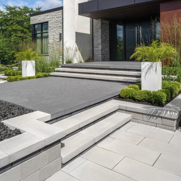
This gorgeous front yard landscape design was inspired by numerous of our products! The exterior of your home is the first thing visitors and potential buyers lay eyes on, so it’s important to make sure they like what they see! Boosting your home’s curb appeal with is often synonymous with selling your home; after all, giving your property a fresh and attractive face is the prime way to attract the interest of potential buyers! Have a look at our pavers to see how you can boost your home's curb appeal: www.techo-bloc.com
 Erin Lau Landscape Design- Seattle
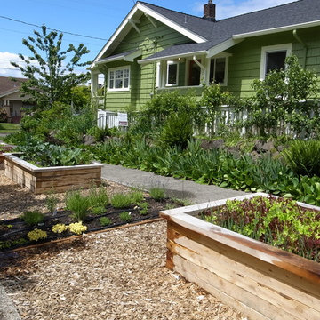
Juniper wood raised beds. Woodchips surrounding and insectary beds for pollination.
Design ideas for a traditional landscaping in Seattle.
Design ideas for a traditional landscaping in Seattle.
 Trio Surfaces
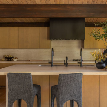
Island Crest is a story of transformation—a quiet reinvention of a 1958 mid-century modern home on Mercer Island that honors its rich past while embracing fresh, expansive possibilities. At Onoma Architecture, we approached this project as an opportunity to reveal the home's latent potential, reconfiguring a 4,000-square-foot post and beam structure into an open, inviting dialogue between interior and exterior spaces.
The vision was clear from the outset: enhance the living area without sacrificing the home's original character. Through creative structural reinforcement techniques, we meticulously eliminated unnecessary columns and walls, forging a continuous, unencumbered space that seamlessly connects the main living areas. This open plan accentuates the relationship between spaces—a fluid exchange where natural light and effortless flow become the orchestrated elements of daily life.
10