
Search results for "Powerful visual" in Home Design Ideas
 E+E Design Consulting
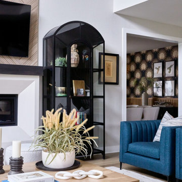
This thoughtfully layered living room vignette showcases the power of intentional styling and architectural details. The custom fireplace feature wall, finished with a white plaster surround, floating wood mantel, and herringbone white oak accent panel, creates a timeless focal point while maintaining a clean, contemporary aesthetic.
An elegant arched display cabinet adds both function and personality, showcasing meaningful travel artifacts, books, and collected objects that tell the homeowners' story. Rich blue velvet lounge chairs introduce bold color and sculptural form, balanced by warm white oak, cognac leather, and soft neutral textiles to create an inviting, sophisticated atmosphere.
Every accessory was carefully curated to layer texture, warmth, and visual interest, demonstrating that luxury interiors are created through thoughtful details as much as architectural design. The result is a space that feels elevated, personal, and effortlessly livable.
Design Style
Refined Organic Contemporary
Organic Modern
Warm Contemporary
Contemporary Luxury
Modern Transitional
Luxury living room, living room styling, designer living room, fireplace feature wall, custom fireplace, white plaster fireplace, herringbone wood accent wall, white oak feature wall, floating mantel, custom millwork, arched display cabinet, glass display cabinet, built-in cabinetry, home styling, luxury home decor, organic modern, warm contemporary, refined contemporary, modern transitional, blue velvet chairs, cognac leather furniture, layered textures, curated interiors, designer accessories, sculptural decor, statement furniture, open concept home, great room, custom home, whole home design, luxury interior design, high-end interiors, residential interior design, Colorado interior designer, Denver interior designer, Castle Pines interior design, timeless interiors, bespoke interiors, architectural details
 Vitruvius Built
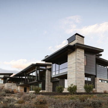
Poised within the exclusive Dancing Sun neighborhood of Tuhaye, Cloudveil is a 5,820-square-foot statement of elevated living — a refined mountain retreat where modern architecture, rich materiality, and natural serenity converge.
With four bedrooms, four and a half bathrooms, and a design that embraces both comfort and sophistication, Cloudveil delivers a deeply personal take on luxury. The interiors reflect a masculine, modern aesthetic, marked by clean lines, grounded textures, and a restrained elegance.
Anchoring the home is a dramatic open-concept living area, where custom Burchette & Burchette wood flooring sets the tone for timeless quality underfoot. Expansive glazing brings in filtered mountain light, evoking the home's namesake — soft, shifting veils of cloud that dance across the landscape. Bespoke lighting and tailored finishes amplify the home’s curated ambiance.
For the wellness-minded, Cloudveil features a private spa sanctuary, complete with a custom sauna designed to soothe and restore. A dedicated golf simulator suite offers both leisure and precision, while generous gathering spaces — both indoors and out — encourage year-round entertaining. Fire features, intimate lounges, and mountain views make every moment immersive.
Thoughtful details include an integrated smart lighting system, luxurious bath fixtures, and handcrafted millwork throughout — all chosen to enhance both the daily rhythm and the visual serenity of the home.
Cloudveil is more than a home. It is a high-altitude haven — a quiet, powerful presence nestled in the Wasatch, where every element is designed not just to impress, but to endure.
Architecture: BERG Design
Interior Architecture: BERG Design
 Wiles Design Group
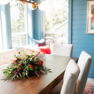
This home was redesigned to reflect the homeowners' personalities through intentional and bold design choices, resulting in a visually appealing and powerfully expressive environment.
This captivating dining room design features a striking bold blue palette that mingles with elegant furniture while statement lights dangle gracefully above. The rust-toned carpet adds a warm contrast, completing a sophisticated and inviting ambience.
Find the right local pro for your project
 Trevor Fulmer Design
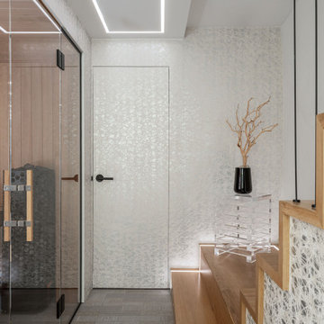
Inspired by luxury fitness facilities, this home gym is designed for stylish multifunctional use. A slatted wood wall provided a zen-like ambiance, floor to ceiling mirrors created visual openness, and strong graphic architectural details, in a tonal materials palette, enhanced the overall space. A linear lighting plan, custom storage feature, and mylar-backed wallpapers gave dimension and personality. Whether power lifting, meditative yoga, or relaxing in the glass-boxed sauna, this home gym is sure to inspire.
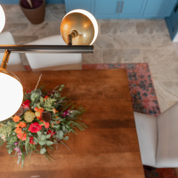 Wiles Design Group
This home was redesigned to reflect the homeowners' personalities through intentional and bold design choices, resulting in a visually appealing and powerfully expressive environment.
This captivating dining room design features a striking bold blue palette that mingles with elegant furniture while statement lights dangle gracefully above. The rust-toned carpet adds a warm contrast, completing a sophisticated and inviting ambience.
 TVL Creative Ltd.
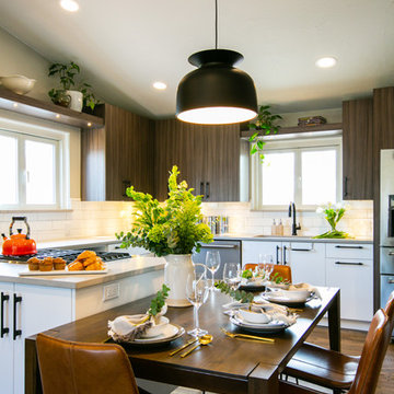
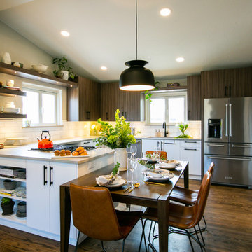
This 1950s home was sporting elements of the original kitchen and the dark space was not meeting our client’s needs. The original kitchen didn’t have much to offer in the way of functionality, so our first order of business was to create a design that would exponentially increase the usability of the kitchen. We brought in functional cabinetry, introduced uninterrupted work surfaces, and added plenty of lighting to brighten up their kitchen. They also wanted to open the new kitchen to the living room and create space for a larger dining table, so we started by removing the existing cabinetry that was visually cut the living space in two and minimized the power of the dramatic vaulted ceiling. We also extended the wood flooring into the kitchen as well to create seamless transitions between spaces. We fell in love with the idea of a two-toned cabinetry design for this kitchen and ultimately went head over heels for clean white painted base cabinets and a textured wood-look melamine on the uppers. This gave us a crisp backdrop that allowed us to bring is fun forms like the black light fixture over the table and the gorgeous silhouettes on the hardware. We played a lot with directionality in this space. The elongated open shelves and rectangular backsplash tiles give us wonderfully clean horizontal lines, but to balance those out we brought in a vertical grain pattern on the wall cabinets and added long black cabinetry pulls that emphasize the verticality of the space. The clients have a green thumb and wanted to make sure we created a home for their growing plant collection. The open shelving gives us plenty of opportunities for foliage and to showcase fun kitchen accessories. This design feels like home and brings together the clean lines and crisp finishes our clients were looking for.
 Lindy Design Build
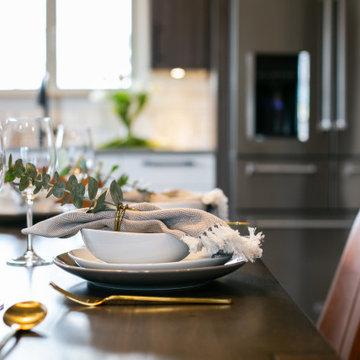
This 1950s home was sporting elements of the original kitchen and the dark space was not meeting our client’s needs. The original kitchen didn’t have much to offer in the way of functionality, so our first order of business was to create a design that would exponentially increase the usability of the kitchen. We brought in functional cabinetry, introduced uninterrupted work surfaces, and added plenty of lighting to brighten up their kitchen. They also wanted to open the new kitchen to the living room and create space for a larger dining table, so we started by removing the existing cabinetry that was visually cut the living space in two and minimized the power of the dramatic vaulted ceiling. We also extended the wood flooring into the kitchen as well to create seamless transitions between spaces.
We fell in love with the idea of a two-toned cabinetry design for this kitchen and ultimately went head over heels for clean white painted base cabinets and a textured wood-look melamine on the uppers. This gave us a crisp backdrop that allowed us to bring is fun forms like the black light fixture over the table and the gorgeous silhouettes on the hardware. We played a lot with directionality in this space. The elongated open shelves and rectangular backsplash tiles give us wonderfully clean horizontal lines, but to balance those out we brought in a vertical grain pattern on the wall cabinets and added long black cabinetry pulls that emphasize the verticality of the space. The clients have a green thumb and wanted to make sure we created a home for their growing plant collection. The open shelving gives us plenty of opportunities for foliage and to showcase fun kitchen accessories. This design feels like home and brings together the clean lines and crisp finishes our clients were looking.

Sponsored
Columbus, OH

Snider & Metcalf Interior Design, LTD
Leading Interior Designers in Columbus, Ohio & Ponte Vedra, Florida
 Lindy Design Build
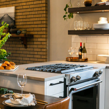
This 1950s home was sporting elements of the original kitchen and the dark space was not meeting our client’s needs. The original kitchen didn’t have much to offer in the way of functionality, so our first order of business was to create a design that would exponentially increase the usability of the kitchen. We brought in functional cabinetry, introduced uninterrupted work surfaces, and added plenty of lighting to brighten up their kitchen. They also wanted to open the new kitchen to the living room and create space for a larger dining table, so we started by removing the existing cabinetry that was visually cut the living space in two and minimized the power of the dramatic vaulted ceiling. We also extended the wood flooring into the kitchen as well to create seamless transitions between spaces.
We fell in love with the idea of a two-toned cabinetry design for this kitchen and ultimately went head over heels for clean white painted base cabinets and a textured wood-look melamine on the uppers. This gave us a crisp backdrop that allowed us to bring is fun forms like the black light fixture over the table and the gorgeous silhouettes on the hardware. We played a lot with directionality in this space. The elongated open shelves and rectangular backsplash tiles give us wonderfully clean horizontal lines, but to balance those out we brought in a vertical grain pattern on the wall cabinets and added long black cabinetry pulls that emphasize the verticality of the space. The clients have a green thumb and wanted to make sure we created a home for their growing plant collection. The open shelving gives us plenty of opportunities for foliage and to showcase fun kitchen accessories. This design feels like home and brings together the clean lines and crisp finishes our clients were looking.
 Leicht San Diego
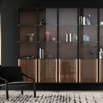
BOSSA – the successful real wood surface programme for elegant cosiness
In its 2021 collection, LEICHT entered completely new territory and laid the foundation for a new type
of room concept and furnishing aesthetic in the high-end kitchen segment with the BOSSA programme.
Their courage was rewarded: since its market launch, BOSSA has proven to be extremely successful and
style-defining for diverse planning in the cross-kitchen living area. The characteristic design element is
the vertically lined surface structure of the real wood fronts, which makes a powerful statement. Protruding,
linear ridges, 7.5 millimetres wide with a gap of 5 millimetres between each ridge, give BOSSA
a delicate, extremely vital, three-dimensional look. The overall grid of the ridges of 12.5 millimetres corresponds
exactly to the vertical joint pattern of LEICHT – a graphic effect the new pullout system M8
also uses for orientation. The result is a stringent, visual fusion of kitchen, wall and unit fronts to create
a furnishing soloist. BOSSA comes in two veneers: the version in light oak has a Scandinavian look characterised
by tranquillity, while the version in dark walnut is sublime and elegantly reminiscent of Italian
‘grandezza’. BOSSA is architectural, modern, bold – and will retain these characteristics in the living space
of the future, too.
 My Kitchen And Bath
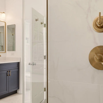
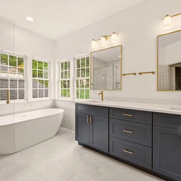
A complete primary bathroom remodel in Springfield, Virginia, designed around three priorities our clients came in with: a real walk-in shower, a freestanding tub by the windows, and a proper double vanity with storage that actually worked.
The original layout had everything in the wrong place. The tub sat against an interior wall away from the natural light. A small stall shower took up real estate across the room. The vanity was squeezed into whatever space was left over. Three windows on the back wall were doing nothing for the room because the layout was fighting them. Our solution involved knocking down the dividing wall between the old shower and vanity area, relocating plumbing for both the tub and the new vanities, and placing the freestanding tub directly under the bay of windows so morning light became part of the experience.
Design Approach
We anchored the room around contrast: deep navy cabinetry against soft white walls, warm brushed gold against cool marble tile, sharp Shaker lines against the curved silhouette of the freestanding tub. Navy was the design decision the rest of the room was built around — the clients knew they wanted color but didn't want anything that would feel dated in five years. Navy reads bold without being loud, pairs with virtually any metal finish, and has staying power that trendier choices don't.
We used Fabuwood Galaxy Indigo for the vanities — all-plywood construction with solid wood doors and drawer fronts, soft close throughout. Shaker-style flat panels keep the navy from feeling heavy. The brushed gold (Jeffrey Alexander 635-96SBZ in satin bronze) shows up across hardware, faucets, lighting, the tub filler, and the shower trim, creating a quiet continuity throughout the room.
The Shower
Removing the wall between the old shower and old vanity area created room for a proper walk-in. We tiled the entire shower floor to ceiling in Decovita Calacatta Suave 24x48" porcelain — large format installed in a 50% offset horizontal pattern, with cement board and redgard underneath. The marble-look porcelain gives the visual depth of natural marble without the maintenance.
A built-in shower bench, custom-built into the corner, is wrapped in the same wall tile on the front with a quartz top matching the vanity counter. The shower niche is detailed with MSI Arabescato Carrara 2" honed hex mosaic at the back, the same tile used on the shower floor. All tile edges are finished with Schluter in satin bronze to match the room's metal finishes. The shower door is custom frameless 3/8" tempered glass with a satin bronze pull — no metal frame interrupting the sight line.
The Vanities and Countertops
The new double vanity gives both clients their own space for morning routines. Counter tops are MSI Calacatta Miraggio Cielo quartz with pencil edging and a 4" backsplash — a soft white with subtle gray veining that reads like real Calacatta marble without the porosity issues. Two undermount square porcelain sinks finish the surface cleanly.
The Tub
A 60" freestanding soaker tub sits under the bay of three windows. The floor-mounted tub filler is satin bronze with a handheld sprayer. We relocated the drain and supply lines to make the centered placement work. The tub is the room's quietest feature and its strongest — clients tell us they use this bathroom differently than they used the old one.
Flooring
MSI Sande Ivory 12x24" matte porcelain runs throughout the bathroom floor in a 50% offset pattern parallel to the vanity wall. Cement board underneath, 4" white wood baseboard, Whisper Grey grout that handles daily use without showing wear.
Paint and Lighting
Walls are Benjamin Moore Chantilly Lace 2121-70 in satin — a true crisp white that doesn't lean cool or warm. The ceiling uses Benjamin Moore Aura Bath and Spa White, which is formulated to resist mildew in high-humidity spaces. Lighting is layered: three new 6" LED recessed lights on a dimmer, two satin bronze vanity sconces above the mirrors, and the existing three windows providing the daytime ambient light.
Project Specs
Location: Springfield, Virginia
Project type: Full primary bathroom remodel
Project duration: Approximately 5 weeks
Style: Modern, Transitional
Color palette: Navy, white, brushed gold, marble
Materials
Cabinetry: Fabuwood Galaxy Indigo, Shaker-style flat panel maple, all-plywood construction
Cabinet hardware: Jeffrey Alexander 635-96SBZ Satin Bronze pulls
Vanity counter and bench top: MSI Calacatta Miraggio Cielo Quartz, pencil edge with 4" backsplash
Sinks: Undermount white porcelain BR-202 square (x2)
Wall tile: Decovita Calacatta Suave 24x48" porcelain
Floor tile: MSI Sande Ivory 12x24" matte porcelain
Shower floor + niche back: MSI Arabescato Carrara 2" honed hex mosaic marble
Edge trim: Schluter satin bronze
Shower door: Custom frameless 3/8" tempered glass
Tub: 60" freestanding acrylic soaker (Ferguson)
Tub filler: Floor-mounted satin bronze (Ferguson)
Vanity faucets, mirrors, sconces, toilet: Satin bronze coordinated finishes (Ferguson)
Wall paint: Benjamin Moore Chantilly Lace 2121-70 Satin
Ceiling paint: Benjamin Moore Aura Bath and Spa White
Grout: Whisper Grey (floor), Standard White (walls and shower)
Designed and built by My Kitchen and Bath out of our Alexandria showroom at 5710 General Washington Drive. We've been designing and building kitchens, bathrooms, and full home renovations across Northern Virginia and the DMV since 1994.

 Free Istock Image
Welcome to a transformative digital journey with Convato360 – where innovation meets immersive design. We are thrilled to introduce our latest project on Houzz.com, inviting you to explore a world of possibilities in digital experiences, interactive spaces, and captivating storytelling.
About Convato360:
Convato360 is a trailblazer in crafting 360-degree digital experiences that transcend the ordinary. Our projects reimagine spaces, creating environments that captivate, engage, and leave a lasting impression. With a passion for innovation, Convato360 turns conventional ideas into immersive digital journeys.
Key Elements of the New Project:
Immersive Design Concepts:
Dive into a collection of immersive design concepts that showcase the power of Convato360 in transforming spaces digitally. From virtual walkthroughs to interactive elements, experience the future of design.
Digital Storytelling Showcase:
Explore our portfolio of digital storytelling, where Convato360 brings ideas to life through a harmonious blend of visuals, interactivity, and narrative. Each project is a unique journey waiting to be discovered.
Client Success Stories:
Hear firsthand from clients who have embraced Convato360 for their projects. Learn how our innovative approach has elevated their spaces, leaving a lasting impact on their audience.
Behind-the-Scenes Insights:
Gain exclusive behind-the-scenes insights into the creative process at Convato360. Understand how we bring ideas from concept to reality, leveraging cutting-edge technologies and a passion for pushing boundaries.
How to Engage:
Visit our Houzz.com Convato360 Project to embark on this digital odyssey. Explore our immersive designs, witness the magic of digital storytelling, and envision the potential of Convato360 for your upcoming projects.
Connect with Us:
Follow Convato360 on Houzz.com for regular updates, insights, and inspirations:
Convato360 Houzz Profile
Collaborate with Convato360:
Ready to elevate your next project with Convato360? Contact us directly through our Houzz.com project page, and let's explore the possibilities of bringing your vision to life in the digital realm.
We invite you to be a part of this exciting journey as we redefine the boundaries of design and storytelling in the digital age. Explore, engage, and envision the future with Convato360 on Houzz.com!
Best regards,
Admin
Convato360 Team
 Lavish Interiors
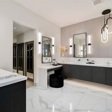
This never-occupied, move-in ready custom home in The Estates at Ascent at The Phoenician showcases the power of professional home staging. With unobstructed Camelback Mountain views, over 4,600 sq ft of designer living space, and luxury finishes throughout, this property was thoughtfully staged to highlight its architectural beauty and create emotional appeal for high-end buyers.
Staging features include layered textures, neutral tones, and curated furnishings that enhance the natural light, open flow, and high-end amenities—like the invisacook induction island, glass-enclosed wine display, and spa-style primary suite. Every space, from the dramatic entry to the multiple view patios, was styled to maximize visual impact and buyer connection.
Luxury home staging helped bring this one-of-a-kind property to life, showing its full potential and lifestyle story.
 Xpress Rendering
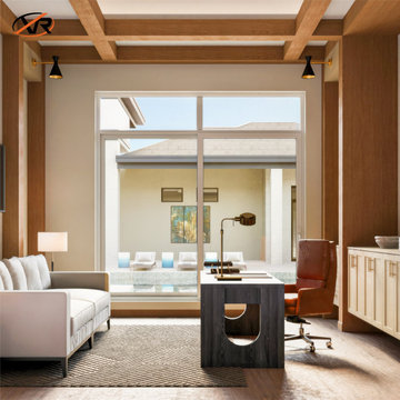
This beautifully designed home office showcases the power of 3D rendering to bring a vision to life before any construction begins. From the initial concept to the final design, every detail was thoughtfully planned and executed. Natural light floods the space, highlighting warm wood textures, soft fabrics, and a seamless connection to the outdoors—creating a workspace that’s both functional and inspiring.


 My Kitchen And Bath
A complete primary bathroom remodel in Springfield, Virginia, designed around three priorities our clients came in with: a real walk-in shower, a freestanding tub by the windows, and a proper double vanity with storage that actually worked.
The original layout had everything in the wrong place. The tub sat against an interior wall away from the natural light. A small stall shower took up real estate across the room. The vanity was squeezed into whatever space was left over. Three windows on the back wall were doing nothing for the room because the layout was fighting them. Our solution involved knocking down the dividing wall between the old shower and vanity area, relocating plumbing for both the tub and the new vanities, and placing the freestanding tub directly under the bay of windows so morning light became part of the experience.
Design Approach
We anchored the room around contrast: deep navy cabinetry against soft white walls, warm brushed gold against cool marble tile, sharp Shaker lines against the curved silhouette of the freestanding tub. Navy was the design decision the rest of the room was built around — the clients knew they wanted color but didn't want anything that would feel dated in five years. Navy reads bold without being loud, pairs with virtually any metal finish, and has staying power that trendier choices don't.
We used Fabuwood Galaxy Indigo for the vanities — all-plywood construction with solid wood doors and drawer fronts, soft close throughout. Shaker-style flat panels keep the navy from feeling heavy. The brushed gold (Jeffrey Alexander 635-96SBZ in satin bronze) shows up across hardware, faucets, lighting, the tub filler, and the shower trim, creating a quiet continuity throughout the room.
The Shower
Removing the wall between the old shower and old vanity area created room for a proper walk-in. We tiled the entire shower floor to ceiling in Decovita Calacatta Suave 24x48" porcelain — large format installed in a 50% offset horizontal pattern, with cement board and redgard underneath. The marble-look porcelain gives the visual depth of natural marble without the maintenance.
A built-in shower bench, custom-built into the corner, is wrapped in the same wall tile on the front with a quartz top matching the vanity counter. The shower niche is detailed with MSI Arabescato Carrara 2" honed hex mosaic at the back, the same tile used on the shower floor. All tile edges are finished with Schluter in satin bronze to match the room's metal finishes. The shower door is custom frameless 3/8" tempered glass with a satin bronze pull — no metal frame interrupting the sight line.
The Vanities and Countertops
The new double vanity gives both clients their own space for morning routines. Counter tops are MSI Calacatta Miraggio Cielo quartz with pencil edging and a 4" backsplash — a soft white with subtle gray veining that reads like real Calacatta marble without the porosity issues. Two undermount square porcelain sinks finish the surface cleanly.
The Tub
A 60" freestanding soaker tub sits under the bay of three windows. The floor-mounted tub filler is satin bronze with a handheld sprayer. We relocated the drain and supply lines to make the centered placement work. The tub is the room's quietest feature and its strongest — clients tell us they use this bathroom differently than they used the old one.
Flooring
MSI Sande Ivory 12x24" matte porcelain runs throughout the bathroom floor in a 50% offset pattern parallel to the vanity wall. Cement board underneath, 4" white wood baseboard, Whisper Grey grout that handles daily use without showing wear.
Paint and Lighting
Walls are Benjamin Moore Chantilly Lace 2121-70 in satin — a true crisp white that doesn't lean cool or warm. The ceiling uses Benjamin Moore Aura Bath and Spa White, which is formulated to resist mildew in high-humidity spaces. Lighting is layered: three new 6" LED recessed lights on a dimmer, two satin bronze vanity sconces above the mirrors, and the existing three windows providing the daytime ambient light.
Project Specs
Location: Springfield, Virginia
Project type: Full primary bathroom remodel
Project duration: Approximately 5 weeks
Style: Modern, Transitional
Color palette: Navy, white, brushed gold, marble
Materials
Cabinetry: Fabuwood Galaxy Indigo, Shaker-style flat panel maple, all-plywood construction
Cabinet hardware: Jeffrey Alexander 635-96SBZ Satin Bronze pulls
Vanity counter and bench top: MSI Calacatta Miraggio Cielo Quartz, pencil edge with 4" backsplash
Sinks: Undermount white porcelain BR-202 square (x2)
Wall tile: Decovita Calacatta Suave 24x48" porcelain
Floor tile: MSI Sande Ivory 12x24" matte porcelain
Shower floor + niche back: MSI Arabescato Carrara 2" honed hex mosaic marble
Edge trim: Schluter satin bronze
Shower door: Custom frameless 3/8" tempered glass
Tub: 60" freestanding acrylic soaker (Ferguson)
Tub filler: Floor-mounted satin bronze (Ferguson)
Vanity faucets, mirrors, sconces, toilet: Satin bronze coordinated finishes (Ferguson)
Wall paint: Benjamin Moore Chantilly Lace 2121-70 Satin
Ceiling paint: Benjamin Moore Aura Bath and Spa White
Grout: Whisper Grey (floor), Standard White (walls and shower)
Designed and built by My Kitchen and Bath out of our Alexandria showroom at 5710 General Washington Drive. We've been designing and building kitchens, bathrooms, and full home renovations across Northern Virginia and the DMV since 1994.
 TVL Creative Ltd.
This 1950s home was sporting elements of the original kitchen and the dark space was not meeting our client’s needs. The original kitchen didn’t have much to offer in the way of functionality, so our first order of business was to create a design that would exponentially increase the usability of the kitchen. We brought in functional cabinetry, introduced uninterrupted work surfaces, and added plenty of lighting to brighten up their kitchen. They also wanted to open the new kitchen to the living room and create space for a larger dining table, so we started by removing the existing cabinetry that was visually cut the living space in two and minimized the power of the dramatic vaulted ceiling. We also extended the wood flooring into the kitchen as well to create seamless transitions between spaces. We fell in love with the idea of a two-toned cabinetry design for this kitchen and ultimately went head over heels for clean white painted base cabinets and a textured wood-look melamine on the uppers. This gave us a crisp backdrop that allowed us to bring is fun forms like the black light fixture over the table and the gorgeous silhouettes on the hardware. We played a lot with directionality in this space. The elongated open shelves and rectangular backsplash tiles give us wonderfully clean horizontal lines, but to balance those out we brought in a vertical grain pattern on the wall cabinets and added long black cabinetry pulls that emphasize the verticality of the space. The clients have a green thumb and wanted to make sure we created a home for their growing plant collection. The open shelving gives us plenty of opportunities for foliage and to showcase fun kitchen accessories. This design feels like home and brings together the clean lines and crisp finishes our clients were looking for.
 StoneUnlimited Kitchen and Bath Remodeling
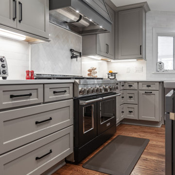
Choosing to abandon uniformity in your kitchen can be a great choice if you're looking to opt out of a monochrome aesthetic. Two-toned kitchen cabinets add visual interest and contrast while drawing focus to different features within the space. Designs utilizing two-toned cabinets have become very popular in recent years and it's not a trend that will be fading out any time soon.
Our clients opted for a combination of Earl Grey and Macchiato Classic cabinetry in their two-toned kitchen. The large island with its second faucet, sink, microwave drawer and lower storage is the focal point of the room and a great work surface for food prep and entertaining. A vertical pull out PowerDock was installed into the top of the island for plugging in kitchen tools, phones and laptops. Dolomite Marble subway tile and Brunello quartz countertops brighten up the kitchen and balance out the tone of the cabinets creating a light and airy feel. The addition of contrasting touches such as the Honey Bronze, Flat Black hardware and Champaign Bronze faucets, accessories the room beautifully. The subdued and sophisticated style of this two-toned kitchen is exquisite and shows the various ways that two-tone cabinets can be versatile and appealing.
Some of the other areas that were remodeled in this home included the complete overhaul of the existing stair well, a guest bath and laundry area.
The guest bath has beautiful vanity cabinets in Celest finish, Monochrome Lotus Deco tile and very reflective Midnight Dots in the shower floor and niche. The combination of all three give a striking white, blue and black design that will inspire and show that you can use pattern and texture in small spaces. A twenty four inch wall mounted shower seat can be lifted and secured when in use and tucked away to allow access out of the shower. A pocket door from the guest bathroom provides a second access point to the hallway with the laundry that has also been revamped with the same style and finish of cabinetry.
 Sarah Hassaan Interiors
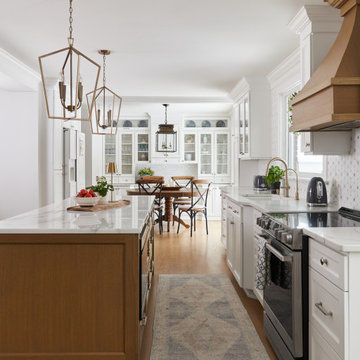
Project Summerhayes is a thoughtfully curated transformation of the heart of the home, the kitchen and family room. These spaces were designed to support daily living while feeling warm, welcoming, and deeply personal.
From the outset, our approach focused on intentional design choices that balance visual impact with comfort and functionality. Each element was carefully selected to enhance the flow of the space while creating an atmosphere that feels both refined and inviting.
Every layer, detail, and finish was chosen with purpose, resulting in interiors that feel lived-in, loved, and uniquely reflective of the family who calls this house home. The transformation highlights the power of considered design where beauty and function work together seamlessly.
We’re delighted to share Project Summerhayes with you.

Sponsored
Columbus, OH
Snider & Metcalf Interior Design, LTD
Leading Interior Designers in Columbus, Ohio & Ponte Vedra, Florida
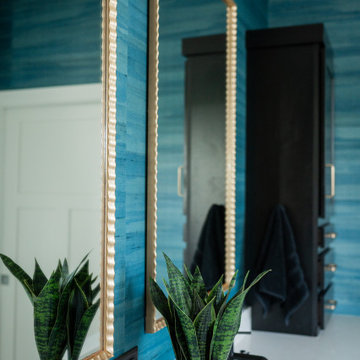 Wiles Design Group
This home was redesigned to reflect the homeowners' personalities through intentional and bold design choices, resulting in a visually appealing and powerfully expressive environment.
Echoing the serene blue palette of the bedroom, this bathroom design seamlessly blends elegance and functionality. The spacious vanity provides ample storage while housing double sinks, complemented by twin mirrors and gracefully designed mirror lighting, culminating in a harmonious and stylish sanctuary.
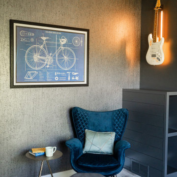 Wiles Design Group
This home was redesigned to reflect the homeowners' personalities through intentional and bold design choices, resulting in a visually appealing and powerfully expressive environment.
In the home office, a sleek table is a focal point, complemented by a plush armchair and ottoman, providing comfort and style. Elegant decor, including captivating artwork and guitars adorning the walls, transforms the space into a harmonious blend of functionality and personal expression.
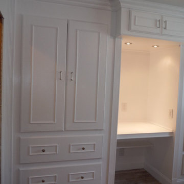
 Jay-Quinones Contracting Inc.
My client requested that I build a functional closet so this is the design that I came up with. The unit was constructed out of ¾ inch birch plywood. In addition to a closet and storage area I created a work station /desk as well. Low voltage lights on a dimmer were installed in the work station. Double closet doors were installed on each side of the work station. A light and automatic light switch was installed for each side of the closet. The lights are activated when the doors are opened and power off when closed. Four deep draws were installed on the unit. A two door cabinet was installed atop of the work station for additional storage. A small shelf was installed below the desk top. I made the top cabinet project out for a visually pleasing effect. Crown molding was installed atop of the unit and a 5 ½ inch base molding was installed throughout. Fluted moldings were installed as well. The unit was finished with High Gloss White paint.
44