
Search results for "Practical planning" in Home Design Ideas
 Margery Wedderburn Interiors
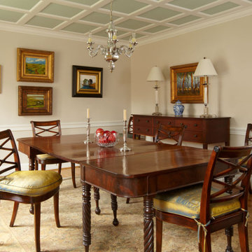
A perfectly designed floor plan is half the battle! In this gorgeous transitional style Great Falls home, we planned the space so that the beautiful artwork and stunning baby grand piano are displayed beautifully. A perfect balance of elements allows the homeowners to sit and relax while practicing the piano. We juxtaposed the client’s unique antique collection with newly sourced decor places to create a harmonious decor plan. We also added plenty of shelves in the beautiful study to store the client’s book collection and precious souvenirs. The unique floor plan ensures the entire home has a lively, seamless flow of positive energy.
Photography by Timothy Bell
Project designed by interior design studio Margery Wedderburn Interiors. They serve Northern Virginia areas including the D.C suburbs of Great Falls, McLean, Potomac, and Bethesda, along with Orlando and the rest of Central Florida.
For more about Margery Wedderburn interiors, see here: https://margerywedderburninteriors.com
 Drury Design
The Setup:
After purchasing this home, the homeowners faced a unique opportunity to reimagine their kitchen and nearby spaces. Water damage from a burst pipe had left much of the home’s interior in need of repair, and while the existing kitchen was functional and in relatively good shape, it didn’t align with the family’s vision for their new home. The layout included a peninsula that wasn’t ideal, and there were some druthers with the nearby pantry.
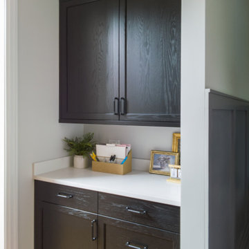
Since the space needed to be rebuilt anyway, the homeowners saw this as a chance to create a kitchen that was both highly functional for their four young children and timeless in its design. The project also included a refresh of the adjacent message center and dining room — spaces that play key roles in the family’s daily life. The goal was to create a cohesive flow between these areas, balancing modern functionality with the craftsman-inspired character of the rest of the home.
Design Objectives:
- Replace the outdated peninsula with a large island to maximize counter space and create new seating options.
- Open up the space visually by removing soffits and rethinking the cabinetry layout.
Incorporate concealed refrigeration and freezer units to provide significant storage for the family while maintaining a streamlined aesthetic.
- Integrate black cabinetry into the design without making the space feel harsh or heavy.
- Ensure the lighting plan balances functional task lighting with ambient accent lighting.
- Avoid visual clutter in the cabinetry design while still giving a nod to the craftsman aesthetic.
- Incorporate a slab backsplash as a key design feature.
Design Challenges:
- The outdated peninsula left dead space in the kitchen and lacked sufficient seating for the family.
- The cooktop wall was cramped, with small cabinets flanking the hood, limited storage, and soffits that made the space feel closed-in.
- The family needed significant refrigeration space (two refrigerators and a freezer) but wanted to avoid a cluttered look with visible stainless steel appliances.
- Adding black cabinetry risked making the space feel too dark or heavy.
- The original lighting plan was insufficient, particularly over the dining table where a decorative fixture proved too dim.
- The family wanted shaker-style drawer fronts to match the home’s arts-and-crafts design but worried that too much shaker cabinetry might look overly busy.
- Prioritizing a slab backsplash in the wish list priority planning.
The Renewed Space
Design Solutions:
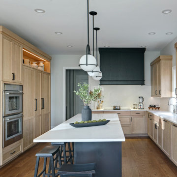
- A functional island: The peninsula was replaced with a large island that provides continuous countertop space for prepping and serving. The island also features seating for four people, creating a central hub for informal meals and activities.
- Streamlined cooktop wall: The soffits were removed, and the upper cabinets on the cooktop wall were eliminated to create a more open, streamlined design. A custom oversized hood became the focal point of the wall, with the blower unit offset inside it to align with the cooktop while maintaining exterior visual symmetry.
- Concealed refrigeration: Two column refrigerators and one freezer were integrated into the cabinetry, concealing them behind wood paneling that blends seamlessly with the overall design.
- Warm black cabinetry: The black cabinetry was crafted from hickory with a visible grain, softening its appearance and adding warmth. The grain detail gives the cabinetry a rich, textured look that avoids feeling stark or overpowering.
- Additional lighting: In the dining area, recessed can lights were added during an additional installation phase to supplement the gorgeous decorative fixture’s dim output. The new lighting plan creates a layered effect, combining functional task lighting with softer ambient lighting.
- Simplified cabinetry details: Slab drawer fronts were used on the upper drawers, while five-piece shaker fronts (with slightly less prominent rail and stile pieces) were reserved for the middle and lower drawers. This approach simplified the overall look while maintaining the craftsman-inspired aesthetic.
- Slab backsplash priority: The slab backsplash was prioritized by making thoughtful adjustments elsewhere, like opting not to extend cabinetry to the ceiling, which also helped visually prioritize the gorgeous slab backsplash. This decision also enhanced the kitchen’s furniture-like feel, aligning with the home’s craftsman character.
- This kitchen perfectly balances practicality with timeless style. By addressing the family’s functional needs — ample seating, smart storage, and effective lighting — while incorporating thoughtful design elements like warm black cabinetry and a striking slab backsplash, Alicia created a space that works beautifully for a busy household. The result is a cohesive, inviting kitchen that honors the home’s craftsman roots and will serve the family well for years to come.
 Kinon Surface Design
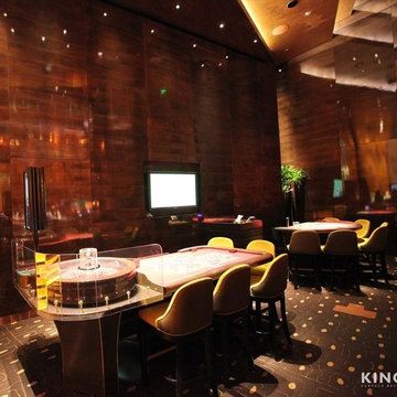
The beautiful Aria Hotel and Casino in Las Vegas, Nevada utilizes Kinon resin surface design to create a bold, classy look.
Minimalist home design photo in Las Vegas
Minimalist home design photo in Las Vegas
Find the right local pro for your project
 Kitchens Bespoke Ltd
e were especially pleased to work with this lovely client again, having designed a kitchen for her previously. This new project consisted of two briefs to maximise the space and natural light for a bijoux annexe;
Design a sleek contemporary open plan kitchen plus utility.
Design bedroom storage and a home working space within the open plan area.
To achieve the contemporary uncluttered style that would maximise the sense of light and space, a true handleless design was the obvious choice. The main run of cabinets in the kitchen and on the wardrobe doors are acrylic gloss with a ply edge. The light reflecting qualities of the gloss doors is further accentuated by the tropical green toughened glass panel behind the sink. We just love this injection of colour. It not only really suits this modern space but will look fabulous when the patio area is developed. Our customer is planning to create a beautiful green oasis with plants on the patio, which will just make this area feel so connected to the outside. The sink area is finished off perfectly with a black Quooker Fusion tap.
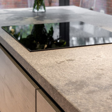
The kitchen island offers a great contrast with the main run of furniture. The concrete effect handleless doors and Konigstone quartz ‘Concrete fossil’ worktop create a real feature, and provide some texture. Extending the worktop down over the sides of the island complements the seamless and uncluttered style of this kitchen perfectly. Not only does it look great, but its a practical space too. Built into the island is an evo port for sockets, enabling it to double up as a work and food prep area.
For a final flourish, the glass shelves are all fitted with LED lights behind them, offering more ambient lighting options.
 Drury Design
The Setup:
After purchasing this home, the homeowners faced a unique opportunity to reimagine their kitchen and nearby spaces. Water damage from a burst pipe had left much of the home’s interior in need of repair, and while the existing kitchen was functional and in relatively good shape, it didn’t align with the family’s vision for their new home. The layout included a peninsula that wasn’t ideal, and there were some druthers with the nearby pantry.
Since the space needed to be rebuilt anyway, the homeowners saw this as a chance to create a kitchen that was both highly functional for their four young children and timeless in its design. The project also included a refresh of the adjacent message center and dining room — spaces that play key roles in the family’s daily life. The goal was to create a cohesive flow between these areas, balancing modern functionality with the craftsman-inspired character of the rest of the home.
Design Objectives:
- Replace the outdated peninsula with a large island to maximize counter space and create new seating options.
- Open up the space visually by removing soffits and rethinking the cabinetry layout.
Incorporate concealed refrigeration and freezer units to provide significant storage for the family while maintaining a streamlined aesthetic.
- Integrate black cabinetry into the design without making the space feel harsh or heavy.
- Ensure the lighting plan balances functional task lighting with ambient accent lighting.
- Avoid visual clutter in the cabinetry design while still giving a nod to the craftsman aesthetic.
- Incorporate a slab backsplash as a key design feature.
Design Challenges:
- The outdated peninsula left dead space in the kitchen and lacked sufficient seating for the family.
- The cooktop wall was cramped, with small cabinets flanking the hood, limited storage, and soffits that made the space feel closed-in.
- The family needed significant refrigeration space (two refrigerators and a freezer) but wanted to avoid a cluttered look with visible stainless steel appliances.
- Adding black cabinetry risked making the space feel too dark or heavy.
- The original lighting plan was insufficient, particularly over the dining table where a decorative fixture proved too dim.
- The family wanted shaker-style drawer fronts to match the home’s arts-and-crafts design but worried that too much shaker cabinetry might look overly busy.
- Prioritizing a slab backsplash in the wish list priority planning.
The Renewed Space
Design Solutions:
- A functional island: The peninsula was replaced with a large island that provides continuous countertop space for prepping and serving. The island also features seating for four people, creating a central hub for informal meals and activities.
- Streamlined cooktop wall: The soffits were removed, and the upper cabinets on the cooktop wall were eliminated to create a more open, streamlined design. A custom oversized hood became the focal point of the wall, with the blower unit offset inside it to align with the cooktop while maintaining exterior visual symmetry.
- Concealed refrigeration: Two column refrigerators and one freezer were integrated into the cabinetry, concealing them behind wood paneling that blends seamlessly with the overall design.
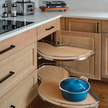
- Warm black cabinetry: The black cabinetry was crafted from hickory with a visible grain, softening its appearance and adding warmth. The grain detail gives the cabinetry a rich, textured look that avoids feeling stark or overpowering.
- Additional lighting: In the dining area, recessed can lights were added during an additional installation phase to supplement the gorgeous decorative fixture’s dim output. The new lighting plan creates a layered effect, combining functional task lighting with softer ambient lighting.
- Simplified cabinetry details: Slab drawer fronts were used on the upper drawers, while five-piece shaker fronts (with slightly less prominent rail and stile pieces) were reserved for the middle and lower drawers. This approach simplified the overall look while maintaining the craftsman-inspired aesthetic.
- Slab backsplash priority: The slab backsplash was prioritized by making thoughtful adjustments elsewhere, like opting not to extend cabinetry to the ceiling, which also helped visually prioritize the gorgeous slab backsplash. This decision also enhanced the kitchen’s furniture-like feel, aligning with the home’s craftsman character.
- This kitchen perfectly balances practicality with timeless style. By addressing the family’s functional needs — ample seating, smart storage, and effective lighting — while incorporating thoughtful design elements like warm black cabinetry and a striking slab backsplash, Alicia created a space that works beautifully for a busy household. The result is a cohesive, inviting kitchen that honors the home’s craftsman roots and will serve the family well for years to come.
 Drury Design
The Setup:
After purchasing this home, the homeowners faced a unique opportunity to reimagine their kitchen and nearby spaces. Water damage from a burst pipe had left much of the home’s interior in need of repair, and while the existing kitchen was functional and in relatively good shape, it didn’t align with the family’s vision for their new home. The layout included a peninsula that wasn’t ideal, and there were some druthers with the nearby pantry.
Since the space needed to be rebuilt anyway, the homeowners saw this as a chance to create a kitchen that was both highly functional for their four young children and timeless in its design. The project also included a refresh of the adjacent message center and dining room — spaces that play key roles in the family’s daily life. The goal was to create a cohesive flow between these areas, balancing modern functionality with the craftsman-inspired character of the rest of the home.
Design Objectives:
- Replace the outdated peninsula with a large island to maximize counter space and create new seating options.
- Open up the space visually by removing soffits and rethinking the cabinetry layout.
Incorporate concealed refrigeration and freezer units to provide significant storage for the family while maintaining a streamlined aesthetic.
- Integrate black cabinetry into the design without making the space feel harsh or heavy.
- Ensure the lighting plan balances functional task lighting with ambient accent lighting.
- Avoid visual clutter in the cabinetry design while still giving a nod to the craftsman aesthetic.
- Incorporate a slab backsplash as a key design feature.
Design Challenges:
- The outdated peninsula left dead space in the kitchen and lacked sufficient seating for the family.
- The cooktop wall was cramped, with small cabinets flanking the hood, limited storage, and soffits that made the space feel closed-in.
- The family needed significant refrigeration space (two refrigerators and a freezer) but wanted to avoid a cluttered look with visible stainless steel appliances.
- Adding black cabinetry risked making the space feel too dark or heavy.
- The original lighting plan was insufficient, particularly over the dining table where a decorative fixture proved too dim.
- The family wanted shaker-style drawer fronts to match the home’s arts-and-crafts design but worried that too much shaker cabinetry might look overly busy.
- Prioritizing a slab backsplash in the wish list priority planning.
The Renewed Space
Design Solutions:
- A functional island: The peninsula was replaced with a large island that provides continuous countertop space for prepping and serving. The island also features seating for four people, creating a central hub for informal meals and activities.
- Streamlined cooktop wall: The soffits were removed, and the upper cabinets on the cooktop wall were eliminated to create a more open, streamlined design. A custom oversized hood became the focal point of the wall, with the blower unit offset inside it to align with the cooktop while maintaining exterior visual symmetry.
- Concealed refrigeration: Two column refrigerators and one freezer were integrated into the cabinetry, concealing them behind wood paneling that blends seamlessly with the overall design.
- Warm black cabinetry: The black cabinetry was crafted from hickory with a visible grain, softening its appearance and adding warmth. The grain detail gives the cabinetry a rich, textured look that avoids feeling stark or overpowering.
- Additional lighting: In the dining area, recessed can lights were added during an additional installation phase to supplement the gorgeous decorative fixture’s dim output. The new lighting plan creates a layered effect, combining functional task lighting with softer ambient lighting.
- Simplified cabinetry details: Slab drawer fronts were used on the upper drawers, while five-piece shaker fronts (with slightly less prominent rail and stile pieces) were reserved for the middle and lower drawers. This approach simplified the overall look while maintaining the craftsman-inspired aesthetic.
- Slab backsplash priority: The slab backsplash was prioritized by making thoughtful adjustments elsewhere, like opting not to extend cabinetry to the ceiling, which also helped visually prioritize the gorgeous slab backsplash. This decision also enhanced the kitchen’s furniture-like feel, aligning with the home’s craftsman character.
- This kitchen perfectly balances practicality with timeless style. By addressing the family’s functional needs — ample seating, smart storage, and effective lighting — while incorporating thoughtful design elements like warm black cabinetry and a striking slab backsplash, Alicia created a space that works beautifully for a busy household. The result is a cohesive, inviting kitchen that honors the home’s craftsman roots and will serve the family well for years to come.
 Kitchens Bespoke Ltd
e were especially pleased to work with this lovely client again, having designed a kitchen for her previously. This new project consisted of two briefs to maximise the space and natural light for a bijoux annexe;
Design a sleek contemporary open plan kitchen plus utility.
Design bedroom storage and a home working space within the open plan area.
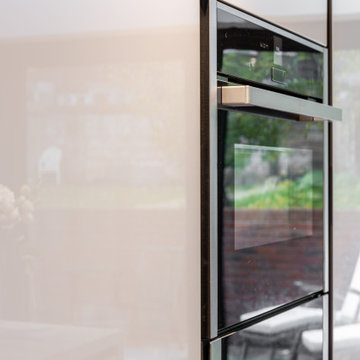
To achieve the contemporary uncluttered style that would maximise the sense of light and space, a true handleless design was the obvious choice. The main run of cabinets in the kitchen and on the wardrobe doors are acrylic gloss with a ply edge. The light reflecting qualities of the gloss doors is further accentuated by the tropical green toughened glass panel behind the sink. We just love this injection of colour. It not only really suits this modern space but will look fabulous when the patio area is developed. Our customer is planning to create a beautiful green oasis with plants on the patio, which will just make this area feel so connected to the outside. The sink area is finished off perfectly with a black Quooker Fusion tap.
The kitchen island offers a great contrast with the main run of furniture. The concrete effect handleless doors and Konigstone quartz ‘Concrete fossil’ worktop create a real feature, and provide some texture. Extending the worktop down over the sides of the island complements the seamless and uncluttered style of this kitchen perfectly. Not only does it look great, but its a practical space too. Built into the island is an evo port for sockets, enabling it to double up as a work and food prep area.
For a final flourish, the glass shelves are all fitted with LED lights behind them, offering more ambient lighting options.

 Houston Bath and Kitchen
In a beautiful suburb on the north side of Houston, Texas, Joe and Kristen discovered their dream home—a property with a great lot, situated in a fantastic neighborhood with a thoughtfully designed floor plan. They had been drawn to the house for its charm and had admired the kitchen, which had been tastefully remodeled a few years earlier by a contractor who, despite doing excellent work, was no longer in business. However, upon moving in, they quickly realized that their master bathroom was woefully inadequate and in dire need of immediate repair.
Determined to turn their bathroom into a luxurious retreat, Joe and Kristen sought out Houston Bath & Kitchen, a reputable design-build firm renowned for their meticulous process and outstanding results. They were impressed from the outset with the efficiency and expertise. In just 90 minutes, their design team presented a complete concept plan and provided a detailed estimate—a promising start to what would become an inspiring collaboration.
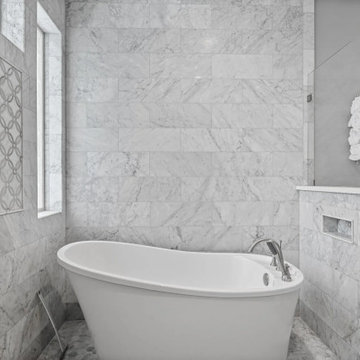
Guided by Houston Bath & Kitchen's comprehensive approach, Joe and Kristen embarked on a thorough "design tour." The team expertly navigated them through the selection process, ensuring every choice aligned perfectly with their aesthetic preferences and practical needs. Together, they crafted a vision that included an oversized shower for two, creatively integrating a freestanding tub within the shower area—an innovative solution that maximized space and luxury.
As the project progressed, The Houston Bath & Kitchen production team conducted a thorough "trade walk," meticulously inspecting the jobsite to uncover potential complexities and ensure no detail was overlooked. This step was crucial in setting reliable expectations and eliminating surprises.
Detailing the scope of work was another pivotal phase, emphasizing transparency and clarity. Joe and Kristen felt reassured knowing exactly what to expect at each stage of the remodel. Houston Bath & Kitchen then moved into the "master planning phase," coordinating materials, surveys, and permits with precision. Trades were scheduled, and critical paths were identified—laying a solid foundation for a seamless execution.
Throughout the process, communication remained robust, and the meticulous planning ensured the project stayed on track both in terms of time and budget. One of the standout features of the design was the intricate tile work that adorned the walls and floors, fulfilling Joe and Kristen's desire for a design with variation and detail. Natural light was ingeniously incorporated through strategically placed windows and skylights, providing a serene ambiance without sacrificing privacy—a testament to Houston Bath & Kitchen's expertise in balancing functionality with aesthetics.
The final touch of luxury came in the form of a heated floor, adding warmth and comfort to the space—a detail that epitomized Houston Bath & Kitchen's commitment to fulfilling every customer priority.
Less than a year after the project was complete, Joe and Kristen made a decision to sell their home. Remarkably, the property went on the market and sold for $75,000 over asking price—a testament to the transformative impact of their newly remodeled master bathroom. While the exact influence of the bathroom on the bidding war remains speculative, it undoubtedly played a significant role in the home's appeal and ultimate sale price.
The success of their home sale not only underscored the value of their investment but also highlighted the expertise and dedication of Houston Bath & Kitchen in delivering a space that not only met but exceeded their expectations. Joe and Kristen stepped into their newly remodeled master bathroom with hearts full of joy. The space surpassed their dreams, reflecting their style and enhancing their daily lives—a sanctuary that would be cherished for years to come, thanks to Houston Bath & Kitchen's skillful guidance and commitment to excellence.
 Sosna Inc
Our retired clients approached us to renovate the Kitchen and Powder Room in their 1993 home, which they have lived in for 30 years.
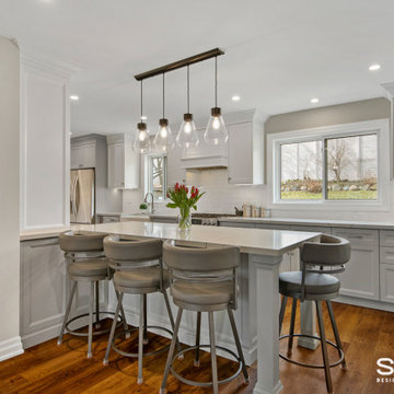
As they love to entertain and have visits with their grandchildren, they needed the Renovation to focus on creating an updated and open concept Main Floor to make their home to look and feel more spacious and inviting.
Their Kitchen was outdated and cramped, lacking in counter space and storage. The Powder Room was dated, and the plumbing fixtures were lacking in both looks and function. As they love to cook and bake, a more open and functional Kitchen was a must.
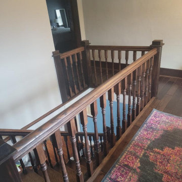
The closed off Main Floor was lacking in flow and function. As the Dining Room and Living Room both felt closed off and isolated, they were often unused. As well, the Main Staircase was carpeted with wooden pickets, and needed a modern facelift.
After working closely with the clients to understand their wants and needs, one of our talented Sosna designers, Camila, was able to create a design plan that not only optimized functionality but also made the space uniquely theirs.
During the planning stage, it was discovered that an exhaust pipe that went from the Basement, and through the Main Floor to the roof could be removed. Removing this pipe freed up a lot of space, allowing for more storage to be added.
Camila then worked closely with the construction area of the Sosna team to provide our clients with the home of their dreams. Our team first removed the walls separating the Living Room, Dining Room, and Kitchen to create a brighter, more open space. We then brought up an existing window sill to match the window at the Kitchen sink to make space for an extra long countertop and plenty of cabinetry. We built a large peninsula with 4 seats in the Kitchen, functioning much like an Island. The peninsula was positioned to face Kitchen window, providing a direct view to their beautiful backyard.
We made sure to incorporate plenty of storage space, and practical features. Appliance garages were installed to store unsightly small appliances, and a coffee station was added, perfect for mornings and afternoon visits with family and friends.
The Powder Room plumbing was updated, providing the space with a modern look, and more efficient fixtures, and the staircase was given a beautiful modern update that will be much easier to maintain.
Our clients and their beautiful dog stayed with their daughter’s family during the renovation. While it was wonderful to spend time with family, it’s always nice to be home again. Our proven process and detailed planning enabled us to keep our promise to get the project completed on time.
In the end, we were able to create an open concept space that was both inviting and functional, perfect for entertaining and cooking. Our clients were thrilled with the results and have already started planning their next get-together.
If you love your home, but looking to make it more functional and comfortable for your specific needs, we're the Renovator You Can Count On. It's our promise. Contact us to get started!
 Drury Design
The Setup:
After purchasing this home, the homeowners faced a unique opportunity to reimagine their kitchen and nearby spaces. Water damage from a burst pipe had left much of the home’s interior in need of repair, and while the existing kitchen was functional and in relatively good shape, it didn’t align with the family’s vision for their new home. The layout included a peninsula that wasn’t ideal, and there were some druthers with the nearby pantry.
Since the space needed to be rebuilt anyway, the homeowners saw this as a chance to create a kitchen that was both highly functional for their four young children and timeless in its design. The project also included a refresh of the adjacent message center and dining room — spaces that play key roles in the family’s daily life. The goal was to create a cohesive flow between these areas, balancing modern functionality with the craftsman-inspired character of the rest of the home.
Design Objectives:
- Replace the outdated peninsula with a large island to maximize counter space and create new seating options.
- Open up the space visually by removing soffits and rethinking the cabinetry layout.
Incorporate concealed refrigeration and freezer units to provide significant storage for the family while maintaining a streamlined aesthetic.
- Integrate black cabinetry into the design without making the space feel harsh or heavy.
- Ensure the lighting plan balances functional task lighting with ambient accent lighting.
- Avoid visual clutter in the cabinetry design while still giving a nod to the craftsman aesthetic.
- Incorporate a slab backsplash as a key design feature.
Design Challenges:
- The outdated peninsula left dead space in the kitchen and lacked sufficient seating for the family.
- The cooktop wall was cramped, with small cabinets flanking the hood, limited storage, and soffits that made the space feel closed-in.
- The family needed significant refrigeration space (two refrigerators and a freezer) but wanted to avoid a cluttered look with visible stainless steel appliances.
- Adding black cabinetry risked making the space feel too dark or heavy.
- The original lighting plan was insufficient, particularly over the dining table where a decorative fixture proved too dim.
- The family wanted shaker-style drawer fronts to match the home’s arts-and-crafts design but worried that too much shaker cabinetry might look overly busy.
- Prioritizing a slab backsplash in the wish list priority planning.
The Renewed Space
Design Solutions:
- A functional island: The peninsula was replaced with a large island that provides continuous countertop space for prepping and serving. The island also features seating for four people, creating a central hub for informal meals and activities.
- Streamlined cooktop wall: The soffits were removed, and the upper cabinets on the cooktop wall were eliminated to create a more open, streamlined design. A custom oversized hood became the focal point of the wall, with the blower unit offset inside it to align with the cooktop while maintaining exterior visual symmetry.
- Concealed refrigeration: Two column refrigerators and one freezer were integrated into the cabinetry, concealing them behind wood paneling that blends seamlessly with the overall design.
- Warm black cabinetry: The black cabinetry was crafted from hickory with a visible grain, softening its appearance and adding warmth. The grain detail gives the cabinetry a rich, textured look that avoids feeling stark or overpowering.
- Additional lighting: In the dining area, recessed can lights were added during an additional installation phase to supplement the gorgeous decorative fixture’s dim output. The new lighting plan creates a layered effect, combining functional task lighting with softer ambient lighting.
- Simplified cabinetry details: Slab drawer fronts were used on the upper drawers, while five-piece shaker fronts (with slightly less prominent rail and stile pieces) were reserved for the middle and lower drawers. This approach simplified the overall look while maintaining the craftsman-inspired aesthetic.
- Slab backsplash priority: The slab backsplash was prioritized by making thoughtful adjustments elsewhere, like opting not to extend cabinetry to the ceiling, which also helped visually prioritize the gorgeous slab backsplash. This decision also enhanced the kitchen’s furniture-like feel, aligning with the home’s craftsman character.
- This kitchen perfectly balances practicality with timeless style. By addressing the family’s functional needs — ample seating, smart storage, and effective lighting — while incorporating thoughtful design elements like warm black cabinetry and a striking slab backsplash, Alicia created a space that works beautifully for a busy household. The result is a cohesive, inviting kitchen that honors the home’s craftsman roots and will serve the family well for years to come.

 Ambiance
This rural contemporary home was designed for a couple with two grown children not living with them. The couple wanted a clean contemporary plan with attention to nice materials and practical for their relaxing lifestyle with them, their visiting children and large dog. The designer was involved in the process from the beginning by drawing the house plans. The couple had some requests to fit their lifestyle.
Central location for the former music teacher's grand piano
Tall windows to take advantage of the views
Bioethanol ventless fireplace feature instead of traditional fireplace
Casual kitchen island seating instead of dining table
Vinyl plank floors throughout add warmth and are pet friendly
 ZeroEnergy Design
This LEED Platinum certified house reflects the homeowner's desire for an exceptionally healthy and comfortable living environment, within a traditional neighborhood.
INFILL SITE. The family, who moved from another area of Wellesley, sought out this property to be within walking distance of the high school and downtown area. An existing structure on the tight lot was removed to make way for the new home. 84% of the construction waste, from both the previous structure and the new home, was diverted from a landfill. ZED designed to preserve the existing mature trees on the perimeter of the property to minimize site impacts, and to maintain the character of the neighborhood as well as privacy on the site.
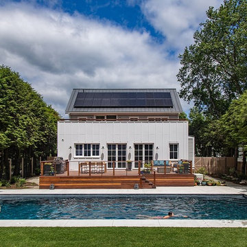
EXTERIOR EXPRESSION. The street facade of the home relates to the local New England vernacular. The rear uses contemporary language, a nod to the family’s Californian roots, to incorporate a roof deck, solar panels, outdoor living space, and the backyard swimming pool. ZED’s careful planning avoided to the need to face the garage doors towards the street, a common syndrome of a narrow lot.
THOUGHTFUL SPACE. Homes with dual entries can often result in duplicate and unused spaces. In this home, the everyday and formal entry areas are one and the same; the front and garage doors share the entry program of coat closets, mudroom storage with bench for removing your shoes, and a laundry room with generous closets for the children's sporting equipment. The entry area leads directly to the living space, encompassing the kitchen, dining and sitting area areas in an L-shaped open plan arrangement. The kitchen is placed at the south-west corner of the space to allow for a strong connection to the dining, sitting and outdoor living spaces. A fire pit on the deck satisfies the family’s desire for an open flame while a sealed gas fireplace is used indoors - ZED’s preference after omitting gas burning appliances completely from an airtight home. A small study, with a window seat, is conveniently located just off of the living space. A first floor guest bedroom includes an accessible bathroom for aging visitors and can be used as a master suite to accommodate aging in place.
HEALTHY LIVING. The client requested a home that was easy to clean and would provide a respite from seasonal allergies and common contaminants that are found in many indoor spaces. ZED selected easy to clean solid surface flooring throughout, provided ample space for cleaning supplies on each floor, and designed a mechanical system with ventilation that provides a constant supply of fresh outdoor air. ZED selected durable materials, finishes, cabinetry, and casework with low or no volatile organic compounds (VOCs) and no added urea formaldehyde.
YEAR-ROUND COMFORT. The home is super insulated and air-tight, paired with high performance triple-paned windows, to ensure it is draft-free throughout the winter (even when in front of the large windows and doors). ZED designed a right-sized heating and cooling system to pair with the thermally improved building enclosure to ensure year-round comfort. The glazing on the home maximizes passive solar gains, and facilitates cross ventilation and daylighting.
ENERGY EFFICIENT. As one of the most energy efficient houses built to date in Wellesley, the home highlights a practical solution for Massachusetts. First, the building enclosure reduces the largest energy requirement for typical houses (heating). Super-insulation, exceptional air sealing, a thermally broken wall assembly, triple pane windows, and passive solar gain combine for a sizable heating load reduction. Second, within the house only efficient systems consume energy. These include an air source heat pump for heating & cooling, a heat pump hot water heater, LED lighting, energy recovery ventilation, and high efficiency appliances. Lastly, photovoltaics provide renewable energy help offset energy consumption. The result is an 89% reduction in energy use compared to a similar brand new home built to code requirements.
RESILIENT. The home will fare well in extreme weather events. During a winter power outage, heat loss will be very slow due to the super-insulated and airtight envelope– taking multiple days to drop to 60 degrees even with no heat source. An engineered drainage system, paired with careful the detailing of the foundation, will help to keep the finished basement dry. A generator will provide full operation of the all-electric house during a power outage.
OVERALL. The home is a reflection of the family goals and an expression of their values, beautifully enabling health, comfort, safety, resilience, and utility, all while respecting the planet.
ZED - Architect & Mechanical Designer
Bevilacqua Builders Inc - Contractor
Creative Land & Water Engineering - Civil Engineering
Barbara Peterson Landscape - Landscape Design
Nest & Company - Interior Furnishings
Eric Roth Photography - Photography
 Hansen's Renovations
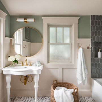
Completed in partnership with LAM Studios Inc., this Fall 2024 renovation transformed multiple areas of a Dilworth home into a cohesive, functional, and beautifully updated living environment. The project included a complete kitchen remodel, living room renovation, bathroom remodel, laundry room update, dining room renovation, fireplace enhancement, and hallway improvements.
The kitchen serves as the centerpiece of the renovation, featuring improved functionality, modern finishes, and a layout designed to support everyday living and entertaining. Adjacent living and dining spaces were thoughtfully redesigned to create a seamless flow throughout the home, while the updated fireplace provides a warm and inviting focal point.
Additional improvements to the bathroom, laundry room, and hallway enhanced both comfort and efficiency, ensuring every space contributes to the home's overall functionality and style. Through careful planning, quality craftsmanship, and timeless design choices, this renovation successfully blends modern living with lasting elegance.
The result is a beautifully refreshed home that feels brighter, more connected, and perfectly tailored to the homeowners' lifestyle.
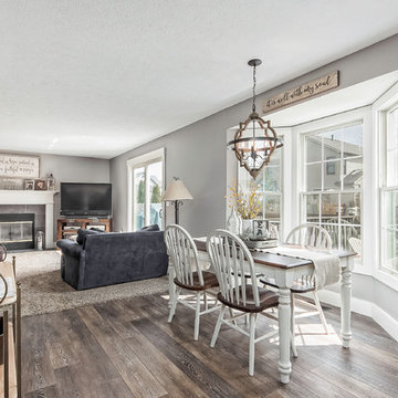
Sponsored
Sunbury, OH

J.Holderby - Renovations
Franklin County's Leading General Contractors - 2X Best of Houzz!
 2Scale Architects
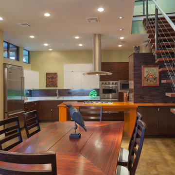
modern home designed by Greg Swedberg while an employee at Allegro Builders. Greg Swedberg now has his own practice 2Scale Architects
Benjamin Hill Photography
 Rollins Andrew Interiors
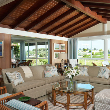
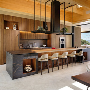
1950's mid-century modern beach house built by architect Richard Leitch in Carpinteria, California. Leitch built two one-story adjacent homes on the property which made for the perfect space to share seaside with family. In 2016, Emily restored the homes with a goal of melding past and present. Emily kept the beloved simple mid-century atmosphere while enhancing it with interiors that were beachy and fun yet durable and practical. The project also required complete re-landscaping by adding a variety of beautiful grasses and drought tolerant plants, extensive decking, fire pits, and repaving the driveway with cement and brick.

 TKS Design Group
Download our free ebook, Creating the Ideal Kitchen. DOWNLOAD NOW
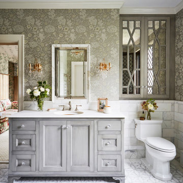
This homeowner’s daughter originally contacted us on behalf of her parents who were reluctant to begin the remodeling process in their home due to the inconvenience and dust. Once we met and they dipped their toes into the process, we were off to the races. The existing bathroom in this beautiful historical 1920’s home, had not been updated since the 70’/80’s as evidenced by the blue carpeting, mirrored walls and dropped ceilings. In addition, there was very little storage, and some health setbacks had made the bathroom difficult to maneuver with its tub shower.
Once we demoed, we discovered everything we expected to find in a home that had not been updated for many years. We got to work bringing all the electrical and plumbing up to code, and it was just as dusty and dirty as the homeowner’s anticipated! Once the space was demoed, we got to work building our new plan. We eliminated the existing tub and created a large walk-in curb-less shower.
An existing closet was eliminated and in its place, we planned a custom built in with spots for linens, jewelry and general storage. Because of the small space, we had to be very creative with the shower footprint, so we clipped one of the walls for more clearance behind the sink. The bathroom features a beautiful custom mosaic floor tile as well as tiled walls throughout the space. This required lots of coordination between the carpenter and tile setter to make sure that the framing and tile design were all properly aligned. We worked around an existing radiator and a unique original leaded window that was architecturally significant to the façade of the home. We had a lot of extra depth behind the original toilet location, so we built the wall out a bit, moved the toilet forward and then created some extra storage space behind the commode. We settled on mirrored mullioned doors to bounce lots of light around the smaller space.
We also went back and forth on deciding between a single and double vanity, and in the end decided the single vanity allowed for more counter space, more storage below and for the design to breath a bit in the smaller space. I’m so happy with this decision! To build on the luxurious feel of the space, we added a heated towel bar and heated flooring.
One of the concerns the homeowners had was having a comfortable floor to walk on. They realized that carpet was not a very practical solution but liked the comfort it had provided. Heated floors are the perfect solution. The room is decidedly traditional from its intricate mosaic marble floor to the calacutta marble clad walls. Elegant gold chandelier style fixtures, marble countertops and Morris & Co. beaded wallpaper provide an opulent feel to the space.
The gray monochromatic pallet keeps it feeling fresh and up-to-date. The beautiful leaded glass window is an important architectural feature at the front of the house. In the summertime, the homeowners love having the window open for fresh air and ventilation. We love it too!
The curb-less shower features a small fold down bench that can be used if needed and folded up when not. The shower also features a custom niche for storing shampoo and other hair products. The linear drain is built into the tilework and is barely visible. A frameless glass door that swings both in and out completes the luxurious feel.
Designed by: Susan Klimala, CKD, CBD
Photography by: Michael Kaskel
For more information on kitchen and bath design ideas go to: www.kitchenstudio-ge.com
 Safferstone Interiors
Dennis and Joe have a large, light-filled house. New construction meant lofted space and open floor plans with traditional styling. Running a busy dental practice by day and engaged in a rich social life by night, this couple needed a professional to take the lead on making their house a home.
That’s my cue!
They wanted to take risks, and stay away from “matchy-matchy”. We gussied up a plain ol’ TV room and gave it a healthy dose of luxury.
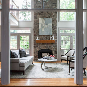
Our plan was initially inspired by an abstract painting hanging over their stone fireplace. We brought in their love of the outdoors to make things cozy and used family furniture whenever possible for nostalgia and comfort.
I took their love for one-of-a-kind objects and started making a design plan, aiming to solve their biggest frustration: the family room. They had a tortured relationship with a “forgotten family room,” a great space that was spacious and bright, but not at all cozy or joyful, and certainly not “them.”
I wanted to create a cozy space functional for everyday curling up with puppies and watching TV after dinner, yet chic enough for hosting the pre-dinner kitchen overflow and cocktails during parties.
I went looking for contrasting textures and materials. I wanted to balance patterns and scale, and use non-traditional colors as neutrals to create an overall sense of “BAM!”
Dennis and Joe loved the nod to the classics juxtaposed with new and different globally-inspired pieces. For this project our design aesthetic can be described as Middle Eastern/tribal meets mid-century modern. We played to their sensible side with proportion and balance, and stayed as far away from boring/bleh as we could.
From there we moved on to other spaces.. We added colorful pillows and sheer drapery to finish off their formal living room. We kept an inherited bedroom set from Dennis’ Mom and added color, draperies, and pillows to overhaul the guest bedroom.
Their project was not a rip-and-replace, we weren’t starting from scratch with a blank piece of paper.
Rather, our goal was to take what was already there and make it better, more like them. Using functionality first, we focused on giving the house a soothing, joyful aesthetic. We upped the chic factor by a gajillion and helped them find their ‘happy’ at home. See more Safferstone stuff at www.safferstone.com. Connect with us on Facebook, get inspired on Pinterest, and share modern musings on life & design on Instagram. Or, send us a love note at hello@safferstone.com.
Photo: Angie Seckinger
 DHD Architecture and Interior Design
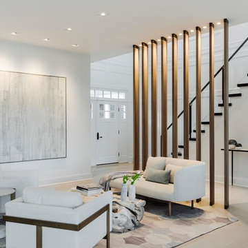
The Watermill House is a beautiful example of a classic Hamptons wood shingle style home. The design and renovation would maintain the character of the exterior while transforming the interiors to create an open and airy getaway for a busy and active family. The house comfortably sits within its one acre lot surrounded by tall hedges, old growth trees, and beautiful hydrangeas. The landscape influenced the design approach of the main floor interiors. Walls were removed and the kitchen was relocated to the front of the house to create an open plan for better flow and views to both the front and rear yards. The kitchen was designed to be both practical and beautiful. The u-shape design features modern appliances, white cabinetry and Corian countertops, and is anchored by a beautiful island with a knife-edge marble countertop. The island and the dining room table create a strong axis to the living room at the rear of the house. To further strengthen the connection to the outdoor decks and pool area of the rear yard, a full height sliding glass window system was installed. The clean lines and modern profiles of the window frames create unobstructed views and virtually remove the barrier between the interior and exterior spaces. The open plan allowed a new sitting area to be created between the dining room and stair. A screen, comprised of vertical fins, allows for a degree of openness, while creating enough separation to make the sitting area feel comfortable and nestled in its own area. The stair at the entry of the house was redesigned to match the new elegant and sophisticated spaces connected to it. New treads were installed to articulate and contrast the soft palette of finishes of the floors, walls, and ceilings. The new metal and glass handrail was intended to reduce visual noise and create subtle reflections of light.
Photo by Guillaume Gaudet
 Jules Duffy Designs
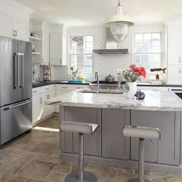
Design: Jules Duffy Design; This kitchen was gutted to the studs and renovated TWICE after 2 burst pipe events! It's finally complete! With windows and doors on 3 sides, the kitchen is flooded with amazing light and beautiful breezes. The finishes were selected from a driftwood palate as a nod to the beach one block away, The limestone floor (beyond practical) dares all to find the sand traveling in on kids' feet. Tons of storage and seating make this kitchen a hub for entertaining. Photography: Laura Moss
51