
Search results for "Predominant" in Home Design Ideas

 Dawson & Clinton
Tucked into the hillsides of Marin, the environment played a predominant role in defining the contemporary yet exotic style of this home.
In the master bedroom, a fireplace adds a cozy design element, while an inconspicuous home theater system can be elegantly tucked away when not in use. In the master bathroom, pebbled stone tile adorn the walls of the double shower that overlooks the hillsides of Marin.
A guest bathroom was designed to compliment the eclectic aesthetic of the home. While in the center of the residence, a spiral acrylic staircase climbs 3 floors acting as a consistent element, tying together the varied yet complementary styles.
 FiveSTAR Landscape
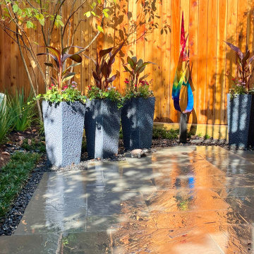
The primary goal of this landscape design project was to create a serene and accessible patio area that is wheelchair friendly, enabling the homeowner to freely navigate, engage with planters, and savor outdoor moments.
To achieve this, we removed obtrusive posts and introduced a sturdy steel beam to open up the space, providing an unobstructed pathway. The homeowners expressed a preference for the timeless beauty of natural Pennsylvania bluestone, which we artfully incorporated into the design.
Incorporating a water feature into this unique diagonal lot added an extra touch of tranquility to the landscape. Emphasizing sustainability, we predominantly utilized native plants, weaving together all the desired elements. The result is a harmonious outdoor oasis, thoughtfully designed to cater to both aesthetics and accessibility, where the homeowners can cherish the beauty of their surroundings.
 Banker Wire
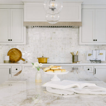
This California residence went from dark and dull to modern and bright with the help of Woodcliff Builders designer Jessica Peters. Remodeled with the thought of entertaining guests in mind, form and functionality played equal roles in the design process. Light cream tones wash over the home, punctuated by the bold statement that Banker Wire’s S-12 makes in it’s Antique Brass plated finish. This woven wire mesh pattern catches the eye throughout the kitchen, living room, and bar as various cabinet door infills.
The unique texture of S-12 brings balance to the stark contrasting color scheme throughout the kitchen. While the open-concept room boasts predominantly pale features, the highlights of the Antique Brass finish draw out the deeper rich tones in the white marble backsplash and counter tops. The shadows created by the weave of the wire mesh help tie in the dark accents in the kitchen, including the black light fixtures and the oil-rubbed bronze cabinet and drawer hardware.
Across from the kitchen, the eye is drawn to the main focal point of the living room, the built-in bookshelves. Banker Wire’s S-12 clads the four central cabinet doors, creating a unique hideaway for television components and other electronics. The Antique Brass finish brings warmth into the otherwise neutral structure, complimented by the displayed curios and the cozy furniture surrounding it. Both the wire mesh and the oil-rubbed bronze hardware are carried over from the kitchen, making for a cohesive home design.
In the home’s custom bar, S-12 adorns the front of the ceiling-high white cabinets. For this area, the former cabinet and drawer pulls have been replaced with brass and ivory colored hardware, underscoring the brass of the cabinet’s panel. Emphasized by the dark stone counter-top, the lowlights of the pattern accentuate the texture of the mesh, while the Antique Brass face coordinates with the wood of the lower cabinets, bringing a consistent appearance to the space.
“I just love that extra level of detail that this wire mesh provides for cabinets,” states Peters. “It really takes the design to the next level.”
The low open area of woven wire mesh pattern S-12 lends itself well to surfacing, cladding, and other applications where partial coverage is key. At 21.6%, only subtle glimpses will be perceptible through the mesh. Embossed and highly faceted, the highs and lows of this distinctive weave are more defined in plated and powder coat finishes, making Antique Brass plating the perfect choice for this residential cabinetry project.
Find the right local pro for your project
 SoNo architects
Architects: SoNo Arhitekti
www.sono.si
www.facebook.com/SonoArhitekti
Location: Slovenia
Architects in Charge: Edvard Blažko, Marko Volk, Nina Tešanović, Samo Radinja
Area: 230 sqm
Year: 2015
Photographs: Aljoša Videtič
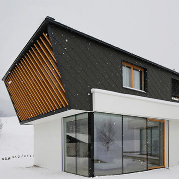
This family home is an example of a modern design filled with natural light and building blocks comprised of sustainable material – in this case wood, one of the if not the most strategic material of Slovenia . It's definitely not a typical prefabricated house out of catalogue as we tried to develop a residence that meets the needs of modern users while having functional floor plans and contemporary elegant exterior all appropriately settled into its landscape.
Main concept presents three volumes that are placed in a triangular composition partially overlayed with a rectangular form of the upper floor. While the dynamic shape of the groundfloor is covered with a flat roof, the 1st floor is completed with a gable –like roof, echoing the traditional architecture of the house's surroundings.
While we enter into an open spacious and dynamically shaped groundfloor we discover a pleasant intimate ambience. The living room and dining area offer a lot of natural light through the large glazed window surfaces. A prominent staircase leads us to the upper sleeping area that consists of the main bedroom with its own dressing room and a bathroom and children's rooms with a smaller bathroom.
Despite groundfloor's dynamic shape, its façade is monochrome - predominately a clean white surface in combination with bigger windows. On the contrary the simple form of the upper floor has a boldly designed façade - a combination of dark colour shades and natural larch wood’s textures.
Wood is the basic structural element and at the same time complements the facades, window frames, while also dominating the interiors.
 Quarry Mill
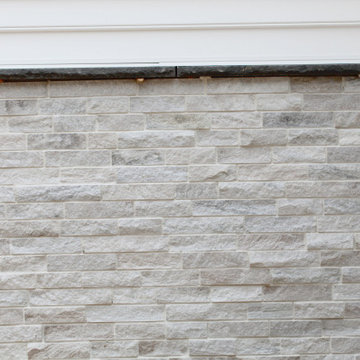
Whittier natural thin stone veneer from the Quarry Mill adds elegance to the exterior of this residential home. Whitter is a natural quartzite veneer in the dimensional ledgestone style. The pieces of stone are all 3” in height with lengths varying from 6”-18”. Whittier is predominantly white with some cream and light grey tones. The stone will also have some soft brown natural veining within the pieces and softly sparkle in the light. The pieces have been sawn on five sides including the top, bottom, ends, and back. The front shows the split face of the stone with a sandpaper like texture. Installation can be done with or without a mortar joint between the pieces. Whittier is a premium quality imported stone that we have in stock and ready to ship.
 Dwellify
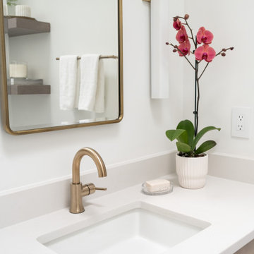
In this kitchen renovation, the aim was to revamp the space, making it not just functional, but stylish and inviting too. The decision to paint the walls predominantly white instantly promoted brightness and airiness into the room, setting the stage for a modern makeover. Knocking down the wall separating the kitchen from the family room added a touch of spaciousness and promoted seamless interaction between the two areas. Introducing a sleek floating island became the centerpiece, offering both practicality and a contemporary aesthetic. Upgrading to all new appliances ensured efficiency without sacrificing style. The end result? A chic, welcoming kitchen that's as perfect for cooking up a storm as it is for gathering with loved ones.
In this extensive bathroom remodel, a once cluttered and cramped primary bathroom has been meticulously transformed into a spacious and bright oasis. By prioritizing additional storage and leveraging the existing skylight, the space underwent a remarkable renovation without the need for significant structural changes. The skylight was maximized to its full potential by surrounding it with pristine white walls, creating an airy and luminous atmosphere. The introduction of a luxurious marble shower not only adds a touch of sophistication but also contributes to the overall cleanliness and sophistication of the space. Soft gray cabinets and warm wood accents were strategically incorporated to create a bathroom with a serene and welcoming ambiance, evoking a sense of tranquility and comfort. Every detail was meticulously considered, from the placement of storage solutions to the selection of materials, ensuring that the remodeled bathroom exudes both functionality and elegance.
The result is a blend of style and practicality, where every aspect of the design works in harmony to create a serene sanctuary where relaxation and rejuvenation are effortlessly embraced.
 Julie Schuster Design Studio
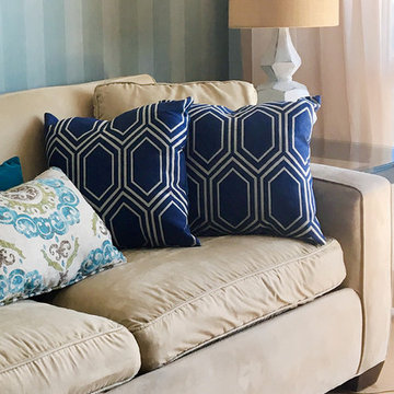
With the accent wall being so predominant in the space and extending from one end of the apartment to the other, it was only natural to stage this multi-functional space with decorative items that complimented the shade of green such as the collection of different shades of blue on the decorative pillows.
 VIP Saloti
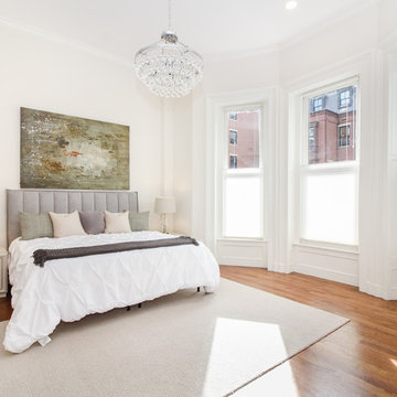
Staged predominantly with VIP Saloti Furniture by Deb Ellis Designs.
Visit Deb Ellis @ https://www.debellisdesigns.com to work with a tremendous individual!
VIP Saloti: Wave Bed, Night Stands, Chest, and Occasional Chair
 JUMA architects
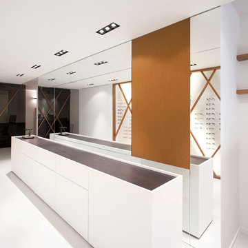
Optiek Herpol wanted to move to a better, more central location with plenty of parking space. A property that complied with these conditions was found on the Market in Deinze, and JUMA architects were subsequently asked to design a new interior for the store.
The property in question is very deep and narrow with little natural light entry. JUMA set to work despite these constraints in an attempt to transform these challenges into qualities.
The architects positioned the sales counter right behind the shop window, so as to make optimum use of the available natural light. This also makes store activities visible from the outside, adding an extra element of attraction. At the narrowest section of the store, a large wall mirror was put in to visually double the space. The wall onto which the eyeglasses are displayed is located opposite the mirror and is literally the eye catcher in the store. A wooden lattice makes for an interesting play of diagonal lines behind which the glasses are presented. This unique concept animates the entire store without detracting from the fact that the glasses should remain the main focal point in the store. The workshop is located in the back, separated from the store by a wall in smoked grey glass. In this way, the optician can keep an eye on the store at all times.
The colour palette is predominantly white, to keep the interior as light as possible. As a counterpoint, warm wood accents are added. The chairs at the counter are upholstered in a colour that harmonizes perfectly with the wood.
Pictures © Thomas De Bruyne
 SDL Design
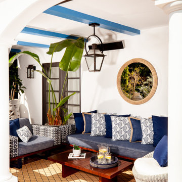
Navy blue is the predominant color throughout the outdoor area. Sarah was inspired from the luxury world of elite nautical life and private navigation. In both areas, there is an atmosphere of relaxation that remind those dwelling of European summers.
 Cali Scaping
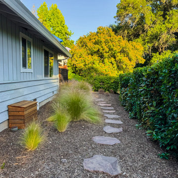
Drought-tolerant, water-efficient plants (such as ornamental grasses, small shrubs, and groundcovers) predominate, arranged in flowerbeds with ample dark wood mulch to conserve moisture and prevent erosion. There is a transition between more and less shaded areas, with mature trees in the background.
 Dwellify
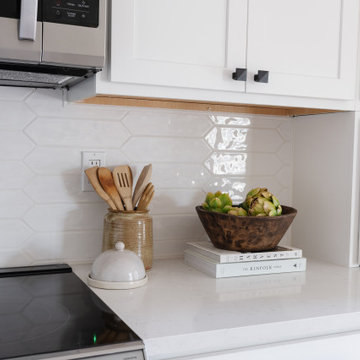
This Coastal kitchen renovation was a detail-oriented renovation, as every small detail made up the greater difference between an outdated kitchen and a Coastal-inspired gathering place. Every detail was meticulously tailored to open up the space and harness the natural light, culminating in a sanctuary of timeless elegance. With the removal of overhead cabinets, dark appliances and a cluttered backsplash, the kitchen instantly opened up, creating an airy, light-filled atmosphere. From white walls to white countertops, predominantly white features were strategically chosen to reflect and amplify the abundant natural light streaming through the expansive windows, creating a luminous and inviting environment. The backsplash, positioned horizontally to visually widen the space, creates a visual sense of expansiveness. Silver appliances contribute to a cool tone which ultimately creates a calm feeling. The accentual wood elements bring warmth and charm, seamlessly blending with the Coastal theme while adding a cozy ambiance. From the removal of clutter to the strategic use of white hues and natural materials, small details contributed to the greater whole to create a serene haven for culinary creativity and cherished gatherings to come to this kitchen.
 Lynch Landscape and Tree Service, Inc.
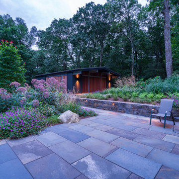
Using predominantly native plant species and bluestone patio, this mid-century modern landscape becomes intrinsically woven into its surroundings.
Large 1950s backyard patio photo in Boston
Large 1950s backyard patio photo in Boston
 TaylorPro Design and Remodeling, Inc.
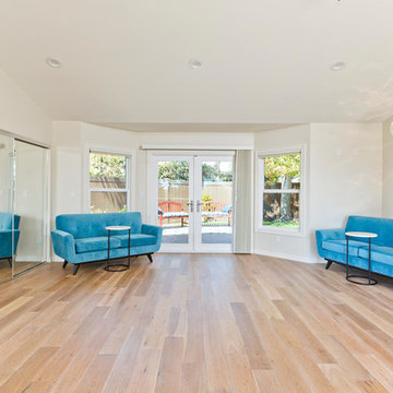
This space was created as a dance studio for this client and was part of a larger master suite addition, which overlooks beautifully landscaped gardens.
"We found Kerry at TaylorPro early on in our decision process. He was the only contractor to give us a detailed budgetary bid for are original vision of our addition. This level of detail was ultimately the decision factor for us to go with TaylorPro. Throughout the design process the communication was thorough, we knew exactly what was happening and didn’t feel like we were in the dark. Construction was well run and their attention to detail was a predominate character of Kerry and his team. Dancing is such a large part of our life and our new space is the loved by all that visit."
~ Liz & Gary O.
Photos by: Jon Upson
 Pro-Land Landscape Construction Inc.
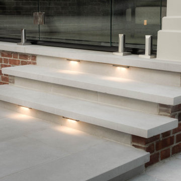
Located in prestigious Rosedale in Toronto, this beautiful custom home by Leprevo Design-Build, needed a landscape to compliment the architecture. One material was used throughout the entire property to not take away from the home. A predominantly green planting scheme highlights the right areas and breaks up the hardscape. Simple, elegant and timeless.
 Interior Design Imports
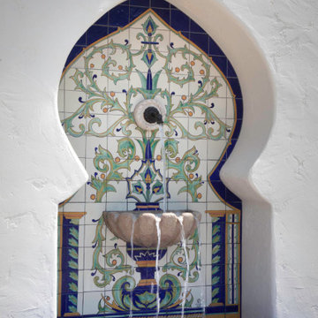
An historic Spanish Colonial residence built in 1925 being redesigned and furnished for a modern-day Southern California family was the challenge. The interiors of the main house needed the backgrounds set and then a timeless collection created for its furnishings. Lifestyle was always a consideration as well as the interiors relating to the strong architecture of the residence. Natural colors such as terra cotta, tans, blues, greens, old red and soft vintage shades were incorporated throughout. Our goal was to maintain the historic character of the residence combining design elements and materials considered classic in Southern California Spanish Colonial architecture. Natural fiber textiles, leathers and woven linens were the predominated upholstery choices. A 7000 square foot basement was added and furnished to provide a gym, Star Wars theater, game areas, spa area and a simulator for indoor golf and other sports.
Antiques were selected throughout the world, fine art from major galleries, custom reproductions fabricated in the old-world style. Collectible carpets were selected for the reclaimed hardwood flooring in all the areas. An estancia and garden over the basement were created and furnished with old world designs and materials as reclaimed woods, terra cotta and French limestone flooring.
 Bespoke Decor
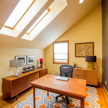
This home office has been fully redone in warm tones more in keeping with the predominant colors in the rest of the residence (Sherbet Pop & Gateway Arch, Valspar). Providing adequate storage allowed for the repurposing of a Danish modern dining table as a desk. An earth toned accent wall grounds the space and highlights the unique shape of the room.
 Michael Nash Design, Build & Homes
Starting Each Day Clean and Refreshed In This Classically-Modern, Marble Masterpiece
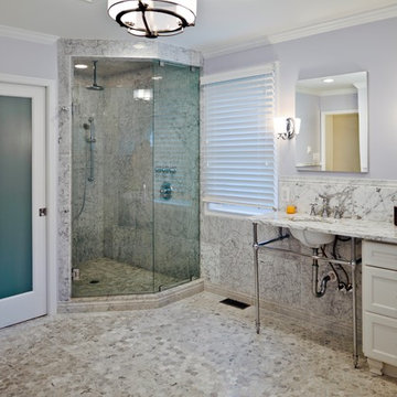
In 1985, the previous owner of the house had added an addition of which part included a 17 feet by 13 feet space off the master bedroom for both a master bath and walk-in closet. Irrespective of the dated red carpet that blanketed the entire bathroom of this 1964 colonial in Annandale, VA, the combination bathroom/closet space had its other oddities, primarily in that there was no shower. The current homeowners -- a family of five, who has been in the home for 7 years, was tired of going down the hall to use the kids’ bathroom to take a shower before work. The renovation that they have created now is a bright and luxurious space that one could bask in all day. They used this bathroom renovation opportunity to total remake the layout and function of this essential room that sets the tone for the day ahead.
Prior to the renovation, the existing bathroom oddly had two entrances, a typical one off of the master bedroom, but another straight off the upstairs hallway. As the toilet was out in the open in the previous design, ensuring that this second door was closed when company was in town was essential and a nuisance. As you entered the room, situated below the arc window, a large soaking tub that was covered on three sides with wooden steps dominated the room from the corner it projected. A relatively small 42” single bowl sink did not leave much space for his and hers toiletries, and there was no other linen closet or cabinetry for storage in the bathroom. The 8 foot by 5 foot closet with accordion doors had poorly laid out rungs not letting the storage space to be fully utilized. At over 220 square feet, the room did offer considerable space to work with, yet the existing layout, which even included a partition wall behind the vanity, felt cramped and dysfunctional.
The homeowners wished to create a classic yet modern, private, deluxe bathroom that would better integrate into their master suite and enable them to start and end each day in a luxurious way. They wanted to maintain having a soaking tub, add in a large shower, have an enclosed commode, expand to include double sinks, and add more storage for toiletries and linens. We worked with the customer to develop a creative design with extensive plumbing rework that accomplished all these needs and more.
The first order of business was to gut out all the carpet, tub, cabinetry, and non-load bearing partition walls. The new tub would be generally in the same location, but as the previous walk-in closet would be repurposed for the commode and the walk-in shower additional water lines, plumbing, and draining needed to be added; fortunately the room below is the garage, which enabled the team to frame out some bulkheads to accomplish this complex plumbing. Following the framing, including walling up the second entrance to the bathroom, adding in a pocket door for the commode, and creating the shape of the new shower, the team also laid down the wiring for one of the luxuries of this room – heated flooring. A glossy percaline boarder, and two-inch hexagon shape percaline tiles cover the entire floor, making it much easier and cleaner than the previous carpet.
Marble look tile is predominant throughout the bathroom as despite the angled frameless glass door, the entire shower is covered in 18 inch polished marble look tiles. The shower coats the user in water from either the overhead rain head, large main showerhead and/or the hand held sprayer. Over 7 feet of white Italian Statuetto marble countertop, enable the couple to have two sink bowls and plenty of room on each side. The bowls are exposed in this stainless steel console sink design which required the team to ensure that the exposed plumbing looked pristine, and painting the bottom of the porcelain bowl to match the coloring.
The white cast-iron 72-inch Cecilia claw-foot soaking tub and its chrome lion’s paws complement that other chrome and white used throughout the room. A tall, almost floor-to-ceiling linen closet finished in arctic white is nestled in the corner near the tub, enabling ample storage of towels, etc. Other cabinetry includes an 18 inch-wide vanity with decorative footing is centered between the two sinks, and a 27 inch wall mounted cabinet with shelf is above the Kohler Devonshire elongated toilet.
Billowing cloud colored grey blue paint was a great choice for this room to pick up on the veining in the marble. Mirrored medicine chests, a chandelier, wall sconces, and overhead recessed lighting also were incorporated into the design and function of the new room.
The artful combination of classic design from material choices, such as free-standing Victorian claw-foot tub along with the modern design as seen in the angled shower, frameless medicine cabinet mirrors, and frosted glass pocket door on the commode, make this bathroom quite a masterpiece.
The clients are enjoying having their private space and not having the use the kids’ bathroom anymore.
 StudioLAB
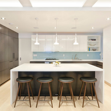
Steps from Riverside Park, the existing apartment had previously not been renovated for 30 years and was in dire need of a complete overhaul. StudioLAB was presented with the challenge of re-designing the space to fit a modern family’s lifestyle today with the flexibility to adjust as they evolve into their tomorrow. The existing formal closed kitchen and dining room were combined and opened up to allow the owners to entertain in an open living environment and allow natural light to permeate throughout different exposures of the apartment. Bathrooms were gutted, enlarged and reconfigured. Central air conditioning was added with minimal ducting as to be hidden and not seem clunky. Built-in bookshelves run the length of the perimeter walls below windows, concealing radiators and providing extra valuable storage in every room. A neutral color palette, minimalist details, and refined materials create a warm, modern atmosphere. Light brown oak veneered archways as well as LED cove ceilings are used to separate programmatic spaces visually without the use of physical partitions. A charcoal stained cube built-in was designed with in the foyer to create deep storage while continuing into the kitchen to hide the built-in refrigerator and pantry visually connecting the two spaces. The family’s two children share one large bedroom in order to create a playroom in the other which can also serves as a guest room when needed. The master bedroom features a full height grey stained ash veneered wall unit that serves as the predominant clothes storage. A panel housing the TV slides to reveal more clothes storage behind. To utilize the exiting formal maid’s room behind the kitchen, a small study and powder room were created that house laundry machines as well.
 Kelly and Abramson Architecture
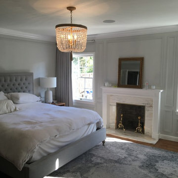
This is the original master bedroom with new paint, fixtures, and furniture. The post WWII homes are mixed styles, which makes me feel a traumatic confusion. The 1920s homes are cohesive in their endearing and unpretentious copying of vernacular European homes.
This home is predominantly Monterey Colonial but has no 2nd floor porch. The lights are boldly spanish, this room is french with its paneling.
29