
Search results for "Predominant" in Home Design Ideas
 Little Miracles Designs - Toronto
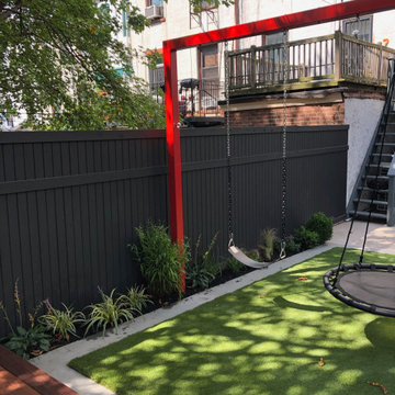
A modest size shady backyard was redesigned to accommodate the needs of a young family with two kids.The garden was to be predominantly used a playground. A small deck was installed around the Chestnut tree to provide a sitting space that was a proper sale for the younger members of the family.
 TaylorPro Design and Remodeling, Inc.
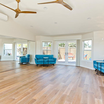
This space was created as a dance studio for this client and was part of a larger master suite addition, which overlooks beautifully landscaped gardens.
"We found Kerry at TaylorPro early on in our decision process. He was the only contractor to give us a detailed budgetary bid for are original vision of our addition. This level of detail was ultimately the decision factor for us to go with TaylorPro. Throughout the design process the communication was thorough, we knew exactly what was happening and didn’t feel like we were in the dark. Construction was well run and their attention to detail was a predominate character of Kerry and his team. Dancing is such a large part of our life and our new space is the loved by all that visit."
~ Liz & Gary O.
Photos by: Jon Upson
 Proline Range Hoods
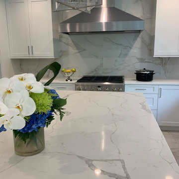
This customer loves their marble – and we love it too! Marble floors, marble countertops, and a marble backsplash all convey the elegance of this kitchen. The ProV WC is a strong focal point; it complements the predominately white and gray kitchen well.
The ProV WC is one of our most customizable wall range hoods. It comes with a chimney, too! As an added bonus, the chimney is telescoping, meaning it can retract and expand to fit in your kitchen. The control panel is easily accessible under the hood, and it features a Rheostat knob to adjust your blower power. There's not set speeds on this model; just turn the knob to find the perfect speed depending on what you are cooking.
The ProV WC also features a unique look with slanted stainless steel baffle filters, as the baffle filters in most of our models sit flat under the hood. These filters are dishwasher safe to keep you less focused on cleaning and more focused on cooking in the kitchen.
Finally, the ProV WC features two different blower options: a 1200 CFM local blower or a 1300 CFM inline blower. It's the only model that gives you the option to install your blower in the ductwork, and not inside the range hood itself!
For more information on our ProV WC models, click on the link below.
https://www.prolinerangehoods.com/catalogsearch/result/?q=Pro%20V%20WC
Find the right local pro for your project
 Sweet Smiling Landscape Design
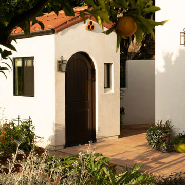
Located on a steep hill above downtown Ventura, this modern Spanish house features panoramic views of town with the ocean and Channel Islands beyond. While the views are amazing from a large front deck, the steep slope presented some constraints on the landscape design.
Although the property is about a third-of-an-acre, the only useable and open garden space is a small (about 500 square feet) area to the West of the house. The house sits at the back of the property, and another steep hill on the neighboring property behind is held back by a tall retaining wall, leaving just enough room for a narrow, hardscaped patio in the back yard.
Bright plantings along the back of the property delineate the home from the neighboring property, and we chose plantings to help stabilize the soil and further develop the Spanish garden look while creating a lush, inviting feel. Additionally, we added 52 pieces of pottery to soften and add interest to the back garden and patio areas. Succulents, herbs, and California natives fill the pottery along with bright, sweet-smelling, tropical-looking, and climate-appropriate plants.
Slope stabilization was paramount for the front hill. Beyond that, finding plants that would thrive on the steep slope was the next obstacle. Finally, the aesthetics could be addressed, and we worked to find plants that meshed with the architecture—blending plants with white and orange to play off the red-tiled roofs and white-plastered walls that are emblematic of the Spanish style of this house as well as the predominate style of the neighborhood.
The flattish area to the West was designed with the idea of creating a contemporary take on the parterre garden. Reminiscent of Mediterranean gardens, this vegetable and herb garden substitutes formal hedges with formal Corten steel planters to honor the modern Spanish architecture of the house. The citrus, herbs, and vegetables serve the foodie clients well.
 Interior Design Imports
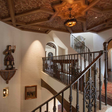
An historic Spanish Colonial residence built in 1925 being redesigned and furnished for a modern-day Southern California family was the challenge. The interiors of the main house needed the backgrounds set and then a timeless collection created for its furnishings. Lifestyle was always a consideration as well as the interiors relating to the strong architecture of the residence. Natural colors such as terra cotta, tans, blues, greens, old red and soft vintage shades were incorporated throughout. Our goal was to maintain the historic character of the residence combining design elements and materials considered classic in Southern California Spanish Colonial architecture. Natural fiber textiles, leathers and woven linens were the predominated upholstery choices. A 7000 square foot basement was added and furnished to provide a gym, Star Wars theater, game areas, spa area and a simulator for indoor golf and other sports.
Antiques were selected throughout the world, fine art from major galleries, custom reproductions fabricated in the old-world style. Collectible carpets were selected for the reclaimed hardwood flooring in all the areas. An estancia and garden over the basement were created and furnished with old world designs and materials as reclaimed woods, terra cotta and French limestone flooring.
 The First Ferry
The First Ferry has created its own Chinese Garden of Eden in Springs, Dubai. Wong Villa - a peaceful, earthy setting is highlighted with four water pools surrounding the villa gazebo to create a sense of earthy homeliness.
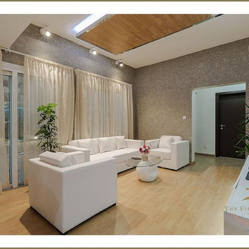
The landscaping is enhanced with simple pink flowers that add a color contrast to the predominately white theme layout. Bamboo plants by the walls, complement the beige exteriors and are also deeply linked with Chinese philosophy and culture.
With clean white lines and lighting strategically placed to bestow a resplendent hue, the space has an atmospheric sense of peace and purity. The white contemporary furniture set occupy the living room space.
A classical chandelier besets the dining area with a divine fondness and simultaneously keeps it close to Mother Nature. The television set is installed over an oak wood platform that exhibits a refined simplistic design.
The master bedroom is an artistic spectacle that portrays a simplistic form of luxury with its signature bed and handpicked selection of covers and sheets. It follows a sublunary theme with whites and brown textured surrounding. The wall behind the bed and the wall with the TV installation is hand painted to create a wooden pattern. Both these walls are enhanced with white back-lighting. Bedside lamps hang from the ceiling, resembling a budding flower with a seraphic radiance.
Conceptualized and designed by The First Ferry
www.thefirstferry.com
 Pro-Land Landscape Construction Inc.
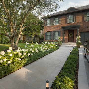
Located in prestigious Rosedale in Toronto, this beautiful custom home by Leprevo Design-Build, needed a landscape to compliment the architecture. One material was used throughout the entire property to not take away from the home. A predominantly green planting scheme highlights the right areas and breaks up the hardscape. Simple, elegant and timeless.
 JUMA architects
Optiek Herpol wanted to move to a better, more central location with plenty of parking space. A property that complied with these conditions was found on the Market in Deinze, and JUMA architects were subsequently asked to design a new interior for the store.
The property in question is very deep and narrow with little natural light entry. JUMA set to work despite these constraints in an attempt to transform these challenges into qualities.
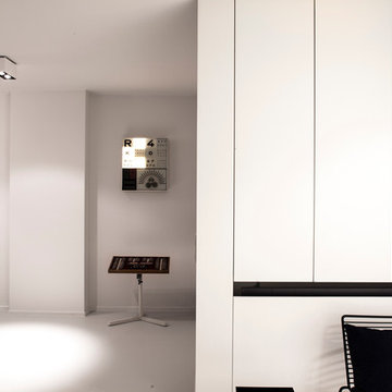
The architects positioned the sales counter right behind the shop window, so as to make optimum use of the available natural light. This also makes store activities visible from the outside, adding an extra element of attraction. At the narrowest section of the store, a large wall mirror was put in to visually double the space. The wall onto which the eyeglasses are displayed is located opposite the mirror and is literally the eye catcher in the store. A wooden lattice makes for an interesting play of diagonal lines behind which the glasses are presented. This unique concept animates the entire store without detracting from the fact that the glasses should remain the main focal point in the store. The workshop is located in the back, separated from the store by a wall in smoked grey glass. In this way, the optician can keep an eye on the store at all times.
The colour palette is predominantly white, to keep the interior as light as possible. As a counterpoint, warm wood accents are added. The chairs at the counter are upholstered in a colour that harmonizes perfectly with the wood.
Pictures © Thomas De Bruyne
![[Bracketed Space] House](https://st.hzcdn.com/fimgs/d871b0d30818f269_3758-w360-h360-b0-p0--.jpg)
 Matt Fajkus Architecture
The site descends from the street and is privileged with dynamic natural views toward a creek below and beyond. To incorporate the existing landscape into the daily life of the residents, the house steps down to the natural topography. A continuous and jogging retaining wall from outside to inside embeds the structure below natural grade at the front with flush transitions at its rear facade. All indoor spaces open up to a central courtyard which terraces down to the tree canopy, creating a readily visible and occupiable transitional space between man-made and nature.
The courtyard scheme is simplified by two wings representing common and private zones - connected by a glass dining “bridge." This transparent volume also visually connects the front yard to the courtyard, clearing for the prospect view, while maintaining a subdued street presence. The staircase acts as a vertical “knuckle,” mediating shifting wing angles while contrasting the predominant horizontality of the house.
Crips materiality and detailing, deep roof overhangs, and the one-and-half story wall at the rear further enhance the connection between outdoors and indoors, providing nuanced natural lighting throughout and a meaningful framed procession through the property.
Photography
Charles Davis Smith
 Julie Moir Messervy Design Studio (JMMDS)
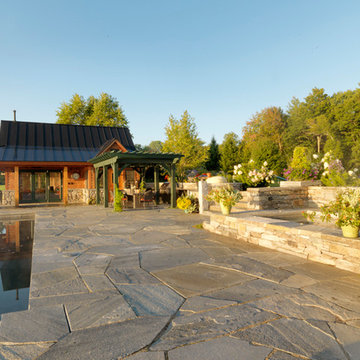
This pool terrace in southern Vermont is nestled into a hillside below the main house with a breathtaking view of mountains receding into the distance. The terrace unites the pool, hot tub, pool house, outdoor kitchen and dining areas, firepit, and abundant planting beds. To complement the scale of the view and the house, everything we created for the pool area is also appropriately overscaled.
A massive Sugarledge slab of stone sits beneath the large black granite dining table, while another slab abuts the dramatic fire pit.
Local materials were used wherever possible: Chester stone for the terrace, local granite for the firepit, Vermont white cedars for the poolhouse, and predominantly native plants with some specialty perennials and annuals.
Photo: Susan Teare.
 Showhomes Portland
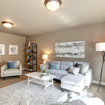
A family room is essentially a less formal living room wherein the family can come and gather to relax and hang out. For this family room, with the walls and ceiling being predominantly beige, adding cool-toned elements into the room such as the couches and throw pillows offer visual contrast to the space that provides a relaxing ambiance. Blue, after all, is one of the most visually relaxing colors.
 Cutuli Homes
Built in 2023 by Cutuli Homes, this custom detached accessory dwelling unit was designed as a true mother-in-law home—a private, beautifully finished residence that allows three generations of one family to live close together while maintaining their own individual spaces.
The DADU was built as a companion to the homeowners' main residence, which Cutuli Homes had extensively remodeled and expanded two years earlier. Rather than treating the new structure as an afterthought, the goal was to create a home that felt architecturally connected to the existing property. Its traditional exterior, white siding, steeply pitched roof, generous windows and carefully proportioned trim give the small residence the character of an established home.
The project was created for the homeowners' mother, who downsized from her large lakefront home in the Midwest to move closer to her family and young grandchild. The result captures one of the greatest advantages of multigenerational living: family and shared community just steps away, balanced with the independence, privacy and comfort of a home of her own.
Inside, every inch was carefully considered. The compact footprint feels remarkably open thanks to a vaulted, white-paneled ceiling, abundant natural light, tall windows and an open vertical design that draws the eye upward. A loft level expands the usable living space without sacrificing the airy feeling of the main floor.
Traditional white Shaker-style cabinetry provides extensive built-in storage throughout the home and gives the interior a clean, timeless architectural character. In the kitchen, cabinetry extends upward to take advantage of the available height, while warm neutral countertops and a textured herringbone-pattern backsplash introduce subtle depth and contrast. Stainless-steel appliances are thoughtfully incorporated into the compact layout, creating a highly functional kitchen without overwhelming the living space.
One of the home's most charming features is the intimate living area tucked beneath custom built-in cabinetry. A built-in upholstered window-seat-style sofa with drawers below transforms what could have been unused space into a comfortable place to read, relax or visit. Across from it, a contemporary fireplace is integrated into a compact feature wall, with a wood display ledge above providing space for artwork, plants and personal collections.
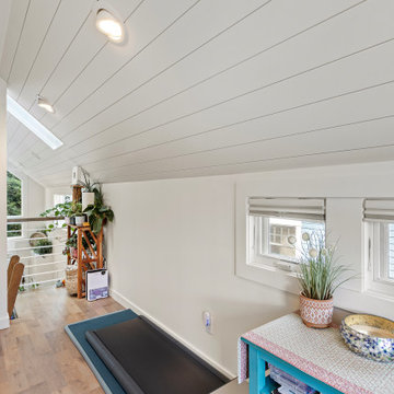
Warm wood accents soften the predominantly white interior. Natural wood ledges, shelving, flooring and the loft ladder bring warmth and texture to the rooms, while greenery and personal furnishings give the home the comfortable character of a full-size residence rather than a conventional accessory dwelling unit.
The private sleeping area demonstrates the same emphasis on intelligent space planning. Built-in cabinetry surrounds the bed and continues overhead, providing substantial storage without requiring bulky freestanding furniture. A softly textured wall treatment, warm wood shelving and abundant natural light make the compact bedroom feel inviting and finished.
Above, the loft takes advantage of the dramatic roofline with a white tongue-and-groove style paneled ceiling extending from wall to wall. Built-in storage is incorporated beneath the sloped portions of the ceiling, turning otherwise difficult spaces into useful cabinetry while preserving an open central area for a desk, music, hobbies or additional flexible living space.
Even the exterior reflects the home's attention to detail. Large windows bring daylight deep into the interior, while the private patio extends the living space outdoors. Traditional siding and trim allow the DADU to complement the architecture of the main residence while still having an identity of its own.
At every turn, this project demonstrates that downsizing does not have to mean compromising on craftsmanship, beauty, storage or individuality. Through custom cabinetry, creative built-ins, vertical space planning and carefully considered architectural details, Cutuli Homes transformed a modest footprint into an elegant and highly personalized residence.
More than simply a DADU, this is a thoughtfully designed multigenerational home—close enough for grandparents, parents and grandchildren to share everyday life, while giving everyone the privacy and independence of having a place of their own
 Interior Design Imports
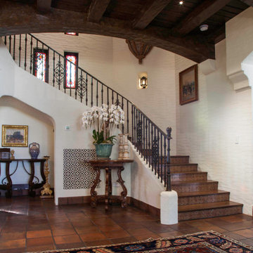
An historic Spanish Colonial residence built in 1925 being redesigned and furnished for a modern-day Southern California family was the challenge. The interiors of the main house needed the backgrounds set and then a timeless collection created for its furnishings. Lifestyle was always a consideration as well as the interiors relating to the strong architecture of the residence. Natural colors such as terra cotta, tans, blues, greens, old red and soft vintage shades were incorporated throughout. Our goal was to maintain the historic character of the residence combining design elements and materials considered classic in Southern California Spanish Colonial architecture. Natural fiber textiles, leathers and woven linens were the predominated upholstery choices. A 7000 square foot basement was added and furnished to provide a gym, Star Wars theater, game areas, spa area and a simulator for indoor golf and other sports.
Antiques were selected throughout the world, fine art from major galleries, custom reproductions fabricated in the old-world style. Collectible carpets were selected for the reclaimed hardwood flooring in all the areas. An estancia and garden over the basement were created and furnished with old world designs and materials as reclaimed woods, terra cotta and French limestone flooring.
 Showhomes Portland
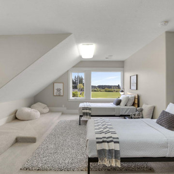
This shared bedroom has two twin-sized beds with blue sheets that compliment the blue carpet placed in between the two beds. With the colors of the room predominantly blue and cool-toned, bringing in something warm-toned like the headboards of the bed brings in a contrasting element into the room that - to some extent - brightens and brings warmth to the eye.
 Interior Design Imports
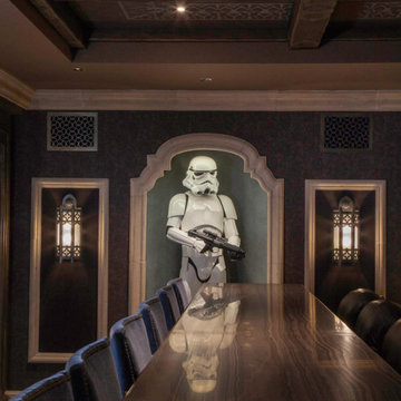
An historic Spanish Colonial residence built in 1925 being redesigned and furnished for a modern-day Southern California family was the challenge. The interiors of the main house needed the backgrounds set and then a timeless collection created for its furnishings. Lifestyle was always a consideration as well as the interiors relating to the strong architecture of the residence. Natural colors such as terra cotta, tans, blues, greens, old red and soft vintage shades were incorporated throughout. Our goal was to maintain the historic character of the residence combining design elements and materials considered classic in Southern California Spanish Colonial architecture. Natural fiber textiles, leathers and woven linens were the predominated upholstery choices. A 7000 square foot basement was added and furnished to provide a gym, Star Wars theater, game areas, spa area and a simulator for indoor golf and other sports.
Antiques were selected throughout the world, fine art from major galleries, custom reproductions fabricated in the old-world style. Collectible carpets were selected for the reclaimed hardwood flooring in all the areas. An estancia and garden over the basement were created and furnished with old world designs and materials as reclaimed woods, terra cotta and French limestone flooring.
 Revival by Design
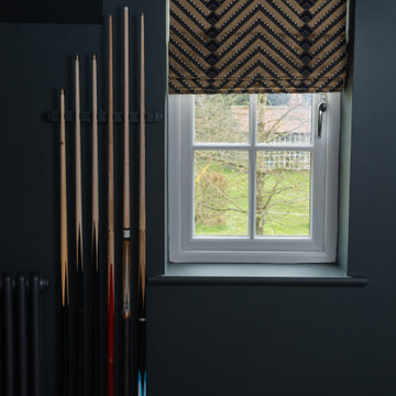
Above a newly constructed triple garage, we created a multifunctional space for a family that likes to entertain, but also spend time together watching movies, sports and playing pool.
Having worked with our clients before on a previous project, they gave us free rein to create something they couldn’t have thought of themselves. We planned the space to feel as open as possible, whilst still having individual areas with their own identity and purpose.
As this space was going to be predominantly used for entertaining in the evening or for movie watching, we made the room dark and enveloping using Farrow and Ball Studio Green in dead flat finish, wonderful for absorbing light. We then set about creating a lighting plan that offers multiple options for both ambience and practicality, so no matter what the occasion there was a lighting setting to suit.
The bar, banquette seat and sofa were all bespoke, specifically designed for this space, which allowed us to have the exact size and cover we wanted. We also designed a restroom and shower room, so that in the future should this space become a guest suite, it already has everything you need.
Given that this space was completed just before Christmas, we feel sure it would have been thoroughly enjoyed for entertaining.
 House of Meraki
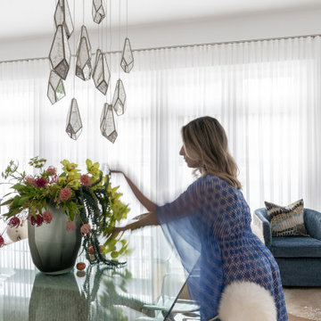
Our vision for this new-build condo was to create a captivating space that celebrates our client’s individuality, bringing together a diverse mix of styles, textures, and elements while maintaining a cohesive and contemporary feel. It combines the fresh, clean look of white as the predominant color with eclectic accents that add our client’s personality and character to the space. There are several “areas'' within this multi-functional space. A large sectional in a greige velvet serves as the centerpiece of the seating area, grounded by pops of blue and pink in the custom Morrocan rug. The cobalt blue theme is carried throughout, seen in the accents, art and even the ombre glass console table of the entry. A set of two blue swivel chairs by the windows, are the perfect setting for a glass of wine in the early evening as the light glistens in through the custom white sheers. The airy dining table is made of glass and carved marble and surrounded by chrome sculptural dining chairs. Above, the multi-faceted antique mirror multi-pendant chandelier drips down from the high ceiling. Our client’s antique carved wood chairs, reupholstered in a linen zebra, flank the selenite and brass bar cabinet. In the corner by the fireplace, a lucite and cowhide desk is paired with a brightly colored vintage chair. On the right of the fireplace, a leather swing, perfectly suited for reading. Lastly, the white kitchen with shimmering blue quartzite countertops brings the design in full circle.
 Hardwood Floor Depot
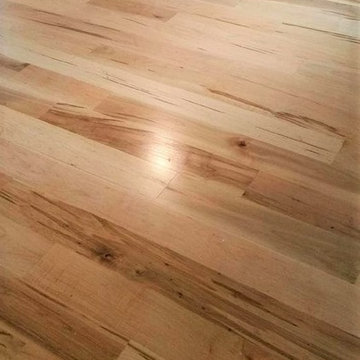
Our Hard Maple #1 Common Grade (2nd or Better Grade) admits tight, sound knots, provided they do not occur on edges or ends of strips. More color variations provided they do not occur in combination with predominately dark heartwood and sapwood. #1 Common Grade Maple will have a white appearance with some small knots or mineral streaks sporadic throughout the hardwood flooring. Our unfinished solid hardwood flooring is milled by MFMA (Maple Flooring Manufactures Association) Standards. The flooring will have a four-sided tongue and groove for ease of installation.
 HELT
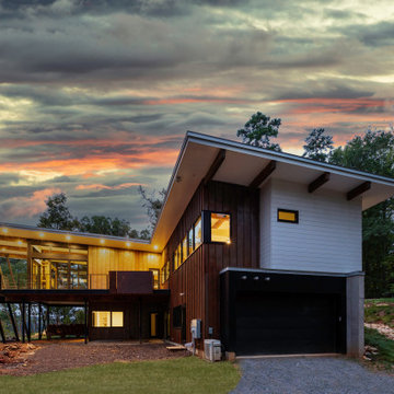
HELTThis lakefront diamond in the rough lot was waiting to be discovered by someone with a modern naturalistic vision and passion. Maintaining an eco-friendly, and sustainable build was at the top of the client priority list. Designed and situated to benefit from passive and active solar as well as through breezes from the lake, this indoor/outdoor living space truly establishes a symbiotic relationship with its natural surroundings. The pie-shaped lot provided significant challenges with a street width of 50ft, a steep shoreline buffer of 50ft, as well as a powerline easement reducing the buildable area. The client desired a smaller home of approximately 2500sf that juxtaposed modern lines with the free form of the natural setting. The 250ft of lakefront afforded 180-degree views which guided the design to maximize this vantage point while supporting the adjacent environment through preservation of heritage trees. Prior to construction the shoreline buffer had been rewilded with wildflowers, perennials, utilization of clover and meadow grasses to support healthy animal and insect re-population. The inclusion of solar panels as well as hydroponic heated floors and wood stove supported the owner’s desire to be self-sufficient. Core ten steel was selected as the predominant material to allow it to “rust” as it weathers thus blending into the natural environment.
 Sweet Smiling Landscape Design
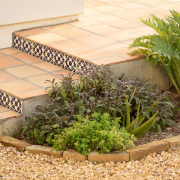
Located on a steep hill above downtown Ventura, this modern Spanish house features panoramic views of town with the ocean and Channel Islands beyond. While the views are amazing from a large front deck, the steep slope presented some constraints on the landscape design.
Although the property is about a third-of-an-acre, the only useable and open garden space is a small (about 500 square feet) area to the West of the house. The house sits at the back of the property, and another steep hill on the neighboring property behind is held back by a tall retaining wall, leaving just enough room for a narrow, hardscaped patio in the back yard.
Bright plantings along the back of the property delineate the home from the neighboring property, and we chose plantings to help stabilize the soil and further develop the Spanish garden look while creating a lush, inviting feel. Additionally, we added 52 pieces of pottery to soften and add interest to the back garden and patio areas. Succulents, herbs, and California natives fill the pottery along with bright, sweet-smelling, tropical-looking, and climate-appropriate plants.
Slope stabilization was paramount for the front hill. Beyond that, finding plants that would thrive on the steep slope was the next obstacle. Finally, the aesthetics could be addressed, and we worked to find plants that meshed with the architecture—blending plants with white and orange to play off the red-tiled roofs and white-plastered walls that are emblematic of the Spanish style of this house as well as the predominate style of the neighborhood.
The flattish area to the West was designed with the idea of creating a contemporary take on the parterre garden. Reminiscent of Mediterranean gardens, this vegetable and herb garden substitutes formal hedges with formal Corten steel planters to honor the modern Spanish architecture of the house. The citrus, herbs, and vegetables serve the foodie clients well.
27