
Search results for "Predominant" in Home Design Ideas
 Woodling Landscape Design
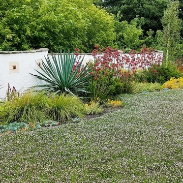
This gorgeous, walkable grass alternative is literally watered ONCE A MONTH folks!!! In the summertime! This is true water conservation!
Large, historic home from the 1930's overlooking downtown Santa Cruz. My clients are self-described "plantaholics" and tend to buy many plants, only to have them die. They have an extensive gardening area and low water budget. Our main goal was to make the overall design cohesive between various areas of the garden while utilizing interesting and unusual plant selections - a very fun project for me! We removed over 3,000 square feet of traditional grass and replaced it with several lawn alternatives. The first is a walkable groundcover that uses a fraction of the water of regular grass (and can be seen here in several seasons, one of which has tiny flowers); The second is a California native grass that grows long (or can be kept short) and can tolerate some shade. Both of these are excellent choices for clients with children or dogs who want a green patch without using excessive water. My clients love plants from Australia and South Africa so plants from the Proteacea and other Southern Hemisphere beauties are used predominantly throughout the project. Clean, flowing water is so important for wildlife and the beautiful stone fountain is a constant gathering spot for birds and other animals. My clients are beyond thrilled with their gorgeous, nature-filled garden and ever-expanding plant knowledge.
 BARRETT STUDIO architects
Anthony Rich Photography
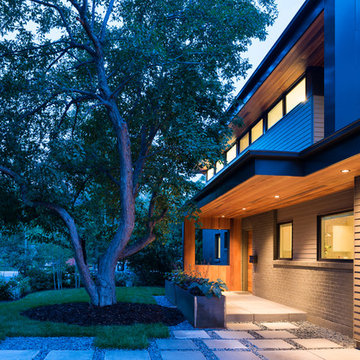
Inspiration for a mid-sized contemporary beige two-story metal exterior home remodel in Denver
Inspiration for a mid-sized contemporary beige two-story metal exterior home remodel in Denver
 DiGiacomo Homes & Renovation
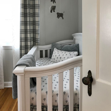
This charming nursery is dotted with elephants and as cozy as can be. Past clients are expecting their first baby this month and invited us to remodel an unused guest room into a nursery. It's been a while since we designed for a baby (our own daughter is 19 and off to college) so this request came as an absolute delight! The mom-to-be asked for a predominantly gray-white palette. We introduced a touch of blue for contrast and added a bit of texture using sheepskin rugs and embroidery.
Photos: Paul Markert, Markert Photo, Inc.
Find the right local pro for your project
 Amato Architecture
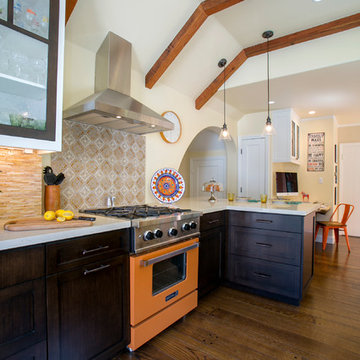
Another distinctive characteristic of Dixon’s style was the use of arches – in ceilings, doorways, and nooks. We opened a hallway off the kitchen to connect an existing powder room and laundry room utilizing a sweeping, asymmetrical arch. The organic curve leading to and from the kitchen softens the predominantly angular space and unifies Dixon’s original vision.
Photography: Ramona d'Viola - ilumus photography

 Costa del Sol Interiors | Interior Designer
This interior design project involved a comprehensive renovation that completely transformed the appearance and features of an apartment located on the Costa del Sol, Spain. The goal was to modernize the space, enhance functionality, and create a more sophisticated and welcoming atmosphere, aligned with a Nordic style that emphasizes warmth and natural elements.
### Space Redistribution:
Originally, the apartment had only one bedroom and one bathroom. The first phase of the renovation involved redistributing the space to add a second bathroom, with one of them becoming an en-suite connected directly to the master bedroom. This addition significantly improved comfort and privacy, allowing each bedroom to have its own bathroom. Additionally, a new laundry area was created, providing a dedicated space for the washing machine, water heater, and cleaning supplies, optimizing the home's functionality without compromising aesthetics.
### Flooring and Visual Continuity:
The old dark, square-patterned flooring was replaced with porcelain tiles that mimic the texture and tone of wood. This new material was extended from the interior to the terrace, creating a sense of continuity and spaciousness. This change not only modernized the apartment's appearance but also reinforced the visual harmony between indoor and outdoor spaces, inviting residents to enjoy the natural light and views offered by the coastal location.
### Bathroom Renovation:
With the addition of a second bathroom, both spaces were completely renovated. The old tiles and bathtub were removed in favor of a more modern and functional design. Light-colored ceramics reflecting the Nordic style were installed, along with contemporary fixtures and clean lines. The en-suite bathroom was designed to offer an intimate and luxurious space, while the second bathroom, though equally modern, provides comfort and accessibility for the rest of the home.
### Style and Décor:
The predominant Nordic style was reflected in the choice of materials and colors. The walls were adorned with wooden slats, a detail that adds texture and warmth to the space, while the décor focused on natural elements like wood, linen, and plant fibers, creating a serene and relaxing atmosphere. Neutral tones and simple lines prevail, achieving a perfect balance between sophistication and comfort.
### Final Result:
The result is an apartment that not only looks more spacious and modern but also exudes a sense of tranquility and comfort. The renovation has transformed the space into a home that invites you to enjoy sunny days on the Costa del Sol, with a terrace seamlessly integrated with the interior and living spaces that reflect a sophisticated, functional, and inviting lifestyle.
Este proyecto de interiorismo consistió en una reforma integral que transformó por completo el aspecto y las características de un apartamento ubicado en la Costa del Sol, España. El objetivo era modernizar el espacio, mejorar la funcionalidad y crear un ambiente más sofisticado y acogedor, alineado con un estilo nórdico que resalta la calidez y la naturalidad.
### Redistribución del Espacio:
Inicialmente, el apartamento contaba con una sola habitación y un solo baño. La primera fase de la reforma implicó una redistribución del espacio, añadiendo un segundo baño, de los cuales uno se convirtió en suite, conectado directamente con la habitación principal. Esta ampliación mejoró significativamente la comodidad y privacidad, permitiendo que cada habitación tuviera su propio baño. Además, se creó una nueva zona de lavadero, un espacio dedicado para la lavadora, el termotanque y los elementos de limpieza, optimizando la funcionalidad del hogar sin sacrificar la estética.
### Suelos y Continuidad Visual:
Se reemplazaron los antiguos suelos de color oscuro, de apariencia cuadrada, por un porcelánico que imita la textura y el tono de la madera. Este nuevo material se extendió desde el interior hasta la terraza, creando una sensación de continuidad y amplitud. Este cambio no solo modernizó el aspecto del apartamento, sino que también reforzó la armonía visual entre los espacios interiores y exteriores, invitando a disfrutar de la luz natural y las vistas que ofrece la ubicación costera.
### Renovación de Baños:
Con la adición de un segundo baño, ambos espacios fueron completamente renovados. Se eliminaron los viejos azulejos y la bañera en favor de un diseño más moderno y funcional. Se instalaron cerámicas de tonos claros que reflejan el estilo nórdico, junto con elementos contemporáneos y líneas limpias. El baño en suite, en particular, fue diseñado para ofrecer un espacio íntimo y lujoso, mientras que el segundo baño, aunque igualmente moderno, ofrece comodidad y accesibilidad para el resto de la casa.
### Estilo y Decoración:
El estilo nórdico predominante se reflejó en la elección de materiales y colores. Las paredes fueron adornadas con palillería, un detalle que aporta textura y calidez al espacio, mientras que la decoración se basó en elementos naturales como madera, lino y fibras vegetales, creando una atmósfera serena y relajante. Los tonos neutros y las líneas simples predominan, logrando un equilibrio perfecto entre sofisticación y comodidad.
### Resultado Final:
El resultado es un apartamento que no solo se ve más amplio y moderno, sino que también transmite una sensación de tranquilidad y confort. La reforma ha transformado el espacio en un hogar que invita a disfrutar de los días soleados en la Costa del Sol, con una terraza que se integra perfectamente con el interior, y unos ambientes interiores que reflejan un estilo de vida sofisticado, funcional y acogedor.
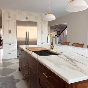
 Cabinet Joint
Classic diamond checkered tile floors underlay this breathtaking walnut kitchen. Intricate details of this space correspond to craft a profoundly elegant style - warm bronze hardware highlights the richness of the dark walnut cabinetry, custom island leg posts, matching marbled countertops and backsplash, and base molding details. A walk-in pantry is connected via a lovely arch and open shelving and an accent wall of full-height white cabinets creates a gentle contrast to the kitchen's lovely browns and predominantly base cabinets.
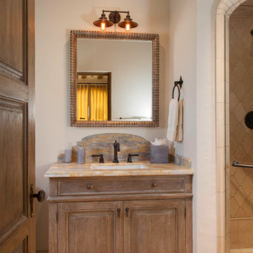
 Interior Design Imports
An historic Spanish Colonial residence built in 1925 being redesigned and furnished for a modern-day Southern California family was the challenge. The interiors of the main house needed the backgrounds set and then a timeless collection created for its furnishings. Lifestyle was always a consideration as well as the interiors relating to the strong architecture of the residence. Natural colors such as terra cotta, tans, blues, greens, old red and soft vintage shades were incorporated throughout. Our goal was to maintain the historic character of the residence combining design elements and materials considered classic in Southern California Spanish Colonial architecture. Natural fiber textiles, leathers and woven linens were the predominated upholstery choices. A 7000 square foot basement was added and furnished to provide a gym, Star Wars theater, game areas, spa area and a simulator for indoor golf and other sports.
Antiques were selected throughout the world, fine art from major galleries, custom reproductions fabricated in the old-world style. Collectible carpets were selected for the reclaimed hardwood flooring in all the areas. An estancia and garden over the basement were created and furnished with old world designs and materials as reclaimed woods, terra cotta and French limestone flooring.
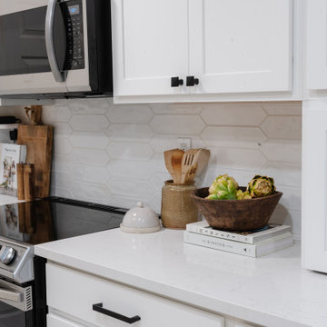
 Dwellify
This Coastal kitchen renovation was a detail-oriented renovation, as every small detail made up the greater difference between an outdated kitchen and a Coastal-inspired gathering place. Every detail was meticulously tailored to open up the space and harness the natural light, culminating in a sanctuary of timeless elegance. With the removal of overhead cabinets, dark appliances and a cluttered backsplash, the kitchen instantly opened up, creating an airy, light-filled atmosphere. From white walls to white countertops, predominantly white features were strategically chosen to reflect and amplify the abundant natural light streaming through the expansive windows, creating a luminous and inviting environment. The backsplash, positioned horizontally to visually widen the space, creates a visual sense of expansiveness. Silver appliances contribute to a cool tone which ultimately creates a calm feeling. The accentual wood elements bring warmth and charm, seamlessly blending with the Coastal theme while adding a cozy ambiance. From the removal of clutter to the strategic use of white hues and natural materials, small details contributed to the greater whole to create a serene haven for culinary creativity and cherished gatherings to come to this kitchen.
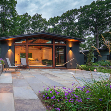
 Lynch Landscape and Tree Service, Inc.
Using predominantly native plant species and bluestone, this mid-century modern landscape becomes intrinsically woven into its surroundings.
Patio - large mid-century modern backyard patio idea in Boston
Patio - large mid-century modern backyard patio idea in Boston
 Amato Architecture
Another distinctive characteristic of Dixon’s style was the use of arches – in ceilings, doorways, and nooks. We opened a hallway off the kitchen to connect an existing powder room and laundry room utilizing a sweeping, asymmetrical arch. The organic curve leading to and from the kitchen softens the predominantly angular space and unifies Dixon’s original vision.
Photography: Ramona d'Viola - ilumus photography
 Dexign Matter Studio
We are Dexign Matter, an award-winning studio sought after for crafting multi-layered interiors that we expertly curated to fulfill individual design needs.
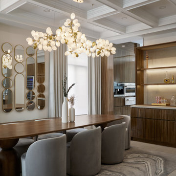
Design Director Zoe Lee’s passion for customization is evident in this city residence where she melds the elevated experience of luxury hotels with a soft and inviting atmosphere that feels welcoming. Lee’s panache for artful contrasts pairs the richness of strong materials, such as oak and porcelain, with the sophistication of contemporary silhouettes. “The goal was to create a sense of indulgence and comfort, making every moment spent in the homea truly memorable one,” says Lee.
By enlivening a once-predominantly white colour scheme with muted hues and tactile textures, Lee was able to impart a characterful countenance that still feels comfortable. She relied on subtle details to ensure this is a residence infused with softness. “The carefully placed and concealed LED light strips throughout create a gentle and ambient illumination,” says Lee.
“They conjure a warm ambiance, while adding a touch of modernity.” Further finishes include a Shaker feature wall in the living room. It extends seamlessly to the room’s double-height ceiling, adding an element of continuity and establishing a connection with the primary ensuite’s wood panelling. “This integration of design elements creates a cohesive and visually appealing atmosphere,” Lee says.
The ensuite’s dramatically veined marble-look is carried from the walls to the countertop and even the cabinet doors. “This consistent finish serves as another unifying element, transforming the individual components into a
captivating feature wall. It adds an elegant touch to the overall aesthetic of the space.”
Pops of black hardware throughout channel that elegance and feel welcoming. Lee says, “The furnishings’ unique characteristics and visual appeal contribute to a sense of continuous luxury – it is now a home that is both bespoke and wonderfully beckoning.”
 Sunny Interior Design
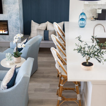
This charming pied-à-terre underwent a stunning transformation featuring a striking fireplace wall, eye-catching lighting, and coastal elements. The large-scale blue porcelain tiles mimic the elegance of marble. We incorporated distinctive built-in bench nooks on either side of the fireplace, adorned with cozy pillows that soften the light gray porcelain tile. The light gray tiles extend to the front of the fireplace, adding an intriguing detail without occupying too much space in this compact area. To enhance the ambiance, we introduced texture through wallpaper and a neutral checked rug that complements the coastal counter stools along the peninsula. The unique white coastal lighting, used in the sconces and dining room fixture, beautifully contrasts with the dark blue wallpaper. The warm glow from the sconces, combined with the flickering fireplace, creates a romantic nighttime atmosphere. The dark blue pendant light above the kitchen peninsula ties in seamlessly with the wallpaper, delivering a much-needed splash of color to this predominantly white kitchen.
 Axis Mundi Design
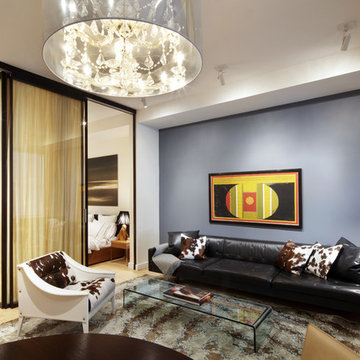
Good design must reflect the personality of the client. So when siblings purchased studios in Downtown by Philippe Starck, one of the first buildings to herald the revitalization of Manhattan’s Financial District, the aim was to create environments that were truly bespoke. The brother’s tastes jibed synchronously with the insouciant idea of France’s most popular prankster converting a building that once housed the buttoned-up offices of JP Morgan Chase. His collection of Takashi Murakami works, the gallery-like centerpiece of the main area, announces his boldness and flair up front, as do furnishings by Droog, Moooi and, of course Starck, as well as hide rugs and upholstery, and a predominantly red palette. His sister was after something soothing and discreet. So Axis Mundi responded with a neutrals and used glass to carve out a bedroom surrounded by drapes that transform it into a golden cocoon. Hide (albeit less flamboyantly applied) evokes a familial commonality, and built-in furniture and cabinetry optimize space restrictions inherent in studio apartments.
Design Team: John Beckmann, with Richard Rosenbloom
Photography: Mikiko Kikuyama
© Axis Mundi Design LLC
 Talianko Design Group, LLC
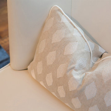
The great room incorporates a living and dining and is open to the kitchen as well as a luxurious back patio. It is the perfect place for entertaining. In this space we used rich wood furniture, including a custom exotic wood scroll bench. Cream and white leather upholstery is predominant with hammered silver nail head trim as accents. An antiqued silver leafed custom bar cabinet in an alcove in the back of the space was custom made just for the client. A floor lamp with crystal accents highlights the gorgeous crystal lamp that rests on the sofa table. A large contemporary art piece on the wall brings in some color and interest. We refinished the walnut strip wood flooring in a darker color for more contrast and placed a custom pony hair area rug to the living room floor for added dimension and luxury. Lots of metal and glass furniture accents are seen throughout. A metallic drapery rod and custom horizontally striped drapery panels over motorized roman shades add a glamorous feel to the space. For an upscale look we used grass cloth and mica wall coverings on the dining room wall. An inlaid walnut sunburst table is surrounded by custom upholstered dining chairs and the focal point is the custom chandelier made with quartz crystal clusters in varied lengths over the dining room table. A player piano in the corner of the room adds to the entertainment ambiance of this new condo. Photography by Erika Bierman
 Aiden Fabrics
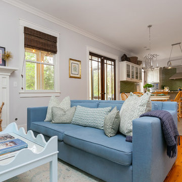
Having relocated from Boston, my clients wanted the house to have a New England feel to it with antiques and vintage pieces mixed in alongside new upholstery and textiles. They loved the traditional color palette of cobalt blues and white seen in New England coastal cottages – and also in her collection of Chinoiserie porcelain – and I introduced various shades of greens throughout to expand the palette beyond two colors. In addition, the blue linen chosen for the re-upholstery of the clients existing sofa helped create a cohesive division space between living room and kitchen, making blue a predominant color in the open space.
____
Photography by Ebony Ellis for Charleston Home + Design Magazine
 Zepboo
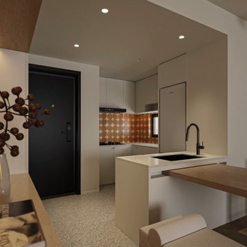
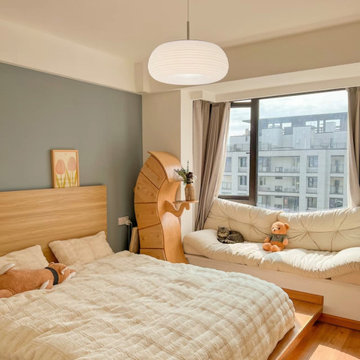
This is a case study of a client based in Lithuania. The client's home is an 85-square-meter residence. The overall interior design style preferred by the client leans towards a creamy Scandinavian and Nordic minimalist style. The color palette is earthy, predominantly featuring white, brown, and black tones, complemented by artistic paintwork and fabric materials for soft furnishings. Additionally, recessed lighting and ambient lighting were incorporated to create a warm and textured atmosphere in the space.
The client's specific requirement was to select a pendant light for the open dining area that would harmonize with the overall interior decor. We recommended a popular pendant light with a creamy texture, which aligns with the design aesthetics. It features a soft and delicate silk material, with white accents that complement the wooden dining table and chairs.
Upon receiving the products, the client expressed complete satisfaction, noting that these light fixtures perfectly matched her needs. We are sharing this case study with everyone in the hope that it will provide inspiration and ideas for your own interior decorating endeavors.
 Talianko Design Group, LLC
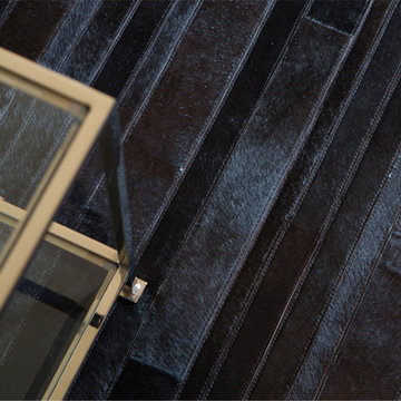
The great room incorporates a living and dining and is open to the kitchen as well as a luxurious back patio. It is the perfect place for entertaining. In this space we used rich wood furniture, including a custom exotic wood scroll bench. Cream and white leather upholstery is predominant with hammered silver nail head trim as accents. An antiqued silver leafed custom bar cabinet in an alcove in the back of the space was custom made just for the client. A floor lamp with crystal accents highlights the gorgeous crystal lamp that rests on the sofa table. A large contemporary art piece on the wall brings in some color and interest. We refinished the walnut strip wood flooring in a darker color for more contrast and placed a custom pony hair area rug to the living room floor for added dimension and luxury. Lots of metal and glass furniture accents are seen throughout. A metallic drapery rod and custom horizontally striped drapery panels over motorized roman shades add a glamorous feel to the space. For an upscale look we used grass cloth and mica wall coverings on the dining room wall. An inlaid walnut sunburst table is surrounded by custom upholstered dining chairs and the focal point is the custom chandelier made with quartz crystal clusters in varied lengths over the dining room table. A player piano in the corner of the room adds to the entertainment ambiance of this new condo. Photography by Erika Bierman
 Zepboo
This is a case study of a client living in Hong Kong. The client's residence is a 100-square-meter home. The client approached us with a requirement to find suitable lighting fixtures for their entire house. The home decor style combines modern design with a mix of natural wood and Scandinavian influences. The client wanted to select different pendant lights for each room - the living room, dining room, two bedrooms, and balcony. They wished for these pendant lights to perfectly match the style and complement each room, while also being budget-friendly.
For the living room, the client desired a touch of Chinese-style wooden accents. Hence, we selected a bamboo-woven pendant light with a Chinese design. As for the balcony, the client wanted a consistent style with the living room, so we chose a double-layered bamboo-woven pendant light. For the two bedrooms, the master bedroom leaned towards a predominantly white color scheme, so we opted for a white Scandinavian-style pendant light. The second bedroom had a focus on natural wood, so we selected a wooden pumpkin-shaped pendant light. For the dining room, which had an overall modern white theme, we chose a white Macaron-style PH5 pendant light.
Interestingly, during the process of selecting lighting fixtures, the client also became interested in our multifunctional robot-inspired five-layered dressing table. They ultimately decided to purchase and install it in the master bedroom. Upon receiving the products, the client expressed their satisfaction with how well the lighting fixtures aligned with their requirements. We are delighted to share this case study with everyone, hoping to provide inspiration and ideas for their own home renovations.
 FiveSTAR Landscape
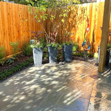
The primary goal of this landscape design project was to create a serene and accessible patio area that is wheelchair friendly, enabling the homeowner to freely navigate, engage with planters, and savor outdoor moments.
To achieve this, we removed obtrusive posts and introduced a sturdy steel beam to open up the space, providing an unobstructed pathway. The homeowners expressed a preference for the timeless beauty of natural Pennsylvania bluestone, which we artfully incorporated into the design.
Incorporating a water feature into this unique diagonal lot added an extra touch of tranquility to the landscape. Emphasizing sustainability, we predominantly utilized native plants, weaving together all the desired elements. The result is a harmonious outdoor oasis, thoughtfully designed to cater to both aesthetics and accessibility, where the homeowners can cherish the beauty of their surroundings.
 Pro-Land Landscape Construction Inc.
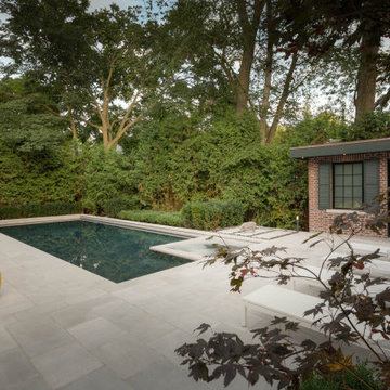
Located in prestigious Rosedale in Toronto, this beautiful custom home by Leprevo Design-Build, needed a landscape to compliment the architecture. One material was used throughout the entire property to not take away from the home. A predominantly green planting scheme highlights the right areas and breaks up the hardscape. Simple, elegant and timeless.
31