
Search results for "Preserving remarkable" in Home Design Ideas
 Haycon Inc.
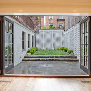
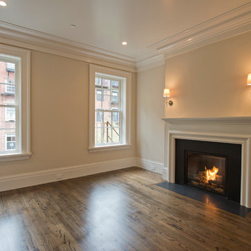
Located directly across from the Statehouse, this magnificent 6,350 square foot townhome restoration perfectly illustrates Haycon’s mastery in high end construction. Working closely with the design team over the course of a year and a half renovation project, 75 Hancock was stripped to the shell and completely transformed. The end result is a remarkable single family home which boasts incredible historic architectural detail while providing a luxurious space including the highest level of finishes, high-end appliances, and the addition of a residential elevator. Haycon appreciates the special attention to stringent preservation guidelines required when working in a historic district such as Beacon Hill.
We also recognize the importance of proactive planning and communication with neighbors and neighborhood organizations such as the Beacon Hill Civic Association.
 Cutuli Homes
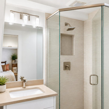
Built in 2024 by Cutuli Homes, this custom detached accessory dwelling unit was designed as a true mother-in-law home—a private, beautifully finished residence that allows three generations of one family to live close together while maintaining their own individual spaces.
The DADU was built as a companion to the homeowners' main residence, which Cutuli Homes had extensively remodeled and expanded two years earlier. Rather than treating the new structure as an afterthought, the goal was to create a home that felt architecturally connected to the existing property. Its traditional exterior, white siding, steeply pitched roof, generous windows and carefully proportioned trim give the small residence the character of an established home.
The project was created for the homeowners' mother, who downsized from her large lakefront home in the Midwest to move closer to her family and young grandchild. The result captures one of the greatest advantages of multigenerational living: family and shared community just steps away, balanced with the independence, privacy and comfort of a home of her own.
Inside, every inch was carefully considered. The compact footprint feels remarkably open thanks to a vaulted, white-paneled ceiling, abundant natural light, tall windows and an open vertical design that draws the eye upward. A loft level expands the usable living space without sacrificing the airy feeling of the main floor.
Traditional white Shaker-style cabinetry provides extensive built-in storage throughout the home and gives the interior a clean, timeless architectural character. In the kitchen, cabinetry extends upward to take advantage of the available height, while warm neutral countertops and a textured herringbone-pattern backsplash introduce subtle depth and contrast. Stainless-steel appliances are thoughtfully incorporated into the compact layout, creating a highly functional kitchen without overwhelming the living space.
One of the home's most charming features is the intimate living area tucked beneath custom built-in cabinetry. A built-in upholstered window-seat-style sofa with drawers below transforms what could have been unused space into a comfortable place to read, relax or visit. Across from it, a contemporary fireplace is integrated into a compact feature wall, with a wood display ledge above providing space for artwork, plants and personal collections.
Warm wood accents soften the predominantly white interior. Natural wood ledges, shelving, flooring and the loft ladder bring warmth and texture to the rooms, while greenery and personal furnishings give the home the comfortable character of a full-size residence rather than a conventional accessory dwelling unit.
The private sleeping area demonstrates the same emphasis on intelligent space planning. Built-in cabinetry surrounds the bed and continues overhead, providing substantial storage without requiring bulky freestanding furniture. A softly textured wall treatment, warm wood shelving and abundant natural light make the compact bedroom feel inviting and finished.
Above, the loft takes advantage of the dramatic roofline with a white tongue-and-groove style paneled ceiling extending from wall to wall. Built-in storage is incorporated beneath the sloped portions of the ceiling, turning otherwise difficult spaces into useful cabinetry while preserving an open central area for a desk, music, hobbies or additional flexible living space.
Even the exterior reflects the home's attention to detail. Large windows bring daylight deep into the interior, while the private patio extends the living space outdoors. Traditional siding and trim allow the DADU to complement the architecture of the main residence while still having an identity of its own.
At every turn, this project demonstrates that downsizing does not have to mean compromising on craftsmanship, beauty, storage or individuality. Through custom cabinetry, creative built-ins, vertical space planning and carefully considered architectural details, Cutuli Homes transformed a modest footprint into an elegant and highly personalized residence.
More than simply a DADU, this is a thoughtfully designed multigenerational home—close enough for grandparents, parents and grandchildren to share everyday life, while giving everyone the privacy and independence of having a place of their own.
 Dwellify
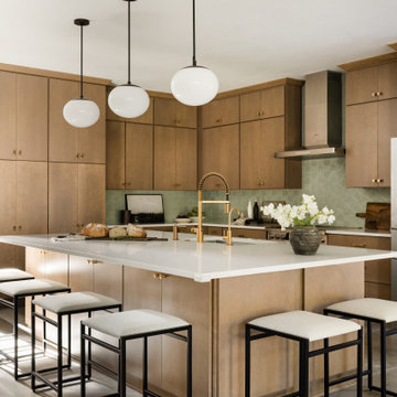
In this remodel, the kitchen underwent a remarkable transformation, evolving from a cramped,
uninspiring space into an elevated culinary haven. Through strategic design choices and
meticulous attention to detail, the once small and cold kitchen blossomed into a spacious focal
point and inviting gathering spot. Floor-to-ceiling cabinetry, adorned with rich maple-stained
wood and accented by gleaming gold hardware, instantly elevated the aesthetic and functionality
of the space. The addition of brand-new appliances further enhanced the kitchen's efficiency and
modern appeal. Removing the wrap-around barstool counter proved to be a pivotal decision, as it
opened up the area, fostering a seamless flow and sense of spaciousness. Adjacent to the kitchen,
a dining room emerged, offering a convenient and inviting space for family meals and
entertaining. To preserve the kitchen's warmth and individuality, vibrant green abstract tiles were
meticulously chosen to line the backsplash, infusing the space with personality and charm. Each
element of the renovation was thoughtfully curated to ensure a harmonious blend of style,
functionality, and comfort, resulting in a kitchen that not only meets but exceeds the needs and
expectations of its inhabitants.
Find the right local pro for your project
 Klopf Architecture
Malibu Glass Box House by Klopf Architecture
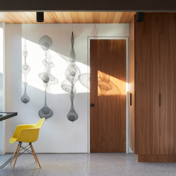
Following the devastating Woolsey Fire of 2018, the site in Malibu offered a unique opportunity to rebuild not just a home, but a new architectural composition that highlighted the property’s potential while navigating strict fire-rebuild codes in the area. Designed by Klopf Architecture, this project embraced a set of limitations and translated them into an architectural asset.
The city’s fire-rebuild process required the new structure to remain close to the original footprint, size and bulk, a constraint that ultimately clarified the architectural direction. Perched near the front of a long, narrow lot, the new home frames and overlooks a private, park-like rear expanse, an uncommon luxury especially in this part of Malibu .
Without a fixed program, the design process allowed for a different kind of creative focus allowing Klopf Architecture the opportunity to explore how a modernist home could best respond to this site. The team approached the project not with a list of requirements, but with a question: How might a modernist live here? What spatial qualities would inspire calm, connection, and a sense of wonder in this setting? The process became less about problem-solving and more about architectural storytelling—letting the site, the light, and the principles of modern design guide the form and flow of the home.
The response emerged in the form of a glass-box pavilion, an open, Mid-Century Modern inspired living, dining, and kitchen space that floats at the edge of the property’s natural descent. Connected to the more enclosed, private areas of the home by a glass-walled hallway, the living pavilion becomes a distinct centerpiece of the design. It opens on all four sides to the landscape with decks and patios on the flanks, an internal garden and water feature to the north, and a dramatic unguarded view of the expansive backyard and ocean horizon to the south.
Because of the mandated footprint, careful planning was required to ensure every space could still engage with light, landscape, or both. Strategic voids in the form of atriums and courtyards allow daylight to filter deep into the home’s core, while offering moments of surprise and retreat. These design gestures allow natural light to filter deep into the interior, creating a sense of brightness and openness throughout the day. At the same time, they expand the perceptual boundaries between inside and out, making the home feel more expansive while anchoring its connection to the surrounding landscape.
The siting of the house is what gives it its unique character. Rather than receding into the backyard like the neighboring homes, the house holds a slight prominence. From the central living pavilion, stepping down into the landscape feels more like entering a secluded park where a separate existing accessory structure, trail, and recreational areas await. The home’s modest street presence gives way to this unfolding drama of space, view, and nature.
Fire-resilient materials and assemblies are integrated seamlessly throughout including triple-pane glazing, under-slab and roof insulation, and locally sourced fire-rated cladding ensure the house not only meets Calfornia’s rigorous wildland-urban interface (WUI) standards, but feels effortlessly aligned with them. While technical decisions like fire-hardening and mechanical systems presented some construction challenges, particularly around the cantilevered glass box, the team found a functional compromise that preserved the integrity of the design.
Inside, a restrained palette and exposed post and beam design celebrate the ethos of mid-century modernism. A central circulation spine extends from the entry to the rear glass wall, offering a continuous visual link from street to ocean. Spaces such as the library and office, though more intimate in scale, are never cut off from nature as each opens to its own unique courtyard or garden view.
Though born out of a strict regulatory framework and developed without a specific client, the rebuild design unfolded with remarkable clarity. Grounded in site logic, refined by limitations and an emphasis on timeless spatial relationships – light, proportion, and a strong connection to nature, the resulting design feels both effortless and uplifting. The home lives lightly on the land, opens generously to its surroundings, and strikes a careful balance between privacy, openness, and calm. For Klopf Architecture, it stands as a compelling case study in how site, code, and circumstantial constraints can inspire enduring, modernist architecture. With years of experience reimagining mid-century modern design for how people live today, the firm took the project’s limitations as an opportunity. The result is a home shaped by open, flowing spaces, strong indoor-outdoor connections, and a calm, clear sense of structure. It’s a good reminder that even with strict constraints, there’s still room for architecture to breathe—and for modernism to keep moving forward.
Klopf Architecture project team: Geoff Campen, John Klopf, AIA, and Sherry Tan
Structural Engineer: ZFA
Contractor: Maison D’Artiste
Photography: ©2025 Mariko Reed
Year Completed: 2023
 Haycon Inc.
Located directly across from the Statehouse, this magnificent 6,350 square foot townhome restoration perfectly illustrates Haycon’s mastery in high end construction. Working closely with the design team over the course of a year and a half renovation project, 75 Hancock was stripped to the shell and completely transformed. The end result is a remarkable single family home which boasts incredible historic architectural detail while providing a luxurious space including the highest level of finishes, high-end appliances, and the addition of a residential elevator. Haycon appreciates the special attention to stringent preservation guidelines required when working in a historic district such as Beacon Hill.
We also recognize the importance of proactive planning and communication with neighbors and neighborhood organizations such as the Beacon Hill Civic Association.
 Luxury Antonovich Design AE
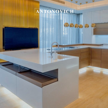
Antonovich Group stands as a benchmark of excellence in luxury design, offering comprehensive services and unmatched expertise in transforming high-end residences. One of their most remarkable achievements is the renovation of an iconic modern villa in Palm Jumeirah—an exceptional project that reflects innovation, elegance, and precision at every level.
This villa renovation showcases Antonovich Group’s ability to reimagine spaces while preserving their architectural integrity. The design concept embraces modern sophistication, integrating open-plan layouts, expansive glazing, and seamless indoor-outdoor transitions that complement the prestigious waterfront setting of Palm Jumeirah. Every detail has been carefully curated to enhance both functionality and visual appeal.
Antonovich Group provides a full spectrum of services, including concept development, architectural enhancement, interior design, fit-out, and complete renovation. For this villa, the team introduced bespoke design elements, premium materials, and custom-made furniture that elevate the overall ambiance. From the grand living areas to the private suites, each space reflects a harmonious blend of luxury and comfort.
Lighting plays a key role in defining the villa’s atmosphere, with layered illumination that highlights textures, materials, and architectural features. The use of neutral tones, refined finishes, and statement pieces creates a timeless yet contemporary aesthetic that defines modern luxury living.
What sets Antonovich Group apart is their commitment to delivering turnkey solutions with meticulous attention to detail. Their expert team ensures seamless project execution from start to completion, maintaining the highest standards of craftsmanship and quality.
This iconic modern villa renovation in Palm Jumeirah is a true testament to Antonovich Group’s vision and expertise. It exemplifies how thoughtful design, technical precision, and creative excellence can transform a residence into a sophisticated and luxurious masterpiece tailored for elevated living.
 Create Construction
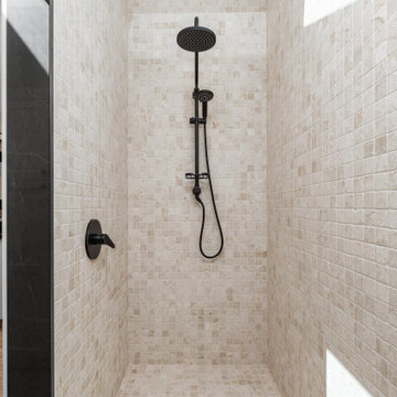
This extensive project showcases a remarkable transformation of a 1920s Craftsman home, combining a thoughtfully designed second-story addition with a full custom remodel of the first floor. The new upper level adds a spacious primary suite, complete with a bedroom, walk-in closet, laundry room, and a stunning bathroom with a drop-in tub, custom vanity, Caesarstone quartz countertops, and a walk-in shower wrapped in green subway tile, medallion accents, and natural stone.
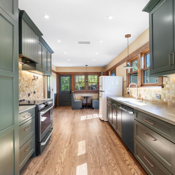
The first floor was reimagined with a new layout to better suit modern living. The kitchen features custom cabinetry, a seamless Corian countertop with integrated sink, and copper hardware. A cozy built-in banquette and natural stone backsplash with medallion inserts bring both elegance and personality to the space. The formal dining room boasts wraparound custom millwork and hidden LED strip lighting within the crown to create ambient mood lighting.
Throughout the home, you’ll find true Craftsman detailing—from solid red oak floors and Marvin wood windows to picture railing trim, cloud corbel detailing, and stained wood baseboards and casings. Skylights with concealed LED strips flood the second floor with natural light while creating atmosphere. The original fireplace was preserved and enhanced with hand-stained brick, a unique custom drywall design, and Zia handmade tile on the hearth.
On the exterior, wood shingle siding and custom-built columns enclose the redesigned front porch, which features a pony wall and decorative wood corbels. The original 1920s dormer was meticulously restored, including custom rafter tail and window detailing that ties into the home’s timeless architecture.
This project is a true homage to Craftsman design—blending historic charm with modern luxury and handcrafted finishes in every room.


 Create Construction
This extensive project showcases a remarkable transformation of a 1920s Craftsman home, combining a thoughtfully designed second-story addition with a full custom remodel of the first floor. The new upper level adds a spacious primary suite, complete with a bedroom, walk-in closet, laundry room, and a stunning bathroom with a drop-in tub, custom vanity, Caesarstone quartz countertops, and a walk-in shower wrapped in green subway tile, medallion accents, and natural stone.
The first floor was reimagined with a new layout to better suit modern living. The kitchen features custom cabinetry, a seamless Corian countertop with integrated sink, and copper hardware. A cozy built-in banquette and natural stone backsplash with medallion inserts bring both elegance and personality to the space. The formal dining room boasts wraparound custom millwork and hidden LED strip lighting within the crown to create ambient mood lighting.
Throughout the home, you’ll find true Craftsman detailing—from solid red oak floors and Marvin wood windows to picture railing trim, cloud corbel detailing, and stained wood baseboards and casings. Skylights with concealed LED strips flood the second floor with natural light while creating atmosphere. The original fireplace was preserved and enhanced with hand-stained brick, a unique custom drywall design, and Zia handmade tile on the hearth.
On the exterior, wood shingle siding and custom-built columns enclose the redesigned front porch, which features a pony wall and decorative wood corbels. The original 1920s dormer was meticulously restored, including custom rafter tail and window detailing that ties into the home’s timeless architecture.
This project is a true homage to Craftsman design—blending historic charm with modern luxury and handcrafted finishes in every room.
 Dwellify
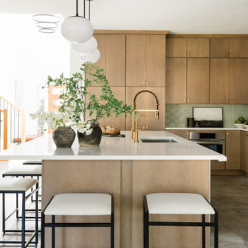
In this remodel, the kitchen underwent a remarkable transformation, evolving from a cramped,
uninspiring space into an elevated culinary haven. Through strategic design choices and
meticulous attention to detail, the once small and cold kitchen blossomed into a spacious focal
point and inviting gathering spot. Floor-to-ceiling cabinetry, adorned with rich maple-stained
wood and accented by gleaming gold hardware, instantly elevated the aesthetic and functionality
of the space. The addition of brand-new appliances further enhanced the kitchen's efficiency and
modern appeal. Removing the wrap-around barstool counter proved to be a pivotal decision, as it
opened up the area, fostering a seamless flow and sense of spaciousness. Adjacent to the kitchen,
a dining room emerged, offering a convenient and inviting space for family meals and
entertaining. To preserve the kitchen's warmth and individuality, vibrant green abstract tiles were
meticulously chosen to line the backsplash, infusing the space with personality and charm. Each
element of the renovation was thoughtfully curated to ensure a harmonious blend of style,
functionality, and comfort, resulting in a kitchen that not only meets but exceeds the needs and
expectations of its inhabitants.
 Klopf Architecture
Malibu Glass Box House by Klopf Architecture
Following the devastating Woolsey Fire of 2018, the site in Malibu offered a unique opportunity to rebuild not just a home, but a new architectural composition that highlighted the property’s potential while navigating strict fire-rebuild codes in the area. Designed by Klopf Architecture, this project embraced a set of limitations and translated them into an architectural asset.
The city’s fire-rebuild process required the new structure to remain close to the original footprint, size and bulk, a constraint that ultimately clarified the architectural direction. Perched near the front of a long, narrow lot, the new home frames and overlooks a private, park-like rear expanse, an uncommon luxury especially in this part of Malibu .
Without a fixed program, the design process allowed for a different kind of creative focus allowing Klopf Architecture the opportunity to explore how a modernist home could best respond to this site. The team approached the project not with a list of requirements, but with a question: How might a modernist live here? What spatial qualities would inspire calm, connection, and a sense of wonder in this setting? The process became less about problem-solving and more about architectural storytelling—letting the site, the light, and the principles of modern design guide the form and flow of the home.
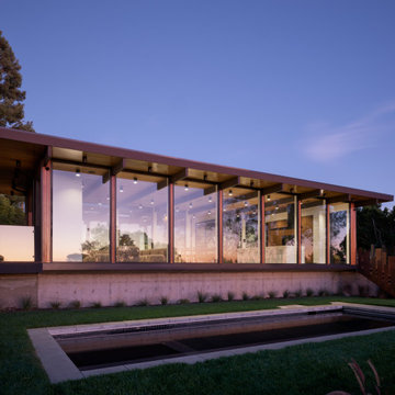
The response emerged in the form of a glass-box pavilion, an open, Mid-Century Modern inspired living, dining, and kitchen space that floats at the edge of the property’s natural descent. Connected to the more enclosed, private areas of the home by a glass-walled hallway, the living pavilion becomes a distinct centerpiece of the design. It opens on all four sides to the landscape with decks and patios on the flanks, an internal garden and water feature to the north, and a dramatic unguarded view of the expansive backyard and ocean horizon to the south.
Because of the mandated footprint, careful planning was required to ensure every space could still engage with light, landscape, or both. Strategic voids in the form of atriums and courtyards allow daylight to filter deep into the home’s core, while offering moments of surprise and retreat. These design gestures allow natural light to filter deep into the interior, creating a sense of brightness and openness throughout the day. At the same time, they expand the perceptual boundaries between inside and out, making the home feel more expansive while anchoring its connection to the surrounding landscape.
The siting of the house is what gives it its unique character. Rather than receding into the backyard like the neighboring homes, the house holds a slight prominence. From the central living pavilion, stepping down into the landscape feels more like entering a secluded park where a separate existing accessory structure, trail, and recreational areas await. The home’s modest street presence gives way to this unfolding drama of space, view, and nature.
Fire-resilient materials and assemblies are integrated seamlessly throughout including triple-pane glazing, under-slab and roof insulation, and locally sourced fire-rated cladding ensure the house not only meets Calfornia’s rigorous wildland-urban interface (WUI) standards, but feels effortlessly aligned with them. While technical decisions like fire-hardening and mechanical systems presented some construction challenges, particularly around the cantilevered glass box, the team found a functional compromise that preserved the integrity of the design.
Inside, a restrained palette and exposed post and beam design celebrate the ethos of mid-century modernism. A central circulation spine extends from the entry to the rear glass wall, offering a continuous visual link from street to ocean. Spaces such as the library and office, though more intimate in scale, are never cut off from nature as each opens to its own unique courtyard or garden view.
Though born out of a strict regulatory framework and developed without a specific client, the rebuild design unfolded with remarkable clarity. Grounded in site logic, refined by limitations and an emphasis on timeless spatial relationships – light, proportion, and a strong connection to nature, the resulting design feels both effortless and uplifting. The home lives lightly on the land, opens generously to its surroundings, and strikes a careful balance between privacy, openness, and calm. For Klopf Architecture, it stands as a compelling case study in how site, code, and circumstantial constraints can inspire enduring, modernist architecture. With years of experience reimagining mid-century modern design for how people live today, the firm took the project’s limitations as an opportunity. The result is a home shaped by open, flowing spaces, strong indoor-outdoor connections, and a calm, clear sense of structure. It’s a good reminder that even with strict constraints, there’s still room for architecture to breathe—and for modernism to keep moving forward.
Klopf Architecture project team: Geoff Campen, John Klopf, AIA, and Sherry Tan
Structural Engineer: ZFA
Contractor: Maison D’Artiste
Photography: ©2025 Mariko Reed
Year Completed: 2023
 Jeanne Schultz Design Studio
Words by Wilson Hack
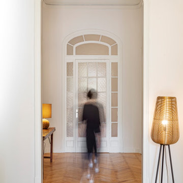
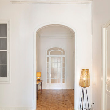
The best architecture allows what has come before it to be seen and cared for while at the same time injecting something new, if not idealistic. Spartan at first glance, the interior of this stately apartment building, located on the iconic Passeig de Gràcia in Barcelona, quickly begins to unfold as a calculated series of textures, visual artifacts and perfected aesthetic continuities.
The client, a globe-trotting entrepreneur, selected Jeanne Schultz Design Studio for the remodel and requested that the space be reconditioned into a purposeful and peaceful landing pad. It was to be furnished simply using natural and sustainable materials. Schultz began by gently peeling back before adding only the essentials, resulting in a harmoniously restorative living space where darkness and light coexist and comfort reigns.
The design was initially guided by the fireplace—from there a subtle injection of matching color extends up into the thick tiered molding and ceiling trim. “The most reckless patterns live here,” remarks Schultz, referring to the checkered green and white tiles, pink-Pollack-y stone and cast iron detailing. The millwork and warm wood wall panels devour the remainder of the living room, eliminating the need for unnecessary artwork.
A curved living room chair by Kave Home punctuates playfully; its shape reveals its pleasant conformity to the human body and sits back, inviting rest and respite. “It’s good for all body types and sizes,” explains Schultz. The single sofa by Dareels is purposefully oversized, casual and inviting. A beige cover was added to soften the otherwise rectilinear edges. Additionally sourced from Dareels, a small yet centrally located side table anchors the space with its dark black wood texture, its visual weight on par with the larger pieces. The black bulbous free standing lamp converses directly with the antique chandelier above. Composed of individual black leather strips, it is seemingly harsh—yet its soft form is reminiscent of a spring tulip.
The continuation of the color palette slips softly into the dining room where velvety green chairs sit delicately on a cascade array of pointed legs. The doors that lead out to the patio were sanded down and treated so that the original shape and form could be retained. Although the same green paint was used throughout, this set of doors speaks in darker tones alongside the acute and penetrating daylight. A few different shades of white paint were used throughout the space to add additional depth and embellish this shadowy texture.
Specialty lights were added into the space to complement the existing overhead lighting. A wall sconce was added in the living room and extra lighting was placed in the kitchen. However, because of the existing barrel vaulted tile ceiling, sconces were placed on the walls rather than above to avoid penetrating the existing architecture.
 Lori Clarke Interior Design Inc.
Get Cozy in this Renovated 1870’s Home with Modern Classic Charm
The Challenge: Replacing and rebuilding an entire floor to coincide with the style and charm of the historic home
For a lot of people, nothing can compare to the charm and warmth of a unique heritage property. As an interior designer, it is remarkable to walk into a home that was built in Fredericton during the 1870s. To be surrounded with such architectural details is a designer’s dream, so you stop and pause and realize the character, charm and warmth should never be comprised, it must be protected. I had every intention of doing so, I wanted to bring the space under renovation back to a luster and original beauty by providing a modern yet classic appeal.
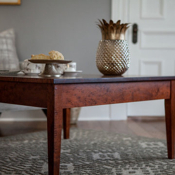
The first thing I noticed was the wasted space that we could capitalize on. The bay window was the perfect backdrop for a custom window bench and the current heritage bookshelves required symmetry, so a decision to build an adjoining custom piece was designed. The floors required complete replacement and the entrance tile was outdated and did not align with the hardwood floor.
With a heritage home renovation comes special challenges that don’t normally present themselves in a newer home renovation. Unfortunately, the original floor had to be replaced, it could not be salvaged. We chose a warm hickory hardwood that aligned perfectly with the warmth and comfort of the home. The entrance tile…took some convincing. In the end the home owners agreed to my recommendation of Casa Roma tile.
The real challenge came when the floor had to be replaced, there were so many issues from rotten wood to uneven floor joists. The contractor and his team were meticulous, ensuring the new floor was safe, balanced and aligned to perfection with the adjoining floor. The entrance floor was removed and a seamless transition from tile to hardwood was perfected. The result – true perfection, like the hardwood and the tile had been married together for years.
The adjoining custom piece was designed to house the electronics in the room but with a great deal of detail to ensure it appeared to have always been there. The real challenge was matching the stain to the existing bookcases, there was no stain on the market that matched. A call to Fredericton’s Stain Doctor and the perfect stain was custom created.
I utilized the colour undertones in the home owners art collection to create the colour palate. I wanted to ensure the furniture and furnishings were worthy of this magnificent home. I developed a soft, warm palate of greys, blues and lavender using different textures yet providing a cozy, modern and classic appeal.
I can’t imagine anyone not wanting to curl up in either of these rooms with a good book, a glass of wine, get lost and let the world go by
Bang On Photography
 Jeanne Schultz Design Studio
Words by Wilson Hack
The best architecture allows what has come before it to be seen and cared for while at the same time injecting something new, if not idealistic. Spartan at first glance, the interior of this stately apartment building, located on the iconic Passeig de Gràcia in Barcelona, quickly begins to unfold as a calculated series of textures, visual artifacts and perfected aesthetic continuities.
The client, a globe-trotting entrepreneur, selected Jeanne Schultz Design Studio for the remodel and requested that the space be reconditioned into a purposeful and peaceful landing pad. It was to be furnished simply using natural and sustainable materials. Schultz began by gently peeling back before adding only the essentials, resulting in a harmoniously restorative living space where darkness and light coexist and comfort reigns.
The design was initially guided by the fireplace—from there a subtle injection of matching color extends up into the thick tiered molding and ceiling trim. “The most reckless patterns live here,” remarks Schultz, referring to the checkered green and white tiles, pink-Pollack-y stone and cast iron detailing. The millwork and warm wood wall panels devour the remainder of the living room, eliminating the need for unnecessary artwork.
A curved living room chair by Kave Home punctuates playfully; its shape reveals its pleasant conformity to the human body and sits back, inviting rest and respite. “It’s good for all body types and sizes,” explains Schultz. The single sofa by Dareels is purposefully oversized, casual and inviting. A beige cover was added to soften the otherwise rectilinear edges. Additionally sourced from Dareels, a small yet centrally located side table anchors the space with its dark black wood texture, its visual weight on par with the larger pieces. The black bulbous free standing lamp converses directly with the antique chandelier above. Composed of individual black leather strips, it is seemingly harsh—yet its soft form is reminiscent of a spring tulip.
The continuation of the color palette slips softly into the dining room where velvety green chairs sit delicately on a cascade array of pointed legs. The doors that lead out to the patio were sanded down and treated so that the original shape and form could be retained. Although the same green paint was used throughout, this set of doors speaks in darker tones alongside the acute and penetrating daylight. A few different shades of white paint were used throughout the space to add additional depth and embellish this shadowy texture.
Specialty lights were added into the space to complement the existing overhead lighting. A wall sconce was added in the living room and extra lighting was placed in the kitchen. However, because of the existing barrel vaulted tile ceiling, sconces were placed on the walls rather than above to avoid penetrating the existing architecture.
 Create Construction
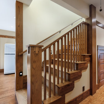
This extensive project showcases a remarkable transformation of a 1920s Craftsman home, combining a thoughtfully designed second-story addition with a full custom remodel of the first floor. The new upper level adds a spacious primary suite, complete with a bedroom, walk-in closet, laundry room, and a stunning bathroom with a drop-in tub, custom vanity, Caesarstone quartz countertops, and a walk-in shower wrapped in green subway tile, medallion accents, and natural stone.
The first floor was reimagined with a new layout to better suit modern living. The kitchen features custom cabinetry, a seamless Corian countertop with integrated sink, and copper hardware. A cozy built-in banquette and natural stone backsplash with medallion inserts bring both elegance and personality to the space. The formal dining room boasts wraparound custom millwork and hidden LED strip lighting within the crown to create ambient mood lighting.
Throughout the home, you’ll find true Craftsman detailing—from solid red oak floors and Marvin wood windows to picture railing trim, cloud corbel detailing, and stained wood baseboards and casings. Skylights with concealed LED strips flood the second floor with natural light while creating atmosphere. The original fireplace was preserved and enhanced with hand-stained brick, a unique custom drywall design, and Zia handmade tile on the hearth.
On the exterior, wood shingle siding and custom-built columns enclose the redesigned front porch, which features a pony wall and decorative wood corbels. The original 1920s dormer was meticulously restored, including custom rafter tail and window detailing that ties into the home’s timeless architecture.
This project is a true homage to Craftsman design—blending historic charm with modern luxury and handcrafted finishes in every room.
 Klopf Architecture
Malibu Glass Box House by Klopf Architecture
Following the devastating Woolsey Fire of 2018, the site in Malibu offered a unique opportunity to rebuild not just a home, but a new architectural composition that highlighted the property’s potential while navigating strict fire-rebuild codes in the area. Designed by Klopf Architecture, this project embraced a set of limitations and translated them into an architectural asset.
The city’s fire-rebuild process required the new structure to remain close to the original footprint, size and bulk, a constraint that ultimately clarified the architectural direction. Perched near the front of a long, narrow lot, the new home frames and overlooks a private, park-like rear expanse, an uncommon luxury especially in this part of Malibu .
Without a fixed program, the design process allowed for a different kind of creative focus allowing Klopf Architecture the opportunity to explore how a modernist home could best respond to this site. The team approached the project not with a list of requirements, but with a question: How might a modernist live here? What spatial qualities would inspire calm, connection, and a sense of wonder in this setting? The process became less about problem-solving and more about architectural storytelling—letting the site, the light, and the principles of modern design guide the form and flow of the home.
The response emerged in the form of a glass-box pavilion, an open, Mid-Century Modern inspired living, dining, and kitchen space that floats at the edge of the property’s natural descent. Connected to the more enclosed, private areas of the home by a glass-walled hallway, the living pavilion becomes a distinct centerpiece of the design. It opens on all four sides to the landscape with decks and patios on the flanks, an internal garden and water feature to the north, and a dramatic unguarded view of the expansive backyard and ocean horizon to the south.
Because of the mandated footprint, careful planning was required to ensure every space could still engage with light, landscape, or both. Strategic voids in the form of atriums and courtyards allow daylight to filter deep into the home’s core, while offering moments of surprise and retreat. These design gestures allow natural light to filter deep into the interior, creating a sense of brightness and openness throughout the day. At the same time, they expand the perceptual boundaries between inside and out, making the home feel more expansive while anchoring its connection to the surrounding landscape.
The siting of the house is what gives it its unique character. Rather than receding into the backyard like the neighboring homes, the house holds a slight prominence. From the central living pavilion, stepping down into the landscape feels more like entering a secluded park where a separate existing accessory structure, trail, and recreational areas await. The home’s modest street presence gives way to this unfolding drama of space, view, and nature.
Fire-resilient materials and assemblies are integrated seamlessly throughout including triple-pane glazing, under-slab and roof insulation, and locally sourced fire-rated cladding ensure the house not only meets Calfornia’s rigorous wildland-urban interface (WUI) standards, but feels effortlessly aligned with them. While technical decisions like fire-hardening and mechanical systems presented some construction challenges, particularly around the cantilevered glass box, the team found a functional compromise that preserved the integrity of the design.
Inside, a restrained palette and exposed post and beam design celebrate the ethos of mid-century modernism. A central circulation spine extends from the entry to the rear glass wall, offering a continuous visual link from street to ocean. Spaces such as the library and office, though more intimate in scale, are never cut off from nature as each opens to its own unique courtyard or garden view.
Though born out of a strict regulatory framework and developed without a specific client, the rebuild design unfolded with remarkable clarity. Grounded in site logic, refined by limitations and an emphasis on timeless spatial relationships – light, proportion, and a strong connection to nature, the resulting design feels both effortless and uplifting. The home lives lightly on the land, opens generously to its surroundings, and strikes a careful balance between privacy, openness, and calm. For Klopf Architecture, it stands as a compelling case study in how site, code, and circumstantial constraints can inspire enduring, modernist architecture. With years of experience reimagining mid-century modern design for how people live today, the firm took the project’s limitations as an opportunity. The result is a home shaped by open, flowing spaces, strong indoor-outdoor connections, and a calm, clear sense of structure. It’s a good reminder that even with strict constraints, there’s still room for architecture to breathe—and for modernism to keep moving forward.
Klopf Architecture project team: Geoff Campen, John Klopf, AIA, and Sherry Tan
Structural Engineer: ZFA
Contractor: Maison D’Artiste
Photography: ©2025 Mariko Reed
Year Completed: 2023
 Dwellify
In this remodel, the kitchen underwent a remarkable transformation, evolving from a cramped,
uninspiring space into an elevated culinary haven. Through strategic design choices and
meticulous attention to detail, the once small and cold kitchen blossomed into a spacious focal
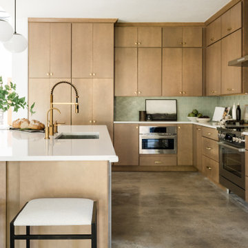
point and inviting gathering spot. Floor-to-ceiling cabinetry, adorned with rich maple-stained
wood and accented by gleaming gold hardware, instantly elevated the aesthetic and functionality
of the space. The addition of brand-new appliances further enhanced the kitchen's efficiency and
modern appeal. Removing the wrap-around barstool counter proved to be a pivotal decision, as it
opened up the area, fostering a seamless flow and sense of spaciousness. Adjacent to the kitchen,
a dining room emerged, offering a convenient and inviting space for family meals and
entertaining. To preserve the kitchen's warmth and individuality, vibrant green abstract tiles were
meticulously chosen to line the backsplash, infusing the space with personality and charm. Each
element of the renovation was thoughtfully curated to ensure a harmonious blend of style,
functionality, and comfort, resulting in a kitchen that not only meets but exceeds the needs and
expectations of its inhabitants.
 Jeanne Schultz Design Studio
Words by Wilson Hack
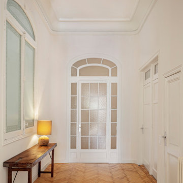
The best architecture allows what has come before it to be seen and cared for while at the same time injecting something new, if not idealistic. Spartan at first glance, the interior of this stately apartment building, located on the iconic Passeig de Gràcia in Barcelona, quickly begins to unfold as a calculated series of textures, visual artifacts and perfected aesthetic continuities.
The client, a globe-trotting entrepreneur, selected Jeanne Schultz Design Studio for the remodel and requested that the space be reconditioned into a purposeful and peaceful landing pad. It was to be furnished simply using natural and sustainable materials. Schultz began by gently peeling back before adding only the essentials, resulting in a harmoniously restorative living space where darkness and light coexist and comfort reigns.
The design was initially guided by the fireplace—from there a subtle injection of matching color extends up into the thick tiered molding and ceiling trim. “The most reckless patterns live here,” remarks Schultz, referring to the checkered green and white tiles, pink-Pollack-y stone and cast iron detailing. The millwork and warm wood wall panels devour the remainder of the living room, eliminating the need for unnecessary artwork.
A curved living room chair by Kave Home punctuates playfully; its shape reveals its pleasant conformity to the human body and sits back, inviting rest and respite. “It’s good for all body types and sizes,” explains Schultz. The single sofa by Dareels is purposefully oversized, casual and inviting. A beige cover was added to soften the otherwise rectilinear edges. Additionally sourced from Dareels, a small yet centrally located side table anchors the space with its dark black wood texture, its visual weight on par with the larger pieces. The black bulbous free standing lamp converses directly with the antique chandelier above. Composed of individual black leather strips, it is seemingly harsh—yet its soft form is reminiscent of a spring tulip.
The continuation of the color palette slips softly into the dining room where velvety green chairs sit delicately on a cascade array of pointed legs. The doors that lead out to the patio were sanded down and treated so that the original shape and form could be retained. Although the same green paint was used throughout, this set of doors speaks in darker tones alongside the acute and penetrating daylight. A few different shades of white paint were used throughout the space to add additional depth and embellish this shadowy texture.
Specialty lights were added into the space to complement the existing overhead lighting. A wall sconce was added in the living room and extra lighting was placed in the kitchen. However, because of the existing barrel vaulted tile ceiling, sconces were placed on the walls rather than above to avoid penetrating the existing architecture.
 Historic American Homes
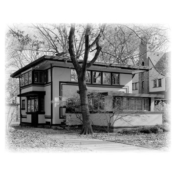
William Drummond started working as a young architect side by side with Frank Lloyd Wright in Louis Sullivan's Chicago office. When Wright started his own office Drummond worked for Wright on many of his most important Prairie homes. Eventually Drummond started his own practice and in 1913 built this house for himself. It's a remarkably compact and efficient plan, minimizing circulation space and packing a surprising number of rooms into a small footprint while still providing the flowing space and vistas that characterize the Prairie Style. Visit Historic American Homes for purchase information
 Create Construction
This extensive project showcases a remarkable transformation of a 1920s Craftsman home, combining a thoughtfully designed second-story addition with a full custom remodel of the first floor. The new upper level adds a spacious primary suite, complete with a bedroom, walk-in closet, laundry room, and a stunning bathroom with a drop-in tub, custom vanity, Caesarstone quartz countertops, and a walk-in shower wrapped in green subway tile, medallion accents, and natural stone.
The first floor was reimagined with a new layout to better suit modern living. The kitchen features custom cabinetry, a seamless Corian countertop with integrated sink, and copper hardware. A cozy built-in banquette and natural stone backsplash with medallion inserts bring both elegance and personality to the space. The formal dining room boasts wraparound custom millwork and hidden LED strip lighting within the crown to create ambient mood lighting.
Throughout the home, you’ll find true Craftsman detailing—from solid red oak floors and Marvin wood windows to picture railing trim, cloud corbel detailing, and stained wood baseboards and casings. Skylights with concealed LED strips flood the second floor with natural light while creating atmosphere. The original fireplace was preserved and enhanced with hand-stained brick, a unique custom drywall design, and Zia handmade tile on the hearth.
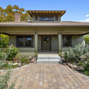
On the exterior, wood shingle siding and custom-built columns enclose the redesigned front porch, which features a pony wall and decorative wood corbels. The original 1920s dormer was meticulously restored, including custom rafter tail and window detailing that ties into the home’s timeless architecture.
This project is a true homage to Craftsman design—blending historic charm with modern luxury and handcrafted finishes in every room.
 Klopf Architecture
Malibu Glass Box House by Klopf Architecture
Following the devastating Woolsey Fire of 2018, the site in Malibu offered a unique opportunity to rebuild not just a home, but a new architectural composition that highlighted the property’s potential while navigating strict fire-rebuild codes in the area. Designed by Klopf Architecture, this project embraced a set of limitations and translated them into an architectural asset.
The city’s fire-rebuild process required the new structure to remain close to the original footprint, size and bulk, a constraint that ultimately clarified the architectural direction. Perched near the front of a long, narrow lot, the new home frames and overlooks a private, park-like rear expanse, an uncommon luxury especially in this part of Malibu .
Without a fixed program, the design process allowed for a different kind of creative focus allowing Klopf Architecture the opportunity to explore how a modernist home could best respond to this site. The team approached the project not with a list of requirements, but with a question: How might a modernist live here? What spatial qualities would inspire calm, connection, and a sense of wonder in this setting? The process became less about problem-solving and more about architectural storytelling—letting the site, the light, and the principles of modern design guide the form and flow of the home.
The response emerged in the form of a glass-box pavilion, an open, Mid-Century Modern inspired living, dining, and kitchen space that floats at the edge of the property’s natural descent. Connected to the more enclosed, private areas of the home by a glass-walled hallway, the living pavilion becomes a distinct centerpiece of the design. It opens on all four sides to the landscape with decks and patios on the flanks, an internal garden and water feature to the north, and a dramatic unguarded view of the expansive backyard and ocean horizon to the south.
Because of the mandated footprint, careful planning was required to ensure every space could still engage with light, landscape, or both. Strategic voids in the form of atriums and courtyards allow daylight to filter deep into the home’s core, while offering moments of surprise and retreat. These design gestures allow natural light to filter deep into the interior, creating a sense of brightness and openness throughout the day. At the same time, they expand the perceptual boundaries between inside and out, making the home feel more expansive while anchoring its connection to the surrounding landscape.
The siting of the house is what gives it its unique character. Rather than receding into the backyard like the neighboring homes, the house holds a slight prominence. From the central living pavilion, stepping down into the landscape feels more like entering a secluded park where a separate existing accessory structure, trail, and recreational areas await. The home’s modest street presence gives way to this unfolding drama of space, view, and nature.
Fire-resilient materials and assemblies are integrated seamlessly throughout including triple-pane glazing, under-slab and roof insulation, and locally sourced fire-rated cladding ensure the house not only meets Calfornia’s rigorous wildland-urban interface (WUI) standards, but feels effortlessly aligned with them. While technical decisions like fire-hardening and mechanical systems presented some construction challenges, particularly around the cantilevered glass box, the team found a functional compromise that preserved the integrity of the design.
Inside, a restrained palette and exposed post and beam design celebrate the ethos of mid-century modernism. A central circulation spine extends from the entry to the rear glass wall, offering a continuous visual link from street to ocean. Spaces such as the library and office, though more intimate in scale, are never cut off from nature as each opens to its own unique courtyard or garden view.
Though born out of a strict regulatory framework and developed without a specific client, the rebuild design unfolded with remarkable clarity. Grounded in site logic, refined by limitations and an emphasis on timeless spatial relationships – light, proportion, and a strong connection to nature, the resulting design feels both effortless and uplifting. The home lives lightly on the land, opens generously to its surroundings, and strikes a careful balance between privacy, openness, and calm. For Klopf Architecture, it stands as a compelling case study in how site, code, and circumstantial constraints can inspire enduring, modernist architecture. With years of experience reimagining mid-century modern design for how people live today, the firm took the project’s limitations as an opportunity. The result is a home shaped by open, flowing spaces, strong indoor-outdoor connections, and a calm, clear sense of structure. It’s a good reminder that even with strict constraints, there’s still room for architecture to breathe—and for modernism to keep moving forward.
Klopf Architecture project team: Geoff Campen, John Klopf, AIA, and Sherry Tan
Structural Engineer: ZFA
Contractor: Maison D’Artiste
Photography: ©2025 Mariko Reed
Year Completed: 2023
11