
Search results for "Primary function" in Home Design Ideas
 Sunny Interior Design
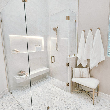
This bathroom embraces a timeless modern coastal aesthetic, blending clean architectural lines with warm organic textures to create a serene, spa-like retreat. A soft neutral palette establishes a calming atmosphere, while subtle layering of natural materials adds warmth and sophistication.
The curbless walk-in shower is enclosed with frameless glass, allowing the room to feel open and expansive. Large-format porcelain tile extends across the shower walls, creating a seamless backdrop, while a floating bench and illuminated recessed niche provide both functionality and a refined architectural focal point. The herringbone marble mosaic flooring introduces movement and texture underfoot, complementing the linear drain and understated champagne bronze plumbing fixtures.
Outside the shower, textured grasscloth-inspired wallcovering softens the space and contrasts beautifully with the sleek tile surfaces. A custom white oak vanity with slim shaker detailing adds warmth through its natural wood grain, while a crisp white quartz countertop enhances the clean, minimalist aesthetic. Champagne bronze hardware and plumbing fixtures are carried throughout the room, providing continuity and an elegant touch.
A sculptural mirror framed in champagne bronze is paired with contemporary cylindrical sconces, delivering balanced illumination while reinforcing the room's sophisticated simplicity. Decorative styling is intentionally restrained, with fresh white hydrangeas, a natural stone tray, and a softly upholstered bench creating a welcoming, lived-in feel. Plush Turkish towels mounted on coordinating bronze hooks complete the spa experience.
Natural light filters through the glass block window, offering privacy while softly illuminating the room. Every element has been thoughtfully curated to balance luxury, comfort, and functionality, resulting in a bathroom that feels bright, timeless, and effortlessly elegant.
 Ann Lowengart Interiors
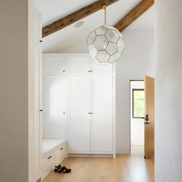
The three-level Mediterranean revival home started as a 1930s summer cottage that expanded downward and upward over time. We used a clean, crisp white wall plaster with bronze hardware throughout the interiors to give the house continuity. A neutral color palette and minimalist furnishings create a sense of calm restraint. Subtle and nuanced textures and variations in tints add visual interest. The stair risers from the living room to the primary suite are hand-painted terra cotta tile in gray and off-white. We used the same tile resource in the kitchen for the island's toe kick.
 Klopf Architecture
The Roger Lee designed house from 1962 was purchased by the current homeowners in almost original condition, as the previous owners elected to defer most maintenance projects over the years. The clients were able to see beyond the dated materials and finishes, single-paned glass and uninsulated walls and they approached Klopf Architecture to help them expand and update the entire home, one the family could settle into and enjoy for years to come. It was important that the new designs were aligned with Lee's original intent not only because of the client's appreciation for mid-century modern architecture, but also because the house was deemed historical. The Stanford Real Estate Office requires a stringent design review which safeguards the integrity of the community, which Klopf Architecture was happy to oblige going into their updated designs.
As with many original mid-century modern homes, the house was scaled to the 1960s lifestyle where rooms were smaller and openings to views were limited and tightly framed. The original conditions defined the direction the family of four would take in updating the house and making it comfortable for their modern lifestyle. Klopf designed a full gut remodel and major addition to bring the house into the 21st century and provide the living area needed for the client's family. The newly expanded house added just about 1,100 sf to create an airy, comfortable and family friendly house, taking full advantage of the beautiful southwestern views that extend out to the hills beyond. The enclosed garage created an additional 240 sf of covered space for long-term storage.
A cracked swimming pool created an eyesore taking up a majority of the backyard landscape, so it was one of the first elements to go during the transformation. Working with Outer Space Landscape Architects, the family asked for a mix of relaxing outdoor patio spaces that eventually blend into the native landscaping, extending their views outward toward the natural greenery of the trees beyond their property. Filling in the old pool was a smart way to expand the living spaces outward. The orientation of the house was designed to enjoy the views, but the original architecture provided the first homeowners with mere glimpses of the landscape outside.
Klopf was able to broaden those views, continuing and extending on the original architecture to take full advantage of the unobstructed natural views across the rear facade of the house. Small horizontal openings in the primary bedroom and office were replaced with much taller windows that now follow the angled roof line upward, extending across almost all of the facade. We worked with Western Windows, whose designs included an oblique-shaped, operable casement that allowed our design to rise with the slope. A new corner office added to the primary suite, offers a bright and functional work-from-home solution that looks out at the distant views and added natural light from the expanded window configuration that now wraps around the corner.
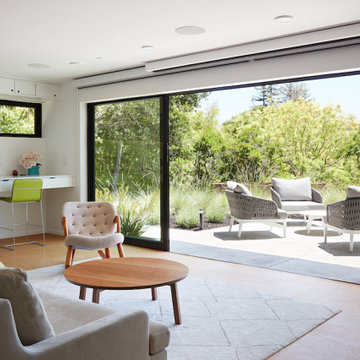
The existing lower level was designed by Lee as a utilitarian space, serving as a wet pool room with a drain in the center of the floor, bathroom, laundry and storage areas. Without the need for a pool room, Klopf was able to convert the area into a much more comfortable and functional living space with a new family room and guest suite. The new spaces enjoy easy access to a new outdoor patio through floor to ceiling, full-width glass sliders.
Continuing along the rear facade, a previously exposed deck extending from the living room and hallway provided access to the backyard through a single set of stairs leading toward the side of the house which made sense when the pool was in place. The new deck was re-envisioned as an extension of the main living room and now serves as a second outdoor living room. A new slatted pergola above provides the homeowners welcome relief from the hot afternoon sun. A second set of stairs now creates a better connection to the redesigned lower level. Klopf was able to reconfigure the spaces, extending the living room outward toward the views, where the family now claims it as the heart of the home, spending a large majority of their time outdoors.
Back inside, the original wood-burning Malm fireplace was beautifully restored and a gas burner installed to comply with California's strict air standards. It now rests in front of a wall of Heath accent tiles where a dated red brick wall used to stand. A new taller window brings more light and views into the refreshed interior living room. The original glass doors opposite the fireplace were replaced by larger sliders that when fully opened, create a seamless transition to the new outdoor living area so the two spaces feel like one connected space. The original utilitarian kitchen was needlessly tucked into the far back corner and closed-off, out of sight from the living room, so the clients asked Klopf to open it up and expand the kitchen forward so it felt more connected. Today the much larger kitchen is connected to the living area where a short wall with a cutout offers a visual glimpse into the kitchen and a handy pass-through counter for serving guests. A new breakfast nook was also added to create another spot where the family can gather for casual meals. Just outside, a new built-in outdoor grill and prep area extends the kitchen outside and connects to a new outdoor dining spot nestled amongst the trees, taking advantage of the views out back.
Klopf was able to expand the other two bedrooms, add a new laundry room and half-bath and convert the carport to an enclosed garage to add more storage areas which was lost when the pool house was converted to the family and guest room.
To maintain a historical connection to the original designs, the exterior siding was repeated on all exterior walls, a full-height stained glass window at the front entryway restored, and an interior slatted screen element repeated outside at the exterior entry courtyard and over the new outdoor living room to create a shade trellis. The new house stands proudly and shines against it's new landscaping features, while respecting and expanding on the original intent of Roger Lee's designs epitomizing the comforts of indoor-outdoor living in Northern California.
Completion year: 2020
Klopf Architecture project team: John Klopf, Klara Kevane, Noel Andrade
Contractor: ORB Construction, Brendan O'Reilly
Structural engineer: Sezen and Moon
Landscape architect: Outer space
Furnishings and decoration: Urbanism Designs
Photographer: Mariko Reed
Find the right local pro for your project
 Kristina Anne Designs
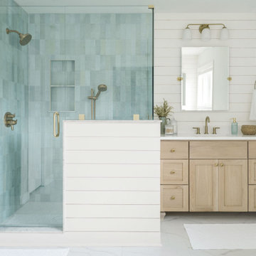
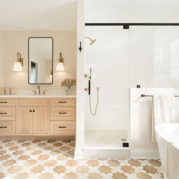
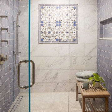
Primary bathroom renovation in Bay Creek, Cape Charles, Virginia. Designed as a serene coastal retreat, this timeless bathroom features custom white oak vanities, shiplap wall detailing, marble-inspired flooring, and a hand-glazed blue and green tile shower inspired by the surrounding bay. Champagne bronze fixtures add warmth and refinement, while integrated storage enhances everyday functionality. Soft coastal tones, natural materials, and thoughtful details create a relaxing, light-filled space that balances luxury, comfort, and practicality.

 Epic Interiors
The floor showcases custom Italian mosaic tile from Mona Lisa Tile, featuring intricate blue and gold floral motifs that echo the shower’s framed wall panel. This bespoke pattern, used in both the floor insets and shower niche, was selected after multiple design iterations to achieve perfect scale and tonal harmony. Pale gray and bluish undertones unify the space, establishing a serene and elegant retreat.
 Crystal Kitchen + Bath
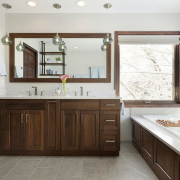
This Master Bathroom was outdated in appearance and although the size of the room was sufficient, the space felt crowded. The toilet location was undesirable, the shower was cramped and the bathroom floor was cold to stand on. The client wanted a new configuration that would eliminate the corner tub, but still have a bathtub in the room, plus a larger shower and more privacy to the toilet area. The 1980’s look needed to be replaced with a clean, contemporary look.
A new room layout created a more functional space. A separated space was achieved for the toilet by relocating it and adding a cabinet and custom hanging pipe shelf above for privacy.
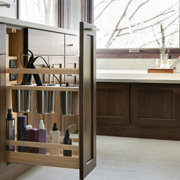
By adding a double sink vanity, we gained valuable floor space to still have a soaking tub and larger shower. In-floor heat keeps the room cozy and warm all year long. The entry door was replaced with a pocket door to keep the area in front of the vanity unobstructed. The cabinet next to the toilet has sliding doors and adds storage for towels and toiletries and the vanity has a pull-out hair station. Rich, walnut cabinetry is accented nicely with the soft, blue/green color palette of the tiles and wall color. New window shades that can be lifted from the bottom or top are ideal if they want full light or an unobstructed view, while maintaining privacy. Handcrafted swirl pendants illuminate the vanity and are made from 100% recycled glass.


 Schroeder Design/Build, Inc.
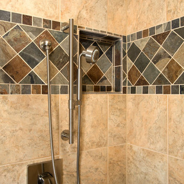
It's hard to believe that this gorgeous master bath was once a small, dull bathroom. Our clients wanted a luxurious, yet practical bath. To accommodate a double vanity, we re-claimed space from an existing closet and replaced the lost space by adding a cantilever on the other side of the room.
The material selections bring the mission style aesthetic to life - natural cherry cabinets, black pearl granite, oil rubbed bronze medicine cabinets, vessel sink, multi-color slate floors and shower tile surround.
 Signature Designs Kitchen | Bath | Interiors
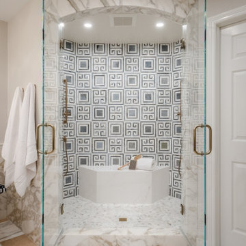
The original primary bathroom, while spacious enough to be impressive, unfortunately fell short in terms of functionality. The shower was so cramped that no adult could use it comfortably. The odd angles, combined with the dark and outdated finishes, along with a massive built-in tub that consumed excessive space, made it clear that a complete transformation was needed.
In our redesign, we introduced elegant walnut cabinetry and created a stunning centerpiece in the shower, featuring dual shower heads and dual handheld options.
This transformation turned the client’s bathroom into a perfect morning oasis. The clients are absolutely thrilled with their revamped space, which offers a complete escape from their daily routines. We are so excited that we got to impact our clients’ lives in a positive way.
?️ Prestige Home Renovations
Bathroom Design and Cabinetry @signaturedesigns.kbi
? @martin.photography__

 Crystal Kitchen + Bath
This Master Bathroom was outdated in appearance and although the size of the room was sufficient, the space felt crowded. The toilet location was undesirable, the shower was cramped and the bathroom floor was cold to stand on. The client wanted a new configuration that would eliminate the corner tub, but still have a bathtub in the room, plus a larger shower and more privacy to the toilet area. The 1980’s look needed to be replaced with a clean, contemporary look.
A new room layout created a more functional space. A separated space was achieved for the toilet by relocating it and adding a cabinet and custom hanging pipe shelf above for privacy.
By adding a double sink vanity, we gained valuable floor space to still have a soaking tub and larger shower. In-floor heat keeps the room cozy and warm all year long. The entry door was replaced with a pocket door to keep the area in front of the vanity unobstructed. The cabinet next to the toilet has sliding doors and adds storage for towels and toiletries and the vanity has a pull-out hair station. Rich, walnut cabinetry is accented nicely with the soft, blue/green color palette of the tiles and wall color. New window shades that can be lifted from the bottom or top are ideal if they want full light or an unobstructed view, while maintaining privacy. Handcrafted swirl pendants illuminate the vanity and are made from 100% recycled glass.
 Crystal Kitchen + Bath
This Master Bathroom was outdated in appearance and although the size of the room was sufficient, the space felt crowded. The toilet location was undesirable, the shower was cramped and the bathroom floor was cold to stand on. The client wanted a new configuration that would eliminate the corner tub, but still have a bathtub in the room, plus a larger shower and more privacy to the toilet area. The 1980’s look needed to be replaced with a clean, contemporary look.
A new room layout created a more functional space. A separated space was achieved for the toilet by relocating it and adding a cabinet and custom hanging pipe shelf above for privacy.
By adding a double sink vanity, we gained valuable floor space to still have a soaking tub and larger shower. In-floor heat keeps the room cozy and warm all year long. The entry door was replaced with a pocket door to keep the area in front of the vanity unobstructed. The cabinet next to the toilet has sliding doors and adds storage for towels and toiletries and the vanity has a pull-out hair station. Rich, walnut cabinetry is accented nicely with the soft, blue/green color palette of the tiles and wall color. New window shades that can be lifted from the bottom or top are ideal if they want full light or an unobstructed view, while maintaining privacy. Handcrafted swirl pendants illuminate the vanity and are made from 100% recycled glass.
 Closet Factory
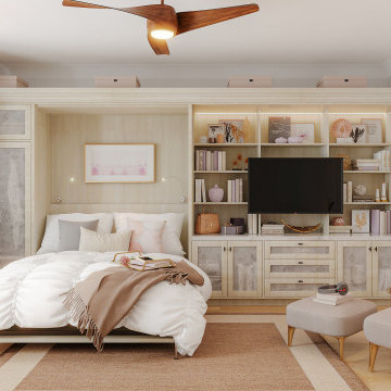
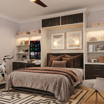
A Murphy bed, also known as a wall bed or pull-down bed, is a space-saving furniture solution designed to be vertically stored against a wall or inside a cabinet when not in use. The primary functionality of a Murphy bed is to provide a comfortable sleeping area while maximizing floor space in a room, making it particularly useful in small living spaces such as studio apartments, guest rooms, or home offices.

Sponsored
Columbus, OH

Structural Remodeling
Franklin County's Heavy Timber Specialists | Best of Houzz 2020!
 Closet Factory
A Murphy bed, also known as a wall bed or pull-down bed, is a space-saving furniture solution that is designed to be vertically stored against a wall or inside a cabinet when not in use.
The primary functionality of a Murphy bed is to provide a comfortable sleeping area while maximizing floor space in a room, making it particularly useful in small living spaces such as studio apartments, guest rooms, or home offices.
 Rodwin Architecture & Skycastle Construction
Rodwin Architecture & Skycastle Homes
Location: Boulder, Colorado, USA
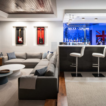
Interior design, space planning and architectural details converge thoughtfully in this transformative project. A 15-year old, 9,000 sf. home with generic interior finishes and odd layout needed bold, modern, fun and highly functional transformation for a large bustling family. To redefine the soul of this home, texture and light were given primary consideration. Elegant contemporary finishes, a warm color palette and dramatic lighting defined modern style throughout. A cascading chandelier by Stone Lighting in the entry makes a strong entry statement. Walls were removed to allow the kitchen/great/dining room to become a vibrant social center. A minimalist design approach is the perfect backdrop for the diverse art collection. Yet, the home is still highly functional for the entire family. We added windows, fireplaces, water features, and extended the home out to an expansive patio and yard.
The cavernous beige basement became an entertaining mecca, with a glowing modern wine-room, full bar, media room, arcade, billiards room and professional gym.
Bathrooms were all designed with personality and craftsmanship, featuring unique tiles, floating wood vanities and striking lighting.
This project was a 50/50 collaboration between Rodwin Architecture and Kimball Modern
 The Brooklyn Studio
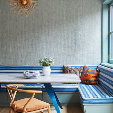
This Cobble Hill Brownstone for a family of five is a fun and captivating design, the perfect blend of the wife’s love of English country style and the husband’s preference for modern. The young power couple, her the co-founder of Maisonette and him an investor, have three children and a dog, requiring that all the surfaces, finishes and, materials used throughout the home are both beautiful and durable to make every room a carefree space the whole family can enjoy.
The primary design challenge for this project was creating both distinct places for the family to live their day to day lives and also a whole floor dedicated to formal entertainment. The clients entertain large dinners on a monthly basis as part of their profession. We solved this by adding an extension on the Garden and Parlor levels. This allowed the Garden level to function as the daily family operations center and the Parlor level to be party central. The kitchen on the garden level is large enough to dine in and accommodate a large catering crew.
On the parlor level, we created a large double parlor in the front of the house; this space is dedicated to cocktail hour and after-dinner drinks. The rear of the parlor is a spacious formal dining room that can seat up to 14 guests. The middle "library" space contains a bar and facilitates access to both the front and rear rooms; in this way, it can double as a staging area for the parties.
The remaining three floors are sleeping quarters for the family and frequent out of town guests. Designing a row house for private and public functions programmatically returns the building to a configuration in line with its original design.
This project was published in Architectural Digest.
Photography by Sam Frost
 TKS Design Group
Download our free ebook, Creating the Ideal Kitchen. DOWNLOAD NOW
As with most projects, it all started with the kitchen layout. The home owners came to us wanting to upgrade their kitchen and overall aesthetic in their suburban home, with a combination of fresh paint, updated finishes, and improved flow for more ease when doing everyday activities.
A monochromatic, earth-toned palette left the kitchen feeling uninspired. It lacked the brightness they wanted from their space. An eat-in table underutilized the available square footage. The butler’s pantry was out of the way and hard to access, and the dining room felt detached from the kitchen.
Lead Designer, Stephanie Cole, saw an improved layout for the spaces that were no longer working for this family. By eliminating an existing wall between the kitchen and dining room, and relocating the bar area to the dining room, we opened up the kitchen, providing all the space we needed to create a dreamy and functional layout. A new perimeter configuration promoted circulation while also making space for a large and functional island loaded with seating – a must for any family. Because an island that isn’t big enough for everyone (and a few more) is a recipe for disaster. The light white cabinetry is fresh and contrasts with the deeper tones in the wood flooring, creating a modern aesthetic that is elevated, yet approachable for everyday living.
With better flow as the overarching goal, we made some structural changes too. To remove a bottleneck in the entryway, we angled one of the dining room walls to create more natural separation between rooms and facilitate ease of movement throughout the large space.
At The Kitchen Studio, we believe a well-designed kitchen uses every square inch to the fullest. By starting from scratch, it was possible to rethink the entire kitchen layout and design the space according to how it is used, because the kitchen shouldn’t make it harder to feed the family. A new location for the existing range, flanked by a new column refrigerator and freezer on each side, worked to anchor the space. The very large and very spacious island (a dream island if we do say so ourselves) now houses the primary sink and provides ample space for food prep and family gathering.
The new kitchen table and coordinating banquette seating provide a cozy nook for quick breakfasts before school or work, and evening homework sessions. Elegant gold details catch the natural light, elevating the aesthetic.
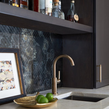
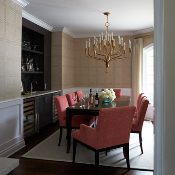
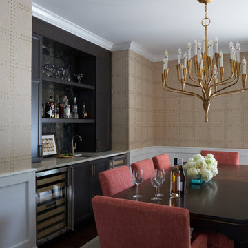
The dining room was transformed into one of this client’s favorite spaces and we couldn’t agree more. We saw an opportunity to give the dining room a more distinguished identity by closing off the entrance from the foyer. The relocated wet bar enhances the sophisticated vibe of this gathering space, complete with beautiful antique mirror tiles and open shelving encased by moody built-in cabinets.
Updated furnishings add warmth. A rich walnut table is paired with custom chairs in a muted coral fabric. The large, transitional chandelier grounds the room, pairing beautifully with the gold finishes prevalent in the faucet and cabinet hardware. Linen-inspired wallpaper and cream-toned window treatments add to the glamorous feel of this entertainment space.
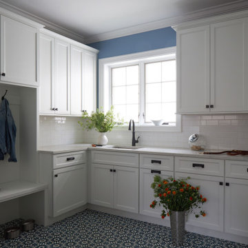
There is no way around it. The laundry room was cramped. The large washer and dryer blocked access to the sink and left little room for the space to serve its other essential function – as a mudroom. Because we reworked the kitchen layout to create more space overall, we could rethink the mudroom too – an essential for any busy family. The first step was moving the washer and dryer to an existing area on the second floor, where most of the family’s laundry lives (no one wants to carry laundry up and down the stairs if they don’t have to anyway). This is a more functional solution and opened up the space for all the mudroom necessities – including the existing kitchen refrigerator, loads of built-in cubbies, and a bench.
It’s hard to not fall in love with every detail of a new space, especially when it serves your day-to-day life. But that doesn’t mean the clients didn’t have their favorite features they use on the daily. This remodel was focused largely on function with a new kitchen layout. And it’s the functional features that have the biggest impact. The large island provides much needed workspace in the kitchen and is a spot where everyone gathers together – it grounds the space and the family. And the custom counter stools are the icing on the cake. The nearby mudroom has everything their previous space was lacking – ample storage, space for everyone’s essentials, and the beloved cement floor tiles that are both durable and artistic.
 TKS Design Group
Download our free ebook, Creating the Ideal Kitchen. DOWNLOAD NOW
As with most projects, it all started with the kitchen layout. The home owners came to us wanting to upgrade their kitchen and overall aesthetic in their suburban home, with a combination of fresh paint, updated finishes, and improved flow for more ease when doing everyday activities.
A monochromatic, earth-toned palette left the kitchen feeling uninspired. It lacked the brightness they wanted from their space. An eat-in table underutilized the available square footage. The butler’s pantry was out of the way and hard to access, and the dining room felt detached from the kitchen.
Lead Designer, Stephanie Cole, saw an improved layout for the spaces that were no longer working for this family. By eliminating an existing wall between the kitchen and dining room, and relocating the bar area to the dining room, we opened up the kitchen, providing all the space we needed to create a dreamy and functional layout. A new perimeter configuration promoted circulation while also making space for a large and functional island loaded with seating – a must for any family. Because an island that isn’t big enough for everyone (and a few more) is a recipe for disaster. The light white cabinetry is fresh and contrasts with the deeper tones in the wood flooring, creating a modern aesthetic that is elevated, yet approachable for everyday living.
With better flow as the overarching goal, we made some structural changes too. To remove a bottleneck in the entryway, we angled one of the dining room walls to create more natural separation between rooms and facilitate ease of movement throughout the large space.
At The Kitchen Studio, we believe a well-designed kitchen uses every square inch to the fullest. By starting from scratch, it was possible to rethink the entire kitchen layout and design the space according to how it is used, because the kitchen shouldn’t make it harder to feed the family. A new location for the existing range, flanked by a new column refrigerator and freezer on each side, worked to anchor the space. The very large and very spacious island (a dream island if we do say so ourselves) now houses the primary sink and provides ample space for food prep and family gathering.
The new kitchen table and coordinating banquette seating provide a cozy nook for quick breakfasts before school or work, and evening homework sessions. Elegant gold details catch the natural light, elevating the aesthetic.
The dining room was transformed into one of this client’s favorite spaces and we couldn’t agree more. We saw an opportunity to give the dining room a more distinguished identity by closing off the entrance from the foyer. The relocated wet bar enhances the sophisticated vibe of this gathering space, complete with beautiful antique mirror tiles and open shelving encased by moody built-in cabinets.
Updated furnishings add warmth. A rich walnut table is paired with custom chairs in a muted coral fabric. The large, transitional chandelier grounds the room, pairing beautifully with the gold finishes prevalent in the faucet and cabinet hardware. Linen-inspired wallpaper and cream-toned window treatments add to the glamorous feel of this entertainment space.
There is no way around it. The laundry room was cramped. The large washer and dryer blocked access to the sink and left little room for the space to serve its other essential function – as a mudroom. Because we reworked the kitchen layout to create more space overall, we could rethink the mudroom too – an essential for any busy family. The first step was moving the washer and dryer to an existing area on the second floor, where most of the family’s laundry lives (no one wants to carry laundry up and down the stairs if they don’t have to anyway). This is a more functional solution and opened up the space for all the mudroom necessities – including the existing kitchen refrigerator, loads of built-in cubbies, and a bench.
It’s hard to not fall in love with every detail of a new space, especially when it serves your day-to-day life. But that doesn’t mean the clients didn’t have their favorite features they use on the daily. This remodel was focused largely on function with a new kitchen layout. And it’s the functional features that have the biggest impact. The large island provides much needed workspace in the kitchen and is a spot where everyone gathers together – it grounds the space and the family. And the custom counter stools are the icing on the cake. The nearby mudroom has everything their previous space was lacking – ample storage, space for everyone’s essentials, and the beloved cement floor tiles that are both durable and artistic.
 TKS Design Group
Download our free ebook, Creating the Ideal Kitchen. DOWNLOAD NOW
As with most projects, it all started with the kitchen layout. The home owners came to us wanting to upgrade their kitchen and overall aesthetic in their suburban home, with a combination of fresh paint, updated finishes, and improved flow for more ease when doing everyday activities.
A monochromatic, earth-toned palette left the kitchen feeling uninspired. It lacked the brightness they wanted from their space. An eat-in table underutilized the available square footage. The butler’s pantry was out of the way and hard to access, and the dining room felt detached from the kitchen.
Lead Designer, Stephanie Cole, saw an improved layout for the spaces that were no longer working for this family. By eliminating an existing wall between the kitchen and dining room, and relocating the bar area to the dining room, we opened up the kitchen, providing all the space we needed to create a dreamy and functional layout. A new perimeter configuration promoted circulation while also making space for a large and functional island loaded with seating – a must for any family. Because an island that isn’t big enough for everyone (and a few more) is a recipe for disaster. The light white cabinetry is fresh and contrasts with the deeper tones in the wood flooring, creating a modern aesthetic that is elevated, yet approachable for everyday living.
With better flow as the overarching goal, we made some structural changes too. To remove a bottleneck in the entryway, we angled one of the dining room walls to create more natural separation between rooms and facilitate ease of movement throughout the large space.
At The Kitchen Studio, we believe a well-designed kitchen uses every square inch to the fullest. By starting from scratch, it was possible to rethink the entire kitchen layout and design the space according to how it is used, because the kitchen shouldn’t make it harder to feed the family. A new location for the existing range, flanked by a new column refrigerator and freezer on each side, worked to anchor the space. The very large and very spacious island (a dream island if we do say so ourselves) now houses the primary sink and provides ample space for food prep and family gathering.
The new kitchen table and coordinating banquette seating provide a cozy nook for quick breakfasts before school or work, and evening homework sessions. Elegant gold details catch the natural light, elevating the aesthetic.
The dining room was transformed into one of this client’s favorite spaces and we couldn’t agree more. We saw an opportunity to give the dining room a more distinguished identity by closing off the entrance from the foyer. The relocated wet bar enhances the sophisticated vibe of this gathering space, complete with beautiful antique mirror tiles and open shelving encased by moody built-in cabinets.
Updated furnishings add warmth. A rich walnut table is paired with custom chairs in a muted coral fabric. The large, transitional chandelier grounds the room, pairing beautifully with the gold finishes prevalent in the faucet and cabinet hardware. Linen-inspired wallpaper and cream-toned window treatments add to the glamorous feel of this entertainment space.
There is no way around it. The laundry room was cramped. The large washer and dryer blocked access to the sink and left little room for the space to serve its other essential function – as a mudroom. Because we reworked the kitchen layout to create more space overall, we could rethink the mudroom too – an essential for any busy family. The first step was moving the washer and dryer to an existing area on the second floor, where most of the family’s laundry lives (no one wants to carry laundry up and down the stairs if they don’t have to anyway). This is a more functional solution and opened up the space for all the mudroom necessities – including the existing kitchen refrigerator, loads of built-in cubbies, and a bench.
It’s hard to not fall in love with every detail of a new space, especially when it serves your day-to-day life. But that doesn’t mean the clients didn’t have their favorite features they use on the daily. This remodel was focused largely on function with a new kitchen layout. And it’s the functional features that have the biggest impact. The large island provides much needed workspace in the kitchen and is a spot where everyone gathers together – it grounds the space and the family. And the custom counter stools are the icing on the cake. The nearby mudroom has everything their previous space was lacking – ample storage, space for everyone’s essentials, and the beloved cement floor tiles that are both durable and artistic.
 TKS Design Group
Download our free ebook, Creating the Ideal Kitchen. DOWNLOAD NOW
As with most projects, it all started with the kitchen layout. The home owners came to us wanting to upgrade their kitchen and overall aesthetic in their suburban home, with a combination of fresh paint, updated finishes, and improved flow for more ease when doing everyday activities.
A monochromatic, earth-toned palette left the kitchen feeling uninspired. It lacked the brightness they wanted from their space. An eat-in table underutilized the available square footage. The butler’s pantry was out of the way and hard to access, and the dining room felt detached from the kitchen.
Lead Designer, Stephanie Cole, saw an improved layout for the spaces that were no longer working for this family. By eliminating an existing wall between the kitchen and dining room, and relocating the bar area to the dining room, we opened up the kitchen, providing all the space we needed to create a dreamy and functional layout. A new perimeter configuration promoted circulation while also making space for a large and functional island loaded with seating – a must for any family. Because an island that isn’t big enough for everyone (and a few more) is a recipe for disaster. The light white cabinetry is fresh and contrasts with the deeper tones in the wood flooring, creating a modern aesthetic that is elevated, yet approachable for everyday living.
With better flow as the overarching goal, we made some structural changes too. To remove a bottleneck in the entryway, we angled one of the dining room walls to create more natural separation between rooms and facilitate ease of movement throughout the large space.
At The Kitchen Studio, we believe a well-designed kitchen uses every square inch to the fullest. By starting from scratch, it was possible to rethink the entire kitchen layout and design the space according to how it is used, because the kitchen shouldn’t make it harder to feed the family. A new location for the existing range, flanked by a new column refrigerator and freezer on each side, worked to anchor the space. The very large and very spacious island (a dream island if we do say so ourselves) now houses the primary sink and provides ample space for food prep and family gathering.
The new kitchen table and coordinating banquette seating provide a cozy nook for quick breakfasts before school or work, and evening homework sessions. Elegant gold details catch the natural light, elevating the aesthetic.
The dining room was transformed into one of this client’s favorite spaces and we couldn’t agree more. We saw an opportunity to give the dining room a more distinguished identity by closing off the entrance from the foyer. The relocated wet bar enhances the sophisticated vibe of this gathering space, complete with beautiful antique mirror tiles and open shelving encased by moody built-in cabinets.
Updated furnishings add warmth. A rich walnut table is paired with custom chairs in a muted coral fabric. The large, transitional chandelier grounds the room, pairing beautifully with the gold finishes prevalent in the faucet and cabinet hardware. Linen-inspired wallpaper and cream-toned window treatments add to the glamorous feel of this entertainment space.
There is no way around it. The laundry room was cramped. The large washer and dryer blocked access to the sink and left little room for the space to serve its other essential function – as a mudroom. Because we reworked the kitchen layout to create more space overall, we could rethink the mudroom too – an essential for any busy family. The first step was moving the washer and dryer to an existing area on the second floor, where most of the family’s laundry lives (no one wants to carry laundry up and down the stairs if they don’t have to anyway). This is a more functional solution and opened up the space for all the mudroom necessities – including the existing kitchen refrigerator, loads of built-in cubbies, and a bench.
It’s hard to not fall in love with every detail of a new space, especially when it serves your day-to-day life. But that doesn’t mean the clients didn’t have their favorite features they use on the daily. This remodel was focused largely on function with a new kitchen layout. And it’s the functional features that have the biggest impact. The large island provides much needed workspace in the kitchen and is a spot where everyone gathers together – it grounds the space and the family. And the custom counter stools are the icing on the cake. The nearby mudroom has everything their previous space was lacking – ample storage, space for everyone’s essentials, and the beloved cement floor tiles that are both durable and artistic.
35