
Search results for "Problem solving" in Home Design Ideas
 MasterCraft Roofing Siding Windows
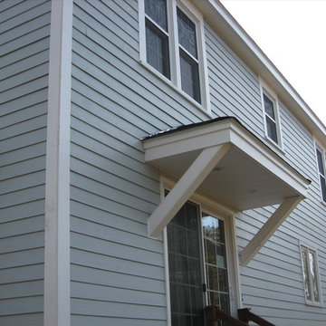
Plymouth MA was tired on maintaining the exterior of this home.
James Hardie siding and trim solved the problem.
Here is a light mist color cedar grained board
 Lola Interiors
Lola Interiors, Interior Design | Johnson Home Builders, Contractor | East Coast Virtual Tours, Photography
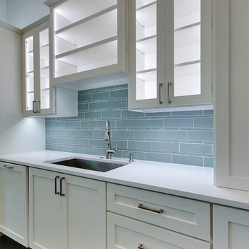
Example of a mid-sized trendy galley dark wood floor open concept kitchen design in Jacksonville with shaker cabinets, white cabinets, quartz countertops, blue backsplash, glass tile backsplash, paneled appliances, an island and a farmhouse sink
Example of a mid-sized trendy galley dark wood floor open concept kitchen design in Jacksonville with shaker cabinets, white cabinets, quartz countertops, blue backsplash, glass tile backsplash, paneled appliances, an island and a farmhouse sink
 KURV Architecture DPC (Alex Hughes Architects)
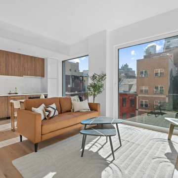
Located in the heart of Manhattan’s Lower East Side, the building was erected on a shallow commercial lot between two 120 year old masonry buildings and a new residential rental building. 330 Grand Street is a mix of 725 SF 1BRs and 1050 SF 2BR apartments. It also contains a 1100 SF two story duplex as well as private and public rooftop space, large private balconies for most units and two large private terraces for the ground floor units.
330 Grand Street was originally designed and approved at the NYC DOB as a prefabricated modular building. During the pandemic, as shipping costs skyrocketed putting the project at risk, we suggested redesigning the building as a reinforced cast-in-place concrete structure. Concrete was readily available and prices had not been affected by the demand increase that many other materials suffered in the pandemic. We took this opportunity to raise floor to ceiling heights, enlarge high performance windows and redistribute the buildings MEPFS and Structural Systems to create very open floor plans.
The challenge was to create a luxurious sensorial living experience with very limited means. In a city with very high construction costs, low cost residential buildings in the area are usually devoid of good quality, design and character. Our approach was to aim high for the end user, prioritizing natural light, open space with long visual perspectives, high ceilings and as always, rejecting the use of predefined building templates.
Our biggest challenge was to ensure that the small spaces feel as clean cut, large and bright as possible. Several unique design decisions were made to ensure low cost and high quality;
Floor plans were laid out so that spaces were wide open and free of clutter from mechanical or structural interruptions. Therefore all infrastructure was placed in lateral demising walls, which in turn act as the unit’s storage and kitchen. The apartments feel wide open, are super quiet and have more storage space than any other comparable apartment in the city.
To solve the problem of the site’s shallow commercial lot which is typically prone to dark interior spaces we focused our attention on the building’s envelope. Instead of the usual small punched window openings, oversized high performance windows were designed to ensure that light penetrated as far as possible into the units. In the smaller 1BR units, the full 50’ depth of the lot is perceived by partitioning spaces with sliding pocket doors that can be retracted to allow deep visual perspectives, making the sight lines in the space feel longer, larger, more ample than normal. In addition to the full height glazing, each unit above the 2nd floor receives a 7 foot covered balcony, adding 120 to 240 sf to each apartment, something unusual in New York City buildings. The space is large enough for a full size dining table, when the weather permits being outside.
We also worked hard to ensure modularity. For example, all kitchen units are all identical throughout the building. The idea of modularity and the economy of the repetitive unit is exercised to the maximum through the building.
Hardware, appliances, flooring, wall coverings and material finishes are all carefully selected to feel bespoke, high quality and unique.
It was important to KURV that the result of this work manifest into something that would deeply connect with the end user and sustain relationships with the consumers of this space.
All images by KURV Architecture ©
Find the right local pro for your project
 Waterman & Sun
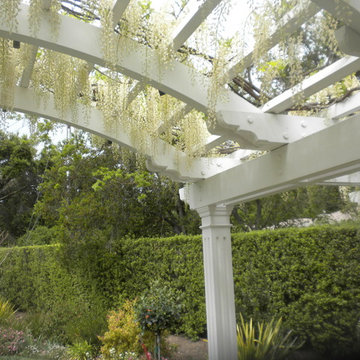
Solving intense sun exposure problem on existing terrace.
Design ideas for a traditional landscaping in San Francisco.
Design ideas for a traditional landscaping in San Francisco.
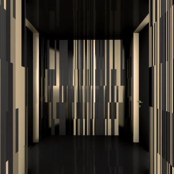 KURV Architecture DPC (Alex Hughes Architects)
Located in the heart of Manhattan’s Lower East Side, the building was erected on a shallow commercial lot between two 120 year old masonry buildings and a new residential rental building. 330 Grand Street is a mix of 725 SF 1BRs and 1050 SF 2BR apartments. It also contains a 1100 SF two story duplex as well as private and public rooftop space, large private balconies for most units and two large private terraces for the ground floor units.
330 Grand Street was originally designed and approved at the NYC DOB as a prefabricated modular building. During the pandemic, as shipping costs skyrocketed putting the project at risk, we suggested redesigning the building as a reinforced cast-in-place concrete structure. Concrete was readily available and prices had not been affected by the demand increase that many other materials suffered in the pandemic. We took this opportunity to raise floor to ceiling heights, enlarge high performance windows and redistribute the buildings MEPFS and Structural Systems to create very open floor plans.
The challenge was to create a luxurious sensorial living experience with very limited means. In a city with very high construction costs, low cost residential buildings in the area are usually devoid of good quality, design and character. Our approach was to aim high for the end user, prioritizing natural light, open space with long visual perspectives, high ceilings and as always, rejecting the use of predefined building templates.
Our biggest challenge was to ensure that the small spaces feel as clean cut, large and bright as possible. Several unique design decisions were made to ensure low cost and high quality;
Floor plans were laid out so that spaces were wide open and free of clutter from mechanical or structural interruptions. Therefore all infrastructure was placed in lateral demising walls, which in turn act as the unit’s storage and kitchen. The apartments feel wide open, are super quiet and have more storage space than any other comparable apartment in the city.
To solve the problem of the site’s shallow commercial lot which is typically prone to dark interior spaces we focused our attention on the building’s envelope. Instead of the usual small punched window openings, oversized high performance windows were designed to ensure that light penetrated as far as possible into the units. In the smaller 1BR units, the full 50’ depth of the lot is perceived by partitioning spaces with sliding pocket doors that can be retracted to allow deep visual perspectives, making the sight lines in the space feel longer, larger, more ample than normal. In addition to the full height glazing, each unit above the 2nd floor receives a 7 foot covered balcony, adding 120 to 240 sf to each apartment, something unusual in New York City buildings. The space is large enough for a full size dining table, when the weather permits being outside.
We also worked hard to ensure modularity. For example, all kitchen units are all identical throughout the building. The idea of modularity and the economy of the repetitive unit is exercised to the maximum through the building.
Hardware, appliances, flooring, wall coverings and material finishes are all carefully selected to feel bespoke, high quality and unique.
It was important to KURV that the result of this work manifest into something that would deeply connect with the end user and sustain relationships with the consumers of this space.
All images by KURV Architecture ©
 IDM Landscapes
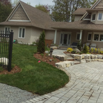
You can see gravel placement which runs parallel to roadside. This collects street water and runs below the parking area and is carried through its piping to a lower discharge location. Solving the water drainage problem
 Art & Smart Inc
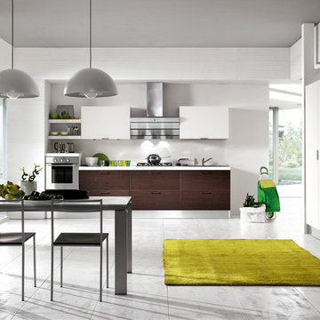
MELA is available in the WHITE, LIGHT OAK, LIGHT WALNUT, BROWN, EGGPLANT, GREY OAK, RED, LARIX, BUTTER, COFFEE and CREAM versions. A young kitchen in performing, suitable even for the most demanding clientele for it was created to solve any problems in use and composition. There are various functional wall hung Accessories and internal equipment. A wide range of tables and chairs is also available to personalised your own kitchen.
 Kitchen Solvers of Columbus
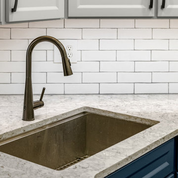
This small kitchen was updated by refacing the cabinets with two tone colors that gave enough contrast to bring the kitchen from an outdated space to a beautiful inviting space. To solve the storage problem, we installed a new pantry. The bead-board backing on the peninsula gave an added interest to the space. The upper cabinets were done in a mist color, while the lower cabinets were done in a midnight color. To finish the new look, we installed an Aria quartz countertop and an igloo ceramic subway tile backsplash. Now this kitchen is ready to be shared with their family and friends.
 Lagois Design Build Renovate
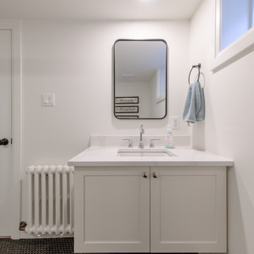
New windows, floors, powder room and basement:
We gave the home new windows, new hardwood floors, and paint throughout. We created a new main floor powder room and a new finished basement containing a living area, three-piece bathroom and new bedroom with egress (tilt and turn) windows.
Flipped around and redesigned kitchen:
We created a new kitchen. The footprint of the kitchen stayed the same, but we flipped it around and redesigned it. Now it has a walk-in pantry area and more floorspace going in and out, which optimized the flow of traffic. We replaced the old non-functioning mudroom with a new one.
Disappearing balcony and drafty door:
To create a new space using a balcony in a bedroom, we extended the second storey out to line up with the first floor, and this increased the square footage. In that room we turned a drafty door into a window.
We reinstated the rear deck, using as many of the original pieces as we could:
There was a leaking roof problem because the original roof pitches were causing ice damming. We designed a new roof to prevent that in the future.
New windows, stucco, and the challenge of asbestos:
Another challenge was installing new windows in the original stucco finish, which contained asbestos. We waterproofed those properly, future proofing them from leaks.
We solved the situation by installing a 5-inch trim around the perimeter of the window. Specialists cut the asbestos back (we had to set up a containment perimeter around each window), and then we placed windows that are five inches wider than the window frames. We used special flashing tapes and sealed them all up behind the stucco.
 JUMA architects
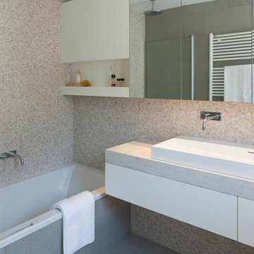
JUMA architects were contacted for the interior design of a shell-state apartment on the coast. The structural construction, the plastering, the floor screed and the technical fittings (heating ducts, plumbing, electricity and ventilation) of the apartment had already been realised.
It soon became apparent, however, that the assignment could not be limited to the interior decoration only, as the placement of kitchen, bathroom and dressing room in the existing plan turned out to be entirely impractical. More extensive renovation work was needed to meet the needs of the customer. The structure of the unit was therefore slightly adjusted to make the bathroom and dressing larger and more functional.
Also, the living room was dominated by a huge radiator that drew all the attention. To solve this problem, new pipes were laid to accommodate an integrated heating element in the sideboard. Gas pipes were fitted in the kitchen for the gas cooker which JUMA included in the design as a real eye-catcher. The sinks, in contrast, were given a more discreet placement.
Light oak parquet was selected for the floors throughout the apartment. The natural appearance of the wood gives all the rooms a warm feel. The built-in furniture was custom made and is finished in black satin lacquer to contrast the light-coloured wood. The dominant colour palette is deliberately kept very simple and neutral and is complemented with light grey tones and colour accents. The colour choice was in fact inspired by a beautiful picture of the coast.
The freestanding furniture and overall decorations were also selected or designed by JUMA architects. The arrangement of the seating area is very playful and atypical. JUMA did not want to put in a couch that would divide the space in two. The composition is meant to create a very open ambiance. A round table was chosen for the same reason. The round shape does not divide the space but allows fluid circulation.
Pictures © Liesbet Goetschalckx
 RG Cowan Design Build
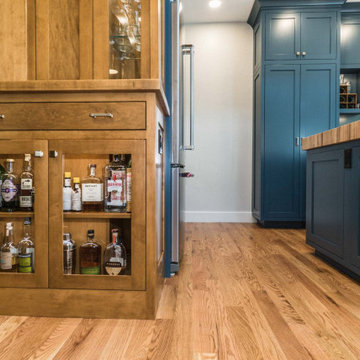
The History Modernized project was designed to solve the problem of a complicated and confined kitchen space in a beautiful turn of the century home. Our clients need for functionality, maximum use of space, and beauty led us to an amazing split kitchen design that allowed for two usable, overlapping work zones in an odd and elongated space.
Within this design we were able to open the kitchen to the existing dining area and create bar seating on the dining room side of the kitchen while modernizing the openness of the plan. Personally, we think function and Beauty tied on this one!
 Remodeling Contractors
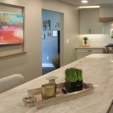
West Des Moines two story homes create challenges for homeowners with layouts including small rooms that don’t seem to flow together. The family that lives in this home found that entertaining and gathering in the kitchen was almost impossible with the current layout and asked for an addition to solve the problem. After listening to the challenges of that they faced and working with the homeowners, a new solution emerged without an addition, reducing the overall budget and allowing the whole main floor to be updated.
By removing the wall between the kitchen and dinning room, the team was able to design an island for family and friends to congregate around. Then by flanking the island with a large commercial range surrounded by a custom backsplash and custom hood a picture perfect kitchen was born. Lastly by repeating elements within the range hood, island and fireplace, the team was able to create unity throughout the space. This visually makes the space feel larger and feels like the addition was built
 Summerwood Products
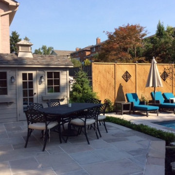
Our traditional Palmerston shed will help you solve your most unusual household problems? Need both a shed and a pool house at the same time? We are here for you
 Pro-Tection Seattle
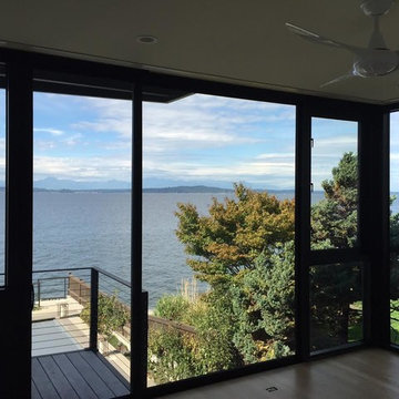
West Seattle offers great views to Puget Sound and this house is no exception. It almost felt like we were in the water from the second and third floor. The bamboo floors were getting a tremendous amount of fading and the air conditioning was having a difficult time keeping up with the heat. We installed 3M Prestige 50 to keep the view and solve the problems from the sun.
 KURV Architecture DPC (Alex Hughes Architects)
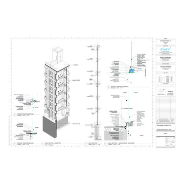
Located in the heart of Manhattan’s Lower East Side, the building was erected on a shallow commercial lot between two 120 year old masonry buildings and a new residential rental building. 330 Grand Street is a mix of 725 SF 1BRs and 1050 SF 2BR apartments. It also contains a 1100 SF two story duplex as well as private and public rooftop space, large private balconies for most units and two large private terraces for the ground floor units.
330 Grand Street was originally designed and approved at the NYC DOB as a prefabricated modular building. During the pandemic, as shipping costs skyrocketed putting the project at risk, we suggested redesigning the building as a reinforced cast-in-place concrete structure. Concrete was readily available and prices had not been affected by the demand increase that many other materials suffered in the pandemic. We took this opportunity to raise floor to ceiling heights, enlarge high performance windows and redistribute the buildings MEPFS and Structural Systems to create very open floor plans.
The challenge was to create a luxurious sensorial living experience with very limited means. In a city with very high construction costs, low cost residential buildings in the area are usually devoid of good quality, design and character. Our approach was to aim high for the end user, prioritizing natural light, open space with long visual perspectives, high ceilings and as always, rejecting the use of predefined building templates.
Our biggest challenge was to ensure that the small spaces feel as clean cut, large and bright as possible. Several unique design decisions were made to ensure low cost and high quality;
Floor plans were laid out so that spaces were wide open and free of clutter from mechanical or structural interruptions. Therefore all infrastructure was placed in lateral demising walls, which in turn act as the unit’s storage and kitchen. The apartments feel wide open, are super quiet and have more storage space than any other comparable apartment in the city.
To solve the problem of the site’s shallow commercial lot which is typically prone to dark interior spaces we focused our attention on the building’s envelope. Instead of the usual small punched window openings, oversized high performance windows were designed to ensure that light penetrated as far as possible into the units. In the smaller 1BR units, the full 50’ depth of the lot is perceived by partitioning spaces with sliding pocket doors that can be retracted to allow deep visual perspectives, making the sight lines in the space feel longer, larger, more ample than normal. In addition to the full height glazing, each unit above the 2nd floor receives a 7 foot covered balcony, adding 120 to 240 sf to each apartment, something unusual in New York City buildings. The space is large enough for a full size dining table, when the weather permits being outside.
We also worked hard to ensure modularity. For example, all kitchen units are all identical throughout the building. The idea of modularity and the economy of the repetitive unit is exercised to the maximum through the building.
Hardware, appliances, flooring, wall coverings and material finishes are all carefully selected to feel bespoke, high quality and unique.
It was important to KURV that the result of this work manifest into something that would deeply connect with the end user and sustain relationships with the consumers of this space.
All images by KURV Architecture ©
 Remodeling Contractors
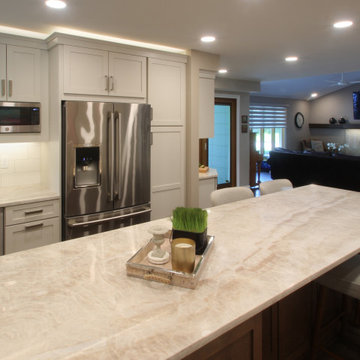
West Des Moines two story homes create challenges for homeowners with layouts including small rooms that don’t seem to flow together. The family that lives in this home found that entertaining and gathering in the kitchen was almost impossible with the current layout and asked for an addition to solve the problem. After listening to the challenges of that they faced and working with the homeowners, a new solution emerged without an addition, reducing the overall budget and allowing the whole main floor to be updated.
By removing the wall between the kitchen and dinning room, the team was able to design an island for family and friends to congregate around. Then by flanking the island with a large commercial range surrounded by a custom backsplash and custom hood a picture perfect kitchen was born. Lastly by repeating elements within the range hood, island and fireplace, the team was able to create unity throughout the space. This visually makes the space feel larger and feels like the addition was built
 Red Pepper Design & Cabinetry
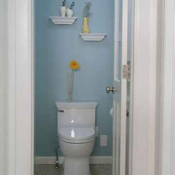
The Happy Throne room! The frosted glass on the top of the door makes this room less claustrophobic. Tile continues in from the main bath area.
Inspiration for a mid-sized timeless bathroom remodel in Denver
Inspiration for a mid-sized timeless bathroom remodel in Denver
 Bellwether Windows, Siding & Doors
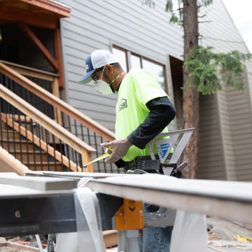
This Colorado mountain home had rotting cedar siding that was creating water intrusion issues. We solved these problems by removing all the siding and trim, as well as soffits and fascia, wrapping the house with HardieWrap, and installing James Hardie HardiePlank 7" lap siding and James Hardie HardieTrim trim. The homeowner selected Timber Bark for the both the siding and trim from the James Hardie ColorPlus Statement Collection, which has a 15-year finish warranty. How do you like the look?
 Galaxy Homes
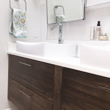
This is a 2-room luxury master bath designed and built by Galaxy Homes. The open and airy shower flows seamlessly from the vanity room with the help of a curb-less shower floor. The vanity is Ikea Godmorgon with custom reclaimed wood drawer fronts. A niche above the vanity solves the problem of needing extra counter space with vessel sinks.
 Alan D. Holt, A.S.L.A., Landscape Architect
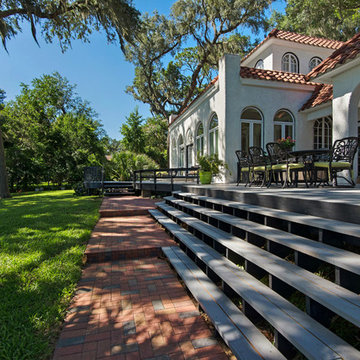
This is a simple addition to the back deck to create an outdoor kitchen and outdoor dining area. A fire pit by the water creates another seating area out in the lawn and gives a perfect place to watch the sun set. The steps and walls improve the access to the boat dock and solve an erosion problem.
Photographed by: Emerald Coast Real Estate Photography
61