
Search results for "Problem solving" in Home Design Ideas
 Edmond Kitchen & Bath LLC
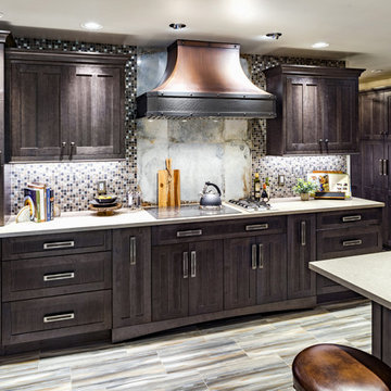
This 1970s ranch style home was in need of a whole revival in the kitchen including a complete new orientation in the space. In order to solve the problem of inadequate passage at the garage door, laundry machines were relocated to another area of the home, and a new "drop zone" for mail and phones was created. A dated soffit was removed and the cooking area was relocated to a longer - focal point wall that allows the cook to be more included while entertaining. An updated rustic and simplified craftsman style was chosen to compliment the other elements of stone and beams in the rest of the home. Of specific note is the installation of both induction and gas cooktops under the same real copper venthood for optional cooking methods. Another great kitchen for a wonderful family. Photos by David Cobb Photography.
 Alan D. Holt, A.S.L.A., Landscape Architect
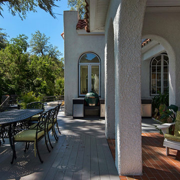
This is a simple addition to the back deck to create an outdoor kitchen and outdoor dining area. A fire pit by the water creates another seating area out in the lawn and gives a perfect place to watch the sun set. The steps and walls improve the access to the boat dock and solve an erosion problem.
Photographed by: Emerald Coast Real Estate Photography
 Shuler Architecture
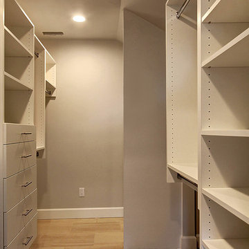
This urban infill project is a make-over of a decrepit structure that had been used as a student rental for close to 50 years. Situated on an elevated, 3300 sf lot, nothing in the original house was salvageable and the entire house was stripped down to the studs. Our challenge with this project was to then open up the original interiors, flood them with natural light while creating a design that appealed to the broadest buyer pool possible.
We solved this problem by organizing a compact floor plan that resulted in a 4 bedroom, 4 bath residence organized around a great room on the main level, a family room on the basement level and an additional 2 bedrooms with city views on the upper. By minimizing circulation space, we were able to re-purpose every square foot of floor area while creating a dramatic, light-filled staircase that tied all 3 levels of the house together into a unified living scheme. Clean lines and clean details, this is another of our attempts at a 'Not So Big House.'
Marketing of the final product lasted less than 10 days and resulted in 3 full priced offers that netted the developer a tidy profit.
Find the right local pro for your project
 Elizabeth Minish Design
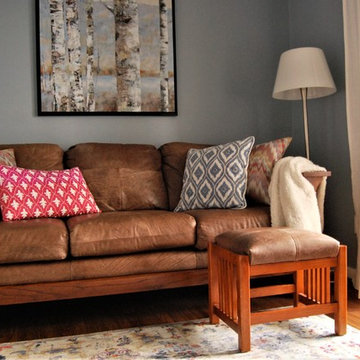
The TV room/Den in this multi-level townhouse suffered from an identity crisis. It opened onto a covered patio but the carpeted floor made it seem more like a bedroom than a room with outdoor access. It sometimes served as an extra bedroom for guests, but was primarily a TV room. An adjacent laundry room was oddly configured and opened into a busy hallway/landing area. The fix included closing off the existing door to the laundry room and opening it up to the den. This made both rooms more user-friendly. The carpet was replaced with luxury vinyl plank flooring in both rooms, making a much more practical surface for a room with an exterior door. A pocket door was not feasible in the location so barn-door hardware solved the problem of a door opening onto the sofa.
 JUMA architects
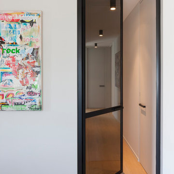
JUMA architects were contacted for the interior design of a shell-state apartment on the coast. The structural construction, the plastering, the floor screed and the technical fittings (heating ducts, plumbing, electricity and ventilation) of the apartment had already been realised.
It soon became apparent, however, that the assignment could not be limited to the interior decoration only, as the placement of kitchen, bathroom and dressing room in the existing plan turned out to be entirely impractical. More extensive renovation work was needed to meet the needs of the customer. The structure of the unit was therefore slightly adjusted to make the bathroom and dressing larger and more functional.
Also, the living room was dominated by a huge radiator that drew all the attention. To solve this problem, new pipes were laid to accommodate an integrated heating element in the sideboard. Gas pipes were fitted in the kitchen for the gas cooker which JUMA included in the design as a real eye-catcher. The sinks, in contrast, were given a more discreet placement.
Light oak parquet was selected for the floors throughout the apartment. The natural appearance of the wood gives all the rooms a warm feel. The built-in furniture was custom made and is finished in black satin lacquer to contrast the light-coloured wood. The dominant colour palette is deliberately kept very simple and neutral and is complemented with light grey tones and colour accents. The colour choice was in fact inspired by a beautiful picture of the coast.
The freestanding furniture and overall decorations were also selected or designed by JUMA architects. The arrangement of the seating area is very playful and atypical. JUMA did not want to put in a couch that would divide the space in two. The composition is meant to create a very open ambiance. A round table was chosen for the same reason. The round shape does not divide the space but allows fluid circulation.
Pictures © Liesbet Goetschalckx
 KURV Architecture DPC (Alex Hughes Architects)
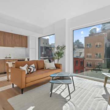
Located in the heart of Manhattan’s Lower East Side, the building was erected on a shallow commercial lot between two 120 year old masonry buildings and a new residential rental building. 330 Grand Street is a mix of 725 SF 1BRs and 1050 SF 2BR apartments. It also contains a 1100 SF two story duplex as well as private and public rooftop space, large private balconies for most units and two large private terraces for the ground floor units.
330 Grand Street was originally designed and approved at the NYC DOB as a prefabricated modular building. During the pandemic, as shipping costs skyrocketed putting the project at risk, we suggested redesigning the building as a reinforced cast-in-place concrete structure. Concrete was readily available and prices had not been affected by the demand increase that many other materials suffered in the pandemic. We took this opportunity to raise floor to ceiling heights, enlarge high performance windows and redistribute the buildings MEPFS and Structural Systems to create very open floor plans.
The challenge was to create a luxurious sensorial living experience with very limited means. In a city with very high construction costs, low cost residential buildings in the area are usually devoid of good quality, design and character. Our approach was to aim high for the end user, prioritizing natural light, open space with long visual perspectives, high ceilings and as always, rejecting the use of predefined building templates.
Our biggest challenge was to ensure that the small spaces feel as clean cut, large and bright as possible. Several unique design decisions were made to ensure low cost and high quality;
Floor plans were laid out so that spaces were wide open and free of clutter from mechanical or structural interruptions. Therefore all infrastructure was placed in lateral demising walls, which in turn act as the unit’s storage and kitchen. The apartments feel wide open, are super quiet and have more storage space than any other comparable apartment in the city.
To solve the problem of the site’s shallow commercial lot which is typically prone to dark interior spaces we focused our attention on the building’s envelope. Instead of the usual small punched window openings, oversized high performance windows were designed to ensure that light penetrated as far as possible into the units. In the smaller 1BR units, the full 50’ depth of the lot is perceived by partitioning spaces with sliding pocket doors that can be retracted to allow deep visual perspectives, making the sight lines in the space feel longer, larger, more ample than normal. In addition to the full height glazing, each unit above the 2nd floor receives a 7 foot covered balcony, adding 120 to 240 sf to each apartment, something unusual in New York City buildings. The space is large enough for a full size dining table, when the weather permits being outside.
We also worked hard to ensure modularity. For example, all kitchen units are all identical throughout the building. The idea of modularity and the economy of the repetitive unit is exercised to the maximum through the building.
Hardware, appliances, flooring, wall coverings and material finishes are all carefully selected to feel bespoke, high quality and unique.
It was important to KURV that the result of this work manifest into something that would deeply connect with the end user and sustain relationships with the consumers of this space.
All images by KURV Architecture ©
 Kitchen Solvers of Columbus
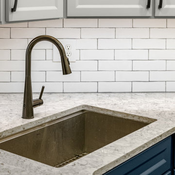
This small kitchen was updated by refacing the cabinets with two tone colors that gave enough contrast to bring the kitchen from an outdated space to a beautiful inviting space. To solve the storage problem, we installed a new pantry. The bead-board backing on the peninsula gave an added interest to the space. The upper cabinets were done in a mist color, while the lower cabinets were done in a midnight color. To finish the new look, we installed an Aria quartz countertop and an igloo ceramic subway tile backsplash. Now this kitchen is ready to be shared with their family and friends.
 Kustom Home Design
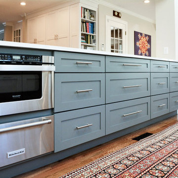
This amazing renovation focused on solving a series of problems that a previous kitchen expansion had created. By rearranging the appliance placement, updating the cabinetry, designing all new storage solutions and maximizing the amazing outdoor views; we cured the spit personality disorder plaguing the existing kitchen. The home now has a beautifully redesigned kitchen and living space perfect for entertaining, relaxing and enjoying the outside views. Vaulted ceilings with bright skylights, reflective glass wall tiles, sleek sophisticated Cambria quartz counter tops, fingerprint-free faucet, multi-functional Prolific kitchen sink by Kohler, stainless steel appliances, creative storage solutions, all new lighting and timeless shaker cabinets by Wellborn lend to the now bright, open, vivacious and flawless function of this newly renovated galley style kitchen. White base cabinets along the outside walls contrast perfectly with the dark grey island cabinets. Linear satin nickel door and drawer pulls coordinate with the stainless steel appliances and sink. An eclectic blend of vintage and modern furnishings, artwork and rugs create a comfortable balance that feels and looks timeless. Breathtaking backyard views are artfully framed by new Pella windows and doors with integral blinds between the glass. Calm, inviting neutral tones provide the perfect backdrop for this refined design.
Photos by: Kimberly Kerl
 Alan D. Holt, A.S.L.A., Landscape Architect
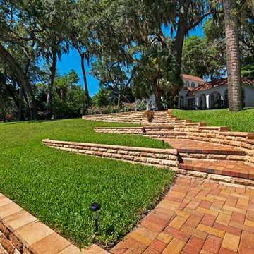
This is a simple addition to the back deck to create an outdoor kitchen and outdoor dining area. A fire pit by the water creates another seating area out in the lawn and gives a perfect place to watch the sun set. The steps and walls improve the access to the boat dock and solve an erosion problem.
Photographed by: Emerald Coast Real Estate Photography
 Chester County Kitchen & Bath
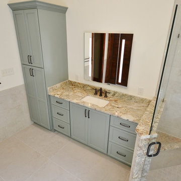
Large West Chester PA Master bath remodel. The clients wanted more storage, his and hers vanities, and no tub. A linen closet, plenty of drawers, and additional cabinetry storage were designed to solve that problem. Fieldstone cabinetry in the Moss Green painted finish really looks sharp. The floor was tiled in large 4’x4’ tiles for a clean look with minimal grout lines. The wainscoting and shower tile were also simple large tiles in a natural tone that tie in nicely with the beautiful granite countertops and shower wall caps. New trims, louvered toilet room and pocket entry door were added and stained to match the original trim throughout the home. ( Perfect match by our finisher ) Frameless glass shower surround, new lighted vanity mirrors, and additional recessed ceiling lights finish out the new look. Another awesome bathroom with happy clients.
 TOUCH Architect Co., Ltd.
PROJECT | Duplicate-Duplex
TYPE | private residence / home-studio
LOCATION | Phayathai Rd., Bangkok, Thailand
OWNER | Ms. Najaree Ratanajiajaroen / Chanon Treenet
ARCHITECT | TOUCH Architect Co.,Ltd.
FLOOR AREA | 64 sq.m.
FLOOR AREA (by proposing) | 75 sq.m.
COMPLETION | 2018
PHOTOGRAPHER | Chalermwat Wongchompoo
CONTRACTOR | Legend Construction Group
A major pain point of staying in 64 sq.m. of duplex condominium unit, which is used for a home-studio for an animator and an artist, is that there is not enough space for dwelling. Moreover, a double-volume space of living area with a huge glass curtain wall, faces West. High temperature occurs all day long, since it allows direct sunlight to come inside.
In order to solve both mentioned problems, three addition items are proposed which are, GRID PARTITION, EXTENSION DECK, and STEPPING SPACE.
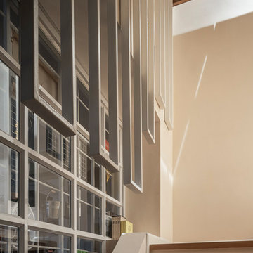
A glass partition not only dividing space between kitchen and living, but also helps reduce electricity charge from air-condition. Grid-like of double glass frame is for stuff and stationery hanging, as to serve the owners’ activities.
Extension deck would help filtrating heat from direct sunlight, since an existing high glass facade facing West.
An existing staircase for going up to the second-floor bedroom, is added by a proposed space above, since this condominium unit has no enough space for dwelling or storage. In order to utilize the space in a small condominium, creating another staircase above the existing one helps increase the space.
The grid partition and the extension deck help ‘decrease’ the electricity charge, while the extension deck and the stepping space help ‘increase’ the space for 11 sq.m.
 Building Shelter Inc
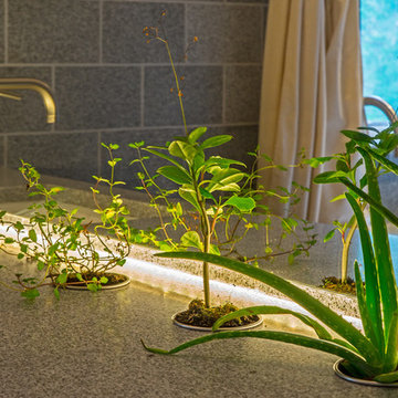
As code begins to require tighter and tighter houses we are locked in with chemicals that are used to build, decorate, furnish and clean our homes. This project was a stab at solving this significant health problem. Here are some key features that helped us create this self-purifying master bathroom:
- Air Purifying Paint
- Air Filtering Plants as per NASA research (pots cut into stone countertops)
- Low Energy indirect LED light strips
- Low VOC materials used throughout including underlayment, glues & grout
- Water-blown spray foam insulation
Photography: Gil Jacobs
 Grandeur Hills Group,Inc.
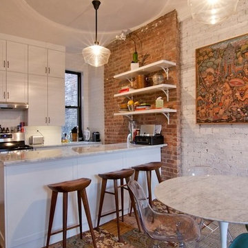
Lighting is one of the main advantages of this great kitchen. Of course, the large windows in the kitchen allow daylight to easily enter the room, but in the evening, the owners of this apartment cannot do without effective artificial lighting.
Unlike most prestigious kitchens with contemporary design styles, you can't see many different types of lighting here. Our interior designers solved the lighting problem with the help of original beautiful large pendant lamps.
Make your kitchen as beautiful, stylish, and functional as this one together with our outstanding interior designers!
 Jacob Lilley Architects
Jacob Lilley Architects
Location: Lexington, MA, USA
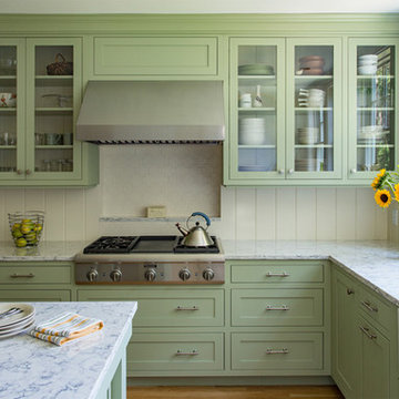
A new garage, kids play room above and a mudroom met the need for more space. A renovated kitchen, bedroom and other living spaces created a refreshed sense of home.
The strategic location of the mudroom as an intermediary connector solved problems with this 19th-century home siting seven feet above the ground with limited access to the rear yard.
The connector between the garage and existing house is a stair that unifies the various levels and develops a strong connection to the yard.
Photographed by: Eric Roth

 JWH Design and Cabinetry LLC
Filling a large room, while maintaining function can be a challenge. The breakfast area with concealed microwave and refrigerator drawers solve this problem at the far end of the room.
Space planning and cabinetry: Jennifer Howard, JWH
Photography: Mick Hales, Greenworld Productions
 Manning Design
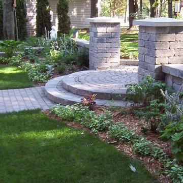
A gracious entry way was designed to highlight the front door, solve a water problem by building a low retaining wall, and create opportunities for perennial beds. Photo by Manning Design
 Labrador Interiors
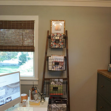
Running out of space in your home? Having a multipurpose room solves the problem! This room allows you to have an organized work space and a large walk in-closet. The key thing is to know what you need to satify both so you plan it out. So here is a "Cloffice"

 Nested Interior Design
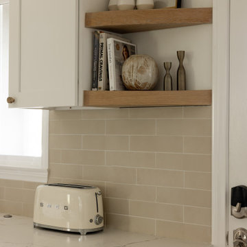
These floating white oak shelves solved a unique problem for our clients! Since the front door opens directly into the kitchen, bringing the upper cabinets all the way to the edge would have created a crowded headspace when entering/leaving the home. The solution was clear: floating shelves! Though, even with floating shelves we were concerned about a 90 degree corner and an unsuspecting guests' forehead one day colliding! Our fix was a custom curve, perfectly suited to maximize the depth & functionality of the shelves while eliminating any risk of a collision. We love how these additions turned out!
 Design Studio West
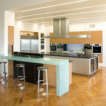
Design Studio West designed and, in concert with our general contractor, installed a Poggenpohl kitchen and wet bar as part of our home remodel. They provided a very creative design (solving a problem of how to open the kitchen to the breakfast and family rooms) and their workmen and subcontractors did excellent work. The kitchen, six years later, still looks like new and still gets rave reviews. Design Studio West was a pleasure to work with.
phpowers.
63