
Search results for "Problem solving" in Home Design Ideas
 Shuler Architecture
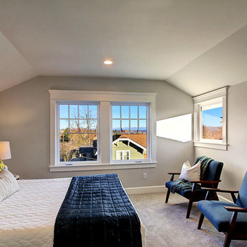
This urban infill project is a make-over of a decrepit structure that had been used as a student rental for close to 50 years. Situated on an elevated, 3300 sf lot, nothing in the original house was salvageable and the entire house was stripped down to the studs. Our challenge with this project was to then open up the original interiors, flood them with natural light while creating a design that appealed to the broadest buyer pool possible.
We solved this problem by organizing a compact floor plan that resulted in a 4 bedroom, 4 bath residence organized around a great room on the main level, a family room on the basement level and an additional 2 bedrooms with city views on the upper. By minimizing circulation space, we were able to re-purpose every square foot of floor area while creating a dramatic, light-filled staircase that tied all 3 levels of the house together into a unified living scheme. Clean lines and clean details, this is another of our attempts at a 'Not So Big House.'
Marketing of the final product lasted less than 10 days and resulted in 3 full priced offers that netted the developer a tidy profit.
 Bennett Design Co.
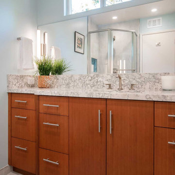
This couple's long-term water leak left their downstairs guest bathroom in disarray. It had gotten so bad that the toilet would actually rock due to the sub-floor deterioration. After the remodel, this small but mighty bathroom leaves a memorable impression on its guests, primarily because of its efficient footprint and bold use of color.
This project became necessary after a long- term water leak left the floor tile broken and the subfloor deteriorating.
Once underway, we set out to determine what other problems we could help solve in this guest bathroom. We explored several different floorplans for this space, but we ultimately decided that the general location of the fixtures worked well for these homeowners.
One of the primary concerns was to determine how we could include as much vanity storage as possible. Their old vanity included a shallow section next to the toilet, but it only had two shallow top drawers, making the bulk of the storage awkward and hard to access.
Although they liked the size of their old shower stall, the plastic insert was corroding. They also didn't have anywhere to place their shower products, and there was no place to hang a towel. We opted for a tiled shower and included a shampoo niche for their bath products. We also included a horizontal shower door handle, which doubles as a towel bar.
 Alan D. Holt, A.S.L.A., Landscape Architect
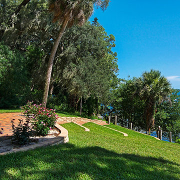
This is a simple addition to the back deck to create an outdoor kitchen and outdoor dining area. A fire pit by the water creates another seating area out in the lawn and gives a perfect place to watch the sun set. The steps and walls improve the access to the boat dock and solve an erosion problem.
Photographed by: Emerald Coast Real Estate Photography
Find the right local pro for your project
 Building Shelter Inc
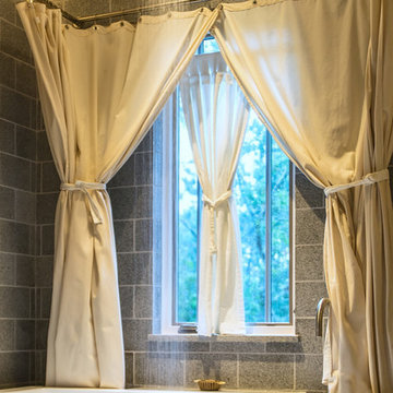
As code begins to require tighter and tighter houses we are locked in with chemicals that are used to build, decorate, furnish and clean our homes. This project was a stab at solving this significant health problem. Here are some key features that helped us create this self-purifying master bathroom:
- Air Purifying Paint
- Air Filtering Plants as per NASA research (pots cut into stone countertops)
- Low Energy indirect LED light strips
- Low VOC materials used throughout including underlayment, glues & grout
- Water-blown spray foam insulation
Photography: Gil Jacobs
 RG Cowan Design Build
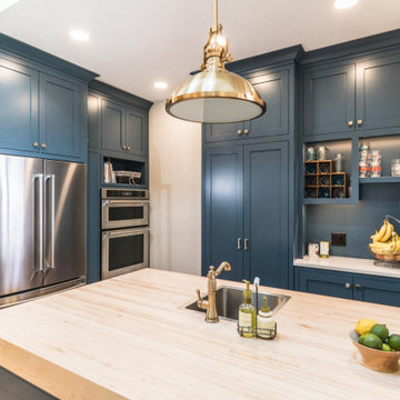
The History Modernized project was designed to solve the problem of a complicated and confined kitchen space in a beautiful turn of the century home. Our clients need for functionality, maximum use of space, and beauty led us to an amazing split kitchen design that allowed for two usable, overlapping work zones in an odd and elongated space.
Within this design we were able to open the kitchen to the existing dining area and create bar seating on the dining room side of the kitchen while modernizing the openness of the plan. Personally, we think function and Beauty tied on this one!
 KE Interior Solutions
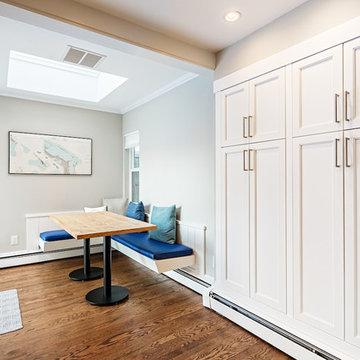
The floating custom bench seating solved the problem of having to remove the baseboard heet system. Keeping that in place was the best option and clean is easy with the floating set structure.
 Mood Interieur
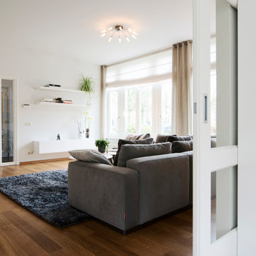
This house needed a total make-over. My clients wanted a solution between living room and serre which added more light and storing space. Mood Interieur was hired to suggest a new floor plan and to act as a sparring partner.
The wall with ceiling high sliding doors and a cupboard over the whole lenght of the wall in the serre solved the light and storing problem.
Mood Interieur also designed the tv cupboard and wardrobe closet.
All the dark colours were replaced by fresh, white colours combined with greige. A colour which beautifully interacts with the shabby-chic Flexform sofa en the greige blue Bomat carpet. The white and wood Arco tablet tables go perfectly with the white tv-cupboard and new doors.
Furniture and curtains are suggested and delivered by Mood Interieur.
 Mood Interieur
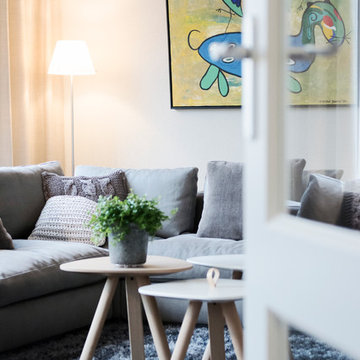
This house needed a total make-over. My clients wanted a solution between living room and serre which added more light and storing space. Mood Interieur was hired to suggest a new floor plan and to act as a sparring partner.
The wall with ceiling high sliding doors and a cupboard over the whole lenght of the wall in the serre solved the light and storing problem.
Mood Interieur also designed the tv cupboard and wardrobe closet.
All the dark colours were replaced by fresh, white colours combined with greige. A colour which beautifully interacts with the shabby-chic Flexform sofa en the greige blue Bomat carpet. The white and wood Arco tablet tables go perfectly with the white tv-cupboard and new doors.
Furniture and curtains are suggested and delivered by Mood Interieur.
 Timberline Patio Covers
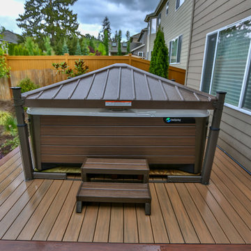
Gable style patio cover attached to the house and equipped with full outdoor kitchen, electric heaters, screens, ceiling fan, skylights, tv, patio furniture, and hot tub. The project turned out beautifully and would be the perfect place to host a party, family dinner or the big game!
 AC Pacific Corporation
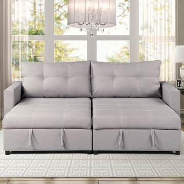
Beautiful and extremely practical. This unique sofa solves your storage space problems. The Robin has been designed with much thought, both in design and function. The contemporary styling that includes simple track arms, beautiful contrasting stitching, and comfy gently tufted back cushions make this beauty a no-brainer.
Hidden under its stylish facade, are two (2) generous storage compartments ready to conceal anything and everything from throw blankets, additional pillows, entertaining supplies, board games, devices, toys, and much more!
How easy is it to access the storage compartments you ask? Easy. Pull and lift the fabric handles in front of the sofa to raise the seat cushion that is reinforced by a safe heavy duty spring and mechanism system for ease of access.
The innovative design, simple to clean fabric, and insanely practical-function of this storage bed makes this new addition to your home the perfect choice for your clutter and storage dilemma.

 KURV Architecture DPC (Alex Hughes Architects)
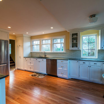
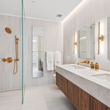
Located in the heart of Manhattan’s Lower East Side, the building was erected on a shallow commercial lot between two 120 year old masonry buildings and a new residential rental building. 330 Grand Street is a mix of 725 SF 1BRs and 1050 SF 2BR apartments. It also contains a 1100 SF two story duplex as well as private and public rooftop space, large private balconies for most units and two large private terraces for the ground floor units.
330 Grand Street was originally designed and approved at the NYC DOB as a prefabricated modular building. During the pandemic, as shipping costs skyrocketed putting the project at risk, we suggested redesigning the building as a reinforced cast-in-place concrete structure. Concrete was readily available and prices had not been affected by the demand increase that many other materials suffered in the pandemic. We took this opportunity to raise floor to ceiling heights, enlarge high performance windows and redistribute the buildings MEPFS and Structural Systems to create very open floor plans.
The challenge was to create a luxurious sensorial living experience with very limited means. In a city with very high construction costs, low cost residential buildings in the area are usually devoid of good quality, design and character. Our approach was to aim high for the end user, prioritizing natural light, open space with long visual perspectives, high ceilings and as always, rejecting the use of predefined building templates.
Our biggest challenge was to ensure that the small spaces feel as clean cut, large and bright as possible. Several unique design decisions were made to ensure low cost and high quality;
Floor plans were laid out so that spaces were wide open and free of clutter from mechanical or structural interruptions. Therefore all infrastructure was placed in lateral demising walls, which in turn act as the unit’s storage and kitchen. The apartments feel wide open, are super quiet and have more storage space than any other comparable apartment in the city.
To solve the problem of the site’s shallow commercial lot which is typically prone to dark interior spaces we focused our attention on the building’s envelope. Instead of the usual small punched window openings, oversized high performance windows were designed to ensure that light penetrated as far as possible into the units. In the smaller 1BR units, the full 50’ depth of the lot is perceived by partitioning spaces with sliding pocket doors that can be retracted to allow deep visual perspectives, making the sight lines in the space feel longer, larger, more ample than normal. In addition to the full height glazing, each unit above the 2nd floor receives a 7 foot covered balcony, adding 120 to 240 sf to each apartment, something unusual in New York City buildings. The space is large enough for a full size dining table, when the weather permits being outside.
We also worked hard to ensure modularity. For example, all kitchen units are all identical throughout the building. The idea of modularity and the economy of the repetitive unit is exercised to the maximum through the building.
Hardware, appliances, flooring, wall coverings and material finishes are all carefully selected to feel bespoke, high quality and unique.
It was important to KURV that the result of this work manifest into something that would deeply connect with the end user and sustain relationships with the consumers of this space.
All images by KURV Architecture ©
 User
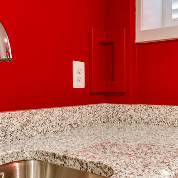
UserThe main waste stack in the corner was unattractive, but had to remain accessible. The access panel with a magnetic latch solves this problem.
Inspiration for a timeless laundry room remodel in DC Metro
Inspiration for a timeless laundry room remodel in DC Metro
 LIV Design Partners
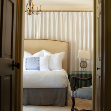
This bedroom has a window that is off center so we covered it with a wall of drapes. It not only solved our symmetry problem but also softens the room.
 Pennsylvania Landscape & Nursery Association
Terren Landscapes http://www.terrenlandscapes.com
Project Entry: Pembrooke Estate Rain Garden
2014 PLNA Awards for Landscape Excellence Winner
Category: Sustainable Landscape &60,000-$120,000
Award Level: Silver
Project Description:
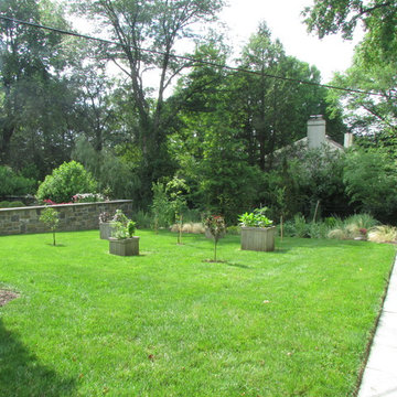
The client contracted our company to solve multiple existing drainage problems. In a heavy rain event the existing French drain system would overflow, causing water to pool in the driveway. After investigating the system we found that the capacity of the French drain was undersized for the amount of storm water from the large rain events received in recent years. As a result of our findings and at the request of the homeowner, we designed a storm water management system to capture all storm water from the structures on the property and regenerate the underground aquifers for the volume of a 5.8” rainstorm. In addition to the new drain system, the homeowners wanted a rain garden to provide a backdrop for an existing formal garden, provide a habitat for wildlife, and provide screening from an adjacent neighbor.
Throughout the design process many challenges were presented, including an existing gas line, which ran directly through the area that best suited the bioswale. The existence of the gas line caused us to alter the shape and depth of the bioswale in some areas. We also inspected the existing downspouts to make sure there were no obstructions that would impede the system’s efficiency, and then conducted a test pit dig to make sure we had sufficient percolation rates for disposal of storm water.
To effectively capture the storm water runoff, the existing downspouts were piped from the main house and the large detached garage to a large catch basin located at the low point in the driveway. The driveway catch basin contains two outlet pipes at different elevations within the basin allowing water from smaller rain events to enter the bioswale and rain garden area to percolate into the soil before excess water overflows into a sediment trap which filters out any debris and is then piped to an underground StormTech® pit to slowly percolate into the ground. The other outlet pipe in the driveway catch basin is used for larger storm water events, taking the water directly to the StormTech® pit.
Accepting and slowing the velocity of the storm water, mitigation of erosion, and filtering out pollutants contained in the “first flush” of rainfall are the primary functions of the bioswale and rain garden. Planting these areas with mostly native plant species helps carry out these functions while attracting and providing shelter for wildlife.
The ‘Niobe’ weeping willow is the centerpiece of the rain garden, connecting with the axis of the existing formal garden. To screen the neighboring property we chose Chamaecyparis nootkatensis ‘Pendula’ for its graceful evergreen habit and tolerance of wet sites. ‘Ivory Halo’ dogwood and Panicum ‘Cloud Nine’ were used for screening as well as winter interest. To provide deciduous structure to the garden Taxodium distichum and Magnolia virginiana were used in conjunction with witch hazel. Mostly native wetland perennials were used due to their tolerance of wet conditions and occasional drought.
The area above the StormTech® pit provides space for the client’s family to relax. The rain garden and bioswale provide screening, storm water management, a habitat for wildlife, and plants that enhance the adjacent formal garden.
Photo Credit: Terren Landscapes
 Alan D. Holt, A.S.L.A., Landscape Architect
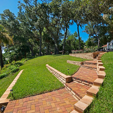
This is a simple addition to the back deck to create an outdoor kitchen and outdoor dining area. A fire pit by the water creates another seating area out in the lawn and gives a perfect place to watch the sun set. The steps and walls improve the access to the boat dock and solve an erosion problem.
Photographed by: Emerald Coast Real Estate Photography
 HeatTrak Snow Melting Mats
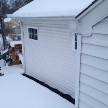
"I have a flat roof covering a porch next to my home. Every winter snow would accumulate and eventually begin to leak in to the home. Even though we had the roof redone, the flashing just wasn't high enough to prevent leaking. After every storm, I would go out on to the roof to Zev saves his home from leaking after the snow | HeatTrak Snow Melting Matsshovel near the house so that the snow wouldn't accumulate and begin to leak in.
The HeatTrak mat solved the problem by melting the snow in the area next to my home so that it couldn't accumulate and leak in.
It worked great.
Thank you for all your help."
- Zev
 Galaxy Homes
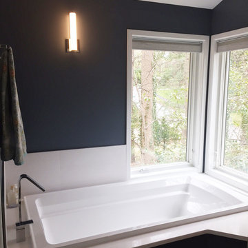
This is a 2-room luxury master bath designed and built by Galaxy Homes. The open and airy shower flows seamlessly from the vanity room with the help of a curb-less shower floor. The vanity is Ikea Godmorgon with custom reclaimed wood drawer fronts. A niche above the vanity solves the problem of needing extra counter space with vessel sinks.
 KURV Architecture DPC (Alex Hughes Architects)
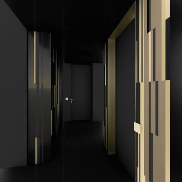
Located in the heart of Manhattan’s Lower East Side, the building was erected on a shallow commercial lot between two 120 year old masonry buildings and a new residential rental building. 330 Grand Street is a mix of 725 SF 1BRs and 1050 SF 2BR apartments. It also contains a 1100 SF two story duplex as well as private and public rooftop space, large private balconies for most units and two large private terraces for the ground floor units.
330 Grand Street was originally designed and approved at the NYC DOB as a prefabricated modular building. During the pandemic, as shipping costs skyrocketed putting the project at risk, we suggested redesigning the building as a reinforced cast-in-place concrete structure. Concrete was readily available and prices had not been affected by the demand increase that many other materials suffered in the pandemic. We took this opportunity to raise floor to ceiling heights, enlarge high performance windows and redistribute the buildings MEPFS and Structural Systems to create very open floor plans.
The challenge was to create a luxurious sensorial living experience with very limited means. In a city with very high construction costs, low cost residential buildings in the area are usually devoid of good quality, design and character. Our approach was to aim high for the end user, prioritizing natural light, open space with long visual perspectives, high ceilings and as always, rejecting the use of predefined building templates.
Our biggest challenge was to ensure that the small spaces feel as clean cut, large and bright as possible. Several unique design decisions were made to ensure low cost and high quality;
Floor plans were laid out so that spaces were wide open and free of clutter from mechanical or structural interruptions. Therefore all infrastructure was placed in lateral demising walls, which in turn act as the unit’s storage and kitchen. The apartments feel wide open, are super quiet and have more storage space than any other comparable apartment in the city.
To solve the problem of the site’s shallow commercial lot which is typically prone to dark interior spaces we focused our attention on the building’s envelope. Instead of the usual small punched window openings, oversized high performance windows were designed to ensure that light penetrated as far as possible into the units. In the smaller 1BR units, the full 50’ depth of the lot is perceived by partitioning spaces with sliding pocket doors that can be retracted to allow deep visual perspectives, making the sight lines in the space feel longer, larger, more ample than normal. In addition to the full height glazing, each unit above the 2nd floor receives a 7 foot covered balcony, adding 120 to 240 sf to each apartment, something unusual in New York City buildings. The space is large enough for a full size dining table, when the weather permits being outside.
We also worked hard to ensure modularity. For example, all kitchen units are all identical throughout the building. The idea of modularity and the economy of the repetitive unit is exercised to the maximum through the building.
Hardware, appliances, flooring, wall coverings and material finishes are all carefully selected to feel bespoke, high quality and unique.
It was important to KURV that the result of this work manifest into something that would deeply connect with the end user and sustain relationships with the consumers of this space.
All images by KURV Architecture ©
 Bridges Const.
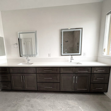
Complete M. Bath makeover, We also replaced windows that failed and solved an ongoing ext. leak problem in the stucco.
Features: New Shaker cabinetry by KCD, Quartz countertops, A dated fiberglass tub and shower enclosure was replaced with a custom shower that included a shampoo niche, frameless glass enclosure and complimentedwith new tile flooring. All new exhaust venting, Led recessed cans and Led mirrors were installed. Before and after pictures tell it all!
62