
Search results for "Process requests" in Home Design Ideas
 Christopher Zoltan Designs
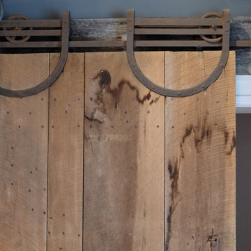
Custom sliding barn doors are a signature project at Zoltan Design Co. The distinctive, upscale look is a stylish solution for cramped spaces while doubling as a beautiful piece of wall art. When a client considers space-saving options but also has a desire to create a chic atmosphere, custom sliding barn doors are a ZDC interior design staple for three reasons:
1. ELEGANCE AND TIMELESSNESS
Nothing serves as a better focal point than a sliding barn door. Mixing the right door with the right colors throughout the space makes décor express itself in all the right places. Zoltan Design’s custom craftsmanship will give a barn door the character it needs to stand out, which explains why it’s one of the most popular accent pieces in interior design.
2. FUNCTIONALITY THAT IS OUTSIDE OF THE ORDINARY
This style choice is an elegant way to save space due to its sliding function. For instance, this feature is creatively used to conceal laundry rooms or to hide electronics during entertaining. A custom sliding barn door is used in a multitude of ways to keep your home functional while embracing glamor and comfort.
3. WE HAVE A PASSION FOR AUTHENTICITY
Zoltan Design’s custom sliding barn doors are authentic and American-made. One of our greatest passions is working with wood, which is why we created BARN, our line of custom furniture and barn doors. It is a privilege to carefully select recycled beams, barnwood and building materials from all over the country to craft beautiful pieces for our clients.
ZOLTAN DESIGN’S CUSTOM SLIDING BARN DOORS
Christopher Ritchie, Creative Director, is one of the area’s most sought-after talents, working with clients from concept to completion. As one of our most in-demand projects, each barn door is unique, refined, and exquisitely curated for your space. Our custom sliding barn doors adorn clients’ walls as pieces of art to elevate elegance in their home. From the historic wood, to the details of the carefully crafted nail heads, Zoltan crafts a piece that reflects refined tastes.
As part of ZDC’s trademark style, the barn doors are American-made and homegrown. These storied pieces celebrate old world vintage with wood that originates from 19th-century barns across the country. Once the high-quality wood is salvaged, it is reclaimed into the lavish design that suspends in a home.
THE PROCESS
Once the space is evaluated, clients receive detailed drawings, and CAD (computer-aided design) drawings, which reveals realistic 3-D layouts of a barn door before the installation process begins. Although each project is highly individualized, a custom sliding barn door will enter its final phase in six to eight weeks
As part of this delicate process, Zoltan Design Co.’s team works with our clients throughout design and manufacturing, all the way to installation. With the ability to choose from a variety of hardware and brackets, as well as the option to incorporate glass, we create a personalized piece to enhance your essence. If you’re interested in learning more about custom sliding barn doors or if you would like to request a consultation, please contact us today.
 Tile Doctor Ltd
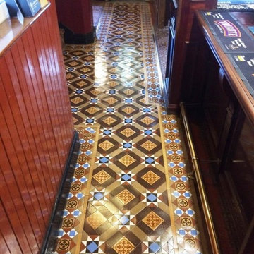
Here’s a really interesting commercial job for you, which I recently completed in the town of Hinckley, Leicestershire. I was asked to take a look at a Victorian Geometric and Encaustic tiled floor in the historic Queen’s Head pub.
This floor is over a century old and although in good condition for its age had suffered significant wear over the years, along with some cracked tiles and slight inherent moisture issues. What the pub landlord requested was a restorative clean to alleviate the aesthetically damaging effect of the wear, and to enhance the natural colours of the stone. I was also asked to seal the floor following the clean to achieve a semi-gloss finish.
The first step in the cleaning process was to mix a strong solution of one part Tile Doctor Pro-Clean to four parts clean water. Pro-Clean is a high alkaline cleaner which also contains stripping properties, allowing it to break down old sealer and tackle heavy soil build-up. The solution was applied to the floor and left to dwell for 15 minutes, giving it times to seep into the stone, get underneath the dirt and lift it to the surface.
I addressed several paint spots and areas suffering from glue contamination by using Tile Doctor Remove & Go, which is specially formulated to break down paint and adhesives on unpolished natural stone floors, amongst others. The entire floor was then scrubbed using a special floor cleaning pad, and the resulting slurry was vacuumed away using a wet-vac machine.
The final issue to deal with was the inherent efflorescence staining. This was treated using Tile Doctor Grout Clean-Up, an acid-based product which removes not just efflorescence but also grout haze, mineral deposits, and rust stains. The solution here was one part Grout Clean-Up diluted with four parts water.
After completing the clean, I thoroughly rinsed the floor with clean water to remove any trace of cleaning product and dried the floor as much as possible with a wet vacuum, then before leaving for the day i installed a couple of air movers to assist with drying overnight.
Upon my return the following day, I checked the floor for any excess moisture before sealing it with our topical, semi-gloss finish sealer, known as Seal & Go Extra which due to its formula is ideal for external or old internal floors where there is unlikely to be damp from membrane.
This unique product provides excellent protection, and allows the tiles to breath where floors are suffering from inherent moisture issues. It is suitable for both internal and external use, on Victorian floor tiles, Sandstone, Flagstones, Terracotta, and rough Slate.
As you can see from the photo, I was able to fulfil my client’s request to a high standard, bringing the pub’s old yet characterful Victorian tiled floor back to life again.
Kay Sylvester
Leicestershire Tile Doctor
 Renovisions
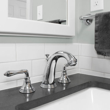
One of our favorite clients requested our services once again, this time to update their outdated full bath. The main goal, aside from keeping the existing tub and surround in place, was to replace the tired vanity, small medicine cabinet, countertop, sink, flooring, light fixture, shower valve and trims with products that are more on trend. The desire was to create a wow factor and display their personal style.
Designing a bath with transitional finishes and a clean aesthetic was top of mind when we selected a white painted inset-style vanity, contrasting marble-look quartz countertop in suede finish and classic 3” x 6” white subway wall tiles. Tying together different patterns and incorporating 8” x 8” black and white deco floor tiles provides an interesting and refreshing industrial look that is an expression of our client’s individuality and style. Adding to this industrial style feature was the double light fixture with clear seeded glass mounted over the new framed recessed medicine cabinet with matching painted finish. Also, a priority in the remodeling process was to provide proper ventilation to not only keep air moving, but to ensure moisture is cleared from the room while showering.
This newly remodeled updated bathroom is light and airy, and clients are thrilled with the result.
“Hi Cathy, I just wanted to let you know how pleased we are with our bathrooms and stairs!! Ed, Bradley, and Charlie did their usual fantastic job, not to mention your guidance and expertise. We could not be more thrilled! Each and every time I look at the wall color in the upstairs bath, I comment to myself that Liz really is a ‘wiz’. Thank you, thank you, thank you!”
- Susan and Hal M. (Hanover)
Find the right local pro for your project
 Moderne Builders
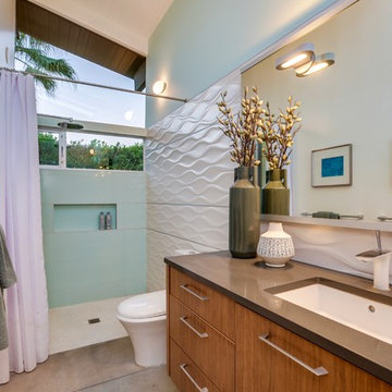
Gorgeous master bath with dramatic retro "wave" tile. Peak Photography
Example of a 1950s bathroom design in Los Angeles
Example of a 1950s bathroom design in Los Angeles
 Renovisions
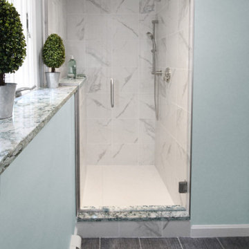
This South Shore of Boston client approached the team of Renovisions to remodel her existing basement bathroom. This bath, with an outdated fiberglass shower stall was cracked and leaking into the concrete floor below. The room had inadequate storage, was dark and did not boost this home’s overall market value.
It was definitely time for a Renovision and the client was excited to get started! She was looking forward to sharing the new space with guests that stay at her home and use the bathroom often.
Working alongside this client was fun and productive as great design and product choices were selected together. In the design process, Renovisions presented a unique idea; using the basement foundation ledge for a shelf that ran into the shower area, gaining extra space for shampoos and soaps, eliminating the need for a niche. Another great idea was to implement a Grohe Smart Control valve which brings this shower experience to another level; they can choose ways to spray with the right degree of warmth. The stunning stream-lined shower trims in brushed nickel finish match the style and finish on the single-lever vanity faucet.
The contrasting dark grey, large format porcelain floor tile’s texture resembles a linen-look pattern the client requested while complimenting the darker veining in the quartz curb, shelf and vanity countertop.
The Carrera-look porcelain shower wall tiles boast no-maintenance and provides a clean, brighter appeal seen through the beautiful custom shower glass enclosure. We lightened up the bath with a light blue paint color which added a fresh look, giving the illusion of a bigger space.
As you can see, with the right colors, textures and accessories, we transformed this basement bath from Drab to Fab. The client was thrilled with her basement Renovision, a true Breath of Fresh Flair’!
 Bella Domicile
Dale Hall Photography, LLC
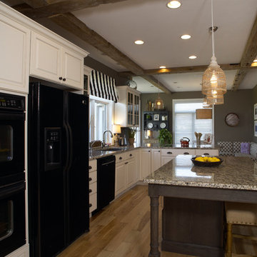
Mountain style l-shaped light wood floor open concept kitchen photo in Milwaukee with an undermount sink, raised-panel cabinets, white cabinets, granite countertops, black appliances and an island
Mountain style l-shaped light wood floor open concept kitchen photo in Milwaukee with an undermount sink, raised-panel cabinets, white cabinets, granite countertops, black appliances and an island
 Advance Design Studio, Ltd.
Jennifer and Dan have lived in their Deer Park Illinois home for 15 years, slowly making minor fixes like painting and decorating; but they had a new plan for their kitchen the entire time. An awkwardly placed garage door, and an island cooktop with a terrible downdraft made a full-scale kitchen remodel an absolute must. Jennifer had many ideas in mind and wanted to work with a company that could provide high-end work, while partnering with a designer that would tailor the kitchen to her ideas.
She was intrigued by the phrase “Common Sense Remodeling” in Advance Design’s feature she discovered while perusing an issue of the community’s Quintessential Barrington Magazine. Doing further research on the company’s website, as she looked through project profiles and read about Advance Design’s “Common Sense Remodeling” philosophy, she promptly scheduled an appointment to see if the people and ideas she read about were truly who they said they were. The more she read, the more she knew that the “Common Sense” approach to remodeling they described was exactly the type of company she was looking for.
The partnership was sealed after an initial consultation with Owner Todd Jurs and Project Designer Michelle Lecinski. They displayed a combination of friendliness, professionalism and respect that was unmatched by any of the other companies Jennifer talked to. She knew that with Advance Design, she would be able to retain the vision that she had in mind with high-quality craftsmanship.
“I reached out to Advance Design because of the ‘Common Sense Remodeling’ tagline,” Jennifer said. “That’s what lingered for me”. “Advance Design was the most respectful- of the house and of my design ideas, and the most professional of the handful of companies that looked at my project”.
Soon after the meeting Jennifer began working with Michelle on the project design. They quickly developed chemistry. Jennifer loved how Michelle researched and located every detail that Jennifer wanted for the kitchen. Between the two of them, every concept and idea was worked through and perfected. “Jennifer had definite ideas about what she wanted the new kitchen to look like, she just didn’t know how to bring it all together. We worked together really well to make her ideas into the practical reality necessary for a well-functioning kitchen, with the look and feel that she had envisioned”, says Michelle.
“Michelle was wonderful in using the CAD system she would show me new drawings every time we changed the layout while working through the design,” Jennifer said. “She was a really wonderful partner in execution, she made sure everything happened quickly and easily.”
The finished design drew out elements of Jennifer’s style and personality. The pair call the look “sophisticated farmhouse” to describe the kitchen renovation to family and friends. The result was a beautifully crafted, authentic-feeling space that satisfied Jennifer’s dreams 15 years in the making. The whole project consisted of a kitchen remodel, mudroom upgrade with powder room, and garage entry relocation. “The projects I personally like the best, are the ones that put the client’s dreams on display,” Project Designer Michelle said. “And this is one of those projects.”
The main focal point of the kitchen is custom zinc and brass ventilation hood with a vintage sheen, which was hand made to order by a small company in Indiana named Vogler Metalworking. “It’s like sculpture, a true work of art”, says Jennifer. Your eye is immediately drawn towards this elegant yet practical hood that eliminated the home’s downdraft problem and added a striking conversation piece at the same time. The carpenters had to use special gloves when transporting and installing it, so they didn’t smudge it with fingerprints. The beautiful hood centers proudly over the stunning black enamel and brass LaCornue Range. “I had a friend who had a LaCornue range and after learning how easy it was to cook perfect meals, I was convinced I wanted to have one”, says Jennifer. This unique, breathtaking combination anchors the entire kitchen and is apparent immediately as you walk into the great room the surrounds the space.
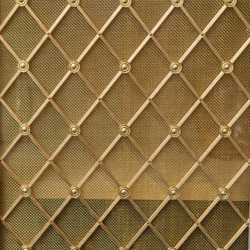
DuraSupreme Crestwood cabinets with a Kendall Panel add function and sophistication. A custom gray paint color paired with a storm blue was developed so that the new kitchen looked like it belonged to the existing space. Unlacquered brass faucets and hardware were important to Jennifer because she wanted the living finishes to age over time. Remarkable brass diamond mesh cabinet door inserts imported from the UK continue to add this one-of-a-kind kitchen renovation; giving it a “you won’t see this everywhere” quality. The use of old railcar flooring for the coffee bar countertop and reclaimed oak for the open shelving gives an authenticity to the space uncommon in kitchens today.
Jennifer and Michelle fell in love with the Limestone Grey Stone while they were investigating unique island countertop ideas. They liked the fact that the limestone as a living finish will age and change over time. Calcutta Miel Quartz countertops made for an excellent pairing around the perimeter, as it’s durable and perfect for cooking preparations. A textured white subway tile backsplash that runs to the ceiling keeps your eye moving towards the open shelving, and to the main focal point of the stunning range hood combination.
“The kitchen functions beautifully, and it’s gorgeous,” beams Jennifer as she gestures with both hands while smiling ear to ear. “The most important thing was I wanted a kitchen that had a wonderful flow, cooked beautiful meals and was a great gathering place for family and friends, and this space does that perfectly! Beauty wise, it turned out exactly how I had envisioned. I felt the function part was the hardest part, and that was nailed”!
Relocating the garage entry to the new mudroom was a huge priority and has finally separated the family’s arriving home functions from their kitchen. Now coats and shoes and bags have their own area for dropping once members arrive home. Matching gray DuraSupreme cabinetry helped create gorgeous, purposeful lockers for the family. A reclaimed vintage sink and custom wall paper were added to the tiny powder room to beautify the once previously only functional space. Advance Design was even able to create a custom space for their dog to sleep while the family is away.
“It was unbelievable that a project of this size was completed in such a short time, and I think that’s because of the large amount of planning and preparation that went into it,” Jennifer marveled, “When we started, we were ready, and everything was prepared”.
When it came to execution, Project Manager Justin Davis and his crew were quick, accessible, and organized. Projects like this kitchen are typically completed in as little as 8-10 weeks. Jennifer’s kitchen however despite the relocation of some challenging HVAC in a soffit and moving of an exterior door was completed remarkably fast in part because the team was working with an existing tile floor that ran throughout the first floor that the client really loved.
“You get to know these people really well because they’re living in your house while you’re living in your house. They were so fast and really good, it didn’t take as long as even planned” reported Jennifer. “I would text Justin and he always responded almost immediately. I got to know all the guys who were working in our house and they were all wonderful people”.
Details in a customized kitchen like this one require skill and care from the people who install it. “All the guys on the job were skilled at what the did. I wanted small details like little feet to look like furniture, that is where their carpentry skill came in to make these all perfect”, said Jennifer. “The tile guys were wonderful. They even let me determine how I wanted the texture with the grout to appear for a salt and pepper look; now that is a very skilled trade person making it custom”.
In Jennifer’s interview, she continued to reference Advance Design’s “Common Sense Remodeling”, so I took a minute to ask her exactly what that phrase meant to her and how it played out in her experience with her project and the Advance Design team. Here is what she said: “I was intrigued about Common Sense Remodeling and in my head that there would be clear costs and prices, great communication between the design team, the execution team and me”, said Jennifer. They did deliver on that, it was so clear about the cost breakdown, what I could expect from everyone who came to my house, and everything that we had ordered. That to me is the Common Sense”!
It’s great to see a client take literally our assertion that a well-planned remodeling project is simply “Common Sense”! She anticipated each step of the way would be clear, concise, and predictable, all the while protecting the outcome due to the careful upfront planning. “Advance Design delivered on their ‘Common Sense Remodeling’ promise,” Jennifer said. “From the design team, to the execution team - everything was straight forward like I imagined. The project turned out exactly how I envisioned, I enjoyed this process and absolutely would recommend Advance Design Studio to anyone.”
 Renovisions
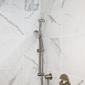
This South Shore of Boston client approached the team of Renovisions to remodel her existing basement bathroom. This bath, with an outdated fiberglass shower stall was cracked and leaking into the concrete floor below. The room had inadequate storage, was dark and did not boost this home’s overall market value.
It was definitely time for a Renovision and the client was excited to get started! She was looking forward to sharing the new space with guests that stay at her home and use the bathroom often.
Working alongside this client was fun and productive as great design and product choices were selected together. In the design process, Renovisions presented a unique idea; using the basement foundation ledge for a shelf that ran into the shower area, gaining extra space for shampoos and soaps, eliminating the need for a niche. Another great idea was to implement a Grohe Smart Control valve which brings this shower experience to another level; they can choose ways to spray with the right degree of warmth. The stunning stream-lined shower trims in brushed nickel finish match the style and finish on the single-lever vanity faucet.
The contrasting dark grey, large format porcelain floor tile’s texture resembles a linen-look pattern the client requested while complimenting the darker veining in the quartz curb, shelf and vanity countertop.
The Carrera-look porcelain shower wall tiles boast no-maintenance and provides a clean, brighter appeal seen through the beautiful custom shower glass enclosure. We lightened up the bath with a light blue paint color which added a fresh look, giving the illusion of a bigger space.
As you can see, with the right colors, textures and accessories, we transformed this basement bath from Drab to Fab. The client was thrilled with her basement Renovision, a true Breath of Fresh Flair’!
 Independent Home Walk In Tubs New Jersey
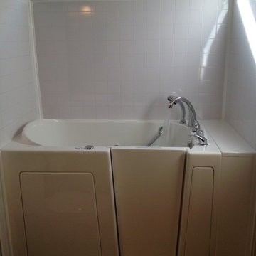
Our installation experts at Independent Home just completed a walk in tub installation for our customer Edward of Haddonfield. Find out why he decided to go with Independent Home along with how the installation was completed.
Edward began shopping around for walk in tubs about a month ago. He was looking for a tub that was not only safe but could help with his arthritis. He received quotes from a few different companies but in the end decided on Independent Home. We were chosen because our salesmen were not pushy and were patient with answering all of Edward’s questions. A pre-installation meeting was then scheduled.
The pre-installation meeting involved our installation experts and, of course, Edward. The meeting consisted of discussing what tub would be best for Edward’s needs, where the best location would be, and what type of finish should be added. Edward and our experts decided to go with our celebrity walk in tub with hydrotherapy model.
The celebrity was the best choice for Edward because it had all of the requirements he was looking for. It met his safety requirements with a non-slip floor, an ADA compliant seat, and a low threshold for an easy entrance and exit. The tub’s hydrotherapy features will be able to reduce Edward’s arthritis pain. All he has to do is turn on the jets and relax. The way that the jets move will increase his circulation which will help his muscles and joints rehabilitate.
The entire installation process only took a couple of days to complete. This consisted of removing Edward’s old tub and foundation, bringing in the new tub, leveling the legs, connecting the water, and testing for leaks. The last step of the installation was building the finish with a simple tile wall surround that Edward had requested.
Edward loves his new tub. The hydrotherapy features have decreased his arthritis pain, allowing him to get out more.
 Hearthstone Inc
Richard Herman is in the hospitality business and owns several upscale hotels in Florida and in other states as well as cattle ranches in both Florida and Missouri. Their farm in Ocala is by farm their most unique. The property serves as a 4-H demonstration project for the purpose of children’s education. They have been working with the Academy Prep of St. Pete which is dedicated to inner-city youths that are selected on the basis of need and achievement. Wife Diane spends her time on the farm raising Gypsy Vanners, a diminutive draft horse named after the job they did in Eastern Europe, pulling the wagons (vans) for gypsies that wandered across the continent. On the Ocala farm, there are several mules with a unique profession.
Richard had visited the Hearthstone display at a Log & Timber Home Shows at the Orlando Convention Center many years ago. He was impressed that Hearthstone had stayed in touch with him over the years by mailings, invitations to shows, and periodic phone calls. When the time came to start serious consideration of the design of barn, Hearthstone responded promptly and professionally to Richard and Diane’s requests for information and a review of their ideas for their barn, which would serve as the centerpiece for their new farm.
They wanted a multipurpose facility that could accommodate an educational environment and a large hall suitable for the fundraising events for his charities. Richard wanted a barn that reflected the look and feel of barns built at the dawn of the 20th century. Besides the rustic chicken houses and vegetable gardens, they have completely renovated a 1020’s era farmhouse to be as historically correct as possible and serves as the entry to the farm.
“They very careful to feel us out, get comfortable with our capabilities, and be convinced that we could perform as promised,” said Project Manager John Ricketson of Hearthstone.
Design Process
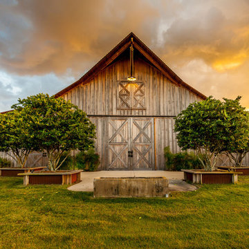
There were some initial drawings that gave us a start on the basic shape and size of the barn. From there, it was a process of narrowing down the uses of each area and the spans that could be achieved. The barn was going to have the traditional “board & batten” exterior siding and a metal roof. There is a cantilevered ‘hay hood” on the north gable end above the large sliding barn doors that open into the foyer and horse stalls. The wings house a combination of areas, beginning with the large restrooms to accommodate crowds for events. Other parts of the wings have garage areas for the farm vehicles, feed room, tack room, wash rack, storage, offices, and smaller restrooms.
Keeping with the look and feel of the turn of the century, Hearthstone developed a process for giving the timbers a surface texture that mimicked the circular cuts of timbers that had just come out of an old sawmill. This was easier said than done. Randy Giles guided his millwright (Wolfgang) in designing a machine that would do this effectively.
The barn was delivered in October of 2014 and was erected over the course of two weeks, thanks to a hardworking crew (Eric Foster) and near-perfect weather. After the Hearthstone crew completed the erection and roof dry-in, it was time for the local carpenters to step up and install some light conventional framing on the gable ends before applying the roof fascia and exterior board & batten siding. Next came the big sliding barn doors, plumbing, electrical, heating, and cooling. Large rustic fixtures were hung from the great hall roof timbers.
Exterior
The board & batten siding was cypress and allowed to turn color naturally as rain hit it and the sun started working on it with UV rays. This method causes a much grayer look closer to the ground and less so where the roof overhang provides protection. The North end has some large limestone boulders and planters arranged around the pad with tall pampas grass. The planters provide casual seating before events and during outside receptions. The entire area was sodded with lush St. Augustine grass and split rail fences were added to enclose the barn area. The corrugated metal roof was a special order material that immediately rusted after being exposed to moisture. The layer of rust protects the metal from the elements.
Interior
The board & batten theme was carried throughout most of the interior with the timbers left natural to show off the circular saw texture. All of the tongue & groove decking was shipped in advance to allow the local painter to pre-stain it with a dark brown transparent stain that is a beautiful background to the light color Eastern White Pine timbers.
“Everything was unique in this project” said Project Manager John Ricketson. “The setting on a small demonstration farm close to Ocala, the multipurpose design, the circular saw texture on the timbers.”
The Hermans are very proud of their farm’s outcome. Richard sent a note to Randy Giles, owner of Hearthstone: “The Barn is fantastic, not a single problem, period. Next month, we have Jo Dee Messina coming in to help with a fundraiser for a local center for abused kids. Folks love the farm, ...... but that barn gets all of the attention. I would encourage you to use me as a reference for your sales team, feel free to extend my cell phone to any prospective purchasers.”

 Twelve Stones Designs, LLC
The owners of this kitchen had spent the money to upgrade the finishes in their kitchen upon building the home 12 years ago, but after living in the space for several years they realized how nonfunctional the layout really was. The (then) two preschool aged children had grown into busy, hungry teenagers with many friends who also liked to hang out at the house. So the family needed a more functional kitchen with better traffic flow, space for daily activities revolving around the kitchen at different times of day, and a kitchen that could accommodate cooking for and serving large groups. Furthermore, the dark, traditional finishes no longer reflected the homeowners’ style. They requested a brighter, more relaxed, coastal style that reflected their love of the seaside cities they like to visit.
Originally, the kitchen was U-shaped with a narrow island in the middle. The island created narrow aisles that bottle-necked at the dishwasher, refrigerator, and cooktop areas. There was a pass-through from the foyer into the kitchen, but the owners never liked that the pass-through was also located so close to the powder room. The awkward proximity was unappealing and made guests feel uncomfortable.
The kitchen’s storage was made up of lots of narrow cabinets, apothecary drawers, clipped corner units, and very few drawers. It lacked useful storage for the larger items the family used on a daily basis. And the kitchen’s only pantry was small closet that had only builder-grade, narrow shelving with no illumination to be able to see the contents inside.
Overall, the kitchen’s lighting plan was poorly executed. Only six recessed cans illuminated the entire kitchen and nook areas. The under cabinet lighting was not evenly distributed either. In fact, the builder had mis-placed the under cabinet lighting around the decorative pilasters which made for choppy, dark cubbies. Further, the builder didn’t include any lighting over the sink or the bar area, which meant whoever was doing the dishes was always in their own shadow. That, coupled with the steep overhang of the game room above made the bar area feel like a dim, cavernous space that wasn’t inviting or task oriented. The kitchen looked out into the main living space, but the raised bar and a narrow wall (which held the only large cabinet in the kitchen) created more of a barrier than a relationship to the living room or breakfast nook. In fact, one couldn’t even see the breakfast nook from the cooktop or sink areas due to its orientation. The raised bar top was too narrow to comfortably sit to either dine at or chat from due to the lack of knee space. The the homeowners confided that the kitchen felt more like a dark, dirty prison than place where the family, or their guests, wanted to gather and commune.
The clients' needs and desires were:
➢ to create a kitchen that would be a space the family loved to be in; to relate to the adjacent spaces all around, and to have better flow for entertaining large groups
➢ to remove the walls between the breakfast nook and living area and to be able to utilize the natural light from the windows in both those areas
➢ to incorporate a functional chopping block for prepping fresh food for home cooked meals, an island with a large sink and drain board, 2 pull out trash cans, and seating for at least the 2 teens to eat or do homework
➢ to design a kitchen and breakfast nook with an airy, coastal, relaxed vibe that blended with the rest of the house's coastal theme
➢ to integrate a layered lighting plan which would include ample general illumination, specific task lighting, decorative lighting, and lots of illuminated storage
➢ to design a kitchen with not only more storage for all the husband’s kitchen gadgets and collection of oils and spices, but smart storage, including a coffee/breakfast bar and a place to store and conceal the toaster oven and microwave
➢ to find a way to utilize the large open space between the kitchen, pantry area, and breakfast nook
Twelve Stones Designs achieved the owner's goals by:
➢ removing the walls between the kitchen and living room to allow the natural light to filter in from the adjacent rooms and to create a connection between the kitchen, nook, and living spaces for a sense of unity and communion
➢ removing the existing pantry and designing 3 large pantry style cabinets with LED tape lights and rollout drawers to house lots of kitchen appliances, gadgets, and tons of groceries. We also took the cabinets all the way up to the 9’ ceiling for additional storage for seasonal items and bulk storage.
➢ designing 2 islands - 1 with a gorgeous black walnut chopping block that houses a drawer for chopping and carving knives and a custom double pull out trash unit for point of use utilization - and 1 that houses the dishwasher, a large Blanco Gourmet sink with integrated drain board, woven baskets for fresh root vegetables and kitchen towels, plenty of drawer storage for kitchen items, and bar seating for up to 4 diners.
➢ closing off the space between the kitchen and the powder room to create a beautiful new private alcove for the powder room as well as adding some decorative storage. This also gave us space to include more tall storage near the new range for precision placement of the husband’s extensive oil and spice collection as well as a location for a combo-steam oven the wife wanted for baking and cooking healthy meals.
The project is enhanced functionally by:
➢ incorporated USB and standard receptacles for the kids’ laptops and phone charging in the large island
➢ designing the small island to include additional open shelving for items used on a daily basis such as a variety of bowls, plates, and colanders. This set up also works well for the husband who prefers to “plate” his dinners in restaurant-style fashion before presenting them to the table.
➢ the integration of specific storage units, such as double stacked cutlery drawers, a custom spice pull-out, a Kuerig coffee and tea pod drawer, and custom double stacked utensil drawers
➢ moving the refrigerator to the old oven location - this eliminated the bottle neck as well as created a better relationship to the eating table. It also utilizes the floor space between the pantry, nook, and kitchen
➢ creating a banquet style breakfast nook - this banquette seating not only doubles the amount of seating for large gatherings but it better utilizes the odd space between the kitchen and the previous nook area. It also helps to create a distinct pathway from the mudroom room through the pantry area, kitchen, nook, and living room.
➢ the coffee/breakfast bar area which includes the perfect location for the concealed microwave and toaster oven, convenient storage for the coffee pods and tea accoutrements. Roll-out drawers below also house the smoothie maker, hot water kettle, and a plethora of smoothie-making ingredients such as protein powders, smoothie additives, etc. Furthermore, the drawers below the Keurig house measuring utensil, cutlery, baking supplies and tupperware storage.
➢ incorporating lots of wide drawers and pullouts to accommodate large cookware.
➢ utilizing as much vertical space as possible by building storage to the ceiling which accommodates the family’s abundant amount of serving platters, baking sheets, bakeware, casserole dishes, and additional cutting boards.
The project is enhanced aesthetically by:
➢ new 5-piece Versailles pattern porcelain tile that now seamlessly joins the entire down stairs area together creating a bright, cohesiveness feeling instead of choppy separated spaces - it also adds a coastal feeling
➢ designing a cabinet to conceal the microwave and toaster oven
➢ the coastal influenced light fixtures over the nook table and island
➢ the sandy colors of the Langdon Cambria countertops. The swirling pattern and sparkling quartz pieces remind the homeowner of black-and-tan sandy beaches
➢ the striped banquet seating whose creamy white background and blue-green stripes were the inspiration for the cabinet and wall colors.
➢ All the interior doors were painted black to coordinate with the blacks and grays in the backsplash tile and countertop. This also adds a hint of tailored formality to an otherwise casual space.
➢ the use of WAC's Oculux small aperture LED units for the overhead lighting complimented with Diode LED strips for task lighting under the cabinets and inside the pantry and glass wall cabinets. All of the lighting applications are on separate dimmer switches.
Innovative uses of materials or construction methods by Realty Restoration LLC:
➢ Each 1-1/2” x 3” block of reclaimed end-grain black walnut that makes up the center island chopping block was hand milled and built in the shop. It was designed to look substantial and proportional to the surrounding elements, executed by creating the 4 inch tall top with a solid wood chamfered edge band.
➢ The metal doors on either side of the vent hood were also custom designed for this project and built in the Realty Restoration LLC shop. They are made 1x2, 11-gauge mild steel with ribbed glass. Weighing 60 lbs a piece, heavy duty cabinet hinges were added to support the weight of the door and keep them from sagging.
➢ Under-cabinet receptacles were added along the range wall in order to have a clean, uninterrupted backsplash.
Design obstacles to overcome:
➢ Because we were removing the demising walls between the kitchen and living room, we had to find a way to plumb and vent the new island. We did this by tunneling through the slab (the slab had post tension cables which prevented us from just trenching) to run a new wet vent through a nearby structural wall. We pulled the existing hot and cold lines between upper floor joists and ran them down the structural wall as well and up through a conduit in the tunnel.
➢ Since we were converting from wall overs to a gas range it allowed us to utilize the 220 feed for the wall ovens to provide a new sub panel for all the new kitchen circuits
➢ Due to framing deficiencies inherited from the original build there was a 1-1/2” differential in the floor-to-ceiling height over a 20 foot span; by utilizing the process of cutting and furring coupled with the crown moulding details on the cabinet elevations we were able to mask the problem and provide seamless transitions between the cabinet components.
Evidence of superior craftsmanship:
➢ uniquely designed, one-of-a-kind metal “X” end panels on the large island. The end panels were custom made in the Realty Restoration LLC shop and fitted to the exact dimensions of the island. The welding seams are completely indistinguishable - the posts look like they are cut from a single sheet of metal
➢ square metal posts on the small island were also custom made and designed to compliment and carry through the metal element s throughout the kitchen
➢ the beautiful, oversized end panels on the pantry cabinets which give the breakfast nook a tailored look
➢ integrating a large format 5 piece Versailles tile pattern to seamlessly flow from the existing spaces into the new kitchen space
➢ By constructing a custom cabinet that jogged around a corner we could not remodel (housing the entry way coat closet) we were able to camouflage the adjacent wall offset within the upper and lower cabinets. By designing around the existing jog in the structural walls we accomplished a few things: we were able to find the space to house, and hide, the microwave and toaster oven yet still have a clean cohesive appearance from the kitchen side. Additionally, the owners were able to keep their much needed coat closet and we didn’t have to increase the budget with unnecessary structural work.
 Tile Doctor Ltd
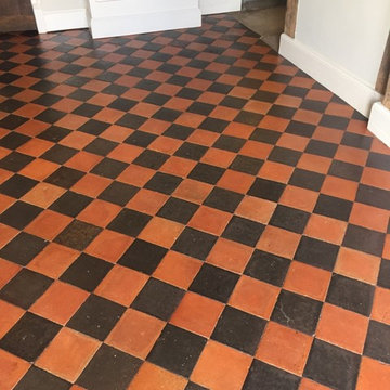
Sometimes it isn’t until you’ve deep cleaned your tiles that you realise just how dirty they were to begin with. This was the case with my customer in Thame, in the south of Oxfordshire where I worked on a classic red and black Quarry tiled floor which was far from being in its best condition.
My starting point in the cleaning process was to mix a strong solution of Tile Doctor Pro Clean, which is the reliable, multi-purpose alkaline cleaner that is safe to use on tile, stone and grout. The solution was left to soak into the tiles for ten minutes before being scrubbed into the floor with a rotary floor machine fitted with a stiff brush.
Following this, I rinsed the floor with clean water and then proceeded to wash it with Tile Doctor Grout Clean Up. This is a concentrated phosphoric acid cleaner designed to remove efflorescence and other mineral deposits such as grout smears.
Finally, I rinsed the tiles again with water and Tile Doctor Neutral Tile Cleaner, which is a pH neutral solution, to neutralise the chemicals and leave the floor fresh and clean, ready to be sealed. The floor was left to dry overnight.
The next day I returned to seal the floor after checking the tiles were dry. I opted to use two different sealers. The first was Tile Doctor Colour Grow, which is an impregnating sealer with the added effect of enhancing the natural colour in the stone. The second was Tile Doctor Seal & Go, a topical sealer that adds the high quality, durable sheen finish to the floor that the customer had requested.
I took the photograph below after sealing half the floor, it really shows the difference a sealer can make to a tiled floor.
Here’s the photo of theQuarry tiled floorafter sealing the whole floor. As you can see, they now have a new lease of life, and they’ll be much easier for the customer to keep looking great in the future.
Barry Woodward
Oxfordshire Tile Doctor
 Renovisions
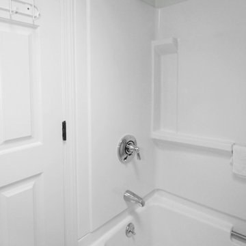
One of our favorite clients requested our services once again, this time to update their outdated full bath. The main goal, aside from keeping the existing tub and surround in place, was to replace the tired vanity, small medicine cabinet, countertop, sink, flooring, light fixture, shower valve and trims with products that are more on trend. The desire was to create a wow factor and display their personal style.
Designing a bath with transitional finishes and a clean aesthetic was top of mind when we selected a white painted inset-style vanity, contrasting marble-look quartz countertop in suede finish and classic 3” x 6” white subway wall tiles. Tying together different patterns and incorporating 8” x 8” black and white deco floor tiles provides an interesting and refreshing industrial look that is an expression of our client’s individuality and style. Adding to this industrial style feature was the double light fixture with clear seeded glass mounted over the new framed recessed medicine cabinet with matching painted finish. Also, a priority in the remodeling process was to provide proper ventilation to not only keep air moving, but to ensure moisture is cleared from the room while showering.
This newly remodeled updated bathroom is light and airy, and clients are thrilled with the result.
“Hi Cathy, I just wanted to let you know how pleased we are with our bathrooms and stairs!! Ed, Bradley, and Charlie did their usual fantastic job, not to mention your guidance and expertise. We could not be more thrilled! Each and every time I look at the wall color in the upstairs bath, I comment to myself that Liz really is a ‘wiz’. Thank you, thank you, thank you!”
- Susan and Hal M. (Hanover)
 Reico Kitchen & Bath
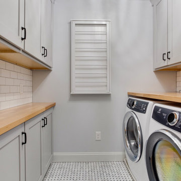
Designed by Katherine Dashiell of Reico Kitchen & Bath in Annapolis, MD in collaboration with Emory Construction, this coastal transitional inspired project features cabinet designs for the kitchen, bar, powder room, primary bathroom and laundry room.
The kitchen design features Merillat Classic Tolani in a Cotton finish on the perimeter kitchen cabinets. For the kitchen island, the cabinets are Merillat Masterpiece Montresano Rustic Alder in a Husk Suede finish. The design also includes a Kohler Whitehaven sink.
The bar design features Green Forest Cabinetry in the Park Place door style with a White finish.
The powder room bathroom design features Merillat Classic in the Tolani door style in a Nightfall finish.
The primary bathroom design features Merillat Masterpiece cabinets in the Turner door style in Rustic Alder with a Husk Suede finish.
The laundry room features Green Forest Cabinetry in the Park Place door style with a Spéciale Grey finish.
“This was our second project working with Reico. The overall process is overwhelming given the infinite layout options and design combinations so having the experienced team at Reico listen to our vision and put it on paper was invaluable,” said the client. “They considered our budget and thoughtfully allocated the dollars.”
“The team at Reico never balked if we requested a quote in a different product line or a tweak to the layout. The communication was prompt, professional and easy to understand. And of course, the finished product came together beautifully – better than we could have ever imagined! Katherine and Angel at the Annapolis location were our primary contacts and we can’t thank them enough for all of their hard work and care they put into our project.”
Photos courtesy of BTW Images LLC.
 Cassoni Furniture & Accessories
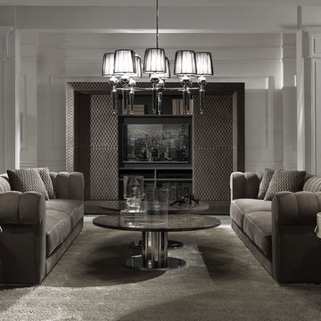
- KENT SOFA. Solid wood structure covered with foam polyurethane with different density. Seat cushions in goose feather supported. Base in metal with chrome finish. Decorative cushions with one side quilted processing.
Sofa available in three sizes.
https://cassoni.com/Kent-Sofa-01
- DOUGLAS COFFEE TABLE. Coffee table with base in stainless steel. Available with antique bronze saten finish or dipped in 24k gold. Top made of MDF 1”1/8 thick with lacquered or covered finish or in marble 3/4” thick.
Coffee table available in two sizes.
https://cassoni.com/Douglas-Coffee-Table-01
- BYRON PRINCE SIDE TABLE. Side table with metal base in chrome, finish. Top made in MDF wood covered in leather with one drawer. Drawer slides with "Blumotion" system. Base is available in chrome or antique bronze finish.
Dimensions: Ø 19"5/8 x 24"3/4H.
https://cassoni.com/Byron-Prince-Side-Table-01
- BYRON TV CABINET. TV Stand made of MDF 7/8" thick matt lacquered. Solid wood frame covered in leather. Available in special size, please request for this.
Dimensions: 110"1/4W x 18"1/2D x 80"5/8H.
https://cassoni.com/Byron-TV-Cabinet-01
- DOUGLAS LIGHTING COLLECTION. Floor lamps, table lamps, chandeliers and wall lamps with structures in shining cast brass or chrome finish. Lampshades in white, black, beige, cannetè fabric.
http://bit.ly/Cassoni-Douglas-Italian-Collection
 Renovisions
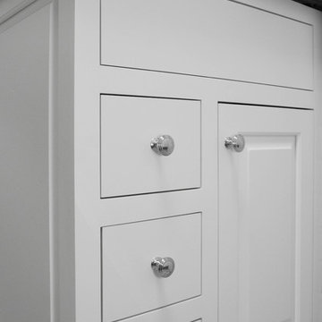
One of our favorite clients requested our services once again, this time to update their outdated full bath. The main goal, aside from keeping the existing tub and surround in place, was to replace the tired vanity, small medicine cabinet, countertop, sink, flooring, light fixture, shower valve and trims with products that are more on trend. The desire was to create a wow factor and display their personal style.
Designing a bath with transitional finishes and a clean aesthetic was top of mind when we selected a white painted inset-style vanity, contrasting marble-look quartz countertop in suede finish and classic 3” x 6” white subway wall tiles. Tying together different patterns and incorporating 8” x 8” black and white deco floor tiles provides an interesting and refreshing industrial look that is an expression of our client’s individuality and style. Adding to this industrial style feature was the double light fixture with clear seeded glass mounted over the new framed recessed medicine cabinet with matching painted finish. Also, a priority in the remodeling process was to provide proper ventilation to not only keep air moving, but to ensure moisture is cleared from the room while showering.
This newly remodeled updated bathroom is light and airy, and clients are thrilled with the result.
“Hi Cathy, I just wanted to let you know how pleased we are with our bathrooms and stairs!! Ed, Bradley, and Charlie did their usual fantastic job, not to mention your guidance and expertise. We could not be more thrilled! Each and every time I look at the wall color in the upstairs bath, I comment to myself that Liz really is a ‘wiz’. Thank you, thank you, thank you!”
- Susan and Hal M. (Hanover)

 Vetter Architects
The client’s request was quite common - a typical 2800 sf builder home with 3 bedrooms, 2 baths, living space, and den. However, their desire was for this to be “anything but common.” The result is an innovative update on the production home for the modern era, and serves as a direct counterpoint to the neighborhood and its more conventional suburban housing stock, which focus views to the backyard and seeks to nullify the unique qualities and challenges of topography and the natural environment.
The Terraced House cautiously steps down the site’s steep topography, resulting in a more nuanced approach to site development than cutting and filling that is so common in the builder homes of the area. The compact house opens up in very focused views that capture the natural wooded setting, while masking the sounds and views of the directly adjacent roadway. The main living spaces face this major roadway, effectively flipping the typical orientation of a suburban home, and the main entrance pulls visitors up to the second floor and halfway through the site, providing a sense of procession and privacy absent in the typical suburban home.
Clad in a custom rain screen that reflects the wood of the surrounding landscape - while providing a glimpse into the interior tones that are used. The stepping “wood boxes” rest on a series of concrete walls that organize the site, retain the earth, and - in conjunction with the wood veneer panels - provide a subtle organic texture to the composition.
The interior spaces wrap around an interior knuckle that houses public zones and vertical circulation - allowing more private spaces to exist at the edges of the building. The windows get larger and more frequent as they ascend the building, culminating in the upstairs bedrooms that occupy the site like a tree house - giving views in all directions.
The Terraced House imports urban qualities to the suburban neighborhood and seeks to elevate the typical approach to production home construction, while being more in tune with modern family living patterns.
Overview:
Elm Grove
Size:
2,800 sf,
3 bedrooms, 2 bathrooms
Completion Date:
September 2014
Services:
Architecture, Landscape Architecture
Interior Consultants: Amy Carman Design
 Renovisions
This South Shore of Boston client approached the team of Renovisions to remodel her existing basement bathroom. This bath, with an outdated fiberglass shower stall was cracked and leaking into the concrete floor below. The room had inadequate storage, was dark and did not boost this home’s overall market value.
It was definitely time for a Renovision and the client was excited to get started! She was looking forward to sharing the new space with guests that stay at her home and use the bathroom often.
Working alongside this client was fun and productive as great design and product choices were selected together. In the design process, Renovisions presented a unique idea; using the basement foundation ledge for a shelf that ran into the shower area, gaining extra space for shampoos and soaps, eliminating the need for a niche. Another great idea was to implement a Grohe Smart Control valve which brings this shower experience to another level; they can choose ways to spray with the right degree of warmth. The stunning stream-lined shower trims in brushed nickel finish match the style and finish on the single-lever vanity faucet.
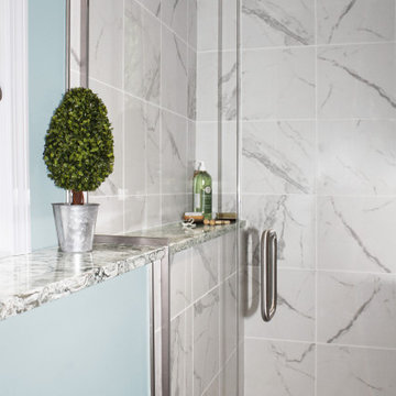
The contrasting dark grey, large format porcelain floor tile’s texture resembles a linen-look pattern the client requested while complimenting the darker veining in the quartz curb, shelf and vanity countertop.
The Carrera-look porcelain shower wall tiles boast no-maintenance and provides a clean, brighter appeal seen through the beautiful custom shower glass enclosure. We lightened up the bath with a light blue paint color which added a fresh look, giving the illusion of a bigger space.
As you can see, with the right colors, textures and accessories, we transformed this basement bath from Drab to Fab. The client was thrilled with her basement Renovision, a true Breath of Fresh Flair’!
 Pennsylvania Landscape & Nursery Association
Terren Landscapes http://www.terrenlandscapes.com
Project Entry: Pembrooke Estate Rain Garden
2014 PLNA Awards for Landscape Excellence Winner
Category: Sustainable Landscape &60,000-$120,000
Award Level: Silver
Project Description:
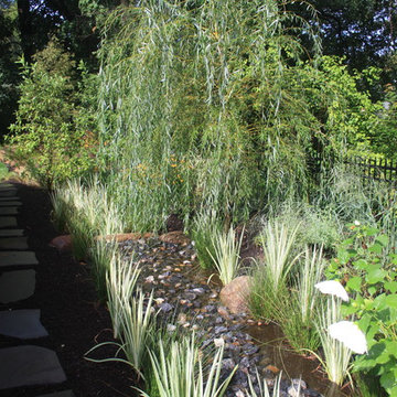
The client contracted our company to solve multiple existing drainage problems. In a heavy rain event the existing French drain system would overflow, causing water to pool in the driveway. After investigating the system we found that the capacity of the French drain was undersized for the amount of storm water from the large rain events received in recent years. As a result of our findings and at the request of the homeowner, we designed a storm water management system to capture all storm water from the structures on the property and regenerate the underground aquifers for the volume of a 5.8” rainstorm. In addition to the new drain system, the homeowners wanted a rain garden to provide a backdrop for an existing formal garden, provide a habitat for wildlife, and provide screening from an adjacent neighbor.
Throughout the design process many challenges were presented, including an existing gas line, which ran directly through the area that best suited the bioswale. The existence of the gas line caused us to alter the shape and depth of the bioswale in some areas. We also inspected the existing downspouts to make sure there were no obstructions that would impede the system’s efficiency, and then conducted a test pit dig to make sure we had sufficient percolation rates for disposal of storm water.
To effectively capture the storm water runoff, the existing downspouts were piped from the main house and the large detached garage to a large catch basin located at the low point in the driveway. The driveway catch basin contains two outlet pipes at different elevations within the basin allowing water from smaller rain events to enter the bioswale and rain garden area to percolate into the soil before excess water overflows into a sediment trap which filters out any debris and is then piped to an underground StormTech® pit to slowly percolate into the ground. The other outlet pipe in the driveway catch basin is used for larger storm water events, taking the water directly to the StormTech® pit.
Accepting and slowing the velocity of the storm water, mitigation of erosion, and filtering out pollutants contained in the “first flush” of rainfall are the primary functions of the bioswale and rain garden. Planting these areas with mostly native plant species helps carry out these functions while attracting and providing shelter for wildlife.
The ‘Niobe’ weeping willow is the centerpiece of the rain garden, connecting with the axis of the existing formal garden. To screen the neighboring property we chose Chamaecyparis nootkatensis ‘Pendula’ for its graceful evergreen habit and tolerance of wet sites. ‘Ivory Halo’ dogwood and Panicum ‘Cloud Nine’ were used for screening as well as winter interest. To provide deciduous structure to the garden Taxodium distichum and Magnolia virginiana were used in conjunction with witch hazel. Mostly native wetland perennials were used due to their tolerance of wet conditions and occasional drought.
The area above the StormTech® pit provides space for the client’s family to relax. The rain garden and bioswale provide screening, storm water management, a habitat for wildlife, and plants that enhance the adjacent formal garden.
Photo Credit: Terren Landscapes
 Renovisions
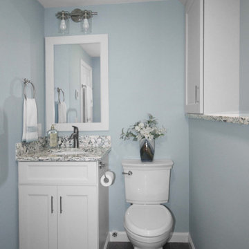
This South Shore of Boston client approached the team of Renovisions to remodel her existing basement bathroom. This bath, with an outdated fiberglass shower stall was cracked and leaking into the concrete floor below. The room had inadequate storage, was dark and did not boost this home’s overall market value.
It was definitely time for a Renovision and the client was excited to get started! She was looking forward to sharing the new space with guests that stay at her home and use the bathroom often.
Working alongside this client was fun and productive as great design and product choices were selected together. In the design process, Renovisions presented a unique idea; using the basement foundation ledge for a shelf that ran into the shower area, gaining extra space for shampoos and soaps, eliminating the need for a niche. Another great idea was to implement a Grohe Smart Control valve which brings this shower experience to another level; they can choose ways to spray with the right degree of warmth. The stunning stream-lined shower trims in brushed nickel finish match the style and finish on the single-lever vanity faucet.
The contrasting dark grey, large format porcelain floor tile’s texture resembles a linen-look pattern the client requested while complimenting the darker veining in the quartz curb, shelf and vanity countertop.
The Carrera-look porcelain shower wall tiles boast no-maintenance and provides a clean, brighter appeal seen through the beautiful custom shower glass enclosure. We lightened up the bath with a light blue paint color which added a fresh look, giving the illusion of a bigger space.
As you can see, with the right colors, textures and accessories, we transformed this basement bath from Drab to Fab. The client was thrilled with her basement Renovision, a true Breath of Fresh Flair’!
25