
Search results for "Process requests" in Home Design Ideas
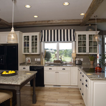
 Bella Domicile
Dale Hall Photography, LLC
Mountain style l-shaped light wood floor open concept kitchen photo in Milwaukee with an undermount sink, raised-panel cabinets, white cabinets, granite countertops, black appliances and an island
Mountain style l-shaped light wood floor open concept kitchen photo in Milwaukee with an undermount sink, raised-panel cabinets, white cabinets, granite countertops, black appliances and an island
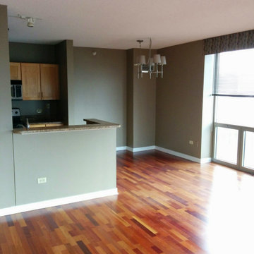
 Windy City Painters
Every Chicago home carries its own unique history—and its own set of restoration challenges. From moisture-damaged plaster and decades of paint layers to the harsh thermal cycles of Chicago winters, generic painting approaches simply won't cut it.
At Windy City Painters, we take a tailored, craftsmanship-first approach to local properties across the North Side and Near West Side.
Our 4-Step Restoration Process:
Prep & Surface Repair: Thorough cleaning, sanding, skim coating, and patching for plaster, drywall, and historic wood trim.
Substrate Priming: Applying high-performance primers (such as Zinsser) tailored to the exact surface for maximum adhesion.
Precision Application: Coating with premium, long-lasting finishes using Sherwin-Williams Duration and Benjamin Moore Aura.
Final Inspection: Rigorous multi-point review ensuring pristine line work and surface consistency.
Whether you're restoring a historic greystone in Lincoln Park or updating a modern loft in River North, we deliver durable, beautiful finishes designed to withstand Chicago's demanding four-season climate.
Get Started: Ready to elevate your interior or exterior spaces? Request your free estimate at windypainters.com.
 Windy City Painters
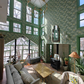
Professional wallpaper installation transformed this Evanston sunroom into a stunning focal point. Evanston's diverse architecture, from historic homes to contemporary residences, requires specialized expertise to ensure wallpaper installation complements existing design elements.
Materials and Products
We utilized premium moisture-resistant wallpaper specifically designed for sunroom environments, paired with professional-grade adhesives from trusted manufacturers like Roman and Zinsser for superior bonding and longevity.
Installation Process
First, thorough surface preparation including cleaning and priming. Second, precise measurements and pattern planning for seamless alignment. Third, careful adhesive application using professional tools. Fourth, meticulous installation with attention to corners and edges.
Chicago Home Challenges
Evanston properties face unique challenges including temperature fluctuations, humidity variations, and aging surfaces. Our wallpaper installation process addresses these concerns through proper surface preparation and climate-appropriate materials.
Results Achieved
The finished sunroom showcases flawless wallpaper installation with perfect pattern matching, smooth application, and professional-quality results that will withstand years of use and seasonal changes.
H2 Professional Tips
Always prime surfaces before wallpaper installation, choose moisture-resistant papers for sunrooms, and hire experienced professionals familiar with Chicago's climate challenges and building characteristics.
See more work and request free estimate at windypainters.com.
Q: What type of wallpaper works best for Evanston sunrooms? / A: Moisture-resistant vinyl or fabric-backed wallpaper handles humidity and temperature changes better than standard paper in sunroom wallpaper installation projects.
Q: How long does professional wallpaper installation take? / A: Most sunroom wallpaper installation projects require 1-2 days depending on room size, pattern complexity, and surface preparation needs.
Q: Can you install wallpaper over existing paint? / A: Yes, wallpaper installation over painted surfaces is possible after proper cleaning, priming, and surface preparation to ensure adhesion.
Q: Do you remove old wallpaper before installation? / A: Professional wallpaper installation often includes complete removal of existing coverings and thorough surface preparation for optimal results.
Q: What preparation is needed for wallpaper installation? / A: Wallpaper installation requires clean, smooth, primed surfaces with all imperfections filled and sanded for professional results.
Q: How do you handle wallpaper seams and patterns? / A: Expert wallpaper installation includes precise measuring, cutting, and alignment to create invisible seams and perfect pattern matching.
Q: Is wallpaper installation suitable for high-humidity areas? / A: Yes, proper wallpaper installation using moisture-resistant materials and techniques works excellently in sunrooms and humid environments.
Q: What warranty do you provide on wallpaper installation? / A: Windy City Painters backs all wallpaper installation work with comprehensive warranties covering materials and workmanship for customer peace of mind.
Q: Can wallpaper installation be done in winter? / A: Professional wallpaper installation can be performed year-round with proper climate control and material handling for optimal adhesion.
Q: How do you ensure wallpaper installation quality? / A: Our wallpaper installation process includes thorough preparation, premium materials, professional techniques, and detailed quality inspection for lasting results.
Find the right local pro for your project
 Tile Doctor Ltd
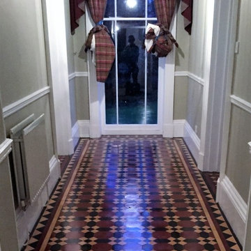
It’s fairly common for owners of older properties – especially houses those that are over 100 years old or more – to find original Victorian tiled flooring hidden underneath carpet. It can wait years for the tiles to be discovered, by which time they have amassed huge amounts of dirt and dust.
Such was the case at this property in Bridlington, a Yorkshire town through which a stream known as the ‘Gypsey Race’ runs, before emptying in the North Sea at the Bridlington Harbour. Interestingly enough, folklore says that when the stream is flowing, bad fortune is at hand. The stream must not have been running on the day that we restored this Victorian hallway, as we managed to achieve some truly fantastic results!!
The hallway had been severely dulled after going years without professional care. We set about giving it the thorough clean and fresh seal that I’d des partly needed. Here’s how we did it.
Our first task was to remove any old, no longer effectual sealer. We did this by liberally applying a strong dilution of our alkaline-based Tile a Doctor Pro Clean, which doubles as a reliable cleaner and a stripper capable of stripping away old sealer. The product was worked into the tiles using a black stripping pad fitted to a 17″ rotary machine, and the process was repeated three times.
I noticed that there was still some stubborn dirt and old sealer around the edges of the hallway, so I used some of our handheld diamond encrusted burnishing blocks to grind it away. To finish the cleaning process, we washed the floor with Tile Doctor pH Neutral Tile Cleaner, leaving it fresh and ready to be sealed once left to dry overnight.
Upon our return to the property the next day, we ran some quick tests to check for any excess moisture (even a small amount could have damaged the performance of the new sealer). Once satisfied with the the condition of the floor, we proceeded to see it with an impregnating sealer, meaning a sealer that penetrates into the pores of the tile to fill them and therefore prevent trapped dirt and ingrained stains.
Our impregnating sealer, Tile Doctor Colour Grow, has the added benefit of being colour intensifying, which really highlights the unique colourful patterns of the tiles. To give the floor a durable sheen finish, as requested by the customer, we also added a coat of Tile Doctor Seal and Go sealer.
The result was a complete transformation of the condition and appearance of this great Victorian tiled hallway. Our customer is very pleased – the floor is now a complete asset to any property, and will now be easier to keep looking great in future.
Ronnie Phipps
East Yorkshire Tile Doctor
 Renovisions
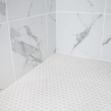
This South Shore of Boston client approached the team of Renovisions to remodel her existing basement bathroom. This bath, with an outdated fiberglass shower stall was cracked and leaking into the concrete floor below. The room had inadequate storage, was dark and did not boost this home’s overall market value.
It was definitely time for a Renovision and the client was excited to get started! She was looking forward to sharing the new space with guests that stay at her home and use the bathroom often.
Working alongside this client was fun and productive as great design and product choices were selected together. In the design process, Renovisions presented a unique idea; using the basement foundation ledge for a shelf that ran into the shower area, gaining extra space for shampoos and soaps, eliminating the need for a niche. Another great idea was to implement a Grohe Smart Control valve which brings this shower experience to another level; they can choose ways to spray with the right degree of warmth. The stunning stream-lined shower trims in brushed nickel finish match the style and finish on the single-lever vanity faucet.
The contrasting dark grey, large format porcelain floor tile’s texture resembles a linen-look pattern the client requested while complimenting the darker veining in the quartz curb, shelf and vanity countertop.
The Carrera-look porcelain shower wall tiles boast no-maintenance and provides a clean, brighter appeal seen through the beautiful custom shower glass enclosure. We lightened up the bath with a light blue paint color which added a fresh look, giving the illusion of a bigger space.
As you can see, with the right colors, textures and accessories, we transformed this basement bath from Drab to Fab. The client was thrilled with her basement Renovision, a true Breath of Fresh Flair’!
 Vetter Architects
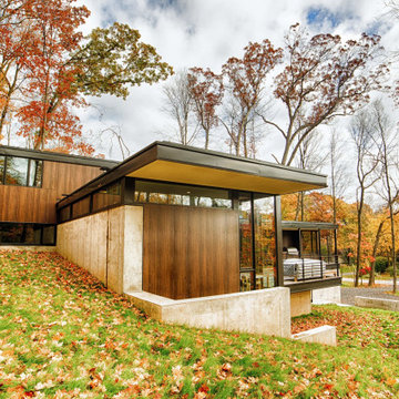
The client’s request was quite common - a typical 2800 sf builder home with 3 bedrooms, 2 baths, living space, and den. However, their desire was for this to be “anything but common.” The result is an innovative update on the production home for the modern era, and serves as a direct counterpoint to the neighborhood and its more conventional suburban housing stock, which focus views to the backyard and seeks to nullify the unique qualities and challenges of topography and the natural environment.
The Terraced House cautiously steps down the site’s steep topography, resulting in a more nuanced approach to site development than cutting and filling that is so common in the builder homes of the area. The compact house opens up in very focused views that capture the natural wooded setting, while masking the sounds and views of the directly adjacent roadway. The main living spaces face this major roadway, effectively flipping the typical orientation of a suburban home, and the main entrance pulls visitors up to the second floor and halfway through the site, providing a sense of procession and privacy absent in the typical suburban home.
Clad in a custom rain screen that reflects the wood of the surrounding landscape - while providing a glimpse into the interior tones that are used. The stepping “wood boxes” rest on a series of concrete walls that organize the site, retain the earth, and - in conjunction with the wood veneer panels - provide a subtle organic texture to the composition.
The interior spaces wrap around an interior knuckle that houses public zones and vertical circulation - allowing more private spaces to exist at the edges of the building. The windows get larger and more frequent as they ascend the building, culminating in the upstairs bedrooms that occupy the site like a tree house - giving views in all directions.
The Terraced House imports urban qualities to the suburban neighborhood and seeks to elevate the typical approach to production home construction, while being more in tune with modern family living patterns.
Overview:
Elm Grove
Size:
2,800 sf,
3 bedrooms, 2 bathrooms
Completion Date:
September 2014
Services:
Architecture, Landscape Architecture
Interior Consultants: Amy Carman Design
 River Valley Landscapes
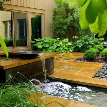
Blending contemporary forms and lush plantings, this Garden maximizes the sensory experience of the materials and planting from inside and outside the home. The garden occupies an interior courtyard framed by four interior walls. The home, designed by Architect Cliff May was built in 1948 and the following year was featured in House Beautiful Magazine. The clients list of needs and desires was brief. They wanted a space that would complement the mid century modern home and provide visual interest from inside the home. Some form of water was also requested. They had a budget of $30,000. In order to stay within their budget the clients performed the demolition of the old garden. The designer’s intent was to create a garden that would possess a clear sculptural quality and would be as visually striking from inside the home as it would be from inside the courtyard. The strategy behind the design was to use hardscape materials characterized by simple geometric forms and a planting palette that would emphasize form over color, and then to arrange the materials to achieve an interpretation of modern aesthetic.
The views from inside the homes three main living rooms present the garden as a graphic composition of space, hardscape materials and planting. Inside the courtyard the edges are defined by stone and planting. The floor is composed of rectangular slabs of Teakwood flagstone with a counterpoint of Mexican beach pebbles set within the joints and around the edges. Concrete along the edges of the Teakwood pads reduces migration of the modified stone and sand base. The contrast of the Mexican beach pebbles accentuates the pattern of the flagstone. The outside perimeter of the pebbles is contained with low profile edging. An existing catch drain was utilized for storm water runoff. A concrete block pier set on a concrete footing is covered with black stucco and provides a perch for a custom made copper bowl that circulates water into the L shaped water feature. The water features subterranean basin is constructed of pressure treated wood with a custom box liner insert. Since the Teakwood flagstone was unavailable as coping for the water feature, the designer chose Shawnee Buff stone to complement the Teakwood flagstone. The subtle sound of water spilling from the copper bowl and the reflective qualities of the water help to create an atmosphere of relaxation. The planting is composed of shades of green with white flowers in order to accentuate the graphic design. ‘Justin Brouwer’ Boxwood, ‘Sum and Substance’ Hosta, white Anemones, black bamboo and ornamental grasses contrast dramatically with the clean lines of the hardscape elements. The black bamboo is set in 30” diameter concrete containers to control the vigorous plant from spreading.
The construction of the interior courtyard space challenged the building team. They set up baffles between the front door and the door to the courtyard as well as temporary protection over the floor to allow the process to move forward without too much disturbance to the client’s lives. All of the materials were shuffled through the temporary portal.
The clients love the space and recently said that “the design is so well thought out and simple that they would never get tired of it.” The designs sculptural quality compliments the modern feel of the home and creates a sublime yet dramatic view from within the house or within the courtyard. The clients plan to purchase two black Bertoia Diamond chairs with red cushions which should perfectly integrate with the space.
 Tile Doctor Ltd
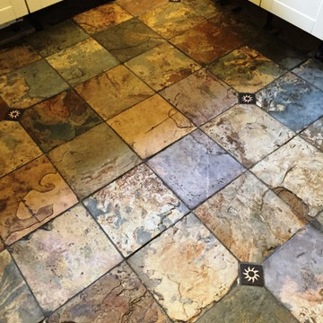
I recently visited a client living in the market town of Woodstock in Oxfordshire to rejuvenate a fantastic multi-coloured Slate floor that had been hidden under several years’ worth of dirt in their kitchen. Slate is a typically hard-wearing tile used for flooring high traffic areas of houses and public buildings but does need sealing to bring out its best features and in this case the sealer had long since worn off and dirt had become ingrained in the stone.
My first task in the cleaning process was to mix a strong solution of Tile Doctor Pro-Clean, which is a strong alkaline cleaner safe to use on Tile and Stone, and NanoTech HBU (Heavy Build-up Remover), which is a particularly powerful product that uses nano-sized particles to tackle muck in areas of the stone where typical cleaners simply can’t reach. I spread this solution across the floor and left it to seep into the stone, to get underneath and lift out the ingrained dirt.
After allowing the solution adequate time to dwell, I scrubbed the floor with a carbon brush to gradually reveal the fantastic natural colours of the Slate hidden beneath. Following this, I rinsed the entire floor several times with clean water, before soaking up the resulting soiled residue with a wet vacuum.
The next part of the cleaning process entailed paying particular attention to the grout lines. I used Tile Doctor Grout Clean-Up to scrub the grout lines and also to treat a small amount of efflorescence. The resulting residue was promptly extracted with the wet vacuum and I finished by giving the whole floor a rinse with Tile Doctor pH Neutral Tile Cleaner. This is a day to day tile cleaning product which is recommended for stone floors, many supermarket tile cleaning products are only suitable for ceramic tiles due to their acidic formula and can damage a floor over years of use so you should always read the label. I then left the floor to dry completely overnight.
On day two, the Slate tiled floor was dry and ready to seal. The floor had to be completely dry, as any excess moisture has the potential to the damage the performance of the sealer. Since my client had specifically requested a matte finish, I opted to use Tile Doctor Colour Grow. Colour Grow is an impregnating sealer that provides durable surface protection from within while also enhancing all of the natural mineral shades.
My client was very pleased with the results, particularly as they hadn’t realised they had such a great looking floor in their house when they had first purchased it!
Barry Woodward
Oxfordshire Tile Doctor
 Vetter Architects
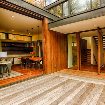
The client’s request was quite common - a typical 2800 sf builder home with 3 bedrooms, 2 baths, living space, and den. However, their desire was for this to be “anything but common.” The result is an innovative update on the production home for the modern era, and serves as a direct counterpoint to the neighborhood and its more conventional suburban housing stock, which focus views to the backyard and seeks to nullify the unique qualities and challenges of topography and the natural environment.
The Terraced House cautiously steps down the site’s steep topography, resulting in a more nuanced approach to site development than cutting and filling that is so common in the builder homes of the area. The compact house opens up in very focused views that capture the natural wooded setting, while masking the sounds and views of the directly adjacent roadway. The main living spaces face this major roadway, effectively flipping the typical orientation of a suburban home, and the main entrance pulls visitors up to the second floor and halfway through the site, providing a sense of procession and privacy absent in the typical suburban home.
Clad in a custom rain screen that reflects the wood of the surrounding landscape - while providing a glimpse into the interior tones that are used. The stepping “wood boxes” rest on a series of concrete walls that organize the site, retain the earth, and - in conjunction with the wood veneer panels - provide a subtle organic texture to the composition.
The interior spaces wrap around an interior knuckle that houses public zones and vertical circulation - allowing more private spaces to exist at the edges of the building. The windows get larger and more frequent as they ascend the building, culminating in the upstairs bedrooms that occupy the site like a tree house - giving views in all directions.
The Terraced House imports urban qualities to the suburban neighborhood and seeks to elevate the typical approach to production home construction, while being more in tune with modern family living patterns.
Overview:
Elm Grove
Size:
2,800 sf,
3 bedrooms, 2 bathrooms
Completion Date:
September 2014
Services:
Architecture, Landscape Architecture
Interior Consultants: Amy Carman Design
 Christopher Zoltan Designs
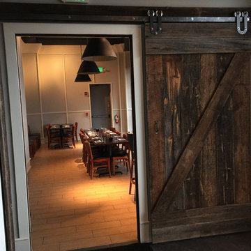
Custom sliding barn doors are a signature project at Zoltan Design Co. The distinctive, upscale look is a stylish solution for cramped spaces while doubling as a beautiful piece of wall art. When a client considers space-saving options but also has a desire to create a chic atmosphere, custom sliding barn doors are a ZDC interior design staple for three reasons:
1. ELEGANCE AND TIMELESSNESS
Nothing serves as a better focal point than a sliding barn door. Mixing the right door with the right colors throughout the space makes décor express itself in all the right places. Zoltan Design’s custom craftsmanship will give a barn door the character it needs to stand out, which explains why it’s one of the most popular accent pieces in interior design.
2. FUNCTIONALITY THAT IS OUTSIDE OF THE ORDINARY
This style choice is an elegant way to save space due to its sliding function. For instance, this feature is creatively used to conceal laundry rooms or to hide electronics during entertaining. A custom sliding barn door is used in a multitude of ways to keep your home functional while embracing glamor and comfort.
3. WE HAVE A PASSION FOR AUTHENTICITY
Zoltan Design’s custom sliding barn doors are authentic and American-made. One of our greatest passions is working with wood, which is why we created BARN, our line of custom furniture and barn doors. It is a privilege to carefully select recycled beams, barnwood and building materials from all over the country to craft beautiful pieces for our clients.
ZOLTAN DESIGN’S CUSTOM SLIDING BARN DOORS
Christopher Ritchie, Creative Director, is one of the area’s most sought-after talents, working with clients from concept to completion. As one of our most in-demand projects, each barn door is unique, refined, and exquisitely curated for your space. Our custom sliding barn doors adorn clients’ walls as pieces of art to elevate elegance in their home. From the historic wood, to the details of the carefully crafted nail heads, Zoltan crafts a piece that reflects refined tastes.
As part of ZDC’s trademark style, the barn doors are American-made and homegrown. These storied pieces celebrate old world vintage with wood that originates from 19th-century barns across the country. Once the high-quality wood is salvaged, it is reclaimed into the lavish design that suspends in a home.
THE PROCESS
Once the space is evaluated, clients receive detailed drawings, and CAD (computer-aided design) drawings, which reveals realistic 3-D layouts of a barn door before the installation process begins. Although each project is highly individualized, a custom sliding barn door will enter its final phase in six to eight weeks
As part of this delicate process, Zoltan Design Co.’s team works with our clients throughout design and manufacturing, all the way to installation. With the ability to choose from a variety of hardware and brackets, as well as the option to incorporate glass, we create a personalized piece to enhance your essence. If you’re interested in learning more about custom sliding barn doors or if you would like to request a consultation, please contact us today.
 Hearthstone Inc
Richard Herman is in the hospitality business and owns several upscale hotels in Florida and in other states as well as cattle ranches in both Florida and Missouri. Their farm in Ocala is by farm their most unique. The property serves as a 4-H demonstration project for the purpose of children’s education. They have been working with the Academy Prep of St. Pete which is dedicated to inner-city youths that are selected on the basis of need and achievement. Wife Diane spends her time on the farm raising Gypsy Vanners, a diminutive draft horse named after the job they did in Eastern Europe, pulling the wagons (vans) for gypsies that wandered across the continent. On the Ocala farm, there are several mules with a unique profession.
Richard had visited the Hearthstone display at a Log & Timber Home Shows at the Orlando Convention Center many years ago. He was impressed that Hearthstone had stayed in touch with him over the years by mailings, invitations to shows, and periodic phone calls. When the time came to start serious consideration of the design of barn, Hearthstone responded promptly and professionally to Richard and Diane’s requests for information and a review of their ideas for their barn, which would serve as the centerpiece for their new farm.
They wanted a multipurpose facility that could accommodate an educational environment and a large hall suitable for the fundraising events for his charities. Richard wanted a barn that reflected the look and feel of barns built at the dawn of the 20th century. Besides the rustic chicken houses and vegetable gardens, they have completely renovated a 1020’s era farmhouse to be as historically correct as possible and serves as the entry to the farm.
“They very careful to feel us out, get comfortable with our capabilities, and be convinced that we could perform as promised,” said Project Manager John Ricketson of Hearthstone.
Design Process
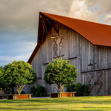
There were some initial drawings that gave us a start on the basic shape and size of the barn. From there, it was a process of narrowing down the uses of each area and the spans that could be achieved. The barn was going to have the traditional “board & batten” exterior siding and a metal roof. There is a cantilevered ‘hay hood” on the north gable end above the large sliding barn doors that open into the foyer and horse stalls. The wings house a combination of areas, beginning with the large restrooms to accommodate crowds for events. Other parts of the wings have garage areas for the farm vehicles, feed room, tack room, wash rack, storage, offices, and smaller restrooms.
Keeping with the look and feel of the turn of the century, Hearthstone developed a process for giving the timbers a surface texture that mimicked the circular cuts of timbers that had just come out of an old sawmill. This was easier said than done. Randy Giles guided his millwright (Wolfgang) in designing a machine that would do this effectively.
The barn was delivered in October of 2014 and was erected over the course of two weeks, thanks to a hardworking crew (Eric Foster) and near-perfect weather. After the Hearthstone crew completed the erection and roof dry-in, it was time for the local carpenters to step up and install some light conventional framing on the gable ends before applying the roof fascia and exterior board & batten siding. Next came the big sliding barn doors, plumbing, electrical, heating, and cooling. Large rustic fixtures were hung from the great hall roof timbers.
Exterior
The board & batten siding was cypress and allowed to turn color naturally as rain hit it and the sun started working on it with UV rays. This method causes a much grayer look closer to the ground and less so where the roof overhang provides protection. The North end has some large limestone boulders and planters arranged around the pad with tall pampas grass. The planters provide casual seating before events and during outside receptions. The entire area was sodded with lush St. Augustine grass and split rail fences were added to enclose the barn area. The corrugated metal roof was a special order material that immediately rusted after being exposed to moisture. The layer of rust protects the metal from the elements.
Interior
The board & batten theme was carried throughout most of the interior with the timbers left natural to show off the circular saw texture. All of the tongue & groove decking was shipped in advance to allow the local painter to pre-stain it with a dark brown transparent stain that is a beautiful background to the light color Eastern White Pine timbers.
“Everything was unique in this project” said Project Manager John Ricketson. “The setting on a small demonstration farm close to Ocala, the multipurpose design, the circular saw texture on the timbers.”
The Hermans are very proud of their farm’s outcome. Richard sent a note to Randy Giles, owner of Hearthstone: “The Barn is fantastic, not a single problem, period. Next month, we have Jo Dee Messina coming in to help with a fundraiser for a local center for abused kids. Folks love the farm, ...... but that barn gets all of the attention. I would encourage you to use me as a reference for your sales team, feel free to extend my cell phone to any prospective purchasers.”
 Windy City Painters
Iron Fence Painting in Wicker Park: A Windy City Painters Case Study
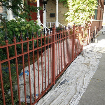
Iron fence painting in Wicker Park is one of the most requested exterior services Windy City Painters performs each season, and this recent project shows exactly why. Set behind an ornate 1890s greystone two-flat, the client's wrought iron fence had endured years of Chicago winters without professional attention. Rust had spread across the pickets, the original black enamel was flaking away in sheets, and the fence's structural hardware had begun to loosen at several joints.
As the trusted local expert for Chicago's North Side and Near West Side, Windy City Painters approached this project the same way we approach every iron fence painting job in Wicker Park: with a methodical, multi-step process designed to outlast Midwest weather rather than simply mask the damage.
The Process, Step by Step
Step 1 — Rust Removal and Surface Preparation. Our crew wire-brushed and mechanically ground every rusted section down to clean, stable metal. For pitted or heavily corroded areas, we applied a chemical rust converter to neutralize corrosion at the molecular level before any coating touched the surface. Furthermore, because this greystone was built well before 1978, Windy City Painters tested the existing paint layers for lead and followed strict containment protocols throughout the removal process.
Step 2 — Spot Repairs. Loose pickets were re-secured, small pits were filled, and hardware at the gate hinges was tightened. In contrast to a quick spray-paint refresh, this stage ensures the fence is structurally sound before a single drop of primer goes on.
Step 3 — Priming. A full coat of rust-inhibiting primer, engineered specifically for ferrous metal, was applied by brush to every surface — with particular attention to welds and joints where moisture tends to collect and restart the corrosion cycle.
Step 4 — Topcoat Application. Two finish coats of industrial-grade, direct-to-metal enamel were applied by brush and roller. This built a durable, uniform barrier in classic gloss black, the most popular finish among Wicker Park's historic properties. Finally, our team inspected every inch of the fence for thin spots or missed sections before calling the job complete.
Project Specs
Surface: Ornamental wrought iron fence, posts, and gate hardware
Products used: Rust-inhibiting DTM primer, chemical rust converter, industrial-grade direct-to-metal enamel
Coats applied: 1 primer coat, 2 finish coats
Finish: Gloss black
Timeline: Completed in under two days
Advice for Wicker Park Homeowners
Before starting a similar iron fence painting project in Wicker Park, homeowners should keep a few things in mind. Notably, never paint directly over active rust — trapped moisture underneath will cause the new coat to fail within a season. Additionally, always ask whether a contractor tests for lead paint on pre-1978 homes, since many Wicker Park greystones fall into that category. Meanwhile, hand brushwork matters: the intricate scrollwork common on Wicker Park ironwork requires careful, detailed application that spray equipment simply cannot replicate. Therefore, hiring a crew experienced specifically in historic Chicago ironwork, like Windy City Painters, makes a measurable difference in the finished result.
Windy City Painters also handles related exterior and interior work for Wicker Park properties, including interior painting, drywall and plaster repair, and additional metal refinishing for porches and railings.
Iron fence painting in Wicker Park protects one of the neighborhood's most defining architectural features while restoring curb appeal instantly. As a result, this greystone now has a fence that matches the quality of the home behind it — and will hold up through many more Chicago winters.
See more of our work and request a free estimate at www.windypainters.com.
Ready to transform your Wicker Park home? Contact Windy City Painters for a free estimate — visit www.windypainters.com today. Proudly serving Wicker Park, West Town, Lincoln Park, Roscoe Village, Lakeview, Ukrainian Village, River North, and all of Chicago.
 Vetter Architects
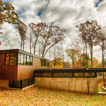
The client’s request was quite common - a typical 2800 sf builder home with 3 bedrooms, 2 baths, living space, and den. However, their desire was for this to be “anything but common.” The result is an innovative update on the production home for the modern era, and serves as a direct counterpoint to the neighborhood and its more conventional suburban housing stock, which focus views to the backyard and seeks to nullify the unique qualities and challenges of topography and the natural environment.
The Terraced House cautiously steps down the site’s steep topography, resulting in a more nuanced approach to site development than cutting and filling that is so common in the builder homes of the area. The compact house opens up in very focused views that capture the natural wooded setting, while masking the sounds and views of the directly adjacent roadway. The main living spaces face this major roadway, effectively flipping the typical orientation of a suburban home, and the main entrance pulls visitors up to the second floor and halfway through the site, providing a sense of procession and privacy absent in the typical suburban home.
Clad in a custom rain screen that reflects the wood of the surrounding landscape - while providing a glimpse into the interior tones that are used. The stepping “wood boxes” rest on a series of concrete walls that organize the site, retain the earth, and - in conjunction with the wood veneer panels - provide a subtle organic texture to the composition.
The interior spaces wrap around an interior knuckle that houses public zones and vertical circulation - allowing more private spaces to exist at the edges of the building. The windows get larger and more frequent as they ascend the building, culminating in the upstairs bedrooms that occupy the site like a tree house - giving views in all directions.
The Terraced House imports urban qualities to the suburban neighborhood and seeks to elevate the typical approach to production home construction, while being more in tune with modern family living patterns.
Overview:
Elm Grove
Size:
2,800 sf,
3 bedrooms, 2 bathrooms
Completion Date:
September 2014
Services:
Architecture, Landscape Architecture
Interior Consultants: Amy Carman Design

 Twelve Stones Designs, LLC
The owners of this kitchen had spent the money to upgrade the finishes in their kitchen upon building the home 12 years ago, but after living in the space for several years they realized how nonfunctional the layout really was. The (then) two preschool aged children had grown into busy, hungry teenagers with many friends who also liked to hang out at the house. So the family needed a more functional kitchen with better traffic flow, space for daily activities revolving around the kitchen at different times of day, and a kitchen that could accommodate cooking for and serving large groups. Furthermore, the dark, traditional finishes no longer reflected the homeowners’ style. They requested a brighter, more relaxed, coastal style that reflected their love of the seaside cities they like to visit.
Originally, the kitchen was U-shaped with a narrow island in the middle. The island created narrow aisles that bottle-necked at the dishwasher, refrigerator, and cooktop areas. There was a pass-through from the foyer into the kitchen, but the owners never liked that the pass-through was also located so close to the powder room. The awkward proximity was unappealing and made guests feel uncomfortable.
The kitchen’s storage was made up of lots of narrow cabinets, apothecary drawers, clipped corner units, and very few drawers. It lacked useful storage for the larger items the family used on a daily basis. And the kitchen’s only pantry was small closet that had only builder-grade, narrow shelving with no illumination to be able to see the contents inside.
Overall, the kitchen’s lighting plan was poorly executed. Only six recessed cans illuminated the entire kitchen and nook areas. The under cabinet lighting was not evenly distributed either. In fact, the builder had mis-placed the under cabinet lighting around the decorative pilasters which made for choppy, dark cubbies. Further, the builder didn’t include any lighting over the sink or the bar area, which meant whoever was doing the dishes was always in their own shadow. That, coupled with the steep overhang of the game room above made the bar area feel like a dim, cavernous space that wasn’t inviting or task oriented. The kitchen looked out into the main living space, but the raised bar and a narrow wall (which held the only large cabinet in the kitchen) created more of a barrier than a relationship to the living room or breakfast nook. In fact, one couldn’t even see the breakfast nook from the cooktop or sink areas due to its orientation. The raised bar top was too narrow to comfortably sit to either dine at or chat from due to the lack of knee space. The the homeowners confided that the kitchen felt more like a dark, dirty prison than place where the family, or their guests, wanted to gather and commune.
The clients' needs and desires were:
➢ to create a kitchen that would be a space the family loved to be in; to relate to the adjacent spaces all around, and to have better flow for entertaining large groups
➢ to remove the walls between the breakfast nook and living area and to be able to utilize the natural light from the windows in both those areas
➢ to incorporate a functional chopping block for prepping fresh food for home cooked meals, an island with a large sink and drain board, 2 pull out trash cans, and seating for at least the 2 teens to eat or do homework
➢ to design a kitchen and breakfast nook with an airy, coastal, relaxed vibe that blended with the rest of the house's coastal theme
➢ to integrate a layered lighting plan which would include ample general illumination, specific task lighting, decorative lighting, and lots of illuminated storage
➢ to design a kitchen with not only more storage for all the husband’s kitchen gadgets and collection of oils and spices, but smart storage, including a coffee/breakfast bar and a place to store and conceal the toaster oven and microwave
➢ to find a way to utilize the large open space between the kitchen, pantry area, and breakfast nook
Twelve Stones Designs achieved the owner's goals by:
➢ removing the walls between the kitchen and living room to allow the natural light to filter in from the adjacent rooms and to create a connection between the kitchen, nook, and living spaces for a sense of unity and communion
➢ removing the existing pantry and designing 3 large pantry style cabinets with LED tape lights and rollout drawers to house lots of kitchen appliances, gadgets, and tons of groceries. We also took the cabinets all the way up to the 9’ ceiling for additional storage for seasonal items and bulk storage.
➢ designing 2 islands - 1 with a gorgeous black walnut chopping block that houses a drawer for chopping and carving knives and a custom double pull out trash unit for point of use utilization - and 1 that houses the dishwasher, a large Blanco Gourmet sink with integrated drain board, woven baskets for fresh root vegetables and kitchen towels, plenty of drawer storage for kitchen items, and bar seating for up to 4 diners.
➢ closing off the space between the kitchen and the powder room to create a beautiful new private alcove for the powder room as well as adding some decorative storage. This also gave us space to include more tall storage near the new range for precision placement of the husband’s extensive oil and spice collection as well as a location for a combo-steam oven the wife wanted for baking and cooking healthy meals.
The project is enhanced functionally by:
➢ incorporated USB and standard receptacles for the kids’ laptops and phone charging in the large island
➢ designing the small island to include additional open shelving for items used on a daily basis such as a variety of bowls, plates, and colanders. This set up also works well for the husband who prefers to “plate” his dinners in restaurant-style fashion before presenting them to the table.
➢ the integration of specific storage units, such as double stacked cutlery drawers, a custom spice pull-out, a Kuerig coffee and tea pod drawer, and custom double stacked utensil drawers
➢ moving the refrigerator to the old oven location - this eliminated the bottle neck as well as created a better relationship to the eating table. It also utilizes the floor space between the pantry, nook, and kitchen
➢ creating a banquet style breakfast nook - this banquette seating not only doubles the amount of seating for large gatherings but it better utilizes the odd space between the kitchen and the previous nook area. It also helps to create a distinct pathway from the mudroom room through the pantry area, kitchen, nook, and living room.
➢ the coffee/breakfast bar area which includes the perfect location for the concealed microwave and toaster oven, convenient storage for the coffee pods and tea accoutrements. Roll-out drawers below also house the smoothie maker, hot water kettle, and a plethora of smoothie-making ingredients such as protein powders, smoothie additives, etc. Furthermore, the drawers below the Keurig house measuring utensil, cutlery, baking supplies and tupperware storage.
➢ incorporating lots of wide drawers and pullouts to accommodate large cookware.
➢ utilizing as much vertical space as possible by building storage to the ceiling which accommodates the family’s abundant amount of serving platters, baking sheets, bakeware, casserole dishes, and additional cutting boards.
The project is enhanced aesthetically by:
➢ new 5-piece Versailles pattern porcelain tile that now seamlessly joins the entire down stairs area together creating a bright, cohesiveness feeling instead of choppy separated spaces - it also adds a coastal feeling
➢ designing a cabinet to conceal the microwave and toaster oven
➢ the coastal influenced light fixtures over the nook table and island
➢ the sandy colors of the Langdon Cambria countertops. The swirling pattern and sparkling quartz pieces remind the homeowner of black-and-tan sandy beaches
➢ the striped banquet seating whose creamy white background and blue-green stripes were the inspiration for the cabinet and wall colors.
➢ All the interior doors were painted black to coordinate with the blacks and grays in the backsplash tile and countertop. This also adds a hint of tailored formality to an otherwise casual space.
➢ the use of WAC's Oculux small aperture LED units for the overhead lighting complimented with Diode LED strips for task lighting under the cabinets and inside the pantry and glass wall cabinets. All of the lighting applications are on separate dimmer switches.
Innovative uses of materials or construction methods by Realty Restoration LLC:
➢ Each 1-1/2” x 3” block of reclaimed end-grain black walnut that makes up the center island chopping block was hand milled and built in the shop. It was designed to look substantial and proportional to the surrounding elements, executed by creating the 4 inch tall top with a solid wood chamfered edge band.
➢ The metal doors on either side of the vent hood were also custom designed for this project and built in the Realty Restoration LLC shop. They are made 1x2, 11-gauge mild steel with ribbed glass. Weighing 60 lbs a piece, heavy duty cabinet hinges were added to support the weight of the door and keep them from sagging.
➢ Under-cabinet receptacles were added along the range wall in order to have a clean, uninterrupted backsplash.
Design obstacles to overcome:
➢ Because we were removing the demising walls between the kitchen and living room, we had to find a way to plumb and vent the new island. We did this by tunneling through the slab (the slab had post tension cables which prevented us from just trenching) to run a new wet vent through a nearby structural wall. We pulled the existing hot and cold lines between upper floor joists and ran them down the structural wall as well and up through a conduit in the tunnel.
➢ Since we were converting from wall overs to a gas range it allowed us to utilize the 220 feed for the wall ovens to provide a new sub panel for all the new kitchen circuits
➢ Due to framing deficiencies inherited from the original build there was a 1-1/2” differential in the floor-to-ceiling height over a 20 foot span; by utilizing the process of cutting and furring coupled with the crown moulding details on the cabinet elevations we were able to mask the problem and provide seamless transitions between the cabinet components.
Evidence of superior craftsmanship:
➢ uniquely designed, one-of-a-kind metal “X” end panels on the large island. The end panels were custom made in the Realty Restoration LLC shop and fitted to the exact dimensions of the island. The welding seams are completely indistinguishable - the posts look like they are cut from a single sheet of metal
➢ square metal posts on the small island were also custom made and designed to compliment and carry through the metal element s throughout the kitchen
➢ the beautiful, oversized end panels on the pantry cabinets which give the breakfast nook a tailored look
➢ integrating a large format 5 piece Versailles tile pattern to seamlessly flow from the existing spaces into the new kitchen space
➢ By constructing a custom cabinet that jogged around a corner we could not remodel (housing the entry way coat closet) we were able to camouflage the adjacent wall offset within the upper and lower cabinets. By designing around the existing jog in the structural walls we accomplished a few things: we were able to find the space to house, and hide, the microwave and toaster oven yet still have a clean cohesive appearance from the kitchen side. Additionally, the owners were able to keep their much needed coat closet and we didn’t have to increase the budget with unnecessary structural work.
 Dura Supreme Cabinetry
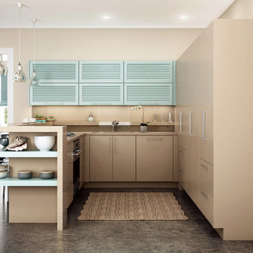
Dura Supreme’s Personal Paint Match Program offers the entire Sherwin-William’s paint palette, over 1500 paint colors, for your new cabinets.
Painted cabinetry is more popular than ever before and the color you select for your home should be a reflection of your personal taste and style. Color is a highly personal preference for most people and although there are specific colors that are considered “on trend” or fashionable, color choices should ultimately be based on what appeals to you personally.
Kitchen & Bath Designers are often asked about color trends and how to incorporate them into newly designed or renovated interiors. And although trends in fashion should be taken into consideration, that should not be the only deciding factor. For example, if you love a specific shade of green, look at selecting complementing neutrals and coordinating colors to bring the entire palette together beautifully.” It could be something as simple as being able to select the perfect shade of white that complements the countertop and tile and works well in a specific lighting situation. Our new Personal Paint Match system makes the process so much easier.
Dura Supreme's new "Personal Paint Match Program" provides the entire Sherwin Williams paint palette of over 1,500 colors to select from. The Sherwin Williams paint color simply needs to be specified and Dura Supreme will then create a color chip for the designer and homeowner to review. Once that color is approved by the homeowner, Dura Supreme then builds and finishes the cabinetry to match. The new Personal Paint Match program is available for all product lines.
Request a FREE Dura Supreme Cabinetry Brochure Packet at:
http://www.durasupreme.com/request-brochure
 Renovisions
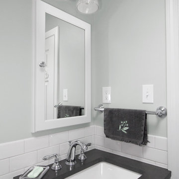
One of our favorite clients requested our services once again, this time to update their outdated full bath. The main goal, aside from keeping the existing tub and surround in place, was to replace the tired vanity, small medicine cabinet, countertop, sink, flooring, light fixture, shower valve and trims with products that are more on trend. The desire was to create a wow factor and display their personal style.
Designing a bath with transitional finishes and a clean aesthetic was top of mind when we selected a white painted inset-style vanity, contrasting marble-look quartz countertop in suede finish and classic 3” x 6” white subway wall tiles. Tying together different patterns and incorporating 8” x 8” black and white deco floor tiles provides an interesting and refreshing industrial look that is an expression of our client’s individuality and style. Adding to this industrial style feature was the double light fixture with clear seeded glass mounted over the new framed recessed medicine cabinet with matching painted finish. Also, a priority in the remodeling process was to provide proper ventilation to not only keep air moving, but to ensure moisture is cleared from the room while showering.
This newly remodeled updated bathroom is light and airy, and clients are thrilled with the result.
“Hi Cathy, I just wanted to let you know how pleased we are with our bathrooms and stairs!! Ed, Bradley, and Charlie did their usual fantastic job, not to mention your guidance and expertise. We could not be more thrilled! Each and every time I look at the wall color in the upstairs bath, I comment to myself that Liz really is a ‘wiz’. Thank you, thank you, thank you!”
- Susan and Hal M. (Hanover)
 Vetter Architects
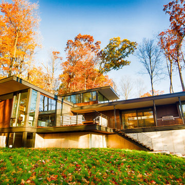
The client’s request was quite common - a typical 2800 sf builder home with 3 bedrooms, 2 baths, living space, and den. However, their desire was for this to be “anything but common.” The result is an innovative update on the production home for the modern era, and serves as a direct counterpoint to the neighborhood and its more conventional suburban housing stock, which focus views to the backyard and seeks to nullify the unique qualities and challenges of topography and the natural environment.
The Terraced House cautiously steps down the site’s steep topography, resulting in a more nuanced approach to site development than cutting and filling that is so common in the builder homes of the area. The compact house opens up in very focused views that capture the natural wooded setting, while masking the sounds and views of the directly adjacent roadway. The main living spaces face this major roadway, effectively flipping the typical orientation of a suburban home, and the main entrance pulls visitors up to the second floor and halfway through the site, providing a sense of procession and privacy absent in the typical suburban home.
Clad in a custom rain screen that reflects the wood of the surrounding landscape - while providing a glimpse into the interior tones that are used. The stepping “wood boxes” rest on a series of concrete walls that organize the site, retain the earth, and - in conjunction with the wood veneer panels - provide a subtle organic texture to the composition.
The interior spaces wrap around an interior knuckle that houses public zones and vertical circulation - allowing more private spaces to exist at the edges of the building. The windows get larger and more frequent as they ascend the building, culminating in the upstairs bedrooms that occupy the site like a tree house - giving views in all directions.
The Terraced House imports urban qualities to the suburban neighborhood and seeks to elevate the typical approach to production home construction, while being more in tune with modern family living patterns.
Overview:
Elm Grove
Size:
2,800 sf,
3 bedrooms, 2 bathrooms
Completion Date:
September 2014
Services:
Architecture, Landscape Architecture
Interior Consultants: Amy Carman Design
 Vetter Architects
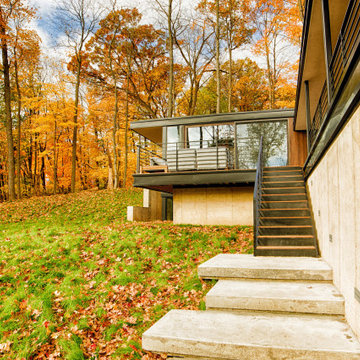
The client’s request was quite common - a typical 2800 sf builder home with 3 bedrooms, 2 baths, living space, and den. However, their desire was for this to be “anything but common.” The result is an innovative update on the production home for the modern era, and serves as a direct counterpoint to the neighborhood and its more conventional suburban housing stock, which focus views to the backyard and seeks to nullify the unique qualities and challenges of topography and the natural environment.
The Terraced House cautiously steps down the site’s steep topography, resulting in a more nuanced approach to site development than cutting and filling that is so common in the builder homes of the area. The compact house opens up in very focused views that capture the natural wooded setting, while masking the sounds and views of the directly adjacent roadway. The main living spaces face this major roadway, effectively flipping the typical orientation of a suburban home, and the main entrance pulls visitors up to the second floor and halfway through the site, providing a sense of procession and privacy absent in the typical suburban home.
Clad in a custom rain screen that reflects the wood of the surrounding landscape - while providing a glimpse into the interior tones that are used. The stepping “wood boxes” rest on a series of concrete walls that organize the site, retain the earth, and - in conjunction with the wood veneer panels - provide a subtle organic texture to the composition.
The interior spaces wrap around an interior knuckle that houses public zones and vertical circulation - allowing more private spaces to exist at the edges of the building. The windows get larger and more frequent as they ascend the building, culminating in the upstairs bedrooms that occupy the site like a tree house - giving views in all directions.
The Terraced House imports urban qualities to the suburban neighborhood and seeks to elevate the typical approach to production home construction, while being more in tune with modern family living patterns.
Overview:
Elm Grove
Size:
2,800 sf,
3 bedrooms, 2 bathrooms
Completion Date:
September 2014
Services:
Architecture, Landscape Architecture
Interior Consultants: Amy Carman Design
 Renovisions
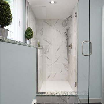
This South Shore of Boston client approached the team of Renovisions to remodel her existing basement bathroom. This bath, with an outdated fiberglass shower stall was cracked and leaking into the concrete floor below. The room had inadequate storage, was dark and did not boost this home’s overall market value.
It was definitely time for a Renovision and the client was excited to get started! She was looking forward to sharing the new space with guests that stay at her home and use the bathroom often.
Working alongside this client was fun and productive as great design and product choices were selected together. In the design process, Renovisions presented a unique idea; using the basement foundation ledge for a shelf that ran into the shower area, gaining extra space for shampoos and soaps, eliminating the need for a niche. Another great idea was to implement a Grohe Smart Control valve which brings this shower experience to another level; they can choose ways to spray with the right degree of warmth. The stunning stream-lined shower trims in brushed nickel finish match the style and finish on the single-lever vanity faucet.
The contrasting dark grey, large format porcelain floor tile’s texture resembles a linen-look pattern the client requested while complimenting the darker veining in the quartz curb, shelf and vanity countertop.
The Carrera-look porcelain shower wall tiles boast no-maintenance and provides a clean, brighter appeal seen through the beautiful custom shower glass enclosure. We lightened up the bath with a light blue paint color which added a fresh look, giving the illusion of a bigger space.
As you can see, with the right colors, textures and accessories, we transformed this basement bath from Drab to Fab. The client was thrilled with her basement Renovision, a true Breath of Fresh Flair’!
 Vetter Architects
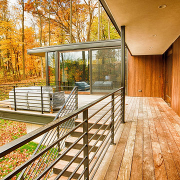
The client’s request was quite common - a typical 2800 sf builder home with 3 bedrooms, 2 baths, living space, and den. However, their desire was for this to be “anything but common.” The result is an innovative update on the production home for the modern era, and serves as a direct counterpoint to the neighborhood and its more conventional suburban housing stock, which focus views to the backyard and seeks to nullify the unique qualities and challenges of topography and the natural environment.
The Terraced House cautiously steps down the site’s steep topography, resulting in a more nuanced approach to site development than cutting and filling that is so common in the builder homes of the area. The compact house opens up in very focused views that capture the natural wooded setting, while masking the sounds and views of the directly adjacent roadway. The main living spaces face this major roadway, effectively flipping the typical orientation of a suburban home, and the main entrance pulls visitors up to the second floor and halfway through the site, providing a sense of procession and privacy absent in the typical suburban home.
Clad in a custom rain screen that reflects the wood of the surrounding landscape - while providing a glimpse into the interior tones that are used. The stepping “wood boxes” rest on a series of concrete walls that organize the site, retain the earth, and - in conjunction with the wood veneer panels - provide a subtle organic texture to the composition.
The interior spaces wrap around an interior knuckle that houses public zones and vertical circulation - allowing more private spaces to exist at the edges of the building. The windows get larger and more frequent as they ascend the building, culminating in the upstairs bedrooms that occupy the site like a tree house - giving views in all directions.
The Terraced House imports urban qualities to the suburban neighborhood and seeks to elevate the typical approach to production home construction, while being more in tune with modern family living patterns.
Overview:
Elm Grove
Size:
2,800 sf,
3 bedrooms, 2 bathrooms
Completion Date:
September 2014
Services:
Architecture, Landscape Architecture
Interior Consultants: Amy Carman Design
24