
Search results for "Professing" in Home Design Ideas
 McCabe By Design LLC
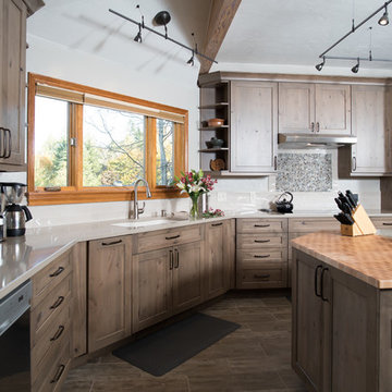
The original kitchen was designed and built by the original homeowner, needless to say neither design nor building was his profession. Further, the entire house has hydronic tubing in gypcrete for heat which means to utilities (water, ventilation or power) could be brought up through the floor or down from the ceiling except on the the exterior walls.
The current homeowners love to cook and have a seasonal garden that generates a lot of lovely fruits and vegetables for both immediate consumption and preserving, hence, kitchen counter space, two sinks, the induction cooktop and the steam oven were all 'must haves' for both the husband and the wife. The beautiful wood plank porcelain tile floors ensures a slip resistant floor that is sturdy enough to stand up to their three four-legged children.
Utilizing the three existing j-boxes in the ceiling, the cable and rail system combined with the under cabinet light illuminates every corner of this formerly dark kitchen.
The rustic knotty alder cabinetry, wood plank tile floor and the bronze finish hardware/lighting all help to achieve the rustic casual look the homeowners craved.
Photo by A Kitchen That Works LLC
 Treefrog Design
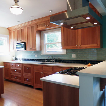
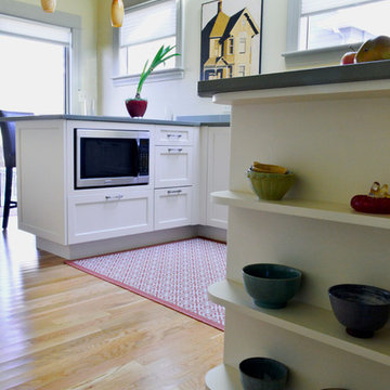
I have been working as a kitchen and bath designer in the Pacific Northwest for 13 years. I love engaging with new clients, ascertaining their needs through various interviews and meetings and then collaborating as we build their finished concept together. The variety of design styles, room layouts and function changes so much between one person and the next that no two finished products are remotely the same. This fluidity allows for endless possibilities for exploration in my field. It keeps the job interesting and has always given me a particular sense of reward and accomplishment as we near completion. The greatest personal recompense in this chosen profession is being able to walk with a client through this process and come out the other side with that client feeling elated with the end result.

Find the right local pro for your project
 Greey Pickett
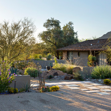
The renovation of this Mid-Century Ranch features the reintroduction of native plant species highlighted with steel planters, steppingstones, a ramada and small fountain.
Landscape Architect: Greey|Pickett
Architect: Clint Miller Architect
General Contractor: Sonora Sunset Construction
Landscape Contractor: West Point Landscaping
Photography: Steve Thompson
 TVL Creative Ltd.
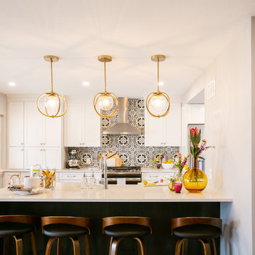
Cramped kitchen be gone! That was the project motto and top priority. The goal was to transform the current layout from multiple smaller spaces into a connected whole that would activate the main level for our clients, a young family of four.
The biggest obstacle was the wall dividing the kitchen and the dining room. Removing this wall was central to opening up and integrating the main living spaces, but the existing ductwork that ran right through the center of the wall posed a design challenge, er design opportunity. The resulting design solution features a central pantry that captures the ductwork and provides valuable storage- especially when compared to the original kitchen's 18" wide pantry cabinet. The pantry also anchors the kitchen island and serves as a visual separation of space between the kitchen and homework area.
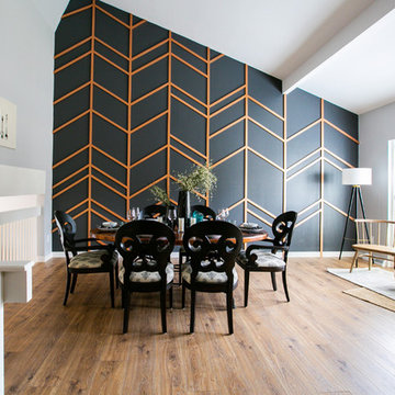
Through our design development process, we learned the formal living room was of no service to their lifestyle and therefore space they rarely spent time in. With that in mind, we proposed to eliminate the unused living room and make it the new dining room. Relocating the dining room to this space inherently felt right given the soaring ceiling and ample room for holiday dinners and celebrations. The new dining room was spacious enough for us to incorporate a conversational seating area in the warm, south-facing window alcove.
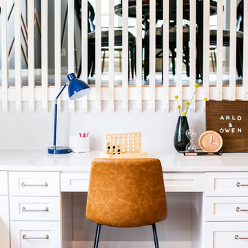
Now what to do with the old dining room?! To answer that question we took inspiration from our clients' shared profession in education and developed a craft area/homework station for both of their boys. The semi-custom cabinetry of the desk area carries over to the adjacent wall and forms window bench base with storage that we topped with butcher block for a touch of warmth. While the boys are young, the bench drawers are the perfect place for a stash of toys close to the kitchen.
The kitchen begins just beyond the window seat with their refrigerator enclosure. Opposite the refrigerator is the new pantry with twenty linear feet of shelving and space for brooms and a stick vacuum. Extending from the backside of the pantry the kitchen island design incorporates counter seating on the family room side and a cabinetry configuration on the kitchen side with drawer storage, a trashcan center, farmhouse sink, and dishwasher.
We took careful time in design and execution to align the range and sink because while it might seem like a small detail, it plays an important role in supporting the symmetrical configuration of the back wall of the kitchen. The rear wall design utilizes an appliance garage mirrors the visual impact of the refrigerator enclosure and helps keep the now open kitchen tidy. Between the appliance garage and refrigerator enclosure is the cooking zone with 30" of cabinetry and work surface on either side of the range, a chimney style vent hood, and a bold graphic tile backsplash.
The backsplash is just one of many personal touches we added to the space to reflect our client's modern eclectic style and love of color. Swooping lines of the mid-mod style barstools compliment the pendants and backsplash pattern. A pop of vibrant green on the frame of the pantry door adds a fresh wash of color to an otherwise neutral space. The big show stopper is the custom charcoal gray and copper chevron wall installation in the dining room. This was an idea our clients softly suggested, and we excitedly embraced the opportunity. It is also a kickass solution to the head-scratching design dilemma of how to fill a large and lofty wall.
We are so grateful to bring this design to life for our clients and now dear friends.
 TVL Creative Ltd.
Cramped kitchen be gone! That was the project motto and top priority. The goal was to transform the current layout from multiple smaller spaces into a connected whole that would activate the main level for our clients, a young family of four.
The biggest obstacle was the wall dividing the kitchen and the dining room. Removing this wall was central to opening up and integrating the main living spaces, but the existing ductwork that ran right through the center of the wall posed a design challenge, er design opportunity. The resulting design solution features a central pantry that captures the ductwork and provides valuable storage- especially when compared to the original kitchen's 18" wide pantry cabinet. The pantry also anchors the kitchen island and serves as a visual separation of space between the kitchen and homework area.
Through our design development process, we learned the formal living room was of no service to their lifestyle and therefore space they rarely spent time in. With that in mind, we proposed to eliminate the unused living room and make it the new dining room. Relocating the dining room to this space inherently felt right given the soaring ceiling and ample room for holiday dinners and celebrations. The new dining room was spacious enough for us to incorporate a conversational seating area in the warm, south-facing window alcove.
Now what to do with the old dining room?! To answer that question we took inspiration from our clients' shared profession in education and developed a craft area/homework station for both of their boys. The semi-custom cabinetry of the desk area carries over to the adjacent wall and forms window bench base with storage that we topped with butcher block for a touch of warmth. While the boys are young, the bench drawers are the perfect place for a stash of toys close to the kitchen.
The kitchen begins just beyond the window seat with their refrigerator enclosure. Opposite the refrigerator is the new pantry with twenty linear feet of shelving and space for brooms and a stick vacuum. Extending from the backside of the pantry the kitchen island design incorporates counter seating on the family room side and a cabinetry configuration on the kitchen side with drawer storage, a trashcan center, farmhouse sink, and dishwasher.
We took careful time in design and execution to align the range and sink because while it might seem like a small detail, it plays an important role in supporting the symmetrical configuration of the back wall of the kitchen. The rear wall design utilizes an appliance garage mirrors the visual impact of the refrigerator enclosure and helps keep the now open kitchen tidy. Between the appliance garage and refrigerator enclosure is the cooking zone with 30" of cabinetry and work surface on either side of the range, a chimney style vent hood, and a bold graphic tile backsplash.
The backsplash is just one of many personal touches we added to the space to reflect our client's modern eclectic style and love of color. Swooping lines of the mid-mod style barstools compliment the pendants and backsplash pattern. A pop of vibrant green on the frame of the pantry door adds a fresh wash of color to an otherwise neutral space. The big show stopper is the custom charcoal gray and copper chevron wall installation in the dining room. This was an idea our clients softly suggested, and we excitedly embraced the opportunity. It is also a kickass solution to the head-scratching design dilemma of how to fill a large and lofty wall.
We are so grateful to bring this design to life for our clients and now dear friends.
 Strouse Davis Architecture
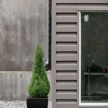
The Owner, a skilled metal fabricator and avid custom car owner and creator, needed more space to spread out given his profession and interests. Strouse Davis was tasked with creating this space on the site of his current home. The 2,500 sf building is clad in metal panel and clear cedar siding. The roof form is a unique semi-butterfly semi-shed roof. The roof water drains into an above ground concrete bio-retention planter. To honor his passion in life, large steel beams are exposed and intersect within the space.
 Treefrog Design
Amy Birrer
I have been working as a kitchen and bath designer in the Pacific Northwest for 13 years. I love engaging with new clients, ascertaining their needs through various interviews and meetings and then collaborating as we build their finished concept together. The variety of design styles, room layouts and function changes so much between one person and the next that no two finished products are remotely the same. This fluidity allows for endless possibilities for exploration in my field. It keeps the job interesting and has always given me a particular sense of reward and accomplishment as we near completion. The greatest personal recompense in this chosen profession is being able to walk with a client through this process and come out the other side with that client feeling elated with the end result.
 Living Spaces Design Group
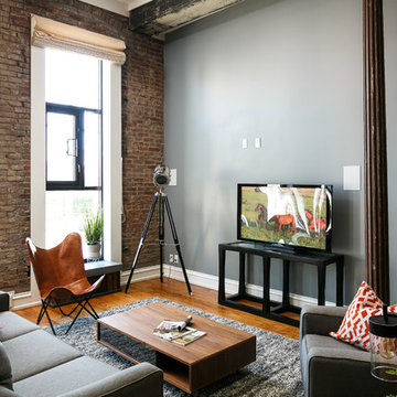
Example of an urban open concept medium tone wood floor family room design in Louisville with gray walls, no fireplace and a tv stand
 Rikki Snyder
Photo: Rikki Snyder © 2015 Houzz
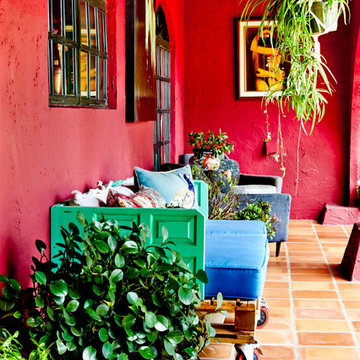
This is an example of an eclectic porch design in New York.
This is an example of an eclectic porch design in New York.
 Treefrog Design
I have been working as a kitchen and bath designer in the Pacific Northwest for 13 years. I love engaging with new clients, ascertaining their needs through various interviews and meetings and then collaborating as we build their finished concept together. The variety of design styles, room layouts and function changes so much between one person and the next that no two finished products are remotely the same. This fluidity allows for endless possibilities for exploration in my field. It keeps the job interesting and has always given me a particular sense of reward and accomplishment as we near completion. The greatest personal recompense in this chosen profession is being able to walk with a client through this process and come out the other side with that client feeling elated with the end result.
 TVL Creative Ltd.
Cramped kitchen be gone! That was the project motto and top priority. The goal was to transform the current layout from multiple smaller spaces into a connected whole that would activate the main level for our clients, a young family of four.
The biggest obstacle was the wall dividing the kitchen and the dining room. Removing this wall was central to opening up and integrating the main living spaces, but the existing ductwork that ran right through the center of the wall posed a design challenge, er design opportunity. The resulting design solution features a central pantry that captures the ductwork and provides valuable storage- especially when compared to the original kitchen's 18" wide pantry cabinet. The pantry also anchors the kitchen island and serves as a visual separation of space between the kitchen and homework area.
Through our design development process, we learned the formal living room was of no service to their lifestyle and therefore space they rarely spent time in. With that in mind, we proposed to eliminate the unused living room and make it the new dining room. Relocating the dining room to this space inherently felt right given the soaring ceiling and ample room for holiday dinners and celebrations. The new dining room was spacious enough for us to incorporate a conversational seating area in the warm, south-facing window alcove.
Now what to do with the old dining room?! To answer that question we took inspiration from our clients' shared profession in education and developed a craft area/homework station for both of their boys. The semi-custom cabinetry of the desk area carries over to the adjacent wall and forms window bench base with storage that we topped with butcher block for a touch of warmth. While the boys are young, the bench drawers are the perfect place for a stash of toys close to the kitchen.
The kitchen begins just beyond the window seat with their refrigerator enclosure. Opposite the refrigerator is the new pantry with twenty linear feet of shelving and space for brooms and a stick vacuum. Extending from the backside of the pantry the kitchen island design incorporates counter seating on the family room side and a cabinetry configuration on the kitchen side with drawer storage, a trashcan center, farmhouse sink, and dishwasher.
We took careful time in design and execution to align the range and sink because while it might seem like a small detail, it plays an important role in supporting the symmetrical configuration of the back wall of the kitchen. The rear wall design utilizes an appliance garage mirrors the visual impact of the refrigerator enclosure and helps keep the now open kitchen tidy. Between the appliance garage and refrigerator enclosure is the cooking zone with 30" of cabinetry and work surface on either side of the range, a chimney style vent hood, and a bold graphic tile backsplash.
The backsplash is just one of many personal touches we added to the space to reflect our client's modern eclectic style and love of color. Swooping lines of the mid-mod style barstools compliment the pendants and backsplash pattern. A pop of vibrant green on the frame of the pantry door adds a fresh wash of color to an otherwise neutral space. The big show stopper is the custom charcoal gray and copper chevron wall installation in the dining room. This was an idea our clients softly suggested, and we excitedly embraced the opportunity. It is also a kickass solution to the head-scratching design dilemma of how to fill a large and lofty wall.
We are so grateful to bring this design to life for our clients and now dear friends.
 Battle Associates, Architects
This project created a singular modern home for clients with two distinct professions; she is an artist; he is a musician. Their directive to Battle Associates was to “design the home of their dreams,” and “make it cool.” As the design evolved, three volumes emerged each with its own individual character. Shapes, materials, and colors reinforced the concept. The “Red Barn” houses a music studio, garage, guest, and children’s bedrooms. The “Industrial” volume is the Art Studio. The “Middle” volume is where the clients live. Each structure has its own set of exterior details, materials, and colors. The three buildings are oriented to maximize views around a man-made pond and a conserved hefty locus tree. Clean, contemporary lines set the tone for the details throughout the project, creating an appropriate environment for displaying artwork. Maple, bamboo, and painted finishes were the predominant palette, complemented with steel and glass for the stairs. Kitchen details favored cut-away pulls instead of hardware. The shell of the entire home was detailed and constructed with a high degree of energy efficiency in mind. Ultra-insulation was the standard with foam panels, triple glazing, and near passive house standards for construction.
 TVL Creative Ltd.
Cramped kitchen be gone! That was the project motto and top priority. The goal was to transform the current layout from multiple smaller spaces into a connected whole that would activate the main level for our clients, a young family of four.
The biggest obstacle was the wall dividing the kitchen and the dining room. Removing this wall was central to opening up and integrating the main living spaces, but the existing ductwork that ran right through the center of the wall posed a design challenge, er design opportunity. The resulting design solution features a central pantry that captures the ductwork and provides valuable storage- especially when compared to the original kitchen's 18" wide pantry cabinet. The pantry also anchors the kitchen island and serves as a visual separation of space between the kitchen and homework area.
Through our design development process, we learned the formal living room was of no service to their lifestyle and therefore space they rarely spent time in. With that in mind, we proposed to eliminate the unused living room and make it the new dining room. Relocating the dining room to this space inherently felt right given the soaring ceiling and ample room for holiday dinners and celebrations. The new dining room was spacious enough for us to incorporate a conversational seating area in the warm, south-facing window alcove.
Now what to do with the old dining room?! To answer that question we took inspiration from our clients' shared profession in education and developed a craft area/homework station for both of their boys. The semi-custom cabinetry of the desk area carries over to the adjacent wall and forms window bench base with storage that we topped with butcher block for a touch of warmth. While the boys are young, the bench drawers are the perfect place for a stash of toys close to the kitchen.
The kitchen begins just beyond the window seat with their refrigerator enclosure. Opposite the refrigerator is the new pantry with twenty linear feet of shelving and space for brooms and a stick vacuum. Extending from the backside of the pantry the kitchen island design incorporates counter seating on the family room side and a cabinetry configuration on the kitchen side with drawer storage, a trashcan center, farmhouse sink, and dishwasher.
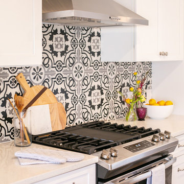
We took careful time in design and execution to align the range and sink because while it might seem like a small detail, it plays an important role in supporting the symmetrical configuration of the back wall of the kitchen. The rear wall design utilizes an appliance garage mirrors the visual impact of the refrigerator enclosure and helps keep the now open kitchen tidy. Between the appliance garage and refrigerator enclosure is the cooking zone with 30" of cabinetry and work surface on either side of the range, a chimney style vent hood, and a bold graphic tile backsplash.
The backsplash is just one of many personal touches we added to the space to reflect our client's modern eclectic style and love of color. Swooping lines of the mid-mod style barstools compliment the pendants and backsplash pattern. A pop of vibrant green on the frame of the pantry door adds a fresh wash of color to an otherwise neutral space. The big show stopper is the custom charcoal gray and copper chevron wall installation in the dining room. This was an idea our clients softly suggested, and we excitedly embraced the opportunity. It is also a kickass solution to the head-scratching design dilemma of how to fill a large and lofty wall.
We are so grateful to bring this design to life for our clients and now dear friends.
 Albers Design LLC
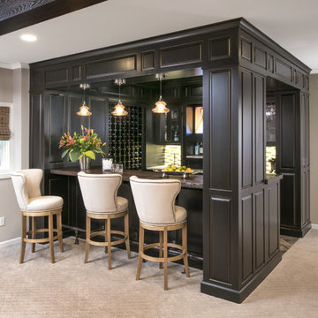
Inspiration for a large timeless u-shaped carpeted and gray floor seated home bar remodel in Minneapolis with an undermount sink, raised-panel cabinets, black cabinets, wood countertops and multicolored backsplash
 Valley View Landworks
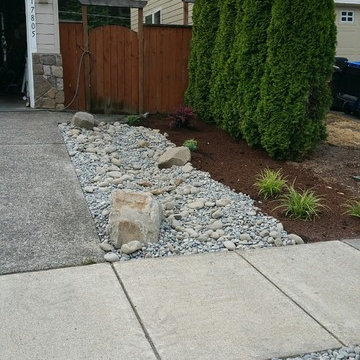
This young family, with busy lives including sports, professions and travel... needed an easy to upkeep front, back and side yards. Weeds and forgotten yard toys piled high, we cleaned everything up and installed this simple solution to easy outdoor family time. The kids love the fire pit, while Mom and Dad enjoy only 10 minutes of focused, front yard mowing. SIde yards are for storage and only need a light weed spraying once in a while. Bamboo is growing to buffer their investment from a busy residential through-street bordering the backyard.
 Carson Douglas Landscape Architecture
William Carson Joyce
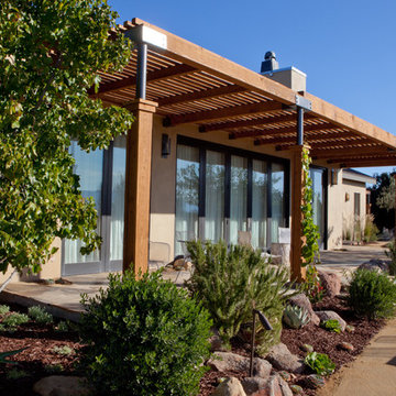
This is an example of a contemporary porch design in Santa Barbara.
This is an example of a contemporary porch design in Santa Barbara.
5