
Search results for "Promoting gold" in Home Design Ideas
 Design Shop Interiors
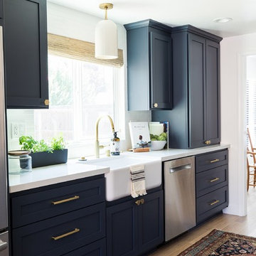
Kitchen - country medium tone wood floor and beige floor kitchen idea in Sacramento with a farmhouse sink, shaker cabinets, black cabinets, white backsplash, brick backsplash, stainless steel appliances, no island and white countertops
 The Artisans Group, Inc.
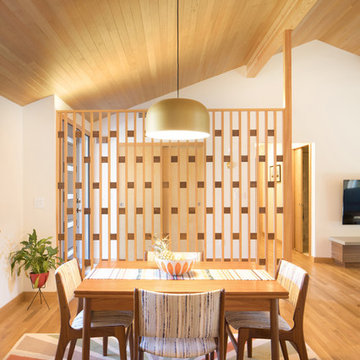
Winner of the 2018 Tour of Homes Best Remodel, this whole house re-design of a 1963 Bennet & Johnson mid-century raised ranch home is a beautiful example of the magic we can weave through the application of more sustainable modern design principles to existing spaces.
We worked closely with our client on extensive updates to create a modernized MCM gem.
Extensive alterations include:
- a completely redesigned floor plan to promote a more intuitive flow throughout
- vaulted the ceilings over the great room to create an amazing entrance and feeling of inspired openness
- redesigned entry and driveway to be more inviting and welcoming as well as to experientially set the mid-century modern stage
- the removal of a visually disruptive load bearing central wall and chimney system that formerly partitioned the homes’ entry, dining, kitchen and living rooms from each other
- added clerestory windows above the new kitchen to accentuate the new vaulted ceiling line and create a greater visual continuation of indoor to outdoor space
- drastically increased the access to natural light by increasing window sizes and opening up the floor plan
- placed natural wood elements throughout to provide a calming palette and cohesive Pacific Northwest feel
- incorporated Universal Design principles to make the home Aging In Place ready with wide hallways and accessible spaces, including single-floor living if needed
- moved and completely redesigned the stairway to work for the home’s occupants and be a part of the cohesive design aesthetic
- mixed custom tile layouts with more traditional tiling to create fun and playful visual experiences
- custom designed and sourced MCM specific elements such as the entry screen, cabinetry and lighting
- development of the downstairs for potential future use by an assisted living caretaker
- energy efficiency upgrades seamlessly woven in with much improved insulation, ductless mini splits and solar gain
 Pennsylvania Landscape & Nursery Association
u2014 ALE: Wayne Rain Garden
Pennsylvania Landscape & Nursery Association
u2014 ALE: Wayne Rain Garden
Terren Landscapes http://www.terrenlandscapes.com
2014 PLNA Awards for Landscape Excellence winner
Category: Residential Up to $15,000
Award Level: Gold
Project Description:
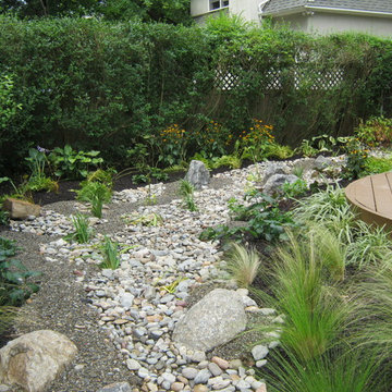
Our company was contracted by the client to provide a creative solution to an ongoing drainage problem. Their property is located within 30 feet of a local stream that collects storm water from the surrounding area. The nearby stream and high water table caused the lawn area at the side of their home to flood and to remain waterlogged for a few days after each storm. The client not only had difficulty growing plants in the existing conditions, but also had a problem with mosquitoes due to standing water.
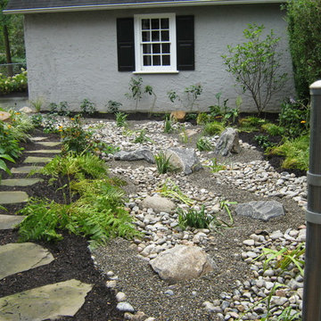
Our goal was to design a self-contained, naturalistic rain garden that slowed storm water runoff, allowed for percolation, and promoted infiltration while permitting excess clean water to enter the nearby stream with diminished force. As designed, the rain garden allows the earth to slowly and more naturally
absorb excess storm water while filtering out toxins such as excess nitrogen and phosphorous which are frequently found in the landscape, therefore reducing the contaminants entering the stream.
A percolation test was conducted with criteria of absorbing a one-inch rainstorm within four hours without overflow. The one-inch storm calculation included an existing downspout from the home, which would be piped into the rain garden to reduce roof runoff. The first test failed due to a deep layer of high clay-content soil. Excavation continued until a layer of sandy loam was reached, the percolation test was repeated, and a successful test result was achieved. Next, the entire rain garden basin was excavated to the sandy loam layer and the soil amended with compost and sand to create a highly porous planting media.
Geotextile fabric was placed to help reduce migration of the surface stone into the soil and allow for minimal maintenance. Gravel, river stone and small boulders were carefully placed to achieve the look of a natural streambed.
A palette of mostly native plants with a few non-invasive ornamentals were chosen for their ability to survive in extreme conditions ranging from floods to drought and were placed according to their specific preferences.
Wetland plants were chosen for the lowest portion of the rain garden as that area remains saturated for longer periods of time, with a Chionanthus virginicus as a focal point surrounded by irises and ferns at the lowest depth.
Plants tolerant of drier conditions were chosen for the upper edges of the garden. The beautiful colors of Monarda, Ligularia, Eupatorium, Solidago, Chelone, and Rudbeckia were scattered within the upper edge, while movement and softness were incorporated by use of the graceful Nassella that lines the border. Finally, winter interest was provided with a backdrop of Cornus sericea.
As built, this small rain garden creates tremendous impact by decreasing the amount of storm water runoff not only on our client's property, but also in the neighboring stream. It serves as a means of slowing the water and providing an area for infiltration back into the earth. The plants provide a habitat for birds, butterflies, and insects, working in harmony with nature and providing beautiful visual interest year-round.
Photo Credit:
Lisa C. Falls
Find the right local pro for your project
 Richard Best Architect, Inc.
Hillside Modernism In Context.
The owners of this modern hillside home sought to have a home in a nice Los Angeles neighborhood wherein they could raise their burgeoning family. The owners purchased a 1948 2000sf, single story, 2 bedroom English Cottage styled home (believed to have been originally owned by Yul Brynner) on a ½ acre hillside site in the exclusive Brentwood area of Los Angeles. The property slopes downward away from the street and overlooks a mini eucalyptus arroyo. The owners love their new location but are now faced-with having to raise their new and growing family on a hillside with extremely limited yard spaces for children to play and in a location where nature is very close – deer as well as coyotes wander the arroyo.
In 2000 the owners commissioned architect Richard Best to add 2500sf to the cottage and transform it into a home more fitting to their growing family’s needs. Subsequently, in 2014/15, the owners again commissioned Richard to create a 2-story master suite addition. Living in or visiting the completed project - the original 1948 home remodeled + the 2000 addition + the 2014/15 addition, one goes through an unexpected and delightful experience as the spaces of the home “unfold” to reveal intimacy and environmental immersion.
It was important to Richard and to the owners that their remodels and additions be appropriately designed to fit into the neighborhood and have the feel, scale, and soul of the original cottage. With this in-mind, Richard has interpreted the design intentions of the original cottage - “modernizing” the architectural vocabulary and creating open-plan, 2-story additions which promote site “engagement” at various floor levels and openness to the outdoors in a manner clearly inspired by the original cottage, yet modern.
At the front door of the original (still remains as it was) 1948 structure, one is presented with a quaint a low-slung entry which establishes a very comfortable sense of scale. Inside, the remodeled spaces of the original cottage exude comfort and a cozy sensibility evoked by the reuse of the original home’s exposed timber framing structure, open-plan circulation, and an inventive two-sided steel fireplace which acts as a room divider between the living room and a home office. Accordion wood doors connect these rooms to a newly formed outdoor rear patio. At this point one also gets ones first hint that something very interesting is happening just beyond – a glimpse of the 2000 & 2014/15 additions.
Moving from the original 1948 structure into the 2-story 2000 addition, one is greeted by a modern and open linear floor plan arrangement – a kitchen, casual dining and family room extend perpendicularly from the 1948 structure into the rear yard and down the hillside. The open framed cathedral ceiling and wood roof trusses establish a lofty feeling and a rhythm discretely separating the open rooms one from the other. Extensive use of windows and French doors connect the indoors to the outdoors and provide abundant natural lighting. This new appendage ends with a symmetrical family room which has no corners – it is a geometry composed of two overlapped squares - one rotated 45 degrees atop the other to create double opportunities for bay windows. The design not only connects the home to the desired exterior flat yards spaces, but it also takes full advantage of the sloping terrain by adding a floor below the original level so as to maintain a scale appropriate to the neighborhood. The exterior materials were chosen taking “hints” from the original 1948 structure – natural redwood siding, reused brick veneer and wood doors/windows all serving to aesthetically connect the addition back-to the spirit of the original structure.
By 2014/15 the owners’ family has fully blossomed - the children are now teenagers and there is a need for additional space. However, the owners are very content with their remodeled cottage and Richard’s 2000 addition – unsure how to add to a home which they feel is quite perfect as it is … wanting whatever changes are to be made to be sympathetic to it. They are also concerned about potential additions blocking-out their views of the eucalyptus arroyo. The owners approached Richard with trepidation – we love our perfect house but we need it to be a bit bigger and we don’t want to block-out the arroyo views or create a hemmed-in feeling – how can we add but still see the arroyo.
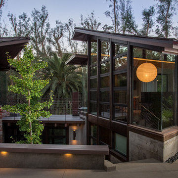
In response Richard created a private yet connected 2-story master suite, which by its positioning, dynamic geometries and extensive glazing create the fourth side of the former rear patio, making it into exterior courtyard with views around and through the new addition into the arroyo. A dynamic angularity in the new master addition (inspired by the 2000 addition) simultaneously reduces the apparent size/presence of the master suite addition on the edge of the eucalyptus arroyo while creating framed views into the arroyo from the newly formed courtyard. The new master suite - a master bathroom, master closet and a master sleeping loft each having exterior decks and/or patios, is connected back to the 2000 addition via a glazed hallway which provides a sense of connectedness and privacy. A modern rustic aesthetic of exposed board-formed concrete, natural finished Corten steel exterior cladding, frameless metal windows, and clear finished Douglas Fir planks serve to “extend” the soul of the original cottage into the master suite.
The project is a highly sustainable design as well. Energy use is reduced by employing a high efficiency heat pump heating and cooling system, dual paned/gasketed metal window/door systems, natural lighting through a Kalwall skylight and generous exterior glazing with extensive eaves for shading, rigid roof insulation, and earthen backing – the lower floor is up-against the hillside which tends to even-out the day/night temperature differential.
Credits:
Architecture & Interior Design: Richard Best Architect Inc.
Structural Engineering: Dan Echeto & David Choi Associates
Interior Decor: Noelle Schoop
Landscape: Connie Heitzman
Photos: Carmel McFayden and Adriano Sarmento / James Porschen
 Dillon Kyle Architects (DKA)
Casey Dunn Photography
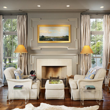
Living room library - mid-sized traditional dark wood floor living room library idea in Houston with gray walls, a standard fireplace and a tile fireplace
Living room library - mid-sized traditional dark wood floor living room library idea in Houston with gray walls, a standard fireplace and a tile fireplace
 down2earth Interior Design, LLC.
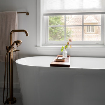
This bathroom features a custom floating vanity, recessed into a drywall niche.
Shelves framed in matching wood are tucked into either side of this niche and provide tons of additional storage. A large custom vanity mirror is framed by navy herringbone tiles and gold fixtures. This herringbone tile is repeated on the shower walls, while the shower floor is composed of large tiles cut into triangular shapes to promote drainage while minimizing grout lines. The sleek soaking tub is a great place to unwind from a busy day in a soothing, spa-like environment.
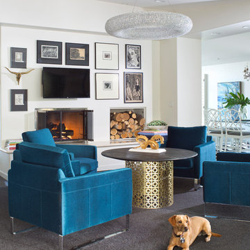
Inspiration for an eclectic open concept family room remodel in Denver with white walls, a standard fireplace and a wall-mounted tv

 Pennsylvania Landscape & Nursery Association
u2014 ALE: Wayne Rain Garden
Pennsylvania Landscape & Nursery Association
u2014 ALE: Wayne Rain Garden
Terren Landscapes http://www.terrenlandscapes.com
2014 PLNA Awards for Landscape Excellence winner
Category: Residential Up to $15,000
Award Level: Gold
Project Description:
Our company was contracted by the client to provide a creative solution to an ongoing drainage problem. Their property is located within 30 feet of a local stream that collects storm water from the surrounding area. The nearby stream and high water table caused the lawn area at the side of their home to flood and to remain waterlogged for a few days after each storm. The client not only had difficulty growing plants in the existing conditions, but also had a problem with mosquitoes due to standing water.
Our goal was to design a self-contained, naturalistic rain garden that slowed storm water runoff, allowed for percolation, and promoted infiltration while permitting excess clean water to enter the nearby stream with diminished force. As designed, the rain garden allows the earth to slowly and more naturally
absorb excess storm water while filtering out toxins such as excess nitrogen and phosphorous which are frequently found in the landscape, therefore reducing the contaminants entering the stream.
A percolation test was conducted with criteria of absorbing a one-inch rainstorm within four hours without overflow. The one-inch storm calculation included an existing downspout from the home, which would be piped into the rain garden to reduce roof runoff. The first test failed due to a deep layer of high clay-content soil. Excavation continued until a layer of sandy loam was reached, the percolation test was repeated, and a successful test result was achieved. Next, the entire rain garden basin was excavated to the sandy loam layer and the soil amended with compost and sand to create a highly porous planting media.
Geotextile fabric was placed to help reduce migration of the surface stone into the soil and allow for minimal maintenance. Gravel, river stone and small boulders were carefully placed to achieve the look of a natural streambed.
A palette of mostly native plants with a few non-invasive ornamentals were chosen for their ability to survive in extreme conditions ranging from floods to drought and were placed according to their specific preferences.
Wetland plants were chosen for the lowest portion of the rain garden as that area remains saturated for longer periods of time, with a Chionanthus virginicus as a focal point surrounded by irises and ferns at the lowest depth.
Plants tolerant of drier conditions were chosen for the upper edges of the garden. The beautiful colors of Monarda, Ligularia, Eupatorium, Solidago, Chelone, and Rudbeckia were scattered within the upper edge, while movement and softness were incorporated by use of the graceful Nassella that lines the border. Finally, winter interest was provided with a backdrop of Cornus sericea.
As built, this small rain garden creates tremendous impact by decreasing the amount of storm water runoff not only on our client's property, but also in the neighboring stream. It serves as a means of slowing the water and providing an area for infiltration back into the earth. The plants provide a habitat for birds, butterflies, and insects, working in harmony with nature and providing beautiful visual interest year-round.
Photo Credit:
Lisa C. Falls
 LA Design Build
Photo by Madeline Tolle
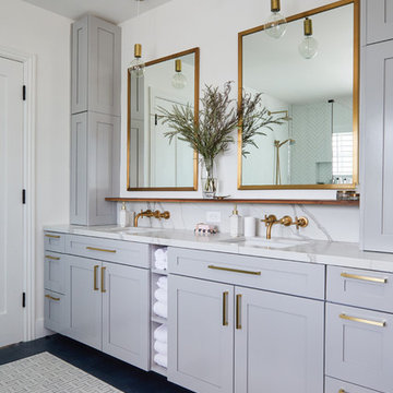
Transitional master black floor bathroom photo in Los Angeles with shaker cabinets, gray cabinets, white walls, an undermount sink and white countertops
Transitional master black floor bathroom photo in Los Angeles with shaker cabinets, gray cabinets, white walls, an undermount sink and white countertops
 down2earth Interior Design, LLC.
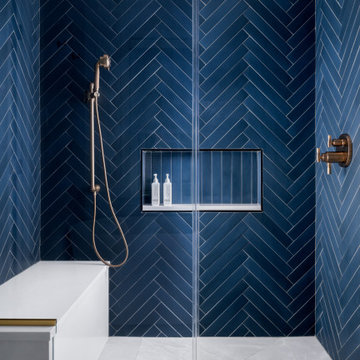
This bathroom features a custom floating vanity, recessed into a drywall niche.
Shelves framed in matching wood are tucked into either side of this niche and provide tons of additional storage. A large custom vanity mirror is framed by navy herringbone tiles and gold fixtures. This herringbone tile is repeated on the shower walls, while the shower floor is composed of large tiles cut into triangular shapes to promote drainage while minimizing grout lines. The sleek soaking tub is a great place to unwind from a busy day in a soothing, spa-like environment.
 Lindross Remodeling
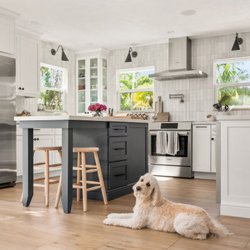
Inspiration for a mid-sized coastal u-shaped medium tone wood floor and brown floor eat-in kitchen remodel in Tampa with an undermount sink, shaker cabinets, white cabinets, quartz countertops, white backsplash, porcelain backsplash, stainless steel appliances, an island and white countertops
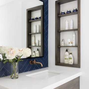 down2earth Interior Design, LLC.
This bathroom features a custom floating vanity, recessed into a drywall niche.
Shelves framed in matching wood are tucked into either side of this niche and provide tons of additional storage. A large custom vanity mirror is framed by navy herringbone tiles and gold fixtures. This herringbone tile is repeated on the shower walls, while the shower floor is composed of large tiles cut into triangular shapes to promote drainage while minimizing grout lines. The sleek soaking tub is a great place to unwind from a busy day in a soothing, spa-like environment.
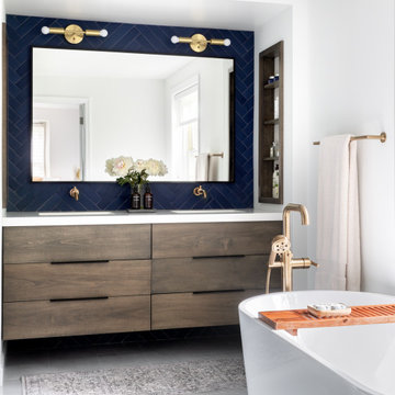 down2earth Interior Design, LLC.
This bathroom features a custom floating vanity, recessed into a drywall niche.
Shelves framed in matching wood are tucked into either side of this niche and provide tons of additional storage. A large custom vanity mirror is framed by navy herringbone tiles and gold fixtures. This herringbone tile is repeated on the shower walls, while the shower floor is composed of large tiles cut into triangular shapes to promote drainage while minimizing grout lines. The sleek soaking tub is a great place to unwind from a busy day in a soothing, spa-like environment.


 TKS Design Group
Download our free ebook, Creating the Ideal Kitchen. DOWNLOAD NOW
As with most projects, it all started with the kitchen layout. The home owners came to us wanting to upgrade their kitchen and overall aesthetic in their suburban home, with a combination of fresh paint, updated finishes, and improved flow for more ease when doing everyday activities.
A monochromatic, earth-toned palette left the kitchen feeling uninspired. It lacked the brightness they wanted from their space. An eat-in table underutilized the available square footage. The butler’s pantry was out of the way and hard to access, and the dining room felt detached from the kitchen.
Lead Designer, Stephanie Cole, saw an improved layout for the spaces that were no longer working for this family. By eliminating an existing wall between the kitchen and dining room, and relocating the bar area to the dining room, we opened up the kitchen, providing all the space we needed to create a dreamy and functional layout. A new perimeter configuration promoted circulation while also making space for a large and functional island loaded with seating – a must for any family. Because an island that isn’t big enough for everyone (and a few more) is a recipe for disaster. The light white cabinetry is fresh and contrasts with the deeper tones in the wood flooring, creating a modern aesthetic that is elevated, yet approachable for everyday living.
With better flow as the overarching goal, we made some structural changes too. To remove a bottleneck in the entryway, we angled one of the dining room walls to create more natural separation between rooms and facilitate ease of movement throughout the large space.
At The Kitchen Studio, we believe a well-designed kitchen uses every square inch to the fullest. By starting from scratch, it was possible to rethink the entire kitchen layout and design the space according to how it is used, because the kitchen shouldn’t make it harder to feed the family. A new location for the existing range, flanked by a new column refrigerator and freezer on each side, worked to anchor the space. The very large and very spacious island (a dream island if we do say so ourselves) now houses the primary sink and provides ample space for food prep and family gathering.
The new kitchen table and coordinating banquette seating provide a cozy nook for quick breakfasts before school or work, and evening homework sessions. Elegant gold details catch the natural light, elevating the aesthetic.
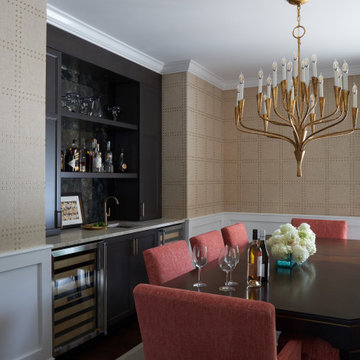
The dining room was transformed into one of this client’s favorite spaces and we couldn’t agree more. We saw an opportunity to give the dining room a more distinguished identity by closing off the entrance from the foyer. The relocated wet bar enhances the sophisticated vibe of this gathering space, complete with beautiful antique mirror tiles and open shelving encased by moody built-in cabinets.
Updated furnishings add warmth. A rich walnut table is paired with custom chairs in a muted coral fabric. The large, transitional chandelier grounds the room, pairing beautifully with the gold finishes prevalent in the faucet and cabinet hardware. Linen-inspired wallpaper and cream-toned window treatments add to the glamorous feel of this entertainment space.
There is no way around it. The laundry room was cramped. The large washer and dryer blocked access to the sink and left little room for the space to serve its other essential function – as a mudroom. Because we reworked the kitchen layout to create more space overall, we could rethink the mudroom too – an essential for any busy family. The first step was moving the washer and dryer to an existing area on the second floor, where most of the family’s laundry lives (no one wants to carry laundry up and down the stairs if they don’t have to anyway). This is a more functional solution and opened up the space for all the mudroom necessities – including the existing kitchen refrigerator, loads of built-in cubbies, and a bench.
It’s hard to not fall in love with every detail of a new space, especially when it serves your day-to-day life. But that doesn’t mean the clients didn’t have their favorite features they use on the daily. This remodel was focused largely on function with a new kitchen layout. And it’s the functional features that have the biggest impact. The large island provides much needed workspace in the kitchen and is a spot where everyone gathers together – it grounds the space and the family. And the custom counter stools are the icing on the cake. The nearby mudroom has everything their previous space was lacking – ample storage, space for everyone’s essentials, and the beloved cement floor tiles that are both durable and artistic.

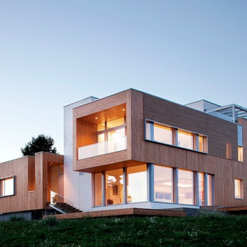
 Hammer & Hand
Karuna Passive House designed by Holst Architecture and built by Hammer & Hand. This high performance home meets the world's most demanding green building certifications. Photo by Jeremy Bittermann.
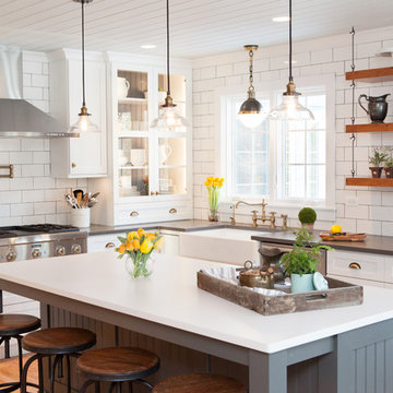
 Advance Design Studio, Ltd.
When this suburban family decided to renovate their kitchen, they knew that they wanted a little more space. Advance Design worked together with the homeowner to design a kitchen that would work for a large family who loved to gather regularly and always ended up in the kitchen! So the project began with extending out an exterior wall to accommodate a larger island and more moving-around space between the island and the perimeter cabinetry.
Style was important to the cook, who began collecting accessories and photos of the look she loved for months prior to the project design. She was drawn to the brightness of whites and grays, and the design accentuated this color palette brilliantly with the incorporation of a warm shade of brown woods that originated from a dining room table that was a family favorite. Classic gray and white cabinetry from Dura Supreme hits the mark creating a perfect balance between bright and subdued. Hints of gray appear in the bead board detail peeking just behind glass doors, and in the application of the handsome floating wood shelves between cabinets. White subway tile is made extra interesting with the application of dark gray grout lines causing it to be a subtle but noticeable detail worthy of attention.
Suede quartz Silestone graces the countertops with a soft matte hint of color that contrasts nicely with the presence of white painted cabinetry finished smartly with the brightness of a milky white farm sink. Old melds nicely with new, as antique bronze accents are sprinkled throughout hardware and fixtures, and work together unassumingly with the sleekness of stainless steel appliances.
The grace and timelessness of this sparkling new kitchen maintains the charm and character of a space that has seen generations past. And now this family will enjoy this new space for many more generations to come in the future with the help of the team at Advance Design Studio.
Photographer: Joe Nowak
Dura Supreme Cabinetry
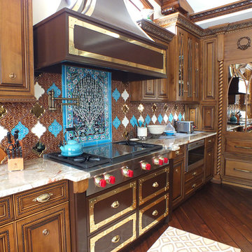
Sponsored
Fredericksburg, OH

High Point Cabinets
Columbus' Experienced Custom Cabinet Builder | 4x Best of Houzz Winner
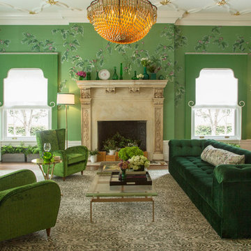
 Margot Hartford Photography
Photo: Margot Hartford © 2017 Houzz
Living Room: April in Paris
Designer: Jonathan Rachman Design
Living room - traditional formal living room idea in San Francisco with green walls and a standard fireplace
Living room - traditional formal living room idea in San Francisco with green walls and a standard fireplace
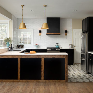
 Jordan Design Build Group
This client came to us with a very clear vision of what she wanted, but she needed help to refine and execute the design. At our first meeting she described her style as somewhere between modern rustic and ‘granny chic’ – she likes cozy spaces with nods to the past, but also wanted to blend that with the more contemporary tastes of her husband and children. Functionally, the old layout was less than ideal with an oddly placed 3-sided fireplace and angled island creating traffic jams in and around the kitchen. By creating a U-shaped layout, we clearly defined the chef’s domain and created a circulation path that limits disruptions in the heart of the kitchen. While still an open concept, the black cabinets, bar height counter and change in flooring all add definition to the space. The vintage inspired black and white tile is a nod to the past while the black stainless range and matte black faucet are unmistakably modern.
High on our client’s wish list was eliminating upper cabinets and keeping the countertops clear. In order to achieve this, we needed to ensure there was ample room in the base cabinets and reconfigured pantry for items typically stored above. The full height tile backsplash evokes exposed brick and serves as the backdrop for the custom wood-clad hood and decorative brass sconces – a perfect blend of rustic, modern and chic. Black and brass elements are repeated throughout the main floor in new hardware, lighting, and open shelves as well as the owners’ curated collection of family heirlooms and furnishings. In addition to renovating the kitchen, we updated the entire first floor with refinished hardwoods, new paint, wainscoting, wallcovering and beautiful new stained wood doors. Our client had been dreaming and planning this kitchen for 17 years and we’re thrilled we were able to bring it to life.
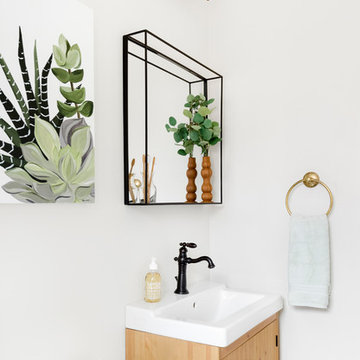
 Delphinium Design
Art: Art House Charlotte
Photography: Meagan Larsen
Featured Article: https://www.houzz.com/magazine/a-designer-tests-ideas-in-her-own-38-square-foot-bathroom-stsetivw-vs~116189786
1